All posts by Niamh

Cleveland-born, Purdue-trained, Detroit-toughened trans woman, engineer, and author. I like football and when Detroit wins stuff. I swear a lot, I write a lot, and I drink coffee a lot.

Counter Attack: The Soccer Board Game

Edit: The creators of the game have reached out and commented on some of my comments. I’ve done my best to edit out incorrect information and provide context where necessary.

I don’t do reviews often on this blog, that’s not really my schtick, but a particular board game came onto my radar because it combined two or three of my favorite things: soccer, nerdiness, and soccer kits. I thought I’d share some thoughts on it.

Spoiler alert for tl;dr:
I enjoyed the game thoroughly, but can see some weaknesses in it. I look forward to playing it again, but I’m not sure I can say the same for Brigid. The rules are easy(ish) if you know D&D, but the tactics can be a steep learning curve as the sport is baked very deeply into the game.

What it is:
Counter Attack is a UK-made card and dice tactics board game based on the actual sport, soccer. Two players move tokens around that represent players, pass, shoot, dribble, and tackle in order to maintain control of a ball with their feet. Foot. Ball. Why it’s called “soccer” should be obvious.

So Brigid and I sat down this morning after shopping and chores and gave the game a shot. Some background: Brigid has no experience with soccer and I have much more, being an avid watcher and player. This will come into play heavily by the end. We are both also big D&D players, which will also come into play heavily by the end.

We also had a bit of a time limit ticking behind us, the game rules suggest a live timer of 45 mintues for each half with each player getting about 1 minute (with a sand timer) to figure out their turn and lose any unused moves or actions when the minute runs out. Obviously we tossed out the 1 minute rule because we didn’t understand any of the other rules. In the two hours we spent we got one attack in each, maybe a total of five or six rounds.

So the game is already primed for a “professional” (with timer) and “amateur” (without) division in play, and that’s okay. As a former Warhammer player, I’m also used to board games that take hours, so the rules limiting how much movement one can do can certainly speed things along.

Henceforth: “attacker” refers to the human player who has control of the ball, “defender” refers to the human player who does not have control of the ball, and “player” refers to the in-game players represented by tokens and cards.

How it’s played:
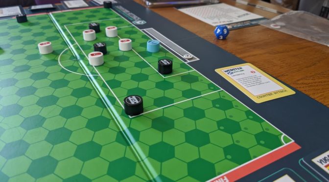
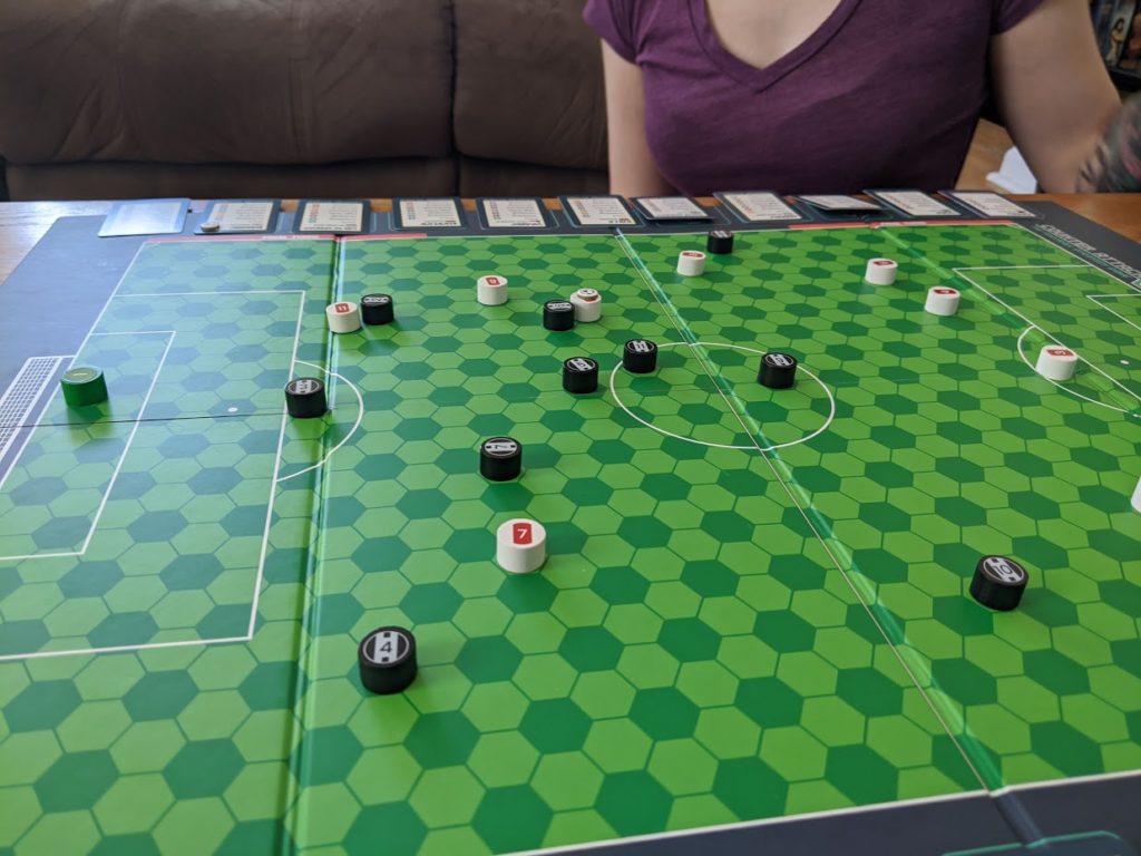
It’s pretty easy, after randomly selecting teams playground style and randomly choosing a ref, you flip a coin (or call evens/odds on your 1 thru 6 d12) you pick to kickoff or defend. Counters are numbers 1 thru 11 so that a player card, with their stats is always tied to a particular counter on the board. Brigid and I lumped players naturally along rough forward/midfield/defender divisions, with defenders being the lower numbers and forwards getting the higher ones, as it was in the old days.

One interesting note right away is that you get 15 outfielders, which means you have five on the bench. However, it might also limit your formation, with what you draw dictating what you play, so if you have a favorite FIFA formation, you might have to forego it to strengthen what you have in your hand.

Newcastle lines up against Arsenal in Lancaster Gate

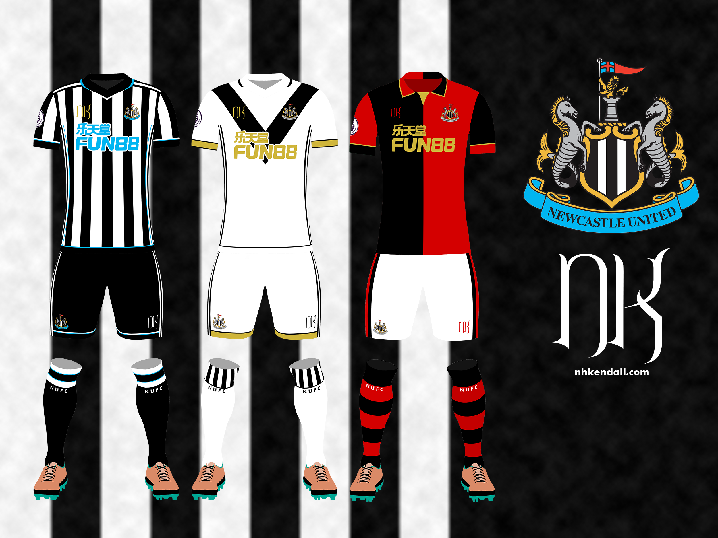
For me, playing as my beloved Magpies, I used a sort of 4-2-1-2-1 that had faded into a 3-4-3 by the time we called the game a wash. Brigid, who is not a soccer person, lined up in a 5-2-3 that had faded into an odd 5-1-4 by the end.

And this is the first weakness: non-soccer people, and even soccer folks who are more just a fan of a team and not necessarily an arm-chair manager, are going to be at a serious disadvantage starting off. For example, the offside rule is described in the booklet as just being the offside rule from real soccer. Not useful as many soccer folks already don’t get how the offside works.

Movement is best divided into the movement phase and all the other movements.

The movement phase is pretty easy to wrap your head around. The rule book describes it as 4-5-2. The attacker gets to move four players based off their pace skills, the defender reacts with five of their owner players based on their pace skills, and then the attacker gets to move two additional pieces (the rule book says “new players” so Brigid and I took it to mean players who had not yet moved that phase) two additional hexes each.

During the movement phase no shots or passes can be attempted… well… mostly. If the attacker moves a player into the penalty box, they may attempt a quick shot with a slight decrease to accuracy. The defender can attempt tackles, one per player, by approaching the player with the ball.

So to be concise, during the movement phase you may:

  • Both attacker and defender can move their players
  • The attacker can attempt a quick shot either by stepping into the penalty area, or if they just received a pass
  • The defender can attempt to tackle to regain possession

Okay, so what about this “all the other movement” you mentioned?

Well, if you’re a fan of D&D, you probably know what an attack of opportunity is. If you don’t, it’s when a character gets a free action because their location is advantageous. They’re generally pretty common sense: if you bend over to tie your shoes in the middle of a battle, the guy trying to kill you is going to try to kill you while you’re distracted.

A lot of actions, and I mean a lot – it’s just about all of them – give players free movement of usually one to three hexes. Keeping track of these free movements can often be far more important than anything, and they’re not collected in a single place on the quick-glance card or the rule book. For example, a high-ball gives the attacker and the defender one three-hex movement to get to the ball. And if it’s into the penalty area, the keeper gets a single hex. Plus the keeper can already move three hexes in a dive. Shots give defenders a free movement to try to deflect the ball. There’s a lot, I’m sure I’m missing some here, but understanding these free moves is paramount to getting the tactics. If you don’t understand them, you might waste full movements during the movement phase to do what you would’ve been able to do for free anyway.

Edit: The additional movements are collected on the quick-reference guide which, in fact, has two sides.

One of the biggest free movements is once per movement phase, if the ball is in the final third and a player moves in the final third as part of their movement phase, every player in the opposite third starting with the attackers gets a free 6 hex movement. This is actually pretty good to know because you shouldn’t waste movement on getting defenders into shape while you’re attacking. But you need to know it’s possible.

After the movement phase, there’s this nebulous, quasi-phase which can be summed up as “the ball phase”. This is when you do things like shooting, passing, and the such. There’s a lot of choices to be made. A short pass on the ground can be followed up by a first-time pass (basically a player strings a pass without moving to make one big pass), it’s a great way to take advantage of a weakness in the middle.

I used a weakness in the mid to string two passes together. and quickly shift the momentum forward.

In the tackling and dribbling is where things fell apart. Brigid rolled a string of 1s that I called as advantages to keep my momentum up, which highlights what Brigid and I figured is probably the number one weakness of the game rules: fouls.

At the beginning of the game, you pick a ref at random. Refs have only one stat: leniency (which is how likely they hand out a card after a foul). When a foul has been committed (defender rolls a 1 during the tackle) the attacker can decide if it’s a foul or if the ref called advantage. If they choose for a foul, which Brigid did when I managed to foul her, both the attack and defender have to roll a dice. The attacker is checking to see if their player is injured, the defender is seeing if their player is booked.

I picked up a card and Brigid an injury for this contest in midfield, it did set up a potentially dangerous free kick, which began the spiral of four or five consecutive 1s for Brigid.
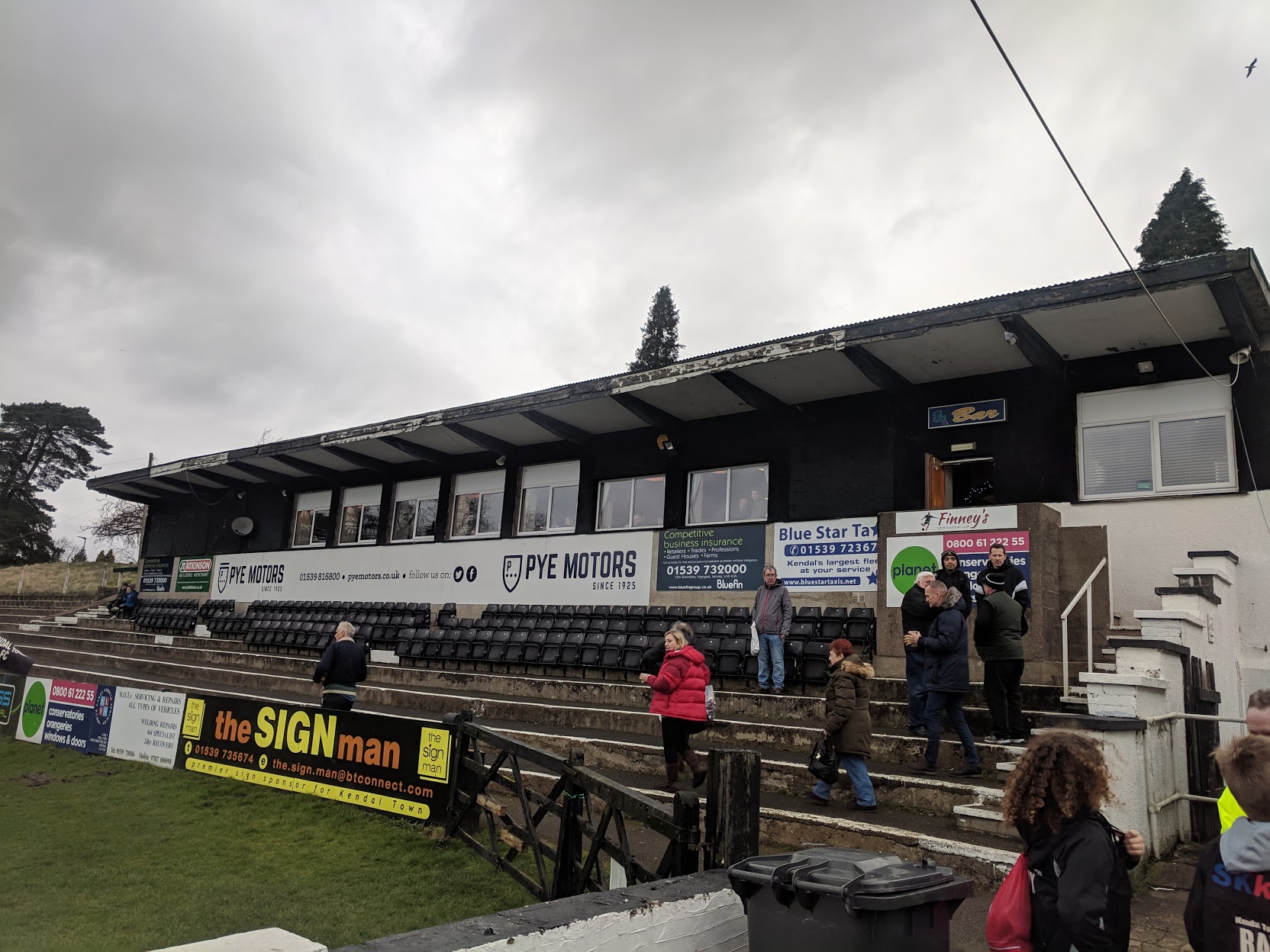
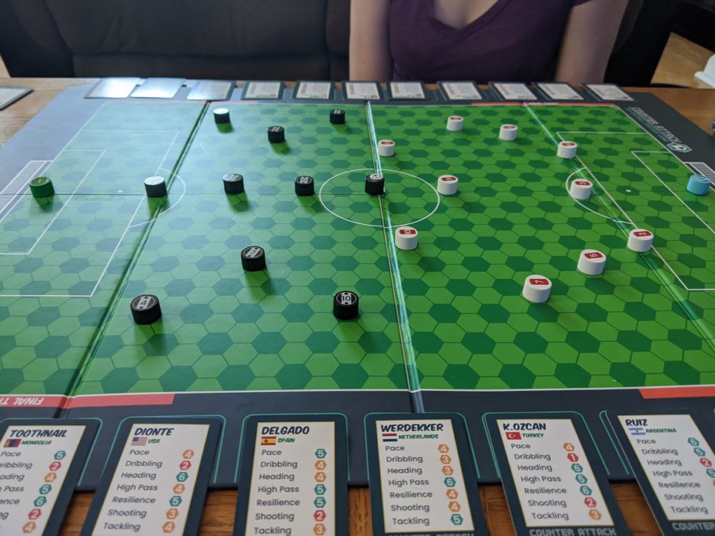
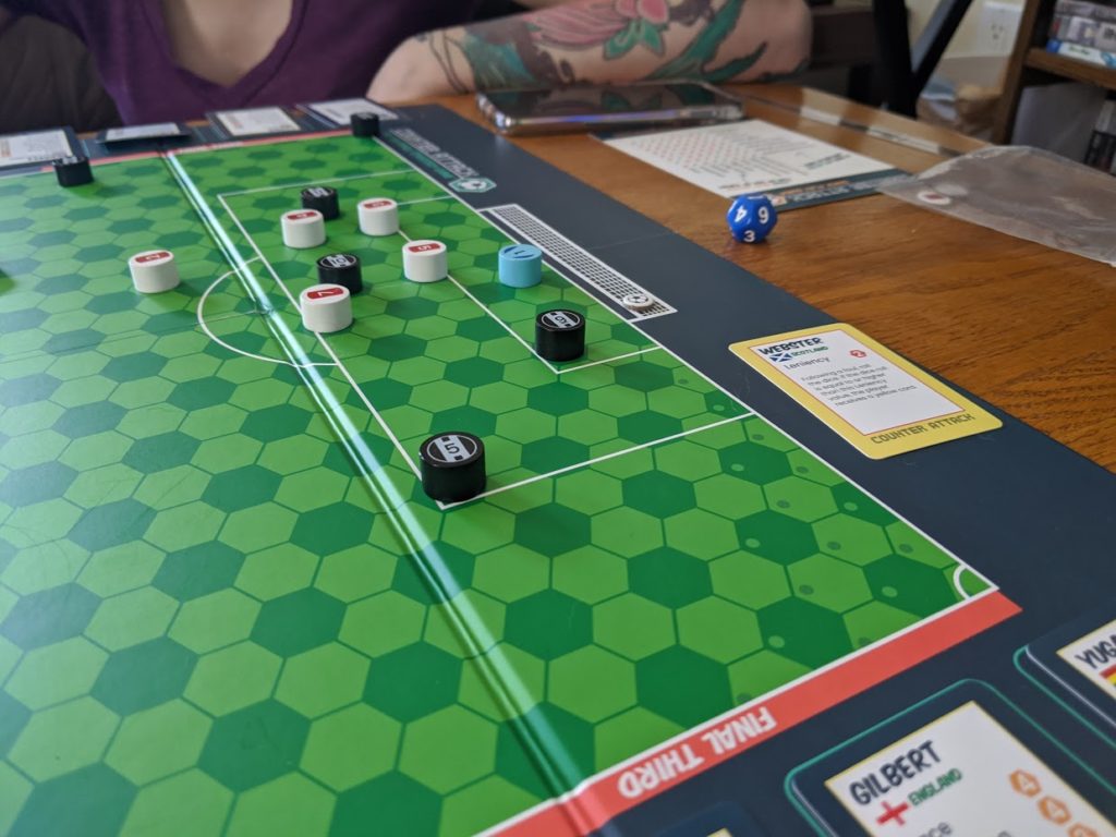
Also note the Newcastle players who are sideways, we did this to mark who had moved in any given movement phase.

The problem is the attacker decides. Not the ref. So even though we have the most strict ref in the deck, he gave me a string of advantages because as I knew that the chance of injuring my glass-cannon number 9 was too high to risk. I’d rather not have him lose pace to injury and maintain my momentum.

Edit: The creator clarified to us that regardless if the attacker chooses advantage or not, resolve the foul and the injury as normal, which to me: a) doesn’t address the problem of injuries seeming a tad common and disastrous, and b) takes a fun little trade of decision of “do you take the advantage and lose the chance to give the opponent a card, or take the free kick with its chance to set up a powerful attack?”

Brigid’s recommendation, which I agree with, is make it like D&D: 1 is auto fail, 6 is auto success; but for them to be special you need to confirm them. So rolling a 1 in a tackle makes a foul, fine. Then have the humans roll. If the defender gets a 1, there’s a chance for a card. If the attacker rolls a 1, there’s a chance for an injury. And those can be tweaked. Maybe it’s a coin flip. Maybe it’s 1-2 for failure.

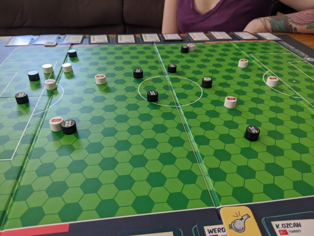
Anyway, over the course of two hours we went through maybe five or six full rounds. With Brigid’s rolls coming up poorly, and her lack of soccer tactics, I was picking up that she was running out of good will for the game. I was already pretty surprised that she offered to play.

After an attempted shot was blocked for a corner, we lined up, and an unmarked attacker headed it into the far end of the goal, which we used as the bow to tie up today’s attempt to learn the game.

Newcastle heads it past the keeper and takes three points in today’s match. The keeper here has been positioned post-movement, 1 hex for high-ball into the penalty spot, plus a further 3 hexes for a dive to save.

The disparity in soccer tactical awareness (plus like five goddamned 1s) really killed the friendly spirit of the game, which fair enough. We aren’t surprised that understanding soccer is vital to playing a soccer board game, and we’re not counting that against the game. I enjoyed it quite a bit, but it must’ve been very frustrating for Brigid.

The rule book is pretty good, I must say, with a few glaring issues (goal kicks need a label and should be part of the goal keeper page), the little scenario pictures are really clever and often answer a lot of edge questions like the long kick picture has a defender in the line of the pass, outside of the zone of control against the attacker which automatically answered a question we had “can a defender intercept a long kick?”. No. It lands further down the pitch and they have to chase after it. Most of the scenarios have little edge-cases included in them visual for quick resolution.

In the end, this is a game that I think will have many fans pretty quickly. It’s subbuteo for the D&D crowd. Plus, since Counter Attack lacks any physical interaction with goal keeping, it has the possibility to be much more available to a wider range of physical abilities.

I also suspect it’ll be a game with a thousand variations soon enough. The rules are pretty much a sturdy skeleton I can see more meatier rules applied to over time. Every league might have their own home rules, and really that’s great, because then players own the game as much as the creators and are thus much more invested in its success. Hopefully I can get some fellow social distancers around to try it out soon enough and see what you all think!

Cheers!


Some quick tips Brigid and I game up with as we played on mostly how to track things:

  • Use the dice to count how many players you’ve moved
  • Turn player counters sideways on the board to mark them as having moved especially as the attacker (Edit: the creators recommend pushing your player cards up or pulling them down to show they’ve moved, but as you can see in our picture, we were pretty tight on space, so this is a preference thing, I thought we were being rather clever and it’s immediately visible while you’re scanning the field rather than your bench)
  • Use the cardboard balls and not the wooden token balls, you can put them on top of the token who has the ball
  • Use the other cardboard ball token to mark the card of the player with the ball
  • Might be a good idea, especially if you’re learning the rules, to limit the game to a number of turns, and schedule a few hours, especially if this is your first time playing

Some ideas I came up that might be used to expand the game further:

  • Adding out of bounds and throw-ins, for example dribble checks when playing on the line, tackle checks to poke it out, high balls and long passes rolling out of play. Throw-ins treated like standard passes or long throws like high passes
  • Goal kicks are defined in the rule book, it’s just not labeled a goal kick, so searching for it in the PDF yields nothing but other expansion rules
  • Player traits (like being able to do long throw-ins)
  • Ref should be a token, with a field of vision (this might make things much more complicated but also more interesting)
  • Ref traits to add more interest to fouls, like we’ve all had that ex-defender ref overlook a crunching tackle or two
  • As above, the fouls seem very heavy handed and are almost always representative of heavy, game-changing fouls instead of being a part of the game.
  • Injuries are really strong, maybe a chance of them resolving as the game continues is a good idea, especially at half time including rolling for severity? Like a 1 means needs immediate subbing, 6 is injury fades after a few turns, and 2 thru 5 is the injury lasts a half or more, but doesn’t need immediate attention
  • Since players can keep pace up for the whole game, substitutions are really only there to deal with injuries, which seems “off” from the spirit of a game about team management
  • Manager or “sideline team” cards, again with traits and stats that might impact things like fixing injuries
  • Captains, not sure what you can do with them, but captains are a thing and maybe something can be figured out like sharing stats, improving rolls, or maybe talking your way out of a card
  • Please center the hexes on the board, it’s really weird that there’s not hexes in the middle of the pitch for the center spot, penalty spots, and to keep the goals even

Kit Nerd Special – Newcastle United

Skip to the next drop-cap paragraph if you don’t care about my background or opinions on the 2020 takeover.

To my usual readers – friends and family folks – it’d probably come as no surprise that I have a great deal of enthusiasm for Newcastle United, a football club based in the North East of England, on the River Tyne. In February and March of 2019, I took a trip to Newcastle (as well as Glasgow and Kendal) and managed to catch two Newcastle games (both two-nill games in our favor: Huddersfield and Burnley), my first in-person after starting to support the team since 2007.

I often get asked “why?”. Why Newcastle? It probably would’ve made more sense in the late 90s, when Newcastle was riding high, but in the late 00s the team was already having issues and the sale of the club from Sir John Hall to Mike Ashley (on the very year I started supporting the club) has proven over the last 13 years to be completely disastrous, marked by an utter lack of ambition and two relegations, as well as hemorrhaging any talent we did manage to attract.

In 2007 I was a freshmen at Purdue University and making a lot of new friends. Supporting football almost always meant English football. I was already a fan of the German national team and flirted with supporting FC Bayern-München (though my eventual German love became and remains FC St. Pauli), but Bundesliga was harder to find on TV back then. Plus if you weren’t supporting an EPL team, there wasn’t much room for actual talk and banter with other folks outside of European competitions.

So, I needed an EPL club. And being me it wasn’t going to be as easy as picking one from the top five or being pressured by my peers into supporting their team just for the camaraderie. I wanted a team to call my own, that spoke to me and the person I was.

For me, Newcastle reminded me of my then-home, Cleveland. It was post-industrial. On a body of water. Far from what was considered “important”. A far-cry from its heyday. And the sports? The sports were suffering, but the fans were die-hard, loyal, and had a certain sense of humor about them. It was this spirit that drew me to Newcastle United, a spirit that has persisted to this day, drawing me closer and closer to the team.

And now, in the last few days of May, 2020 – it seems to be over.

Mike Ashley is, almost certainly, done with Newcastle United. After 13 years of milking the club as nothing more than a billboard to hold Sports Direct signs, it appears that a consortium backed by the Public Investment Fund, the sovereign wealth fund of Saudi Arabia, is on the brink of making Newcastle United the one of, if not the, wealthiest club on the planet.

Which, of course, has brought its own confusions, thoughts, and opinions. I have many of them, I’ve shared them with folks as prompted, but mostly haven’t outside of a few twitter posts and a few posts on r/NUFC, the Newcastle United subreddit. I am very much anti-Mike Ashley. I am glad to be seeing the back of him and hope the door hits him where biology splits him. I hope he buys the Mackems and I hope he completely fucks that up too.

But it is just our luck that we’re trading the unmotivated and apparently skittish cockney bastard for PIF, which through various deals and purchases, has tried desperately and often wildly successfully to cover for the crimes of Saudi Arabia through “sportswashing” or, to put it as flatly as possible, projecting Saudi Arabia’s image to the West as one in the same while also going through the tried and true motions of bread and circus for its own people.

The situation is one I’d rather not be in, to be frank. I agree largely with both sides. I don’t support PIF. I don’t support Saudi Arabia. I hate Mike Ashley and I do support Newcastle United. I think it is wrong for outsiders to think the Geordies support Saudi Arabia because they refuse to be turned off from their club, a club that is very dear to them in many ways I think Americans especially do not understand. I think there is also a minority of folks, either in bad faith or for whatever reason, need to lay off and stop acting like PIF is bloodless. Especially when it comes to attack victims of Saudi Arabia.

In many ways, Newcastle is my non-strings attached sports team. I don’t really interest myself in the politicking around the team. This, of course, is in stark contrast to my love of Detroit City FC and FC. St. Pauli, both heavily politically left teams. That said, I plan to take the future one season at a time. I suspect those first few seasons will be something grand. The wins. The big names. The expectations. They will all build. And so too will Newcastle’s support here in the US. I guess, succinctly, I expect my love of Newcastle to evolve over the next few years as its popularity grows and other people actually form opinions about them. Opinions they will then share with me, whether I want to hear them or not.

Only time will tell.


So. That was a lot of words. It was written basically in one take over my lunch break. leading into Memorial Day Weekend, a time that would usually mean sports and celebration in the United States, but is currently rainy and probably going to get hot, and then thunderstormy.

Oh. And there’s a crazy pandemic going on and it’s been a load of fun. I swear.

Once a year I do a post where I theorize and conjure some kits for Detroit City FC. I call it my “kit nerd” post. One team I’ve actually never done a design for is Newcastle United. I couldn’t tell you why. I love Newcastle’s kits, and I have extremely strong opinions on them:

  • The tops should be primarily black
  • More, thinner stripes rather than fewer, thicker stripes
  • Stripes should be spaced evenly
  • The white space should be the same width as the stripes
  • Shorts and socks should always be black
  • Blue should be either used as an accent, or not used at all
  • If there’s no blue accent, the numbers on the back should be red
  • Stripes should be front and back, and on the sleeves
  • If you can make the socks hooped, you should

These are just off the top of my head. And with those opinions, I wanted to create three designs (as I usually do for Detroit City): a home kit, an away kit, and a clash or alternate kit.

Some other last thoughts before I just pull the trigger and do that damn thing: I kept Fun88 as sponsor because I don’t really care that a lot of folks have been throwing various Saudi Arabian logos and companies on there. Fun88 is the current sponsor, that’s who I used. I also don’t do real-life manufacturers. They all suck, and these are my designs anyway.

Lastly, my main source for historical kit designs remains Historical Football Kits over at http://www.historicalkits.co.uk/. They are an extremely valuable source, and I thank them for the work they do.

Let’s get to it.

Theoretical 2020-2021 Newcastle United FC home kit

I wanted a kit that would invoke one of my all-time favorite Newcastle kits, a recent one, the 2017-2018 kits. What a great kit. Clean, simple big-ass red numbers on the back. It’s really gorgeous. It’s been followed by two of my least favorite home kits. 2018-2019 had too much white and I hated every second of the white socks, and 2019-2020 with it’s one, dorky stripe in the middle with black sides.

But there was a little tweak I wanted to make, blue. Knowing where I was heading with the away and alternate kits, I wanted to bring that splash of sky blue to this kit in subtle piping on the sides, sorts, socks, and sleeves.

For me, this would be a quintessential Newcastle kit. Unmistakable for anyone else. If you’re a regular here and you’re wondering why I always have more to say about away and alt kits than my home designs, this is why. A home kit shouldn’t need explanation. If you’re explaining your home kit, you fucked up.

Theoretical 2020-2021 Newcastle United FC away kit

When coming up with an away and alternate kits, I like the idea of going back in history. Taking something from deep in the club’s DNA or history, and in this case elevate something that struck a chord with the fans. In 2014-2015 Newcastle United wore a “4th” kit for exactly one game, a replica of a kit Newcastle wore from 1914 to 1930 as their change (albeit with dark shorts). I wanted to go ahead and make that kit the change.

To counteract all the plainness in the white and black, I called upon gold in very limited use to unify the design with the sponsor, without going heavy on a color like blue, which I used on the home kit. For this reason, I actually switched the ribbon on the crest to silver, as it was with the 125th Anniversary kit, so there’s no blue anywhere but in the banner on top of the castle in the crest. To round off the design, I chose to use the socks that appeared on a number of Newcastle kits from 1958 to 1961 – white with striped turnovers.

Theoretical 2020-2021 Newcastle United FC clash or alternate kit

This is another kit based in history. Early history. Pre-history, even. It’s also why I wanted to go heavy on the blue for the home kit. One of my favorite little tidbits about Newcastle United is that the striped kits, the kits that have literally defined the club visually for well over a century, is that they were originally change kits, loaned to us when we clashed with another side. I love that, and I love when the club makes little call backs or in the case of 1995-1996 and 2018-2019, we readopt an older kit as an away kit (in this case a red and black hooped kit from 1881 as a maroon and navy hooped kit with cream-colored shorts).

Here I’m taking the top from 1886-1889 home kits and the shorts/socks of the 1881 kit to create something completely different. Black, red, gold are three amazing colors and they always play so well with one another. And once again, I have dropped the blue entirely, even from the crest, to let these colors really shine.

The collar is half-and-half as well, with the colors opposite the main body, and trimmed in gold to further emphasize the split. Very minimal use of the gold elsewhere, it’s completely gone from the shorts and the socks. For me, this was to help the sponsor feel more incorporated with the rest of the shirt.


My three designs for the 2020-2021 Newcastle United FC season

Anyway, that’s all I wrote for this one. I hope everyone enjoyed the designs, maybe it answered some questions you might’ve had for me regarding the Newcastle takeover and other stuff.

If you liked the designs, feel free to follow me here or on twitter where I’d love to hear your thoughts on these designs. Tell me what you liked, what you’d’ve done different. And if you’re looking for some designs to be made of your own, I am actually available as either a quick sketch-up designer or a consultant. You can read more about that on my kit design commission page with details such as pricing and what I expect from commissioners.

Cheers!

The Kit Post – 2020

This is a bit delayed what with so much more Detroit City than we’ve ever had before. This is the sixth Kit Post and it’s the closest to it’s actual year, though I am unsure if Detroit get’s its new kits before the Spring session of NISA or before the premier of our women’s (!!!) team in the summer. Or, alternatively, after the women’s season and before the start of the 2020/21 season of NISA.

If I had to guess, it’d be option number three. Anyway, let’s cut the chaff and get to this, shall we?

For the uninitiated every year after the DCFC season ends, I write up a review of the previous kits (or current as it might very well be) and draw up some potential designs for the upcoming season (hence the title being a year in the future).

The post from previous years can be found here:

2015 | 2016 | 2017 | 2018 | 2019


First, for the interested, you can actually see a wiki-fied list of Detroit City’s kits in as many combinations as I could remember. If you know of any other combinations, let me know! Especially if you have photographic evidence. I’d love to build a robust list. Some of the designs are not quite up to snuff, but I’d like to fix that in my free time over the next year.

So we didn’t go all out with our home kits, as I “predicted”, rather quite the opposite – DCFC returned to the dark purply maroon with a simple, clean kit with the dark red used in the piping elements on all three (the socks I’m not 100% about, tbh) pieces of the kit. Initially I think this caused a bit of a stir after a number of years of more complicated kits. The last time we wore plain kits were the much more off-the-shelf Nike kits of 2016.

The away kits were certainly a thing, though. White bodied and red sleeved, they used the red in the piping and after a humorous mistake by Toledo, appeared in the “Kit Man Moi combination” using the red shorts and socks in order to prevent a clash. These were certainly a thing to behold, beautiful even, in their simplicity without just being plain white. I loved the look personally, even though I didn’t get one from the store.

Lastly, this is the first time Detroit City has ever had a true “alternate” kit, and boy were they better than anyone could ever imagine. Pure black with gold piping. What a marvelous look for the club and I’m so happy they got to be used more than once. The boys in rouge looked absolutely stunning in black.

With three solid hits, it’s almost impossible for me to imagine what could be next. And that isn’t just a remark about kits, that’s also a remark about everything. The season was spectacular. Top of the table, Midwest finals, Members Cup champion. Our new Gaffa created a powerful side that played well and looked like a cohesive team, something I think was sorely missing the last few seasons.

But let’s give it a try anyway, shall we?


Anyway, the usual disclaimers before we continue:

  • I don’t work for the DCFC front office
  • The DCFC front office fucks with me
  • Kits shown here are not official direction
  • Logos, league, and sponsors are used without permission
  • Sponsors and league are not official or necessarily endorsed by our front office
  • The reality of 2020 might be very different than what I predict here, I love the challenge regardless

First things first.

Hummel?

Or Adidas?

Obviously for my kits it doesn’t matter, but for the unaware, NISA has signed a preferred supplier deal with Danish kit maker Hummel. This deal, as far as this writer is aware, basically gives teams access to cheaper, customizable kits from a supplier large enough to handle the quantities needed while allowing other teams to choose other suppliers if so desired.

Here’s the thing. I like Adidas, but I also understand that they are expensive and that their recent batch of templates leave a lot to be desired, especially in an era where even most small suppliers offer full sublimation of kits at a fraction of the cost of Adidas’ prices. A savings which can hopefully bring kit costs back to a more reasonable $50 or $60.

Hummel also was a leader in the sport hijab business as the main supplier for the Afghan Women’s NT. We’d be partnered with a company that holds many of our ideals and has partnered with some big names.

I guess what I’m saying is – if DCFC ditches Adidas for Hummel, I won’t lose much sleep over it. And hopefully I can afford more kits, which isn’t that just swell?


Okay, moving on to the part that I’m sure you’re all actually interested in, my 2020 designs for the Detroit City FC kits.


The Home Kit

Despite some earlier comments on thinking of going 90s, I ended up retreating from that pretty quickly. My focus on neotraditional design is pretty incompatible with the variety of design that embodied the 90s in football and despite doing some research, I don’t think it’s an æsthetic I could replicate in the time frame I had set aside for this project.

Here I went with a rather clean design, focusing only on trim and small flourishes. I touched up the collar and cuffs with a dark maroon, small touches of gold. On the left shoulder, a gradient of fleurs de lys come down roughly in line with the crest and are echoed in the socks with a very faint pattern there as well as the two gold stripes.

I like the over-all feel of this kit, though it is not my favorite from the three this year. It’s simple without being plain; the elements like the fleurs and the gold flashes on the neck and cuffs given extra weight from a design that isn’t fighting itself for your attention.


The Away Kit

This was the first kit I finished this year and it’s arguably my favorite. There’s a different sort of feeling when you work on a home kit than an away kit an especially a clash/alternative kit.

When asking for ideas for the home kit, I got some suggestions for sure, but there were definitely some ideas where I thought to myself, “I’d rather not start a riot.” Home kits are sacred territory and making big, uncalled-for changes can get a certain reaction from a fan base.

Away kits, though, have a bit of leeway and I wanted to play with that leeway this year. This idea struck me while doing research on historicalkits.co.uk, Specifically I was looking at Hearts kits and I noticed the black socks with maroon and white hoops on many of their kits back in the teens through 1940s. The idea of combining those with a white and maroon hooped kit was too much to resist, so here we are.


The Clash/Alternative Kit

This final kit was going to be an important piece of the puzzle. Alternate kits are used to fill any gaps between the home and away kits when it comes to color. It is easy to see a situation where the rouge home and the white/rouge away kits are both ruled to be ‘clashing’ with another team’s, for example that’s what happened with the game against Toledo at Keyworth.

I think these pretty much fill the gaps.

It’s sort of a take on the alternates from this year with a pretty obvious tweak. We’ve done gold and white a number of times and it’s not a bad look, but black and gold look so damn good together, and it’d be true even if I wasn’t a Boilermaker. I followed New Balance and went with half-and-half socks, this time with a bit of a chance to transition from one to the other without looking like the sock was accidentally only dipped halfway into the dye. The crest is in alternate colors, this time majority gold with the statue in black.

The sash, probably the most prominent feature here, was actually a late addition, spurred on by the suggestion that the gold felt empty. I do think lighter colors are more at a risk of feeling empty than dark. Instead of fading normally, it actually pixelates out of existence as it goes up to the shoulder, which is what gave me the idea of making the fleurs de lys on the home kit fade out quickly going the opposite way.

They, in a way, echo each other.


So that’s all she wrote, my friends! Another annual Kit Nerd Post come and gone.

As always, I hope everyone enjoyed the read and loves the designs, if you have any comments feel free to reach out via twitter. I’d love to hear your thoughts or any other ideas you might have. If you’re interested in perhaps having me work on some kits for you, you can check out my kit design commission page with details such as pricing and what to expect.

I wish everyone a happy holidays and hope to be post more soon!

Cheers.

Eleventh Warrior Appears

A while ago, I posted a set of eleven kits for the eleven members of the still-to-be-renamed NPSLPro’s Founders Cup, which kicks off in August. The Founder’s Cup, for the uninitiated, is basically a trial run of the NPSLPro before the league actually kicks off and is divided into East and West divisions.

But before even the NPSL amateur season could kick off, there’s already been some changes with that original eleven line-up. Weeks after NISA gained (provisional?) tier 3 status, Cal United tucked and rolled from the group. While nothing official has been confirmed, there have been some rumblings of them and at least one other team some had tagged for NPSLPro-ship are realigning their interests with NISA rather than NPSLPro.

Suddenly, our eleven were down to ten… until a second eleventh appeared on the horizon: Napa Valley 1839 FC.

Napa 1839 is an interesting, if little head-cocking, addition to the line-up. When creating what is essentially a punk-rock soccer league, the wine-mum club seems to stand out a bit, but then again there are already a few clubs that might be wrecking the vibes for some people; Milwaukee and Phoenix especially.

I’ve actually designed kits for Napa in the past on my twitter account, which they kindly responded to. In my previous design, I went with a bottle green/primary, marlot/alternate set up. They actually seemed to take this into consideration and when their second kits were unveiled they were green/primary and a red/white combo for the alternate. So starting with that, I’ve come up with a set to join the other ten (plus one).

Napa Valley 1839 FC

For the home kits, I wanted to stick with the two-tone green combo that’s on Napa’s crest, which is one of my favorite in the NPSL. I know that it’s a little cheesy, but the Napa Valley front office seems to have a good sense of humor about it all, which I can respect. Hopefully they get that my “mummy’s chalkboard art” aesthetic above comes from a place of brotherly love and not malice. The other thing I wanted to do with both the primary and secondary kits was give it a watermark look using a sublimation process – here it’s some grapevine art picked up from Freepik. Accreditation done, the secondary goes to that red/white combo that Napa is already using, and reduces the water marking to just the shorts and the left shoulder, just off the crest.

So that gets us caught back up on the eleven teams in the Founders Cup. Welcome Napa Valley to the family. I look forward to the chance to beat you and then share a lovely Chardonnay.

Kendal Town 3 – Market Drayton Town 2

So, as I type this, my trip to England is coming to a close, but it isn’t quite over yet. I still have a trip down to London tomorrow and Monday (the 4th) the flight back to Detroit. I think back on the last week and a half and I’m exhausted. I wouldn’t’ve done it any different, but it is amazing that I was able to pull it off. Newcastle, Glasgow, Kendal; all absolutely lovely places and I would go back in a heartbeat, especially to just explore or enjoy the countryside or history a little bit more.

It’s been a while since I’ve written, so I’ll back up a bit. On the 28th, I jumped in a train or three and headed from Newcastle, on the east side of the island to Kendal, in the west.

I say good bye to Newcastle central and then headed out on a journey that involved three trains, delays, someone trespassing on the tracks, nearly boarding the wrong train, nearly waiting for the wrong train, then finally getting to the right train. Waiting for 30 minutes in the cold for the last train… which I road for 5 minutes.

But I was in Kendal and I set about exploring the city and the surrounding countryside. I had trouble capturing the whole city from above, but I did what I could by climbing up a tall hill overlooking the city, where the castle is, and doing my best.

The second picture is actually of my hotel from the castle tower. The castle and hill were beautiful, but then I went about exploring the town proper the next day, and found it to be much larger than I expected and much more bustling. 30,000 plus live in the area, much more than I thought.

Most of the city is made of this grey stone, giving Kendal it’s nickname, the Auld Grey Town. But many buildings are rather colorful, like these ones here.

It’s also a town of alleyways and yards in the middle of blocks of buildings. Down one of these alleyways was a little distillery, which of course I popped my head into.

And the city had some old-fashioned public or free houses, including the highly recommended and eclectic Ring O’ Bells, where, if you’re lucky, you get to meet Kendal’s biggest character: Jeff from Swindon.

And yes.

I met Jeff from Swindon/

The next day, today as of writing, was my final match of the trip: Kendal Town FC vs Market Drayton Town FC. Kendal Town is in a bit of a bind. Manager walked with the first team after issues getting paid by the club came to light. There’s a fissure between fans who want the chairman to step down and those that either don’t care or don’t blame him for the issues facing the club. As of writing the current manager might be the one paying the players, and from what I could gather, he wasn’t a manager so much as a wealthy gentleman who fancied himself one. Kendal Town is in the relegation fight, and a relegation at this level of football is basically into obscurity. Every game is vital. Every point is needed.

Luckily, I’m three for three when rooting for the homeside.

This pitch is a bit different from the previous two: tucked away in the hills behind the castle and a graveyard, it’d be easy to miss if you weren’t looking for it.

There’s a bar and a clubhouse overlooking the pitch, which as the game progressed got more and more tempting. The weather was chilly to start, but by the end was bitter and it was pouring rain. I ended up catching a ride home with a friend of a friend.

Supporters had a covered… terrace… of sorts. Covered was all that really mattered, by the end. I actually poked around on the other side where there was more covered seating, but the crowd there was either unengaged, or engaged… to one the other squad’s players.

My view of the pitch:

It was a hard-fought, scrappy game, made so much worse by the worsening conditions. Kendal opened up the scoring, but in the process knocked Market Drayton’s keeper out of the game. After a lengthy wait, one of their defenders donned the keeper kit and play resumed for the first half. By halftime the score was even: one-one.

Kick off for the second half and within 30 seconds it’s 1-2 for Market.

There was a real sense of defeat hanging around, even the fans who still supported the chairman seemed to know Kendal was not doing well. There were several conversations either overheard or participated in on the nature of support and supporting. Kendal was, for a moment, a microcosm of supporter culture throughout the world. Show up to support the lads? Or avoid giving money to a FO that doesn’t care? There’s no easy or right answer there.

Regardless, a defender handled a ball during a goal line scramble and Kendal got awarded the penalty. Fan-favorite Aaron Helliwell lined up, and equalized.

By now, Kendal was playing much better, much more aggressively and Market was started to back down from that challenge. And the rain kept falling.

Finally, on an early cross from just outside the box, Ryan Moore comes flying in and heads it straight past the keeper.

It was a long, long ten minutes plus stoppage in the cold and in the rain, but eventually three whistles came and Kendal Town had three points, three impossible points. And I leave England four for four, perhaps far better than I could’ve ever expected.

Tomorrow I start the journey home. I’m ready to go back home. A cold is setting in, I’m homesick, our cat is probably so pissed off, and I still don’t get to see my Brigid again until the end of the week. Yet, this’ll always have happened. And I will and do remember it fondly.

Until next time, England.

Cheers.

Newcastle 2 – Burnley 0

After the Glasgow trip, I actually took to relaxing for a day. When I originally scheduled the trip, the Burnley game was on Wednesday, but by the time I arrived it had been moved to Tuesday to better accommodate TV broadcasting, which meant folks back home could’ve (and did) watch the game. It also meant that I could write this after the fact instead of burning the midnight oil.

Monday

My day off was mostly spent writing. I recently restarted writing book 4 after months of staring at an incomplete manuscript thinking “this is garbage, I should’ve plotted it out better before putting word to page”. There were three goals that day: get a full English breakfast, go to the distillery, write. I don’t have any pictures of the full English because I was getting the feeling the place I was at was not happy to have me (fancy-smancy), but I did get to the distillery where I managed to complete chapter 1 in a single sitting, which is impressive for me. It was about 40% new stuff, 60% reused, and of the reused there was a decent amount of editing that went into it.

I also grabbed a bottle of gin and some socks for use at DCFC and Harper’s matches:

I also wandered around for a while and checked out the scenery again:

And finally I got dinner at a place where you can find this lovely mural:

I covered the whole “Anarchist Burrito” saga on my twitter. Needless to say, the folks running the place had noooooo idea who the Zapatistas were. But the food was decent, so I might go back, though I am being pressured to go to Greggs as I write this.

Tuesday

Tuesday started with a little bit of writing and a lot of refusing to wake up. I met up with a friend of mine from the States who is studying down in Durham just south of town, and we explored a bit more, stopping at the Strawberry and candy shop not far from the stadium. Then we headed back into town and parted ways so that I could get ready for the game.

After taking a nap and chatting with Brigid a little, I headed back to the Strawberry once more for one final Newcastle pint (I promised myself I’d take a day off drinking on Wednesday) and to soak in the atmosphere one last time.

While I was there I ran into a group from the Toronto-area and we hit it off, then all of us got cozy with some locals who were meeting up with their friend from Burnley, which was a lot of fun. And then, finally, the time came to pack back into St. James’ and enjoy life in the sun.

Or at least a massive array of day-bright lights that fucked with my camera.

I don’t know if I was just better awake this time, but the stadium was much more alive. Burnley is a bit of a boogey team for Newcastle, so there was a feeling that it’d be a bit of a fight. And the game was chippy. Burnley played a hard press most of the game to keep Miggy from fully utilizing his speed. When he could, it was always breaks down the wing, that’d eventually lead to traffic in the middle.

The crowd was much more into it. Chants were loud and often. It was a bit more like the Celtic match, with hits being celebrated as the game got pretty chippy toward the end.

Newcastle scored twice on the far side of the pitch from me before halftime, and the just about came down. During the second half, Burnley seemed to be inching closer and closer to a goal, but luck and Martin Dubravka saved us more times than many of us were comfortable with.

Miggy did have a few runs toward our end, as did Perez and Rondon. Some got tantalizingly close, but bad luck or good pressure kept me from seeing a goal up close.

It was a big win for us, as it pushed up over Burnley on the table and well out of the relegation zone, though the fight isn’t quite over yet. Fulham and Huddersfield are pretty much guaranteed to go down as of writing but only seven points separate Southampton at 18th and Newcastle at 13th. On the flip side, only five points separate Newcastle and Everton at 9th.  So at least the bottom half of the EPL is competitive.

The game ended, some people hung around to watch the monitors in the concorse, but I went to the foot trucks to get another disgustingly amazing steak and onion sandwich, which left me soaked in gravy.

All in all, Newcastle has been a lovely, wonderful city full of some great people. I loved every second of it and will definitely use today (Wednesday) to do a bit more exploring before the next bit of this journey – heading into the Lake District to watch Kendal Town and hopefully give them that Kendall bump I seem to be bringing with me.

As I sit here in my hotel room groggy and hungry (and definitely, probably going to Greggs after this), it’s a good time to think about all of this and try to process it all. But I can’t. I start to and then fade into just how crazy and amazing it all has been. I was really here. I really did see those games. Meet those people. Walk to and from stadium more times then I can count. Hopefully it won’t be twelve years in the making for the next time I get here.

Until then, I’ll miss it.

Celtic 4 – Motherwell 1

Mon the Hoops!

This is coming to you after the fact, because the trip to Glasgow was an all-day affair. So basically what happened was that between the Huddersfield game and the Burnley game I had a two day gap and didn’t just want to sit around for two whole days aimlessly wandering because that would lead me to “aimlessly” wander back to the Strawberry and then drink all day.

So instead I purposefully wandered to Glasgow (known locally, apparently, as “Glesga”) and purposefully wandered into a bar and drank all day until it was time to do something really fun – go to a Celtic FC match, something I had originally planned on doing, but thought might’ve been a bit hard to do.

The day started pretty bright and early with a trip to the train station.

And of course a journey through the beautiful English countryside.

Look at all that majesty, folks. But I’m only kidding. The fog eventually broke up and there were some absolutely beautiful sights. Some I got pictures of, some that were blurry messes. Here’s the town of Alnmouth.

But I found Berwick-upon-Tweed to be absolutely picturesque.

Along the way I had a cuppa and not much else as I watched the scenery go by. Once we crossed into what used to be the “Marches” of southern Scotland it really was like crossing into a new world. The little farms and the grazing sheep gave way almost immediately to rocky hills and towering trees. None of which you could photograph at 70mph, but they were amazing, and I really do wish I could share. Scotland and England are equally beautiful countries for very different reasons.

I made a train change in Edinburgh, a city which I saw, for all intents and purposes, none of. Then another ride to Glasgow on a train I was only 75% sure was going to Glasgow. Luckily it did go to Glasgow. One of the ticket-punchers was amused that I was planning on doing this whole thing as a “round trip”, I didn’t have the heart to tell him that five hours down and five hours back is normal for a soccer fan in the US, and that’s by car, which does make it bother harder in some ways and easier in others.

Eventually I arrived in Glasgow and smartly got off a station early (could’ve probably gotten off earlier than that) which put me closer to an area of the city called “The Barras” which is sort of like Detroit’s Eastern Market, only a bit rougher around the edges and also entirely full of people I can’t understand. It wasn’t a long walk, basically down High Street and then along Gallowgate, and I swear every city here has a street called “Gallowgate”, which I assume comes from the street where the gallows and gates were and fucking hell guys.

I found Glasgow to be a beautiful city in that way that old European cities are. Even when they’re rough and tumble, there’s a history and a story to them that sort of overwhelms the anxiety or apprehension of being far from home and instead forces you to think about how that bar is casually older than your country.

On my way to the barrows I ran into five lads from Kempten, Bavaria wearing the skull and bones of St. Pauli and with a shout of “Forza Sankt Pauli” I had five new friends and they had someone who had a better chance of understanding the local gist, though really what some of the Glaswegians were saying was a total mystery to all of us.

They (and I, actually) had been told to go to a place called “Bar ’67”, which was a great place to start any Celtic match, as it turned out to be as Celtic as a place could be without just being the stadium.

Edit: The Kempten lads were Michael, Helmi, Dino, K, and Schlossi. It was Dino’s 20th or 50th birthday, none of us could figure it out.

The walk to Celtic park from the Barras is about 30mins. I heard conflicting information. Some folks told me that the walk took us through Rangers territory, but some local folks told me that wasn’t true. What we did piece together was that might’ve been the case even five years ago, but things have quickly been changing, with more Celtic bars popping up around Celtic Park and more Rangers bars around Ibrox.

Regardless, it was a long walk that involved buying fries from a  Pizza Hut so two of us could use the bathrooms. But as you make your way eventually the word “Paradise” comes to mind, as the massive stadium rises over a green hill and between the apartments and malls.

And we saw that it was good.

The game was massive, made more so by just how loud and just how into it the entire crowd was. Every hit on Motherwell was celebrated. Every hit on us was booed. When Motherwell manged to claw one back off a scrappy happening in the box, the Celtic fans booed and hissed so loud and so long I honestly thought the ref was going to relent and scratch it from the books.

And when we scored… oh when Celtic scored…

It brings me to tears thinking about it now. It was hugs and high-fives and arms around shoulders as we all cheered and chanted. And to think Celtic weren’t even playing their ‘A’ squad, but to these guys it didn’t matter. Celtic were playing and Celtic is Celtic, whether first, second, or third line.

I was planning on meeting back up with the Kempten crew, but I realized too late that if I didn’t take the next train to Edinburgh, I wouldn’t be catching a train to Newcastle. So I popped back into that closer station, skipping the one I was supposed to use, and headed back. Only to find that the usual train to Newcastle had been changed out for a different one. Luckily I figured out which was which and spread the word to some other Celtic fans who were headed back along the same way as me. The platform manager kept trying to explain and finally I had to say “I don’t care where it’s going, so long as I end up in Newcastle.” The Celtic fans headed to Berwick had a laugh too, we were all tired and drunk and just wanted to know we’d be home.

Actually, when they got off, one recognized me through the window and gave a wave. Because so far, football has done nothing but make me friends wherever I go here.

And I think that’s pretty amazing.

Newcastle 2 – Huddersfield 0

HOWAY!

I don’t know how but as I write this it’s 6:00pm Newcastle time, I’ve had more pints than I can count, and mostly of those were free… and I find the more pints I have the more of a Geordie accent I pick up.

Let’s start from the beginning.

9:50am Feb 21, 2019 I ditched work to make a delivery at Roush, By 10:15 I was on the road back home to shower, change, then relax before heading to the airport. Flight starts bumpy over Lake Eire and again rough as we head out over the Atlantic, but other than that it was pretty smooth and I think over the 7 hours I got about 3 or 4 hours of sleep, non of it continuous.

As we approached London, there was no way of telling how high we were as the whole area was buried under fog:

This photo was taken at 1500~2000 feet:

If you look carefully, there are towers poking out of the “clouds”.

After landing in Heathrow I took the Tube 1.5 hours to King’s Cross, and then the train another 2.5 hours to Newcastle. Along the way my phone died, but not before I snapped this:

Which I grabbed at 9:30am, giving the poor girl working the trolley a laugh.

Eventually I made it to Newcastle proper, dropped my bags off at the hotel while they made up my room, and explored the city, including heading up to the stadium to grab my tickets from the box office. While I was up there I stopped at the Strawberry, the pub across the street from the stadium and the Irish Center (for some help with the Celtic game).

The next day (today as of writing) I had to recreate all that, starting with my base of operations until I head into the Lake District:

Snagged one of these from the Strawberry:

British bathroom light switches are on the outside and I forget every time:

View round the corner from my hotel:

The Chinese gate on the entrance to Chinatown and toward St. James’ Gate:

Some shots of the stadium:

Sir Bobby:

Alan Shearer:

And of course the Strawberry:

I got adopted by some locals and headed over to the Nine, the bar at the stadium proper:

And after a pint there I headed to my seat and holy hell was it a place and a half:

It was about this time that the realization of over a decade of being a Newcastle supporter was coming to life. I sort of broke down at the sight of it all.

It’s kinda of hard to describe, and I’ll probably talk about it more for game #2, but it was just a lot to take in all of a sudden.

Like seriously:

That red card:

Goal #2:

Do you think I’ll be able to make it back?

I did manage to grab some stadium grub:

Tomorrow I’m headed to “Glasga” to watch Celtic, and while I’m not certain I’ll be able to do a that-day update, I will certainly get something posted on Monday!

Cheers everyone.

The Founders Cup – Eleven Warriors Assemble

Happy Holidays, everyone.

I hope everyone has been enjoying at least a few days off, or if you haven’t, that your days have been slow enough to be at least a little regenerative.

Been a pretty low-key vacation time for me. Writing has been put on a back-burner for a while as I recover my creative reserves and what better way to recover one’s creative reserves than other creative projects you’ve been knocking around in the noggin for a month or so?

Not long ago, Detroit City and ten other clubs announced the long-anticipated NPSL Founders Cup. These eleven clubs have elected to go pro for a bit of a pace lap before a fuller professional league kicks off in the 2020 season. The list of clubs included some no-duh clubs like Cosmos, Detroit City, and Chattanooga as well as some surprises like Albion SC, Torrent, and Miami United. I was actually surprised at some missing names, but they might be aiming more at 2020 than 2019.

So eleven teams total, split into East (6) and West (5) divisions. As far as I am aware right now they will only play within their group with no idea if there will be a EvW Champion match.

What better way to keep people going in these long dark days while we wait for some announcement than to make some unofficial home/away kits for all eleven teams?

None.

None ways.

So here we go folks, strap in!

NPSL Founders Cup – EAST

Chattanooga Football Club

For our friends in Tennessee, I went with a pretty standard home kit, focusing on the dark/light contrast in the blue of their crest. I know in the past they’ve had some interesting takes on these, but I wanted to come back to basics for at least a season. For their aways, I looked at some recent kits they’ve used and went with a contrasting white/yellow get-up with a full collar. The small touch of sky blue in the collar works well breaking up the top of the kit.

Detroit City Football Club

I know that I already did Detroit City recently, but I am always excited to give it another shot. I spoke a bit with the FO about next season’s kits, and I’ll keep it under wraps, mostly because you all know how much they love fucking with me.

Mr. Wright, if you’re reading. Here. Order these.

Anyway, for the homes I went a little out of the usual comfort zone for a plain rouge kit with darker accents, framed in gold. Generally DCFC home kits are pure rouge with two-tone touches. The away kit is white with some rouge touches to keep it from falling into an overly plain hell. The pinstriping is a nice touch, I think, and creates a look that is pretty unique in our history.

Miami Football Club

Miami FC are an interesting kit team because their home kit colors aren’t the same shades as their crest. It creates a unique look with a lot of possible variations. In the past they’ve used orange socks, but here I went with sky blue and orange stripes. The away kit, though, does take on the crest colors with only a tiny touch of the sky blue in the pipe cuffing of the sleeves.

Miami United Football Club

Miami United FC was one of those clubs that surprised me in the announcements, however I love working with their neon color scheme which is one of my favorites in soccer anywhere. I actually toned it down from their current rugby-styled tri-color hoops, which are chef kiss amazing. Here I tried out my new henley template and tried to keep them as far from the other Miami in look as I possibly could. Home went high-contrast, and the away took on a traditional European look that shouldn’t be unfamiliar if you read this year’s kit day post.

Milwaukee Torrent

Milwaukee Torrent was another name that surprised me when I read it. Having traveled there two seasons ago, I wasn’t impressed with the turnout. The bar literally across the street hadn’t even heard of them, so… ramp up the marketing. Torrent have a very interesting silver and blue color scheme, and in 2018 not only did they use a half-and-half top, but half-and-half pants as well! Here I went with another rare look in the US: asymetrical stripes, then for home and away I stuck with the pattern but swapped the colors around. Changing out the blue for the white (instead of just swapping white for black) gives enough contrast to prevent clashing.

New York Cosmos

The Cosmos (long may they be fucked), are certainly the most storied of the clubs in the Founders Cup. I believe they’ve actually already unveiled their kits, but I hadn’t actually been paying much attention. As far as I am aware, both Inaria and myself came to the same conclusion – there’s too much blue in the NPSL Founders Cup. Instead of the normal blue, I went with green for the home kits, based on a design I did quite a while ago for the “Green Mountain Boys” of Vermont plus a small navy detail so it wasn’t devoid of navy. The aways are tied to the home with the navy collar, but otherwise are a simple top/shorts+socks contrast game.

NPSL Founders Cup – WEST

Albion Soccer Club San Diego

I’ve actually interacted with Albion before on twitter, when I remarked that their grey-colored crest was very interesting, and tried to design some kits around that color scheme. Their twitter account reached out to tell me that they actually had a traditional look that they used and I checked it out. Despite the chance for an interesting silver kit, I stuck with what I’ve seen of theirs so far. The home kits are red and white hoops paired with blue, which for the away kits I went with a Rangers-esque look, broken up with some red and white on the chest.

 California Football Club

This was pretty hard, to be honest. Cal FC doesn’t have a crest, apparently. Or they really are going to go with the California flag with a soccer ball photoshopped onto it. I didn’t use that “crest” here. It was… well… it was a flag with a soccer ball shopped onto it. And the only thing I saw for them was a blue kit in their wikipedia page. So… I went with blue-white scheme, because there isn’t enough blue in the NPSL Founders Cup. For the aways I went with broken red hoops on white, with red socks as a nod back to the California flag.

California United Strikers Football Club

I have to admit that, like Miami United, California United’s neon-based color scheme rubs me in all the right ways. Not sure what everyone else thinks, but I love it. For the home kits I went white. White is a color that I often avoid when designing home kits, but I often use in away kits. I wanted to change that with a mostly white kit that relies on the cyan and black as flavor enhancers. The away kits, though, are certainly one that you’d expect from me. I didn’t want to copy the Miami United “color on black”, and instead went “black on color”.

Football Club Arizona

I’m really happy to hear that we have an Arizona team in the lineup as that might give a good reason to take Brigid out to her parent’s place and then for Ron and I to watch some soccer again. For their kits, I wanted to do two totally different co-equal “home” kits. First was FC Arizona’s more traditional-looking red and white kits, which is a favorite combo of mine. I wouldn’t want to take that away. Then, for the other kit, I wanted to go to the complete other end of the spectrum and do a busier kit in the modern sensibility. Gold-Red-Navy is a great combination, and given that Arizona’s flag is just that, why not translate it into a kit?

Oakland Roots Soccer Club

When the Oakland Roots first unveiled their crest on twitter it was met with equal parts of “What? No…” and “What? Yaaas.” I love it, personally. It isn’t a crest I would design or even want to design, but it’s like the DCFC crest of the Madison pink flamingo crest – it isn’t about working for everyone, it’s about working for the community around it. And that’s fantastic. I wanted to lean into that wild look for the home kit. I split the tree top and bottom and spread it out so the roots and their colors could rule over the chest and shoulders. Then the rest of the kit was nothing but color. For the away kits I wanted to focus on the roots themselves, in black, then combined that with touches of red.

So that wraps up all eleven teams in the NPSL Pro Founders Cup. There is a lot of great stuff to work with here, which is great. Rumor has it that the Nola Jesters will be joining too, adding a third neon-schemed team to the mix, so I am excited for that. Plus Cleveland SC and FC Buffalo rumored as well could mean the return of the Rust Belt Derby.

I’m excited for what the future offers here, there is a lot of “pros” to our punk-rock pro-league, but some cons as well. We face an uphill road, but I think Detroit City remains as level-headed as ever and we are in good company. This will be one of the most critical “fronts” in the Soccer Warz™, so regardless of where you are or who you root for, you’ll want to at least keep up-to-date on the Founders Cup in specific and the NPSL in general.

I hope you all enjoyed my designs and have a great rest of 2018. It’s been a tough year, but there’s a lot to look forward to in 2019.

Cheers, everyone!

Update 29th of December: Now with 100% less phallic imagery.

Football from Scratch

In a “two birds, one stone” sort of situation, celebrating both my thirtieth birthday and HAFC’s 12-2 victory late on Tuesday night, I wanted to write a bit about the genesis of the club from the perspective of the guy who’s almost really only done marketing/branding/kit work (which shouldn’t really be shocking to any of you).

So what is Harper’s Athletic Football Club (usually just “Harper’s” or more rarely “HAFC”)?

Harper’s is a co-ed, beer-league indoor/outdoor football (soccer) team that is comprised of about equal parts DCFC fanatics and not, who started off life as Whiskey in the Jar in the DCFL outdoor summer league which plays at historic Fort Wayne south of downtown.

I joined on the urging of several friends as a way to get more soccer in my life, actually start playing sports competitively, and as a way of staying healthy.

Between the summer and fall seasons there was a longer-than-usual break as Detroit City prepared to open the Fieldhouse (and then later, the Clubhouse). This would move DCFL indoors to the renovated facility. At this point the captain of Whiskey decided to look into a few new potential sponsors and a rebranding.

The Crest and “Harper’s” AFC

Being a sort-of, almost sports branding person, I basically took this as a chance to have a ton of fun and learn a lot about running the image of a team. I set out chasing down one potential sponsor which will pop up a lot in the following images. But despite that, it was pretty quick how we moved from them once another sponsor popped up.

The decisions between sponsors is a story that doesn’t necessarily belong here, or really anywhere. Both are fantastic. Both owners were generous and forward. Both are worth your patronage.

Originally, and in the spirit of the bar league, we were going to take the name of the bar that sponsored us, but with the coming Fieldhouse (and the attached bar, the Clubhouse) we knew that there might be multiple sponsors in our future. At that point was the genesis of a club with an actual name and thus a real identity.

The first mock up was pretty basic, a bumper filled with red beer with the name of a bar over it, here Little Tony’s, which is a favorite hang out of Brigid and me.

This is a prototype image, because I had never bought the actual image IIRC. Or if I did, I didn’t use it later. It might’ve actually been free, now that I’m thinking about it.

Anyway, it was eventually upgraded to this:

Which is a much better-looking glass and I most certainly have the right license too!

The reason for a red beer instead of more traditional black or yellow ones actually has to do with the kits, but it starts here with Little Tony’s. This bar is in an offset building on Mack Avenue that is green and black:

(Taken from the Little Tony’s Facebook)

I knew I wanted to use green and black as two of the primary colors of the club, and if they were going to be the primary colors, it was likely that the crest would involve both. Now, I could’ve gone with a green crest and a black beer, but I already had a sort of idea in mind so what I needed was contrast. The cream contrasted the black, and so to contrast the green I went with red.

So I threw together a very Germanic or even Celtic-inspired crest with an art deco font I had laying around (and again – the license to). I needed a sort of “name” to fit in there and rather than using Lorem Ipsum, mostly jokingly threw on the name of the other avenue I live near – Harper.

For those of you know don’t know, I live between Mack and Harper avenues literally on the line of Grosse Pointe Woods and Harper Woods. Many of the bigger, better teams in the DCFL (which play in the much more competitive “Neighborhoods” league) use the names of local neighborhoods. Harper Woods is oft forgotten, so eh?

I fully expected the name to be questioned and changed pretty quick to another part of Detroit proper or even just to something a bit more generic. To my surprise it stuck, which maybe I shouldn’t’ve been because it does roll off the tongue pretty well and I love that it has a human quality to it without also being easily gendered.

Plus my phone puts “Harper’s Ferry” and “Harper’s AFC” next to each other so… you know… fight the power.

“Athletic Football Club” also came from a desire to be outside the norm. “Football Club” is much more common, especially here in the States. Really it’s a tiny tweak, but it has some good consequences. It differentiates us and it the abbreviation is much more aesthetically pleasing to me: HAFC vs HFC. HAFC is a sports team, HFC is a TV channel that plays in the background of the dentist’s office.

The Folks in Hoops

This is probably the part everyone is waiting for. Obviously one of the things that appealed the most to me was being able to design distinct, perhaps even iconic kits for HAFC and then getting to actually make them. The thought of working with suppliers and designers, at the time, was super exciting. And to an extent, it still is, but it is much more… mundane? Mundane.

The first thing I did was sit down and collect my thoughts and asked a vital question. What makes a kit iconic?

What makes a kit that after hundreds of years of iteration can be put next to the first one and you go “oh yeah, I see that”. And really, what I found, is that it is a combination of sticking to your colors, sticking to a simple design that offers room for experimentation without losing the focus.

So the next question was, what are some iconic kits?

Newcastle. Celtic. Manchester United. Chelsea. Inter Milan. Barcelona.

This list could go on forever. But basic colors. Basic designs. Focus. A plain shirt is a design. It’s an aesthetic as much as any other decision. Hoops vs stripes. What color are your shorts? Your socks? Those can be easy to forget when doing this. Shorts and socks provide either more room for your color of choice, like with Liverpool. Or can provide contrast, like Manchester City.

If you haven’t checked it out, I highly recommend Historical Kits. which is a lovely archive of hundreds if not thousands of kits spanning more than 100 years of football history in England and Scotland. It’s an easy way to see (and also get lost in) the design of football kits.

But if you’ve been on this site even just once or paid attention to that crest I posted, you probably know where this is going – we’re going to hoops.

The crest and the kit were being iterated at the same time, but the hoops were first on the kit and then migrated to the crest to solidify the relationship, it’s also a bit of a nod to my favorite English team – Newcastle United, who have their stripes on their crest. I did think about vertical stripes, but the hoops are so much… better? Better is the wrong word, but it works here.

One club in particular I had in mind when picking colors and designs was Plymouth Argyle, a team I know literally nothing about other than over the last few years they’ve had several kits I nearly bought just to have lying around. Their colors are also include a beautiful shade of green and black and boy have they had some amazing kits:

Plymouth Argyle's most recent home kits

(Image taken from PlymouthLive)

Their 2018/19 kit especially (far left above) is so gloriously fantastic that I might still buy one just to have. If only their season was going as well as those kits. They’d be in the PL before Christmas.

But I’m getting ahead of myself. I hadn’t even picked colors yet. Whiskey in the Jar (the team, not the bar) wore sky blue kits.

The shorts and socks were a mish-mash as only tops were made and I actually never even had one as I wore a sky blue Adidas training top. Originally I considered keeping to the sky blue and potentially doing hoops or stripes with that. But since we were on the prowl for a new sponsor, the idea to grab new colors was too strong and the green/black color combo is a favorite of mine, one that I’ve used a number of times in mock ups and world building scenarios.

This is a kit I designed as part of a failed project mentioned several times in the blog. You can tell it was pretty early in my ‘career’ as it uses the 3/4ers “hero” pose and things don’t line up as neatly or make much sense. Like the logo on the side of the shorts. The first iteration of the Harper’s kits was basically this translated to the front view:

I wanted to emphasize green with the hoops, rather than black, so instead of starting and ending with black, I started and ended with green. The sleeves line up with the shirt only in opposite colors, which gives it a cool effect, I think. Then, stealing directly from Plymouth, I threw on that sexy, sexy white collar. You can see the first iteration logo here. I think it mostly works, but it doesn’t have the charm of the circular ones to come.

Still with the older logo (the second iteration of the logo was something that really only lasted a day or two before being replaced, so it didn’t really end up on any mockups), I had a sort of serendipitous moment when I colored the sleeves white and liked the look of it so much I took another step back to let it soak in. That’s when I came up with this crazy idea – what if the top of the kits were white?

I applied a pattern I had laying around from another project (or recreated it) and got that rounded effect on top.

Side note – if you’ve ever worked with me and wonder why I can finish shit so quickly, it’s because A) I’m very familiar with my tools (I’ve been using PS since I was like 14), B) I have a very extensive knowledge of kits because there are great people like Högs, Eric, Roger, and others who always give me great tips when stuff pops up and C) I’ve got a very large portfolio made almost entirely of random ideas that I can quickly grab pieces off of. And also, when you pay for “15 minutes of work” you’re actually paying for 15 minutes of my time and all of the above. This shouldn’t need to be explained, but there’s a trend of devaluing artists and designers… but not the work they produce? Which is weird.

Anyway.

So, I get the designs all together (there is a corresponding away kit that has not and will not be made and isn’t being discussed here) and I send them over to our captain for review.

The review portion can always be nerve-wracking, even in situations where I maintain a large amount of control like this. It often leads to sitting next to gmail and refreshing.

What came from the review was: no collar, different sponsor. Plus at the time we were made aware that the custom socks could not be made, so we had to choose from some pre-made ones, we chose black.

I have one final check that I often like to do when working on more traditional designs like the one above. I open up my sandbox on wikipedia and I try to recreate the kit using only the default patterns for the kit and see if it captures the spirit of the design. Not necessarily 99% of it, or even really 90%. But the closer, the better.

It worked fantastically.

So there it is. The Harper’s AFC kit in all it’s finished glory. I’ve actually learned a lot about everything working on these. Including how to get those hooped socks, which some of us now have! There is a few things I’d improve with the finished (i.e. worn product) but for the most part they are amazing and I’m please to have worked on them.

We’re already looking into next year’s kits and we have some sexy new away kits on the wings ready to drop in the next few weeks.

Cheers, everyone!