Got a bit of time before an afternoon appointment ends up sinking a good chunk of our afternoon so I thought I’d get a rambly life review post out of the way. This is going to shift topics pretty quick so try to keep up.
Wine
After a half-year hiatus due to the move, our wine bucket is full again this time with a straight pomegranate wine. Right now the smell is amazing and fermentation is roaring ahead. I’m looking forward to the finished product.
In a week or two, we’ll get a second batch going: this time of raspberry wine. That too should be amazing.
And once winter sinks in, we’ll look at upgrading our wine cellar with some stone work and some decent racks and perhaps even a wine cooler. We’re probably looking at doing it ourselves so expect a full how I managed it post at some point.
The House
We’re settling into the house quickly. We’ve already done a lot of work and we’re looking at getting the roof fixed first thing is spring. We also looked into either doing siding or remodeling the bathroom, but those ended up falling out of our price range. Too bad, both of those things can seriously go with an overhaul.
We’ve almost entirely unpacked as well, notable exceptions are bags of stuffed animals in the bedroom as well as organizing our clothes. Plus there is a giant tupperware container in our office plus a box that needs to find a home. The office is now fully equipped for coffee production, freeing up much needed space in the kitchen (an issue that came very much to light when depipping ten pounds of pomegranates.
Otherwise we’re settled and extremely comfortable. The benefits of living so much closer to work and friends has already paid off, plus the reduced cost from the mortgage every month is helping as well. Walking is way, way up thanks to the myriad of stores and restaurants near-by, and we’ve signed up for fencing classes, our first since uni, so hopefully I can burn this damn beer gut away.
Writing
Been getting a lot done on the writing front, even if I haven’t been talking about it.
I am not participating in NaNoWriMo, so don’t expect word counts. I do plan to get some editing done, but there may or may not be some huge overhauls in my plans for the coming year/year and a half.
Brigid and I have been talking timing and publish for my four novels, which will either fall under her pre-existing company or more likely my own that I will set up when the time comes. The current plan is a release schedule something like this:
Sun-King: Q2 2018
Book 2: Q4 2018
Night Queen: Q2 2019
Book 4: Q4 2019
None of that is cemented, in fact I think it is safe to say the release schedule will likely get pushed back even further.
Why?
Well I’m a slow writer, mostly. I wanted book 3 (Night Queen) to at least be written (first draft) before I pull the trigger on publishing Sun-King. But Brigid very honestly pointed out that at the rate I write, I might want book 4 (is it strange I have the most trouble coming up with titles for the even numbers?) in the first draft stage and book 3 essentially wrapped up from the writing perspective.
I might plot out and write books 3 and 4 here in the next year – one giant binge of writing. Then I’ll have a first reader or two go through all four books and realign the consistency of the tone and action. That way I don’t have to keep going back to Sun-King when I make adjustments in Night Queen’s plotting.
It’s a lot of work, and the encouragement I get from you guys is, and always has been, great.
So thank you very much.
Kit Nerd
I’ve still been kit-nerding it up lately, messing around with sponsors and even going as far as to look beyond my normal front sponsors, manufacturer, and experimenting with a bit of color.
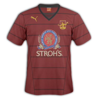
A clean-ish rouge kit sticking on the piping theme from the official kit nerd post. In this series I went with Stroh’s as the official sponsor, following the tradition of teams like Liverpool and Newcastle who proudly wore their favorite session beers on the front of the logo. With this particular kit the dark red above the black collar isn’t the back of the shirt – it’s actually an inset of the front, so the collar is a rather traditional cut while also giving the effect of wearing an undershirt even when you’re not.
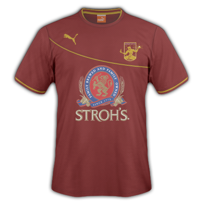
A bit of a cleaner design, in my opinion. A minimal amount of gold breaks up an otherwise plain rouge kit (top) or divides the rouge from a darker shade (bottom). I like that the Puma and DCFC logos follow the swoop, gives it a more balanced effect then when used above. I like them both quite a lot, with perhaps a slight preference to the plain one on top. The Stroh’s logo ads a lot of colors but if done right (and DCFC has been doing their sponsors right – with transparencies instead of giant bounding boxes) it still looks good. In fact the red and gold in the logo are really great with the rest of the get up.
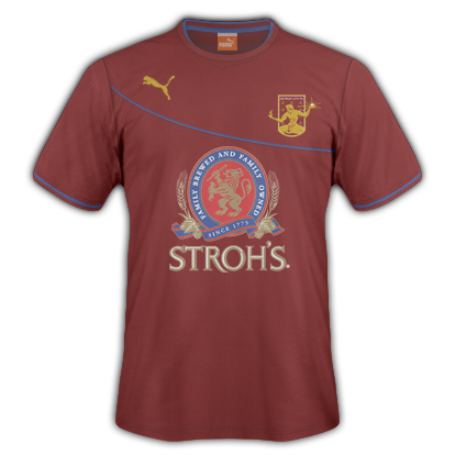
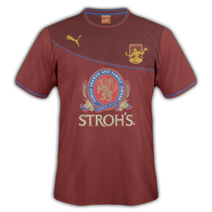
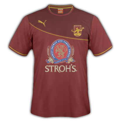
Now on twitter I mentioned these would probably be a bit controversial (though that has so-far proven untrue). Instead of gold accents, I went with the blue from the Stroh’s logo, something unheard of for DCFC. I want to go on record saying I prefer the gold more and that I don’t actually want to see blue added to our kits, but it was a fun little experiment which I think looks good. In this case, though, I think the Rouge – Blue – Dark Rouge works better (instead of the plain one as was the case above). Maybe the blue stands out better with the defined line between the reds and isn’t lost as much.
Anyway, that is a life update. Cheers everyone.
Mmm raspberry wine! *drool*