Kit Nerd Day?

Apparently some people had some suggestions for the home kit. While I stick by mine with the rouge/rouge combo, you can’t argue that these aren’t damn fucking sexy as well.

Like last time, I don’t own the rights to any of this nor did I get permission. I am an amateur/fan with basic access to a kit customizer so don’t think that these are real. They are intended only as possibilities of what future kits can look like. For more info/reasoning check the post from earlier today.

The Other Home Kit – Because Hoops and Because Rouge AND Gold

Hoops_16_front

So here is the Rouge AND Gold kit for the bhoys.

I certainly can’t complain. These are some damn sexy kits. Are they my first choice? That’s… uh… hard to say. There are definitely a lot of pluses to these. First, the hoops are more apparent. Second, we finally have gold in the Rouge and Gold. Third they are an older Adidas model and are therefore cheaper. Fourth – holy shit do they look good.

I have to admit those are some strong reasons to say that this kit is the better.  As I write this I think less and less of my original design and more and more of this one. So there you have it, I guess? The new Detroit City home kit for 2016.

Other views:

Hoops_16_shirt_front Hoops_16_shirt_side Hoops_16_back

So here’s the line up (with an alternate away so we don’t out-do the collar):

Hoops_16_shirt_front Away_16_shirt_front_alt Alt_16_shirt_front

Early Renders

These are some earlier ideas for the home kit, before I went straight rouge and rouge.

These two have some white accenting on the socks and on the kit itself. I ended up thinking that it was a bit like last years: just too much. So I simplified them a bit.


Home_16_front Home_16_back

While this one only retains the white on the Adidas logo. Even this felt so of… weird. So I set the logo to be rouge too, it helped the sponsor stand out and just made it nice and clean.


home_16_shirt_front

The “Kit” Post – 2016

Did you know I was a kit nerd?

Really?

No?!

Come on.

Seriously.

Okay, before we get started some usual disclaimers – I’ve used images without permission (sorry DCFC and Flagstar), I haven’t edited anything other than transparencies (and in one case made the Flagstar logo white as to stand out on a rouge kit). Hope you guys don’t mind. This is done completely on my own. To potential sponsors this is in no way an official thing, this is one fan’s ideas of the best looking kits.

Also this is going to become a “thing”. Each year, perhaps far enough ahead to actually influence decisions I will post the annual Kit Nerd  (tagged “Kit Nerd” for search-ability) post, detailing my biased and subjective opinions on DCFC kits and what I personally want to see in the coming year. I will do my best to always back-up my arguments but realize that kits are subjective and since I am an admitted kit nerd/buyer that my opinions might not always be popular. I.e. – I would want to buy these kits, not just think they look good. These are the kind of kits I WANT in my closet costs be damned.

The other “thing” is that I’ve been keeping the kits up-to-date on the wikipage.

Next – some thoughts on last year’s designs with several months of hindsight.  Last year’s designs were very over done. I was having a ton of fun with the cit customizer so I went ahead and just puked color over everything with the exception of the gold alternate kits. They look, in short, pretty bad. 90s bad. Actually, not that bad – but you know what I mean. They sort of remind me of training kits, which tend to be a bit more… busy.

Third order of business – thoughts on the actual kits from the 2015 season – I liked them. We stuck with Nike and some patterns have been emerging which I am going to work with here in the three new designs. First – we seem to have colors starting to lock down. Home – rouge, Away – white, Alt – black. That’s cool. I will note that there is a serious lack of gold in any of this, but I’m actually okay with that for the most part. Rouge, white, black is a great combination and one I am more than happy to work with.

Specifics regarding the kits: the home one was my least favorite – the white stripes didn’t “do it” for me, they just broke up the nice rougeyness of it all. I’m going to focus on bringing that back. The away kit was great, loved the decision to add the collar and despite being plain, they were classy as shit. The alternates were great as well. Simple black with white shorts.


Brand – Adidas (pron: AH-dee-dahs, not uh-DEE-dus)

Like last year I’m going to push for Adidas, which is my favorite kit-maker and has the best kit customizer by far. Seriously Nike, how hard is it to fucking get a kit customizer to work? Don’t make enough selling $5 sweat-shop shoes for $150? Pay someone to fix it.

I know this is unlikely. DCFC has used Nike every year thus far and it sounds like Detroit is getting its own Nike store, making purchasing all the easier. But I’m going to hold my ground – get Adidas and get the girl… or trophy… I don’t know just go with Adidas.

Kit Names – YES

Again, this is me spitting into hurricane force winds but I’d like to see kit names. The owners were very kind to explain why they didn’t have kit names: Nike essentially sends a box with a variety of sizes and numbers and that’s all the team gets for their own use. Some players do seem to have their own number (e.g. Edwardson with 18, Rogers with 6) but in general these need to be fluid to dress whoever is available.

Still, I’d love to see names so names are included in my kits. I am looking forward to a time when we can do this.

Sponsor – Flagstar

Last year I didn’t add a sponsor and gave some wishy-washy reasons as to why. Not this year. This year I’m buckling down and having an opinion. In 2015 DCFC had two main sponsors: our kit sponsor (Metro Detroit Chevy Dealers) and our soul sponsor (Flagstar). Both local, both big deals, but I honestly feel only one came to the table and that was Flagstar. From day one Flagstar seemed very interested in engaging DCFC and the Northern Guard. Yes I can be a cynic and say “of course that’s what a sponsor would do” but look at Metro Chevy – they didn’t seem to do anything but hand out tickets for the soccer camps, something Flagstar can easily do as well.

I felt that Flagstar REALLY wanted to be the kit sponsor but lost out in a bidding war or something. They made handkerchief, they helped bus kids in from the city to watch games, they engaged with the NGS and fans on twitter, the company seemed to really want to be there so I’m going to give them the kit spot for my 2016 kits. Good luck Flagstar, this Ford employee wishes you all the luck in the world.

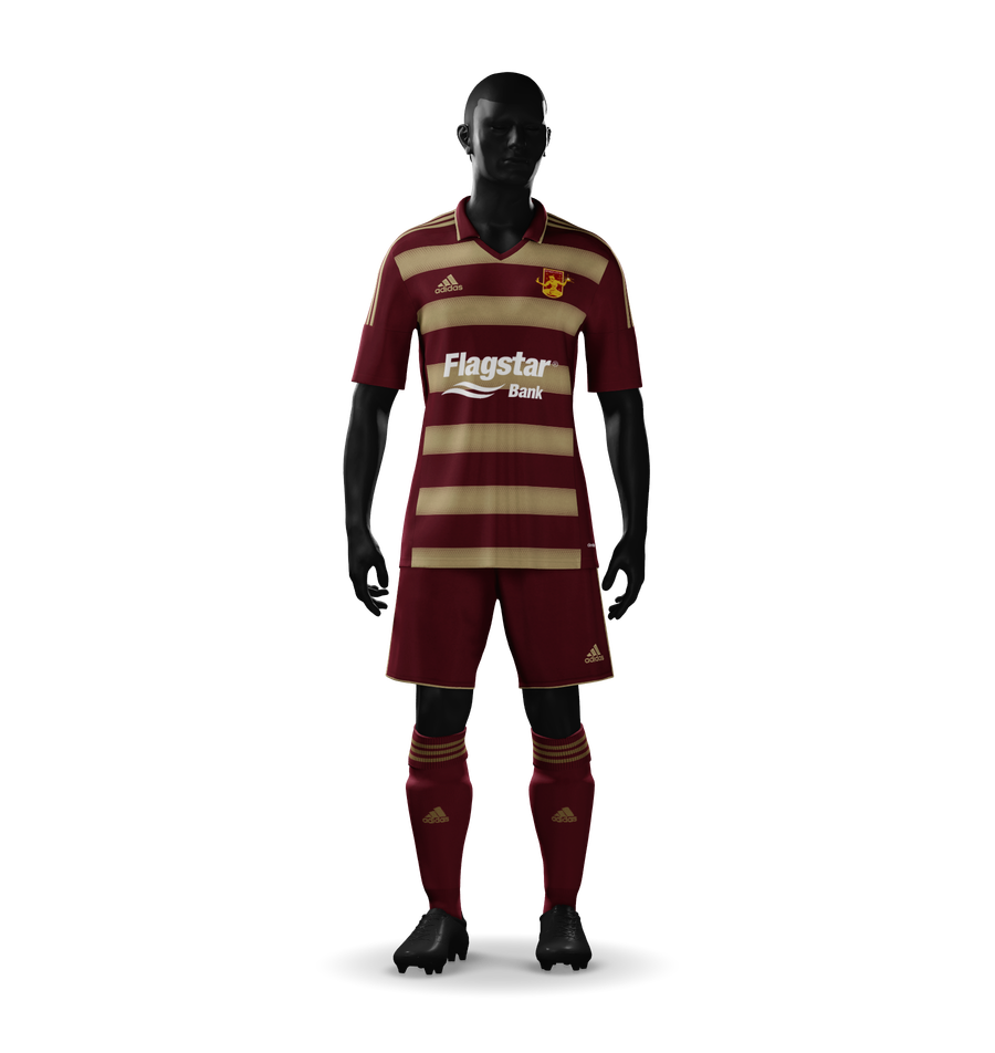
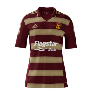
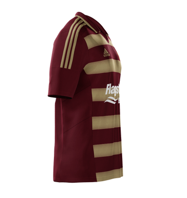
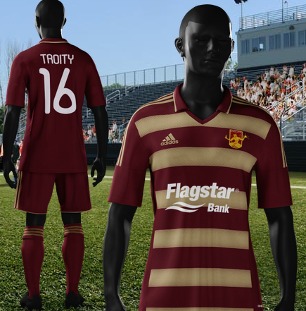
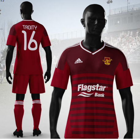
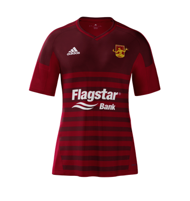
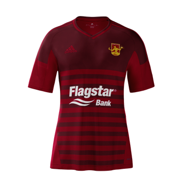
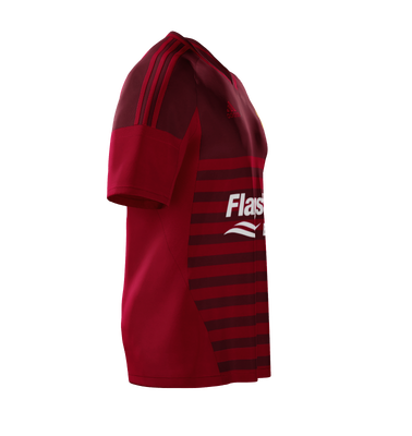
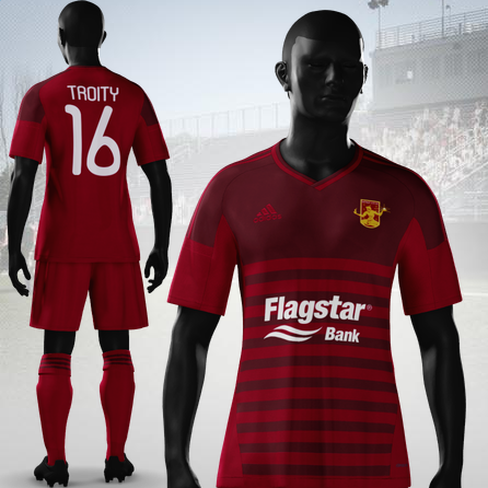
The Home Kit – Rouge ’til I Die


Home_16_front

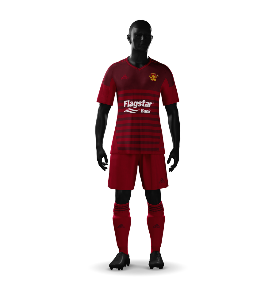
The hoops WILL return, dammit. They will. It will happen and I will be super stoked.

Working off the issues I had with my designs last year, I’ve simplified the color scheme on this (and all) the kits. I’ve limited myself to two main colors on all the kits, with a third for accents – burgundy and red dominate with white for the Flagstar logo and numbering to stand out.

When I design these I both think about what will look good and if we were to move up what would not be stealing or competing with another team. For example, red and gold is out because A) DCFC hasn’t been emphasizing the gold aspect much and B) I don’t really want to compete with the Strikers and other Red/Gold primary teams.

Yes, most combinations have been taken. Black/Red is Atlanta and though those look great, I’m going to try to avoid it all and stick to Rouge. So everything is some variation of our beloved color except for the Flagstar logo, giving it great visibility while keeping the kit simple and clean.

I’ve definitely been obsessing over the details here, tweaking everything over and over, just to see little variations – mostly with the highlites, and using white for the Adidas logos and such. Perhaps I’ll post failed versions later, but there is little to look at.

Of course, here are some more views.

Home_16_shirt_front Home_16_shirt_side Home_16_back


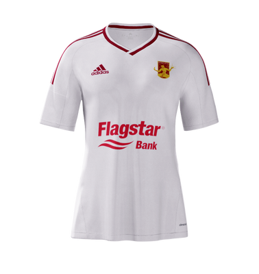
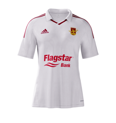
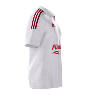
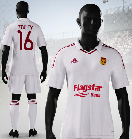
The Away Kit – The Collar Means Business

Away_16_front

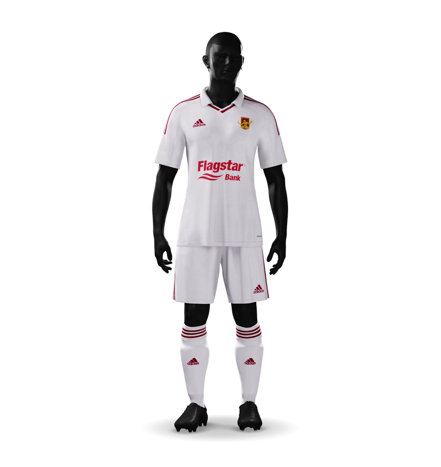
The brilliant white + collar returns. Again, trying to keep it nice and clear. I’m not a huge fan of plain white kits, but for some reason add the collar and suddenly it works! Add a DCFC logo and a a little bit of rouge and it is just WOW.

Last year I talked about a running element – something that would exist in all three kits – and that was the rouge/gold socks. Obviously here you can see that was abandoned. Socks are tailored to match the kit and here it is two colors – white and rouge.

As I said above, white seems to dominate our second kits, so instead of fighting that let’s embrace it. I’ve started to think of DCFC’s colors mostly as rouge and gold in name only, our logo shows one thing but the field shows another. While I don’t advocate changing the logo at all, I do think gold doesn’t work as well and can be harder to add to the kits. Do we use old gold or a darker yellow? Most companies are pretty limited here usually offering old gold, yellow, and something that belongs on a construction site – as compared to red where you usually have three real options or more (Red, maroon, burgundy, bright red &c).

In 2015 I believe the white kits used black numbering, I went with rouge here. I guess that is my theme this year – two colors a kit.

The other views:

Away_16_shirt_front Away_16_shirt_side Away_16_back


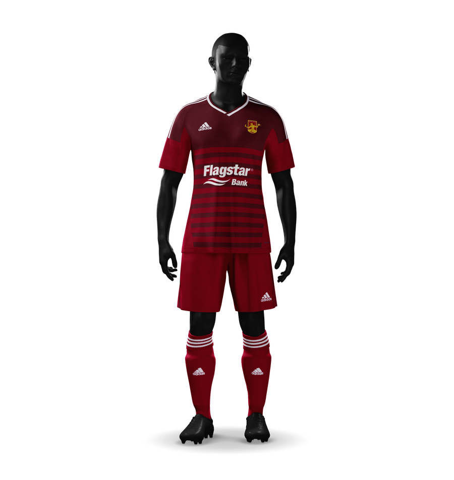
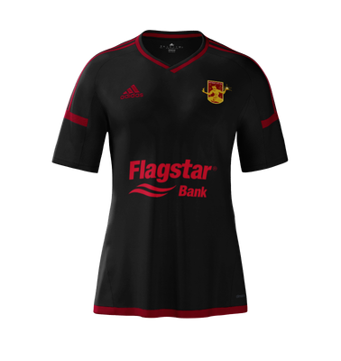
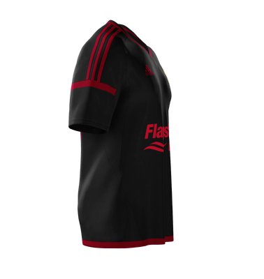
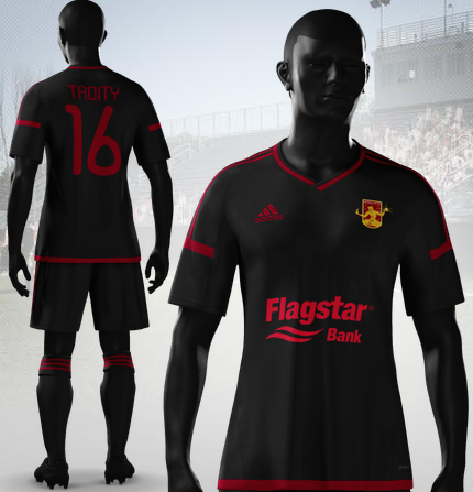
The Alternative Kit – The Stealth Kit

Alt_16_front

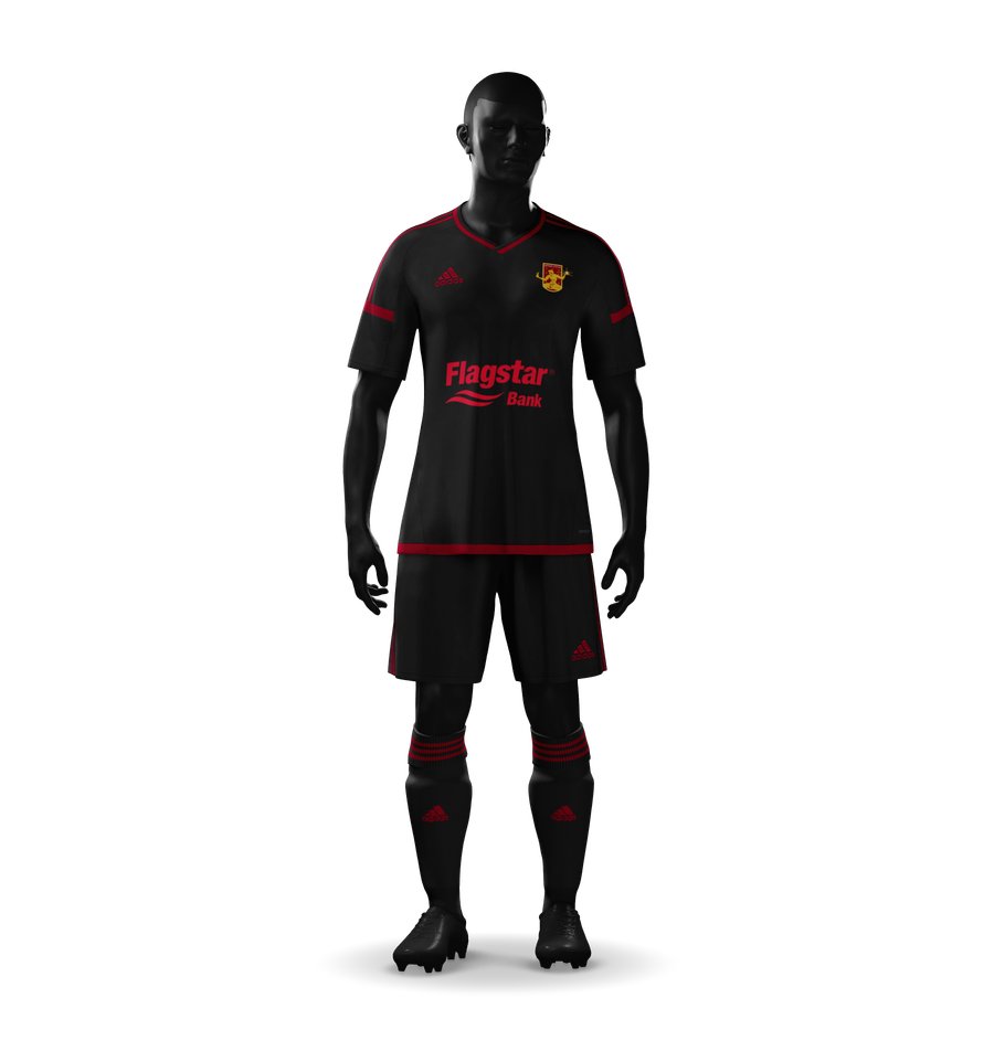
I teased this on twitter before starting to write this as this was the first kit that really came together quickly.

Third kits are a chance to have fun, really do something different. Some teams do it well, some teams don’t. While I’ve always enjoyed the DCFC third kits I’ve had two main issues in the last two years. First, let’s wear them a bit more. Playoff games, friendlies are all good times to use the third. I get that we auction off the thirds during the selected charity match but… ugh… I want to see them more! Secondly, we’ve always used the white shorts with them, probably as a cost saver.

So with my design I’ve made two big departures from DCFC’s usual methods. First – instead of pairing black with white, I’ve paired it with rouge. I assume their use of white means they can grab shirts from the bargain bin at the Nike outlet by my house, but this is my blog so we get my kits. Second – the shorts are black too. Deal with it.

I’ve been calling this the “Stealth Kit”. It looks mean. It looks like a team that doesn’t fuck around. If this kit was released I’d probably end up divorced and the only thing I’d ask for is the fifty or sixty of these I bought stay with me.

Black has slowly been working its way into the DCFC phenotype. It is one of the main colors of the Northern Guard and so it is not surprising just as DCFC shapes us, we also shape DCFC. This sharing is epitomized right here in rouge and black.

The other views:

Alt_16_shirt_front Alt_16_shirt_side Alt_16_back


So there it is! Kit post 2016, hopefully early enough to turn some heads and maybe even affect some decisions.

Any and all comments and criticisms are welcome; twitter, reddit, or even here are all great places to hit me up with your own ideas. Here’s to a short off-season!

Slartibartfast

I would want nothing more in life to win an award for drawing coastlines. Like most fans of strange, rugged terrain – I am always in awe of the fjords of Norway, though I am ashamed to admit my favorite piece of geography will always be Newfoundland. Not just for its historical context, but also because I feel like if I had to pick a great piece of Earth to plagiarize for a test – it would be Newfoundland. It has it all: gentle coasts, rugged coasts, finger lakes, rivers, ocean, thin isthmuses, and deep forests.

Luckily I write fantasy so it is almost mandatory that I make lots of maps. Lots and lots of maps. I posted previously about adding some level of detail to my maps and now I sort of want to go over my process as an alternative to literally jerking off in front of you all. So sit back and marvel at my genius.

MARVEL DAMMIT.

Anyway, recently I added a great deal to my map partially out of boredom, partially to keep my mind on my writing even when not writing, and partially to just flush out the rest of the world I’ve been writing in. This post will only focus on geography because I tend to actually finish my geography but will fiddle with cultural and political stuff endlessly.

So how can one go about making a map? There are numerous ways, I prefer hand drawn because I can think about the world as I draw and come up with ideas. Some people prefer to use tools or filters to create randomized maps and then place things as they make sense. I feel like world builders prefer the randomness while writers prefer the control but that is an opinion with no meat behind it. I’m a writer and I prefer hand drawn just so my bias is crystal clear.

Starting is a matter of coming up with ideas, or at least a goal in mind. Generally size is a big question. I use engineering paper so I think in terms of how many sheets I want to use. Six to eight seems to be the sweet spot for continents, but obviously continents are not all similarly sized so that might need to change depending. So the first hour or two of work might be done in the car, at work, or eating dinner. Basically I come up with ideas for what the terrain should look like, what kind of features are needed to support ideas for cities, nations, or cultures.

And that is the key – I usually decide what kind of places and people I need before I start drawing. If I need highlanders, I will draw mountains. If I want an oceanic civilization, I will draw safe harbors – only rarely the other way around and then usually as secondary thoughts or filler. Some world builders might gasp, but maybe not. I’m not terribly involved in their world (haw hee haw hee haw).

So I fill up engineering paper and eventually a sheet looks like this.

1

It’s hard to explain how I draw the lines because I just draw them. I assume it is not hard. Just draw lots and lots of squiggles. It probably sounds patronizing or self-aggrandizing but I’m not really sure what to say. Draw something, decide if you like it, if not erase it and redraw it. Simple as that. Only show what you like.

To do edges I have a top secret technique of counting boxes and then marking the point the line cross the dark green as best I can on the second page. And if they don’t match exactly that is okay, there are steps to hide that.

I usually also keep a sheet that has the layout so I can number the map sheets and rearrange them later. Counting boxes and some hand math makes for pretty accurate mapping if needed, so I can’t recommend getting a stack of engineering paper highly enough. Plus who doesn’t love engineering paper?

Eventually they all get smashed back together.

Capture

I do this in CS2 and this file is generally pretty huge. I scan them in at 200dpi. Why 200? Because I accidentally did that for the first several sheets a few years ago and everything has needed to match since. So 200 it is.

In CS I have a number of layers I’ll use with different stuff like rivers, water, boarders, and then eventually meta-stuff like political regions, linguistic, and even religious areas. This makes it easy to flip through data and keep boundaries consistent in the case of needing changes. E.g. if People A only worship God A, if I change where people A live, I better also change where God A is worshipped.

Anyway, getting ahead of myself.

Second step is tracing.  This usually doesn’t take too long and can be relaxing as well as a good time to fix any near misses. I think the furthest I was off with this map was an eight of an inch, which is pretty good given that it was eight sheets some portrait and others landscape and three not aligned to the given edges.

Borders are done on their own layer so I can play with them later.

Tracing 1

That lake and inlet are by far some of my favorite geography to date. Very proud of it.

Once everything is outlined, I copy the border and merge one into a white sheet, run a threshold, then run a filter that creates flattened, trippy maps based on black lines.

Flattened


This allows me to quickly and easily color water blue and land white. Which I need for making rivers, which is step four.

Rivers

Rivers are part traced from the original yellow sheets and part free-hand. Getting them to look right is a pain in the ass. Rivers are essentially fractals. They are curvy no matter how far you zoom in or out.

There is a science that is pretty easy to understand about how the curves in rivers form and they are actually pretty regular – when a river is allowed to run unimpeded down a flat plain. The Nile and Mississippi are good-ish examples of large rivers allowed to run their course, while the Ohio and Colorado are good examples where things like mountains and gorges might have some say.

Yes I know the Grand Canyon was formed by the Colorado River, but sometimes one digs their own grave.

Have I mentioned I am not a geographer? If not – I AM NOT A GEOGRAPHER DO NOT LISTEN TO ME I WRITE FANTASY NOVELS AND MAKE FANTASY MAPS.

After I get rivers set I start doing terrain and biomes.  I usually sketch a rough idea of where mountains go on my maps, but nothing else. I then decide as I draw where things go. Unfortunately, while I have a basic understanding of geography, I’m also not a climatologist so I have to sort of guess where things like rain shadows go.

The other problem is my drawing style has been changing over the last few years. It’s pretty solid, but I’m better with small details. Mountain ranges aren’t many hundreds of kilometers thick anymore – they have a bit of variance. Of course this means that my northern continent and southern continent are slightly different visually. Hopefully it is not too noticeable.

Each terrain feature gets a layer and I usually do them one at a time starting with mountains and ending with “rare” terrains like large fens/marshes.

Layers

Eventually all those layers start stacking up to something that looks nice!

Colors

Something that comes much later, and only if needed, is adding map icons for terrain. I usually add cities as part of the “politics and sociology” part, so I’m not covering it in much detail here. Though, as an overview, humans like water and cities should congregate near water or abundant resources.  Important cities should be in important places: straights, major river fords – never buried deep in the mountains (though that might be good for major fortresses).

So I dig out the Tolkienesque map brushes and get to work (switching to the Northern continent).

last of trees

slow and steady

Then intent is it should eventually look good in black/white.

Tree tree tree

I also do a fine detail version (shown above) and a coarse detail version (more cut out for printing).

Hadyrland w Cities

For Book copy v4

Unfortunately wordpress cuts into the detail.

But to give you an idea, here are a couple of finished black/whites of my northern continent (where Sun-King takes place).

Hadyrland with Cities

The Whole Damn Thing

Cheers guys! Perhaps conlanging next time?