Taldērszon, gamédunz!
I don’t often start my posts with conlang stuff, but I think today’s long-overdue post deserves it. Over this long break I decided to work on a project that I’ve been kicking around in my head for a while, specifically because it would combine my fantasy world, my conlang, some calligraphy, and of course soccer kits.
Well, technically hurling kits, but I digress.
For those who are new to the site, I dabble in fantasy writing; I’m currently about 3,000 words into book four with the intent to finish writing the drafts of the books before cleaning them up and publishing them one after the other sometime in the unknown future. One of things I like to do in my downtime is work on world building for the setting of my fantasy realm. This often involves long periods of working on nothing in particular but time wasters and stuff like that. But one thing I hit on a while ago was to do a fantasy World Cup, including all the participating nations and everything.
I got a lot of work done on that, but as I kept writing I didn’t like the idea that I was making much of the World Cup work invalid. So it became hard to focus on an eventually I gave up on it. Plus I found designing crests very difficult. I actually talked about this on a previous post and this is a similar post to that, the road one takes when working on a literal fantasy sports team. Regardless of the outcome, it was a lot of fun to work on and it definitely improved my design-sense when it came to soccer kits.
So, moving forward, I wanted a smaller-scale thing to work on. Something that was based in a part of the world that was decently fleshed out and unlikely to change too much – Hadyrland, the main setting for the books.
Makes sense, right?
Plus I’ve already worked on some conlanging and stuff, so I can make it truly fantastical. This is also something I’ve worked on in the past, though it was in the days before I got my PSD templates. The work even got me a nod from Azzurri, the Italian-based maker of kits. So that was awesome.
I’ve learned a lot since then, about how kits work and why there are design limits put on them. It gave me a lot to think about moving forward.
A recent-ish project you might’ve seen getting posted onto twitter were just huge dumps of Wikipedia-styled kits. I’m actually not done with them yet, but here’s the gist: five leagues of 20, 20, 22, 24, and 24 teams divided into four tiers, with the two 24-team leagues representing an East/West regional divide for low-tier teams.
Part of this was an off-shoot of another project I was working on to update my map of Hadyrland to be much more accurate and give me a better understanding of the human geography of the region. Accents, religion, income, population density. Part of that was adding the smaller towns and cities that surrounded large ones and that got me thinking about low-tier soccer.
So with the goal of making 110 teams, I set out.
I picked cities, names, years founded, tri-codes, colors, how many top-tier championships they had won, and even the “identity” of the club. Identities included political affiliations (including non-political and even anti-political), racial and religious affiliations, and in a few cases military-backed clubs. This really gave a sense for the world, the cities these people lived in, and what made them get up and go to a game in the morning.
The club that I wanted to work on was Union Macenburgh, which I mentioned in that previously linked post.
It was a club designed to have my heart from the get-go. A top-tier team that hadn’t given up its identity for fame, one that fed a huge Old Firm-styled rivalry with the big club across the river. It is the home club of one of my main POV characters and for a chapter in book two, we actually get to go to a game (though a game long before the rules were ever really codified outside of the local “understood” rules).
So I started at the base-level. What is “Union Macenburgh” in Hadysh?
Well, that was pretty easy – Macenburgh is “Moxn” in Hadysh. Union is “Opubfę”. Combining them it’s Opubfę Moxnd (with the “d” at the end sort of being like an ‘s in English).
Cool. That’s done.
Next was the crest. 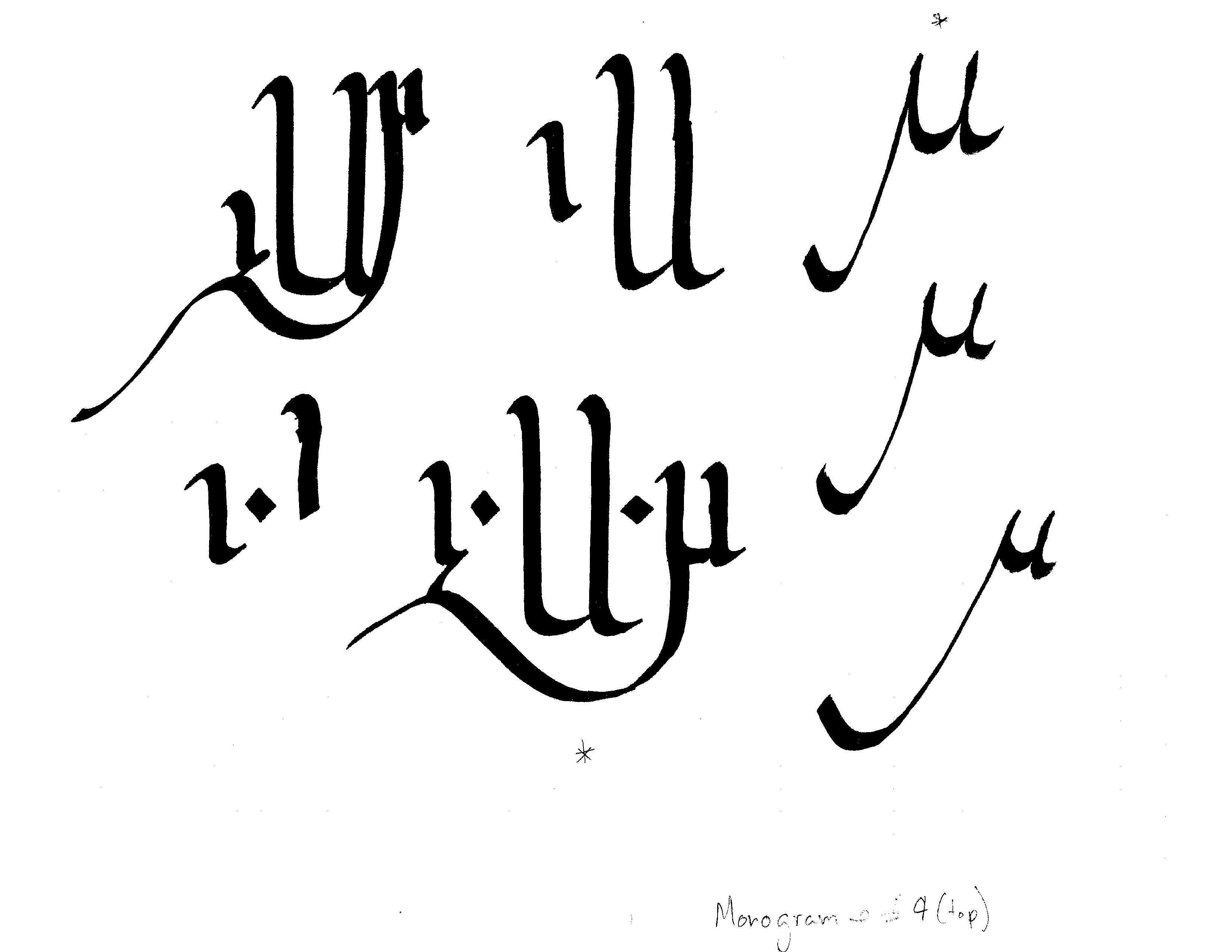
I wanted to work with a monogram-style, much in the vein of the baseball work from last time. The crest is the club’s name abbreviated (OMd). I debated having the d as a superscript because it’s not really an initial (we’ll see this later), but I liked how it came out when it was at an even footing.
Hadysh is a unicase script, meaning there’s no upper or lower case letters. It’s heavily based on the Armenian and Georgian alphabets, which I think are truly beautiful. The influences from Armenian are much more apparent, with lots of u-looking glyphs.
This particular font is “Western Blackletter”, or a script that arose in the western part of Hadyrland (where Macenburgh is). It differs slightly from Eastern Runic forms and it’s decedent systems. I can make a whole post on that, and I probably will, but later.
Next I did the sponsor:
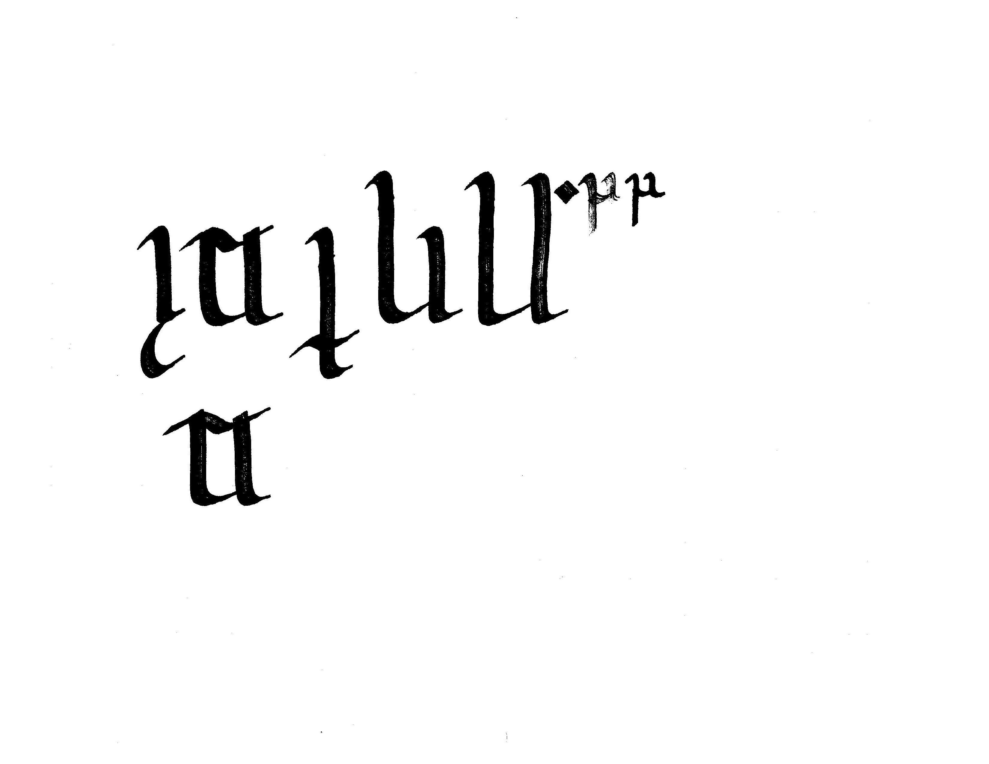
Here it is another abbreviation, this time for “Opubfę Acléęttaƥin ț Unħódna Moxnd” which means “Macenburgh Dockyard and Packing Union”. The though process here was even though this was a big team, it still pulled from local companies and groups for sponsorship, usually with a focus on manufacturing and labor, which is a vital part of both the club’s history and the city’s financial security. Macenburgh is a twin city with Blackwater Port, which the later being the more economically well-off and globally powerful. So if Blackwater Port is New York City, Macenburgh is New Jersey.
This also gets into a weird little tidbit about Hadysh: most conjunctions (like “and”) are single sounds. If the word following starts with a consonant, you add a vowel to the end, but you don’t write it, it’s implied. But that means the ampersand for Hadysh is just another letter on the keyboard, not hidden away above the 7, which is good because Hadysh has two numerical systems…
Anyway…
From that previous post on Hadysh hurling, Macenburgh’s main colors are maroon and gold and they generally wear hoops, which is usually, but not always, a marker for working-class teams.
The last bit was a bit of a slogan, one that if you’re a St. Pauli fan you might’ve seen.
Now for this I used the digital font I’ve been working on for a couple months now, so unfortunately there’s no scan document to show.
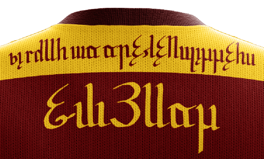
Get the easy bit out of the way, the lower bit is a name, “Ulēmad”. The top bit is what we’re interested in, “K̦o kémõ za ay͂a̋fa̋nyodda̋õs” – No Hurling for Fascists.
Ay͂a̋fa̋nyodda̋õs was an interesting word to come up with. Most, if not all, of the vocabulary I have thus far is not modern in sense of what words are available. I might have “cart” but I don’t have “bus”, I might have “pen” but I don’t have “computer”.
But the idea of “fascism” is a modern term so it required a lot of work, more than usual. First I needed to expand my fixes to include “ism” and “ist”. For the former, I used a modified instrumental case, dropping the object fix at the end and only keeping “a(~)-“. The ~ marks that the fix causes nasalization to the next consonant if that consonant can be nasalized. For “ist” I used “-daʊ̯”, which is the Hadysh fix for “-er” in English (e.g. Runner or builder).
The English for Fascism comes from the Latin fasces, the axe surrounded in a bundle of sticks. It was a symbol of the Roman legions and was co-opted by the Italian Fascists.
I didn’t necessarily want to get this deep (shocker, I know) into a project that was already ballooning out of control in size and scope.
To make a long story short the word breaks down into:
a(~) + ja̋f + a̋nyo + d + da̋ + õ + s
“ism” + “federation” + “nation” + genitive marker + -er + object marker + plural.
Yes, that means in Hadysh both “ism” and “ist” are going to appear in the same word. It’s just another quirk of an already quirky language.
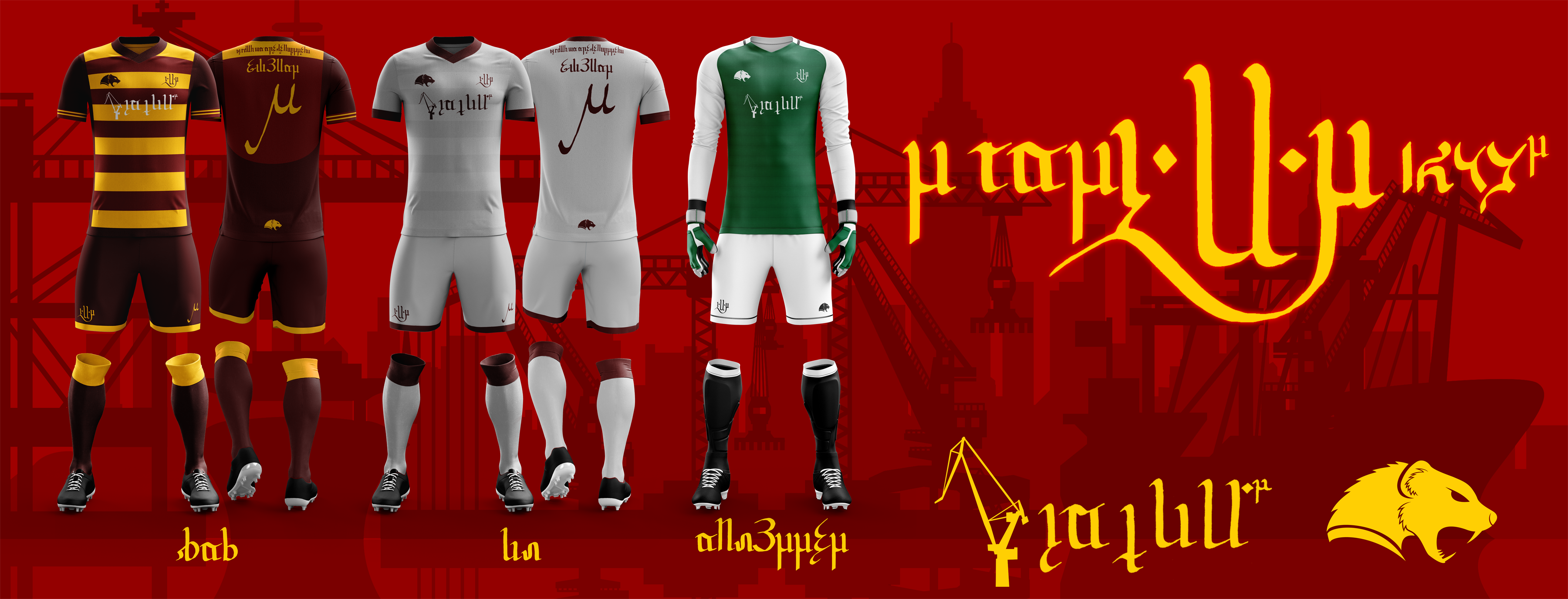
After all that, or really, during, I worked back and forth, I got to work on some killer kits.
The home kits were pretty easy, rouge and hoops are like my calling cards, getting to use the gold was a huge plus, I was happy to not always be doing “shadow” hoops. 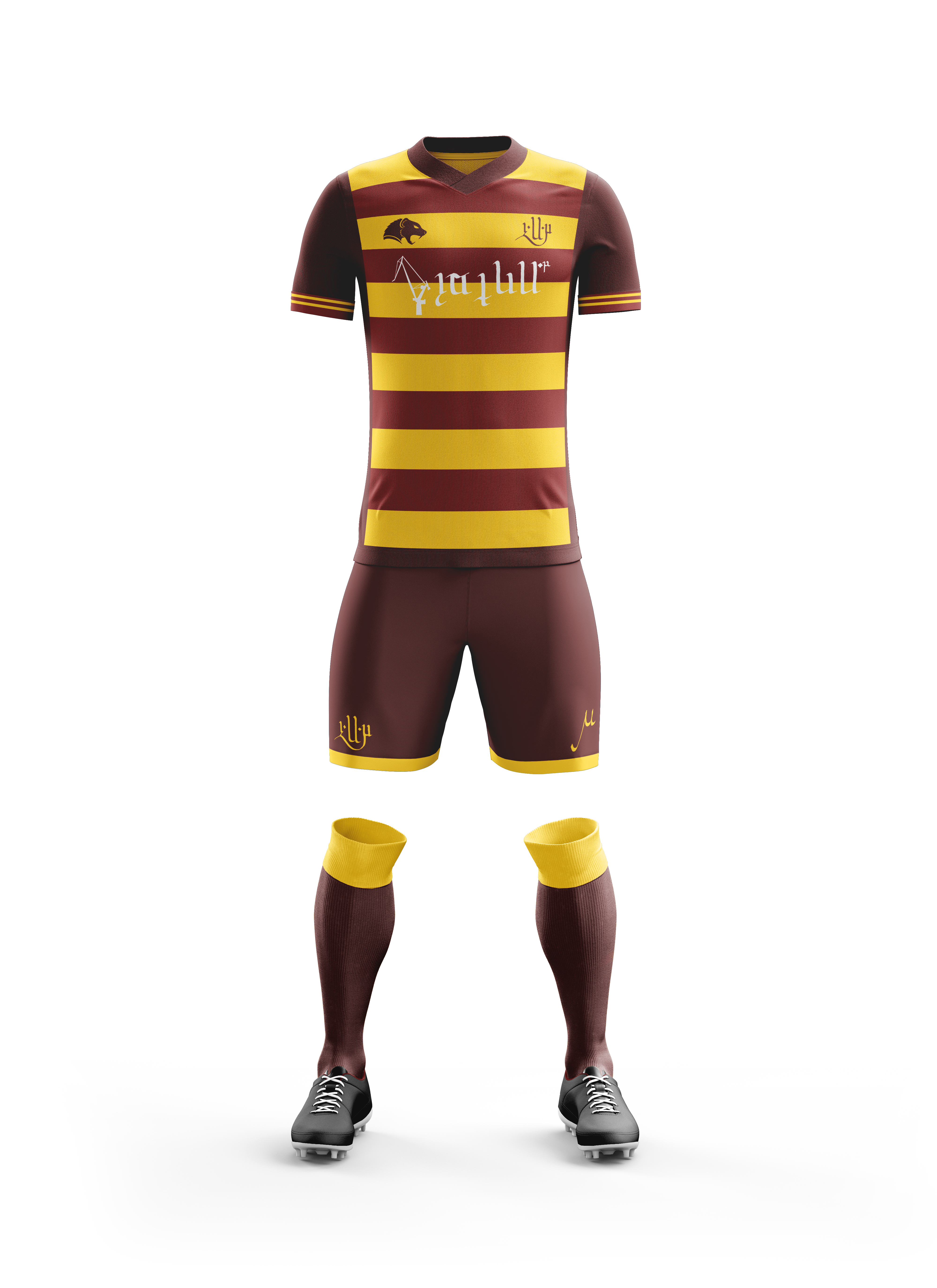
Awwwww yeah.
I am super pleased with how these turned out. The dual-tone of maroon and darker maroon. The sponsor in the middle was a bit of a sticking point, switching between white and the darker shade of maroon from the outside of the kit, in the end the darker shade just wasn’t legible even at this scale, so I had to switch to white, adding another color to the mix. Oh well, I think it is still clean enough to work well.
The shorts have the crest on the right pant (our left) and the player’s number (in this case “9”) on the other. I debated going with hooped socks, but I left it with just the flip over, a favorite of mine. Sleeve cuffs are hard to see, but they are the lighter shade of maroon with two gold bars through them. Breaks up an otherwise plain sleeve.
For the aways, I wanted to go for a simpler, old-fashioned look. On my league sheet, I had white kits with maroon cuffs, collar, and short bottoms. I basically planned to take that whole-sale but with a minor tweak or two.
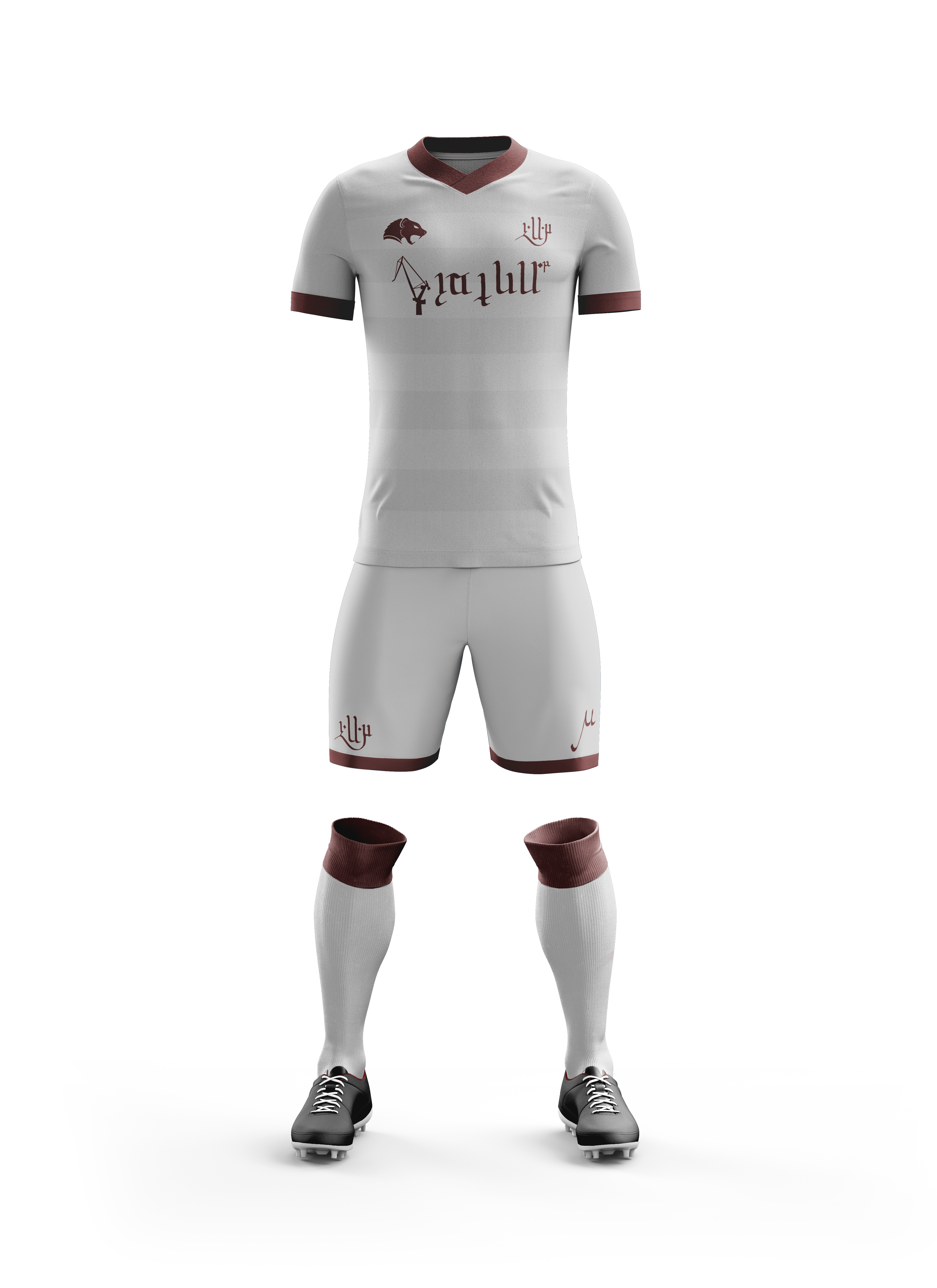
Instead of white, I went with silver. And instead of plain, I brought back the hoops as shadows to tie it more closely with the kits above and the club’s history.
The outer edging was dropped, though, so the hoops run from side to side, top to bottom, with nothing in their way. Compare this to the home kit with the darker maroon framing the hoops on three sides. I dropped the two stripes on the cuff in favor of a solid color, and all the trim pieces are the same color as the logo, crest, and sponsor, giving the whole thing a very cohesive look. Clean, simple, classy.
Recently I’ve been doing more than just field players, I’ve wandered into the realm of keepers as well. And in the case of this project, much more into the rest of the kits as I did rear views as well, which had their own issues. Anyway, for the keeper kits, I try to go for the radical departure. For example, in my portfolio there’s a mockup for a non-existent “Grosse Pointe United” that uses blue/gold/white/black for the field players and carries that white/black over to the keeper kit only to replace the blue/gold with orange.
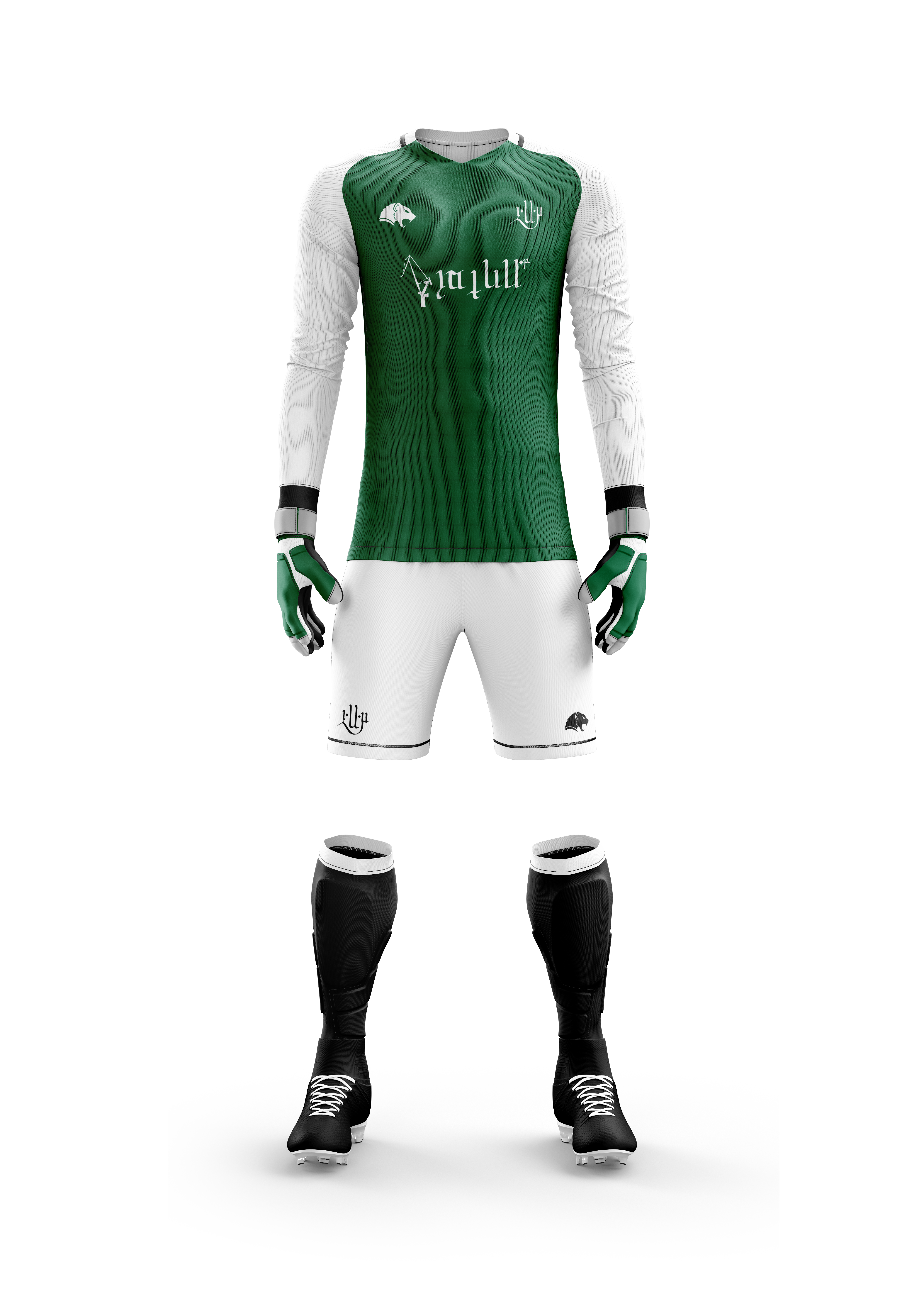
Here I went with green/white/black to compliment the maroon/gold/silver from above. It’s also important to note that these are the national colors of Hadyrland. On the left leg (right for us) the player number has been replaced with the branding logo. Otherwise it is a particularly “normal” kit for me. One difference is the gradient-shadow hoops in the green bits. They’re meant to be hardly noticeable, just a fine detail.
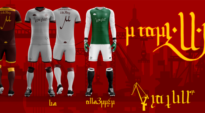
So it’s time to bring them all together and do a sort of mock-announcement. I know the next on right of a kit is sort of a thing I do, but in this case I didn’t have the time to do much else. I was thinking about trying to class it up, but how? Unfortunately my talents are still limited. Maybe in the future I can get some kits made and then shoot some “real” footage.
Ah well.
The labels under the kits read “home”, “away”, and “keeper’s”. The text in the upper right reads “Your 1423 OMD”. I liked the idea of having the crest as part of the statement, rather than above or below it.
So that wraps up this monster of a post. I hope everyone at least found it a tad less controversial than the last one. With the DCFC season picking up and my writing still flailing around, no idea when I can get updates on my actual books and stuff, or even make sure this gets updated more often than once a quarter.
Cheers, everyone.