Welcome, welcome to my eighth annual Detroit City FC kit post. For those new to the site, new to Detroit City, or both, let me give you a quick idea of what this yearly even is about: when a Detroit City kit reaches the end of its life, usually at the end of a season, but sometimes at the end of the year (this time it’s both), I do a review of the out-going kits and design a set (home, away, third) of new kits for the upcoming year/season.
If you need a handy guide to my previous updates, here you go!
2015 | 2016 | 2017 | 2018 | 2019 | 2020 | 2021
2021 was an amazing year for Detroit City, quite possibly the best since the inception. An utterly dominant season that technically started in the fall of 2020, Detroit City won everything that we could. We were so dominant that to keep up appearances and competition, buys and spots in the finals were consistently given to a number of teams with a growing number of asterisks behind their names.
In the end, though, City saw it all the way through to the end, beating LA Force and gaining that fabled star over the crest. It was an emotional moment for all of us, but for the team it was the plateau that would hold through the end of 2021, when we won our third consecutive NISA “season”-thingy.
It really is hard to emphasize how much of a powerhouse Detroit had become, and instead of the tide lifting all ships, things seemed to get worse. Bad teams just upped the chippiness and physicality, taking advantage of NISA’s unpaid refs and willingness to let red cards just be forgiven with no real fall-out. With all that in mind, it’s not surprising that Detroit City chose to fauxmote to the USL Championship, a move that is rather fraught, so let’s start there (because this really is as much as season retrospective as it is a kit post, despite the title).
My thoughts are mixed to say the least, when it comes to this move. USL has long been a bogey in the dark, looming over Detroit City since our early days and the on-and-off proxy battles with Dan Duggan and the Michigan (now Flint) Bucks. Their model, especially in 2013 and 2014 was MLS but not as good, going as far to act as an MLS stand-in during these battles.
The closed system. The high fees to enter. The countless MLS 2 teams. USL was not where anyone wanted to see Detroit City, and I assume there are folks who continue to not want to see us there, and I won’t fault them that.
While Sean Mann has assured us that our IP is safe and that the gameday experience will almost certainly not change, the latter still needs to be proven, and I’d bet many people will remain apprehensive until the end of time, because if anything, the USL has proven to be as fickle with rule enforcement as NISA has. Lastly, when talking about USL, is how did we afford it to begin with. Word is an angel investor stepped in, one who wishes to remain anonymous, but I don’t think that soothes anyone’s minds. Really, it only bristles us more. So now we have a league that could, at any time, step in and fuck with how we do things and an anonymous owner who could step in at any time and fuck with how we do things – either through direct action or inaction.
On the other hand, we had clearly outgrown NISA and all the worrying warts that made us sigh or roll our eyes aren’t as forgivable two years into the experience, especially given the arbitrariness of them. COVID doesn’t stop NISA from living up to its own rules and its own disclosed values, but shitty league owners do. NISA is “independent” but independent seems to have less to do with not fucking with teams and fans (which NISA is happy to do) and more like “letting certain owners get away with whatever they want so long as they throw a big enough fit”. Plus vetting is apparently non-existent as a number of vaporware teams appear in equal standing with Detroit City, threatening to water it all down for us.
Sure, for many of us NISA was the equivalent of the Titanic in the vicinity of Liverpool circa 1912 – but we’re not in Liverpool anymore, we’re off the coast of Newfoundland and given the choice of staying on the Titanic or jumping over to the Carpathia, some of us see the choice as easier than others.
Does it make hypocrites of all of us?
Unpopular answer – yeah, yeah it does. But you roll with the punches knowing that’s the only thing folks got on you and keep on supporting.
Luckily for me, the kits are a much easier topic to tackle. I absolutely loved both of our primary kits. I especially loved that the squad itself grew so attached to the away kit they were requesting to wear it for big matches and the championships. They couldn’t’ve have picked a better kit to win trophies in, except for maybe the home one. But that’s just me.
The home kits were a perfect example of a clean kit – a phrase that I’ve used in contrast to a plain kit quite a bit on this site. Like pornography and art, sometimes you need to see it to know the difference. A plain kit comes off the rack, or does nothing to look like it didn’t. Whereas our home kits used the gold adidas striping to frame the otherwise “plain” shirt, giving it an extremely intentional and professional look. The gold trim is something I had wanted to see for quite some time, I hope we stick to it. While the all-rouge or rouge-on-rouge-on-rouge kits are okay, I’d rather keep that for elements like hoops or stripes while the gold details can be kept.
Meanwhile, the away kits were absolutely gorgeous. Gold bodies with white sleeves, gold trim on the sleeves and shorts kept them unified with the home kit. And boy did those kits get plastered everywhere on the media. Every time we needed to lift a trophy, there they were. I wouldn’t be surprised if there were a few new comers who didn’t wonder if we were really Le Champagne. A little-noted feature of all three kits that I adored was that the crest changed to match the kit it was on – rouge and gold for the home, champagne and white for the away, black and grey for the charity kit.
And while we’re on the charity kit – they never grew on me, quite the opposite really. Intricate, sublimated designs aren’t my thing. Plus it required us to use Admiral kits which probably meant that more could go to the Give Merit charity, but eh. I don’t like kits as picture canvases and prefer that designs stick to the old limitations even as everything becomes sublimated now.
Anyway, my usual list of disclaimers, which I’m just copy-pasting from last year because why the fuck not?
- I don’t work for the DCFC front office
- The DCFC front office fucks with me
- Kits shown here are not official direction
- Logos, league, and sponsors are used without permission
- Sponsors and league are not official nor necessarily endorsed by our front office
- I refuse to include the Chevy logo on my work, deal with it
- The reality of 2022 might be very different than what I predict here, I love the challenge regardless
Before we got to the designs, I want to talk briefly on process, because I often touch upon it when writing these posts anyway. Since I am a stickler for very traditional designs, I often “sketch” kits in wikipedia format before scaling them up. I mentioned this forever ago in a post about working on the first Harper’s kits. Recently, I made a photoshop template for free-hand sketching wiki kits, so I don’t have to rely on the finicky template system, instead allowing me to potentially churn out dozens of designs with little or no trouble.
And as of late, that’s where I’ve been starting for bigger projects like this. Getting my thoughts out and on a piece of digital paper allows me to test things out, or get a better grip on the reality of what I’m thinking. Some designs die here because their flaws become obvious or seeing them for real makes me aware that they don’t really look like a Detroit City FC kit.
I’ve been finding this process to really help, especially when it comes to broadening my designs, proper framing, and getting ideas out and on the page without committing too much energy to them. That’s the best thing – the experimentation. Since I’m working in a tiny format with barely any resolution, I can sketch an idea, see it sucks, and move on all in like three minutes, instead of thirty. It means I don’t rely on crutches as much, even though, a favorite of mine is about to appear again.
This year one of the designs to not make it was a throwback to the 2013 kits, with the rouge stripe through the chest on the away kit. I was conceptualizing what a “better” version of that would look like. It just never worked and I knew it wasn’t working without feeling committed to the design. I moved on to another idea I had and it looked much, much better. So that’s what you’ll see here.
And with all that out of the way, let’s see some kits!
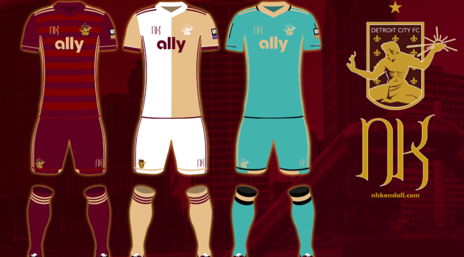
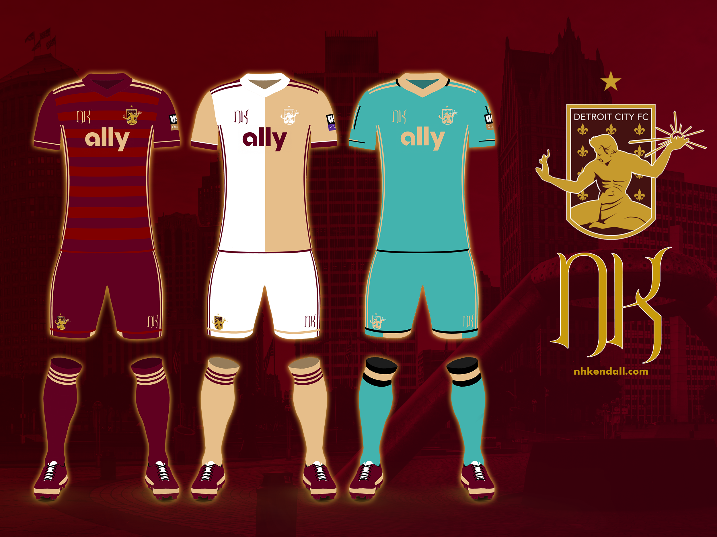
The Home Kit
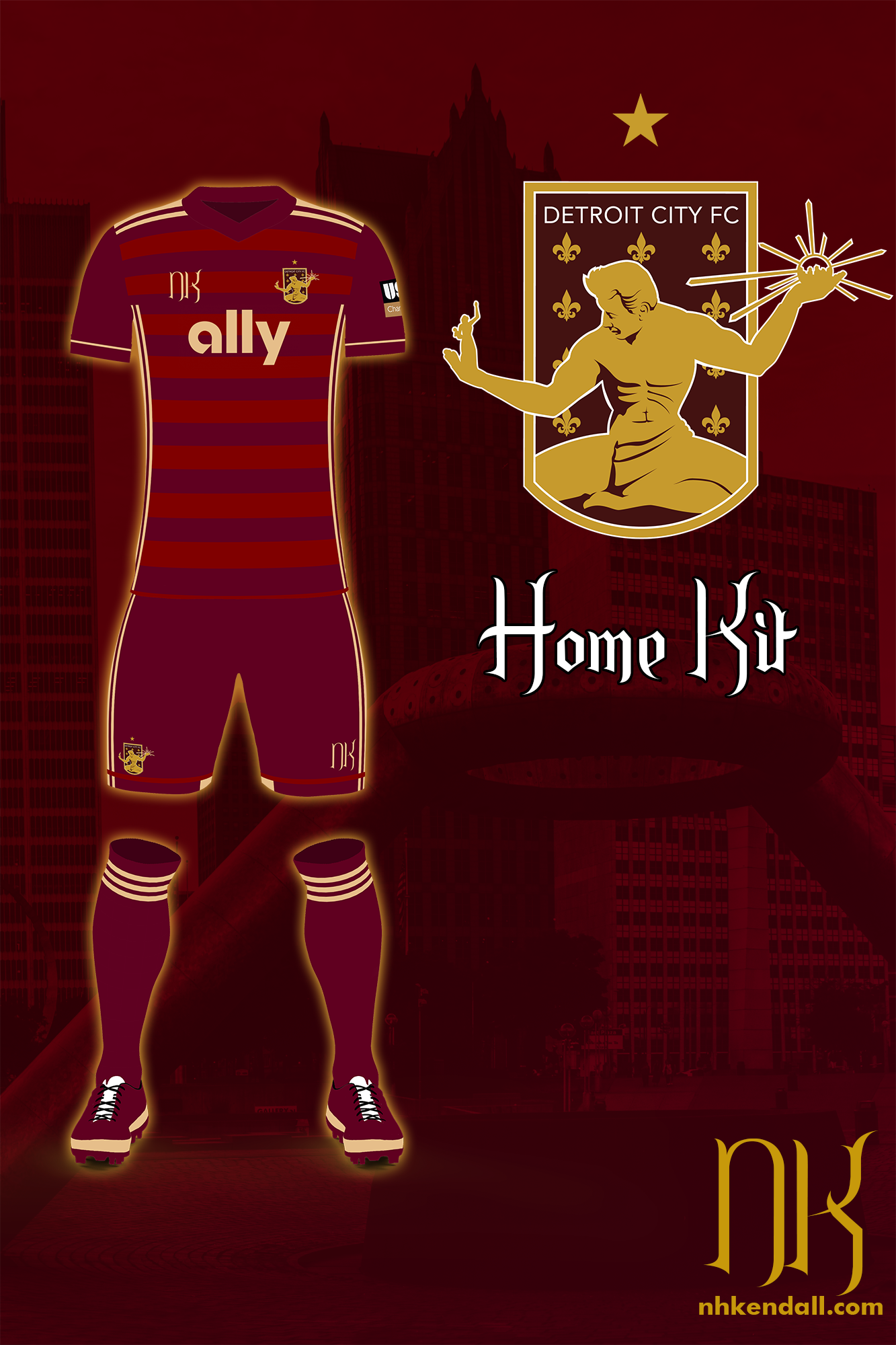
I’ve often said that the home kit can be hardest, though perhaps the better word is it can be more daunting. There’s a lot of focus on getting the home kit right and folks can be much more picky about what is and isn’t on it. This year I wanted to return to a focus on kits that can be produced by a company like Adidas, after a few years of allowing some slips into the sublimated hell that is dominating US kits right now.
After such a stellar year, I wanted to go back to a reoccurring Detroit City kit – the rouge on rouge hoops. City has worn hooped kits twice before: 2014 and 2017. Of the two, I think the 2017 did it better, and not just because it was Adidas over Nike. The darker “base” with the lighter “hoops” just looked overall better to me, and I wanted to follow up on that. I also wanted to keep the gold framing – we are rouge and gold after all. Having both colors on the kit at once is a good nod to that. I kept it cohesive with little light rouge touches in the shorts, using an extra little line to break up the vertical stripes and at the hem of the shirt, which gives good definition to the overall makeup of the kit.
The Away Kit
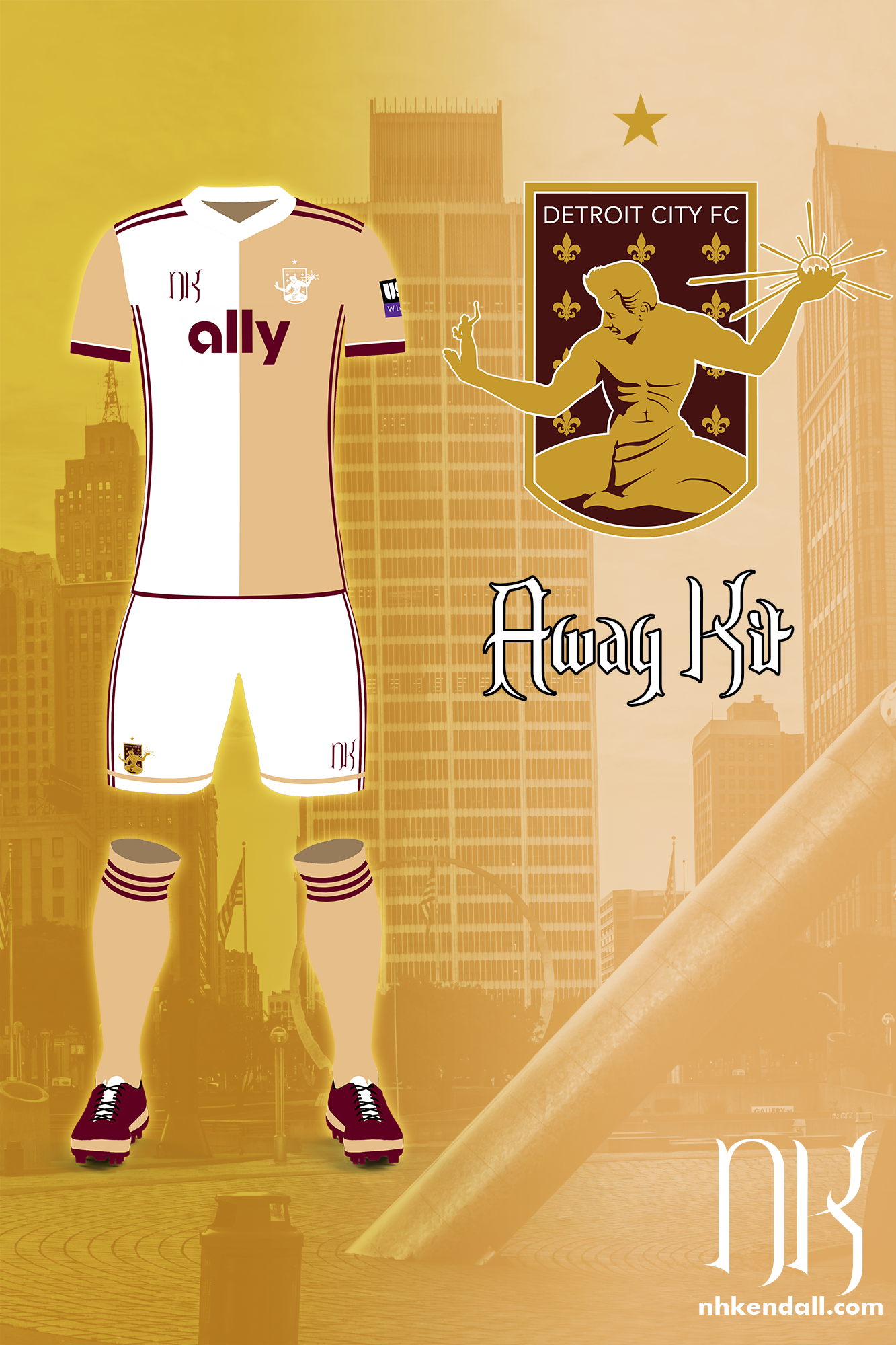
Champagne is a difficult color to work with, admittedly. Generally, it doesn’t come out looking like “gold” so much as sandy tan, while “gold” is usually just a highly saturated yellow (think the Packers). Such is the disconnect when working with a color named after a shiny metal. The alternative, for Detroit City, would be white, which is our usual away kit color. Personally? I prefer the champagne, I think it looks better, it’s not a common color for kits, and again, we are the Rouge and Gold, so it’s nice to stick to that.
But as in many things in life, it can sometimes be important to compromise. Gold? White? Why not both. And thus we arrive at a staple design that rarely makes its way to the United States – the half-and-half. Here I’m working with a base of champagne, with the right half of the kit colored white. The sleeves are both champagne, as they are often a separate “item” to be colored on sites like Adidas, with no option to split them. Like the home kit, I wanted to showcase both colors, and so here I use rouge as the framing color in the cuffs and the stripes. And bucking previous trends, I went with the champagne socks – something unseen since 2012.
The Clash/Alternate Kit
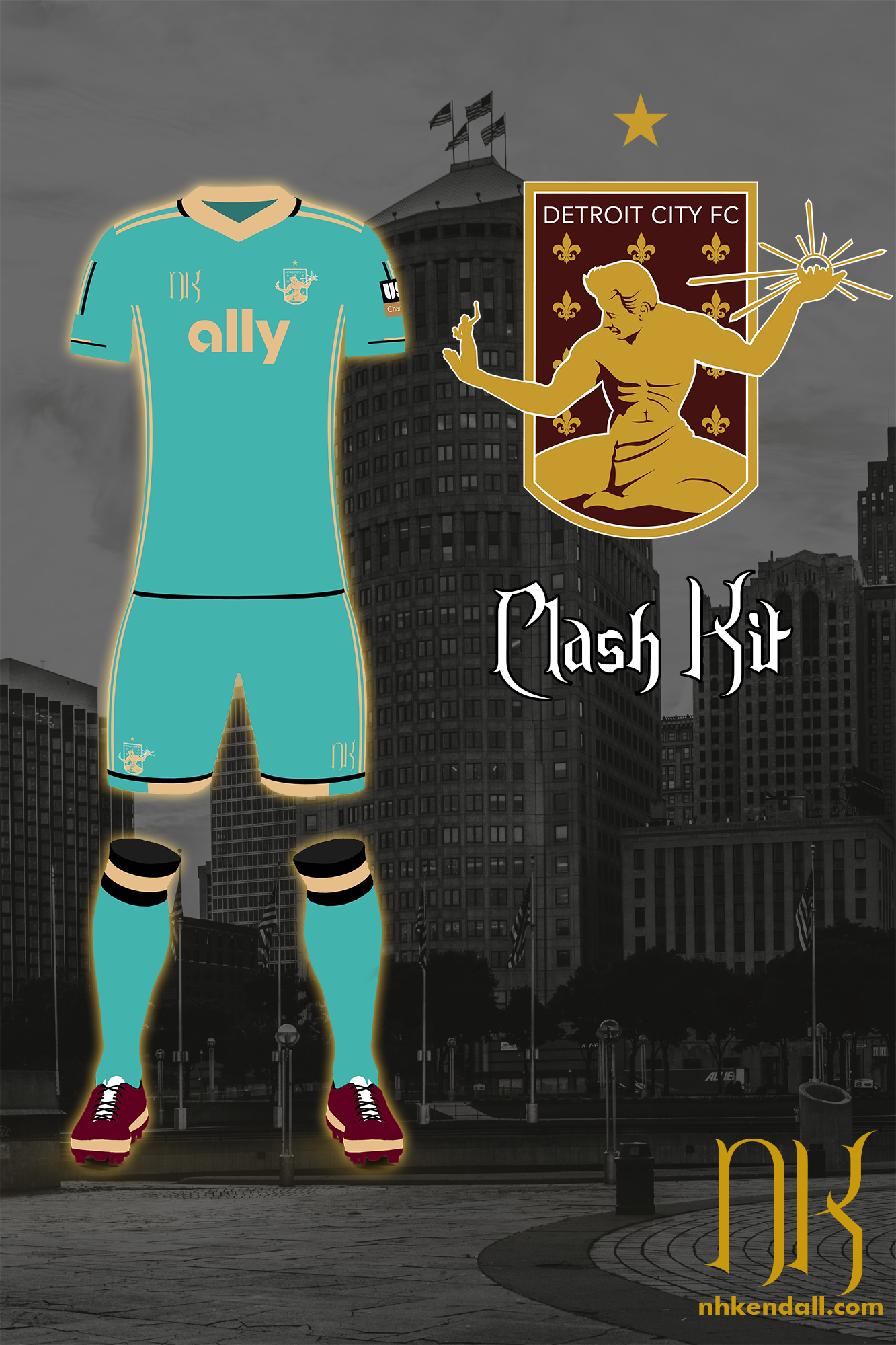
The template I work with is admittedly not that impressive, but it is cheap and it does work for someone who is more of a spirited amateur than a professional. A few years ago I turned off the layers that are intended to add the photorealistic shading and texturing to the kits, in favor of this more cartoony/sketch look. One of the downsides to that was when you made clean kits it effectively came out looking like a romper, with nothing dividing the shirt from the shorts. But this is an actual design concern and this year I wanted to address it with the hem at the bottom of the kit.
Verdigris, the color of oxidized copper, has been a popular recommendation when I seek them out. The Spirit of Detroit, the statue that is at the heart of our crest, is in person a large copper statue and is, in fact, verdigris. It goes without saying, then, that this would be a fantastic choice for an alternate kit, though I think the color would be hard to do in reality. I used gold and black to frame the kit, leaving it otherwise unblemished by design elements. The sleeves have some vertical elements that I saw in my head as going partway around the sleeve, so it wouldn’t just be the ones visible.
The Sketches
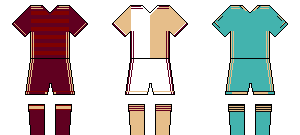
I mentioned above that I use tiny wiki-sketches to get my ideas down on paper first, so I wanted to include the actual sketches at the bottom of this post. There are some differences for sure – for example the solid bar gold tops of the rouge kit wandered over to the clash. Part of that was just about look. The verdigris kit also had a slightly different collar look, with the gold not completely surrounding the neck, but I just couldn’t get it to look right in the render, so it was dropped. Otherwise, I think I stayed pretty true to the original sketches, and they look amazing in miniature, if I do say so myself.
So that’s that for the 2021-wrap up and the 2022 kit post. As you can see by the sorry state of my site, I don’t really post much to it but this annual shindig, but hey – what can you do? 2021 was a hell year, just like 2020 and there wasn’t much for it.
As always, if you’re interested in commissioning me, you can check out my portfolio/commissions page for what to expect. Have a lovely holiday everyone, and I hope to have more stuff to put on this site eventually other than just “I’m trans” and “I love kits”, but honestly, that’s probably all it’ll be for a while!
Cheers!
Background Photo Credit:
Photo 75098233 © Jesse Kunerth | Dreamstime.com