This is a bit delayed what with so much more Detroit City than we’ve ever had before. This is the sixth Kit Post and it’s the closest to it’s actual year, though I am unsure if Detroit get’s its new kits before the Spring session of NISA or before the premier of our women’s (!!!) team in the summer. Or, alternatively, after the women’s season and before the start of the 2020/21 season of NISA.
If I had to guess, it’d be option number three. Anyway, let’s cut the chaff and get to this, shall we?
For the uninitiated every year after the DCFC season ends, I write up a review of the previous kits (or current as it might very well be) and draw up some potential designs for the upcoming season (hence the title being a year in the future).
The post from previous years can be found here:
2015 | 2016 | 2017 | 2018 | 2019
First, for the interested, you can actually see a wiki-fied list of Detroit City’s kits in as many combinations as I could remember. If you know of any other combinations, let me know! Especially if you have photographic evidence. I’d love to build a robust list. Some of the designs are not quite up to snuff, but I’d like to fix that in my free time over the next year.
So we didn’t go all out with our home kits, as I “predicted”, rather quite the opposite – DCFC returned to the dark purply maroon with a simple, clean kit with the dark red used in the piping elements on all three (the socks I’m not 100% about, tbh) pieces of the kit. Initially I think this caused a bit of a stir after a number of years of more complicated kits. The last time we wore plain kits were the much more off-the-shelf Nike kits of 2016.
The away kits were certainly a thing, though. White bodied and red sleeved, they used the red in the piping and after a humorous mistake by Toledo, appeared in the “Kit Man Moi combination” using the red shorts and socks in order to prevent a clash. These were certainly a thing to behold, beautiful even, in their simplicity without just being plain white. I loved the look personally, even though I didn’t get one from the store.
Lastly, this is the first time Detroit City has ever had a true “alternate” kit, and boy were they better than anyone could ever imagine. Pure black with gold piping. What a marvelous look for the club and I’m so happy they got to be used more than once. The boys in rouge looked absolutely stunning in black.
With three solid hits, it’s almost impossible for me to imagine what could be next. And that isn’t just a remark about kits, that’s also a remark about everything. The season was spectacular. Top of the table, Midwest finals, Members Cup champion. Our new Gaffa created a powerful side that played well and looked like a cohesive team, something I think was sorely missing the last few seasons.
But let’s give it a try anyway, shall we?
Anyway, the usual disclaimers before we continue:
- I don’t work for the DCFC front office
- The DCFC front office fucks with me
- Kits shown here are not official direction
- Logos, league, and sponsors are used without permission
- Sponsors and league are not official or necessarily endorsed by our front office
- The reality of 2020 might be very different than what I predict here, I love the challenge regardless
First things first.
Hummel?
Or Adidas?
Obviously for my kits it doesn’t matter, but for the unaware, NISA has signed a preferred supplier deal with Danish kit maker Hummel. This deal, as far as this writer is aware, basically gives teams access to cheaper, customizable kits from a supplier large enough to handle the quantities needed while allowing other teams to choose other suppliers if so desired.
Here’s the thing. I like Adidas, but I also understand that they are expensive and that their recent batch of templates leave a lot to be desired, especially in an era where even most small suppliers offer full sublimation of kits at a fraction of the cost of Adidas’ prices. A savings which can hopefully bring kit costs back to a more reasonable $50 or $60.
Hummel also was a leader in the sport hijab business as the main supplier for the Afghan Women’s NT. We’d be partnered with a company that holds many of our ideals and has partnered with some big names.
I guess what I’m saying is – if DCFC ditches Adidas for Hummel, I won’t lose much sleep over it. And hopefully I can afford more kits, which isn’t that just swell?
Okay, moving on to the part that I’m sure you’re all actually interested in, my 2020 designs for the Detroit City FC kits.
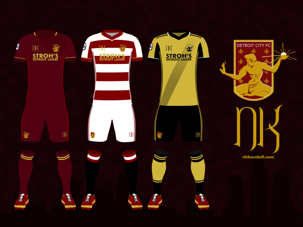
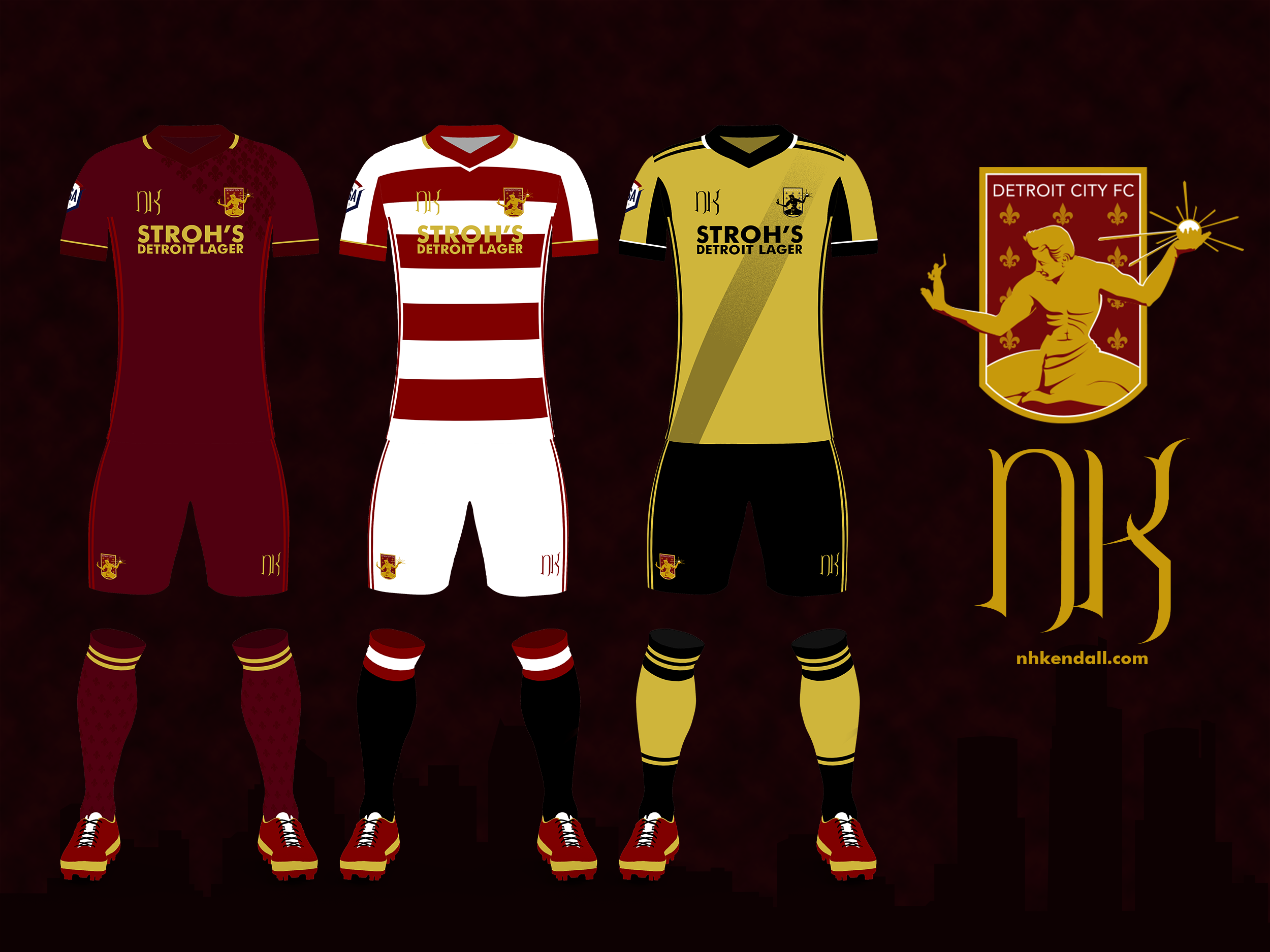
The Home Kit
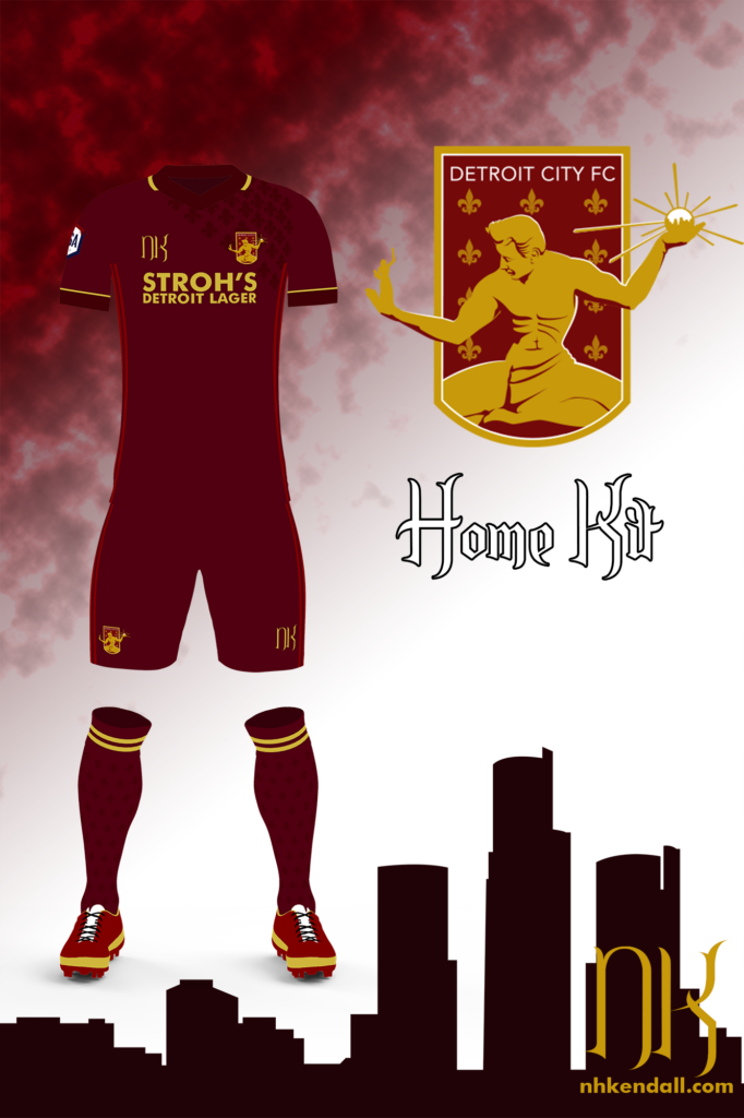
Despite some earlier comments on thinking of going 90s, I ended up retreating from that pretty quickly. My focus on neotraditional design is pretty incompatible with the variety of design that embodied the 90s in football and despite doing some research, I don’t think it’s an æsthetic I could replicate in the time frame I had set aside for this project.
Here I went with a rather clean design, focusing only on trim and small flourishes. I touched up the collar and cuffs with a dark maroon, small touches of gold. On the left shoulder, a gradient of fleurs de lys come down roughly in line with the crest and are echoed in the socks with a very faint pattern there as well as the two gold stripes.
I like the over-all feel of this kit, though it is not my favorite from the three this year. It’s simple without being plain; the elements like the fleurs and the gold flashes on the neck and cuffs given extra weight from a design that isn’t fighting itself for your attention.
The Away Kit
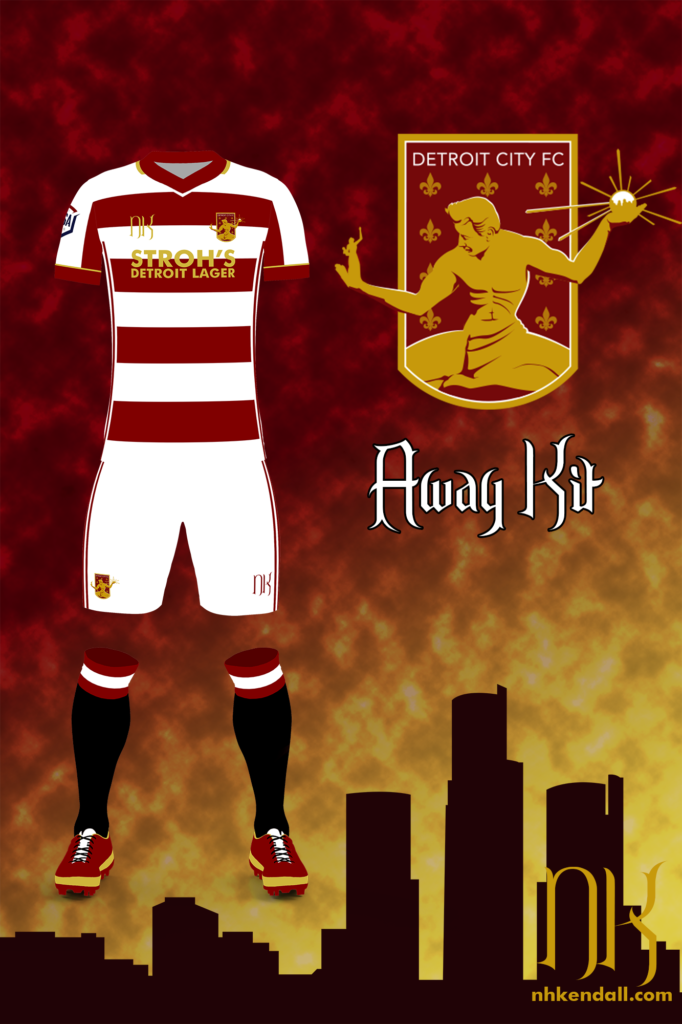
This was the first kit I finished this year and it’s arguably my favorite. There’s a different sort of feeling when you work on a home kit than an away kit an especially a clash/alternative kit.
When asking for ideas for the home kit, I got some suggestions for sure, but there were definitely some ideas where I thought to myself, “I’d rather not start a riot.” Home kits are sacred territory and making big, uncalled-for changes can get a certain reaction from a fan base.
Away kits, though, have a bit of leeway and I wanted to play with that leeway this year. This idea struck me while doing research on historicalkits.co.uk, Specifically I was looking at Hearts kits and I noticed the black socks with maroon and white hoops on many of their kits back in the teens through 1940s. The idea of combining those with a white and maroon hooped kit was too much to resist, so here we are.
The Clash/Alternative Kit
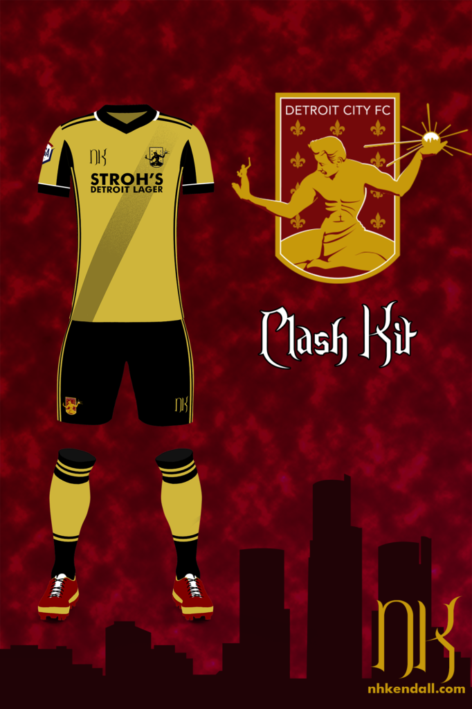
This final kit was going to be an important piece of the puzzle. Alternate kits are used to fill any gaps between the home and away kits when it comes to color. It is easy to see a situation where the rouge home and the white/rouge away kits are both ruled to be ‘clashing’ with another team’s, for example that’s what happened with the game against Toledo at Keyworth.
I think these pretty much fill the gaps.
It’s sort of a take on the alternates from this year with a pretty obvious tweak. We’ve done gold and white a number of times and it’s not a bad look, but black and gold look so damn good together, and it’d be true even if I wasn’t a Boilermaker. I followed New Balance and went with half-and-half socks, this time with a bit of a chance to transition from one to the other without looking like the sock was accidentally only dipped halfway into the dye. The crest is in alternate colors, this time majority gold with the statue in black.
The sash, probably the most prominent feature here, was actually a late addition, spurred on by the suggestion that the gold felt empty. I do think lighter colors are more at a risk of feeling empty than dark. Instead of fading normally, it actually pixelates out of existence as it goes up to the shoulder, which is what gave me the idea of making the fleurs de lys on the home kit fade out quickly going the opposite way.
They, in a way, echo each other.
So that’s all she wrote, my friends! Another annual Kit Nerd Post come and gone.
As always, I hope everyone enjoyed the read and loves the designs, if you have any comments feel free to reach out via twitter. I’d love to hear your thoughts or any other ideas you might have. If you’re interested in perhaps having me work on some kits for you, you can check out my kit design commission page with details such as pricing and what to expect.
I wish everyone a happy holidays and hope to be post more soon!
Cheers.