A while ago, I posted a set of eleven kits for the eleven members of the still-to-be-renamed NPSLPro’s Founders Cup, which kicks off in August. The Founder’s Cup, for the uninitiated, is basically a trial run of the NPSLPro before the league actually kicks off and is divided into East and West divisions.
But before even the NPSL amateur season could kick off, there’s already been some changes with that original eleven line-up. Weeks after NISA gained (provisional?) tier 3 status, Cal United tucked and rolled from the group. While nothing official has been confirmed, there have been some rumblings of them and at least one other team some had tagged for NPSLPro-ship are realigning their interests with NISA rather than NPSLPro.
Suddenly, our eleven were down to ten… until a second eleventh appeared on the horizon: Napa Valley 1839 FC.
Napa 1839 is an interesting, if little head-cocking, addition to the line-up. When creating what is essentially a punk-rock soccer league, the wine-mum club seems to stand out a bit, but then again there are already a few clubs that might be wrecking the vibes for some people; Milwaukee and Phoenix especially.
I’ve actually designed kits for Napa in the past on my twitter account, which they kindly responded to. In my previous design, I went with a bottle green/primary, marlot/alternate set up. They actually seemed to take this into consideration and when their second kits were unveiled they were green/primary and a red/white combo for the alternate. So starting with that, I’ve come up with a set to join the other ten (plus one).
Napa Valley 1839 FC
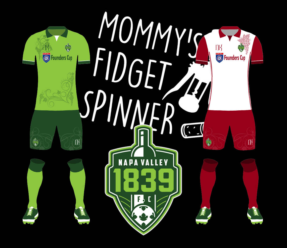
For the home kits, I wanted to stick with the two-tone green combo that’s on Napa’s crest, which is one of my favorite in the NPSL. I know that it’s a little cheesy, but the Napa Valley front office seems to have a good sense of humor about it all, which I can respect. Hopefully they get that my “mummy’s chalkboard art” aesthetic above comes from a place of brotherly love and not malice. The other thing I wanted to do with both the primary and secondary kits was give it a watermark look using a sublimation process – here it’s some grapevine art picked up from Freepik. Accreditation done, the secondary goes to that red/white combo that Napa is already using, and reduces the water marking to just the shorts and the left shoulder, just off the crest.
So that gets us caught back up on the eleven teams in the Founders Cup. Welcome Napa Valley to the family. I look forward to the chance to beat you and then share a lovely Chardonnay.