Welcome to the third annual Kit Nerd Day!
For the unaware I am a hack of a kit designer and every year I post ideas for next season’s kits. Generally I post a home, away, and alternate kit but this year we’re going big – that’s right, after the success of Minneapolis City SC’s throw-back kits I too am doing some throw-backs.
And as always we’re going to start with some disclaimers. First I am not a professional, I don’t work for Adidas, Flagstar, Detroit City, or anything of note. I’ve used all images blatantly without permission. Nothing here represents an official direction for DCFC so fans of Adidas hold strong but expect more disappointing Nike and for potential sponsors these are not endorsed by the front office in any way.
And one last thing, this year marks the end of a) posting full kits and b) using the Adidas kit builder! That’s right I’ve upgraded to photoshoped fake kits that are, for the most part, almost entirely actual designs the kit makers use, but I can edit things a bit more and use colors freely. Kit designs are, of course, subjective. I’m happy to hear your ideas on twitter or as comments below.
Some thoughts on last year and last season’s kits.
As for my kits the 2016 predictions included the fabled return of the hoops, which have not really stuck in my head. That particular design is not my favorite as the hoops are rather thin and there’s a lot of them. The white Flagstar brand across the chest likewise seems slightly small and out of position. The kits in general lack a unifying theme, but I generally liked the the away and alternate kits. In the end, though, that home kit is extremely complicated.
The actual 2016 DCFC kits were, for the most part, good. The home kit returned to a plain rouge affair, reminiscent of our first season back in 2012. I snagged one of those at the kit unveiling, my first home kit purchase! The away kit was dreadfully dull and lacked any color at all. The alternates though?! Fuck yeah Nike Volt kits with black trim! I bagged one of those too, buying one of charity ones so it went to a good cause.
Some complaints – the number on my home kit is already flaking off, which is upsetting. The little Detroit flags were lost to add more ad space and that kind of sucked. And the alternates should’ve used black numbers instead of white.
A big change in the 2016 season was the introduction of actual player numbers! That’s right, players were assigned a number and though it might seem petty, it’s a pretty big step in having strong starting squads and hopefully is a step on the path to a professional squad.
So, without further ado, the 2017 Kit Day Post:
Brand – Adidas
I’m going to fight for Adidas to the end of time but it seems like the front office is pretty stuck on Nike, something which will probably be even more likely next season with a major Nike store open(ing) in downtown Detroit. Nike, though, is one of the laziest fucking kit designers on the planet. They used the same damn design (in different colors) for at least half their clients this season including several national teams that were fucking involved in a major tournament against one another.
It was disgraceful.
Meanwhile Adidas have simplified their designs here in the States (they are still the sole kit designer for the MLS) removing the signature stripes from the shoulders and moving them to the sides. It’s a weird choice, granted, but I can deal. Their designs for the MLS continue to be decent, though I find the Seattle ones to be very, very weird. The choice to go with the blue sleeves bothers me, especially with an all-blue third kit. The Sounders need green.
My favorite from the MLS has to be Portland’s black and red aways. Those things are sexy as fuck.
Kit Names – No
Last year I took a stand on this saying we should include names on the kits as a way to look “official”; to look like we’re not run by amateurs. But we are run by amateurs and we are not a big-name club. With each passing season we leave more and more of a trail, make more and more history, and define more and more of what makes Detroit City unique to our city.
One thing I’d like is perhaps never include names on the kits. Never. As in if we’re playing for the MLS leave only the number.
I think it serves as a reminder than names don’t make a club, the club will survive and will never be made or broken by a single star. Sure a hero will go down in history, but the players now understand that they aren’t playing for their own personal fame – but for the fans and for the crest. If we go pro, those pros will need to be brought into line too. They play for us. Not for themselves.
Sponsor – Flagstar
I’m going to get this to work eventually.
I still think Flagstar is a better sponsor than Metro Detroit Chevy Dealers and they still act the part, and I’m not just saying that as an employee of a certain company symbolized by a blue oval. My opinions from last year are still alive here so it is what it is.
Interesting additions this last season though: Stroh’s and Faygo. Really interesting to see both an adult beverage company and a family beverage company join the team. Welcome and I hope dollar Stroh’s is a thing that sticks around.
And as I promised to Mr. Wright, I will not post the kit with hatchetman on it.
Okay, so there are my preliminary notes. Only one thing left to do and that’s roll out my 2017 Kits!
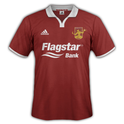
The Home Kit – Rouge Ringer
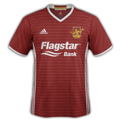
Here is my 2017 Detroit City FC home shirt. This would be matched with rouge shorts (with white stripes) and rouge socks (with white stripes at the top).
Something became very clear in the last few seasons – Detroit City might be the Rouge and Gold but their kits are Rouge and White. That isn’t a bad thing. I understand white kits are easier to come by and probably cheaper. I say run with it. Really buy into that rouge and white feel and make the kits consistent year to year.
It build a brand and will help make the club more recognizable in the long run especially to outsiders and potential fans. The use of pin-stripes gives a shout-out to the ever-popular hooped kits while not actually hooping our kits, which leaves the brand more recognizable and doesn’t begin to blur the line with another bunch of hooped semen… er… seamen…. I mean… fucking Lansing.
Like the last two years I wanted a unifying theme between all my kits (or at least the three main kits). First year it was the red socks. Last year was the lighter rouge details like the logo and stripes. This year it is the horizontal pin-stripes. Anyone who’s been to my wikipedia page has probably seen the preliminary designs up there.
I wanted to bring in the white here after a season with all-rouge kits, switching the cuff rings, collar, details and the striping to white rather than a second shade of rouge.
Inside the collar it says “Detroit City til I Die” under a banner of rouge and gold, bringing just a little hint of the Blood and Treasure to the Blood and Bones kits.
The Away Kit – Bloody Bones
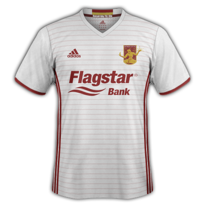
Here is my 2017 Detroit City away kit. As I envision it these would be paired with white shorts with rouge stripes and the same rouge socks as the home kit (a little hearkening back to the 2015 post).
As I said above, the 2016 away kits were way, way too plain for my tastes. I usually buy the away kits, they tend to be the more varied of the designs or in the case of 2015 Brigid really liked the collars. I haven’t brought the collar back (partially due to a twitter poll on the matter but also out of free choice), but instead I’ve brought color color back to the aways.
This kit is very much an inversion of the home kit with the exception of the collar, which remains white. Partially this allows the rouge and gold banner on the inside of the collar to still pop and not just be a random gold bar above the DCTID motto. The pin-striping and Adidas stripes switch over to rouge to maintain their visibility.
I think that the rouge elements, especially the stripes and pin-stripes give the aways enough color and “feel” that they don’t seem like unfinished, blank, canvases. These are “finished” kits with a finished, consistent feel with the home kits.
The Alternate Kit – The Nightmare
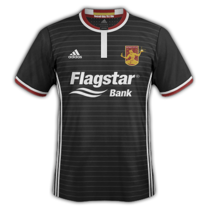
Here is my 2017 Alternate/Charity Kit! The way I’m seeing it is this shirt plus black shorts with white stripes and black socks with white stripes on the top.
There was a little bit of controversy with my original choice of collar (that is it had an actual collar, which proved to not exactly be the most popular choice). Here I’ve gone for a little bit of a non-standard choice for the collar – closer to the neck without the actual pop-up collar that we had in 2015.
I also went a bit more “crazy” with the colors. Cuffs are bi-colored instead of mono like the above, matching the collar. The crest returns to full rouge and gold glory, instead of the black and gold of the past. The pin-stripes are retained, back in white.
This is a fun, one-off kit that fits into the rest of the catalog a bit better than previous charity kits. In the previous seasons they were either: bizarre colors (Volt or urban camo), or strange two-tone pieces (the black tops and white shorts of previous years). This one would return to the edgier black while also maintaining the consistent top/shorts choice of black and white. Hopefully this keeps them a bit cheaper as well.
Black is a great look for DCFC and I hope the charity kits become true alternates in the few instances where neither the home or aways provide the necessary differentiation from our opponents. If I was in charge they’d be worn at least twice if not thrice.
The Throw-Back Kit
These would be worn with plain rouge shorts and plain rouge socks.
Just a simple take on the MPLS City SC throw-backs they released this season. Plain kit for a simpler time. Plus I was able to get my collar on you spiteful, spiteful bastards.
Anyway, I hope everyone enjoyed this year’s Kit Day post. If I get a chance I will post some of the other designs and steps I took if they exist. The alternate kit especially got a lot of “love” and attention, especially in the neck area. There was also the mock-up that I posted that had red sleeves. If/when that goes up I’m not 100% certain, it’ll be a manual post (this one is scheduled).
If you have any comments/criticisms/ideas of your own, feel free to let me know in the comments below or on twitter/reddit.
And don’t forget, kilt orders are due in 11 days!
Thanks everyone!
Sláinte!
One thought on “The Kit Post – 2017”
Comments are closed.