Cheers and salutations to the fifth annual Kit Post! Five years of talking my head off in these Sisyphean attempts to further my clout and reach as a kit designer so that one day I may be sipping martinis with Cristiano Ronaldo while one of my kits barely contains his physique.
For those new to my site, whether you hate-watch it or I freshly picked you up during the 2018 Detroit City FC season, welcome! Every year in August I make a post about Detroit City FC’s kits from that season and then make some “predictions” on what we can look forward to next season.
If you’re interested in the previous four, you can find them here:
Over the last several years, I’ve learned a lot about designing kits and how they are made. I’m not far from making the jump from “hobbyist” to “freelancer” and have actually had a few (three or four) false starts on that front. But each time I learn a bit more and come back a bit stronger. I’m also on the cusp of figuring out a way to just design kits and sell them, which I might experiment with. Things like my fantasy kits are probably the best place to start. So if you’re a fan of the Union Macenburgh kits, perhaps you should watch this site or my twitter for details.
My designs, I think, are significantly stronger than they were even a few short years ago. Partially because I’ve started using professional templates, but also because I’ve become better at translating the vision to the page. Still not great at logos. Not sure what I can do for that but keep working on it.
So let’s start with the 2018 Detroit City kits. I have some mixed opinions here and I actually managed to get a few things right:
- Away kits used white socks with red flip-overs
- We dropped Detroit Metro Chevy Dealers
- I predicted the chevron for the home, we used them on the charity kits
Some things that I was completely wrong on:
- I predicted we’d use the darker, purple-y maroon again for the home colors, we returned to just dark red
- The away kits returned to white
- I have *always* predicted a black charity kit, once again that proved not to be true (more on that in a bit)
- We still didn’t pick up Stroh’s as the primary, but we did pick up Lyft; so welcome to the team Lyft
- The Metro Chevy Dealers deal did not have multiple years left on it
Okay, but I got some hits! That’s better than nothing.
Last seasons kits can be ranked as thus: Away just barely hedges out Home, then a massive gulf in quality, the charity kits. If we were talking purely the tops it be a much closer race but… let’s just start there.
The charity kits, when first unveiled were already divisive. There’s the undercurrent of anti-blue in the DCFC fandom that is not surprising. Our biggest rivals all wear blue (Lansing, A2, GR, the Cavs… apparently), so for us to don it as well is not going to be well received. There’s some evidence that the FO is just trolling, but whatever. I liked the sky blue tops, I liked that they still incorporated touches of gold and the rouge chevrons. The problem was everything else. When they were unveiled, they were unveiled with the white shorts and socks. That looked good. Later in the season, I noticed that the white socks that had been worn at the unveiling were not the white socks we were using that season, so I put a vote up. People supported using the away socks or perhaps sky blue socks. What we got was so much worse: the home socks and the home shorts… for some reason. It looked like utter garbage, a very rare miss for our kits.
The home kits, on the other hand, were great. I really liked the subtle nod to Dave Edwardson’s hometown for what turned out to be his final season (apparently, as of writing). The vertical stripes of Newcastle looked good in the two-tone rouge. I prefer the hoops, if I’m honest, but I also like breaking up plain-looking kits. I’m thinking that next year we’ll return to a more plain look. I really hope we avoid the mess of patterns offered by Adidas for the upcoming season. Some are descent… but others are just… bad. Like snow flakes? Really? For fuck’s sake Adidas.
Finally, the away kits, which were absolutely stunning. Loved them. Didn’t grab one because I’m a clutz and I don’t want to ruin a $90 kit. The touches of rouge in the collar and on the cuffs was sublime. That’s how you do an all white kit… by not taking “all white” literally. A few teams in our league, including DCFC a few seasons ago have worn what are essentially bargin-bin white kits from Dick’s that have had the logos and sponsors ironed on. That’s good for a team that pulls fewer fans out per game than it concedes goals, but for DCFC you gotta be cutting edge. This year’s away kits? Italian chef finger kiss Divine.
Before we continue, I have a few disclaimers for readers:
- I don’t work for the DCFC front office
- The DCFC front office fucks with me
- Kits shown here are not official direction
- Logos, league, and sponsors are used without permission
- Sponsors and league are not official or necessarily endorsed by our front office
- The reality of 2019 might be very different than what I predict here
So we’re nearly a thousand words in by this point so you’re probably going, “Nick, just show us your fucking kits,” which I think is a rational response, so we’ll get the show on the road.
Last year I wanted to focus on the possible, that is to say I studied some of Adidas’ available templates and based my designs off those. This year I’m not sticking to that so much. I want kits that are both possible, but also are a bit more involved. So with the next three designs I have one that fits the “fully sublimated” design, the “easily available template” design, and another that falls in between. I liked mixing it up and I liked getting to do some more complicated things.
I have a feeling one or more of these designs might be a tad controversial, but we’ll see.
One last point to address before I get started is that I actually reached out for feedback and ideas and really I only got three: pink/black combo, “verdigris”, and for the sashes from the 2014 season to return. I’m only going to address one of those points here: pink/black. I just designed a pink/black kit for a client and so I was not necessarily keen on doing it again. I love the pink/black combination and I’ll certainly revisit it in the future, but the timing was off for me so it’ll wait. However, I do hope everyone enjoys the one I did make when it comes out in a couple months.
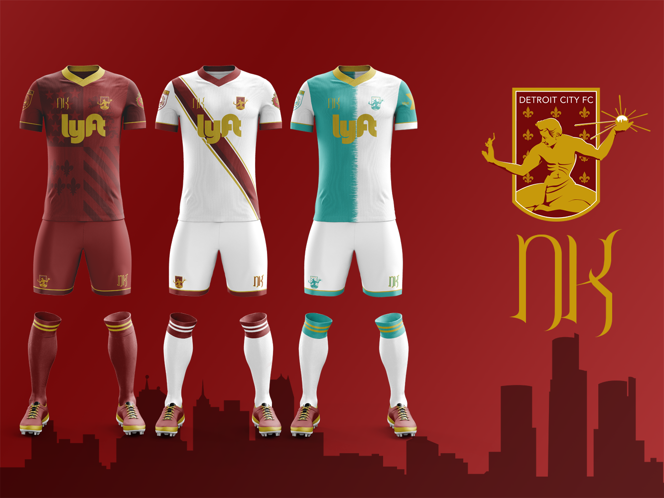
The Home Kit – Soul of Detroit
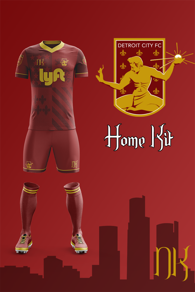
My 2019 Detroit City FC home kits feature the Detroit city flag sublimated onto the front in the two-tone rouge that has become a mainstay for our home kits in the last few years. For an added touch, I alternated the colors of the sleeves as well to give the traditional feel of a quartered kit, a pretty common design in Europe but very rare on this side of the Atlantic, especially in the US.
I have a love-hate relationship with sublimation. I feel that it’s often misused to create these vastly complicated designs instead of bringing a fresh take on older designs (like using the quarters to create the Detroit flag). Gold trim on the collar, shorts, sleeves, and socks bring the overall look together – an otherwise disjointed design framed and united. Not unlike the city itself.
With the constant war in US soccer on an increasing number of “fronts”, including Detroit and now Chattanooga, I wanted to make it perfectly clear what team is Detroit’s team.
The Away Kit – Heart of Detroit
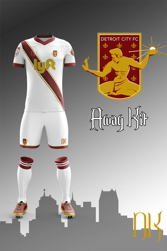
The idea of bringing back the sash from the infamous “kitless” season of 2014 (which also gave us the hoops for the first time) has crossed my mind, but having it specifically called out when I requested input made it too much to avoid.
The sash itself is two-tone rouge, like the home kit, to give it a bit of dimension, and then “trimmed” in gold. The gold trim on the sleeves and shorts remains from the home kits, but the collar switches to rouge, not unlike the 2018 kits, and I kept the red flipover with white stripes for the socks.
A repeat of the 2014 and 2017 seasons would be fantastic, picking up this under-rated beauty would be a great place to start. That and picking up a certain WMB.
The Charity Kit – Spirit of Detroit
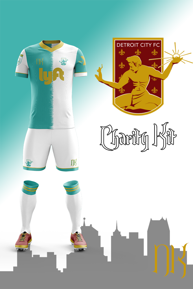
So the suggestion of “verdigris” was a fascinating one, certainly got my gears turning for possibilities. For the unaware, verdigris is the color of weathered copper… featured prominently on old statues like the Statue of Liberty and our own Spirit of Detroit, which has been featured on every single Detroit City FC kit from the very beginning.
I knew right away I wanted to go into one of those “traditional” kit designs that are not common in the United States. Originally I started with the quarters, but I quickly shelved this. It just didn’t click in my head, so I switched the the halved design thinking that I could add some smaller details in it to give it some life. Sublimation ideas crossed my mind, including the statue proper, but like I said the statue is on every kit and I didn’t want it to look like it was a larger crest sublimated over the entirety of the kit. I also considered some golden pin stripes, but again getting too complicated.
What I chose is what’s here: the gold collar and trim on the shorts, sleeves, and socks as well as the verdigris and white alternate logo. Sleeves alternate color like the home kit (or really the home kit picked it up from here as this was the first kit I worked on) with the YMCA as the charity sponsor. Between the two halves I applied a bit of a staggering design to give it a bit of needed life without over-complicating the entire design.
This is absolutely, hands down, my favorite of the three. The choice of verdigris as a color was amazing, it works brilliantly with the gold and white and is definitely being added to my dossier of color combinations for later. If I had to pick one kit, just one kit for DCFC to actually make real, no competition: it’s this one.
So that’s that! Kit Post 2019 has come and gone and we’re still under 2000 words!
I hope everyone enjoyed the little discussion today and I really hope everyone loves the designs. As always, keep your eyes on my twitter where I often post snippets of, or even full designs for kits and in the coming weeks definitely stay tuned for some big unveilings that I have planned.
And what do you guys want to see? What did you like, what didn’t you like from the 2018 Detroit City kits? Let me know!
Cheers, everyone!