Okay, so hopefully by now most of you have seen that I posted some dream kits for DCFC. I am rather proud of them so I want to spend some additional time egobating (ego+masturbating) all over your faces by sharing some thoughts over them.
So let’s start from the big picture: brand and names.
I chose Adidas as the brand for two reasons. First, they have a great kit customizer, so that is a huge plus. Second I am a big fan of Adidas kits, I think they look better and look professional. It is an instantly recognizable brand. Stripes on the shoulders give it away and I think it gives us a hugely professional feeling. With the rumors of an NASL-bound DCFC in the next five years, looking good now is a big deal.
Second, I wanted to add permanent names to the kits. This goes back to that “professional” feel, but with so many DCFC players heading to the pros as well as so many homegrown heroes I’d love to be able to have a kit signed by the guy whose name is on it. It will also help build the relationship between players and fans. Sometimes you only know someone as “Number 12” but what if there are three “Number 12s” running around? So for that reason I want to see permanent numbers even if we can only buy generic kits like usual. This of course will come at a cost, it means no sharing kits.
Lastly, sponsors. I’d love to see a sponsor on the front of those kits. I don’t have any good vector images to throw on it though, nor do I want to sully them for the time being if DCFC is scouting around to attach a big name on them. Mostly I want a good quality image and don’t have one. But I’d assume there would be a sponsor on there. A big one. Helping pay for these lovely kits.
HOME KIT
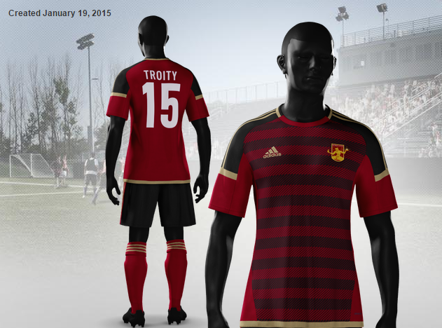
The hoops return in lovely Rouge. This time the Rouge on Rouge effect is actually thin black pin striping in the hoops that gives the two-color effect.
Unless you’ve been living under a rock, these kits are specifically invoking the 2014 Weltmeister, Germany’s Red and Black beauties (though I am being told they are very Manchest United-ish). However, since we are le Rouge, the focus here is on the red and not the black. Black would be a new color for our kits, but I think it is a good one. I think it is a strong color and gives the team that gritty feeling that we love so much.
On the edges I went with the closest thing to Old Gold that Adidas had, giving a little hint of “treasure” in all that blood.
Moving down, I went with a black base for the shorts with red highlights/inserts and the treasure stripes. I like the continuation of that black. I’m obviously biased as a Northern Guard member, but this completes the rough, angry look of a Detroit team that truly embodies our fair city.
Lastly, the socks. Socks are often something easily forgotten in a kit (at least for me anyway). I went with rouge. First, because it looks good with the treasure stripes and logo. Second, I actually wanted to leave a little “Kendall” signature there, so I actually turned to Kendal Town FC for some inspiration. One of the most obvious parts of their kits is their socks, which are red in stark contrast to their magpie kits and black shorts. So taking that little piece of Kendal gives me a literal Kendall signature.
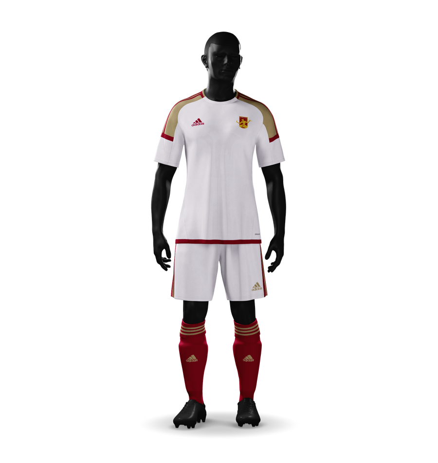
AWAY KIT
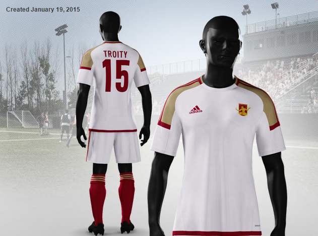
So the first thing I want to note is the socks – the blood and treasure socks feature on all three designs. Again, this is my signature, but also it gives them a bit of commonality.
For the aways I wanted to pull away from the addition of black and go to white. I’m not a fan of plain white kits. Our away kits from last year were especially bad, I think. So I am trying (and likely failing) to give a bit of life to white kits everywhere. Using the gold on the shoulders with the red accents is a nod to the 13 white kits, which is actually one of my favorite kits of all time and something I am have been photographed in quite a lot. So blood and treasure mingle again on the edges of a white canvas.
The shorts are the home kit pants with white instead of black. I’m fairly confident that the black shorts and the shorts from the alternate kit will work well this this set up, which is a great thing to have if you want to mix it up a bit and sometimes you have to.
I just checked. Looks great with the black shorts from above.

So there you go.
ALTERNATE KIT
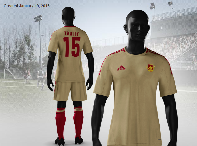
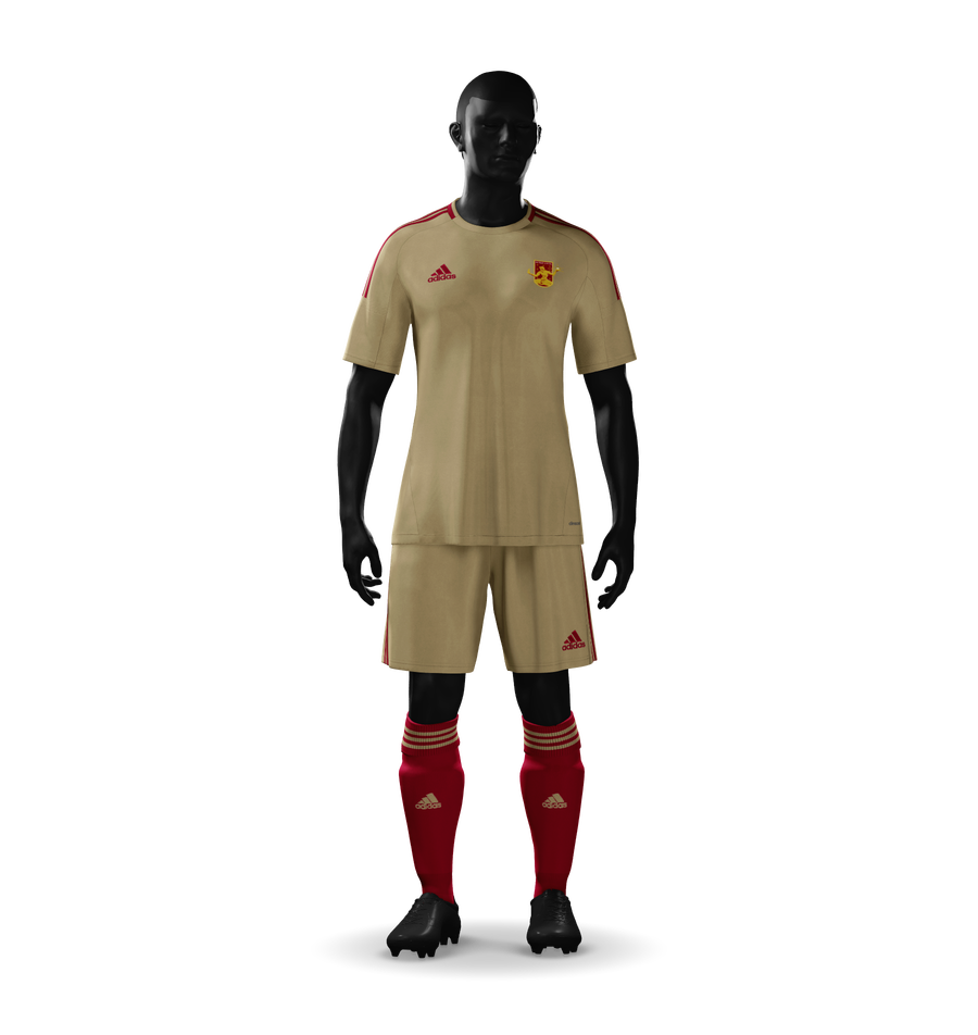
I decided to add a third change just in case we need some more color in the stands or we want to wear something special for play-offs or anything like that. These kits are much cleaner looking and are actually a throw-back to season one when our second kits were plain gold with white shorts. Here we have plain gold with red accents, including the shorts.
Not much you can say about a throw-back kit. The socks continue to unite all three designs and I think the black or white shorts will go awesome here. After such a complex home design, with all sorts of colors, stripes, and everything I think it was important to keep it simple. So there is a flow here.
I think gold is an often forgotten color of ours. I mean the logo is Rouge and Gold. Our chant is “Com’on you bhoys in rouge. Com’on you bhoys in gold.”
Bring the gold back, please Detroit City.
And wouldn’t you know it. Black shorts – totally work as well. 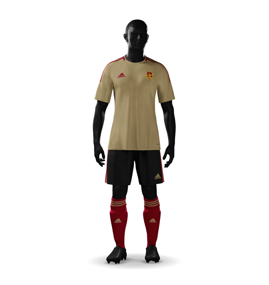
So if corners have to be cut, cut them there. Three great shirts, one great set of shorts and socks. But if the boys head out onto the field in May wearing that top set, you better believe I’m going FKN (full kit nerd) on them.
I hope everyone enjoyed this little look into my kit nerdom. Onward Troity!
2 thoughts on “Kit Nerd 2015”
Comments are closed.