I have a very fond obsession with symbols. All kinds of symbols, maybe things you don’t think of as symbols per se. To me a symbol is anything we use to define ourselves whether through common understanding or inside understanding.
We cover ourselves in symbols. Colors. Kits. Flags. Even phrases. We use them as a shorthand of who we are, what we stand for, or who we stand with.
If I were to write:
AEIOU
Most of you would probably think “Very nice, Nick. Those are in fact the vowels in alphabetical order.”
How many of you would instantly think “Alles Erdreich Ist Österreich Untertan” (All the world is subject to Austria) or “Austriae Est Imperare Orbi Universo” (It is Austria’s destiny to rule the world)?
That’s what I see.
AEIOU was a symbolic device of the Habsburgs of Austria. It represented their belief that they were the one true masters of Europe and thus the world, and who could argue? The Habsburgs ruled two of the largest empires for centuries with night falling on their reign only after the end of World War One.
What about what we wear?
The discussion about hats came up on twitter recently. “No one I know wears a [flatcap],” said one indignant (and rather uneducated) user. “Well half of the Northern Guard does,” said Killted Ken.
Flatcaps are a symbol. They can represent Irish influences. Working class influences. They were popular in England for centuries as a cheap hat, their significance as a poorman’s hat brought about by short-lived law requiring men over eight to wear a hat.
What about soccer kits? What do soccer kits tell us about people? Their colors, their designs. Hoops. Stripes. Sashes. There’s lingo and basic elements. A lot of it is based off what you like. I’m not sure that the colors or anything meant anything. I’m probably wrong. Those colors, back in the 1870s meant everything. There’s a lot of combinations of claret and blue in England.
Maybe they’re all copying.
Recently, in my boredom and partially out of a desire to procrastinate, I created twenty hurling kit sets (home/away+socks) for the “premier” hurling (called Caman in my books) league using the Azzurri GAA kit builder. Part of it was an exercise in thinking about the different cities I had created for my story. What did these cities do? What sort of people lived there? What did they do and how would that affect their favorite teams?
What did different designs and colors mean? Some patterns and themes emerged as I worked on them. I also tried to think about our own trends in sports, drawing differences between EPL and MLS. Here are a handful, hope you enjoy.
Union Macenburgh

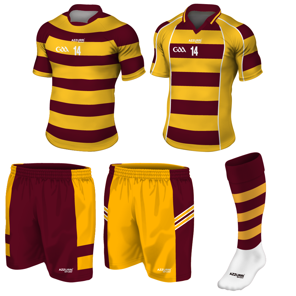
Union Macenburgh (and the next entry) feature in their old incarnations in the sequel to Sun-King. They are based very much on my beloved Detroit City FC (as is obviously apparent in the colors) but also in the fans. The “Union” in the name is used by teams to reflect that they were originally founded by working-class people, this is backed up by the hoops (which I took from Celtic). The fans are rowdy, dedicated, ready for a scrap, and pile into the bars before and after every match. Macenburgh itself is very much based on Detroit (including it’s southern suburb Southfields). Rozenn is a huge fan of Union, dragging Einar to a game in book 2 where she of course starts and ends a fight with the supporters from across the river.
First Blackwater

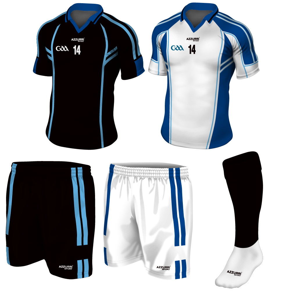
When I first named “Blackwater” I wasn’t actually thinking about PMCs or anything. It was originally named after Dublin (Dubh Linn – Blackpool). As I was writing Blackwater and Macenburgh traded places as the working class and upper class sides of a single massive metropolis. Blackwater sounded more exclusive so it took over. Blackwater’s fans are mostly wealthy or conservative in general. The two teams and their rivalry draw from the Old Firm derby (Celtic v Rangers) hence the blue details for Blackwater.
ACC Aurora

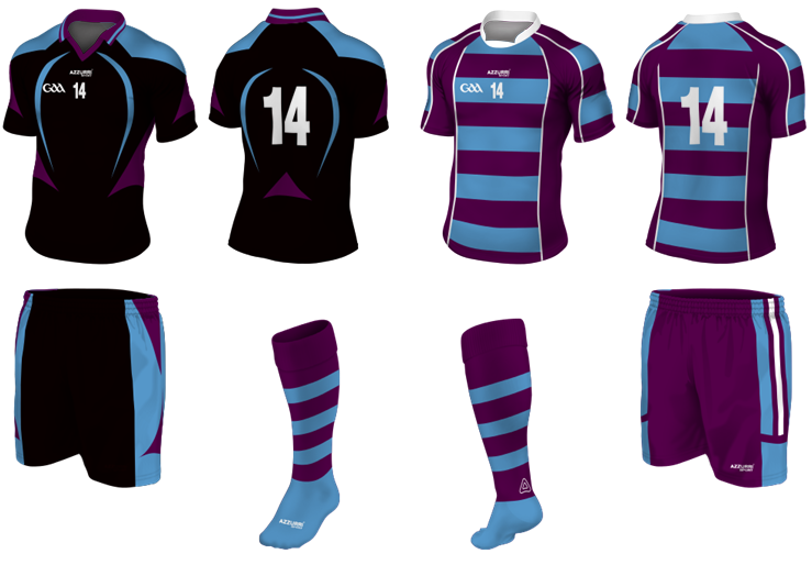
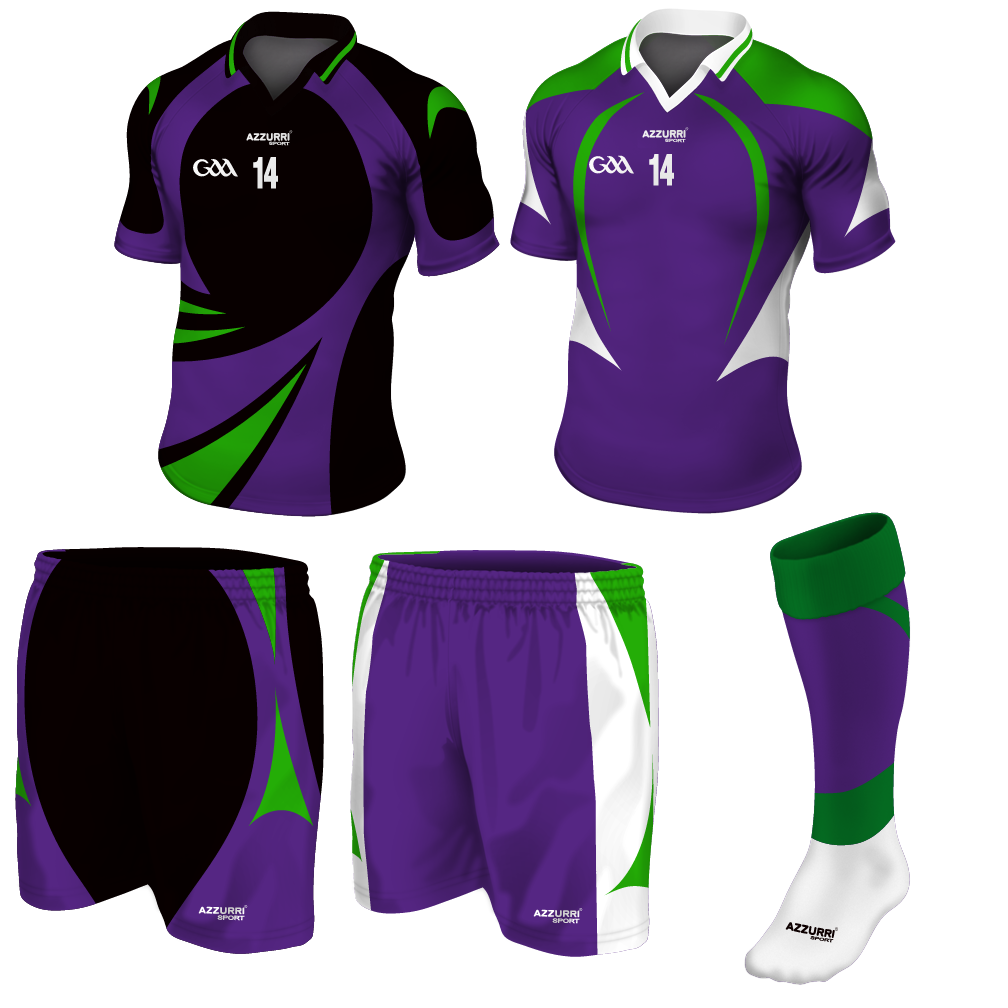
Whereas the Macenburgh and Blackwater teams are ancient fixtures in their cities, ACC Aurora represents that new breed of sports team, eager to stand out and eager to build an ancient identity in a few short years. In the books it’ll be hundreds of years before they are even founded. They represent a disneyfied team – bright colors and weird patterns based on the local scene. In this case the auroras above the city of Aurora, far north of the “arctic” circle of this world. They aren’t the worst team, they certainly aren’t the best. They are young and thus their owners make silly mistakes or are in general less interested in keeping with traditions or words of wisdom. Hence purple kits.
Dockyard Union CC

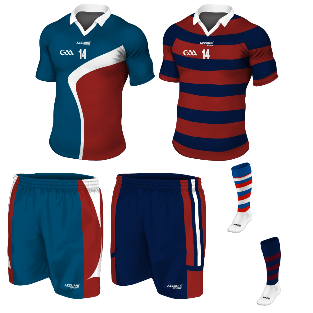
This team quickly became one of my favorites, those kits on the right are a good reason. Like Union Macenburgh, Dockyard is a Union club. In my world they are a very St. Pauli-esque club. Punk, anarchic, supporter-run, vulgar, and ready to shout-down fascists at the drop of a hat. While they hold Macenburgh in high esteem, they reject the idea of capos in the crowd, opting instead for spontaneous chants and lots and lots of pyro – mostly stolen from the docks.
First Valkburgh NCC

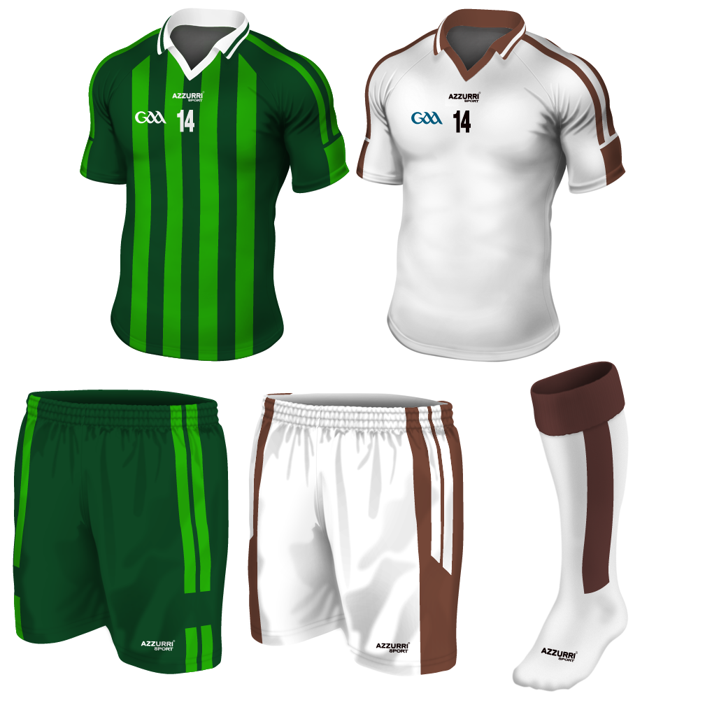
I nearly wasn’t going to include this one. This is the team from Einar’s hometown and that he (secretly) roots for despite Rozenn’s passion for Macenburgh dominating their sporting relationship. Nicknamed “Rangers” that is more an homage to Sun-King and the “Nyrnish Rangers” who are head quartered in Valkburgh. Before any real-life Rangers fans jump on board, the Nyrnish Rangers were an elite scout force turned traitorous IRA-esque militia. Their colors green and brown harken back to these military roots. I also wanted a team that had unusual colors without going into the realm of the disneyfied teams. Brown was an interesting choice, again inspired by St. Pauli.
Some other teams of note:
Union Waldenhof – Essentially the Newcastle United of this world.
Kairnburgh ACC – Based off Liverpool, good but never quite good enough.
Waldenhof City – The rich team that almost always buys their way to the top.
Southfields CC – The team in the burbs who wonder why no one takes them seriously.
NCC Fovel Town – That team you’ve never heard of and then are surprised to find out are significantly older than your side.
Launburgh ACC – That club out in the middle of nowhere with a tiny stadium.

