Here’s the idea: design a new flag for Michigan. Reply to this tweet and share widely. The top 3 designs will each receive $500.
— Rick DeVos (@RickDeVos) June 14, 2016
For many reasons, Rick DeVos is probably not the kind of person you expect to be retweeted on this blog. I’m not going to go there tonight, or perhaps ever as a political mouth and not necessarily a political ear.
Say what you will about Rick (as a person) or the DeVos family (as a force in politics and business), Mr. DeVos has brought up an interesting point: Michigan’s flag is kinda… well… let’s just say it fits in well with most US states.
That is to say… bad.
It’s bad, okay?
There, I said it. Michigan’s flag sucks. It is yet another seal on a bedsheet with some Latin logos and deer thrown all over it. There might be an eagle too. All things you can hunt in Michigan.
Rick has asked for some flag designs, my guess is that it has to do with his “Art Prize” thingie. Get a bunch of art and flags related to Michigan, how Michigan stands out in people’s minds. For me it is a chance to stretch my inner designer again.
Before we go too far, I want to bring up the long-sacred rules of flag design:
- Keep it simple – A child should be able to draw the flag from memory
- Use meaningful symbolism – Symbols on a flag should promote the ideals and beliefs of the people the flag represents
- Use 2 to 3 colors – This is an extension of rule #1 and also makes the flag easy to convert to greyscale if done correctly
- No lettering or seals – Letters and seals are for seals, not for flags which should be instantly recognizable at a distance
- Be distinctive or be related – Flags should show common heritage while also standing out in the crowd
Where does Michigan sit?
- Fail – Michigan’s flag is very complicated, with a seal and three animals plus a bunch of Latin.
- Sorta Pass – Michigan’s flag throws enough against the wall that some of it sticks. Elk and deer for our forests, Eagle for America, mottoes and stuff represent the people in the state. However, it is way too much and is starting to get out dated. Deer might’ve been majestic in 1840 but now? They’re mostly just roadkill. Michigan isn’t roadkill. Plus it can be exchanged for any forested state in the US.
- Fail – Clearly Michigan fails. It has a ton of colors, some for only small details.
- Fail – Michigan’s flag is a seal on a bedsheet.
- Sorta Pass – Michigan’s flag gets a sorta pass here. It is definitely related – it’s related to all the other seals on (almost always blue) bedsheets that dominate the flags of the United States. But on the flip side it doesn’t stand out in any way.
While I doubt that Rick has any major plans for pushing for a change of the Michigan flag, without a doubt we need a new flag; it just isn’t the most pressing thing facing the state right now. On the flip side a new flag might be the perfect way to get people united behind improving our beautiful, wonderful, and amazing state.
I’ve already posted an idea here and with Rick, but I’ll post it and some others for your viewing pleasure.
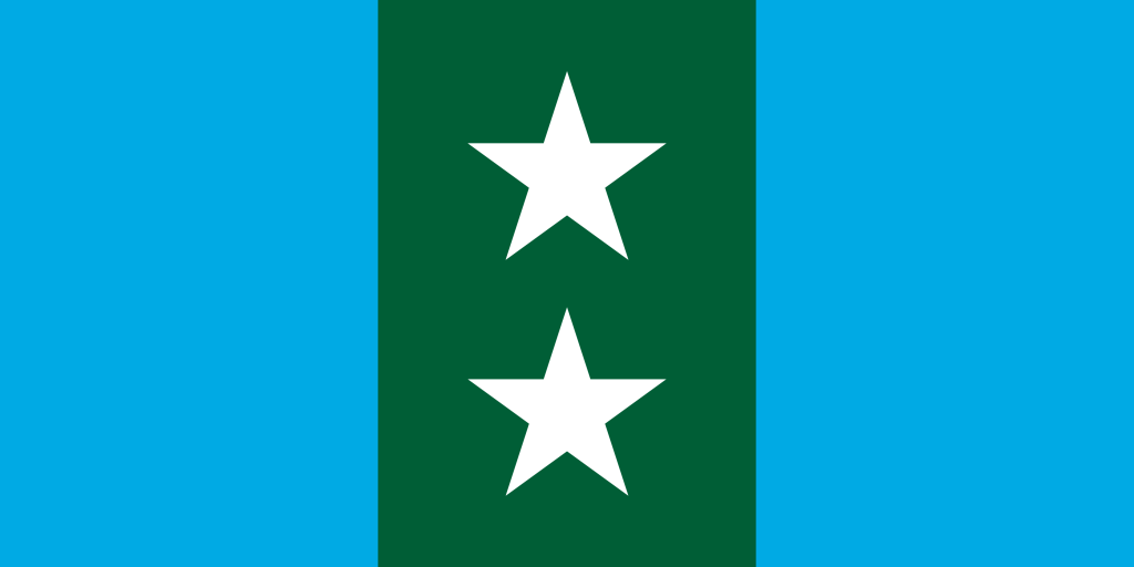
Two Lakes/One Michigan Flag:
This 1:2 flag represents Lake Michihuron and Lake Superior with Michigan nestled in the middle. The two stars represent the Upper and Lower Peninsula united within a green forest. It is important to never forget that the Upper Peninsula is a part of Michigan, it isn’t just a vacation spot or where you can get a cheap piece of land for hunting. That’s why I want to show it as one with the Lower Peninsula instead of always separate.
Also, I recognize that my opinion on Lake Michihuron being one lake, but trust me when I say geography agrees with me – they are one lake with one surface that rises and falls together. Say it with me: Michihuron (/ˈmɪʃəhjɚˌɹɒn/).
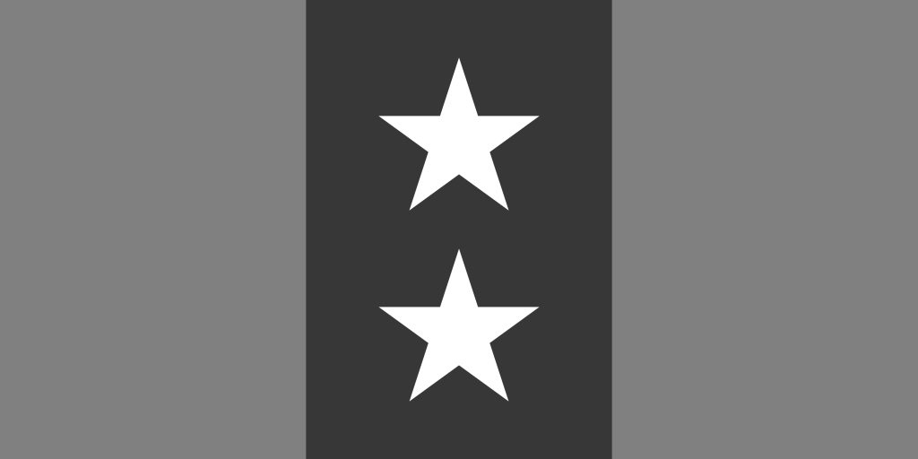
And like last time, it retains its distinctive look in greyscale.
Lake Above/Forest Below:

This one maintains the same two peninsulas, one Michigan theme as the one above. The Light blue is replaced with a more traditional navy. The navy maintains the start contrast difference between the blue and white so that in greyscale it still remains distinct. It also ties it back in with the rest of the US by including the stars and that traditional navy blue. This uses a more standard 3:5 ratio.
The Michigan Square:

I think we all know that a certain neighbor to the south uses a weirdly shaped flag, so why can’t we? I’ve switched to a 1:1 ratio while maintaining the colors from above. I’ve moved the green to the fly (the side not attached to the pole) so that when draped it will stand out from the other navy blue flags.
The Michigan Tri-color (Horizontal):

A simple white-green-blue tricolor in a normal 3:5 ratio. I’ve removed the stars and made a flag that is very easy to draw from memory but is completely distinct from other American flags as well as just about any flag in the entire world (it the flag of the Komi Republic in Russia flipped). White for snow. Green for forests. Blue for the lakes. It is meant to invoke a common scene in Michigan – snow-covered pines by a placid lake. Simple, but distinctly Michigan.
The Michigan Tri-color (Vertical):

The same three colors as before, the same order – only twisted and given the 1:2 ratio I’m so fond of. Draped in still air it creates the scene from above. Aloft it is a flag like no other. Unique among all the world’s flags as a vertical tricolor that doesn’t use white or yellow in the middle (shared presumably with only Cameroon).
So there are five designs, hope you’ve guys enjoyed and you found something you like. Hopefully this all goes over well and Michigan can try to unite behind a new, beautiful flag!
Slán!


