I just posted about symbols and fake hurling clubs in case you missed it. As a sort of joke I threw a half-assed crest and kit set that I had made for “Pheasants Hurling Club” a semi-serious discussion between Aaron Mink and I about starting a GAA Hurling club here in Detroit.
While I doubt that anyone in great Detroit even owns a piece of ash besides me, it was a fun thought.
The Name
I called the club Pheasants Hurling Club as a shout out to Troity the Drug-Addicted House Pheasant of DCFC fame. One can’t take themselves so seriously these days.
The Colors
I chose “wine” and “sky blue” because they looked clownish without looking bad. One shouldn’t take themselves too seriously.
The Crest
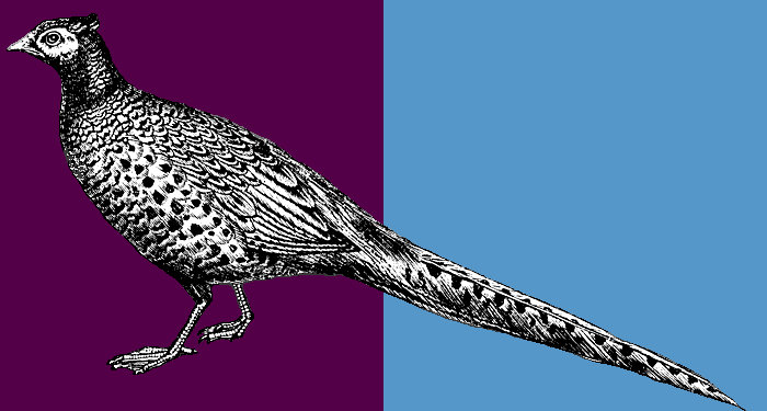
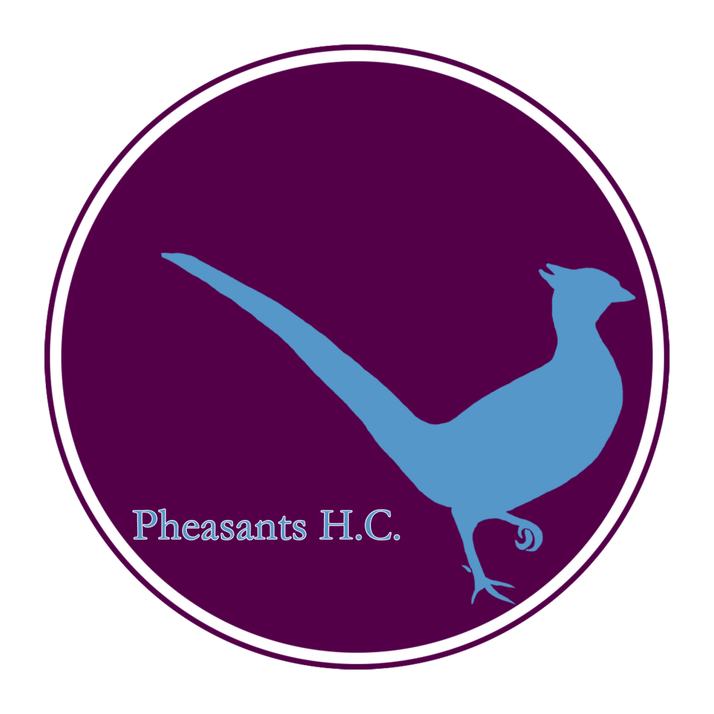
It’s a pheasant in our colors. Because we’re Pheasants HC, remember? This isn’t hard. It’s a circle because it’s easy to make in photoshop and would look good on a button. You should never think you’re too serious for buttons.
The Kits
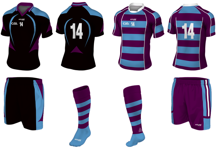
Hurling kits are interesting in one way – from what I can tell there’s only two kits. The keeper wears the one that the team is not. So if the team’s wearing the home kits, the keeper wears the away kit.
I think I meant the blacks as the original home and the hoops as the away, but now it would be the opposite. But like always, the designs are a reflection of what I’ve just decided is the team’s motto – Don’t take yourself seriously, no one else does.


