Welcome to the fourth annual Kit Nerd Day!
That’s right, I’ve done three of these already, and so far I’ve successfully predicted literally zero of the kits. Of course, that isn’t necessarily the point. The point is for me to have fun and for you guys to get a gander of all the crazy ideas constantly going through my head.
For those new to the site: every year around the end of August I do a post with some ideas and thoughts about next season’s kits. So just to repeat, these are ideas for the 2018 season.
And, like always, let’s start with some disclaimers. First, I am not a professional. I don’t work for Detroit City FC or any of the major kit design companies. I’ve used all images without permission. Nothing I post represents an official direction of the front office or any one tangentially involved. Remember – the FO actively works to fuck with me and they’ve even told me.
Any potential sponsors/leagues, these are not endorsed by the FO, the NGS, or anyone else. I make them for fun.
So the first thing is thoughts on last year’s kits.
Fuck. Yeah.
I mean, that was a crazy season. Beat two professional European teams. A new record-sized crowd was there. We won the Midwest. We attracted attention from all over the world through our friends at Copa90US. Keyworth’s stands are nearly completely opened. The “Wolfpack” started as a meme and ended up as a rallying cry. I got to meet Peter Wilt, who’s setting up NISA, in the stands at the Key. So that was pretty awesome from just a soccer-nerd standpoint.
Oh.
And Lansing blew a 3-0 lead.
As for the kits: the hoops returned! We did actually get throwback kits (to the ’67 Cougars). We even made the long-desired, long-awaited switch to Adidas! That’s fucking awesome. These kits were way better quality than the Nike’s. Way better. They did come at a higher price tag for us, but damned were they fucking gorgeous.
Across the board they were fantastic. From the hooped rouge on rouge on rouge kits to the golden away days kits (which saw quite a bit of use at home) to the fantasticly simple charity kits to those drop-dead gorgeous Cougar throw-backs. There are three 2017 kits in the Kendall-Collins household. I feel that is too few, but it is what it is.
Adidas pretty much owns US soccer, namely through their agreement with MLS, which IIRC was just renewed. Nothing of their really struck me this year. Portland’s home kits are more reminiscent of their third kits from previous years, which is nice.
Atlanta’s kits are pretty good. I’m a fan of the black/red combo and the grey and red makes for an interesting away. Columbus got their yellows back. That’s good. New England has an interesting 50/50 kit, rare on this side of the pond.
I noticed a few “default” designs either leaked into MLS or out. Atlanta’s home kit. NE’s home. Columbus’s away. Houston’s away. Plus any solid color kits. Not a good or bad, just something I found interesting.
Okay, some thoughts about DCFC kits in general before I move forward with unveiling my designs.
According to Crain’s the deal with Adidas is a multi-year agreement. That means I can pretty easily open up the Adidas miTeam app and fiddle around. But instead of using their kit builder, I’ve chosen to instead create some designs based on what’s available in the kit creator. So these designs should be entirely possible for Detroit City to don for 2018.
Moreover I’ve learned about when they actually put in the orders, so… I know that I’m ahead of the curve here. Fingers crossed. Is this the year we get the Nick Kendall kits?!
We’ll see.
One last note:
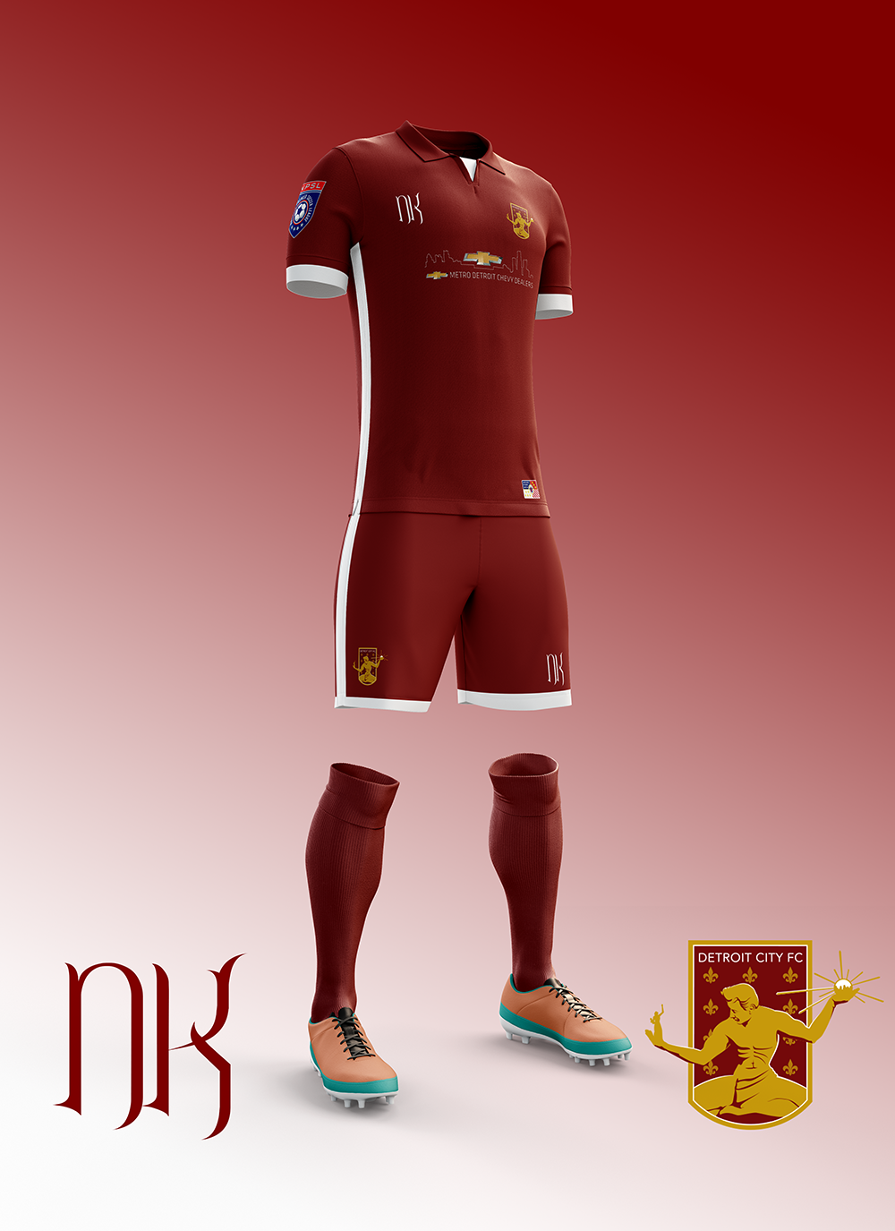
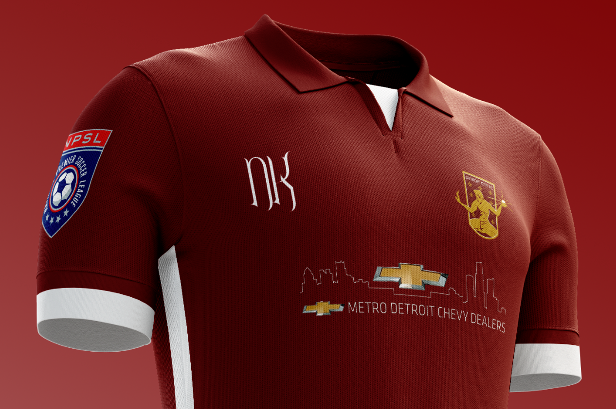
Sponsor – Stroh’s
After the loss of Flagstar as a sponsor, I’ve had to switch it up. I’ve more or less fallen into the rut of using Stroh’s because damn it looks great on our kits. Now, I don’t actually think this will be a thing because I think the deal with Metro Chevy Dealers also has multiple years left on it, but I’ll be damned if I stick a bowtie on my designs.
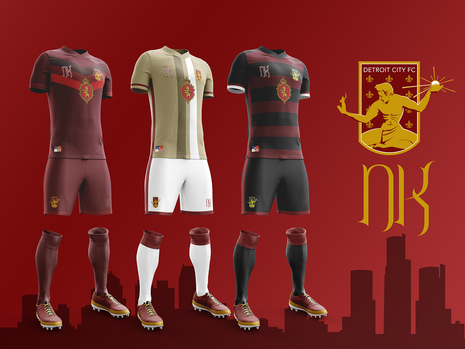
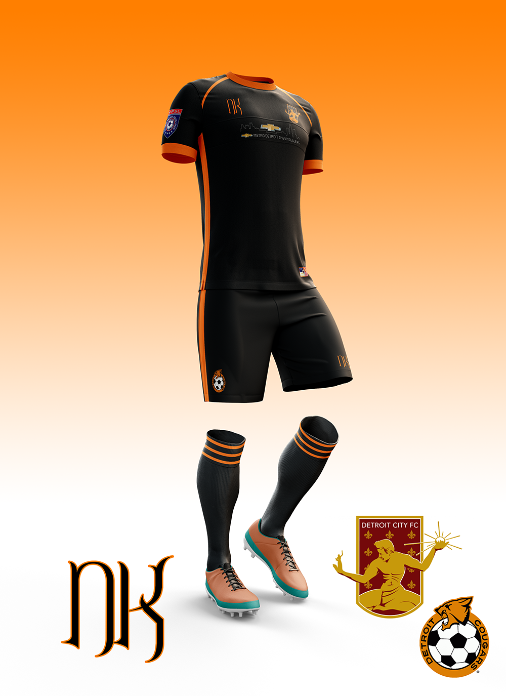
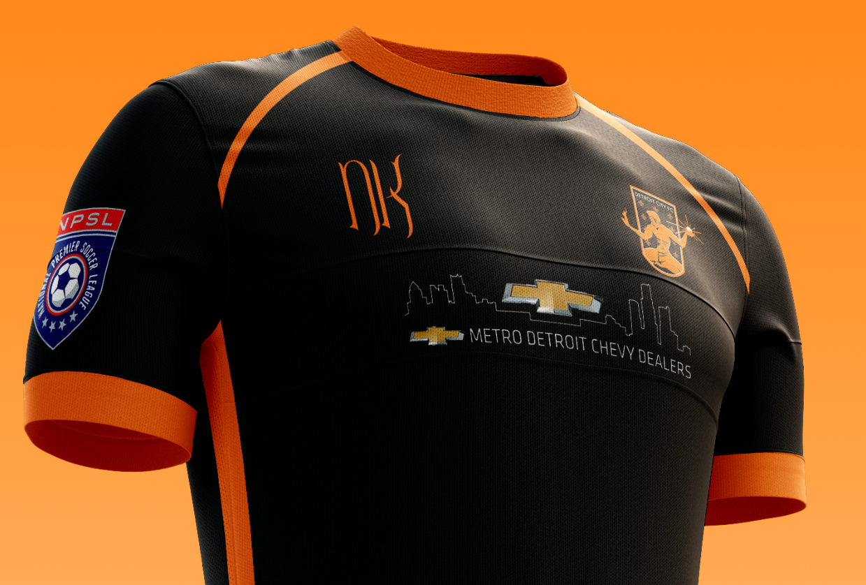
The Home Kit – Wolf’s Bite
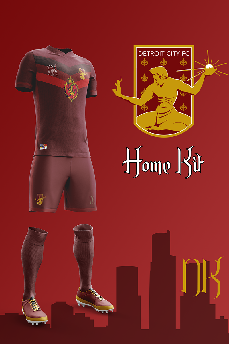
Starting from the top, my prediction for the 2018 home kit. Based off Adidas’ chevron design – the chest is broken up by a bloodied dagger like a wolf’s blooded maw. Put five or six of them together and you’ve got yourself a fearsome beast.
I’ve stuck with the darker shade of rouge for the main body, adding just the barest hint of a lighter shade for the accents on the side and on the edges. And at the very bottom, just above the hem, is the flag of Detroit.
The Away Kit – Upwards
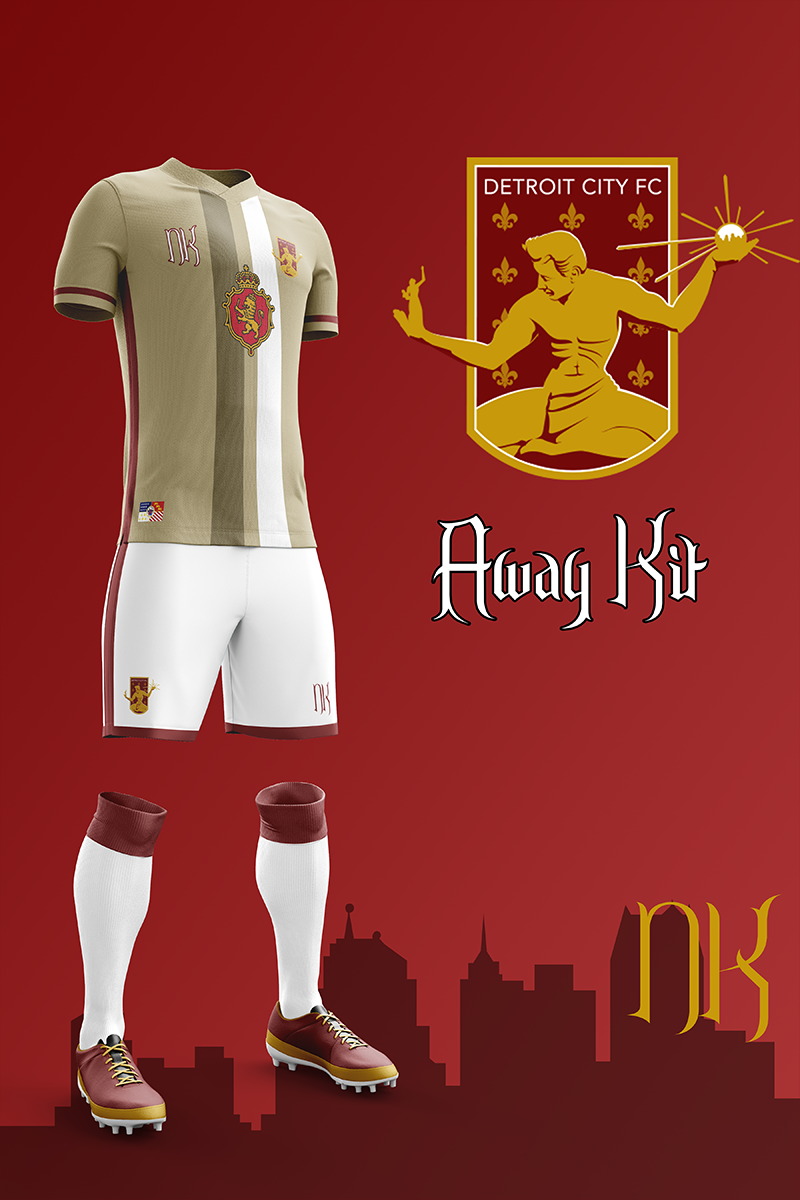
Next up is the away kits, I want to continue the gold and white kits. I was extremely happy to see them make a return after too many seasons away. We’re the blood and treasure, rouge and gold allez allez, so let’s keep it going. Whether we end up in NISA, NASL, or remain in the NPSL it’s all coming up City.
This design is based on the same design that they use for the New England Revolution’s home kit and has since become a default design, only here the stripes go the whole way through. The rouge accents are far more visible on the gold and white, but remain consistent with the home kit.
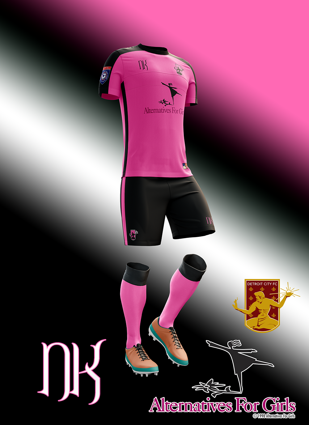
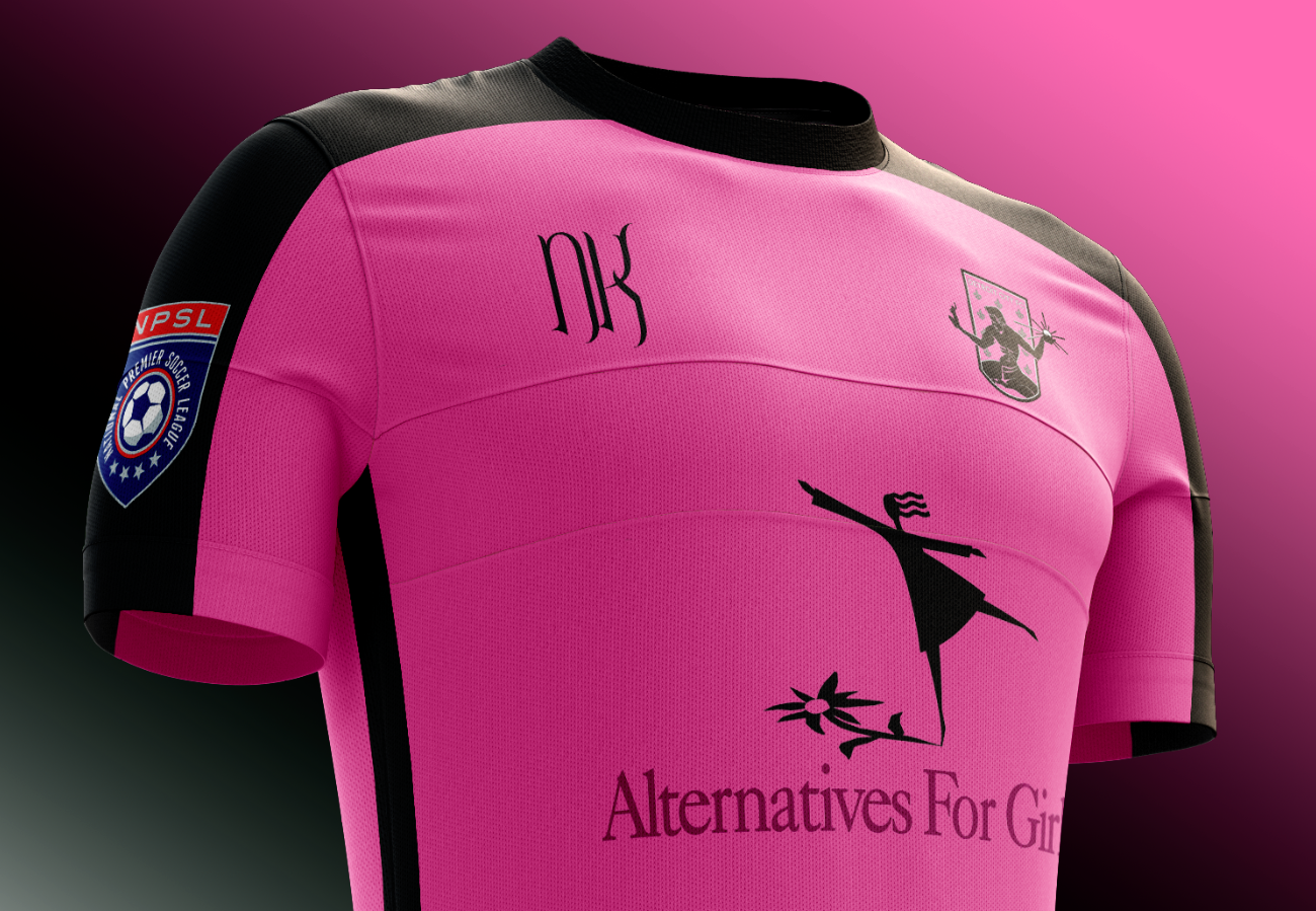
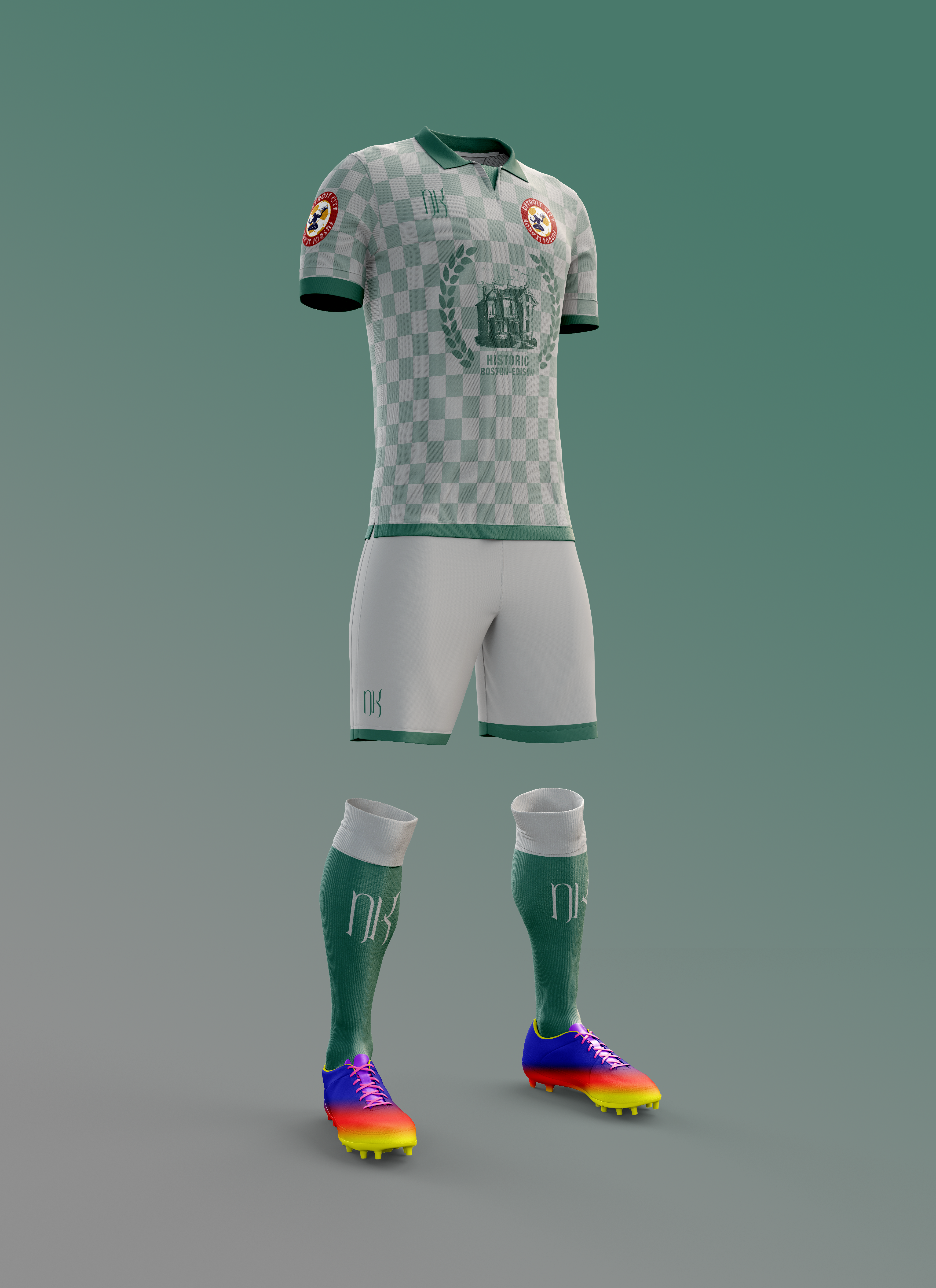
The Charity Kit – Soccer’s Heel
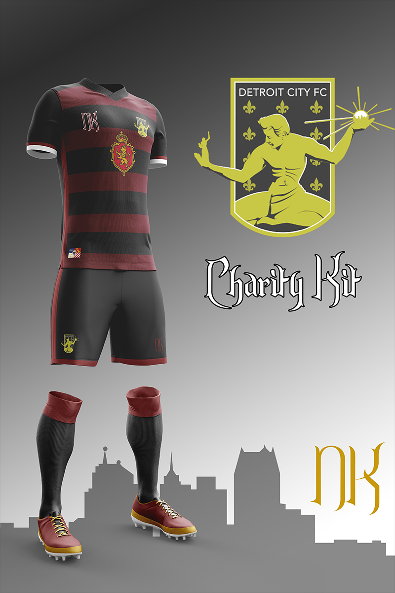
Not everyone gets to be a good guy, someone has to play heel so some self-righteous prick can play face and tell himself that no matter his own faults, at least he doesn’t light off smoke, swear, and have too much fun in the stands.
Harking back to arguably one of the greatest teams of all time and certainly back to the single most beautiful Adidas kit ever the charity kits are a combination of black and rouge that begs, begs to be unleashed on the pitch.
Let the soccer moms tremble, everyone’s favorite team to hate is here.
There it is everyone, Kit Nerd Day 2018! What did you like? What do you hate? What do you want to see the Boys in Rouge don this year? Let me know either in the comments or on twitter.
I’ll keep posting extras on twitter as I usually do.
And as always; Lansing blew a 3-0 lead.
Cheers everyone!