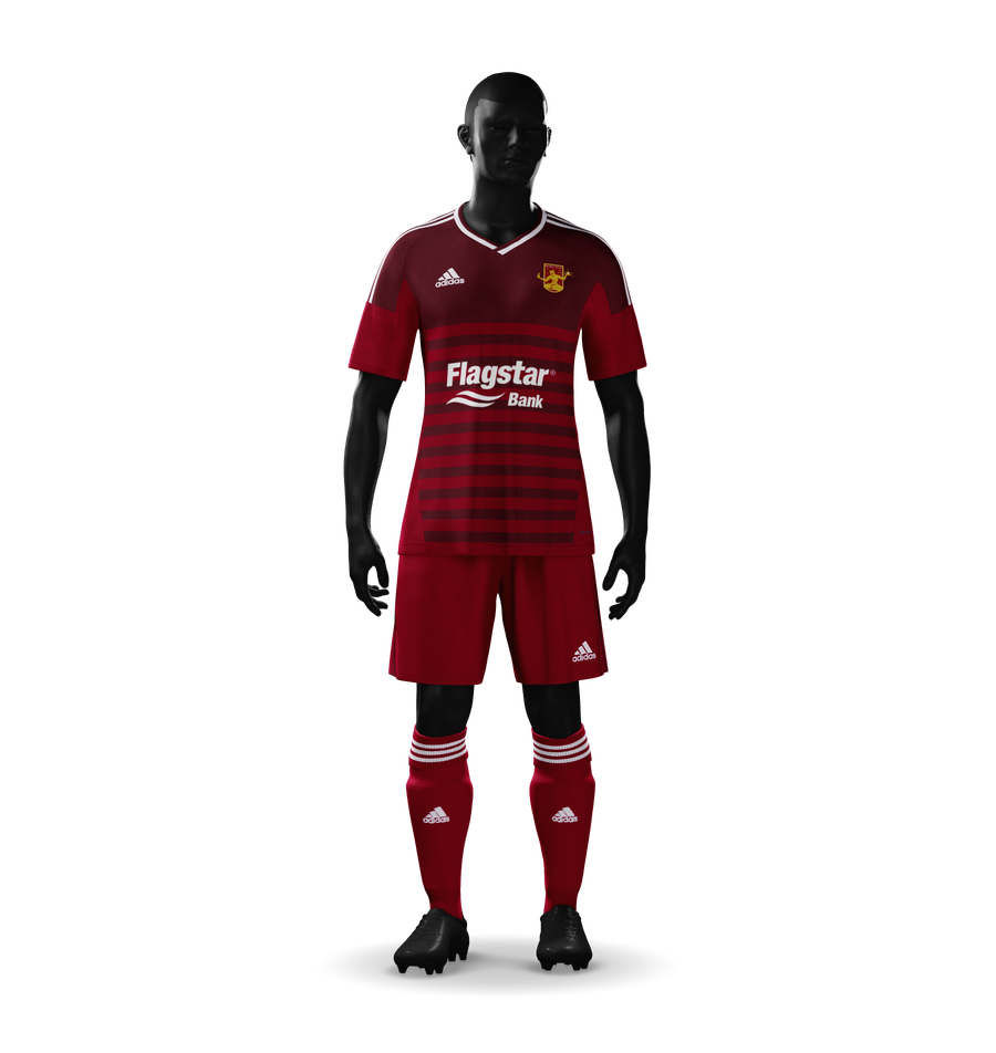
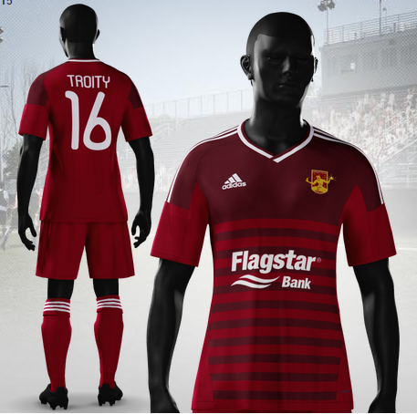
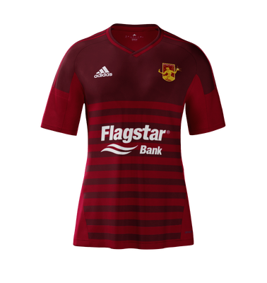
These are some earlier ideas for the home kit, before I went straight rouge and rouge.
These two have some white accenting on the socks and on the kit itself. I ended up thinking that it was a bit like last years: just too much. So I simplified them a bit.
While this one only retains the white on the Adidas logo. Even this felt so of… weird. So I set the logo to be rouge too, it helped the sponsor stand out and just made it nice and clean.


