So this post has been a long-time coming, originally meant to be posted way back in November, I was dealing with some other issues that I glossed over briefly in a twitter thread in the context of talking about my daily word counts. Right when I was hoping to get this out, during a four-day weekend around Thanksgiving.
That didn’t happen.
Actually, thanks to some work-related stressed that spilled over into my real life, not much of anything got done. Including my normal writing or perhaps a bit of blogging.
Anyway, this has been postponed long enough.
This is a project that has been floating in the back of my mind for quite a while now, namely it is a rebranding of a team that has caught some (justified, if you ask me) ire lately due to their name and their iconic mascot: the Cleveland Indians.
For the uninformed, I am a Cleveland native and not much of a baseball enthusiast, but that itself needs some discussion. I don’t care for the actual sport of baseball – which I find a boring, tiresome drag – but I do love the traditions of baseball – which I find fascinating and lovely in a quaint kind of way, but it’s a good quaint, like finding a small midwestern town and stopping in a dinner for a shake, having a great time, and then asking yourself why you don’t do it more often.
Cleveland’s mascot, the maligned Chief Wahoo, goes back a long way. He’s, in short, a caricature of a 30s racist rendering of a native american man. And as of writing there are a lot of signs, including selective marketing images and the ever-present rumble of political correctness gone mad that Chief Wahoo is about to be binned permanently.
And good riddance, though it does mostly defeat the purpose of this post.
There’s a lot of ways to deal with this issue and Cleveland is taking pretty much the compromise route in that it’ll leave most people unhappy, but I can’t speak for the native americans in the least, but the name “Indians” is still there and there’s still baggage with that and I know for a fact that people were running out and buying up as many Chief Wahoo hats as they could so they’d have a stock to either sell when they get rare or to wear at games as long as possible.
That strikes me as a little crazy, to be so dedicated to something that is causing a peoples whose history since 1492 has been “how low can low go” feel even lower. Perhaps sports and empathy aren’t supposed to mix in the minds of many, but I’m not of the many. Sports are about empathy and community. So let’s cut to the case.
I’ve been waiting for nearly three years to have the ability to rebrand the Cleveland Indians. Three years. It came in steps. First it was finding the TIF-based images that allow me to work in a pseudo three-dimensional space. Those are the kits you see quite a bit both on this site and on many other sites. Second was finding a baseball version of that template. There’s been one floating around for a few years, and they’re gorgeous, but they’re also $80, which is a bit more than I expect to ever make from this project. But, in the last few months, one did come out, and it’s a pretty good one, cutting much of the kit into much smaller chunks than the soccer ones.
So let’s begin:
As these things usually start, some disclaimers: this is a personal project. I have not discussed any of this with anyone remotely representing the Cleveland Indians nor any group advocating the removal of Chief Wahoo.
These are not official, sanctioned, &c &c.
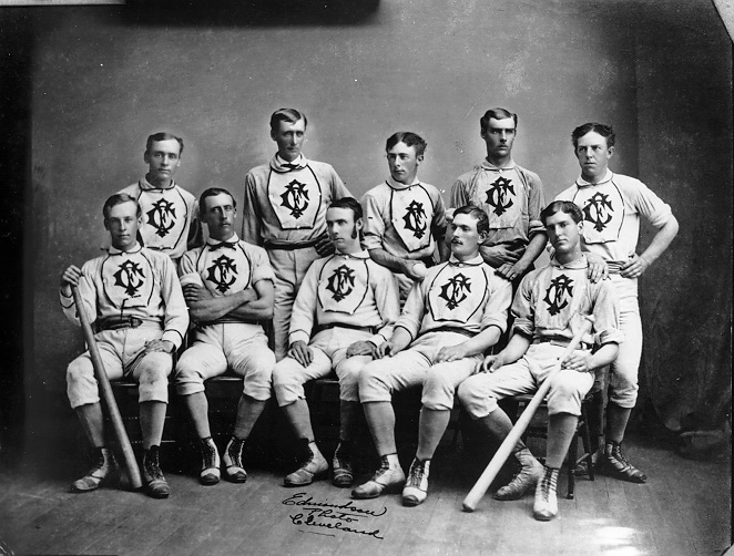
In 1868 an amateur baseball team formed in Cleveland that, following the Cincinnati Red Stockings, joined the professional ranks in 1871. This team, which would only play two seasons at the professional level, were the Cleveland Forest Citys (note: not “cities”).
They finished their existence 16-35, as this was back when teams played once per week.
This is where I am going to start – with a plucky little team in 1871. Now, Cleveland had other teams between then and now, but I wanted to focus on the Forest Citys for a few reasons:
- The 150th anniversary of professional baseball in Cleveland is 2021, a scant three years away
- “Forest City” provides a much more blank canvas for me
- I wanted to focus on the tradition of baseball rather than aim for a “Disney-fied” team name like “The Spiders,” though a strong case can be made for “The Spiders” and I’d love to see someone tackle that
- I believe that by mixing a strong heap of history into this mix, it will be better received by fans and…
- An all new look and theme will help discourage people wearing Chief Wahoo gear to future games. Sure the die-hards will never stop, but I think that more casual fans will just buy a new cap and eventually a new shirt and it’ll be pushed out of the system quicker this way. Keeping the “Indians” name does nothing to discourage this behavior.
My starting point was the logo. If I couldn’t get that done, I’d be in trouble. I’m no good with vector programs, I’ve just never had time to sit and watch enough tutorials to get good at them, which I have a project to hopefully change that… more on that later.
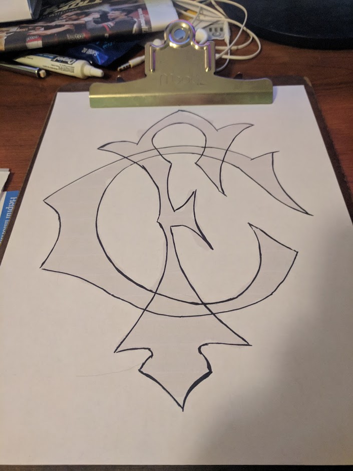
So for this we went the old fashioned route. I blew up that picture above, picked the most straight-on dude, cropped everything out, and printed out a giant FC monogram. Which I traced. Three times.
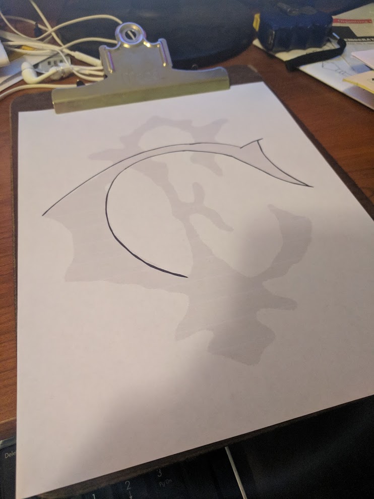
Here’s the start of the initial tracing.
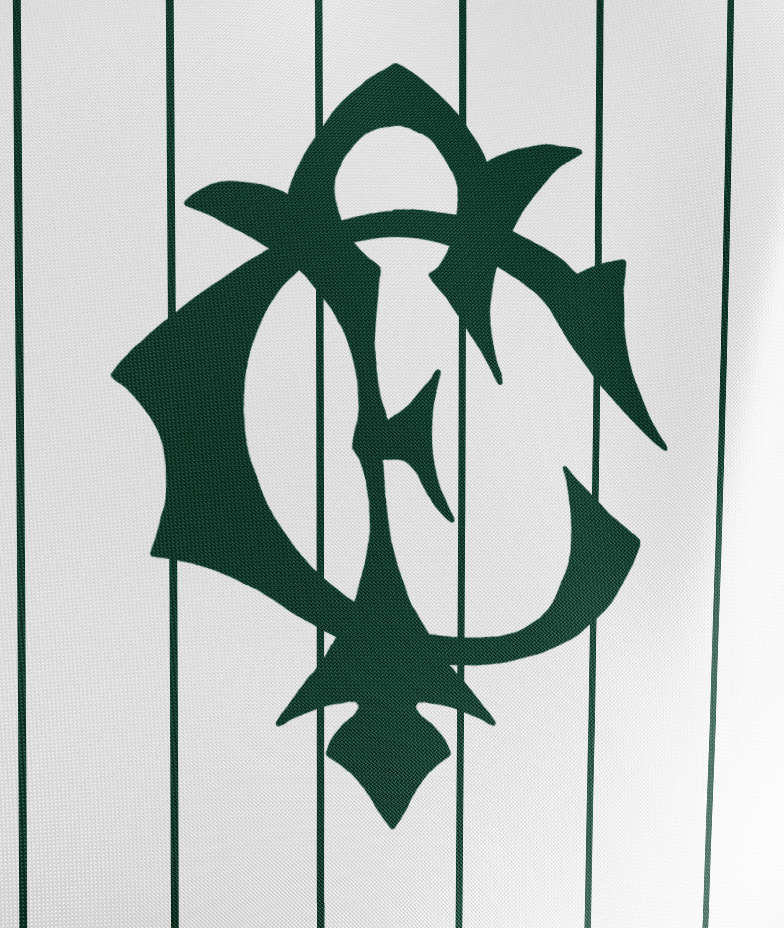
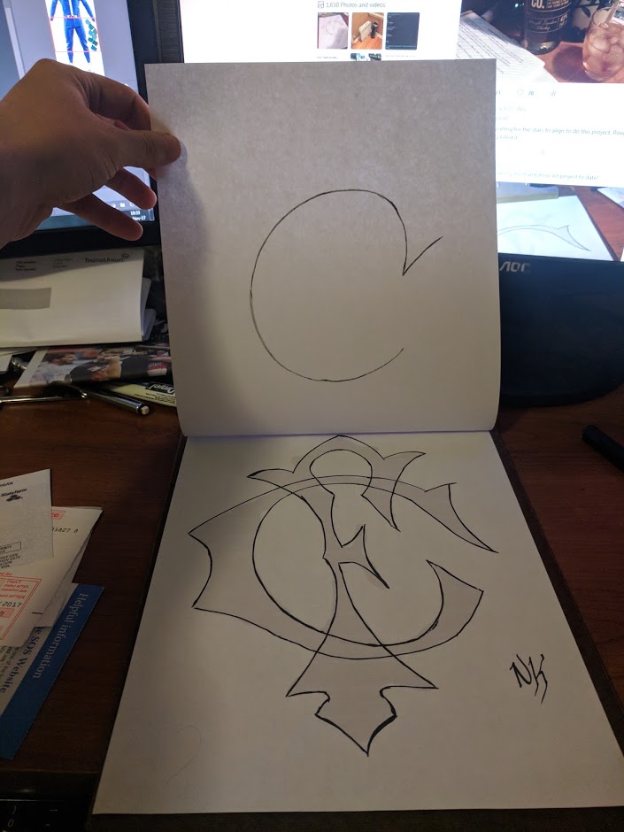
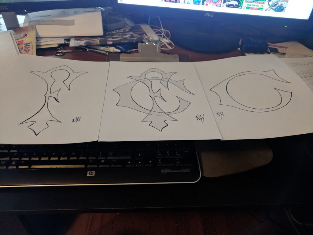
This is the finalized trace of the monogram. But just in case, I wanted the letters separate, so I then used my trusty clipboard to make two more tracings.
And then finally:
I scanned these in at 600dpi black/white so I could then bring them into photoshop for post-processing.
Not the best, but I’m very happy with how it came out.
The next thing I started to work on was the color scheme. I’ll admit to being ignorant to what colors the original Forest Citys wore. I probably could’ve done a deeper dive into some historical records, but in the end I knew I wanted forest green for some pretty obvious reasons. Alongside green, I wanted to stick to the traditional colors of black and white.
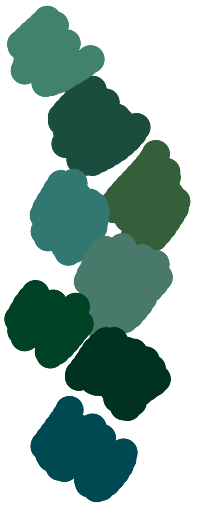
So I loaded up the wikipedia page for shades of green, and began to pick and choose some of my favorites, building a palette of colors to ponder over and consider. The final cut of those looked like this:
Each one had pluses and minuses, some were too blue, others too grey, some too green even. The one that I chose is the second from the top. I think it balanced out the dark, the greens, the blues, and the greys. For those interested, it is called “Brunswick Green” and was historically used in many settings including auto racing and passenger cars on trains. It’s also sometimes called “English Green.”
So with the logo and the color scheme picked out, it was time to design some baseball ki… um… uniforms.
Going into this project, I knew precious little about how baseball uniforms “worked” (for lack of a better word). Generally, in football, you have a “first” kit, which is strongly rooted in tradition; a “second” kit, which can be rooted in tradition but more often is a canvas for creativity; and a “clash” or “alt” kit, which is almost always a departure from the norm and is intended for use either as a charity thing or in case both the first and second kits are ruled to clash with the home side. This actually came up recently: in the Hibernian vs Celtic game on the 10th, all three of Celtic’s kits were ruled to be “clashing” and they were forced to dig out last year’s charity kits in order for the game to start.
Baseball teams usually have three or four uniform choices as well. A white set for home games. A grey set for away games. And then a number of “alternative” sets that are colored and may be used whenever. There are some other rules that seem to come up. First home sets usually have the team name/logo on them. Away sets have the city name on them. And alternatives have a bit more leeway.
There’s some history behind this. Back in the day, grey sets hid dirt, so require less laundering – an advantage when you’re on the road and don’t have access to your cleaning facilities. Whites required more cleaning, but the home side did have access to cleaning facilities, so that’s not a problem.
The team vs city name basically came from fans know the home side by their name, but might not know the away side. Back before cell phones and access to a constant stream of electronically broadcast information, this was a legitimate concern.
These traditions provided an interesting design space for me to work with. And there were other concerns, thoughts, and ideas as well. For example: Pin stripes? Or no? Monogram? Or team name? “Old English”? Or Block?
If one thing is obvious so far, it’s that I chose to go with a monogram over a mascot or one of the more “modern” names that are based off some kind of [NOUN]. I wanted to go back to a very traditional looking form.
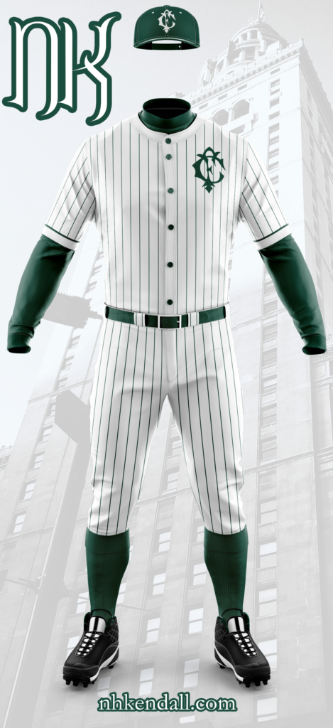
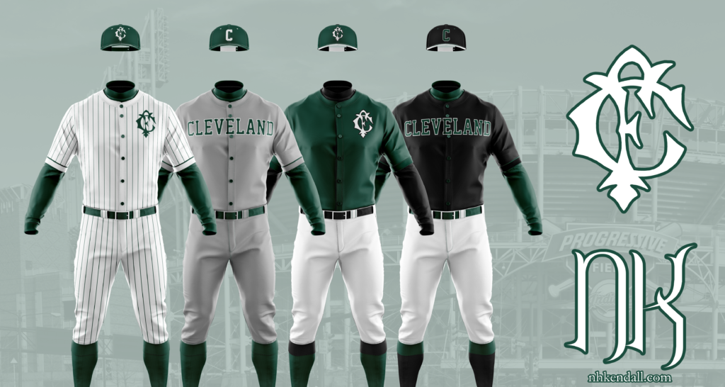
The Home Uniform
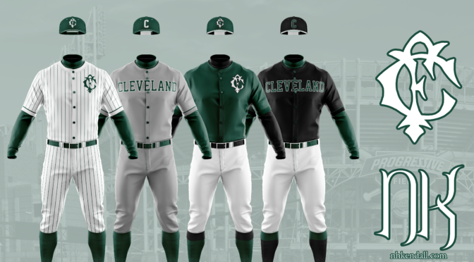
For the home uniform I went with pinstripes, which I think is probably the most controversial thing you’ll find in this post (other than the concept of entirely removing the branding of a much-beloved MLB franchise). Brunswick Green dominates the secondary features: pinstripes, undershirt, cap, belt, buttons, and stockings. Instead of a team name, I went with the monogram over the left chest. It gives a clean look that really lets the pin striping do the heavy visual lifting. White accents the caps both in the monogram and the stitching.
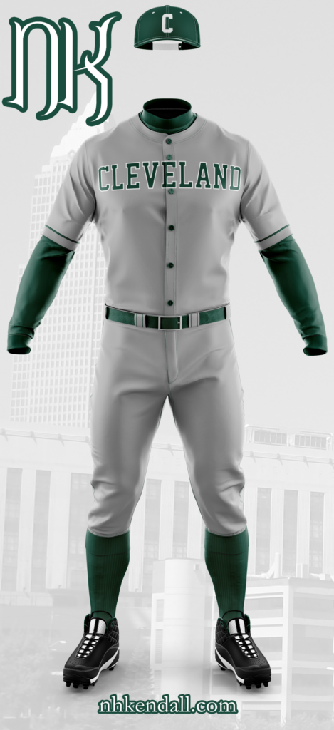
The Away Uniform
Brunswick Green continues to be heavily represented in the secondary features here, but the plain grey with block lettering takes over in the traditional away uniform. A few features remain from the home uniform: the piping on the sleeve roll-over for example, and the two pinstripes on the front-most belt loop. The cap is still green with the white accents, now with the block C in white front and center.
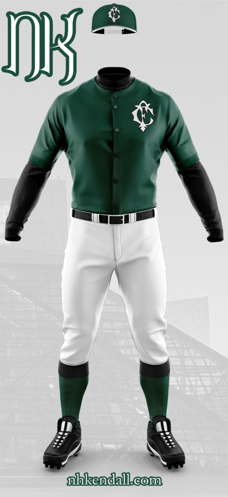
Alternative One (Color Uniform)
For the first alternative or color uniform, I went with a Brunswick Green jersey and plain, white pants. The stockings are no longer a solid green: they have black flip-overs. The piping on the jersey’s sleeves has been removed for a crisp, mono-color look. The undershirt and belt have been made black and white is more heavily featured on the cap, which instead of all green with which stitching, now has a white bill and green stitching. The monogram returns, this time in white with a black stroke.
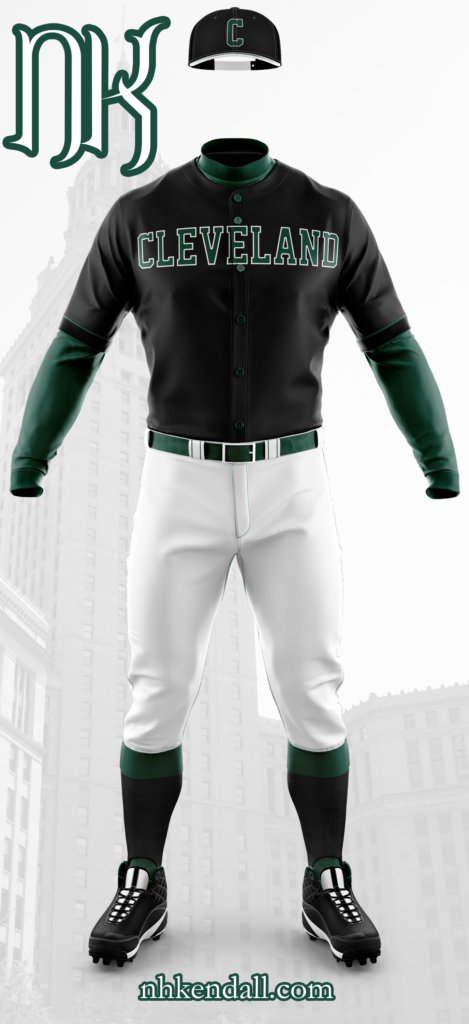
Alternative Two (Color Uniform)
In many ways this is the inverse of the previous uniform, though the white pants remain. Undershirt and belt are Brunswick Green. This uniform has black stockings with green flip-overs, the piping on the sleeves returns in green. The buttons remain green as well. The jersey itself, though, is black with green block lettering, stroked in white. The cap is black, with a white bill and green stitching. The block C is featured here in the same green/white combo as the jersey itself. Of all the uniforms here, I have to say that this one is the most striking to me. The combination of the dark green, black, and white really comes together here. Especially the white stroke around “Cleveland” and the block C.
Over-all, I am extremely happy with how these four uniforms turned out, though perhaps I am a bit biased about that. While I have no doubt that the Indians are probably not going to do a complete rebranding this late into the argument, especially with stiff resistance from a vocal part of the fan base, it would be fantastic if they did or maybe even considered a heritage match in 2021 celebrating 150 years of professional baseball in Cleveland.
If you are one of those vocal fans, I really do hope you give this some though, or at the least, you like the designs from an abstract, objective view (rather than thinking of me trying to replace your team).
As always, I hope everyone enjoyed this rather long read and liked the designs I came up with. This has been a bit of a passion project meant to force me out of my comfort zone by designing for a sport I am not quite so familiar with, that has a few more, stricter rules, about what can and cannot go into a design.
Thank you so much. Cheers, everyone.
Photo sources (other than me for the monogram process shots):
Forest Citys: Case Western Reserve
Stock art: pixabay.com

