Been working on a major flag project lately.
Hint hint.
I have a whole write up that I’m putting together for when it is done and unveiled going into the ins and outs, lots of pics, probably really dumb, but if anyone is interested when the time comes.
But in my off time I’ve… also been working on flags, or at least thinking about them.
The flags of many US states and even more US cities are abysmal failures in design, often containing little more than a seal on a bed sheet. Detroit itself has one-upped everyone by putting their seal on a clusterfuck of other flags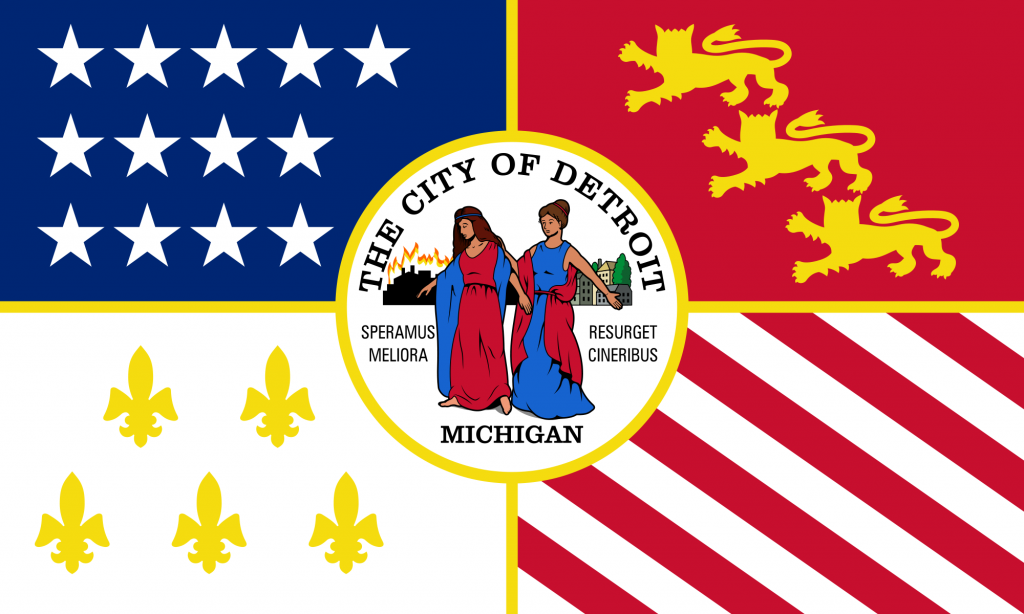
As Detroit City showed, dropping the colors to two (preferably rouge/gold) and removing the seal actually creates a lovely flag.

(Photo – Jon DeBoer)
Anyway, recently I took a wind of Michigander pride (before having it dashed by the likes of Rick Fucking Snyder) and designed a Michigan flag (which I posted to r/vexillology to a… mild welcome) and tonight designed a Rustbelt flag in general.
Michigan Flag
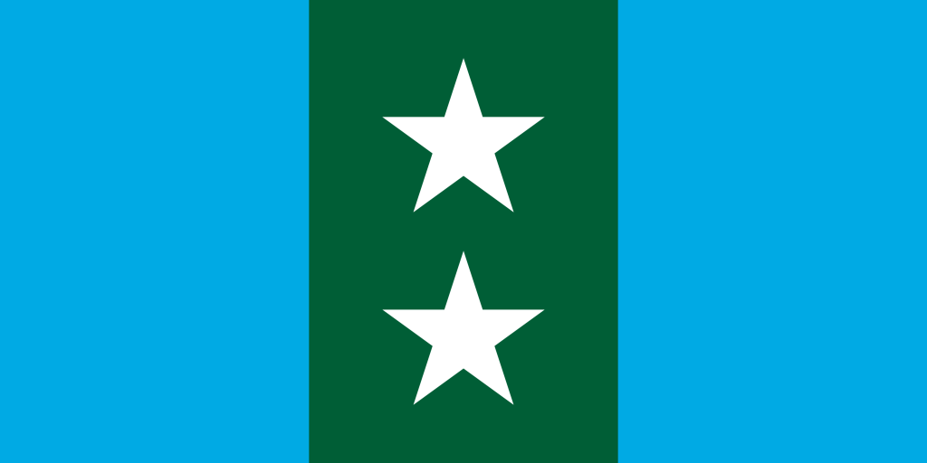
This is one of those basic flags that’s supposedly full of symbolism. Sometimes I like that – a flag with layers and a story, not just colors on a piece of nylon. Two bodies of water (Michihuron and Superior) surround a forested land (two blue bars and a green in the middle). The land is divided into two halves (two stars and the 1:2 ratio) but in the end is a united whole (stars inside solid green bar).
Simple. Elegant. Slightly reminds one of a flag likely found in a place where “President” is a title held for life or as long as the military stays loyal.
I’m personally a fan of the 1:2 tricolor design, same as used by the Republic of Ireland. I like when flags escape the usual 2:3 and 3:5 ratios.
As for the colors; a blue different from the usual dark blues used by many states (including Michigan) reflects the (once) clear Great Lakes and forest green for… well… our green forests.
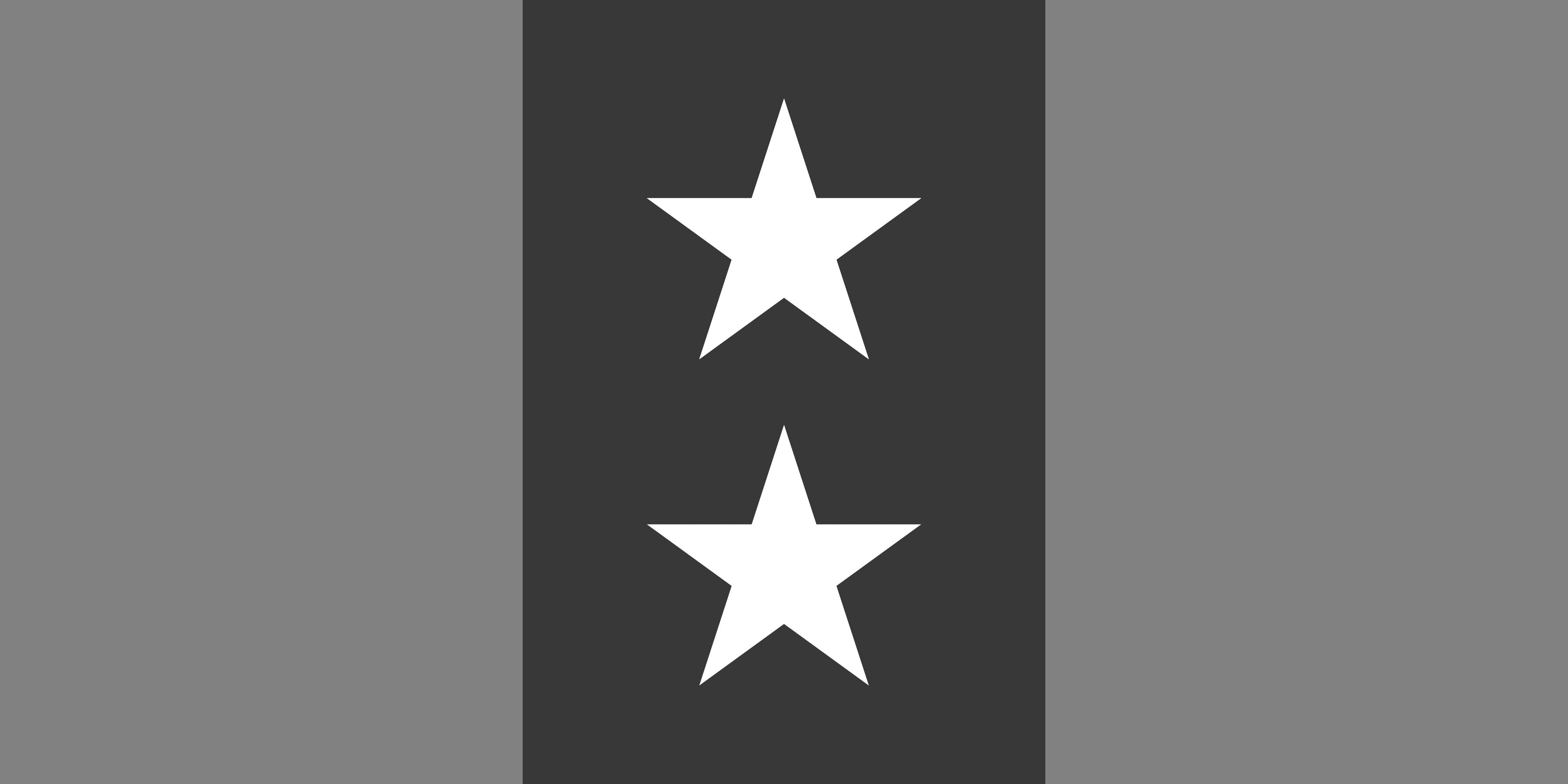
One of the things I wanted to practice with this flag is grey scale contrast – that is colors that when put in grey scale are still apparently different. This is why you often want to keep flags down to only three or four colors – so the contrast is different.
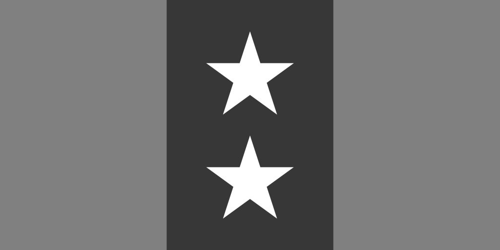
So here is the flag in grey scale and you can see that all three colors and still completely distinct. Why is this important? Well, often times, when printing letterheads or other documents, states use grey scale to save on printing costs. Right now most flags become a blackish smudge. This flag maintains its elements even when losing its color. So success!
Rustbelt Flag
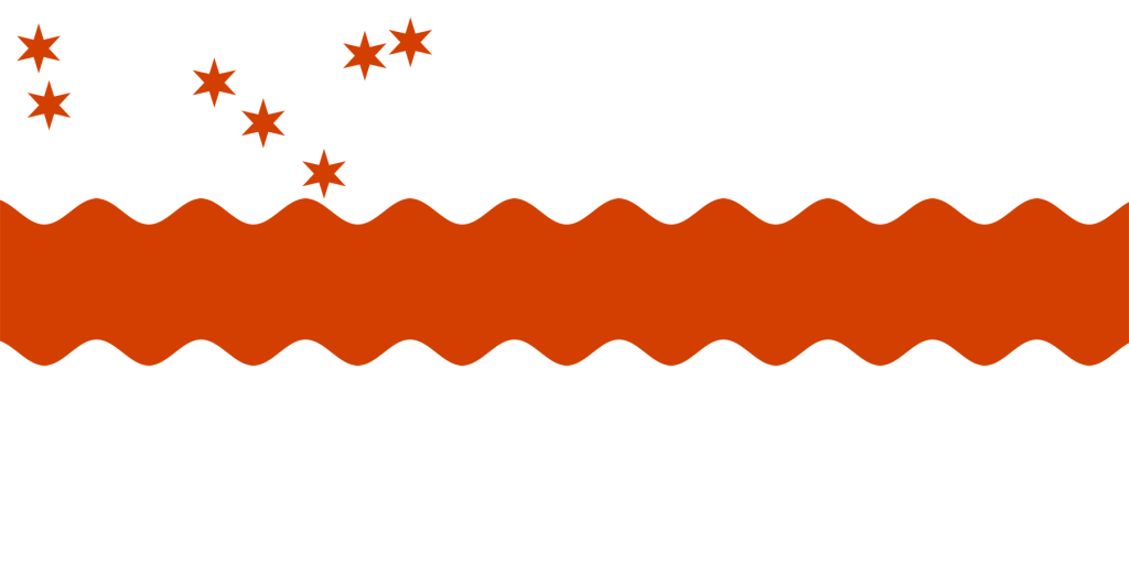
Another 1:2 flag from yours truly, this one with a bit more complicated of a design (though a common motif for the region). What better to represent the Rustbelt than an actual rusty belt across the middle?
Right now the background is white, though it was suggested to me to use grey for steel/iron. That might work, actually, but for now let’s leave it with the more traditional white.
To break the monotony, in the canton I’ve added eight stars to represent eight cities that come to my mind when I think of the Rustbelt – Milwaukee, Chicago, Detroit, Cleveland, Pittsburgh, Buffalo, and Rochester. They’ve been spaced out geographically across the top, leaving some room if I was pressed to add more.
Why eight? Just ‘cuz. Originally it was nine, but Green Bay is significantly smaller than I thought, so it got dropped. One downside to the current set up is that it sort of forms three distinct regions, not really hitting up that “unity” spiel I was going for. Maybe I should add Grand Rapids or something in Indiana as well as Erie, PA and get a better cohesion going – then again I don’t really think of those cities when I think of the decaying ruins of once-proud industrial cities.
Anyway, feedback welcome as always; and before anyone asks, yes – book two is going well and is totally not chaffing under my other flag commitments. I swear.