To be honest, I actually though I had until this summer to work on this post, which I usually do as a wrap up to the previous season, but noooo~ we’re going to do a mid-season kit change. So here it is fuckers, the kit post twenty-twenty-one
For those new to the site: HI! I mostly post about sports and kits, sorrrrrrry! If it helps I do have something in the works combining kits and trans that will happen eventuallytm. At the wrap up of a Detroit City FC season kit’s lifespan, I do a little write up about the last set, things I guessed wrong or right, and then come up with three new kits (home, away, alt) to get everyone excited for the unveiling of the upcoming kits.
If you want to check out any previous Kit Post, here’s a handy guide:
2015 | 2016 | 2017 | 2018 | 2019 | 2020
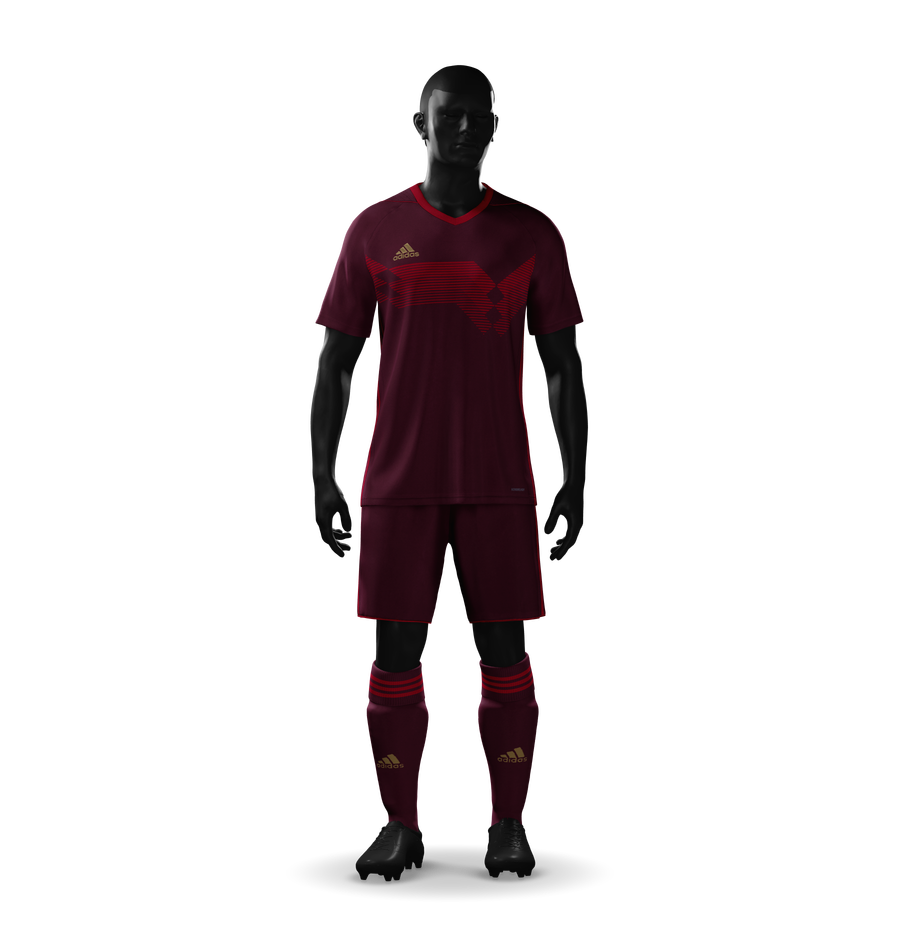
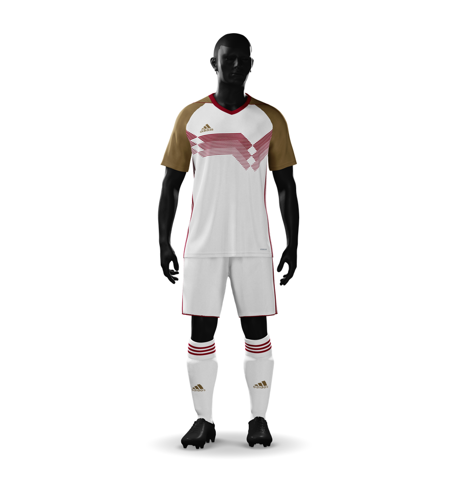
So in last year’s post I went a little off the beaten path and came up with some designs that were a little different both for Detroit City and for myself. I went with heavily sublimated kits in the vein of Inaria or Icarus with details across the actual bodies of the kits that would require some level of customization on the part of the manufacturer.
I think I was closest with the away kits, in which I predicted a white with rouge hooped kit and off-colored socks, and while literally none of that happened, the actual away kit was white with rouge pinstripes and has very much grown on me over the last year. It is, in fact, the 2020 kit that I own, as I rarely buy more than one. It was in the white kits that Le Rouge dominated the Fall Championship, and in those kits we hoisted the cup, which given the climate of 2020, was an amazing and cathartic thing to see. I, for one, will always associate the image of Stephen Carroll pouring an entire can of Stroh’s into his mouth with the Fall trophy with 2020. Victory in the face of adversity, celebration in the face of uncertainty will always be 2020 to me.
The home kits, however, were frustrating to me, visually, the pin stripes so small as to be effectively invisible from far away, yet so painfully obvious when up close, ruining an otherwise crisp kit. They didn’t do it for me, I guess, and this is obviously a quite subjective take. I think it was particularly rough following the very popular 2019 design, which was very, very clean and of course also came with a lot of baggage and trophies. Somehow, though, I don’t feel like I’m missing out not seeing another trophy or three lifted in that particular design.
And there were no alternative kits last cycle, thanks in no small part to COVID. So Nothing to say here.
Anyway, my usual list of disclaimers, which I’m just copy-pasting from last year because why the fuck not?
- I don’t work for the DCFC front office
- The DCFC front office fucks with me
- Kits shown here are not official direction
- Logos, league, and sponsors are used without permission
- Sponsors and league are not official or necessarily endorsed by our front office
- The reality of 2021 might be very different than what I predict here, I love the challenge regardless
I am pleased that so far Detroit City has resisted the temptation of highly sublimated kits, and happy that they’ve stuck with Adidas. We shall see if that continues (I suspect it will given the respectability and reverence for the brand). Say what you will, getting good kits from Adidas just has a certain something to it, it elevates Detroit City, and that’s not worth nothing, especially when you’re talking about charging $80+ for a soccer kit.
Assuming we stick with Adidas, we can actually have some potential throwbacks to our 2013 kits, though maybe those should wait for 2023, then? I sketched them up in October of last year. It’d also be really cool for 2022 being our tenth anniversary or even this year being our tenth season to see the club release a poster with all the kits so far made by Dave at Historical Kits. That would be a legitimate instant grab for me.
Anyway, we’re about 700 words into this beast, so why don’t we move on and get to the goods? Here are my designs for the 2021 Detroit City FC kits!
The Home Kit
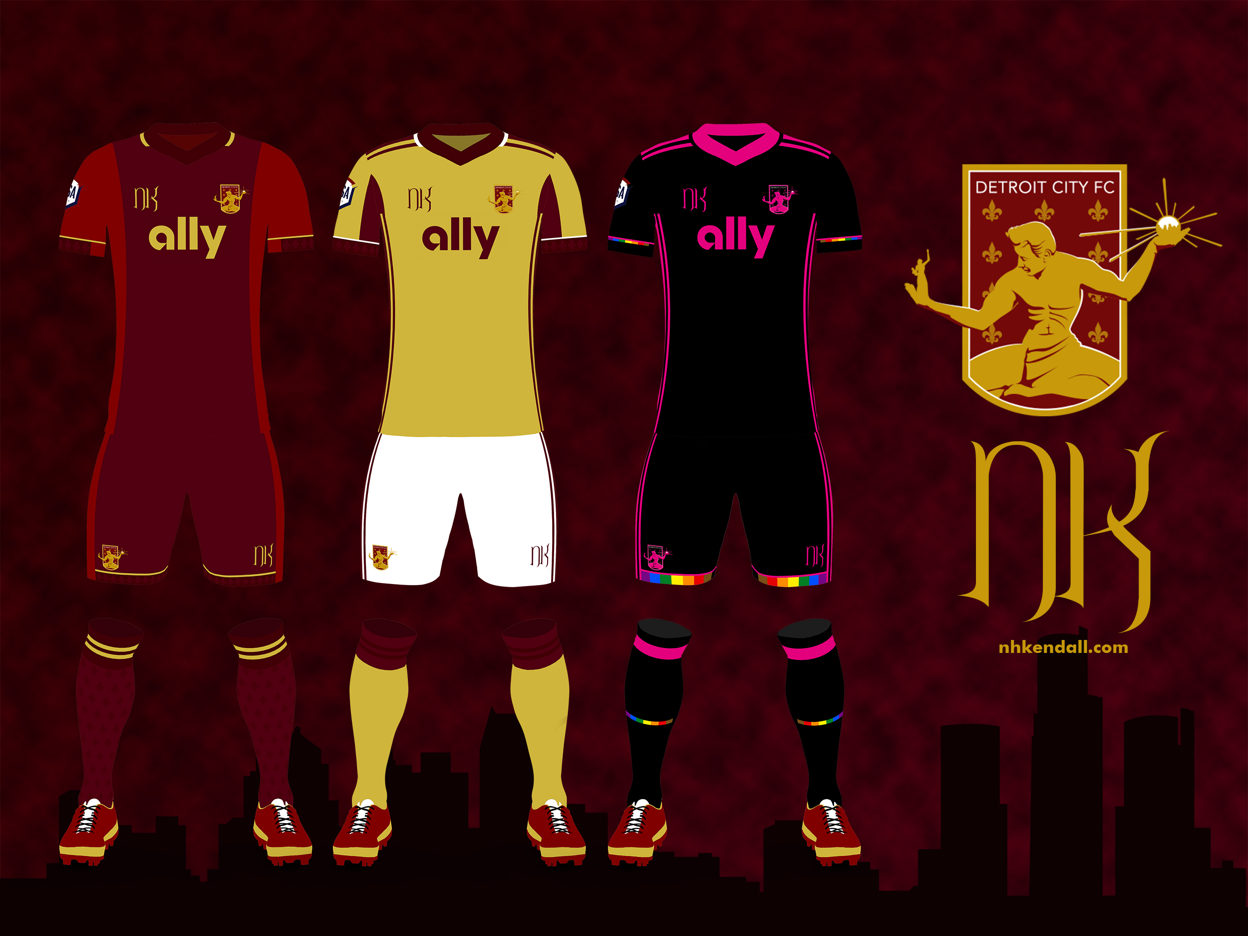
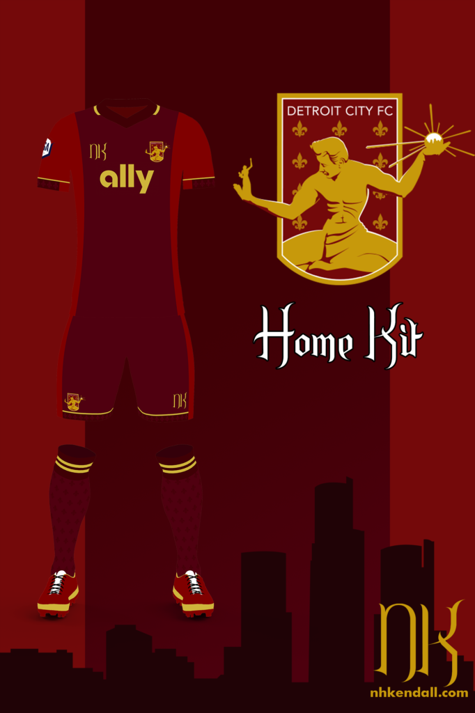
After a couple years of more complicated designs, I wanted to get back to something simpler this year, and that’s the theme of this trio – clean. Clean is a hard thing to describe. Clean to one person is plain to another, and plain is bad, it’s boring. So how does one design for clean while avoiding plain? Well, that’s really hard to say. For me, plain kits have no details, and they elicit little emotional investment. Small details, like the gold cuff stripes on the shirt and shirts, the fleurs de lis on the socks mirrored onto the shirt and shorts in small ways to me builds a cohesive whole.
For the home kit, I went with an old-school design that will be familiar to fans (and enemies) of teams like Arsenal and Ajax. The core of the kit is a darker, more purpley rouge, with the outside being brighter. The cuffs and the collar are the darkest, giving a boarder to it all, and of course small golden lines throughout make it cohesive. I always suspect my home kits will be the most divisive, and that’s no different here.
The Away Kit
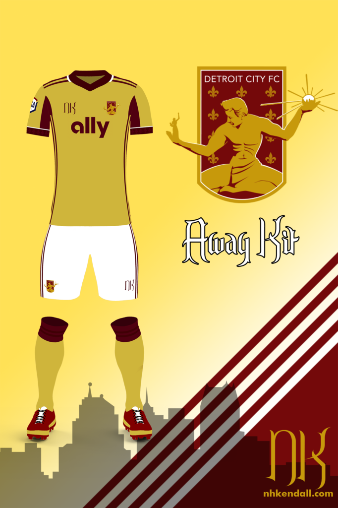
I really liked the gold and black kits from my 2020 set, and I started with that here. You might notice the same Adidas stripes turning into a colored inset in the pits and on the sleeves. But I wanted to walk away from the black because this is the away kit, which needs to get tied more strongly in with the over-all colors of the club. So here I went with rouge as was the case for the 2017 kits. Detroit City’s first away kits were gold, and they’ve popped up here and there, but gold is a difficult color to work with in manufacturing. In the end you are effectively left with two choices: sand or yellow? In the past, Detroit City has gone the route of sand, avoiding the garish yellows of teams like the Green Bay Packers.
When designing these, it felt very subtractive, which is an unfortunate feeling. I was removing features rather than adding them and here I was having trouble finding a place to add anything of note. I did bring back the fleurs from the home kit, this time only on the shirt, as I have let the shorts remain more clean, letting the white dominate. It is easy to overpower white, especially in the shorts. And I wrapped it up with tow-tone rouge turn-overs on the socks.
The Clash/Alternative Kit
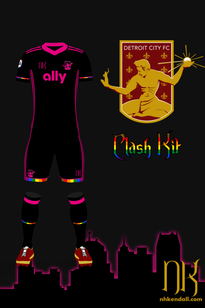
This one is by far and away my favorite of this year. I took a lot of inspiration from the popularity of the 2019 alternate kits, a keepers kit that appeared like exactly once as far as I am aware, and FC St. Pauli. When you have the word “Ally” written across the chest of every kit, it was hard not to want to lean into that in more ways than one. This kit probably took the longest, had a very strange evolution, and was workshopped a bit more than the away kit and far, far more than the home (I rarely workship home kits).
Pink and black are an amazing combo, it’s hard to do wrong, if I’m honest, and that’s good because there might be some fun stuff with Harper’s dropping soon that I’m very excited for. This kit was the hardest when it came to balancing clean and plain, or clean and over designed. Especially when you introduce the pride flag into things, you have a lot of colors competing for attention, which is why reducing them to thin stripes ended being just what the doctor ordered. Originally, for example, the whole cuff was a pride flag, which then makes the sleeves look busy, which then makes the shirt look paradoxically empty. I think the balance was struck here, and it is certainly my favorite design of the bunch.
Once again folks we have come to the end of another Kit Post. Like I said up top, I thought I had another two or three months to work on this, and with all the other work I’ve been doing lately, I was worried that I wouldn’t have the juice to get through this one on such short notice.
I’d love to hear any thoughts or other idea you might have on twitter, and if you like my work, as always – please check out my commission page for pricing and what to expect, as well as some of my recent designs.
Cheers, everyone!

