Category Archives: Soccer

Kits and Writing.

So I got some updates for the site we’re going to skip the “it’s been a whi-” and just move on.

A lot has gone down since the last update, including getting a fancy new position at Ford which I am greatly enjoying. That has made things a bit hectic but the last few weeks have gone by lightning-quick. I am really loving it.

I’ve also made the decision to work more on professionalizing my portfolio of soccer kits. Will it lead to a profession switch? Unlikely. Could I potentially make a few bucks off it? Maybe. Honestly, I’d love to see some of my designs become real. That would be absolutely fantastic.

If you read my twitter feed, which I don’t necessarily recommend Mum, I often post stuff while working including some snapshots of a big on-going project I’ve started.

What is this project; you ask.

Well, I am doing a big world building project set in the same world as my novels. It’s a big world cup write up, and it’ll have news articles, team profiles, stadium profiles, potentially player profiles, and a whole boat load of kits. At least 96 of them: home and away for 48 teams.

https://twitter.com/pirmas697/status/843948691451011072

I’ve already got 48 crests made, though I am not 100% happy with all of them. They were quickly thrown together with stock heraldry images from Wikimedia. Already I have about 18 kits finished, so I have quite a bit of work to do. And that’s okay, I’m planning on this taking most of the summer.

It’ll be fun and I’ll make sure to have a page to showcase it. Not sure how, but I got some ideas. I hope that everyone else will enjoy it half as much as I have so far.

https://twitter.com/pirmas697/status/845726249167339520

There’s a lot to post and explore so I’ll only have a few slices here.

Done on a whim for Paradox Interactive (not popular with the studio manager, Johan):

https://twitter.com/pirmas697/status/845044112688590848

A little idea for Bristol Rovers FC:

https://twitter.com/pirmas697/status/845740747567611904

And of course Detroit City FC:

https://twitter.com/pirmas697/status/839234507572199427

https://twitter.com/pirmas697/status/838910793286565889

Another quick mock-up for a friend:

If you have any ideas or criticism, reach out on twitter. Currently I take requests on an impulse-based sort method. Not sure how long that’ll last, though. As the Detroit City season quickly approaches, my free time will soon dissolve to nothing.

On the flip side some news regarding my writing. I have finished the rewrites of book 2, finally! It has grown by about 10,000 words to 137,000. I think the pacing has been improved and I’m happy with it in general. It’ll definitely need a final smoothing that’ll come once I get the drafts for books 3 and 4 done, which I am going to start in about ten~fifteen minutes when I am done here!

I’m pretty much actually being productive, which is great. It feels great to be getting so much done.

Of course, as I write this, it is a quarter to eight and I’ve been trying to get this done since before four… then I got distracted with the Bristol kits.

So I am going to sign off and get back to writing. I got a long way to the expected 175,000 words of book 3.

Cheers, everyone.

The Winding Road

Today I went on a bit of a winding road of world building and it all started because I wanted to make a soccer kit. Over-all the kit took about ten minutes to make and the world building took about four or five hours by my count. It involved conlanging, linguistics, some alphabet work, image manipulation, heraldry, and then eventually some soccer.

Let’s get a baseline.

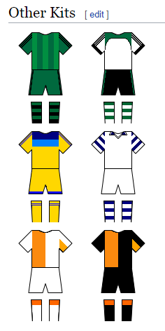
Anyone who follows my profile on Wikipedia (if you do, wow, that’s uh… dedication…) will see that I often just “doodle” soccer kits there using the Wikimedia template for kits. In the last week I added six more:

These are meant to represent home and away kits for three nations from the world of my novels sped up to the “present” day (about 450 years after my novels). Why? Because it’s fun for me. The top two are Hadyrland, the country most of my novels are set in; the middle two the Union, which is heavily involved; and Steriou, which a couple characters have ties to.

Note: yes, the three shades of orange in the bottom two bothers the FUCK out of me.

The national sport of Hadyrland is Kémõ /keɪmɔ̃/ (Hurling) and the national sport of the Union is (in Hadysh) Wixgaħ /wɪxgaʁ/ (Cricket). I have these words because they are in my novels. I’ve even posted about Hadysh Hurling in the past.

But like in this world, just about every nation plays football, which is also the national sport of Steriou. And also like in our world, there is a big international organization that regulates the sport and organizes the world game between all the nations.

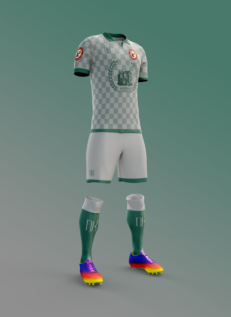
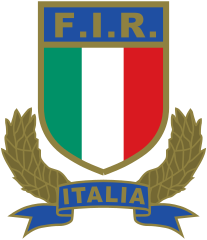
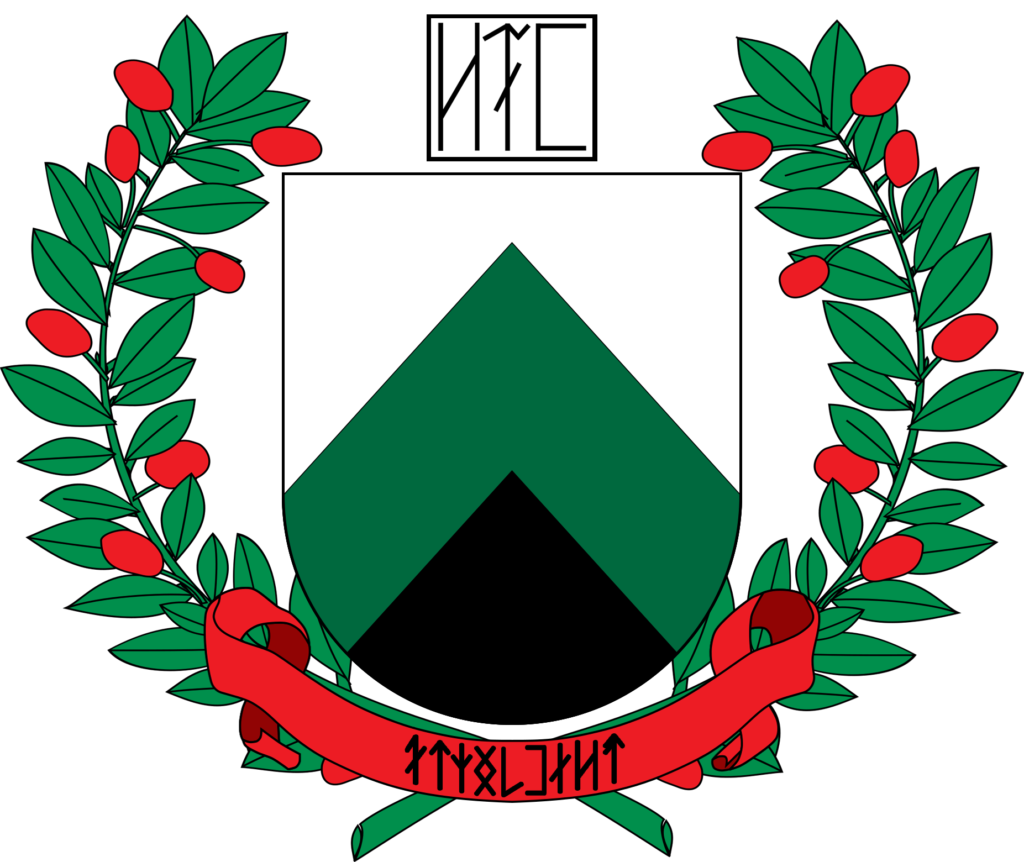
I wanted to make a realistic rendering of the Hadysh home kit, so that meant I needed certain details, like a crest. The crest would need some details too: shapes, colors, labels, elements. So for that I started with the crest of the Italian National Rugby team (they played today, so it was on the mind). It’s a simple tricolor crest with the initials of the national rugby federation on top and the name of the country at the bottom. Plus a little wreath.

So that’s where I started. Hadyrland’s modern flag is also a tricolor, though with horizontal bands of white, green, and black. This physically represents the nation, with its frozen north, forested center, and mountainous south. But to give this a bit of dynamism, instead of using three horizontal bands, I used a peaked design.

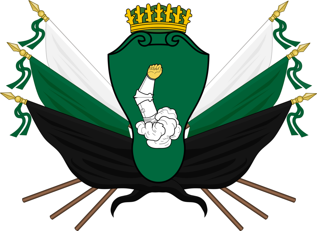
The Hadysh national coat of arms shows the white-green-black motif:


For the wreath I went with something that had berries. The Yew Tree is the national symbol of the nation, as well as being an important religious symbol for the majority of its citizens. So I found a vector of a wreath with berries and moved forward.

I got a banner and then things started going down hill…

So if you look at the Italian crest you see FIR – for the Federation of Italian Rugby (Federazione Italiana Rugby) and at the bottom a simple Italia, which I think most people can get without a translation. Well, I know the Hadysh name for Hadyrland: Volgamfyə /vɔlgamfjə/, but I am missing the “FIR” element. So I started working.

I started with the name “Hadysh Football Federation” and then reordered it into proper Hadysh (while still using English): “Federation Hadysh Football”. “Federation” is the subject, “Hadysh” is an adjective, and “Football” would need to be a genitive noun.

Then I open up my Hadysh dictionary. Which words do I have? Hadysh. That’s it. The adjective form is b̌olgē /bvɔlgi/.

So I have some work to do making up new words. Federation was easiest because it could be a concrete idea. In German the word for federation is Bund. This comes from the same root as “bind” in English, as in “bound together”, which a federation is – units bound together to make a whole. For “federation” I went with a simple word, like German: ya̋f /jaʊf/.

Two down, now “football”. Well, I can break that down into two units: “foot” and “ball” and then recombine them, which in Hadysh would be “ballfoot” with the foot being in the genitive.

Ooooookay…. for “foot” I went with bod /bɔd/, which is a reference to “pode” the Greek for foot. And for ball? ð̌aç /dðaç/. Little bit more work… the genitive for bod is bot (the genitive is usually word + (e)d, but if it ends with d it devoices to t). So the Hadysh for “football” is ð̌açbot /dðaçbɔt/.

But… but… we can take this further. So, oftentimes, words get adopted into a language from another language. “Football” is one of these words that often end up in other languages because it is easier to just adopt a new word then something up. For a bit of fun I decided that in Hadysh ð̌açbot would be the actual piece of equipment, while the word for the sport would come from Union Common, which is a distant relative to Hadysh. I don’t actually have two conlangs going so we needed to de-evolve the words ð̌aç and bot back to the last shared ancestor of Common and Hadysh and then re-evolve it forward to present-day Common.

Common is more like English in how it compounds words so in Common it would be foot + ball instead of ball + foot, so I decided it was best to do the two components separately and then recombine them.

I actually have a chart showing the genetic relationships between Hadysh and some of the other languages back to a language called “Proto Piylo-Tundric” which is the mother of many of the northern languages on the continent Sun-King and others take place on. Whole branches of these languages are extinct so I need to go up six steps and then down five.

Now, not every step is distinct, but it helped think about how the languages worked and this whole thing would come in handy later. Also, the question, why not Sterian for the language if that’s where the sport is most ubiquitous? Common is more of a prestige language and while the Union is not nearly as big as it once was, there are far more Common-speaking nations than Sterian or Hadysh combined.

So, “ball”…

Hadysh to Old Hadysh: /dðaç/ ➝ /ðʲaç/. The decision here was that consonants at the start of stressed syllables underwent sound changes akin to Gaelic/Russian where they could be palatalized before open vowels, unchanged before mid vowels, and labialized before close vowels. /a/ is back, so /ð/ becomes /ðʲ/. The implication here is that as Old Hadysh turned into Middle and then Modern Hadysh, this palatalized phoneme became it’s own sound /dð/ unrelated to /ð/.

Speeding up: /ðʲaç/ ➝ /dʲæç/ ➝ /ˈdʲæk.əl/ ➝ /dəˈkʲʌl/ gets us as far back as it needs to go, back to Old Piylean. Now it needs to move forward through time:

/dəˈkʲʌl/ ➝ /dəˈkʌl/ ➝ /dᵊˈkʌl/ ➝ /gʌl/ ➝ /gɔl/

And “foot” from Hadysh to Old Piylean:

/bɔd/ ➝ /bʲɔd/ ➝ /bʲɑd/ ➝ /bʲɑt/

And now from Old Piylean to Modern Common:

/bʲɑt/ ➝ /pɑt/ ➝ /pat/ ➝ /paθ/

You’ll notice that the word for “foot” has been significantly more conservative than the word for “ball”. This is because a foot is more significant to ancient peoples than a ball. So the word is preserved better. When you look at the ancient word for “ball”, it had two syllables. As it moves toward the present it drops to one with the Hadysh branch keeping the first syllable /də/ (which in its first step away from Old Piylean becomes stressed to /dʲæ/) and the Common branch keeping the stressed /kʲʌl/. The words /dðaç/ and /gɔl/ have nothing in common, but are related none the less.

So the Common word for “football” is /ˈpaθ.gɔl/.

So now I can come up with the acronym for the Hadysh Football Federation: YB̌P for Ya̋f B̌olgē Paþgold.

I will remind you, this entire exercise was for one of those three letters.

So now I can finish… making…

Fuck, Hadysh doesn’t use the Latin alphabet except when I write on the internet. In the fantasy world it would use it’s native alphabet. Luckily I have that alphabet, I just don’t have it digitized. So hang on.

There YB̌P at the top and Volgamfyə at the bottom. The crest is done.

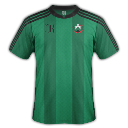
Now I can put together that soccer kit.

There, that wasn’t so hard, was it?

That said, the longest parts were the image manipulations. Even though the linguistics takes up the lion’s share here, I played around with the vectors and the images far longer than I spent making up words. There was also a lot of background stuff with the linguistics, like filling in my dictionary with the new words and their declinations, which is important only to me.

Now will I make a crest for their dreaded rivals, the Sunrays out of Rannot?


Probably not.

No.

Cheers, everyone.

Mid-Autumn Review

Got a bit of time before an afternoon appointment ends up sinking a good chunk of our afternoon so I thought I’d get a rambly life review post out of the way. This is going to shift topics pretty quick so try to keep up.

Wine

After a half-year hiatus due to the move, our wine bucket is full again this time with a straight pomegranate wine. Right now the smell is amazing and fermentation is roaring ahead. I’m looking forward to the finished product.

In a week or two, we’ll get a second batch going: this time of raspberry wine. That too should be amazing.

And once winter sinks in, we’ll look at upgrading our wine cellar with some stone work and some decent racks and perhaps even a wine cooler.  We’re probably looking at doing it ourselves so expect a full how I managed it post at some point.

The House

We’re settling into the house quickly. We’ve already done a lot of work and we’re looking at getting the roof fixed first thing is spring. We also looked into either doing siding or remodeling the bathroom, but those ended up falling out of our price range. Too bad, both of those things can seriously go with an overhaul.

We’ve almost entirely unpacked as well, notable exceptions are bags of stuffed animals in the bedroom as well as organizing our clothes. Plus there is a giant tupperware  container in our office plus a box that needs to find a home. The office is now fully equipped for coffee production, freeing up much needed space in the kitchen (an issue that came very much to light when depipping ten pounds of pomegranates.

Otherwise we’re settled and extremely comfortable. The benefits of living so much closer to work and friends has already paid off, plus the reduced cost from the mortgage every month is helping as well. Walking is way, way up thanks to the myriad of stores and restaurants near-by, and we’ve signed up for fencing classes, our first since uni, so hopefully I can burn this damn beer gut away.

Writing

Been getting a lot done on the writing front, even if I haven’t been talking about it.

I am not participating in NaNoWriMo, so don’t expect word counts. I do plan to get some editing done, but there may or may not be some huge overhauls in my plans for the coming year/year and a half.

Brigid and I have been talking timing and publish for my four novels, which will either fall under her pre-existing company or more likely my own that I will set up when the time comes. The current plan is a release schedule something like this:

Sun-King: Q2 2018
Book 2: Q4 2018
Night Queen: Q2 2019
Book 4: Q4 2019

None of that is cemented, in fact I think it is safe to say the release schedule will likely get pushed back even further.

Why?

Well I’m a slow writer, mostly. I wanted book 3 (Night Queen) to at least be written (first draft) before I pull the trigger on publishing Sun-King. But Brigid very honestly pointed out that at the rate I write, I might want book 4 (is it strange I have the most trouble coming up with titles for the even numbers?) in the first draft stage and book 3 essentially wrapped up from the writing perspective.

I might plot out and write books 3 and 4 here in the next year – one giant binge of writing. Then I’ll have a first reader or two go through all four books and realign the consistency of the tone and action. That way I don’t have to keep going back to Sun-King when I make adjustments in Night Queen’s plotting.

It’s a lot of work, and the encouragement I get from you guys is, and always has been, great.

So thank you very much.

Kit Nerd

I’ve still been kit-nerding it up lately, messing around with sponsors and even going as far as to look beyond my normal front sponsors, manufacturer, and experimenting with a bit of color.

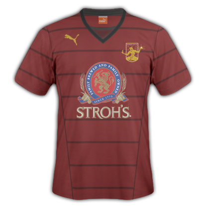
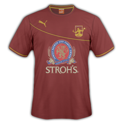
puma_strohs

A clean-ish rouge kit sticking on the piping theme from the official kit nerd post. In this series I went with Stroh’s as the official sponsor, following the tradition of teams like Liverpool and Newcastle who proudly wore their favorite session beers on the front of the logo. With this particular kit the dark red above the black collar isn’t the back of the shirt – it’s actually an inset of the front, so the collar is a rather traditional cut while also giving the effect of wearing an undershirt even when you’re not.

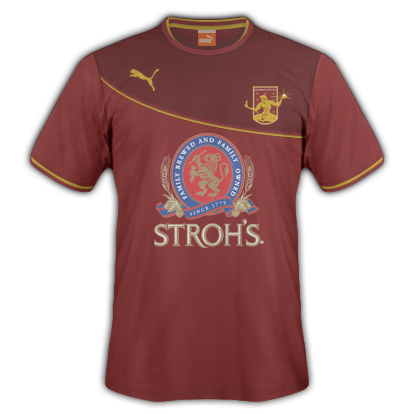
puma_strohs_plain_w_gold puma_strohs_plain_w_gold_bired

A bit of a cleaner design, in my opinion. A minimal amount of gold breaks up an otherwise plain rouge kit (top) or divides the rouge from a darker shade (bottom). I like that the Puma and DCFC logos follow the swoop, gives it a more balanced effect then when used above. I like them both quite a lot, with perhaps a slight preference to the plain one on top. The Stroh’s logo ads a lot of colors but if done right (and DCFC has been doing their sponsors right – with transparencies instead of giant bounding boxes) it still looks good. In fact the red and gold in the logo are really great with the rest of the get up.

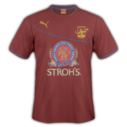
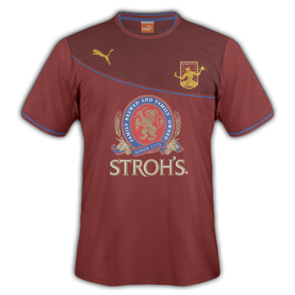
puma_strohs_plain_w_blue puma_strohs_plain_w_blue_bired

Now on twitter I mentioned these would probably be a bit controversial (though that has so-far proven untrue). Instead of gold accents, I went with the blue from the Stroh’s logo, something unheard of for DCFC. I want to go on record saying I prefer the gold more and that I don’t actually want to see blue added to our kits, but it was a fun little experiment which I think looks good. In this case, though, I think the Rouge – Blue – Dark Rouge works better (instead of the plain one as was the case above). Maybe the blue stands out better with the defined line between the reds and isn’t lost as much.

Anyway, that is a life update. Cheers everyone.

The Kit Post – 2017

Welcome to the third annual Kit Nerd Day!


For the unaware I am a hack of a kit designer and every year I post ideas for next season’s kits. Generally I post a home, away, and alternate kit but this year we’re going big – that’s right, after the success of Minneapolis City SC’s throw-back kits I too am doing some throw-backs.

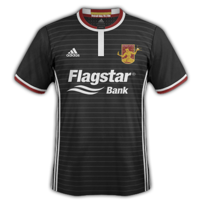
And as always we’re going to start with some disclaimers. First I am not a professional, I don’t work for Adidas, Flagstar, Detroit City, or anything of note. I’ve used all images blatantly without permission. Nothing here represents an official direction for DCFC so fans of Adidas hold strong but expect more disappointing Nike and for potential sponsors these are not endorsed by the front office in any way.

And one last thing, this year marks the end of a) posting full kits and b) using the Adidas kit builder! That’s right I’ve upgraded to photoshoped fake kits that are, for the most part, almost entirely actual designs the kit makers use, but I can edit things a bit more and use colors freely. Kit designs are, of course, subjective. I’m happy to hear your ideas on twitter or as comments below.


Some thoughts on last year and last season’s kits.

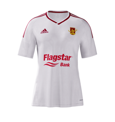
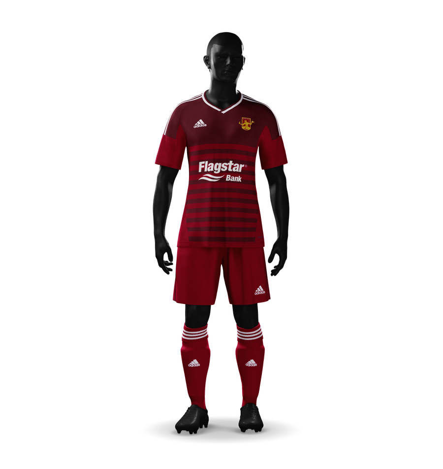
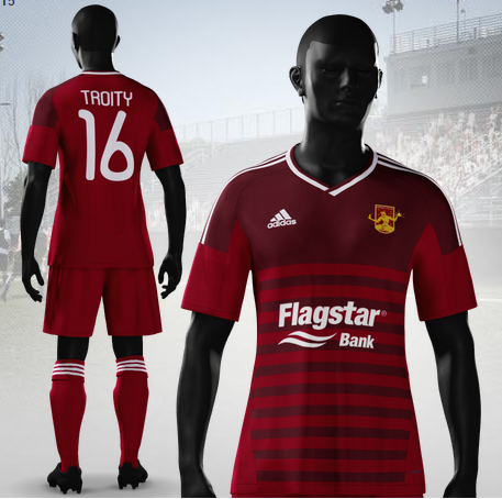
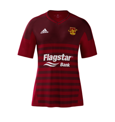
As for my kits the 2016 predictions included the fabled return of the hoops, which have not really stuck in my head. That particular design is not my favorite as the hoops are rather thin and there’s a lot of them. The white Flagstar brand across the chest likewise seems slightly small and out of position. The kits in general lack a unifying theme, but I generally liked the the away and alternate kits.  In the end, though, that home kit is extremely complicated.

The actual 2016 DCFC kits were, for the most part, good. The home kit returned to a plain rouge affair, reminiscent of our first season back in 2012. I snagged one of those at the kit unveiling, my first home kit purchase! The away kit was dreadfully dull and lacked any color at all. The alternates though?! Fuck yeah Nike Volt kits with black trim! I bagged one of those too, buying one of charity ones so it went to a good cause.

Some complaints – the number on my home kit is already flaking off, which is upsetting. The little Detroit flags were lost to add more ad space and that kind of sucked. And the alternates should’ve used black numbers instead of white.

A big change in the 2016 season was the introduction of actual player numbers! That’s right, players were assigned a number and though it might seem petty, it’s a pretty big step in having strong starting squads and hopefully is a step on the path to a professional squad.

So, without further ado, the 2017 Kit Day Post:


Brand – Adidas

I’m going to fight for Adidas to the end of time but it seems like the front office is pretty stuck on Nike, something which will probably be even more likely next season with a major Nike store open(ing) in downtown Detroit. Nike, though, is one of the laziest fucking kit designers on the planet. They used the same damn design (in different colors) for at least half their clients this season including several national teams that were fucking involved in a major tournament against one another.

It was disgraceful.

Meanwhile Adidas have simplified their designs here in the States (they are still the sole kit designer for the MLS) removing the signature stripes from the shoulders and moving them to the sides. It’s a weird choice, granted, but I can deal. Their designs for the MLS continue to be decent, though I find the Seattle ones to be very, very weird. The choice to go with the blue sleeves bothers me, especially with an all-blue third kit. The Sounders need green.

My favorite from the MLS has to be Portland’s black and red aways. Those things are sexy as fuck.

Kit Names – No

Last year I took a stand on this saying we should include names on the kits as a way to look “official”; to look like we’re not run by amateurs. But we are run by amateurs and we are not a big-name club. With each passing season we leave more and more of a trail, make more and more history, and define more and more of what makes Detroit City unique to our city.

One thing I’d like is perhaps never include names on the kits. Never. As in if we’re playing for the MLS leave only the number.

I think it serves as a reminder than names don’t make a club, the club will survive and will never be made or broken by a single star. Sure a hero will go down in history, but the players now understand that they aren’t playing for their own personal fame – but for the fans and for the crest. If we go pro, those pros will need to be brought into line too. They play for us. Not for themselves.

Sponsor – Flagstar

I’m going to get this to work eventually.

I still think Flagstar is a better sponsor than Metro Detroit Chevy Dealers and they still act the part, and I’m not just saying that as an employee of a certain company symbolized by a blue oval. My opinions from last year are still alive here so it is what it is.

Interesting additions this last season though: Stroh’s and Faygo. Really interesting to see both an adult beverage company and a family beverage company join the team. Welcome and I hope dollar Stroh’s is a thing that sticks around.

And as I promised to Mr. Wright, I will not post the kit with hatchetman on it.

Okay, so there are my preliminary notes. Only one thing left to do and that’s roll out my 2017 Kits!


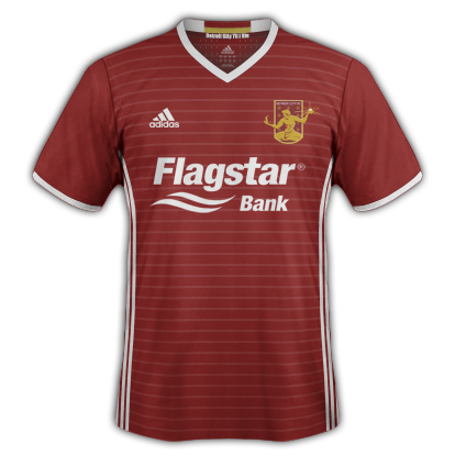
The Home Kit – Rouge Ringer

2017_KD_Home

Here is my 2017 Detroit City FC home shirt. This would be matched with rouge shorts (with white stripes) and rouge socks (with white stripes at the top).

Something became very clear in the last few seasons – Detroit City might be the Rouge and Gold but their kits are Rouge and White. That isn’t a bad thing. I understand white kits are easier to come by and probably cheaper. I say run with it. Really buy into that rouge and white feel and make the kits consistent year to year.

It build a brand and will help make the club more recognizable in the long run especially to outsiders and potential fans. The use of pin-stripes gives a shout-out to the ever-popular hooped kits while not actually hooping our kits, which leaves the brand more recognizable and doesn’t begin to blur the line with another bunch of hooped semen… er… seamen…. I mean… fucking Lansing.

Like the last two years I wanted a unifying theme between all my kits (or at least the three main kits). First year it was the red socks. Last year was the lighter rouge details like the logo and stripes. This year it is the horizontal pin-stripes. Anyone who’s been to my wikipedia page has probably seen the preliminary designs up there.

I wanted to bring in the white here after a season with all-rouge kits, switching the cuff rings, collar, details and the striping to white rather than a second shade of rouge.

Inside the collar it says “Detroit City til I Die” under a banner of rouge and gold, bringing just a little hint of the Blood and Treasure to the Blood and Bones kits.


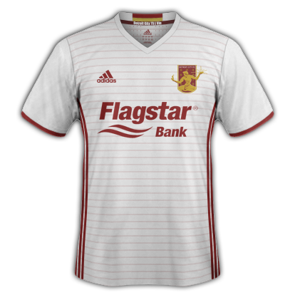
The Away Kit – Bloody Bones

2017_KD_Away_v2

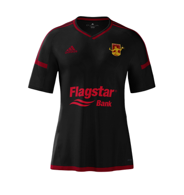
Here is my 2017 Detroit City away kit. As I envision it these would be paired with white shorts with rouge stripes and the same rouge socks as the home kit (a little hearkening back to the 2015 post).

As I said above, the 2016 away kits were way, way too plain for my tastes. I usually buy the away kits, they tend to be the more varied of the designs or in the case of 2015 Brigid really liked the collars. I haven’t brought the collar back (partially due to a twitter poll on the matter but also out of free choice), but instead I’ve brought color color back to the aways.

This kit is very much an inversion of the home kit with the exception of the collar, which remains white. Partially this allows the rouge and gold banner on the inside of the collar to still pop and not just be a random gold bar above the DCTID motto. The pin-striping and Adidas stripes switch over to rouge to maintain their visibility.

I think that the rouge elements, especially the stripes and pin-stripes give the aways enough color and “feel” that they don’t seem like unfinished, blank, canvases. These are “finished” kits with a finished, consistent feel with the home kits.


The Alternate Kit – The Nightmare

2017_KD_Alt_v7

Here is my 2017 Alternate/Charity Kit! The way I’m seeing it is this shirt plus black shorts with white stripes and black socks with white stripes on the top.

There was a little bit of controversy with my original choice of collar (that is it had an actual collar, which proved to not exactly be the most popular choice). Here I’ve gone for a little bit of a non-standard choice for the collar – closer to the neck without the actual pop-up collar that we had in 2015.

I also went a bit more “crazy” with the colors. Cuffs are bi-colored instead of mono like the above, matching the collar. The crest returns to full rouge and gold glory, instead of the black and gold of the past. The pin-stripes are retained, back in white.

This is a fun, one-off kit that fits into the rest of the catalog a bit better than previous charity kits. In the previous seasons they were either: bizarre colors (Volt or urban camo), or strange two-tone pieces (the black tops and white shorts of previous years). This one would return to the edgier black while also maintaining the consistent top/shorts choice of black and white. Hopefully this keeps them a bit cheaper as well.

Black is a great look for DCFC and I hope the charity kits become true alternates in the few instances where neither the home or aways provide the necessary differentiation from our opponents. If I was in charge they’d be worn at least twice if not thrice.


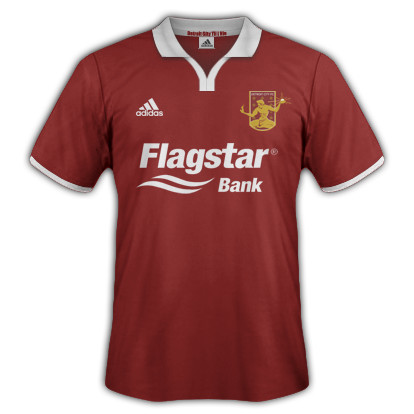
The Throw-Back Kit

2017_KD_ThrowBack

These would be worn with plain rouge shorts and plain rouge socks.

Just a simple take on the MPLS City SC throw-backs they released this season. Plain kit for a simpler time. Plus I was able to get my collar on you spiteful, spiteful bastards.


Anyway, I hope everyone enjoyed this year’s Kit Day post. If I get a chance I will post some of the other designs and steps I took if they exist. The alternate kit especially got a lot of “love” and attention, especially in the neck area. There was also the mock-up that I posted that had red sleeves. If/when that goes up I’m not 100% certain, it’ll be a manual post (this one is scheduled).

If you have any comments/criticisms/ideas of your own, feel free to let me know in the comments below or on twitter/reddit.

And don’t forget, kilt orders are due in 11 days!

Thanks everyone!

Sláinte!

For the Love of Low-Tier Soccer

Sláinte motherfuckers!

I wanted to take some time to talk more about low-tier soccer in America and also in þe olde Ængland.

For those outside of the loop, the soccer tiers in England go very deep. Beyond the 4 “top” flights (Premier League, Championship, League 1, and League 2) there are many, many regional leagues full of plucky amateurs, bar buddies, and small towns that scrape together to put a team on a pitch.

It’s honestly amazing how deep it goes and how passionate people can be about the sport. Soccer is, in a nutshell, fractal. No matter how deep you look or how far away you get the image and passion are always crystal clear. It doesn’t matter if it is Newcastle United playing in front of 55,000 people, Detroit City in front of 7,400, or Kendal Town in front of 200.

And until recently that sort of passion was unheard of in the United States except in baseball.

And that’s a good point of comparison. Americans love baseball. They’ll gladly root for a local, low-tier baseball team over the more distant professional teams. There is local, civic pride on the line and it is a place for locals to root for other locals. There is a strong sense of community that isn’t found elsewhere especially in the shallow attempts of the big teams to check off the “look, we care” checklist of Breast Cancer, Troops, and potentially one or two local-ish charities.

There is no doubt that this sense of community has lead to the explosive success of Detroit City. Detroit is a city that thrives on community and the “Detroit vs Everyone” mentality. It’s an intoxicating favor that is quick to take over the minds of Rust Belters everywhere.

More now than ever I think low-tier soccer in America will win. They will win  against the NCAA and they will win against the domination of bigger leagues like the MLS. As I see the rise of teams like MPLS City SC, Detroit, Chattanooga, and nebulous non-team in Mobile, is seem communities that will weather greater storms.

And in their wake more and more teams flourish. Is the age of the one and done NPSL team over? I think so. That isn’t to say they won’t crop up from time to time, but that the time frame when a sizeable chunk of teams would pop up and die the next off season is probably over for good.

People, not owners, see the success of teams like Detroit and Chattanooga and they will replicate those successes with their own local flavors.

And in time the lower-leagues will be saturated more and more until a system like Promotion and Relegation becomes not only possible, but desirable to all involved. I don’t think the issue with pro/rel is one of the chicken and the egg. It is one of needing to build a strong, stable set of low-tier teams worthy of the system. We don’t have that yet, but it is seeming more and more likely every day.

The idea that Americans won’t root for low-tier soccer teams is become more and more of a bad dream with each broken attendance record.

It doesn’t take the reward of promotion to build a community – it takes a nucleus that a community can thrive on and that is a team. If you want pro/rel you need to support the little guys. You need to grow communities that can support a team going up as well as coming back down.

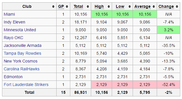
On the flip side the NASL continues to look like it is in dire straits. Strikers attendance has fallen to the point that their worst can no longer be rounded to 1,100 and is now just 1,000 – not bad for an NPSL team. Only three teams have posted any sort of growth on their average attendance numbers with the over-all average per game down 13%. I am very interested in what Puerto Rico can do when they join in the fall. In the end though I think there are some teams in the NASL that are untenable from an economic standpoint. You cannot pay for a tier two team on a seventh of the attendance of a tier four team.

Anyway, I wanted to give some love to a low-tier team over in England that I am particularly fond of: Kendal Town FC. If you follow my twitter or facebook you might’ve caught a tweet or share of some of the action over at Kendal Town, a tier eight team based in Cumbria, one of two counties at the very north of England.

With a bit of time on my hands I decided to design a pair of kits for them in the way I usually do (on Adidas’ website because I’m generally artistically bunk).

Home Kit

Kendal Home Full

Kendal Home Shirt

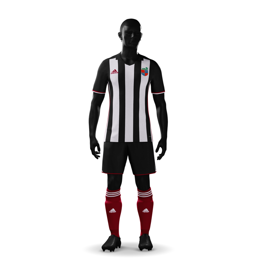
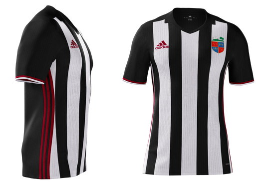
With the new range of Adidas kits I wanted to extend the range of the red on the Kendal home kits. Usually it is reserved for just the socks but here it extends up into the stripes, sleeves, shorts, and the Adidas logo. The pin striping on the white is a nice touch as well, methinks.

Kendal Town sometimes alternates their shorts between white and black, here I stuck with the black. I have a preference for black over white in kits, I’ve spoken about this regarding Newcastle. With magpie kits I prefer black to dominate, I think the color is more imposing and makes the kit look more finished as compared to more empty.

Away Kit

Kendal Away Full

Kendal Away Shirt

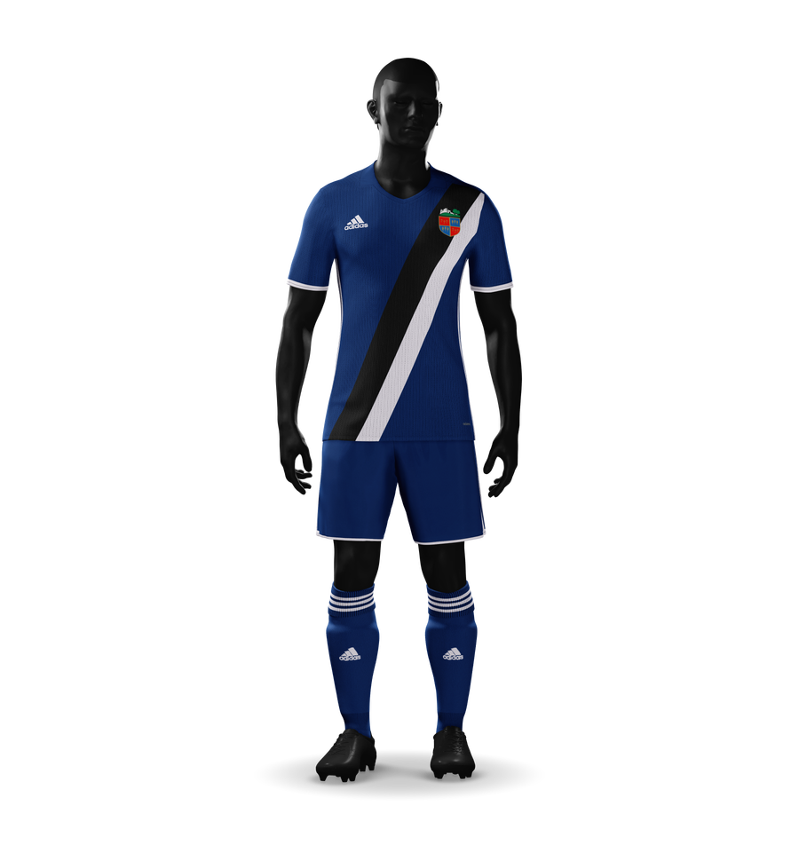
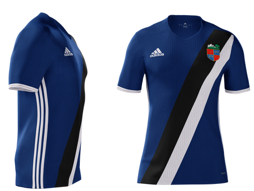
As for seconds, I went for a combination of Kendal Town’s usual blue kits while maintaining the distinctive magpie colors. The all-blue kits are broken up with some white highlights and the centerpiece of the shirt – the black and white sash. This beat out some other designs, some that were a tad white-heavy

I have to admit that even if I could, I probably wouldn’t do completely custom kits. Probably because I can’t and I’m suffering from delusions, but also because I like the idea of “designing” something that can actually be made tomorrow. I also like that constrains the possible to a smaller set and means you have to focus on other elements like color and style branding.

Too many teams these days, looking at you USMNT, completely ignore color and style branding. Every kit is as removed from the previous as I am from Ganymede. New colors! Weird colors! Hoops! Stripes! Blank! Sash!

What’s so fucking wrong with building a brand? We’re going to buy your kit anyway and it is nice to be able to see a Celtic kit from a mile away. It is nice to recognize that’s Newcastle, that’s Man City, that’s Sunderland.

Modern kits, man, it’s what’s wrong with modern soccer.

If you’ve never been, check out Historical Football Kits, I can guarantee you’ll lose a few days there. But it is also, for designers, a great way to soak in those ideas of brands. English kits rarely change dramatically, especially not the first/home kits. The biggest change in the Newcastle kits in the last 100 years was a switch from blue to black shorts and the occasional white (instead of black) socks.

MLS teams often have trouble focusing on this. Hell, even Detroit City had some trouble with this (and I’m not helping of course) going from solid rouge, to rouge on rouge, to rouge and white, back to solid rouge.  Hopefully a pattern can catch on soon.

Anyway, I have some ideas for bigger overhauls of brands and stuff that I might do in the future. Who knows, maybe one day a team will trot out in something I’ve designed.

An Open Letter

Hi Tom and Dan,

Well… Hi Tom, Dan’s blocked me on twitter apparently for that time I reminded him that he can’t just say Detroiters support the Cavs. Or maybe he did it on MLS’ orders in which case expect your list of required blocks soon – I’m on it.

Anyway, I literally just wrote about this.

Convenient.

I’m not going there right now. In fact, I’m going to try to be as nice as I possibly can. Which is really hard given the mental situation I am currently in. I’m not going to talk war plans. I’m not going to talk fighting this at every turn. I’m not going to talk about doing everything in my power to stop you. I’ll even drop the “Fuck MLS” tag for just a regular “Soccer” tag.

See? Meeting you half way.

I’m just going to offer the olive branch once.

Hey guys. Heard you want to put an MLS side in Detroit. That’s cool. That’s cool. I’m sure lots of thought and planning has gone into this announcement. And there’s a lot more coming, of course. You’ve got a whole team and culture to build.

But.

But what if you didn’t?

What if instead of trampling over what already exists like a three year old left to their own devices in the flower beds, what if you help us grow Detroit City FC further?

Sure we aren’t exactly… sanitary for the big TV markets and stuff… sure we’re not exactly the kind of people you’d bring to your big fancy parties with your fancy finger foods.

But we are Detroit.

We are the life blood of this city, this city you both are so apparently interested in helping.

We bus kids into games.

We rebuild old stadiums.

We help our vets and we recognize losses to the community.

We follow our team through thick and thin.

We, or at least most of us, are willing to listen to what you have to offer. We want to believe you’re here to do good. We need you to prove that.

I’m not going to list any demands (yet). Nothing like that. What I want is a chance to show you want DCFC has is unique.

Have you come to a game?

Have you stood in the midst of the supporter’s side? In the smoke? In the songs? In the greatest party in Detroit?

I invite you, Tom (but also Dan if you pass this along to him), to join us at any DCFC game. USOC, FCUM match, at Keyworth or not… join us and see the soul and heart of Detroit. See the excitement in people’s eyes. See the passion. Smell the smoke.

Join us and not only will I recomp you your tickets, I’ll buy you a pint, buy you a burger, and buy you a smoke mask so you can really get into the heart of it all.

Sure it doesn’t sound like much to you, but you probably made this afternoon what I made since moving to Detroit four and a half years ago. But it is offered openly and freely. I’d like for you to accept it. I’d love for you to have real talks with Detroit City’s owners and it’s fans.

I promise. I promise you’ll love it if you give it a shot.

Please?

Pleeeeeeeeease?

Don’t kill my team. Because if you try, we will fight back.

Faust

Faust: Who holds the devil, let him hold him well, He hardly will be caught a second time.

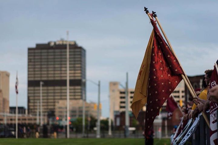
During the first DCFC season, my friend Zak and I had fashioned some cheap and easy flags. For mine he spray painted a quick trio of fleurs de lys on it in no more than two minutes and called it a day. Meanwhile he found a rouge-colored fabric with golden fleurs de lys sewn into it.
received_10155245222385643

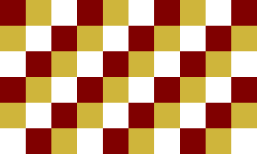
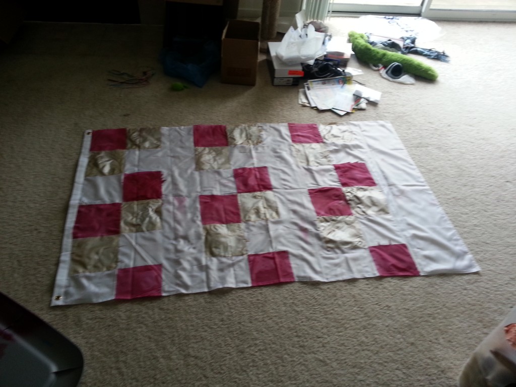
The next year I decided to get a bit more advanced. Zak had dropped out, so I was on my own. I bought a blank white flag, marked it off, and covered it in rouge, gold, and white checkers. It was janky, the colors looked like shit, and the lines between them were blurred and runny.

Over-all it blew. But it made it to quite a few matches. And as I told one supporter who called it shit but was empty handed, “It’s better than yours.”
Checker

20130512_131912

The next two seasons I was flagless. Generally it was pretty liberating, not having to worry about where the flag was, keeping track of it, or worrying about someone running off with it (like anyone would steal that piece of shit). But I missed having one. For some reason I had it in my head that I needed a flag.

This season all that changes.

I’m back in the business of making a flag. This post is/was not written after the fact. I am saving it as a draft and publishing it upon the completion of the flag, which I have dubbed “Faust”. As I work I will add more to the post so you’ll get a stream of thought. Generally I’ll break writing periods with quotes from or about Faust.

Faust, for the uninformed was a German folklore character who sold his soul to the devil for all sorts of powers.

I am part of that power which eternally wills evil and eternally works good.

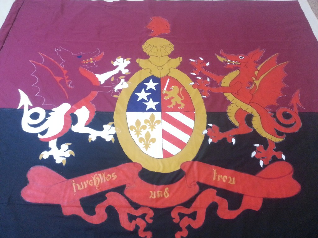
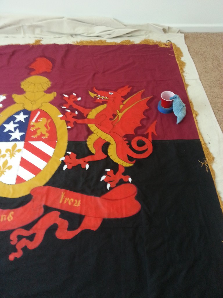
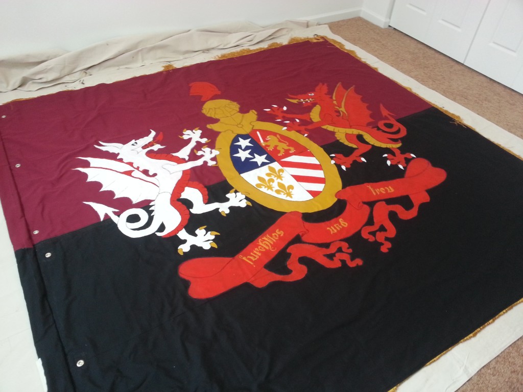
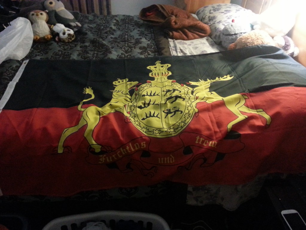
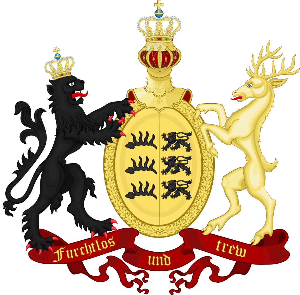
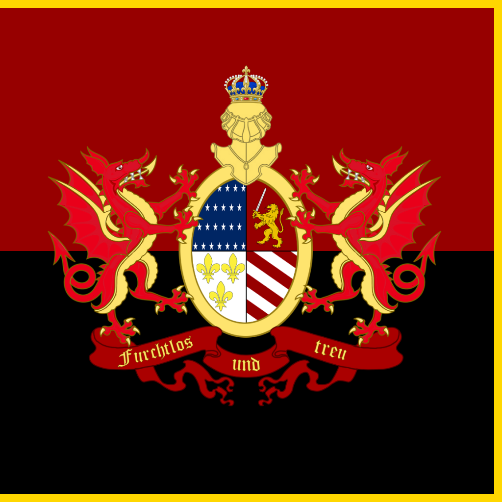
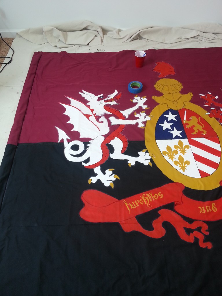
Unlike previous flags, no small deal of work went into designing Faust. The basis was the flag of the Kingdom of Württemberg. The banner at the bottom reads Furchtlos und Trew [sic]. I would keep that and fix it to the correct Furchtlos und Treu meaning “Fearless and True/Loyal”, a great line for any hardcore supporter.
20150704_195751

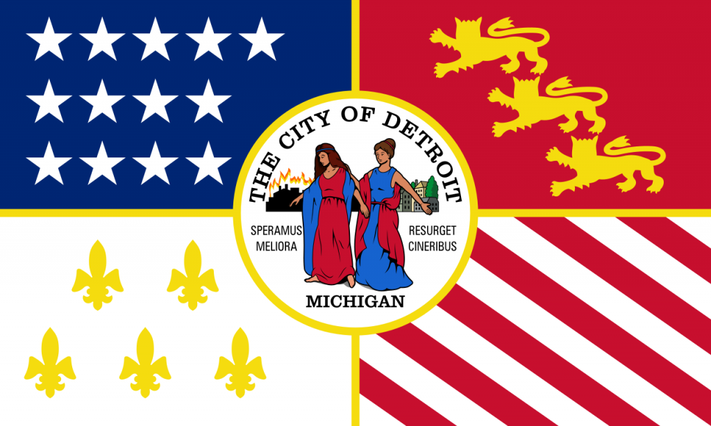
I wanted a way to mesh this flag with the flag of Detroit.
1280px-Flag_of_Detroit,_Michigan.svg

My thought was to work on the crest in the middle. Instead of Württemberg and Swabia, my thought would be to create a simplified version of the above: a field of stars, a gold lion on red, fleurs de lys on white, and alternating red and white stripes.
2000px-Coat_of_Arms_of_the_Kingdom_of_Württemberg,_1817.svg


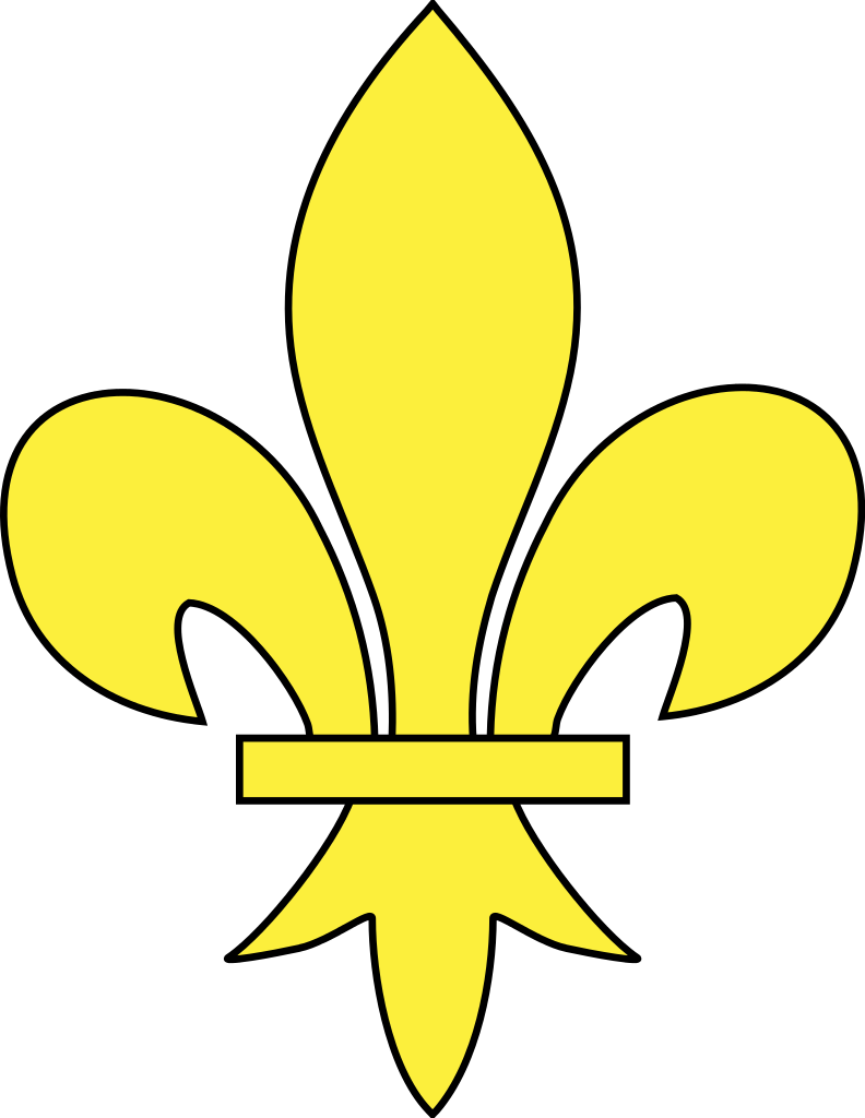
I worked on simplifying the Detroit flag. I removed the needless crest. Replaced the fleurs with something a bit more complicated, then replaced that with something less complicated but still more traditional than the ones on the Detroit flag.
Meuble_héraldique_Fleur_de_lys.svg

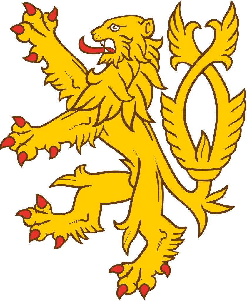
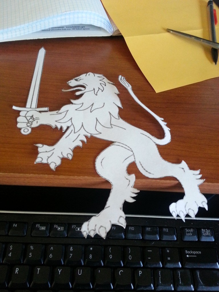
Concerning the lions of England, I knew at first I’d rather a single, better detailed lion than three smaller ones. Plus I wanted it in a more active pose.
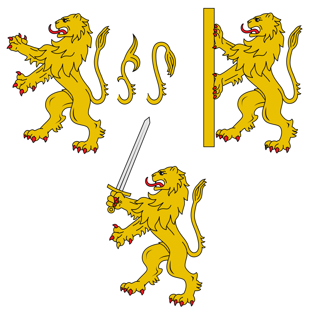
Lion_rampant_-_Heraldry.svg

So I looked at some more complicated, active lions. And I mean, really, that one has a sword! So the sword won.

The blue field of stars should’ve been simple. The Detroit flag has 13 for 13 states, but their pattern is kind of lame. I chose to replace them with something based off the flag of the United States when Michigan was added to the Union.
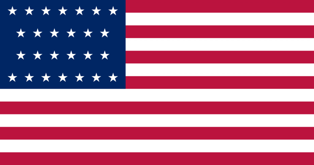
US_flag_26_stars.svg

Lastly I flipped red to the top so the red banner would be on the black half of the flag. So here is the first main version of the Faust:
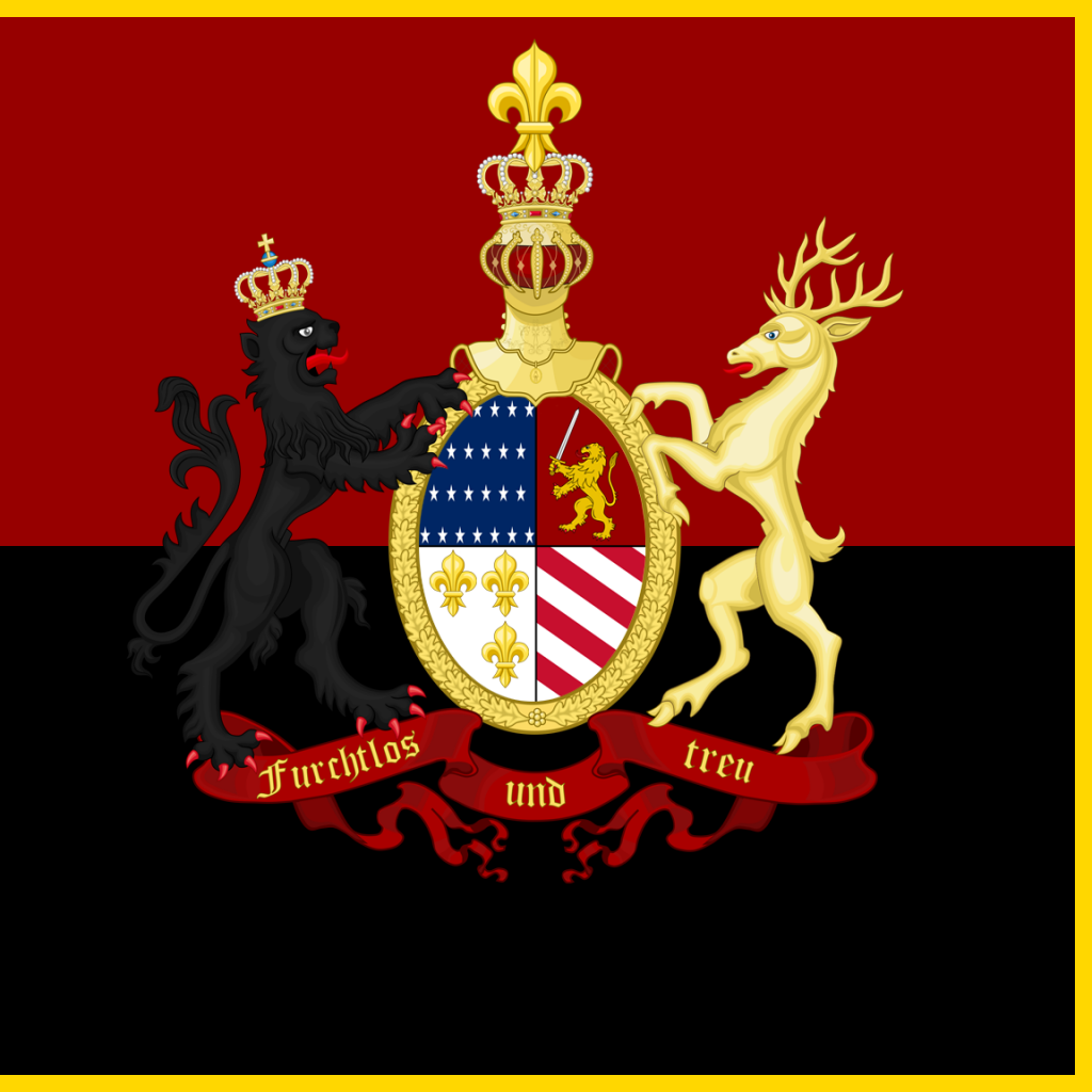
KoK_V1_Release

Some other changes would be needed. Originally I liked the black lion and the gold stag – it made a good reference to Michigan, but it was a bit complicated and the black wouldn’t show up well on the black and red banner.

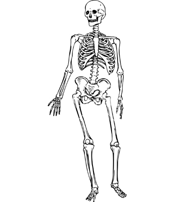
First I considered a skeletal crow and a a skeleton as supporters.
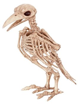
41wEevSctvL._SY355_ human-skeleton-vector-294186

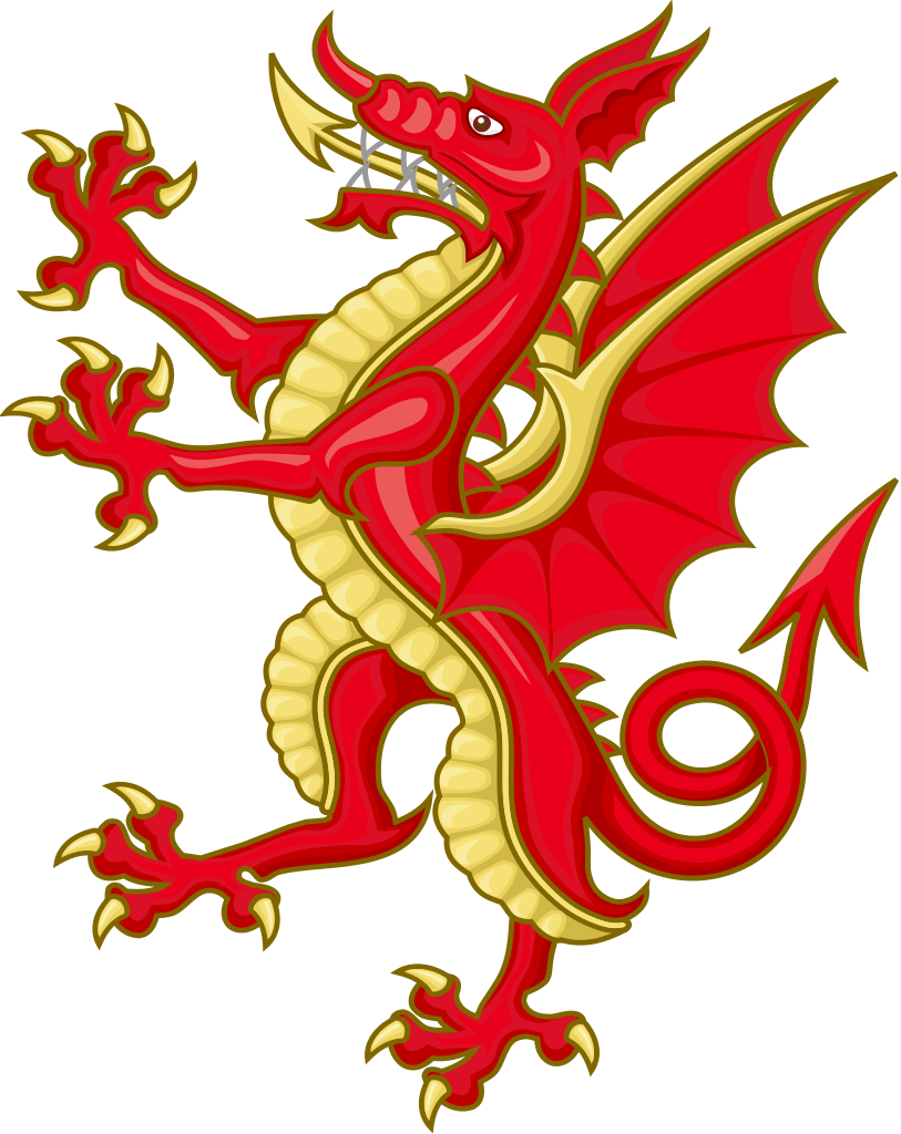
But with zero artistic ability I switched to the Tudor dragon which is rouge and gold paired with a golden lion.
Tudor_Dragon_Badge.svg

Heraldic_Lion_(Two_tailed)_05.svg

The dragon, however, is a really cool image. So the decision was made to double down on the dragons.

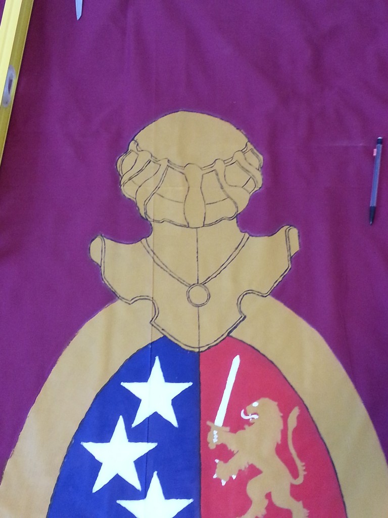
I worked on simplifying the golden shield around the crest, knowing that if time and paint permitted I could always add the the leaves and texture back in. Another minor detail I wanted to fix was the super tall helmet on top made especially tall with an extra fleur de lys on top.

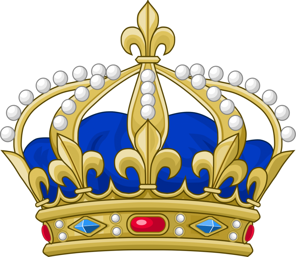
The idea came to combine the fleur with the crown and find a simpler helmet to go on top.
Royal_Crown_of_France.svg

So the crown of France will have to do.

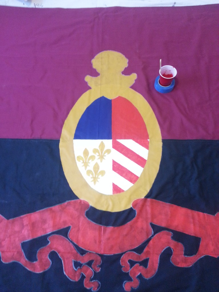
The final design for Faust:
KoK_V3_Release

(Dragons further flattened for painting)

God help us — for art is long, and life so short.

Eventually I had to get working. It wasn’t long before the itch got the best of me and Brigid and I ran out to two Jo Ann Fabrics to get enough polycotton and gold trim to put this together. Brigid came for the Japanese food.

I divided the build into four phases:

Phase 1 – Combining the halves

Phase 2 – Painting

Phase 3 – Trimming

Phase 4 – Basing

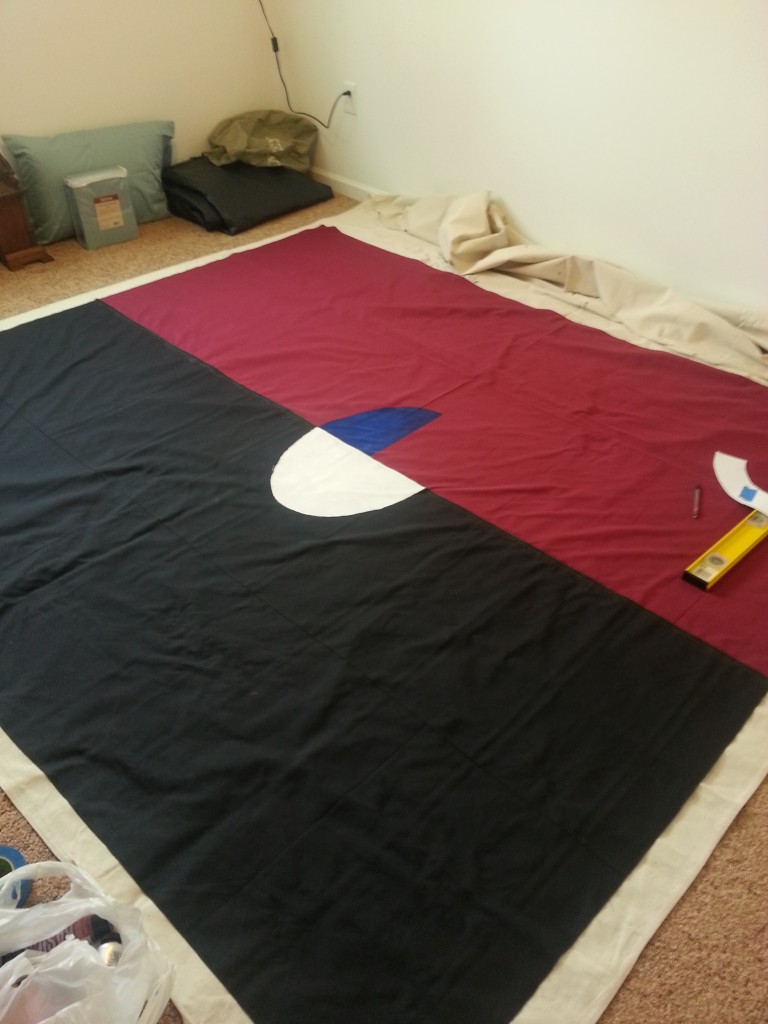
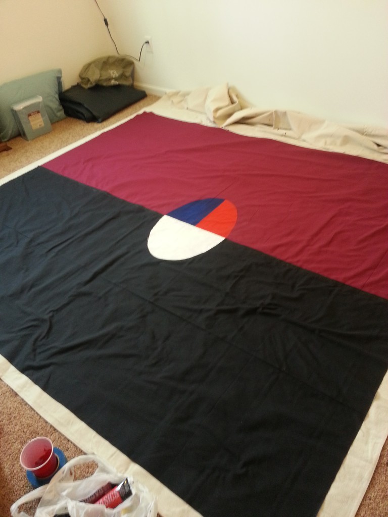
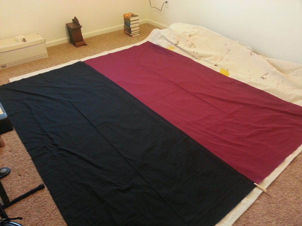
Phase 2 is far and away the longest, or at least most tedious step, itself having a main coloring phase and a second detailing phase. So here we go. First I sealed off a spare bedroom in our house and put down a thick painter’s canvas. Next I laid out the red half, then marked an inch deep onto it to overlap the black half. The I laid out the black half and pinned them at the end.
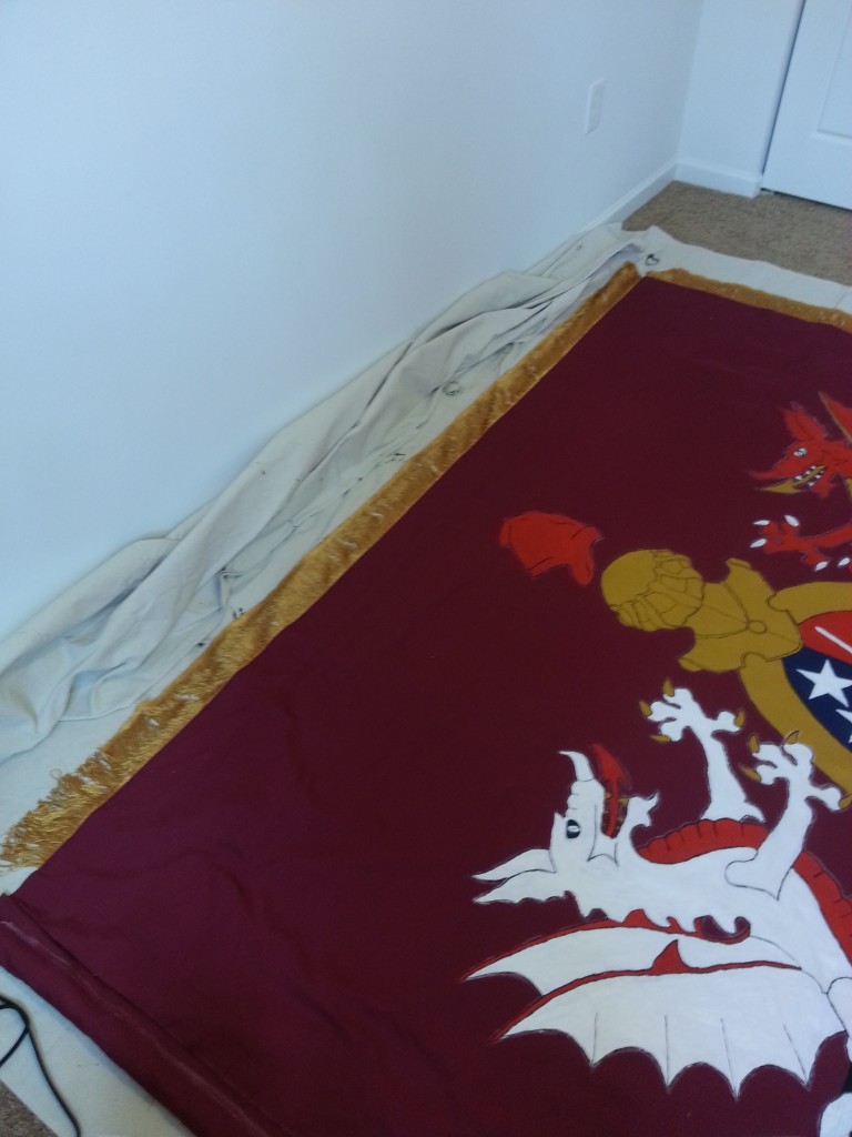
20160201_171137

Over two days I glued the two halves together.
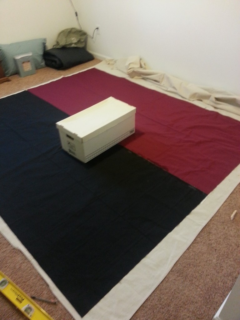
20160201_173337

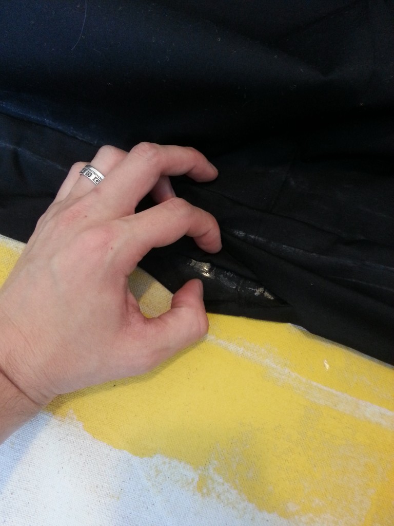
It wasn’t perfect but I managed to not completely cock it up.  After gluing I wanted to stitch it just to be careful that there wouldn’t be a completely failure if it got caught in the rain.
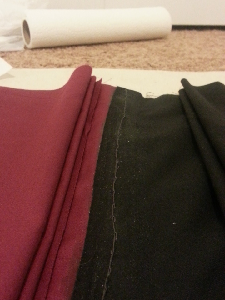
IMG_20160202_190455

It wasn’t a terribly good stitching job, and it caused quite a bit of bleeding from the fact that I didn’t do a terribly good stitching job. Otherwise it was a a basic backstitch job.

Stitching took three nights (doing a little bit at a time so not to completely start to loathe the project), after which I let it sit for a few nights until I had time to get paints.

After I did get paints I got back to work pretty quick:
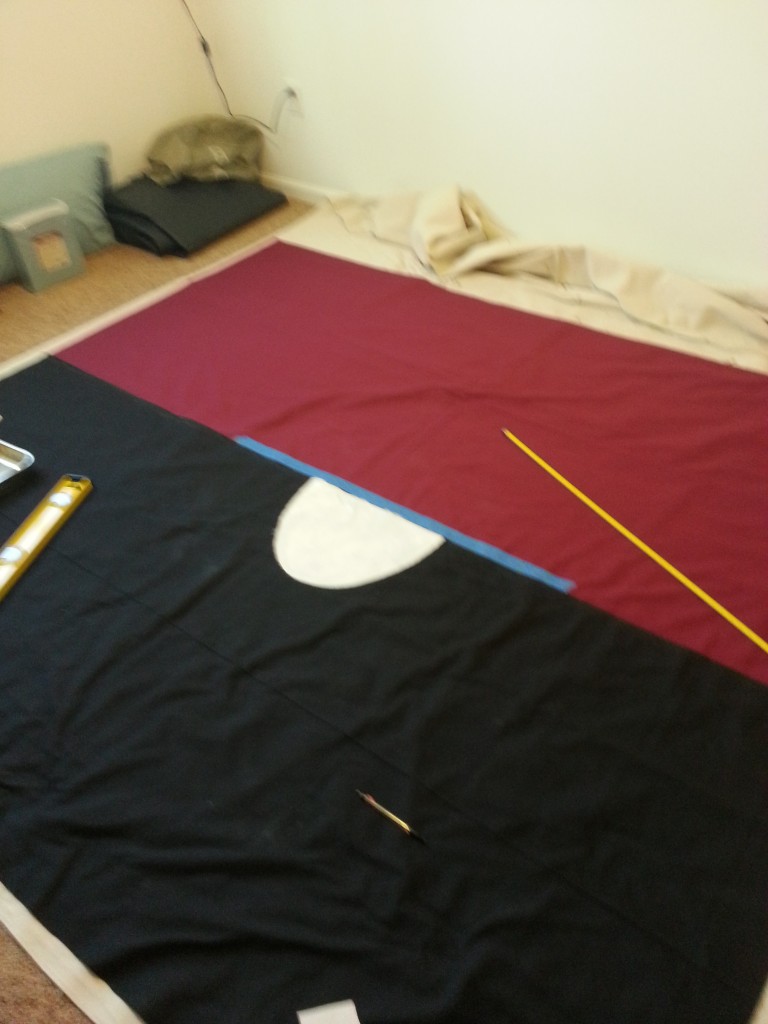
20160206_164512

20160207_131420

20160207_152802

Surprisingly, all of this happened without a major fuck-up, which is some sort of record for me. Hence I wasn’t surprised when:
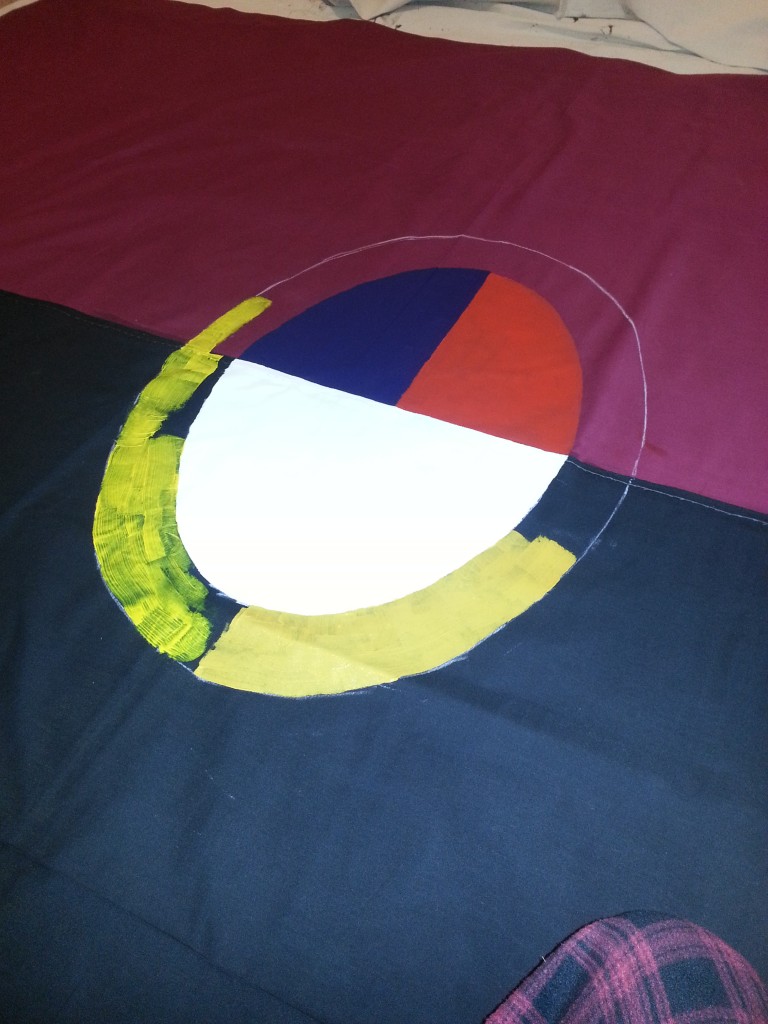
20160208_181718

20160208_183243

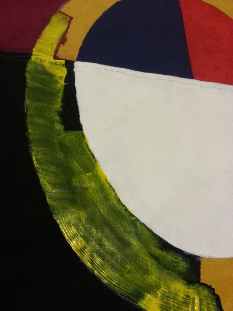
A gentle reminder to would-be painters, all yellow paint is neon green until proven otherwise. Luckily I was able to soak most of it up with a paper towel and then paint directly over it with zero wait. Not sure how the back looks as of writing but the back is the least of my worries.
20160208_184318

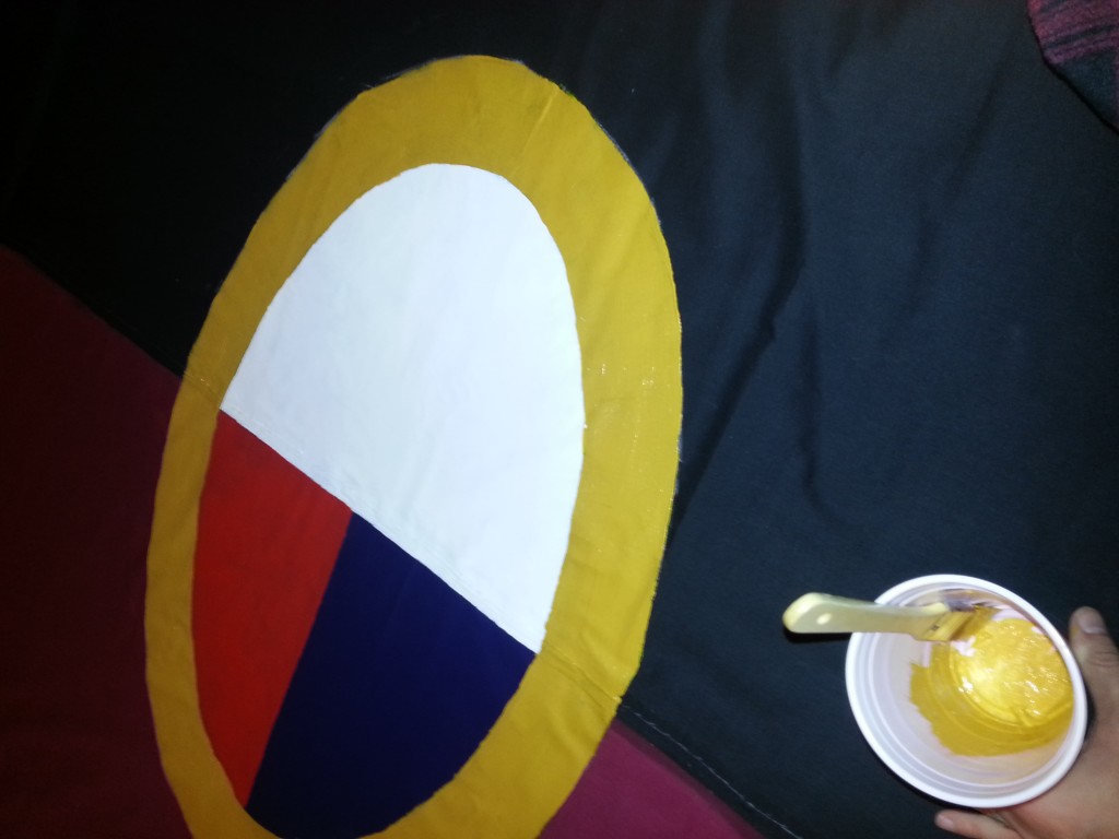
I lost a shade of gold, but in the end… I lost the need to constantly swap colors, so I’ll call it a win.

Just take a look at our patrons, and you’ll know
Some don’t appreciate us, others never will.

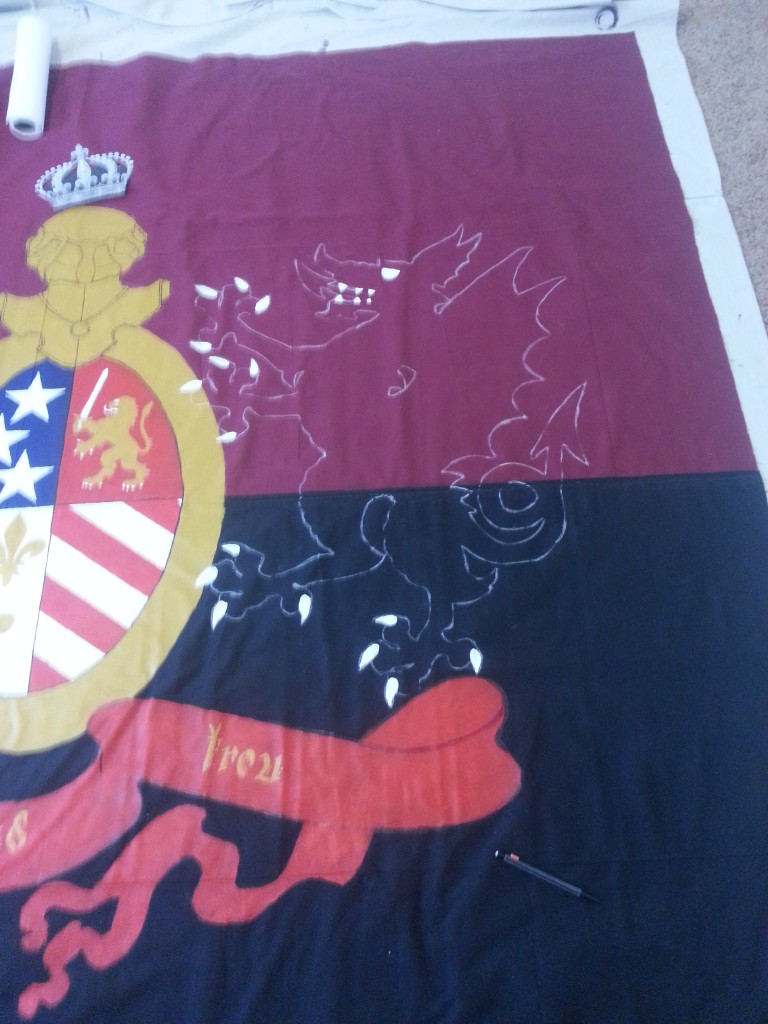
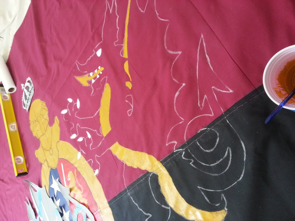
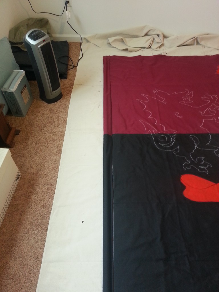
The next big step was getting some chalk and chalking out the helm, the ribbon, and eventually the dragons. I initially wanted to save the details for later, but I broke down in time and just started scatterbraining across the 8×8 canvas.
20160214_102138

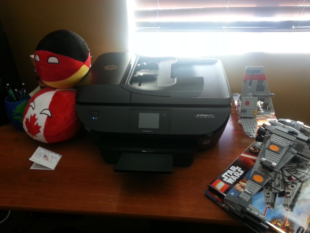
Eventually some equipment would need to be replaced. Brushes break, cups dirty, but my poor old printer was just getting too old. Plus it was like $50 for new ink cartridges so for $100 on Amazon Prime I got a new ink with a free printer thrown in. Oldest joke in the book, but work with me here.

This one has wifi. No more wife emailing print-outs to me.

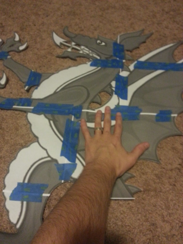
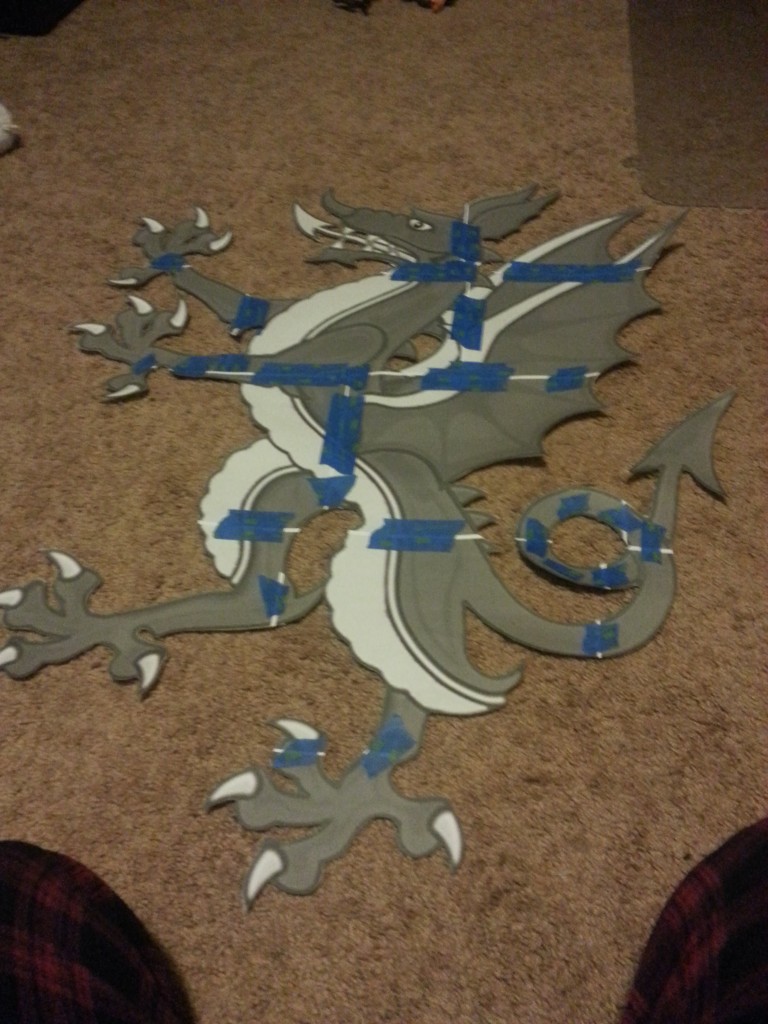
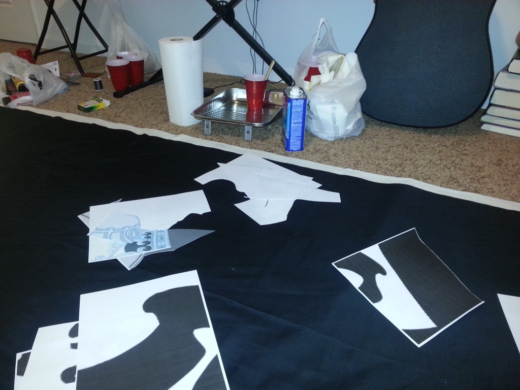
Usually one paints a tifo by first projecting the image onto a wall, hanging the fabric, tracing the image, and then painting it on. Colors are limited and even the small details are huge. Here, no luck. Projectors are expensive and the small details require getting up close and personal, often free-handing the actual lines. For the most part I use tracing, which in turn means lots of printing, cutting, and taping.
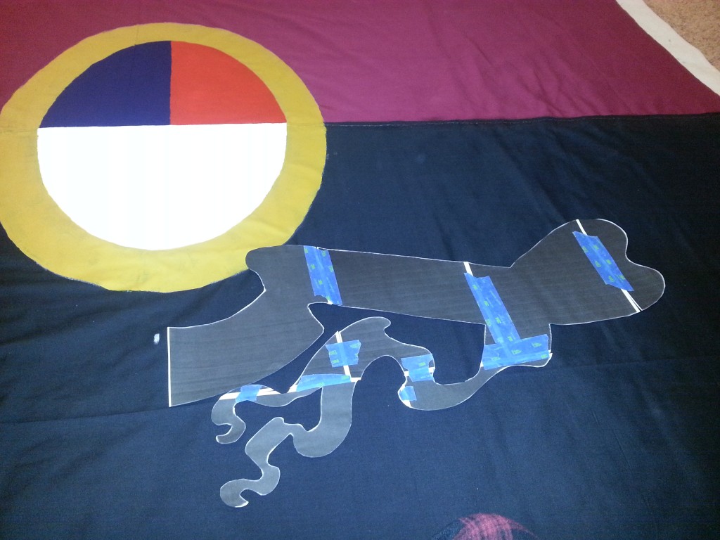
20160210_180457

20160210_182434

Then once the stencil is made, it is traced out. One of the reasons I made everything as symmetrical is that I can use the stencils “twice” – once on each side.
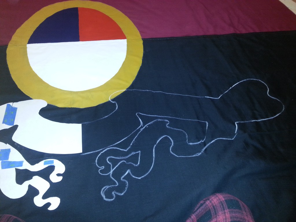
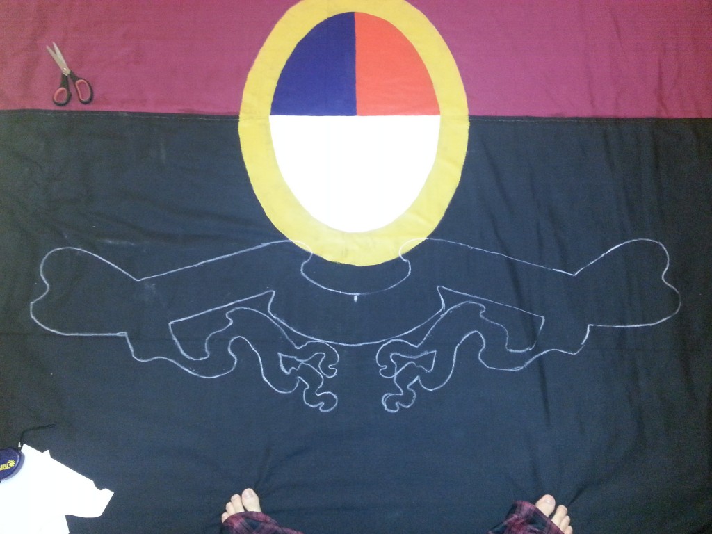
20160210_182850

20160210_183133

Plain, white blackboard chalk is surprisingly hard to find. I’ve checked at multiple places multiple times over the year and have never actually found white chalk, always just an empty hook next to the colored blackboard chalk no one wants because it stains everything.
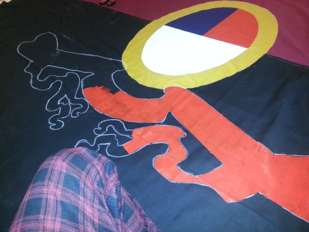
20160210_184425

20160210_190507

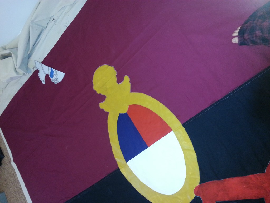
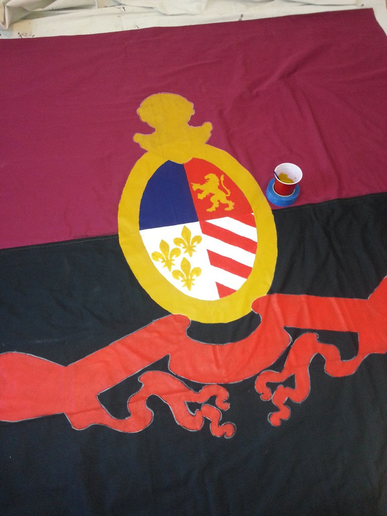
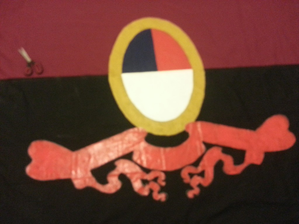
First coat of the red banner, right before getting scatterbrained.
20160216_165751

20160216_172659

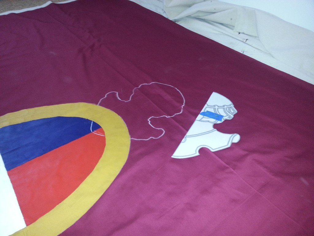
Second coat of gold on the ring, first on the helmet. Genius Kendall. Also, by this point the brush death toll started. A 1″ brush Brigid grabbed so I wouldn’t have to dedicate a single night to a single color died about halfway ’round the ring.
20160216_174206

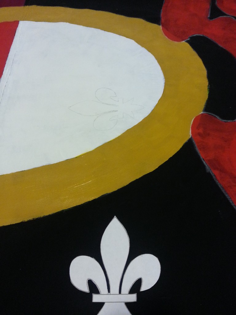
So while the gold dried I decided to work on small details instead of cleaning my remaining 1″ brush twice.
20160216_180804

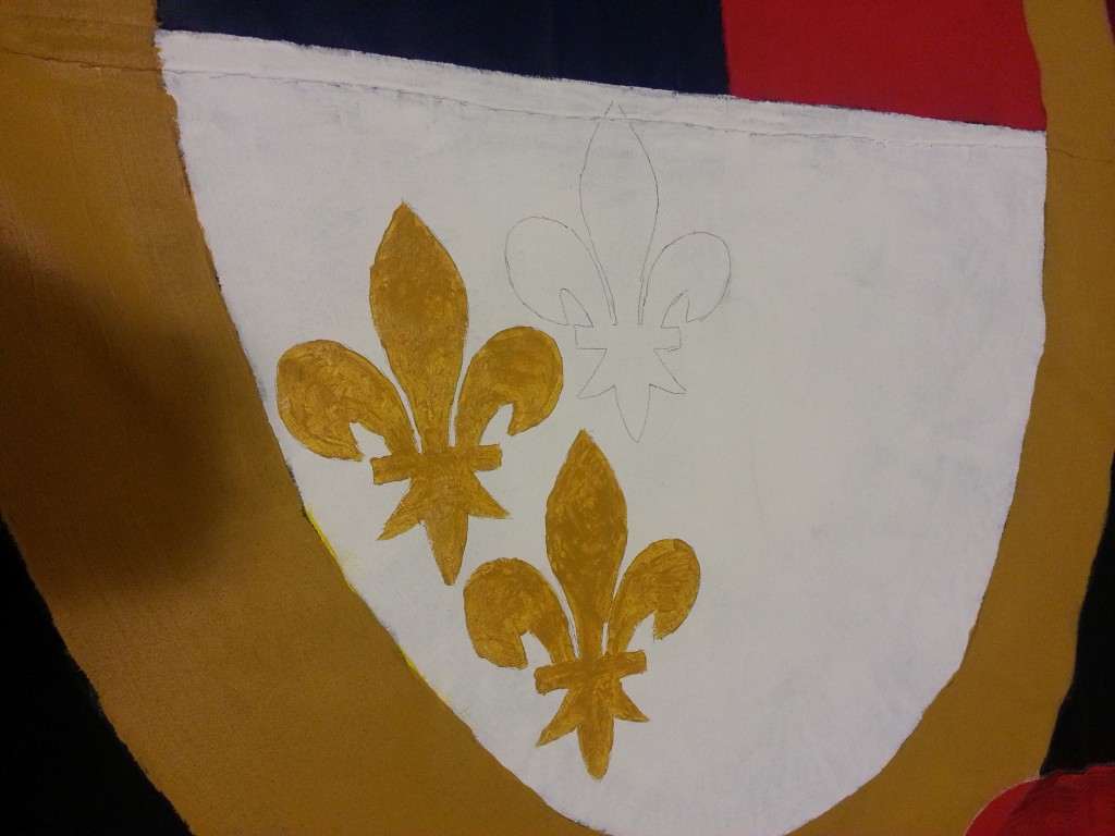
At this point I also realized that my old printer had slightly enlarged certain print outs. So my fleurs de lys were too big to fit two abreast.

So they got staggered in a weird pattern. Had I know earlier I would have aligned two to the right and one center and to the left. But fuck it. Perfection was never the goal. So I finished the third fleur and then went to wash my brushes…. and promptly killed my good 1″ brush by rinsing it under too-hot water, causing all the bristles to loosen and fall out.

For fuck’s sake, Kendall.
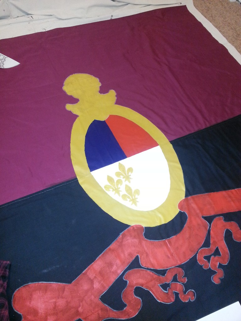
20160216_181408

All theory is gray, my friend. But forever green is the tree of life.

Bought new brushes today. Grabbed two and didn’t grab cheapos. The first order of business was going to be the crest I was hoping to finish it first so I wouldn’t be sitting on the supporters to get at it later. This would include the helmet too and then eventually the motto. The first day back to work was a red day.
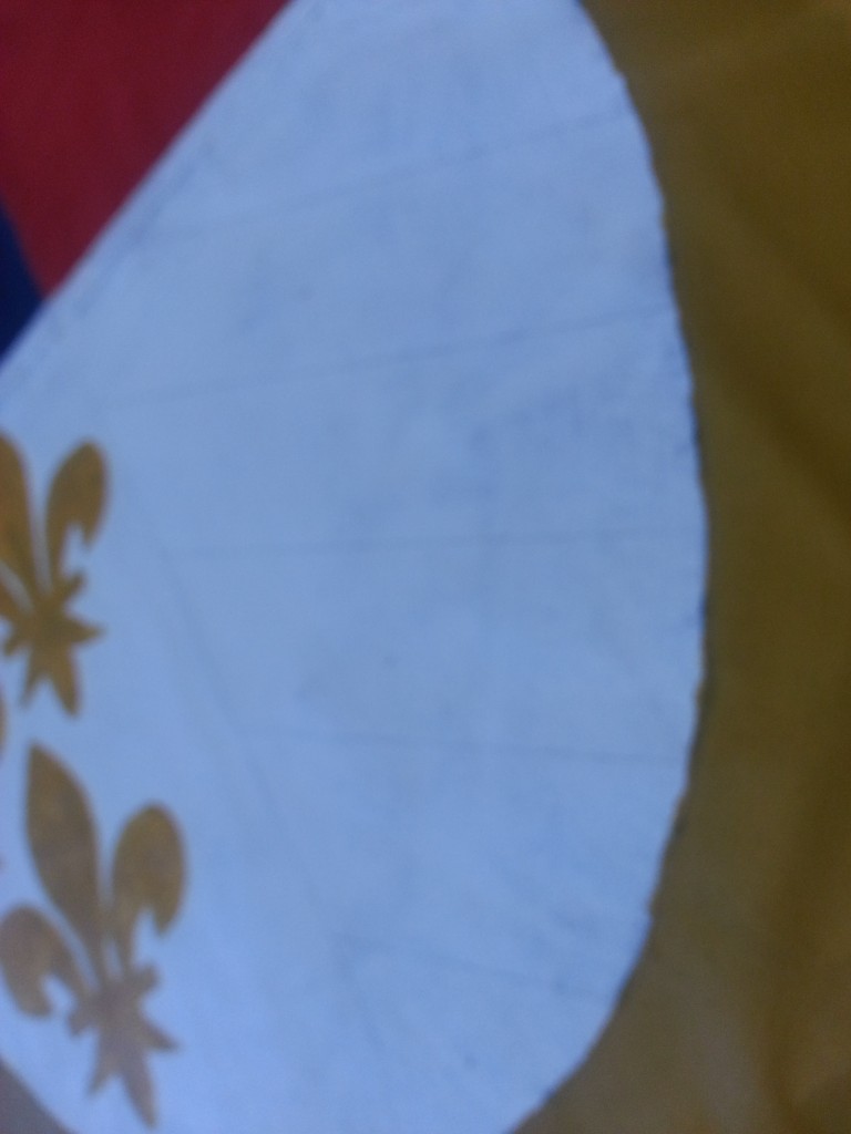
20160218_171903

Traced out the lines.

20160218_172942

Looks good.

20160218_180342

And promptly went about adding a second coat to the banner.

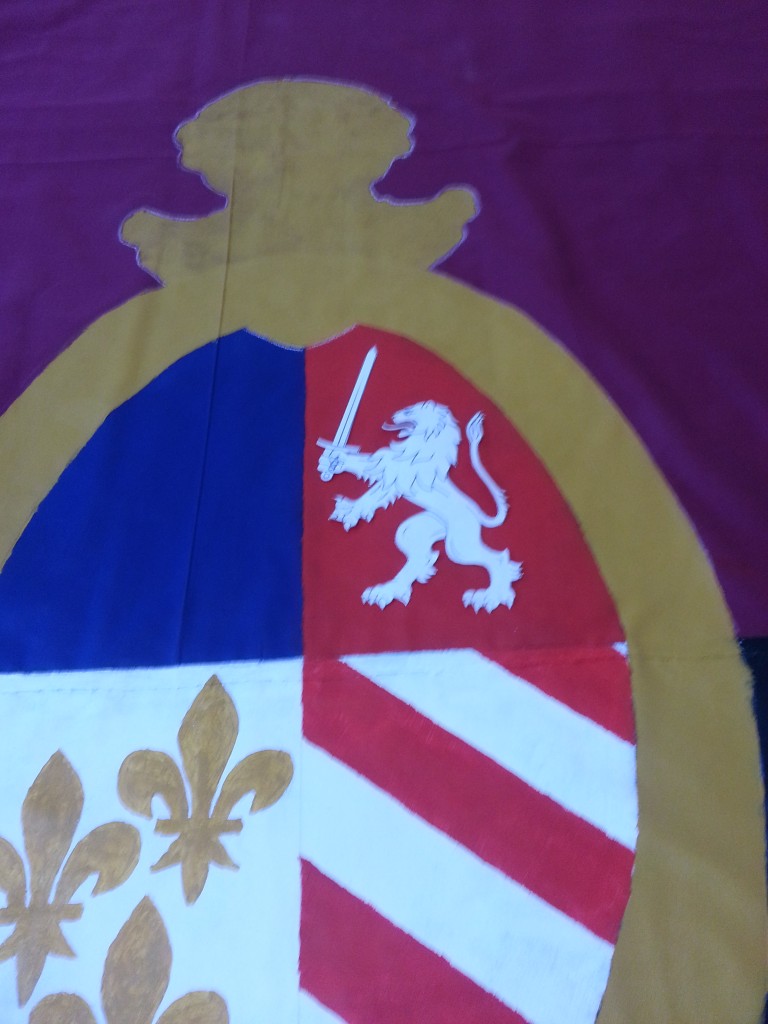
With the red done, it was time to move onto the first of the arty parts of the project – the Lion in the red field. The Detroit flag uses a stylized version of the English coat of arms – three Lions. I wanted to simplify this, but also add a Detroit flair. The choice of a Lion holding a sword was a simple one.
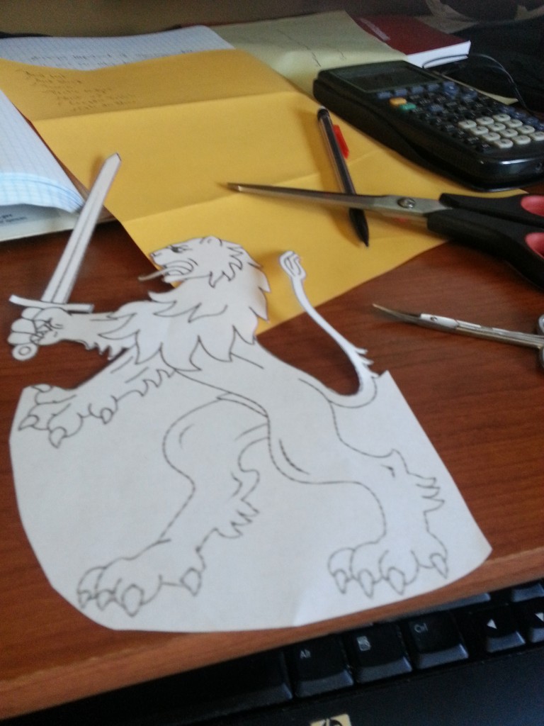
20160220_145436

Worked upstairs on this one.

20160220_151737

Freeeeeee!

20160220_154221

It fits! Mostly because I specifically shrank it.
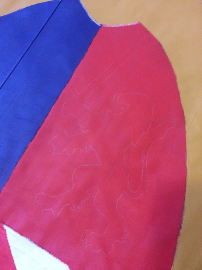
20160220_155044

A quick trace later.

20160220_161352

And the gold paint added.

And before anyone asks what’s happening to all the brush cleaner, don’t worry, I’m no litterbug.
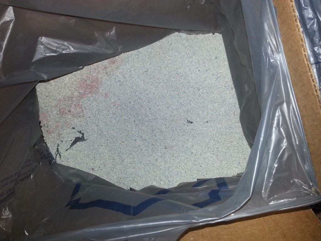
20160220_164748

That’s right. Kitty litter. It’ll go into the trash, not the best but beats down the drain because I’d never do that…. ever… really.

I waited to finish the Lion’s sword, teeth, and claws until I was getting the white paint out, basically when I did the stars.
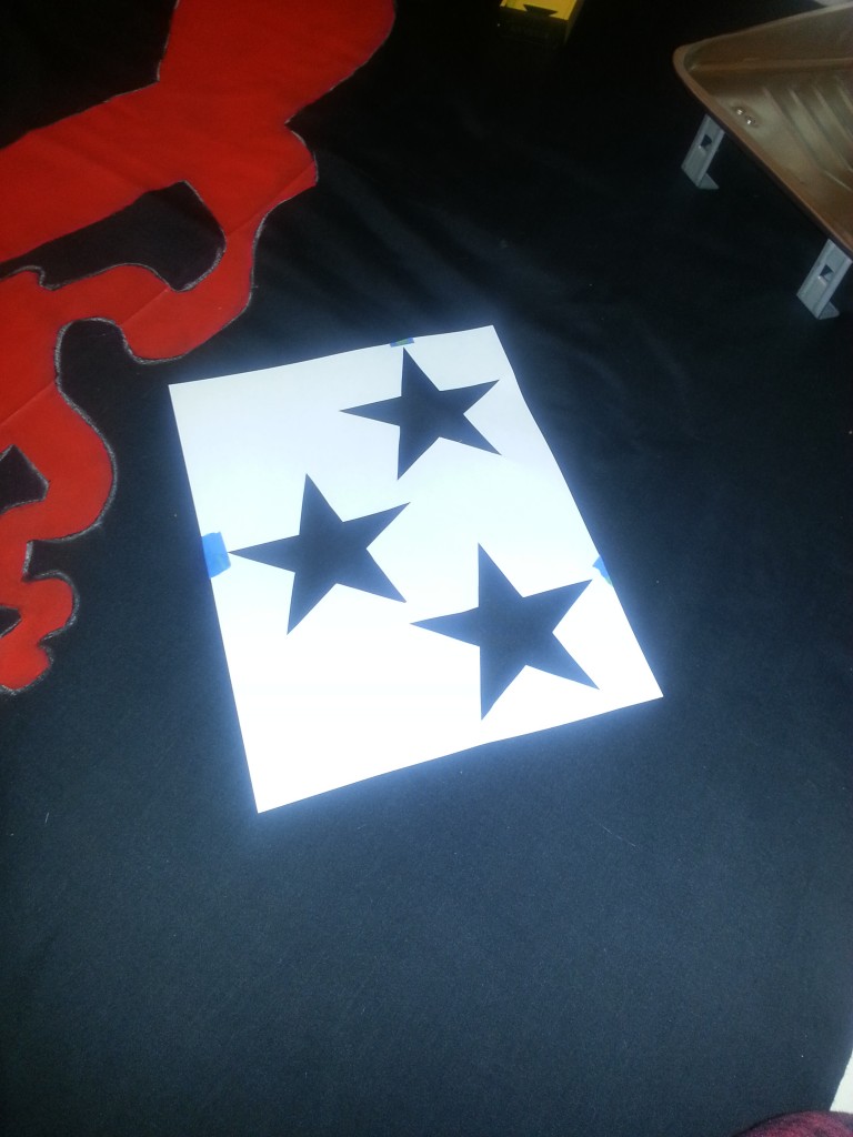
20160220_190155

Going with an inverse stencil to keep the spacing.
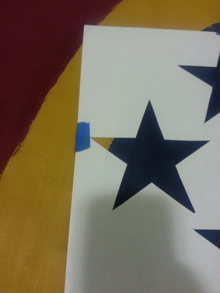
20160220_190235

FUCK.

20160220_193354

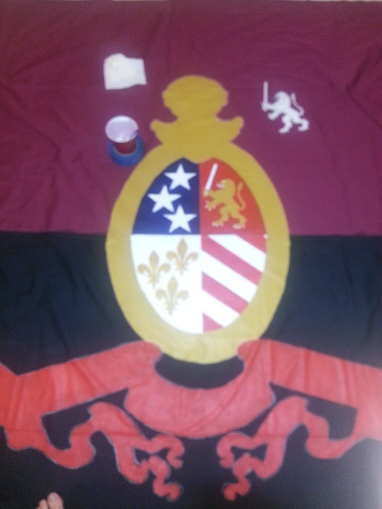
Squished that second star in. Still. Fuck. Anyway, shitty picture – but that is the nearly finished crest. Just needed some black outlining and that needed a a bit of bravery because we were getting into freehand territory.
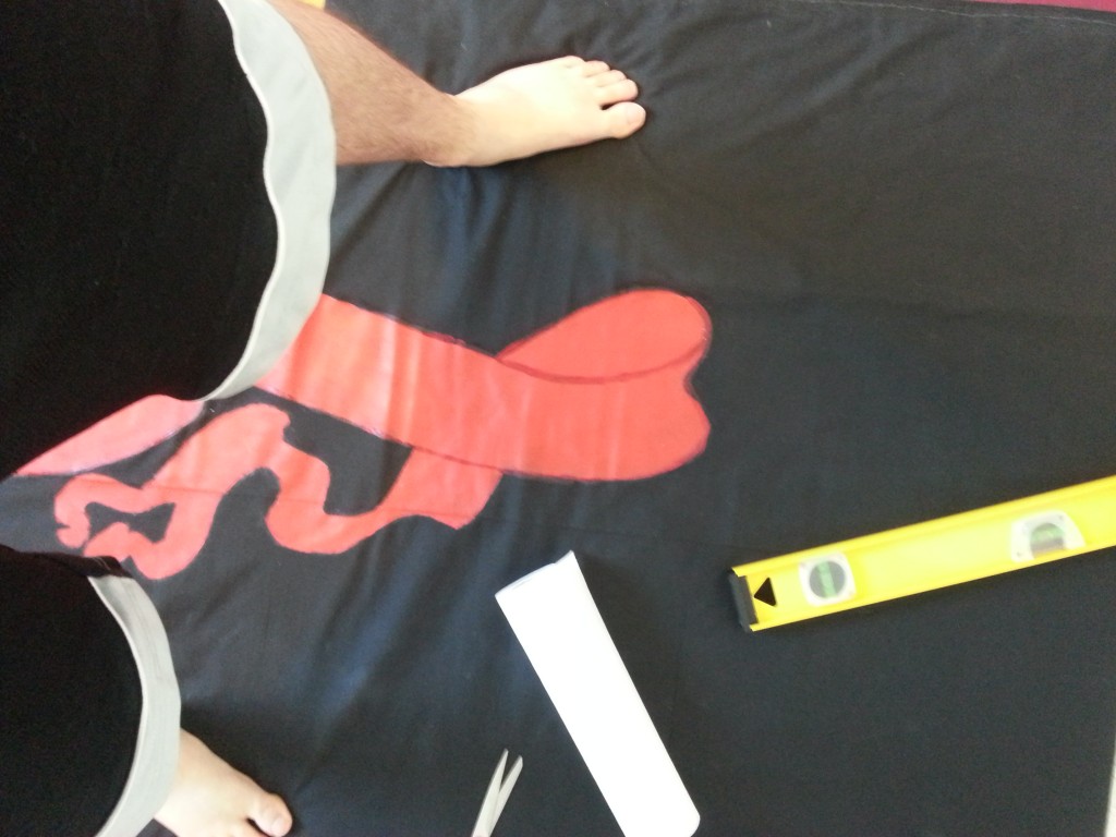
20160227_163513

Practiced outlining with the dark red for the banner. It doesn’t look good up close but fuck it. Paint was not sticking well.
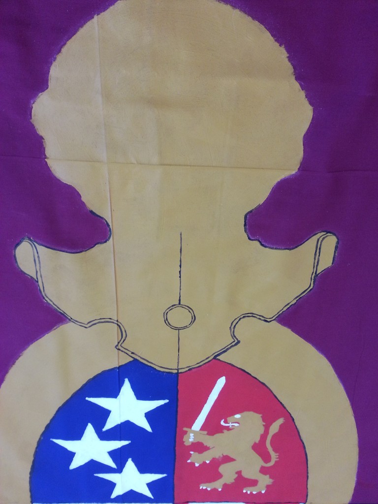
20160227_165012

This bit I could free hand, or use basic existing stencils like a ruler or a spool. However eventually I’d have to at least trace the main guidelines.
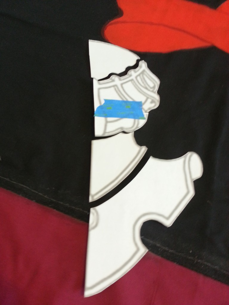
20160227_172805

So I cut apart the existing stencil.

20160227_172824

Boom! Looks good considering I’m shit at art.
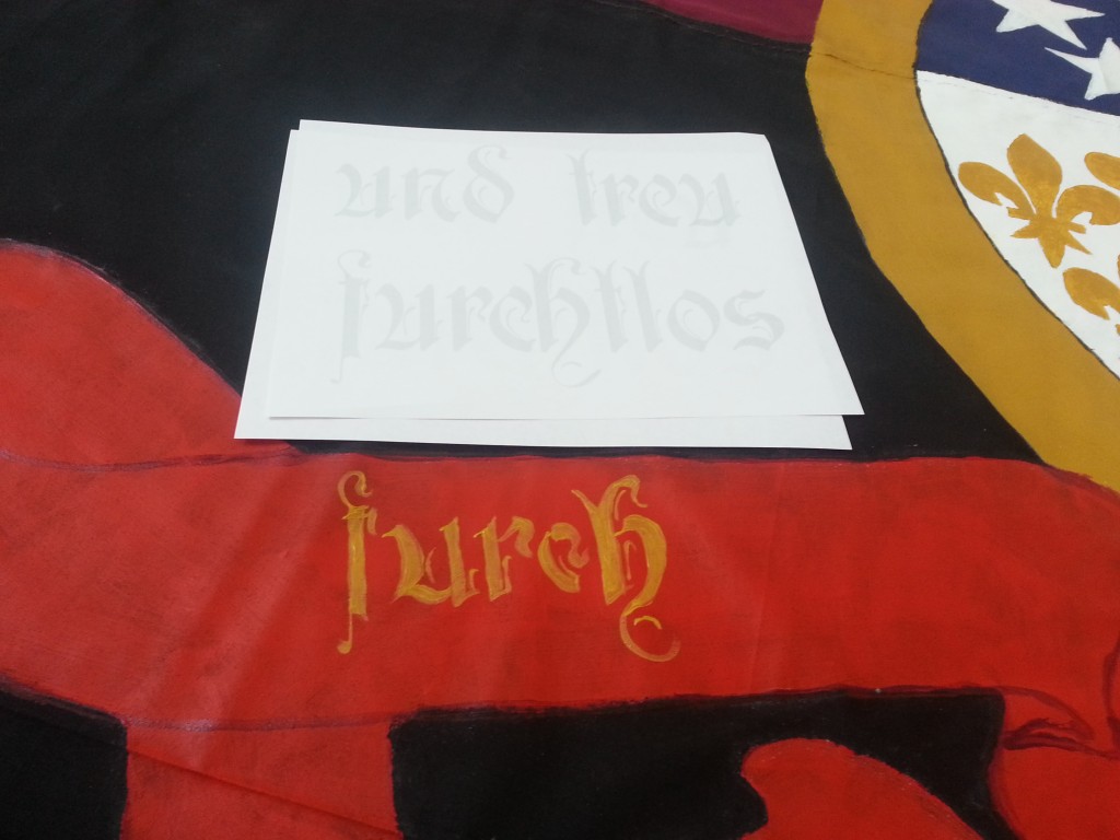
20160228_100523

More free handing. Super, super proud of the calligraphy I was able to do. Probably wouldn’t be able to do it again. But I got it when it counted.
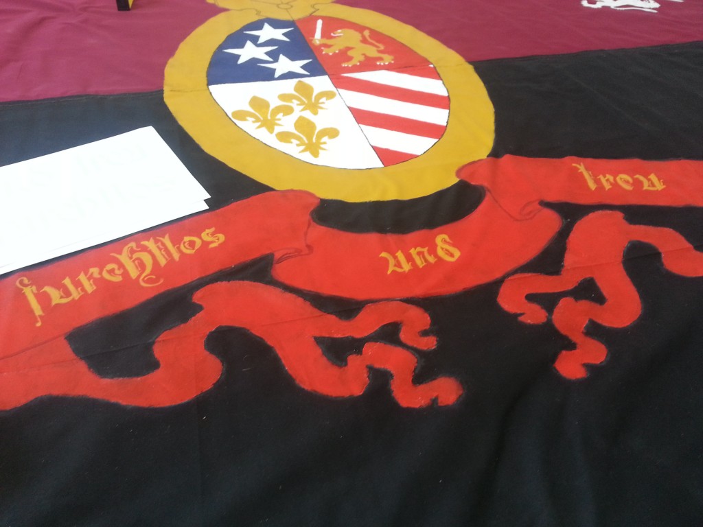
20160228_101540

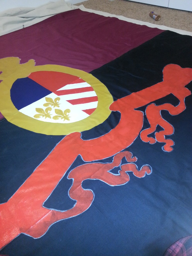
The traced crest and the motto. Furchtlos und Treu for sure. But with that there were two things to go… two things I had been postponing – the highly intricate crown… and the two massive dragons.

That which issues from the heart alone,
Will bend the hearts of others to your own.

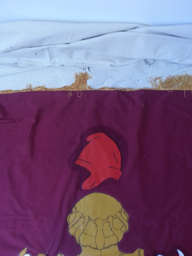
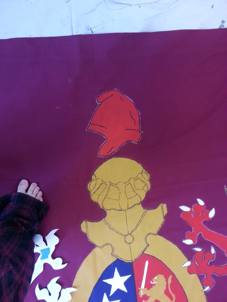
So, that crown… kinda royalist… don’t you think? Maybe you don’t. Maybe you don’t care about things like that. But I do. It was grating on me for a while. Not only was it intricate and hard to paint, but it also symbolized something I don’t support – monarchism. If only there was some sort of hat that represented freedom and democracy… Wait! There is!
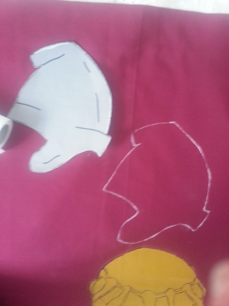
20160305_144401

It’s called a Phrygian cap and is a symbol of revolution. It appears in a lot of French Revolutionary scenes as well as the coat of arms of Argentina.  It’s also on the seal of the US Senate.
20160320_141013

That was easy. 😉

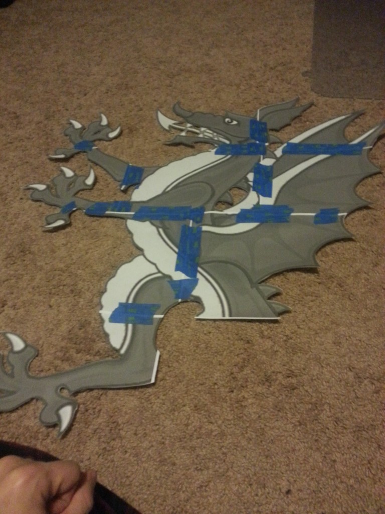
Now those fucking dragons.
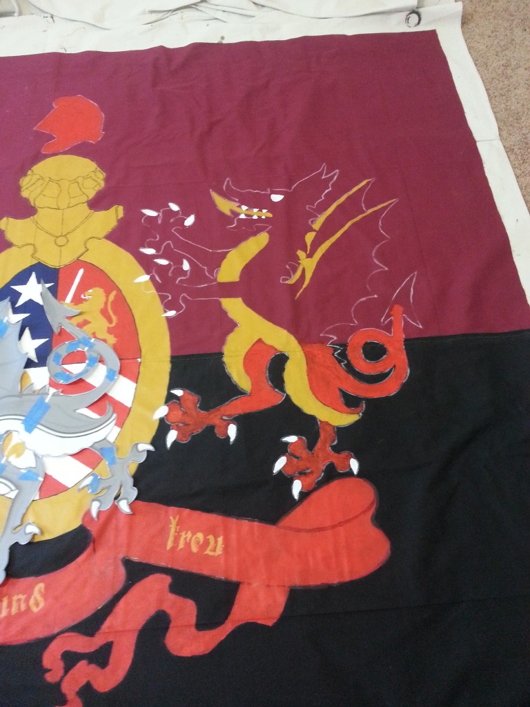
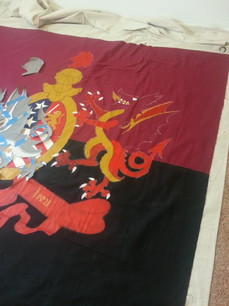
20160303_182937

20160303_182955

It’s pretty big.

20160303_185119

Finished. It was something like 13 or 14 sheets of paper all told. I don’t have the final count any more. It was a lot though, but it is for a good cause.
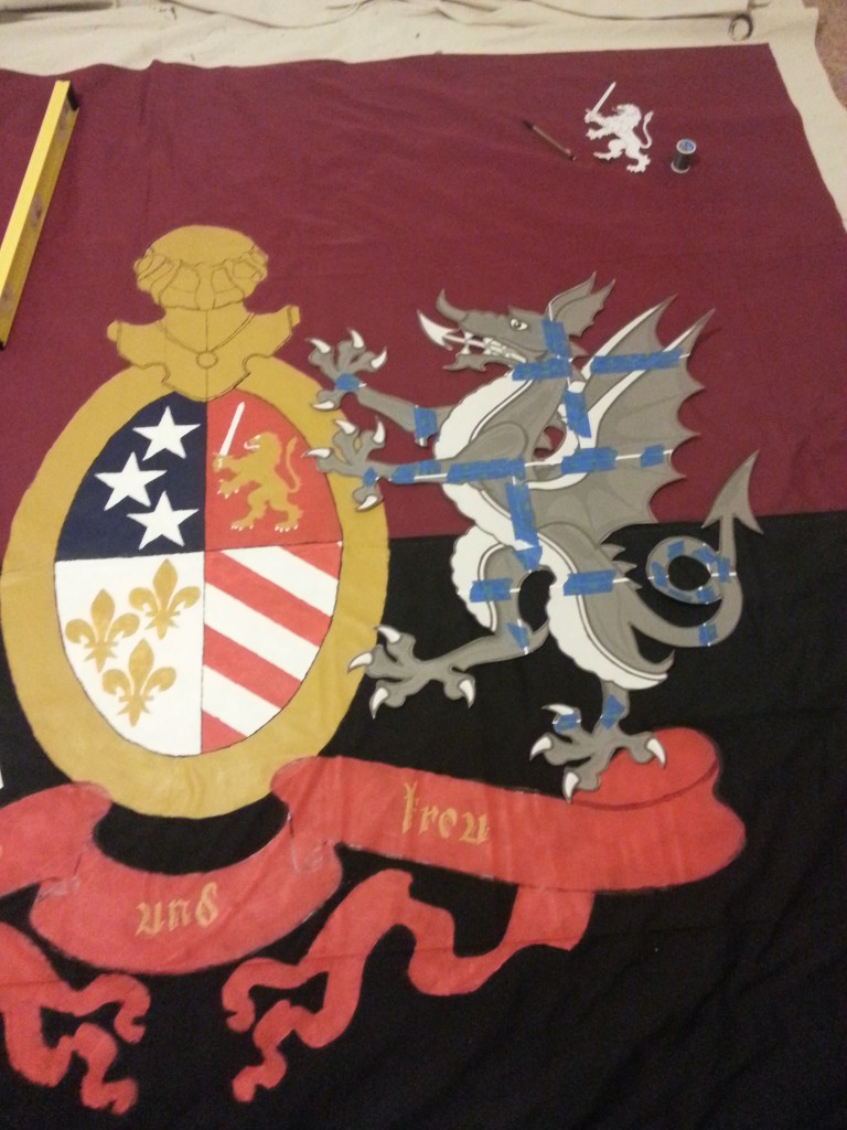
20160303_185412

Positioning. Ignore the missing phrygian cap.
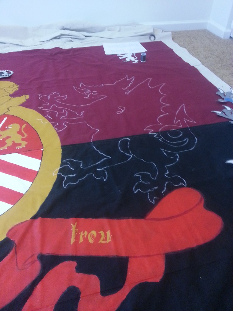
20160305_081640

Traced.

20160305_084617

White details.

20160305_104209

Gold details.

20160305_171645

Starting the red.

20160319_182918

More red.

20160320_140931

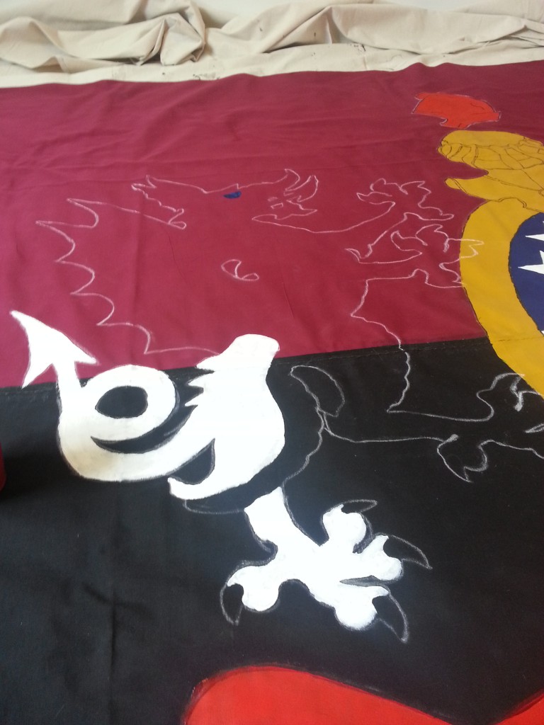
Added black details and more red. Still a lot to go… plus… another fucking dragon? Shiiiiiiiiiiiiiiiit.

Whatever is the lot of humankind
I want to taste within my deepest self.
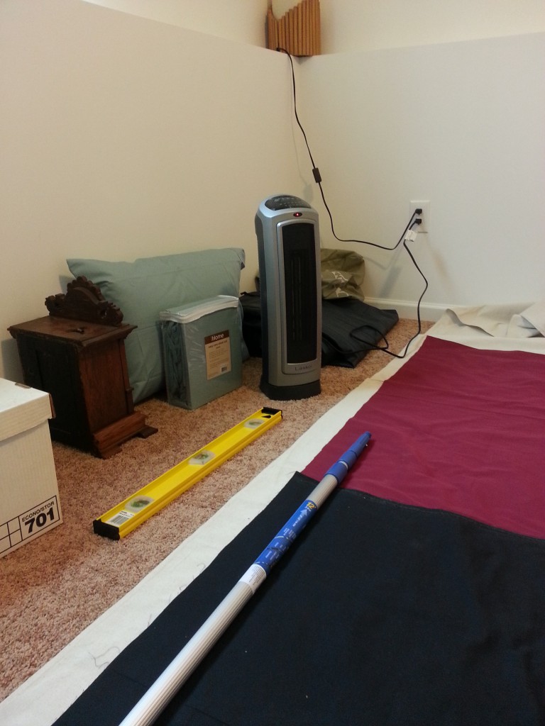
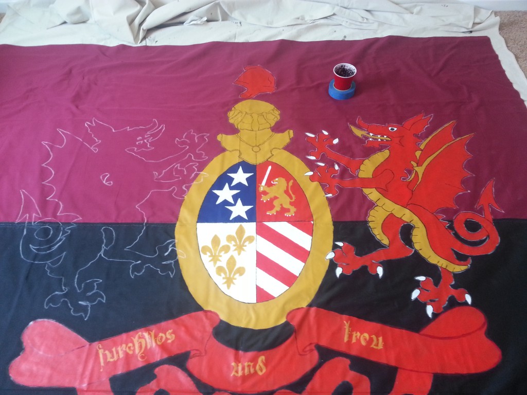
20160328_115432

Working down in the basement was hell on my fingers, decided the best thing to do was get a space heater and let that baby wash over me. I also started bringing down a tablet to listen to podcasts and things to keep my brain occupied. After this I noticed shifts went from an hour or two to six hours pretty quick.
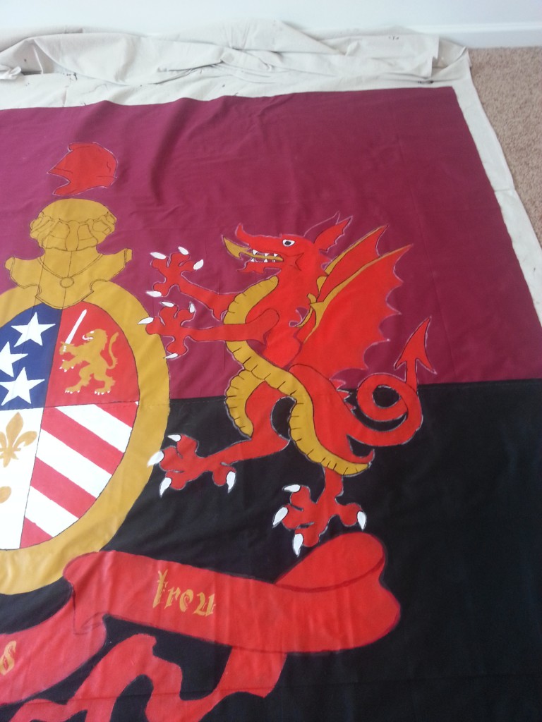
20160328_133240

An nearly complete dragon.

20160328_144311

One down, one to go.

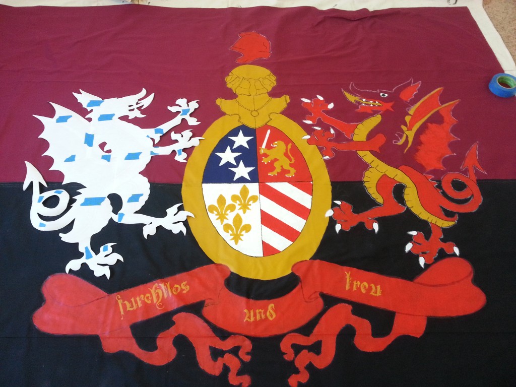
20160402_121244

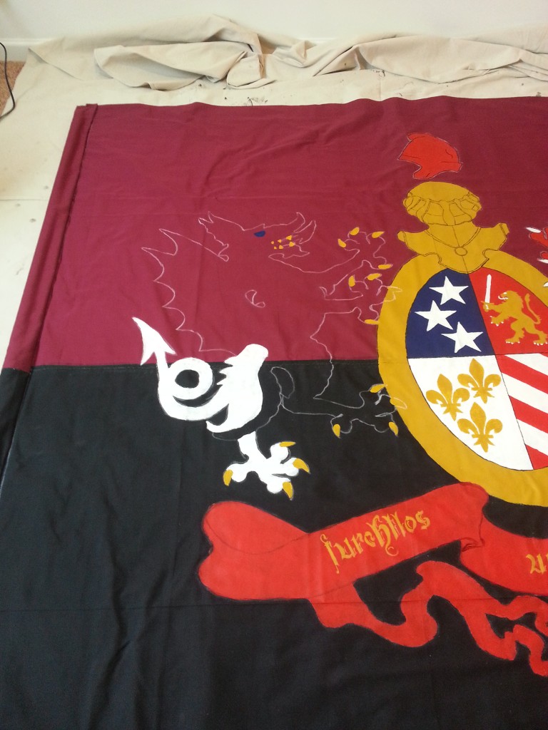
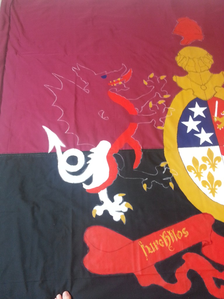
Got the sleeve glued, but not stitched. In this time frame I was thinking about the colors of the dragons. I was thinking that a lot of the flag was very samey looking. After talking to Brigid, I decided to switch the second dragon up. White -> Gold, Gold -> Red, Red-> White.

This would give me some more variety and could also reflect the Polish roots of Hamtramck and have the dragons wearing the traditional kit colors of DCFC – Rouge (home) and White (away).
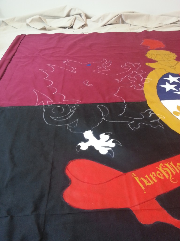
20160402_122626

20160402_123830

20160402_125109

20160402_134629

20160402_145149

20160402_171204

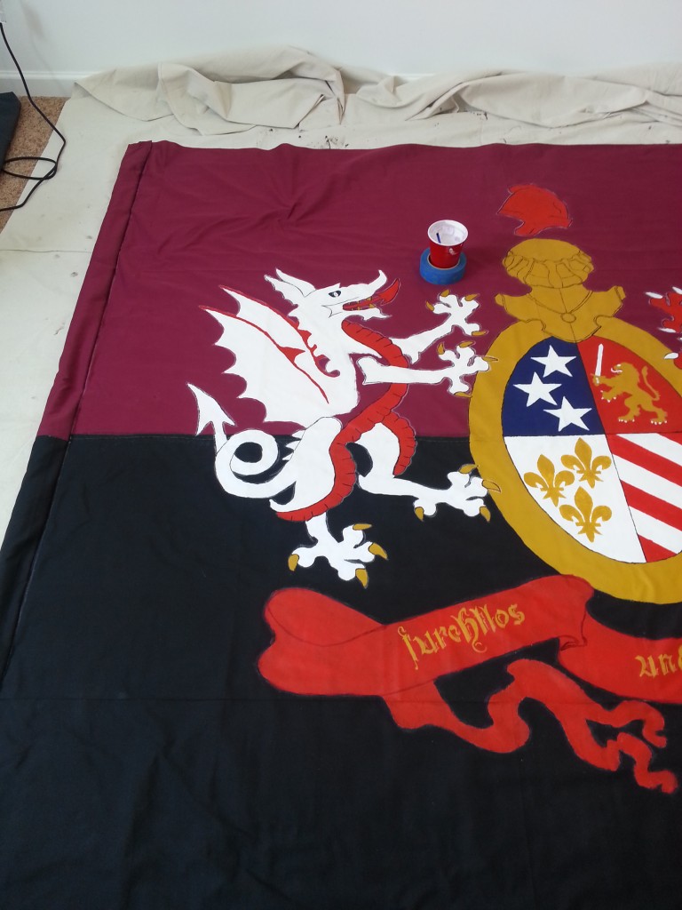
I got the sleeve and a massive chunk of the white dragon (everything seen above) done in a single shift. I also named the dragons – Danny on the left, Dave on the right.

I am not omniscient, but I know a lot.

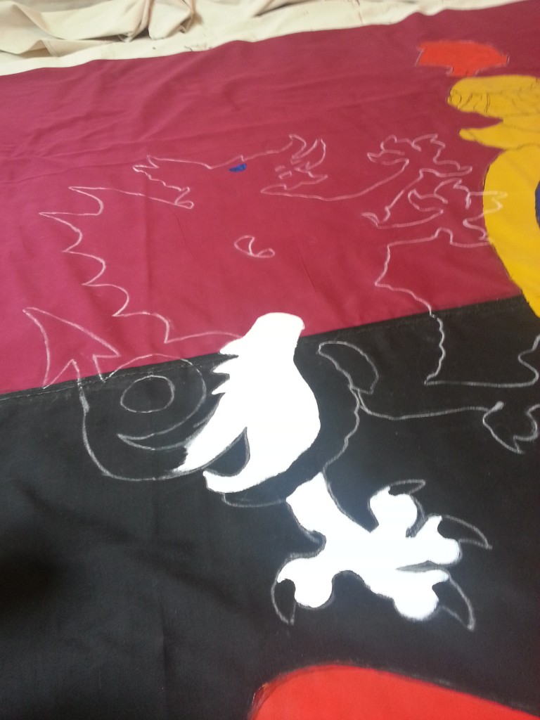
I’m headed into the final stretch at this point. Finish the white dragon and then getting trim and re-enforcement on before the 16th of April was the goal. I put zero work in over the week, but was dedicated on getting it finished on the weekend.

On Saturday we did our normal routine of Bob Evans followed by grocery shopping. Then. Work.

It had to be done in time.
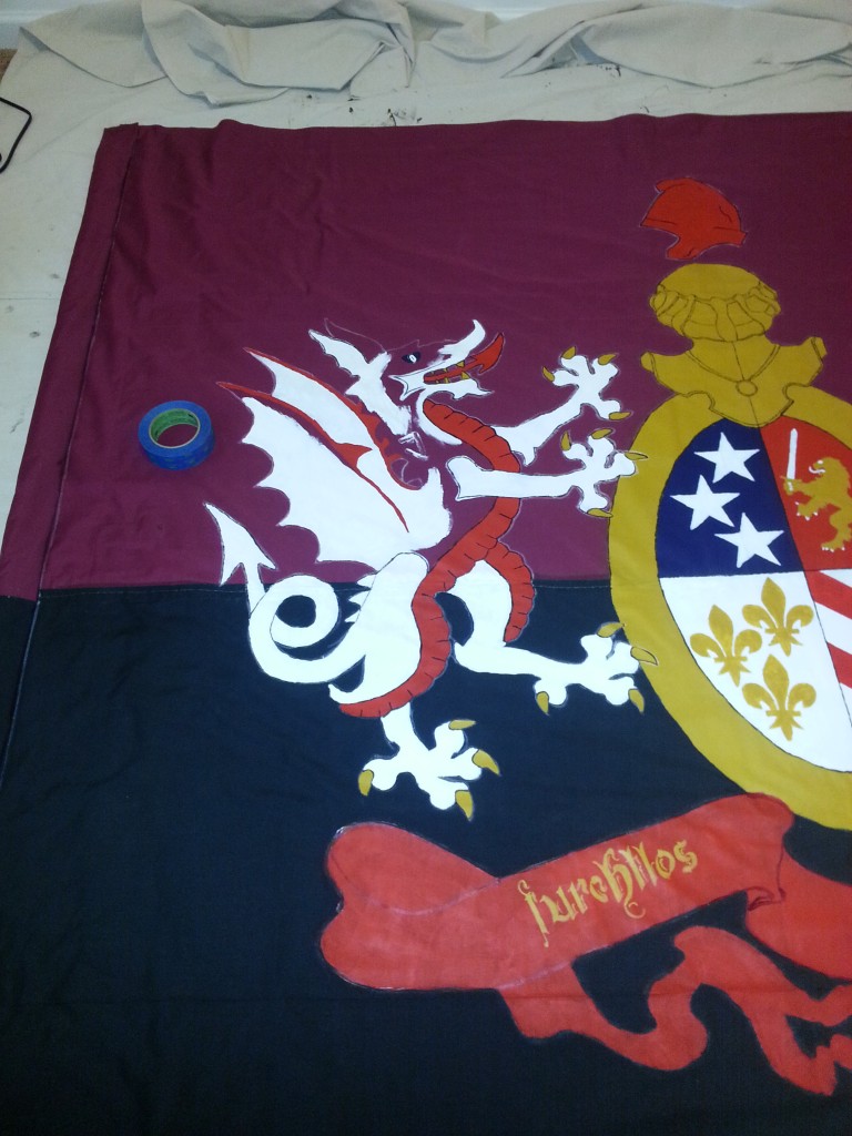
20160408_193629

20160409_121148

20160409_124855

In case anyone (no one) was wondering, I used the tape roll to keep my paint cup from getting knocked over. Saved me quite a few times.
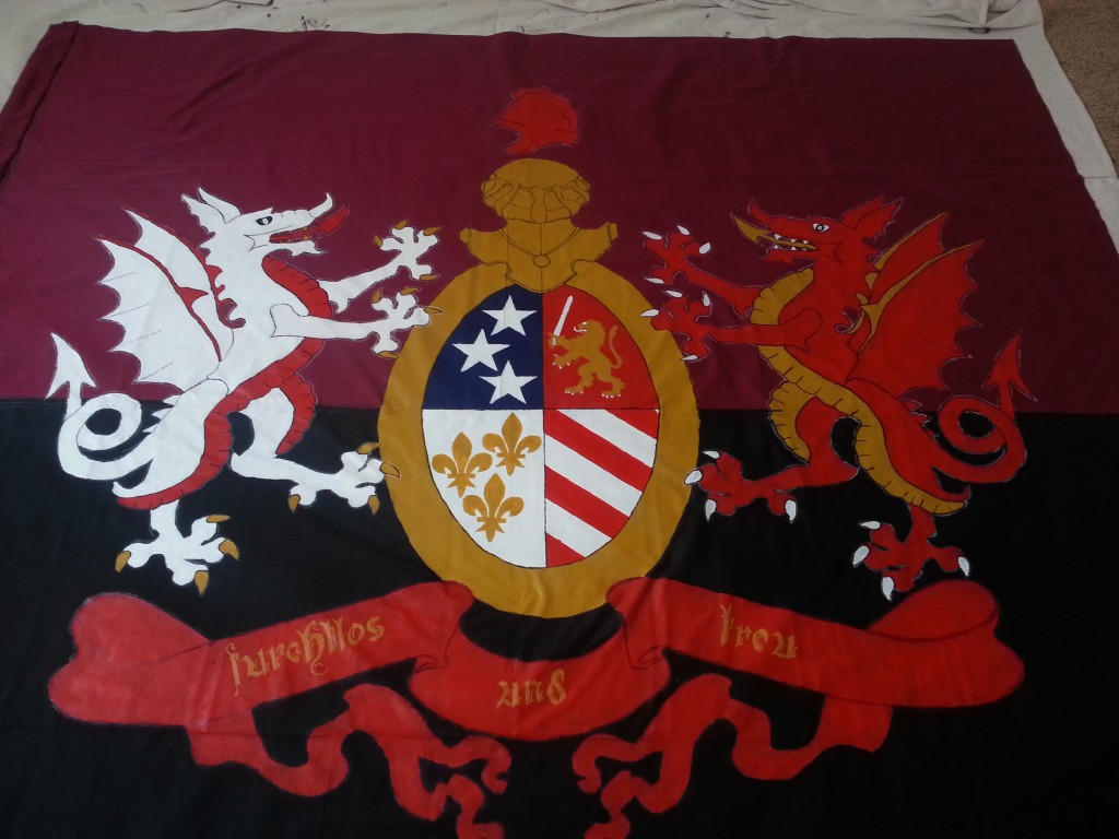
20160409_141909

Painting complete.

Now I had to move onto the trimming and the re-enforcements.
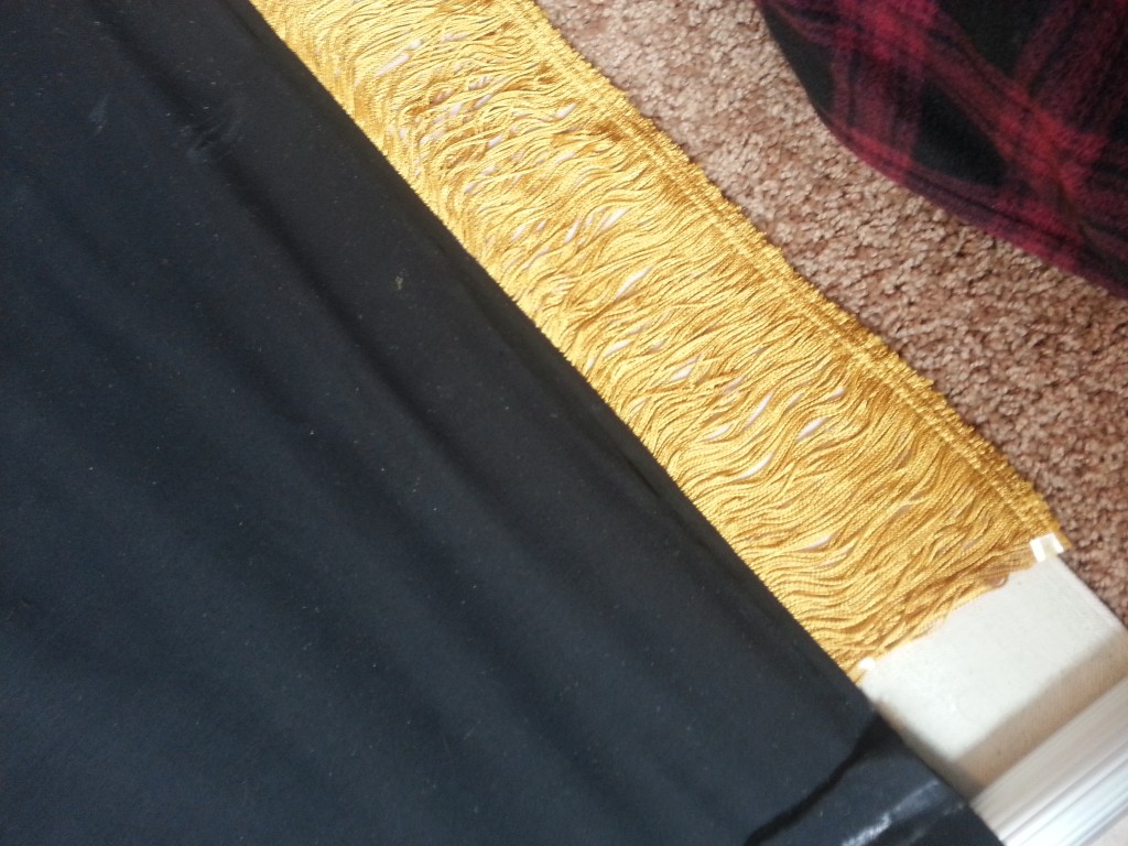
20160409_154658

It’ll never look this good again.

20160409_155929

20160409_160817

20160409_173803

Around this time I was horrified to discover that the sleeve around the pole had two pinch points and thus it was impossible to remove the pole from the sleeve. Which means I needed to cut it out.

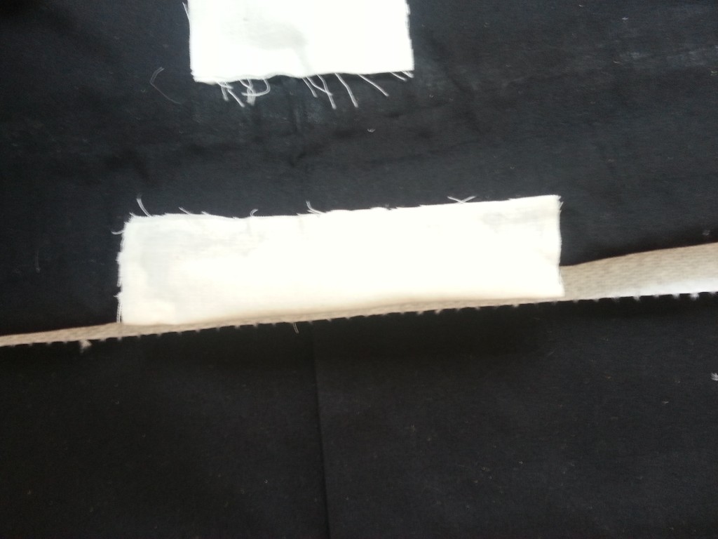
Luckily I had some fabric lying around from uni when we tried to make bags for cornhole. I was planning on using this for the grommets, but I had plenty so it would also be used to expand the sleeve.
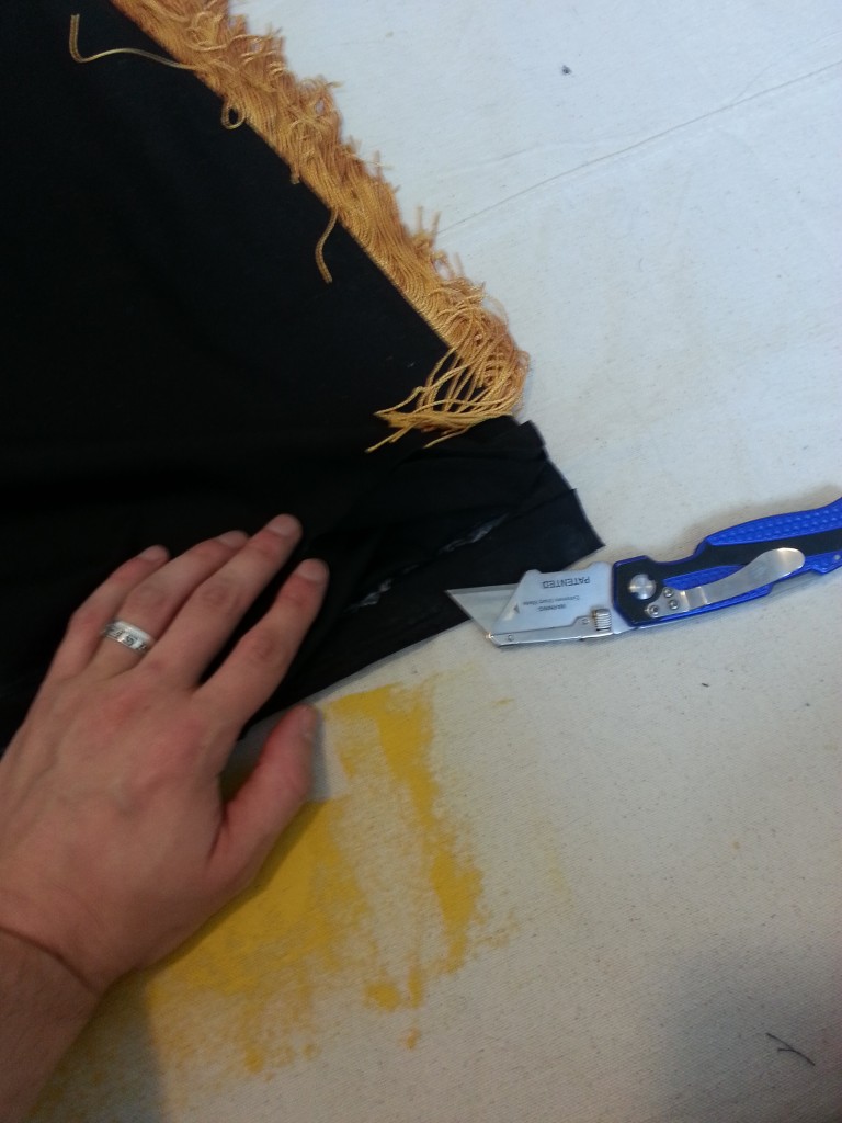
20160410_110736

First pinch at the bottom.

20160410_110744

Second pinch about a quarter the way up.
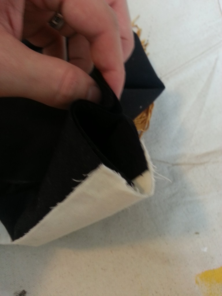
20160410_114403

Little extra room.

20160410_125426

20160410_125436

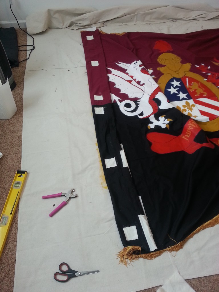
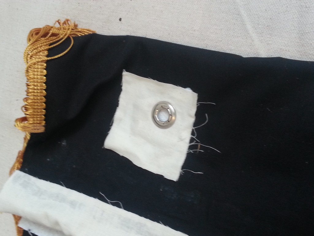
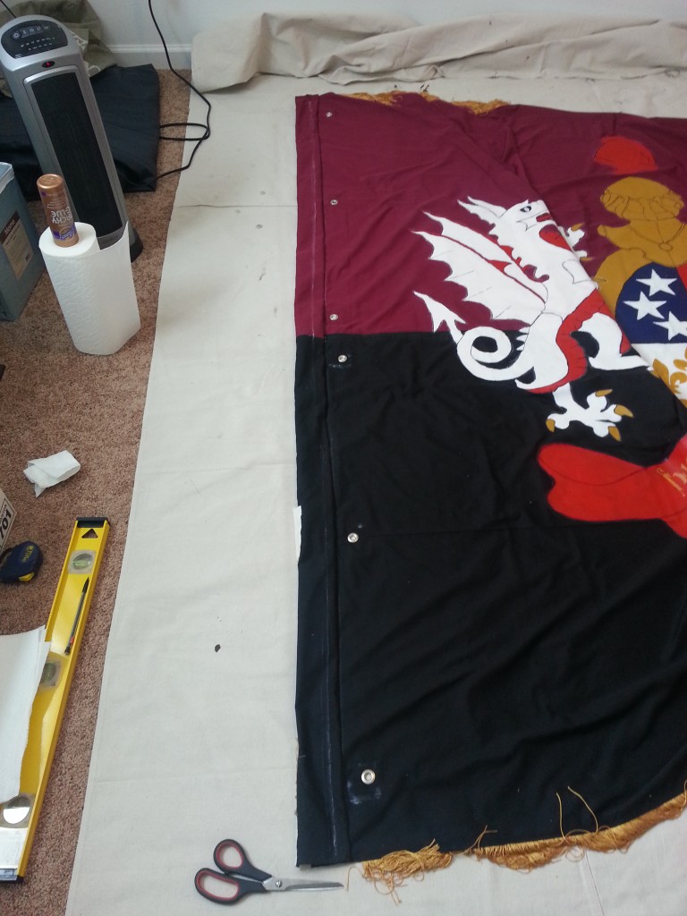
I laid out patches for the grommets. This would add a few extra layers of canvas so they wouldn’t pull out easily. The plan was that the grommets would be used as a secondary re-enforcement to the sleeve on particularly windy days.
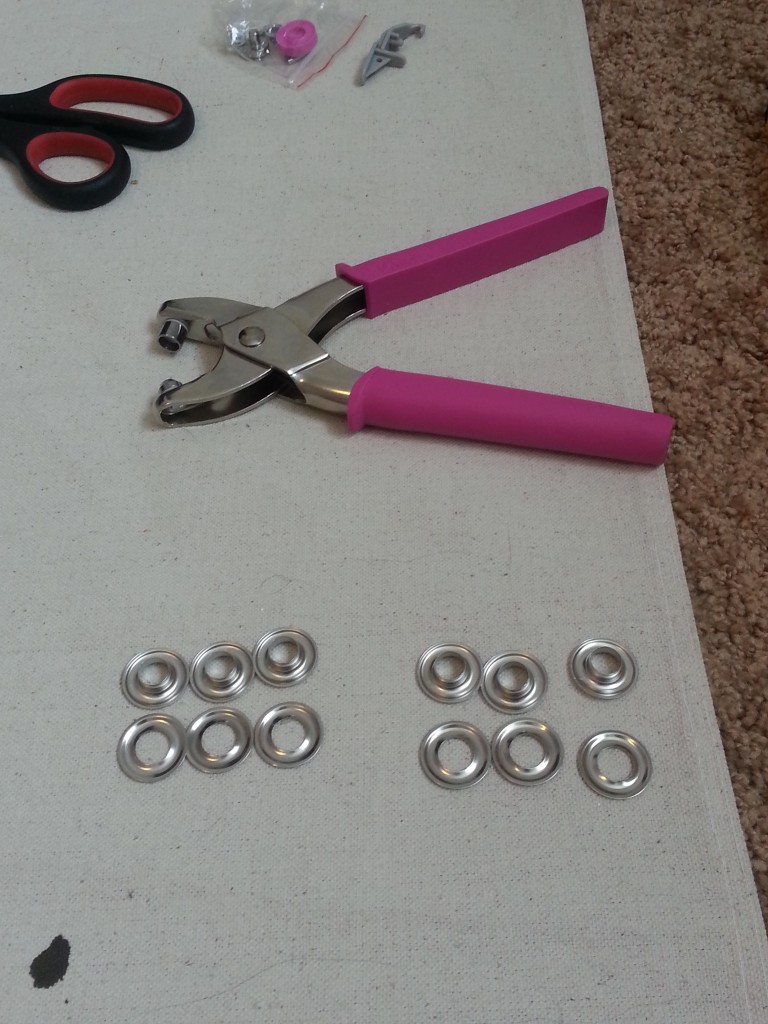
20160410_130131

Pretty in pink.

20160410_130956

20160410_131009

If my aim was off it was because getting over the sleeve was a pain in the ass.
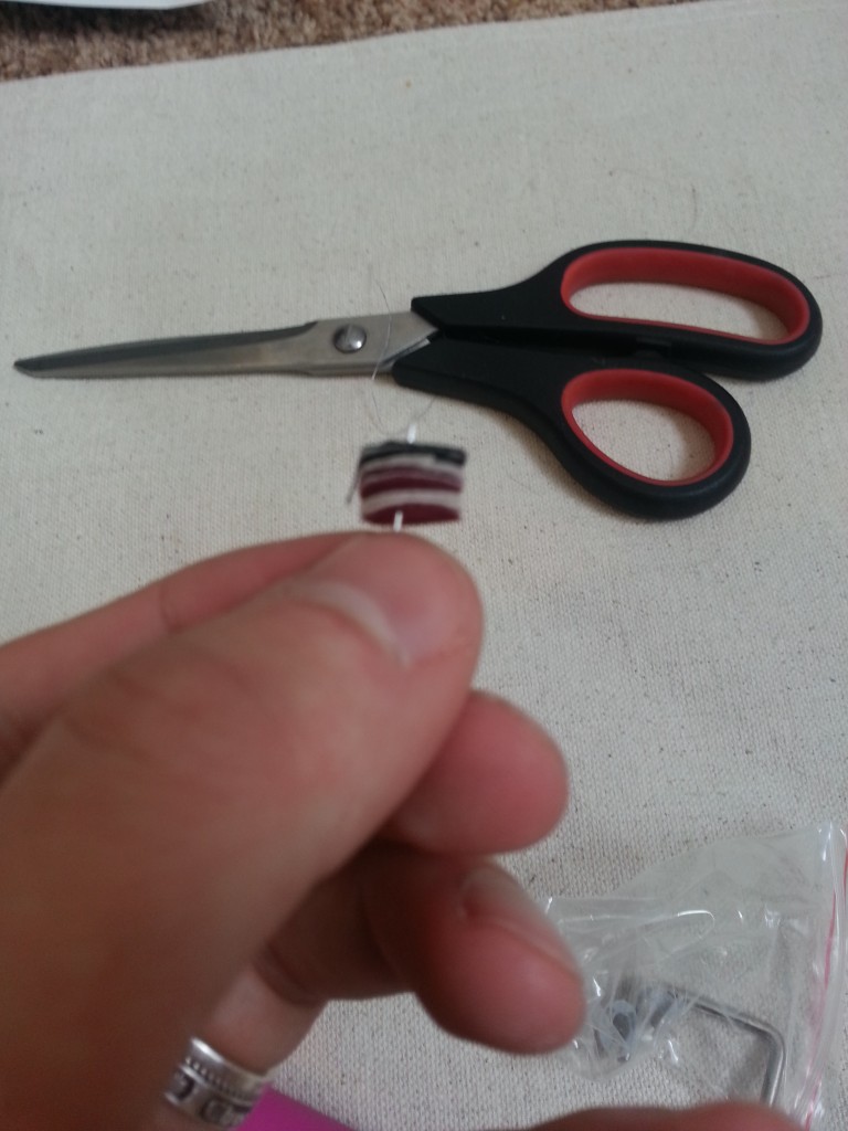
20160410_131349

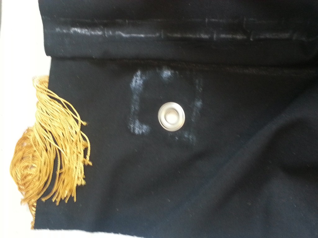
I have to admit cleaning the grommet pliers was pretty awesome.
20160410_131910

All nice and set.

20160410_125629

20160410_125641

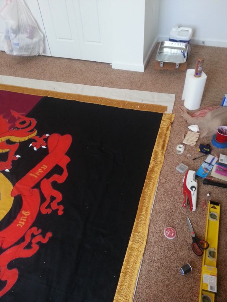
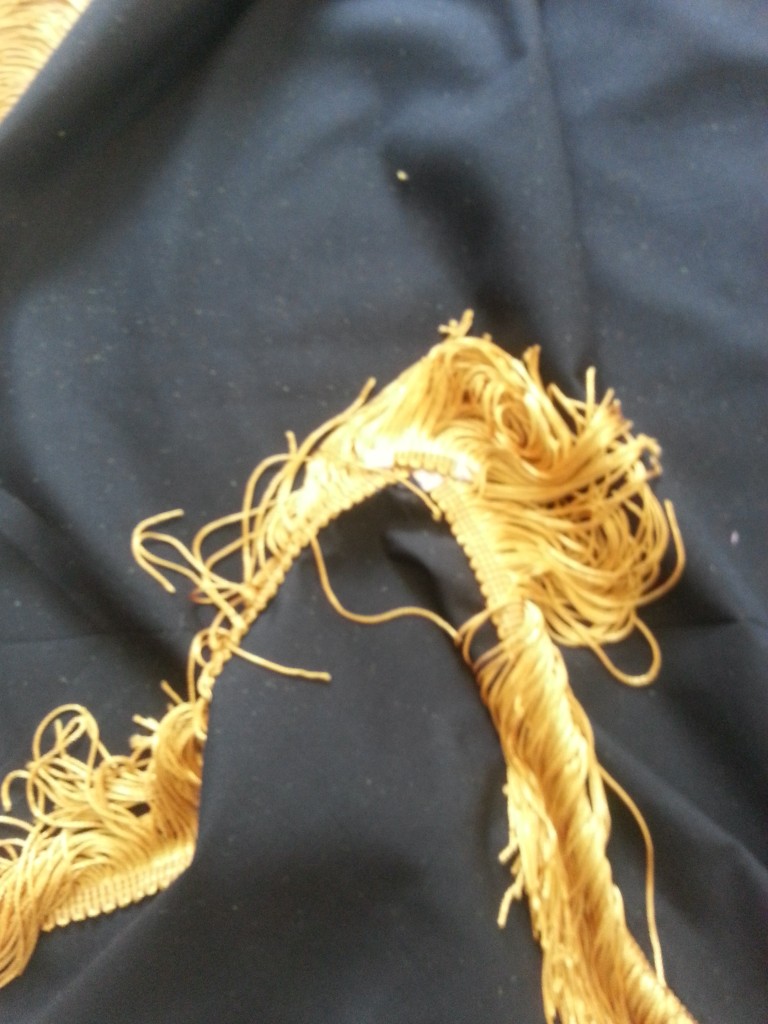
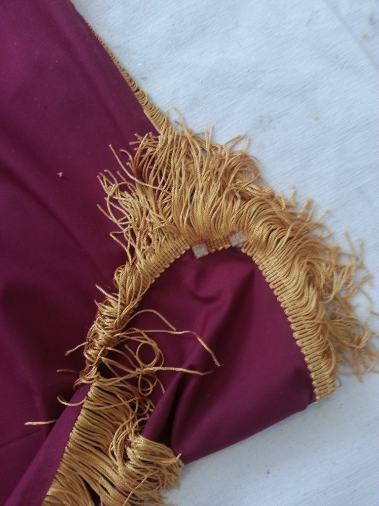
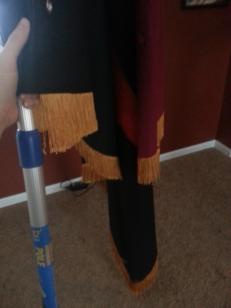
At this point I undid the ties holding the fringe together and wasn’t happy with the corners. (Un)Luckily I had mismeasured along the top and had to run to JoAnns for more fringe, so I had a foot to play with. I cut some tiny sections out and glued them diagonally across the corners. This really filled it out well.

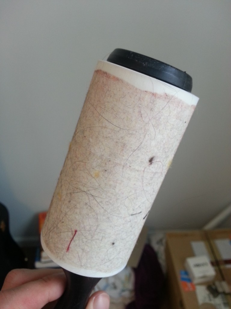
The last steps were cleaning. I had to get all the chalk off and all the gold lint from the fringe as well, also cat hair, human hair, and just general junk.
20160410_132634

20160410_135642

20160410_135702

20160410_145136

And so ends my project!

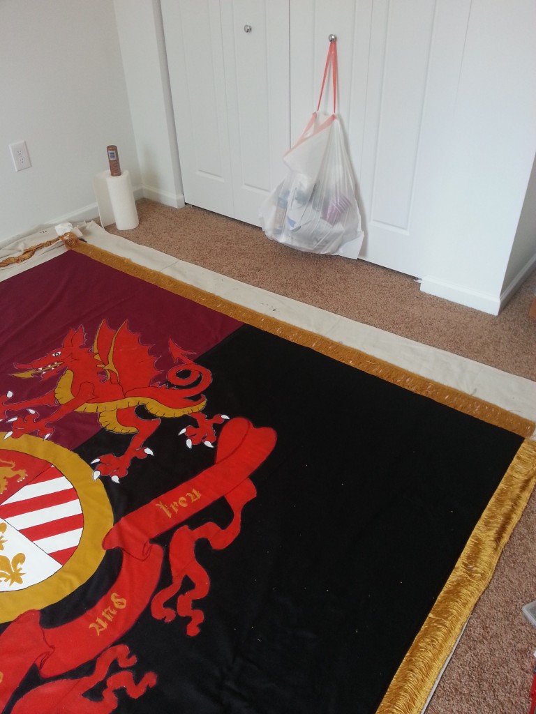
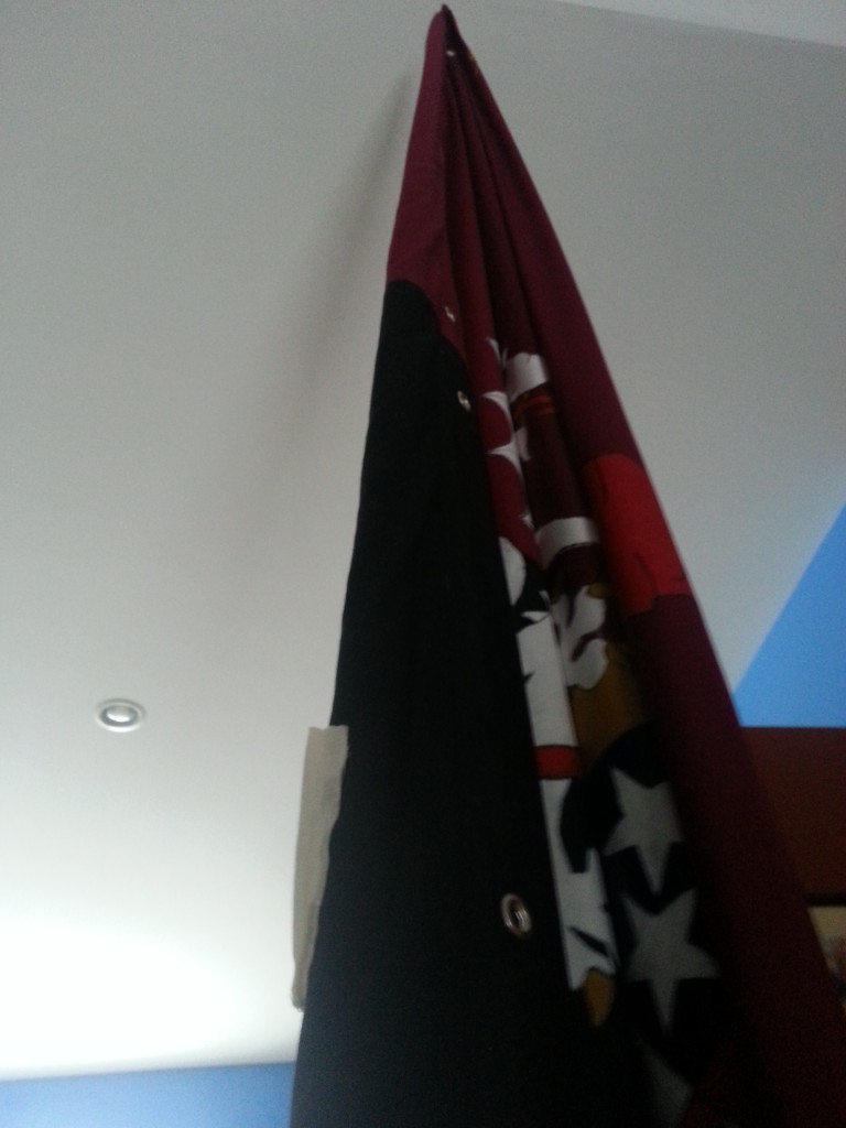
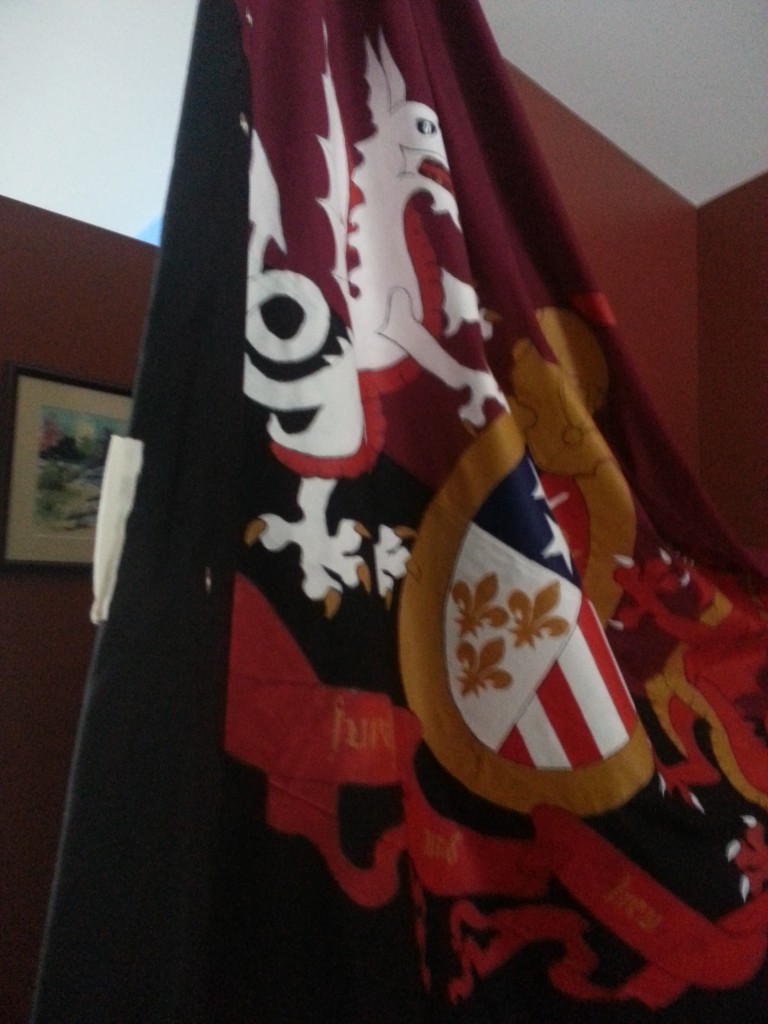
Brigid suggested we give Faust some air upstairs in our great room.
20160410_153418

20160410_153451

20160410_153507

Faust stands proud.

Thanks to everyone who helped me along the way when I had questions or just needed a little encouragement. This project had a lot of twists and turns and a few complications, but in the end everything for my club.

Up The Fucking City!


Draft to Reality:

KoK_V1_Release

KoK_V3_Release

20160410_145136

Only took two months.
A Deal with the Devil

Few things are more reliable than the occasional bleating of the MLS2Detroit crowd. Usually something spurs them all, all self-serving. Whether it is Dan Duggan trying to drum up support for his shitty PDL-side or Dan Garber creating a sense of demand for the franchises he is shilling for, at minimum, $100 milllion dollars.

And with the inevitable MLS2Detroit sheep come the wolves of the NGS. Or at least that is the story I keep hearing. It certainly isn’t the story I’m seeing.

The Northern Guard, for whom I cannot speak, aren’t about a league. They’re about a team. That team is Detroit City Football Club.

I think this much they’ll agree with me on. After this remember I am a single member of the NGS speaking for himself and no one else.

I don’t like MLS. In fact, fuck MLS. I mean, for fuck’s sake, I’m blocked by the MLS twitter account for calling their rules on championship stars “Byzantine bullshit”. Now, “Byzantine” is a big word for those interns, but blockable? Really?

Whatever.

Fuckers.

There are a lot of aspects of the MLS that suck. Their commissioner is a twat. Their expansion is based off the needs of billionaires. They ban fans for creating the atmosphere that appears on all the marketing materials. They active work on turning the league into a retirement league for over-the-hill Eurostars. They kill local teams, local culture, and plop down sanitized “darbies” on fans who otherwise never interact.
So if DCFC has to grow, and it is growing, it will eventually outgrow the NPSL with its short season and reliance on unpaid college players bound to the rules of the NCAA.

So where does DCFC go?

Well let’s look at our options, shall we?

We have the PDL… which is also tier 4 and is occupied by the Fucks so why bother? Really it is just a fancy NPSL with a little bit of MLS weight behind it.

We have the USL, tier 3 soccer and the first truly professional league in the pile. There are a lot of MLS “2/B” teams here which for me sort of wrecks the fairness and the prestige. They keep trying to call themselves tier 2and my reaction is always, “You can’t be tier 2 when you’re a fucking reserve league”.

There’s the NASL, tier 2 and the “wild west” of all the professional leagues. With their expansion into California their position on the pyramid is safe for now, but there are a lot of other issues we’ll get into.

And lastly the MLS – the sanitized big league with the cash, the clout, and contracts.

Who does DCFC go with? Where do we expand?

My gut reaction, and my heart’s reaction is “NASL”. Go with the wild boy. He’ll treat you right and we’ll go far together.

But. And this physically pains me to say. My final answer would probably be “MLS”.

O snap!

Fires rage in the comments below.

Give me a second.

I fucking loathe the MLS. FUCKING LOATHE everything about it. But do you know what I loathe more?

The idea of a world without DCFC.

That hits me hard. I want DCFC to survive above everything else. I want to go to DCFC games when I’m 80. I want to fucking be buried in  rouge and gold knowing that DCFC was a world-wide name, a symbol of Detroit’s rise from the ashes and a club renowned for its involvement in the community and the loyalty of its fans.

The USL is a league to get pigeon-holed in. You either bounce out of that league quick or you fucking die in it.

That leaves the NASL and the MLS.

So why one over the other?

Want to see why?

NASL Attendance

Source.

That’s why.

Strikers 52% down?! Cosmos, the reigning champions, down 13% plus a decrease of 1,400 from 5,000 to 3,600 in one week. Jacksonville down 36%. The only team that is up is fucking MinnU and they’re leaving for the MLS!

These are terrifying numbers if I’m honest. The NASL looks like it is entirely propped up on the rush of fans to new teams like Miami and Rayo. It’s like a fucking ponzi scheme or something.

Indy Eleven, the big success story that sold out like every game last season? Down 7%.

I’m sorry, but I’m not seeing a sustainable league here. Based on the average DCFC outdraws two of these teams and is not far behind a couple more. And now we have a bigger stadium to call home and the FO announced on twitter that we’re down to 200 season tickets left. I’m assuming we were selling about two or three thousand.

Now these numbers are based on only a handful of games but each of these includes the fucking home opener. That’s supposed to be a big match. It’s super hyped up! First game of the season! But here its coming with a whimper instead of a bang.

So the reality is, from where I’m sitting, unless the NASL cleans up its act really quick, it’s going under and its going to be soon. The only real hope is for new expansion teams to breath life into its quickly withering body. And I don’t want to risk losing DCFC for a fucking league I don’t owe anything to. That’s what we mean by club over league.

Now, obviously, I will follow DCFC regardless of where they go and I’ll support to the greatest of my ability, but I don’t see the NASL working out. I just don’t.

The USL could work but its a pretty big could. For the USL to work in my eyes you need to divide the independent teams from the reserve teams. Let the USL be its own league with its own character and then we can talk.

So really, what league does that leave?

It leaves the MLS.

And that is, when you boil it down, the key issue. There are no alternatives in the US when it comes to soccer. And this is why so many people are MLS or nothing (beyond they simply don’t know about the other leagues).

So what are some likely scenarios?

Well, assuming USL stays its course (a mix of indie and reserve teams), NASL stays its course (the wild west, ghost towns and all), and the MLS stays its course (sanitized franchise corp) this is how I can imagine it playing out.


Detroit City announces move to NASL around 2018, but league is looking shaky. Loses a few “core” teams either to bankruptcy or smaller leagues (looking at Strikers and Edmonton). Cosmos not looking good either, but league considers their history too important.

New teams keep giving a boost to the league, but nothing ever seems to pan out past a season or two.

By the time DCFC enters the NASL there are serious problems showing. Owners might reconsider at this point, fearing attaching themselves to a sinking ship, however staying semi-pro would be equally ruinous.

Detroit plays two or three seasons in NASL, but in that time the league basically sags under its own dead weight. Teams drawing 2,000 fans are hurting teams drawing 12,000. Without TV exposure any chance at success for bigger teams is nonexistent. MLS begins openly courting rumors they might be planning on stealing the cream of the crop, DCFC among them.

After that I would assume that we’d jump over, especially if NASL is in a nose dive. MLS isn’t worried at this point. They know they can claim any city recently devoid of a club as their own. They aren’t going to help anyone out of the wreckage. Teams that escape will escape on their own merits. Rumors of backroom deals are all bullshit. Does Detroit make it? Honestly not sure.

Anyway, that is pure speculation. But realistically I just can’t convince myself the NASL is okay unless we see a turn around on those numbers and soon.

I don’t know. Maybe I’m being a pessimist, and this is why I usually keep my mouth shut during the MLS/NASL debates. One is abusive and the other can’t hold down a job.

In the end they both suck.

And in the end I stick with my team through thick and thin.


Kit Nerd Day?

Apparently some people had some suggestions for the home kit. While I stick by mine with the rouge/rouge combo, you can’t argue that these aren’t damn fucking sexy as well.

Like last time, I don’t own the rights to any of this nor did I get permission. I am an amateur/fan with basic access to a kit customizer so don’t think that these are real. They are intended only as possibilities of what future kits can look like. For more info/reasoning check the post from earlier today.

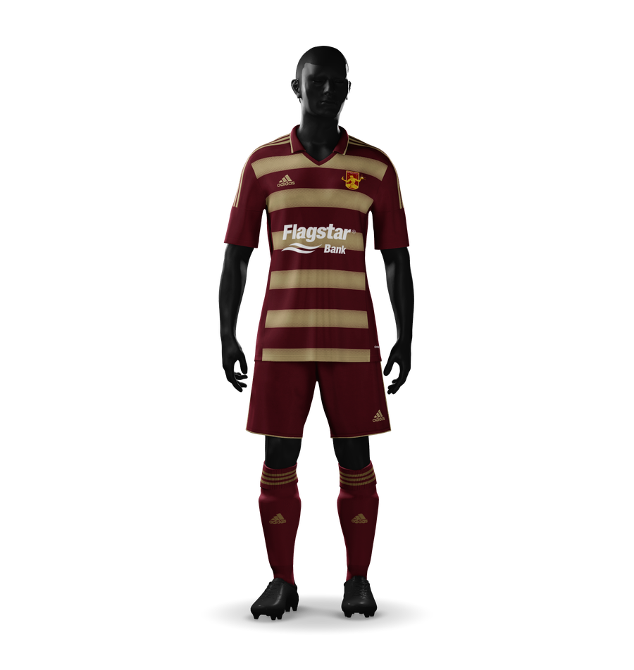
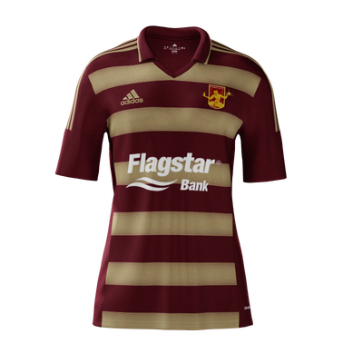
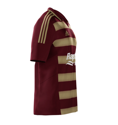
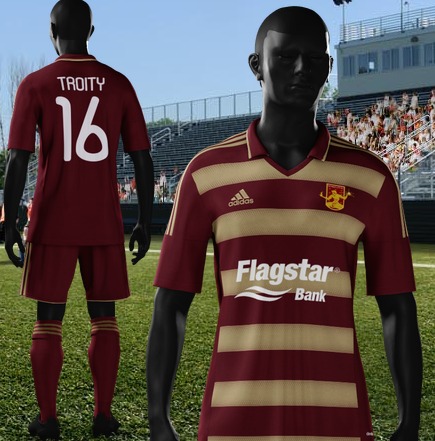
The Other Home Kit – Because Hoops and Because Rouge AND Gold

Hoops_16_front

So here is the Rouge AND Gold kit for the bhoys.

I certainly can’t complain. These are some damn sexy kits. Are they my first choice? That’s… uh… hard to say. There are definitely a lot of pluses to these. First, the hoops are more apparent. Second, we finally have gold in the Rouge and Gold. Third they are an older Adidas model and are therefore cheaper. Fourth – holy shit do they look good.

I have to admit those are some strong reasons to say that this kit is the better.  As I write this I think less and less of my original design and more and more of this one. So there you have it, I guess? The new Detroit City home kit for 2016.

Other views:

Hoops_16_shirt_front Hoops_16_shirt_side Hoops_16_back

So here’s the line up (with an alternate away so we don’t out-do the collar):

Hoops_16_shirt_front Away_16_shirt_front_alt Alt_16_shirt_front

Early Renders

These are some earlier ideas for the home kit, before I went straight rouge and rouge.

These two have some white accenting on the socks and on the kit itself. I ended up thinking that it was a bit like last years: just too much. So I simplified them a bit.


Home_16_front Home_16_back

While this one only retains the white on the Adidas logo. Even this felt so of… weird. So I set the logo to be rouge too, it helped the sponsor stand out and just made it nice and clean.


home_16_shirt_front