Tag Archives: Kit Nerd

Forest City – Or: Breaking Comfort Zones

So this post has been a long-time coming, originally meant to be posted way back in November, I was dealing with some other issues that I glossed over briefly in a twitter thread in the context of talking about my daily word counts. Right when I was hoping to get this out, during a four-day weekend around Thanksgiving.

That didn’t happen.

Actually, thanks to some work-related stressed that spilled over into my real life, not much of anything got done. Including my normal writing or perhaps a bit of blogging.

Anyway, this has been postponed long enough.

This is a project that has been floating in the back of my mind for quite a while now, namely it is a rebranding of a team that has caught some (justified, if you ask me) ire lately due to their name and their iconic mascot: the Cleveland Indians.

For the uninformed, I am a Cleveland native and not much of a baseball enthusiast, but that itself needs some discussion. I don’t care for the actual sport of baseball – which I find a boring, tiresome drag – but I do love the traditions of baseball – which I find fascinating and lovely in a quaint kind of way, but it’s a good quaint, like finding a small midwestern town and stopping in a dinner for a shake, having a great time, and then asking yourself why you don’t do it more often.

Cleveland’s mascot, the maligned Chief Wahoo, goes back a long way. He’s, in short, a caricature of a 30s racist rendering of a native american man. And as of writing there are a lot of signs, including selective marketing images and the ever-present rumble of political correctness gone mad that Chief Wahoo is about to be binned permanently.

And good riddance, though it does mostly defeat the purpose of this post.

There’s a lot of ways to deal with this issue and Cleveland is taking pretty much the compromise route in that it’ll leave most people unhappy, but I can’t speak for the native americans in the least, but the name “Indians” is still there and there’s still baggage with that and I know for a fact that people were running out and buying up as many Chief Wahoo hats as they could so they’d have a stock to either sell when they get rare or to wear at games as long as possible.

That strikes me as a little crazy, to be so dedicated to something that is causing a peoples whose history since 1492 has been “how low can low go” feel even lower. Perhaps sports and empathy aren’t supposed to mix in the minds of many, but I’m not of the many. Sports are about empathy and community. So let’s cut to the case.

I’ve been waiting for nearly three years to have the ability to rebrand the Cleveland Indians. Three years. It came in steps. First it was finding the TIF-based images that allow me to work in a pseudo three-dimensional space. Those are the kits you see quite a bit both on this site and on many other sites. Second was finding a baseball version of that template. There’s been one floating around for a few years, and they’re gorgeous, but they’re also $80, which is a bit more than I expect to ever make from this project. But, in the last few months, one did come out, and it’s a pretty good one, cutting much of the kit into much smaller chunks than the soccer ones.

So let’s begin:


As these things usually start, some disclaimers: this is a personal project. I have not discussed any of this with anyone remotely representing the Cleveland Indians nor any group advocating the removal of Chief Wahoo. 

These are not official, sanctioned, &c &c. 


In 1868 an amateur baseball team formed in Cleveland that, following the Cincinnati Red Stockings, joined the professional ranks in 1871. This team, which would only play two seasons at the professional level, were the Cleveland Forest Citys (note: not “cities”).

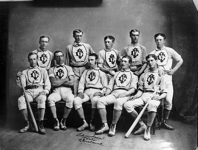
They finished their existence 16-35, as this was back when teams played once per week.

This is where I am going to start – with a plucky little team in 1871. Now, Cleveland had other teams between then and now, but I wanted to focus on the Forest Citys for a few reasons:

  • The 150th anniversary of professional baseball in Cleveland is 2021, a scant three years away
  • “Forest City” provides a much more blank canvas for me
  • I wanted to focus on the tradition of baseball rather than aim for a “Disney-fied” team name like “The Spiders,” though a strong case can be made for “The Spiders” and I’d love to see someone tackle that
  • I believe that by mixing a strong heap of history into this mix, it will be better received by fans and…
  • An all new look and theme will help discourage people wearing Chief Wahoo gear to future games. Sure the die-hards will never stop, but I think that more casual fans will just buy a new cap and eventually a new shirt and it’ll be pushed out of the system quicker this way. Keeping the “Indians” name does nothing to discourage this behavior.

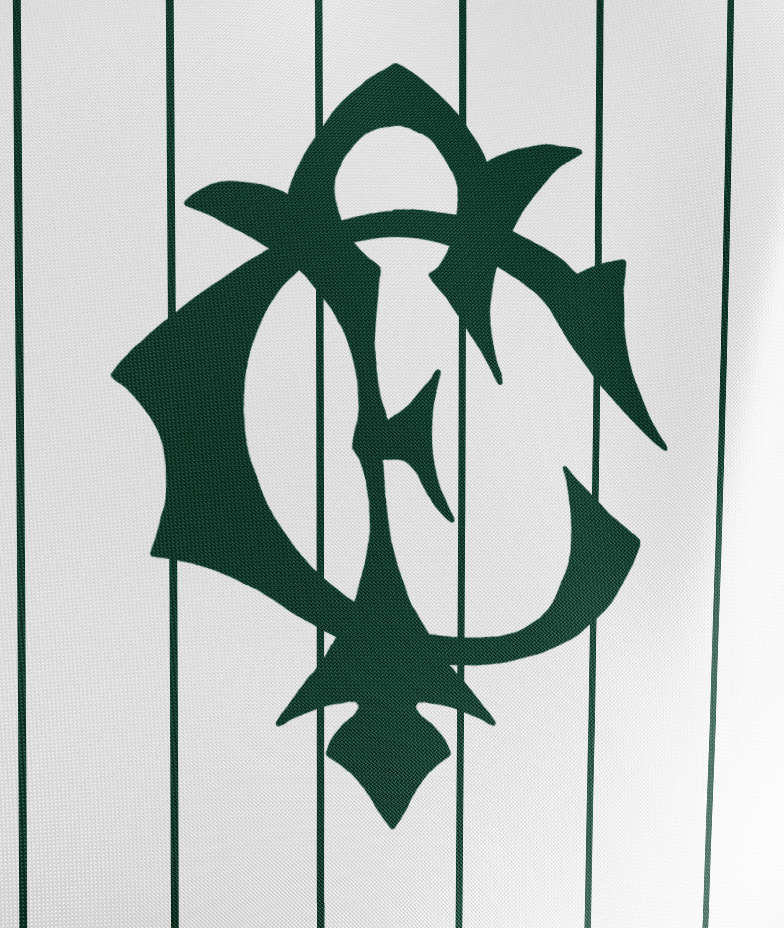
My starting point was the logo. If I couldn’t get that done, I’d be in trouble. I’m no good with vector programs, I’ve just never had time to sit and watch enough tutorials to get good at them, which I have a project to hopefully change that… more on that later.

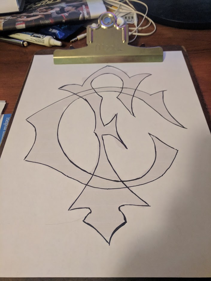
So for this we went the old fashioned route. I blew up that picture above, picked the most straight-on dude, cropped everything out, and printed out a giant FC monogram. Which I traced. Three times.

Here’s the start of the initial tracing.

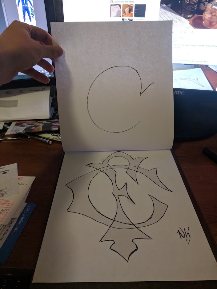
This is the finalized trace of the monogram. But just in case, I wanted the letters separate, so I then used my trusty clipboard to make two more tracings.

And then finally:

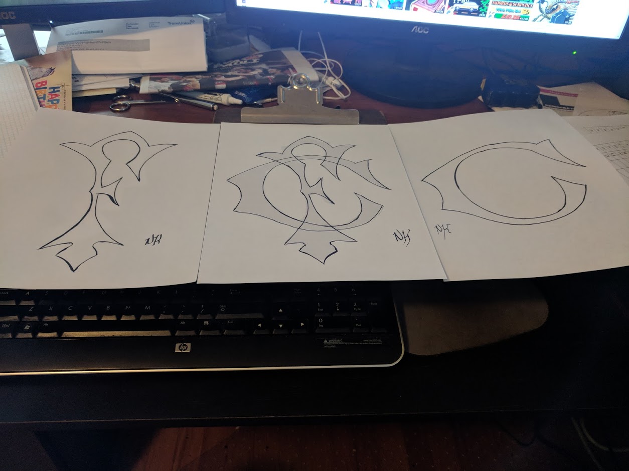
I scanned these in at 600dpi black/white so I could then bring them into photoshop for post-processing.

Not the best, but I’m very happy with how it came out.

The next thing I started to work on was the color scheme. I’ll admit to being ignorant to what colors the original Forest Citys wore. I probably could’ve done a deeper dive into some historical records, but in the end I knew I wanted forest green for some pretty obvious reasons. Alongside green, I wanted to stick to the traditional colors of black and white.

So I loaded up the wikipedia page for shades of green, and began to pick and choose some of my favorites, building a palette of colors to ponder over and consider. The final cut of those looked like this:

Each one had pluses and minuses, some were too blue, others too grey, some too green even.  The one that I chose is the second from the top. I think it balanced out the dark, the greens, the blues, and the greys. For those interested, it is called “Brunswick Green” and was historically used in many settings including auto racing and passenger cars on trains. It’s also sometimes called “English Green.”

So with the logo and the color scheme picked out, it was time to design some baseball ki… um… uniforms.

Going into this project, I knew precious little about how baseball uniforms “worked” (for lack of a better word). Generally, in football, you have a “first” kit, which is strongly rooted in tradition; a “second” kit, which can be rooted in tradition but more often is a canvas for creativity; and a “clash” or “alt” kit, which is almost always a departure from the norm and is intended for use either as a charity thing or in case both the first and second kits are ruled to clash with the home side. This actually came up recently: in the Hibernian vs Celtic game on the 10th, all three of Celtic’s kits were ruled to be “clashing” and they were forced to dig out last year’s charity kits in order for the game to start.

Baseball teams usually have three or four uniform choices as well. A white set for home games. A grey set for away games. And then a number of “alternative” sets that are colored and may be used whenever. There are some other rules that seem to come up. First home sets usually have the team name/logo on them. Away sets have the city name on them. And alternatives have a bit more leeway.

There’s some history behind this. Back in the day, grey sets hid dirt, so require less laundering – an advantage when you’re on the road and don’t have access to your cleaning facilities. Whites required more cleaning, but the home side did have access to cleaning facilities, so that’s not a problem.

The team vs city name basically came from fans know the home side by their name, but might not know the away side. Back before cell phones and access to a constant stream of electronically broadcast information, this was a legitimate concern.

These traditions provided an interesting design space for me to work with. And there were other concerns, thoughts, and ideas as well. For example: Pin stripes? Or no? Monogram? Or team name? “Old English”? Or Block?

If one thing is obvious so far, it’s that I chose to go with a monogram over a mascot or one of the more “modern” names that are based off some kind of [NOUN]. I wanted to go back to a very traditional looking form.
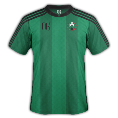
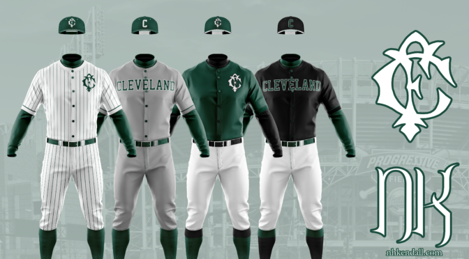
The Home Uniform

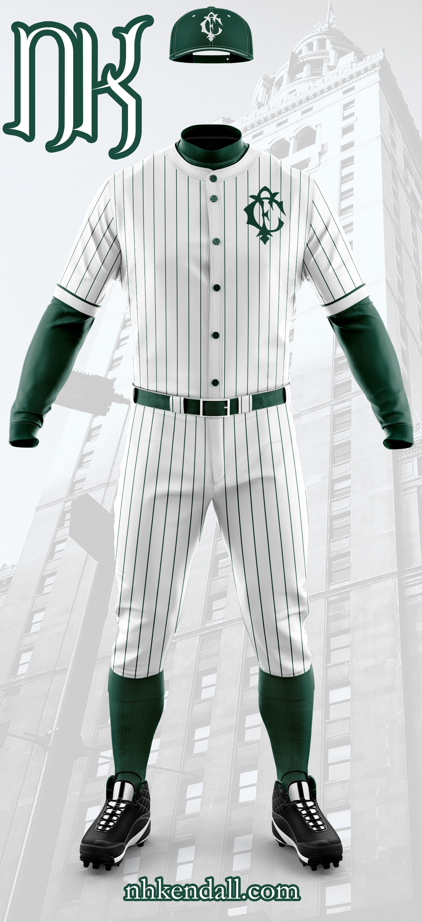
For the home uniform I went with pinstripes, which I think is probably the most controversial thing you’ll find in this post (other than the concept of entirely removing the branding of a much-beloved MLB franchise). Brunswick Green dominates the secondary features: pinstripes, undershirt, cap, belt, buttons, and stockings. Instead of a team name, I went with the monogram over the left chest. It gives a clean look that really lets the pin striping do the heavy visual lifting. White accents the caps both in the monogram and the stitching.

The Away Uniform

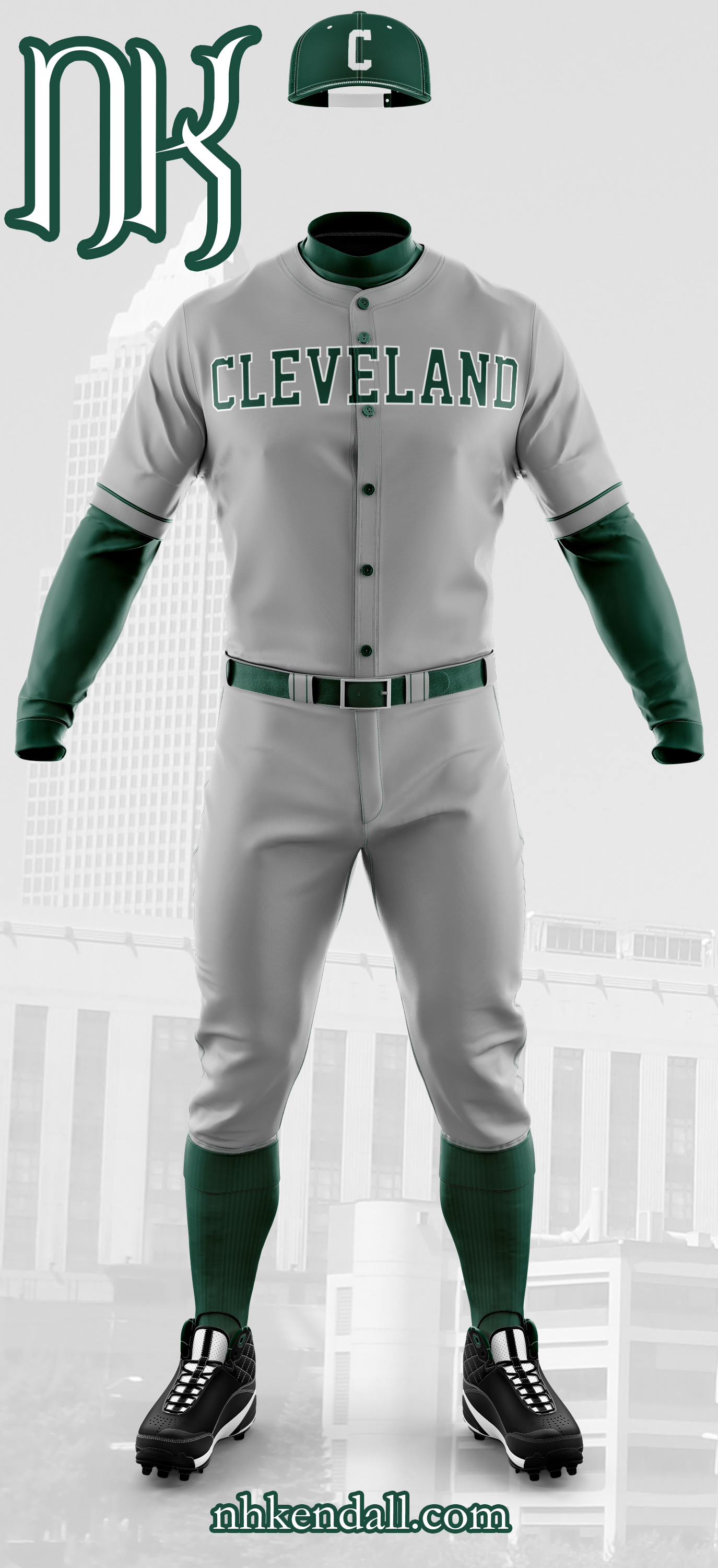
Brunswick Green continues to be heavily represented in the secondary features here, but the plain grey with block lettering takes over in the traditional away uniform. A few features remain from the home uniform: the piping on the sleeve roll-over for example, and the two pinstripes on the front-most belt loop. The cap is still green with the white accents, now with the block C in white front and center.

Alternative One (Color Uniform)

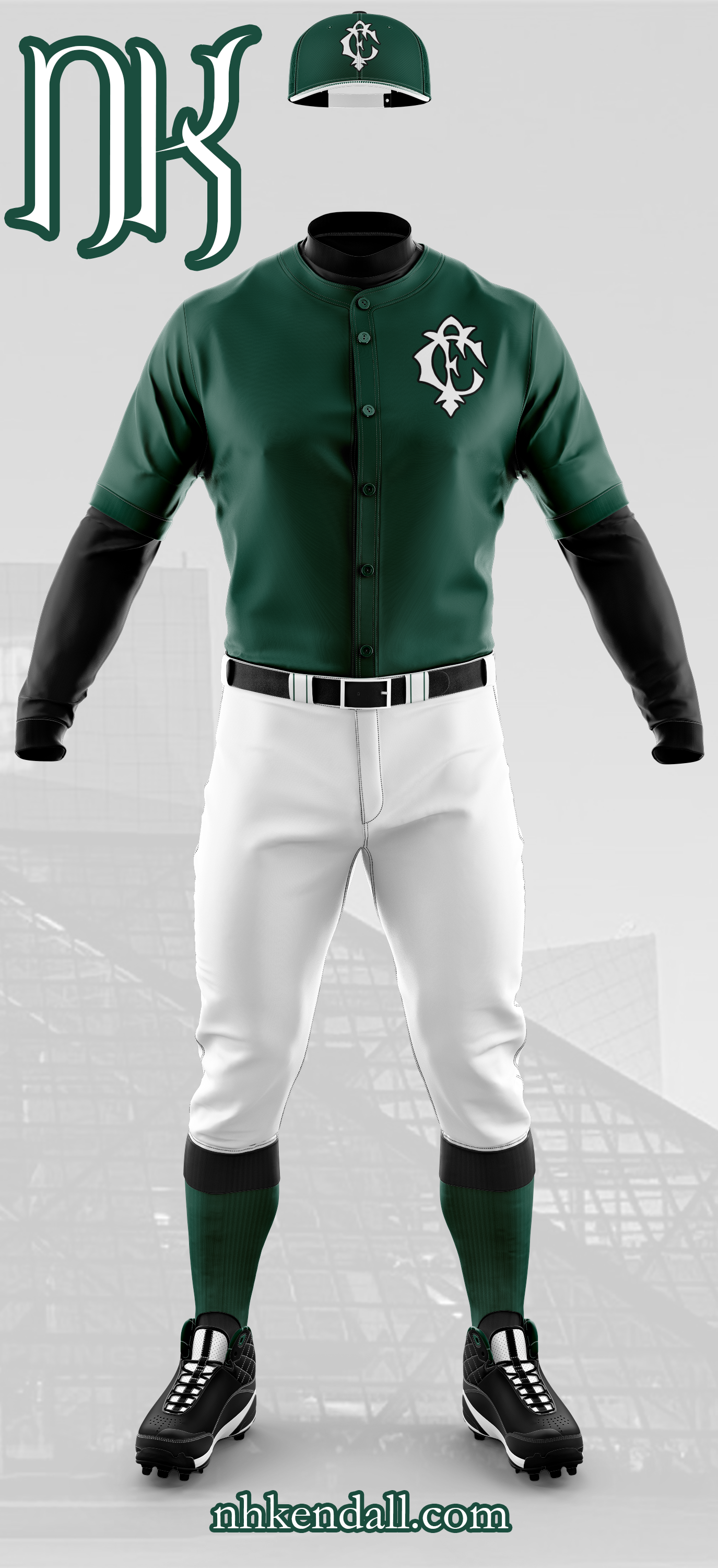
For the first alternative or color uniform, I went with a Brunswick Green jersey and plain, white pants. The stockings are no longer a solid green: they have black flip-overs. The piping on the jersey’s sleeves has been removed for a crisp, mono-color look. The undershirt and belt have been made black and white is more heavily featured on the cap, which instead of all green with which stitching, now has a white bill and green stitching. The monogram returns, this time in white with a black stroke.

Alternative Two (Color Uniform)

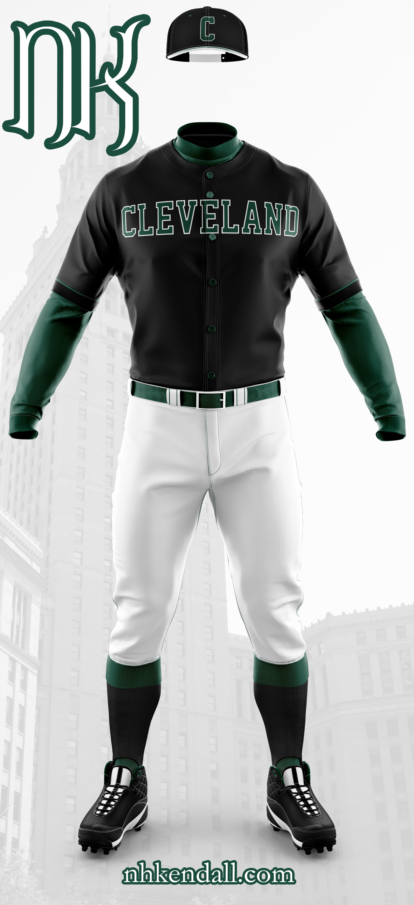
In many ways this is the inverse of the previous uniform, though the white pants remain. Undershirt and belt are Brunswick Green. This uniform has black stockings with green flip-overs, the piping on the sleeves returns in green. The buttons remain green as well. The jersey itself, though, is black with green block lettering, stroked in white. The cap is black, with a white bill and green stitching. The block C is featured here in the same green/white combo as the jersey itself. Of all the uniforms here, I have to say that this one is the most striking to me. The combination of the dark green, black, and white really comes together here. Especially the white stroke around “Cleveland” and the block C.

Over-all, I am extremely happy with how these four uniforms turned out, though perhaps I am a bit biased about that. While I have no doubt that the Indians are probably not going to do a complete rebranding this late into the argument, especially with stiff resistance from a vocal part of the fan base, it would be fantastic if they did or maybe even considered a heritage match in 2021 celebrating 150 years of professional baseball in Cleveland.

If you are one of those vocal fans, I really do hope you give this some though, or at the least, you like the designs from an abstract, objective view (rather than thinking of me trying to replace your team).

As always, I hope everyone enjoyed this rather long read and liked the designs I came up with. This has been a bit of a passion project meant to force me out of my comfort zone by designing for a sport I am not quite so familiar with, that has a few more, stricter rules, about what can and cannot go into a design.

Thank you so much. Cheers, everyone.

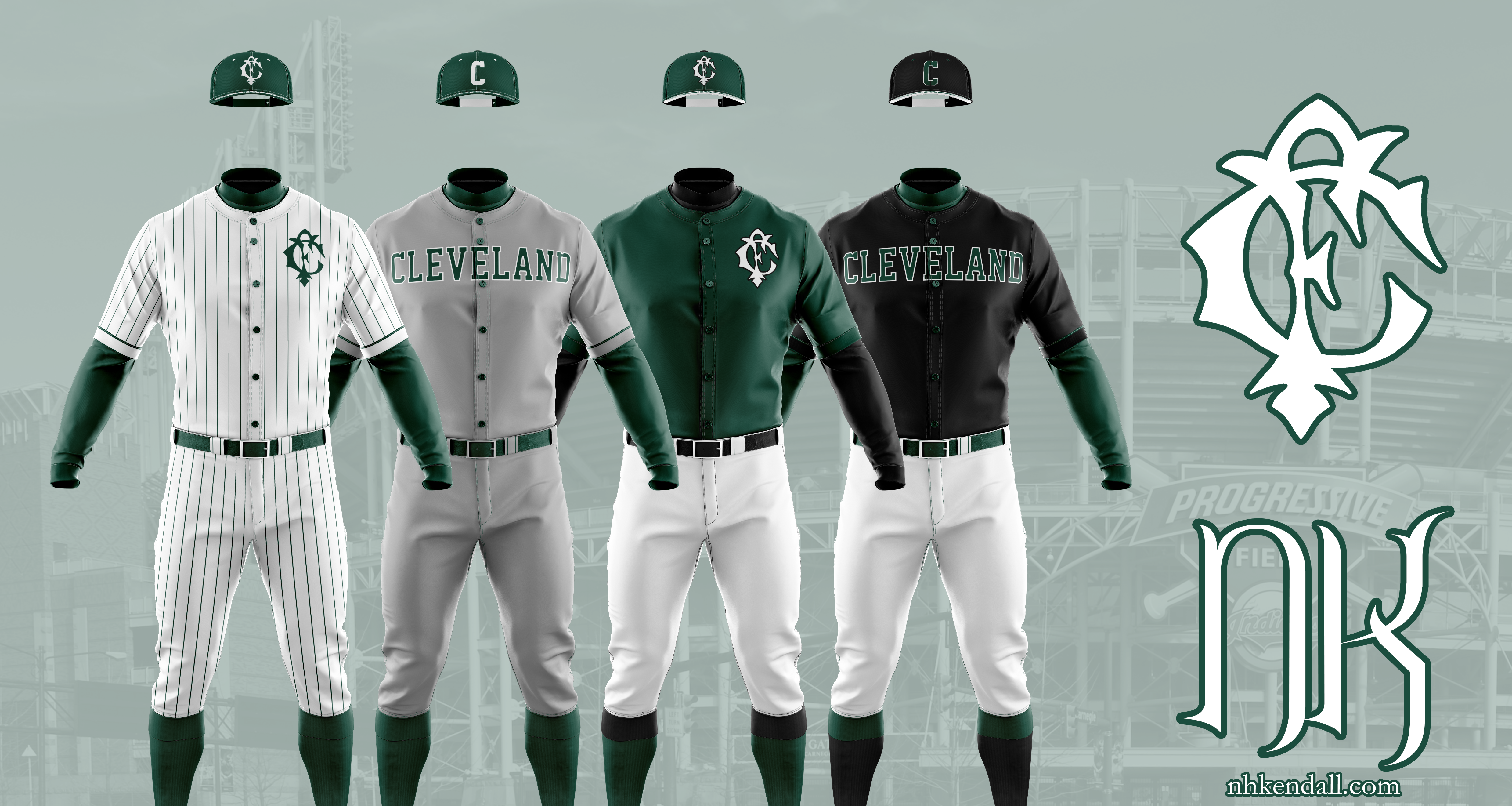
Photo sources (other than me for the monogram process shots):

Forest Citys: Case Western Reserve

Stock art: pixabay.com

The Kit Post – 2018

Welcome to the fourth annual Kit Nerd Day!

That’s right, I’ve done three of these already, and so far I’ve successfully predicted literally zero of the kits. Of course, that isn’t necessarily the point. The point is for me to have fun and for you guys to get a gander of all the crazy ideas constantly going through my head.

For those new to the site: every year around the end of August I do a post with some ideas and thoughts about next season’s kits. So just to repeat, these are ideas for the 2018 season.

And, like always, let’s start with some disclaimers. First, I am not a professional. I don’t work for Detroit City FC or any of the major kit design companies. I’ve used all images without permission. Nothing I post represents an official direction of the front office or any one tangentially involved. Remember – the FO actively works to fuck with me and they’ve even told me.

Any potential sponsors/leagues, these are not endorsed by the FO, the NGS, or anyone else. I make them for fun.


So the first thing is thoughts on last year’s kits.

Fuck. Yeah.

I mean, that was a crazy season. Beat two professional European teams. A new record-sized crowd was there. We won the Midwest. We attracted attention from all over the world through our friends at Copa90US. Keyworth’s stands are nearly completely opened. The “Wolfpack” started as a meme and ended up as a rallying cry. I got to meet Peter Wilt, who’s setting up NISA, in the stands at the Key. So that was pretty awesome from just a soccer-nerd standpoint.

Oh.

And Lansing blew a 3-0 lead.

As for the kits: the hoops returned! We did actually get throwback kits (to the ’67 Cougars). We even made the long-desired, long-awaited switch to Adidas! That’s fucking awesome. These kits were way better quality than the Nike’s. Way better. They did come at a higher price tag for us, but damned were they fucking gorgeous.

Across the board they were fantastic. From the hooped rouge on rouge on rouge kits to the golden away days kits (which saw quite a bit of use at home) to the fantasticly simple charity kits to those drop-dead gorgeous Cougar throw-backs. There are three 2017 kits in the Kendall-Collins household. I feel that is too few, but it is what it is.

Adidas pretty much owns US soccer, namely through their agreement with MLS, which IIRC was just renewed. Nothing of their really struck me this year. Portland’s home kits are more reminiscent of their third kits from previous years, which is nice.

Atlanta’s kits are pretty good. I’m a fan of the black/red combo and the grey and red makes for an interesting away. Columbus got their yellows back. That’s good. New England has an interesting 50/50 kit, rare on this side of the pond.

I noticed a few “default” designs either leaked into MLS or out. Atlanta’s home kit. NE’s home. Columbus’s away. Houston’s away. Plus any solid color kits. Not a good or bad, just something I found interesting.


Okay, some thoughts about DCFC kits in general before I move forward with unveiling my designs.

According to Crain’s the deal with Adidas is a multi-year agreement. That means I can pretty easily open up the Adidas miTeam app and fiddle around. But instead of using their kit builder, I’ve chosen to instead create some designs based on what’s available in the kit creator. So these designs should be entirely possible for Detroit City to don for 2018.

Moreover I’ve learned about when they actually put in the orders, so… I know that I’m ahead of the curve here. Fingers crossed. Is this the year we get the Nick Kendall kits?!

We’ll see.

One last note:

Sponsor – Stroh’s

After the loss of Flagstar as a sponsor, I’ve had to switch it up. I’ve more or less fallen into the rut of using Stroh’s because damn it looks great on our kits. Now, I don’t actually think this will be a thing because I think the deal with Metro Chevy Dealers also has multiple years left on it, but I’ll be damned if I stick a bowtie on my designs.


The Home Kit – Wolf’s Bite

Starting from the top, my prediction for the 2018 home kit. Based off Adidas’ chevron design – the chest is broken up by a bloodied dagger like a wolf’s blooded maw. Put five or six of them together and you’ve got yourself a fearsome beast.

I’ve stuck with the darker shade of rouge for the main body, adding just the barest hint of a lighter shade for the accents on the side and on the edges. And at the very bottom, just above the hem, is the flag of Detroit.


The Away Kit – Upwards

Next up is the away kits, I want to continue the gold and white kits. I was extremely happy to see them make a return after too many seasons away. We’re the blood and treasure, rouge and gold allez allez, so let’s keep it going. Whether we end up in NISA, NASL, or remain in the NPSL it’s all coming up City.

This design is based on the same design that they use for the New England Revolution’s home kit and has since become a default design, only here the stripes go the whole way through. The rouge accents are far more visible on the gold and white, but remain consistent with the home kit.


The Charity Kit – Soccer’s Heel

Not everyone gets to be a good guy, someone has to play heel so some self-righteous prick can play face and tell himself that no matter his own faults, at least he doesn’t light off smoke, swear, and have too much fun in the stands.

Harking back to arguably one of the greatest teams of all time and certainly back to the single most beautiful Adidas kit ever the charity kits are a combination of black and rouge that begs, begs to be unleashed on the pitch.

Let the soccer moms tremble, everyone’s favorite team to hate is here.


There it is everyone, Kit Nerd Day 2018! What did you like? What do you hate? What do you want to see the Boys in Rouge don this year? Let me know either in the comments or on twitter.

I’ll keep posting extras on twitter as I usually do.

And as always; Lansing blew a 3-0 lead.

Cheers everyone!

Detroit City 2017 Kit Guess

I’ve been getting a lot of work done on my fake world cup stuff, but recently Detroit City FC announced their 2017 charity match and charity: the Kalamazoo match 23. June will benefit Alternatives for Girls, a Detroit-based charity that helps homeless and at-risk girls and women in the city.

What a great group to be helping, and honestly what amazing possibilities for some awesome charity kits, right?

Right.

Listen, I designed more kits and I’m about to shove them down your eyeholes.

Anyway, I decided to guess what the 2017 Detroit City kits are going to look like. I have a bit of an advantage because I’ve possibly been tipped off to what they aren’t but there are still a lot of unknowns. First is the possibility of a fourth set of kits hinted at debuting at the Glentoran match as throw-backs to the Detroit Cougars.

But, as a few of us agreed, there is the likely chance that there will still be only three sets – home, throw-back, and charity. I think this is what we will end up seeing. It keeps with tradition and doesn’t saturate the market with unwanted kits.

So let’s start with that throw-back. This isn’t terribly hard, we already have a raging clue: Glentoran already unveiled their Cougar throw-back kits and they are white plus orange. From there it is easy to deduce that ours will be black and orange. Here it is folks, our first non-white secondary kits. That’s pretty exciting. But what will they look like? Maybe something like this:

Simple black kits with orange trim/cuffing. Arm space is almost always reserved for the league and sponsors so I’ve put the Cougar’s logo on the pant leg.

It would be strange seeing orange on our kits, of all things, but I assume that as throw-backs they’ll be in for a season and out. Hopefully, though, the black stays and next season we can have some black on black on black kits.

So we got a black and orange kit… what next? How about a pink and black charity kit!

Our charity, Alternatives for Girls takes over on the chest of a stunning hot pink and black combination. I love, love, the idea of pink/black kits for Detroit City. If we do end up getting them, they will surely be hard to beat in the future.

Definitely check out the Alternatives for Girls site and give them a follow/like on your favorite social media site. Very excited to bring them into the DCFC family.

“That’s all fine and dandy,” you might be thinking. “But there’s only one kit I care about” and you’d not be wrong.

I don’t think you’re right, but you’re not wrong what with opinions and subjectivity and all, but you do you. I love secondary and alternate kits a lot as an expression of creativity. Home kits should be consistent, the others should shake it up from time to time a place to test what works and what doesn’t. To throw metaphoric shit against the wall and see what sticks.

Anyway, the home kits:

Rouge. Lots and lots of rouge. And a little bit of white. It’s very similar to a design I posted a while ago, but I’ve added the collar so the home kit isn’t just a ctrl+c, ctrl+v of last year’s, which admittedly was very simple.

Anyway, that wraps up this “surprise” update. Hope you guys enjoyed and feel free to let me know what you think… or, alternatively if you are a kit manufacturer hire me.

Cheers, everyone.

Kits and Writing.

So I got some updates for the site we’re going to skip the “it’s been a whi-” and just move on.

A lot has gone down since the last update, including getting a fancy new position at Ford which I am greatly enjoying. That has made things a bit hectic but the last few weeks have gone by lightning-quick. I am really loving it.

I’ve also made the decision to work more on professionalizing my portfolio of soccer kits. Will it lead to a profession switch? Unlikely. Could I potentially make a few bucks off it? Maybe. Honestly, I’d love to see some of my designs become real. That would be absolutely fantastic.

If you read my twitter feed, which I don’t necessarily recommend Mum, I often post stuff while working including some snapshots of a big on-going project I’ve started.

What is this project; you ask.

Well, I am doing a big world building project set in the same world as my novels. It’s a big world cup write up, and it’ll have news articles, team profiles, stadium profiles, potentially player profiles, and a whole boat load of kits. At least 96 of them: home and away for 48 teams.

I’ve already got 48 crests made, though I am not 100% happy with all of them. They were quickly thrown together with stock heraldry images from Wikimedia. Already I have about 18 kits finished, so I have quite a bit of work to do. And that’s okay, I’m planning on this taking most of the summer.

It’ll be fun and I’ll make sure to have a page to showcase it. Not sure how, but I got some ideas. I hope that everyone else will enjoy it half as much as I have so far.

There’s a lot to post and explore so I’ll only have a few slices here.

Done on a whim for Paradox Interactive (not popular with the studio manager, Johan):

A little idea for Bristol Rovers FC:

And of course Detroit City FC:

Another quick mock-up for a friend:

If you have any ideas or criticism, reach out on twitter. Currently I take requests on an impulse-based sort method. Not sure how long that’ll last, though. As the Detroit City season quickly approaches, my free time will soon dissolve to nothing.

On the flip side some news regarding my writing. I have finished the rewrites of book 2, finally! It has grown by about 10,000 words to 137,000. I think the pacing has been improved and I’m happy with it in general. It’ll definitely need a final smoothing that’ll come once I get the drafts for books 3 and 4 done, which I am going to start in about ten~fifteen minutes when I am done here!

I’m pretty much actually being productive, which is great. It feels great to be getting so much done.

Of course, as I write this, it is a quarter to eight and I’ve been trying to get this done since before four… then I got distracted with the Bristol kits.

So I am going to sign off and get back to writing. I got a long way to the expected 175,000 words of book 3.

Cheers, everyone.

The Winding Road

Today I went on a bit of a winding road of world building and it all started because I wanted to make a soccer kit. Over-all the kit took about ten minutes to make and the world building took about four or five hours by my count. It involved conlanging, linguistics, some alphabet work, image manipulation, heraldry, and then eventually some soccer.

Let’s get a baseline.

Anyone who follows my profile on Wikipedia (if you do, wow, that’s uh… dedication…) will see that I often just “doodle” soccer kits there using the Wikimedia template for kits. In the last week I added six more:

These are meant to represent home and away kits for three nations from the world of my novels sped up to the “present” day (about 450 years after my novels). Why? Because it’s fun for me. The top two are Hadyrland, the country most of my novels are set in; the middle two the Union, which is heavily involved; and Steriou, which a couple characters have ties to.

Note: yes, the three shades of orange in the bottom two bothers the FUCK out of me.

The national sport of Hadyrland is Kémõ /keɪmɔ̃/ (Hurling) and the national sport of the Union is (in Hadysh) Wixgaħ /wɪxgaʁ/ (Cricket). I have these words because they are in my novels. I’ve even posted about Hadysh Hurling in the past.

But like in this world, just about every nation plays football, which is also the national sport of Steriou. And also like in our world, there is a big international organization that regulates the sport and organizes the world game between all the nations.

I wanted to make a realistic rendering of the Hadysh home kit, so that meant I needed certain details, like a crest. The crest would need some details too: shapes, colors, labels, elements. So for that I started with the crest of the Italian National Rugby team (they played today, so it was on the mind). It’s a simple tricolor crest with the initials of the national rugby federation on top and the name of the country at the bottom. Plus a little wreath.

So that’s where I started. Hadyrland’s modern flag is also a tricolor, though with horizontal bands of white, green, and black. This physically represents the nation, with its frozen north, forested center, and mountainous south. But to give this a bit of dynamism, instead of using three horizontal bands, I used a peaked design.

The Hadysh national coat of arms shows the white-green-black motif:


For the wreath I went with something that had berries. The Yew Tree is the national symbol of the nation, as well as being an important religious symbol for the majority of its citizens. So I found a vector of a wreath with berries and moved forward.

I got a banner and then things started going down hill…

So if you look at the Italian crest you see FIR – for the Federation of Italian Rugby (Federazione Italiana Rugby) and at the bottom a simple Italia, which I think most people can get without a translation. Well, I know the Hadysh name for Hadyrland: Volgamfyə /vɔlgamfjə/, but I am missing the “FIR” element. So I started working.

I started with the name “Hadysh Football Federation” and then reordered it into proper Hadysh (while still using English): “Federation Hadysh Football”. “Federation” is the subject, “Hadysh” is an adjective, and “Football” would need to be a genitive noun.

Then I open up my Hadysh dictionary. Which words do I have? Hadysh. That’s it. The adjective form is b̌olgē /bvɔlgi/.

So I have some work to do making up new words. Federation was easiest because it could be a concrete idea. In German the word for federation is Bund. This comes from the same root as “bind” in English, as in “bound together”, which a federation is – units bound together to make a whole. For “federation” I went with a simple word, like German: ya̋f /jaʊf/.

Two down, now “football”. Well, I can break that down into two units: “foot” and “ball” and then recombine them, which in Hadysh would be “ballfoot” with the foot being in the genitive.

Ooooookay…. for “foot” I went with bod /bɔd/, which is a reference to “pode” the Greek for foot. And for ball? ð̌aç /dðaç/. Little bit more work… the genitive for bod is bot (the genitive is usually word + (e)d, but if it ends with d it devoices to t). So the Hadysh for “football” is ð̌açbot /dðaçbɔt/.

But… but… we can take this further. So, oftentimes, words get adopted into a language from another language. “Football” is one of these words that often end up in other languages because it is easier to just adopt a new word then something up. For a bit of fun I decided that in Hadysh ð̌açbot would be the actual piece of equipment, while the word for the sport would come from Union Common, which is a distant relative to Hadysh. I don’t actually have two conlangs going so we needed to de-evolve the words ð̌aç and bot back to the last shared ancestor of Common and Hadysh and then re-evolve it forward to present-day Common.

Common is more like English in how it compounds words so in Common it would be foot + ball instead of ball + foot, so I decided it was best to do the two components separately and then recombine them.

I actually have a chart showing the genetic relationships between Hadysh and some of the other languages back to a language called “Proto Piylo-Tundric” which is the mother of many of the northern languages on the continent Sun-King and others take place on. Whole branches of these languages are extinct so I need to go up six steps and then down five.

Now, not every step is distinct, but it helped think about how the languages worked and this whole thing would come in handy later. Also, the question, why not Sterian for the language if that’s where the sport is most ubiquitous? Common is more of a prestige language and while the Union is not nearly as big as it once was, there are far more Common-speaking nations than Sterian or Hadysh combined.

So, “ball”…

Hadysh to Old Hadysh: /dðaç/ ➝ /ðʲaç/. The decision here was that consonants at the start of stressed syllables underwent sound changes akin to Gaelic/Russian where they could be palatalized before open vowels, unchanged before mid vowels, and labialized before close vowels. /a/ is back, so /ð/ becomes /ðʲ/. The implication here is that as Old Hadysh turned into Middle and then Modern Hadysh, this palatalized phoneme became it’s own sound /dð/ unrelated to /ð/.

Speeding up: /ðʲaç/ ➝ /dʲæç/ ➝ /ˈdʲæk.əl/ ➝ /dəˈkʲʌl/ gets us as far back as it needs to go, back to Old Piylean. Now it needs to move forward through time:

/dəˈkʲʌl/ ➝ /dəˈkʌl/ ➝ /dᵊˈkʌl/ ➝ /gʌl/ ➝ /gɔl/

And “foot” from Hadysh to Old Piylean:

/bɔd/ ➝ /bʲɔd/ ➝ /bʲɑd/ ➝ /bʲɑt/

And now from Old Piylean to Modern Common:

/bʲɑt/ ➝ /pɑt/ ➝ /pat/ ➝ /paθ/

You’ll notice that the word for “foot” has been significantly more conservative than the word for “ball”. This is because a foot is more significant to ancient peoples than a ball. So the word is preserved better. When you look at the ancient word for “ball”, it had two syllables. As it moves toward the present it drops to one with the Hadysh branch keeping the first syllable /də/ (which in its first step away from Old Piylean becomes stressed to /dʲæ/) and the Common branch keeping the stressed /kʲʌl/. The words /dðaç/ and /gɔl/ have nothing in common, but are related none the less.

So the Common word for “football” is /ˈpaθ.gɔl/.

So now I can come up with the acronym for the Hadysh Football Federation: YB̌P for Ya̋f B̌olgē Paþgold.

I will remind you, this entire exercise was for one of those three letters.

So now I can finish… making…

Fuck, Hadysh doesn’t use the Latin alphabet except when I write on the internet. In the fantasy world it would use it’s native alphabet. Luckily I have that alphabet, I just don’t have it digitized. So hang on.

There YB̌P at the top and Volgamfyə at the bottom. The crest is done.

Now I can put together that soccer kit.

There, that wasn’t so hard, was it?

That said, the longest parts were the image manipulations. Even though the linguistics takes up the lion’s share here, I played around with the vectors and the images far longer than I spent making up words. There was also a lot of background stuff with the linguistics, like filling in my dictionary with the new words and their declinations, which is important only to me.

Now will I make a crest for their dreaded rivals, the Sunrays out of Rannot?


Probably not.

No.

Cheers, everyone.

Mid-Autumn Review

Got a bit of time before an afternoon appointment ends up sinking a good chunk of our afternoon so I thought I’d get a rambly life review post out of the way. This is going to shift topics pretty quick so try to keep up.

Wine

After a half-year hiatus due to the move, our wine bucket is full again this time with a straight pomegranate wine. Right now the smell is amazing and fermentation is roaring ahead. I’m looking forward to the finished product.

In a week or two, we’ll get a second batch going: this time of raspberry wine. That too should be amazing.

And once winter sinks in, we’ll look at upgrading our wine cellar with some stone work and some decent racks and perhaps even a wine cooler.  We’re probably looking at doing it ourselves so expect a full how I managed it post at some point.

The House

We’re settling into the house quickly. We’ve already done a lot of work and we’re looking at getting the roof fixed first thing is spring. We also looked into either doing siding or remodeling the bathroom, but those ended up falling out of our price range. Too bad, both of those things can seriously go with an overhaul.

We’ve almost entirely unpacked as well, notable exceptions are bags of stuffed animals in the bedroom as well as organizing our clothes. Plus there is a giant tupperware  container in our office plus a box that needs to find a home. The office is now fully equipped for coffee production, freeing up much needed space in the kitchen (an issue that came very much to light when depipping ten pounds of pomegranates.

Otherwise we’re settled and extremely comfortable. The benefits of living so much closer to work and friends has already paid off, plus the reduced cost from the mortgage every month is helping as well. Walking is way, way up thanks to the myriad of stores and restaurants near-by, and we’ve signed up for fencing classes, our first since uni, so hopefully I can burn this damn beer gut away.

Writing

Been getting a lot done on the writing front, even if I haven’t been talking about it.

I am not participating in NaNoWriMo, so don’t expect word counts. I do plan to get some editing done, but there may or may not be some huge overhauls in my plans for the coming year/year and a half.

Brigid and I have been talking timing and publish for my four novels, which will either fall under her pre-existing company or more likely my own that I will set up when the time comes. The current plan is a release schedule something like this:

Sun-King: Q2 2018
Book 2: Q4 2018
Night Queen: Q2 2019
Book 4: Q4 2019

None of that is cemented, in fact I think it is safe to say the release schedule will likely get pushed back even further.

Why?

Well I’m a slow writer, mostly. I wanted book 3 (Night Queen) to at least be written (first draft) before I pull the trigger on publishing Sun-King. But Brigid very honestly pointed out that at the rate I write, I might want book 4 (is it strange I have the most trouble coming up with titles for the even numbers?) in the first draft stage and book 3 essentially wrapped up from the writing perspective.

I might plot out and write books 3 and 4 here in the next year – one giant binge of writing. Then I’ll have a first reader or two go through all four books and realign the consistency of the tone and action. That way I don’t have to keep going back to Sun-King when I make adjustments in Night Queen’s plotting.

It’s a lot of work, and the encouragement I get from you guys is, and always has been, great.

So thank you very much.

Kit Nerd

I’ve still been kit-nerding it up lately, messing around with sponsors and even going as far as to look beyond my normal front sponsors, manufacturer, and experimenting with a bit of color.

puma_strohs

A clean-ish rouge kit sticking on the piping theme from the official kit nerd post. In this series I went with Stroh’s as the official sponsor, following the tradition of teams like Liverpool and Newcastle who proudly wore their favorite session beers on the front of the logo. With this particular kit the dark red above the black collar isn’t the back of the shirt – it’s actually an inset of the front, so the collar is a rather traditional cut while also giving the effect of wearing an undershirt even when you’re not.

puma_strohs_plain_w_gold puma_strohs_plain_w_gold_bired

A bit of a cleaner design, in my opinion. A minimal amount of gold breaks up an otherwise plain rouge kit (top) or divides the rouge from a darker shade (bottom). I like that the Puma and DCFC logos follow the swoop, gives it a more balanced effect then when used above. I like them both quite a lot, with perhaps a slight preference to the plain one on top. The Stroh’s logo ads a lot of colors but if done right (and DCFC has been doing their sponsors right – with transparencies instead of giant bounding boxes) it still looks good. In fact the red and gold in the logo are really great with the rest of the get up.

puma_strohs_plain_w_blue puma_strohs_plain_w_blue_bired

Now on twitter I mentioned these would probably be a bit controversial (though that has so-far proven untrue). Instead of gold accents, I went with the blue from the Stroh’s logo, something unheard of for DCFC. I want to go on record saying I prefer the gold more and that I don’t actually want to see blue added to our kits, but it was a fun little experiment which I think looks good. In this case, though, I think the Rouge – Blue – Dark Rouge works better (instead of the plain one as was the case above). Maybe the blue stands out better with the defined line between the reds and isn’t lost as much.

Anyway, that is a life update. Cheers everyone.

The Kit Post – 2017

Welcome to the third annual Kit Nerd Day!


For the unaware I am a hack of a kit designer and every year I post ideas for next season’s kits. Generally I post a home, away, and alternate kit but this year we’re going big – that’s right, after the success of Minneapolis City SC’s throw-back kits I too am doing some throw-backs.

And as always we’re going to start with some disclaimers. First I am not a professional, I don’t work for Adidas, Flagstar, Detroit City, or anything of note. I’ve used all images blatantly without permission. Nothing here represents an official direction for DCFC so fans of Adidas hold strong but expect more disappointing Nike and for potential sponsors these are not endorsed by the front office in any way.

And one last thing, this year marks the end of a) posting full kits and b) using the Adidas kit builder! That’s right I’ve upgraded to photoshoped fake kits that are, for the most part, almost entirely actual designs the kit makers use, but I can edit things a bit more and use colors freely. Kit designs are, of course, subjective. I’m happy to hear your ideas on twitter or as comments below.


Some thoughts on last year and last season’s kits.

As for my kits the 2016 predictions included the fabled return of the hoops, which have not really stuck in my head. That particular design is not my favorite as the hoops are rather thin and there’s a lot of them. The white Flagstar brand across the chest likewise seems slightly small and out of position. The kits in general lack a unifying theme, but I generally liked the the away and alternate kits.  In the end, though, that home kit is extremely complicated.

The actual 2016 DCFC kits were, for the most part, good. The home kit returned to a plain rouge affair, reminiscent of our first season back in 2012. I snagged one of those at the kit unveiling, my first home kit purchase! The away kit was dreadfully dull and lacked any color at all. The alternates though?! Fuck yeah Nike Volt kits with black trim! I bagged one of those too, buying one of charity ones so it went to a good cause.

Some complaints – the number on my home kit is already flaking off, which is upsetting. The little Detroit flags were lost to add more ad space and that kind of sucked. And the alternates should’ve used black numbers instead of white.

A big change in the 2016 season was the introduction of actual player numbers! That’s right, players were assigned a number and though it might seem petty, it’s a pretty big step in having strong starting squads and hopefully is a step on the path to a professional squad.

So, without further ado, the 2017 Kit Day Post:


Brand – Adidas

I’m going to fight for Adidas to the end of time but it seems like the front office is pretty stuck on Nike, something which will probably be even more likely next season with a major Nike store open(ing) in downtown Detroit. Nike, though, is one of the laziest fucking kit designers on the planet. They used the same damn design (in different colors) for at least half their clients this season including several national teams that were fucking involved in a major tournament against one another.

It was disgraceful.

Meanwhile Adidas have simplified their designs here in the States (they are still the sole kit designer for the MLS) removing the signature stripes from the shoulders and moving them to the sides. It’s a weird choice, granted, but I can deal. Their designs for the MLS continue to be decent, though I find the Seattle ones to be very, very weird. The choice to go with the blue sleeves bothers me, especially with an all-blue third kit. The Sounders need green.

My favorite from the MLS has to be Portland’s black and red aways. Those things are sexy as fuck.

Kit Names – No

Last year I took a stand on this saying we should include names on the kits as a way to look “official”; to look like we’re not run by amateurs. But we are run by amateurs and we are not a big-name club. With each passing season we leave more and more of a trail, make more and more history, and define more and more of what makes Detroit City unique to our city.

One thing I’d like is perhaps never include names on the kits. Never. As in if we’re playing for the MLS leave only the number.

I think it serves as a reminder than names don’t make a club, the club will survive and will never be made or broken by a single star. Sure a hero will go down in history, but the players now understand that they aren’t playing for their own personal fame – but for the fans and for the crest. If we go pro, those pros will need to be brought into line too. They play for us. Not for themselves.

Sponsor – Flagstar

I’m going to get this to work eventually.

I still think Flagstar is a better sponsor than Metro Detroit Chevy Dealers and they still act the part, and I’m not just saying that as an employee of a certain company symbolized by a blue oval. My opinions from last year are still alive here so it is what it is.

Interesting additions this last season though: Stroh’s and Faygo. Really interesting to see both an adult beverage company and a family beverage company join the team. Welcome and I hope dollar Stroh’s is a thing that sticks around.

And as I promised to Mr. Wright, I will not post the kit with hatchetman on it.

Okay, so there are my preliminary notes. Only one thing left to do and that’s roll out my 2017 Kits!


The Home Kit – Rouge Ringer

2017_KD_Home

Here is my 2017 Detroit City FC home shirt. This would be matched with rouge shorts (with white stripes) and rouge socks (with white stripes at the top).

Something became very clear in the last few seasons – Detroit City might be the Rouge and Gold but their kits are Rouge and White. That isn’t a bad thing. I understand white kits are easier to come by and probably cheaper. I say run with it. Really buy into that rouge and white feel and make the kits consistent year to year.

It build a brand and will help make the club more recognizable in the long run especially to outsiders and potential fans. The use of pin-stripes gives a shout-out to the ever-popular hooped kits while not actually hooping our kits, which leaves the brand more recognizable and doesn’t begin to blur the line with another bunch of hooped semen… er… seamen…. I mean… fucking Lansing.

Like the last two years I wanted a unifying theme between all my kits (or at least the three main kits). First year it was the red socks. Last year was the lighter rouge details like the logo and stripes. This year it is the horizontal pin-stripes. Anyone who’s been to my wikipedia page has probably seen the preliminary designs up there.

I wanted to bring in the white here after a season with all-rouge kits, switching the cuff rings, collar, details and the striping to white rather than a second shade of rouge.

Inside the collar it says “Detroit City til I Die” under a banner of rouge and gold, bringing just a little hint of the Blood and Treasure to the Blood and Bones kits.


The Away Kit – Bloody Bones

2017_KD_Away_v2

Here is my 2017 Detroit City away kit. As I envision it these would be paired with white shorts with rouge stripes and the same rouge socks as the home kit (a little hearkening back to the 2015 post).

As I said above, the 2016 away kits were way, way too plain for my tastes. I usually buy the away kits, they tend to be the more varied of the designs or in the case of 2015 Brigid really liked the collars. I haven’t brought the collar back (partially due to a twitter poll on the matter but also out of free choice), but instead I’ve brought color color back to the aways.

This kit is very much an inversion of the home kit with the exception of the collar, which remains white. Partially this allows the rouge and gold banner on the inside of the collar to still pop and not just be a random gold bar above the DCTID motto. The pin-striping and Adidas stripes switch over to rouge to maintain their visibility.

I think that the rouge elements, especially the stripes and pin-stripes give the aways enough color and “feel” that they don’t seem like unfinished, blank, canvases. These are “finished” kits with a finished, consistent feel with the home kits.


The Alternate Kit – The Nightmare

2017_KD_Alt_v7

Here is my 2017 Alternate/Charity Kit! The way I’m seeing it is this shirt plus black shorts with white stripes and black socks with white stripes on the top.

There was a little bit of controversy with my original choice of collar (that is it had an actual collar, which proved to not exactly be the most popular choice). Here I’ve gone for a little bit of a non-standard choice for the collar – closer to the neck without the actual pop-up collar that we had in 2015.

I also went a bit more “crazy” with the colors. Cuffs are bi-colored instead of mono like the above, matching the collar. The crest returns to full rouge and gold glory, instead of the black and gold of the past. The pin-stripes are retained, back in white.

This is a fun, one-off kit that fits into the rest of the catalog a bit better than previous charity kits. In the previous seasons they were either: bizarre colors (Volt or urban camo), or strange two-tone pieces (the black tops and white shorts of previous years). This one would return to the edgier black while also maintaining the consistent top/shorts choice of black and white. Hopefully this keeps them a bit cheaper as well.

Black is a great look for DCFC and I hope the charity kits become true alternates in the few instances where neither the home or aways provide the necessary differentiation from our opponents. If I was in charge they’d be worn at least twice if not thrice.


The Throw-Back Kit

2017_KD_ThrowBack

These would be worn with plain rouge shorts and plain rouge socks.

Just a simple take on the MPLS City SC throw-backs they released this season. Plain kit for a simpler time. Plus I was able to get my collar on you spiteful, spiteful bastards.


Anyway, I hope everyone enjoyed this year’s Kit Day post. If I get a chance I will post some of the other designs and steps I took if they exist. The alternate kit especially got a lot of “love” and attention, especially in the neck area. There was also the mock-up that I posted that had red sleeves. If/when that goes up I’m not 100% certain, it’ll be a manual post (this one is scheduled).

If you have any comments/criticisms/ideas of your own, feel free to let me know in the comments below or on twitter/reddit.

And don’t forget, kilt orders are due in 11 days!

Thanks everyone!

Sláinte!

For the Love of Low-Tier Soccer

Sláinte motherfuckers!

I wanted to take some time to talk more about low-tier soccer in America and also in þe olde Ængland.

For those outside of the loop, the soccer tiers in England go very deep. Beyond the 4 “top” flights (Premier League, Championship, League 1, and League 2) there are many, many regional leagues full of plucky amateurs, bar buddies, and small towns that scrape together to put a team on a pitch.

It’s honestly amazing how deep it goes and how passionate people can be about the sport. Soccer is, in a nutshell, fractal. No matter how deep you look or how far away you get the image and passion are always crystal clear. It doesn’t matter if it is Newcastle United playing in front of 55,000 people, Detroit City in front of 7,400, or Kendal Town in front of 200.

And until recently that sort of passion was unheard of in the United States except in baseball.

And that’s a good point of comparison. Americans love baseball. They’ll gladly root for a local, low-tier baseball team over the more distant professional teams. There is local, civic pride on the line and it is a place for locals to root for other locals. There is a strong sense of community that isn’t found elsewhere especially in the shallow attempts of the big teams to check off the “look, we care” checklist of Breast Cancer, Troops, and potentially one or two local-ish charities.

There is no doubt that this sense of community has lead to the explosive success of Detroit City. Detroit is a city that thrives on community and the “Detroit vs Everyone” mentality. It’s an intoxicating favor that is quick to take over the minds of Rust Belters everywhere.

More now than ever I think low-tier soccer in America will win. They will win  against the NCAA and they will win against the domination of bigger leagues like the MLS. As I see the rise of teams like MPLS City SC, Detroit, Chattanooga, and nebulous non-team in Mobile, is seem communities that will weather greater storms.

And in their wake more and more teams flourish. Is the age of the one and done NPSL team over? I think so. That isn’t to say they won’t crop up from time to time, but that the time frame when a sizeable chunk of teams would pop up and die the next off season is probably over for good.

People, not owners, see the success of teams like Detroit and Chattanooga and they will replicate those successes with their own local flavors.

And in time the lower-leagues will be saturated more and more until a system like Promotion and Relegation becomes not only possible, but desirable to all involved. I don’t think the issue with pro/rel is one of the chicken and the egg. It is one of needing to build a strong, stable set of low-tier teams worthy of the system. We don’t have that yet, but it is seeming more and more likely every day.

The idea that Americans won’t root for low-tier soccer teams is become more and more of a bad dream with each broken attendance record.

It doesn’t take the reward of promotion to build a community – it takes a nucleus that a community can thrive on and that is a team. If you want pro/rel you need to support the little guys. You need to grow communities that can support a team going up as well as coming back down.

On the flip side the NASL continues to look like it is in dire straits. Strikers attendance has fallen to the point that their worst can no longer be rounded to 1,100 and is now just 1,000 – not bad for an NPSL team. Only three teams have posted any sort of growth on their average attendance numbers with the over-all average per game down 13%. I am very interested in what Puerto Rico can do when they join in the fall. In the end though I think there are some teams in the NASL that are untenable from an economic standpoint. You cannot pay for a tier two team on a seventh of the attendance of a tier four team.

Anyway, I wanted to give some love to a low-tier team over in England that I am particularly fond of: Kendal Town FC. If you follow my twitter or facebook you might’ve caught a tweet or share of some of the action over at Kendal Town, a tier eight team based in Cumbria, one of two counties at the very north of England.

With a bit of time on my hands I decided to design a pair of kits for them in the way I usually do (on Adidas’ website because I’m generally artistically bunk).

Home Kit

Kendal Home Full

Kendal Home Shirt

With the new range of Adidas kits I wanted to extend the range of the red on the Kendal home kits. Usually it is reserved for just the socks but here it extends up into the stripes, sleeves, shorts, and the Adidas logo. The pin striping on the white is a nice touch as well, methinks.

Kendal Town sometimes alternates their shorts between white and black, here I stuck with the black. I have a preference for black over white in kits, I’ve spoken about this regarding Newcastle. With magpie kits I prefer black to dominate, I think the color is more imposing and makes the kit look more finished as compared to more empty.

Away Kit

Kendal Away Full

Kendal Away Shirt

As for seconds, I went for a combination of Kendal Town’s usual blue kits while maintaining the distinctive magpie colors. The all-blue kits are broken up with some white highlights and the centerpiece of the shirt – the black and white sash. This beat out some other designs, some that were a tad white-heavy

I have to admit that even if I could, I probably wouldn’t do completely custom kits. Probably because I can’t and I’m suffering from delusions, but also because I like the idea of “designing” something that can actually be made tomorrow. I also like that constrains the possible to a smaller set and means you have to focus on other elements like color and style branding.

Too many teams these days, looking at you USMNT, completely ignore color and style branding. Every kit is as removed from the previous as I am from Ganymede. New colors! Weird colors! Hoops! Stripes! Blank! Sash!

What’s so fucking wrong with building a brand? We’re going to buy your kit anyway and it is nice to be able to see a Celtic kit from a mile away. It is nice to recognize that’s Newcastle, that’s Man City, that’s Sunderland.

Modern kits, man, it’s what’s wrong with modern soccer.

If you’ve never been, check out Historical Football Kits, I can guarantee you’ll lose a few days there. But it is also, for designers, a great way to soak in those ideas of brands. English kits rarely change dramatically, especially not the first/home kits. The biggest change in the Newcastle kits in the last 100 years was a switch from blue to black shorts and the occasional white (instead of black) socks.

MLS teams often have trouble focusing on this. Hell, even Detroit City had some trouble with this (and I’m not helping of course) going from solid rouge, to rouge on rouge, to rouge and white, back to solid rouge.  Hopefully a pattern can catch on soon.

Anyway, I have some ideas for bigger overhauls of brands and stuff that I might do in the future. Who knows, maybe one day a team will trot out in something I’ve designed.

Because it seemed like the thing to do

I just posted about symbols and fake hurling clubs in case you missed it. As a sort of joke I threw a half-assed crest and kit set that I had made for “Pheasants Hurling Club” a semi-serious discussion between Aaron Mink and I about starting a GAA Hurling club here in Detroit.

While I doubt that anyone in great Detroit even owns a piece of ash besides me, it was a fun thought.

The Name

I called the club Pheasants Hurling Club as a shout out to Troity the Drug-Addicted House Pheasant of DCFC fame. One can’t take themselves so seriously these days.

The Colors

Troity

I chose “wine” and “sky blue” because they looked clownish without looking bad. One shouldn’t take themselves too seriously.

The Crest

logo2 copy

It’s a pheasant in our colors. Because we’re Pheasants HC, remember? This isn’t hard. It’s a circle because it’s easy to make in photoshop and would look good on a button. You should never think you’re too serious for buttons.

The Kits

Kits_post

Hurling kits are interesting in one way – from what I can tell there’s only two kits. The keeper wears the one that the team is not. So if the team’s wearing the home kits, the keeper wears the away kit.

I think I meant the blacks as the original home and the hoops as the away, but now it would be the opposite. But like always, the designs are a reflection of what I’ve just decided is the team’s motto – Don’t take yourself seriously, no one else does.

The Obsession of Symbols

I have a very fond obsession with symbols. All kinds of symbols, maybe things you don’t think of as symbols per se. To me a symbol is anything we use to define ourselves whether through common understanding or inside understanding.

We cover ourselves in symbols. Colors. Kits. Flags. Even phrases. We use them as a shorthand of who we are, what we stand for, or who we stand with.

If I were to write:

AEIOU

Most of you would probably think “Very nice, Nick. Those are in fact the vowels in alphabetical order.”

How many of you would instantly think “Alles Erdreich Ist Österreich Untertan” (All the world is subject to Austria) or “Austriae Est Imperare Orbi Universo” (It is Austria’s destiny to rule the world)?

That’s what I see.

AEIOU was a symbolic device of the Habsburgs of Austria. It represented their belief that they were the one true masters of Europe and thus the world, and who could argue? The Habsburgs ruled two of the largest empires for centuries with night falling on their reign only after the end of World War One.

What about what we wear?

The discussion about hats came up on twitter recently. “No one I know wears a [flatcap],” said one indignant (and rather uneducated) user. “Well half of the Northern Guard does,” said Killted Ken.

Flatcaps are a symbol. They can represent Irish influences. Working class influences. They were popular in England for centuries as a cheap hat, their significance as a poorman’s hat brought about by short-lived law requiring men over eight to wear a hat.

What about soccer kits? What do soccer kits tell us about people? Their colors, their designs. Hoops. Stripes. Sashes. There’s lingo and basic elements. A lot of it is based off what you like. I’m not sure that the colors or anything meant anything. I’m probably wrong. Those colors, back in the 1870s meant everything. There’s a lot of combinations of claret and blue in England.

Maybe they’re all copying.

Recently, in my boredom and partially out of a desire to procrastinate, I created twenty hurling kit sets (home/away+socks) for the “premier” hurling (called Caman in my books) league using the Azzurri GAA kit builder. Part of it was an exercise in thinking about the different cities I had created for my story. What did these cities do? What sort of people lived there? What did they do and how would that affect their favorite teams?

What did different designs and colors mean? Some patterns and themes emerged as I worked on them. I also tried to think about our own trends in sports, drawing differences between EPL and MLS. Here are a handful, hope you enjoy.

Union Macenburgh

Union Macenburgh

Union Macenburgh (and the next entry) feature in their old incarnations in the sequel to Sun-King. They are based very much on my beloved Detroit City FC (as is obviously apparent in the colors) but also in the fans. The “Union” in the name is used by teams to reflect that they were originally founded by working-class people, this is backed up by the hoops (which I took from Celtic). The fans are rowdy, dedicated, ready for a scrap, and pile into the bars before and after every match. Macenburgh itself is very much based on Detroit (including it’s southern suburb Southfields). Rozenn is a huge fan of Union, dragging Einar to a game in book 2 where she of course starts and ends a fight with the supporters from across the river.

First Blackwater

First Blackwater

When I first named “Blackwater” I wasn’t actually thinking about PMCs or anything. It was originally named after Dublin (Dubh Linn – Blackpool). As I was writing Blackwater and Macenburgh traded places as the working class and upper class sides of a single massive metropolis. Blackwater sounded more exclusive so it took over. Blackwater’s fans are mostly wealthy or conservative in general. The two teams and their rivalry draw from the Old Firm derby (Celtic v Rangers) hence the blue details for Blackwater.

ACC Aurora

ACC Aurora

Whereas the Macenburgh and Blackwater teams are ancient fixtures in their cities, ACC Aurora represents that new breed of sports team, eager to stand out and eager to build an ancient identity in a few short years. In the books it’ll be hundreds of years before they are even founded. They represent a disneyfied team – bright colors and weird patterns based on the local  scene. In this case the auroras above the city of Aurora, far north of the “arctic” circle of this world. They aren’t the worst team, they certainly aren’t the best. They are young and thus their owners make silly mistakes or are in general less interested in keeping with traditions or words of wisdom. Hence purple kits.

Dockyard Union CC

Dockyard Union CC

This team quickly became one of my favorites, those kits on the right are a good reason. Like Union Macenburgh, Dockyard is a Union club. In my world they are a very St. Pauli-esque club. Punk, anarchic, supporter-run, vulgar, and ready to shout-down fascists at the drop of a hat. While they hold Macenburgh in high esteem, they reject the idea of capos in the crowd, opting instead for spontaneous chants and lots and lots of pyro – mostly stolen from the docks.

First Valkburgh NCC

First Valkburgh NCC

I nearly wasn’t going to include this one. This is the team from Einar’s hometown and that he (secretly) roots for despite Rozenn’s passion for Macenburgh dominating their sporting relationship. Nicknamed “Rangers” that is more an homage to Sun-King and the “Nyrnish Rangers” who are head quartered in Valkburgh. Before any real-life Rangers fans jump on board, the Nyrnish Rangers were an elite scout force turned traitorous IRA-esque militia. Their colors green and brown harken back to these military roots. I also wanted a team that had unusual colors without going into the realm of the disneyfied teams.  Brown was an interesting choice, again inspired by St. Pauli.


Some other teams of note:

Union Waldenhof – Essentially the Newcastle United of this world.

Kairnburgh ACC – Based off Liverpool, good but never quite good enough.

Waldenhof City – The rich team that almost always buys their way to the top.

Southfields CC – The team in the burbs who wonder why no one takes them seriously.

NCC Fovel Town – That team you’ve never heard of and then are surprised to find out are significantly older than your side.

Launburgh ACC – That club out in the middle of nowhere with a tiny stadium.