Happy Holidays, everyone.
I hope everyone has been enjoying at least a few days off, or if you haven’t, that your days have been slow enough to be at least a little regenerative.
Been a pretty low-key vacation time for me. Writing has been put on a back-burner for a while as I recover my creative reserves and what better way to recover one’s creative reserves than other creative projects you’ve been knocking around in the noggin for a month or so?
Not long ago, Detroit City and ten other clubs announced the long-anticipated NPSL Founders Cup. These eleven clubs have elected to go pro for a bit of a pace lap before a fuller professional league kicks off in the 2020 season. The list of clubs included some no-duh clubs like Cosmos, Detroit City, and Chattanooga as well as some surprises like Albion SC, Torrent, and Miami United. I was actually surprised at some missing names, but they might be aiming more at 2020 than 2019.
So eleven teams total, split into East (6) and West (5) divisions. As far as I am aware right now they will only play within their group with no idea if there will be a EvW Champion match.
What better way to keep people going in these long dark days while we wait for some announcement than to make some unofficial home/away kits for all eleven teams?
None.
None ways.
So here we go folks, strap in!
NPSL Founders Cup – EAST
Chattanooga Football Club
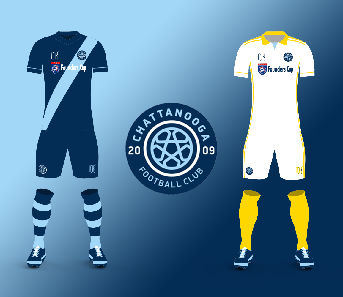
For our friends in Tennessee, I went with a pretty standard home kit, focusing on the dark/light contrast in the blue of their crest. I know in the past they’ve had some interesting takes on these, but I wanted to come back to basics for at least a season. For their aways, I looked at some recent kits they’ve used and went with a contrasting white/yellow get-up with a full collar. The small touch of sky blue in the collar works well breaking up the top of the kit.
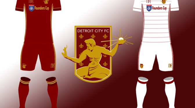
Detroit City Football Club
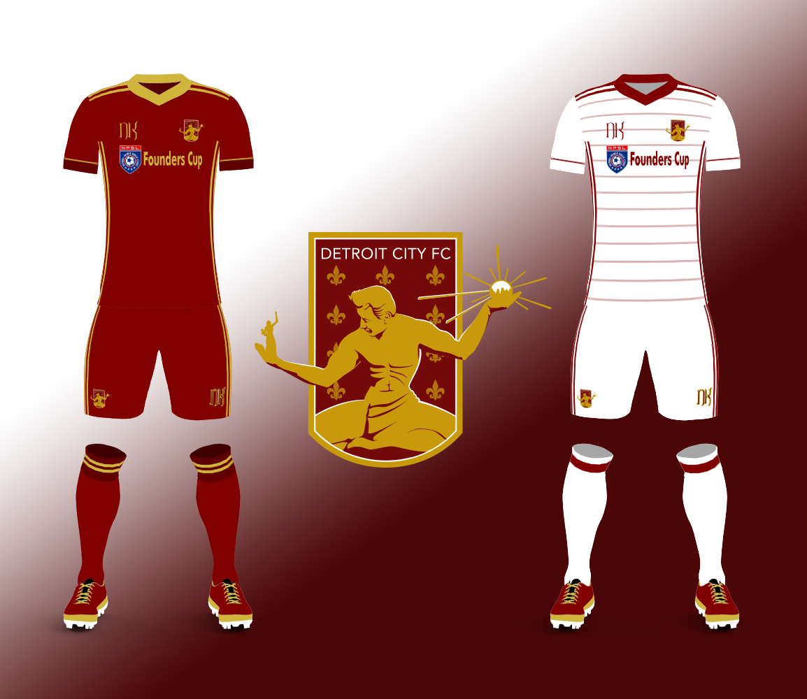
I know that I already did Detroit City recently, but I am always excited to give it another shot. I spoke a bit with the FO about next season’s kits, and I’ll keep it under wraps, mostly because you all know how much they love fucking with me.
Mr. Wright, if you’re reading. Here. Order these.
Anyway, for the homes I went a little out of the usual comfort zone for a plain rouge kit with darker accents, framed in gold. Generally DCFC home kits are pure rouge with two-tone touches. The away kit is white with some rouge touches to keep it from falling into an overly plain hell. The pinstriping is a nice touch, I think, and creates a look that is pretty unique in our history.
Miami Football Club
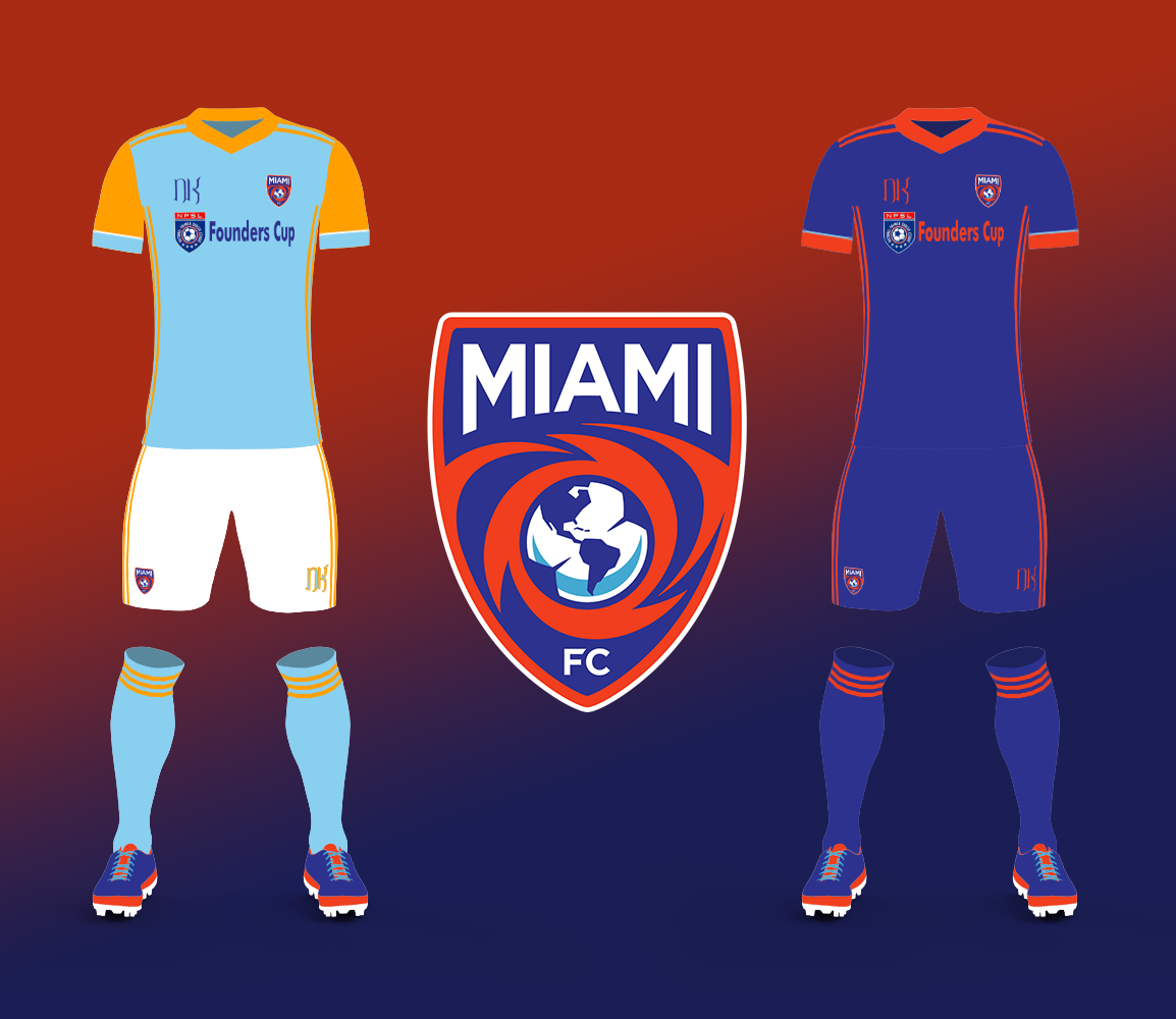
Miami FC are an interesting kit team because their home kit colors aren’t the same shades as their crest. It creates a unique look with a lot of possible variations. In the past they’ve used orange socks, but here I went with sky blue and orange stripes. The away kit, though, does take on the crest colors with only a tiny touch of the sky blue in the pipe cuffing of the sleeves.
Miami United Football Club
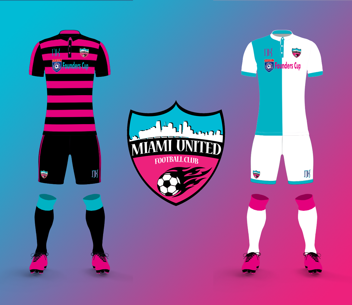
Miami United FC was one of those clubs that surprised me in the announcements, however I love working with their neon color scheme which is one of my favorites in soccer anywhere. I actually toned it down from their current rugby-styled tri-color hoops, which are chef kiss amazing. Here I tried out my new henley template and tried to keep them as far from the other Miami in look as I possibly could. Home went high-contrast, and the away took on a traditional European look that shouldn’t be unfamiliar if you read this year’s kit day post.
Milwaukee Torrent
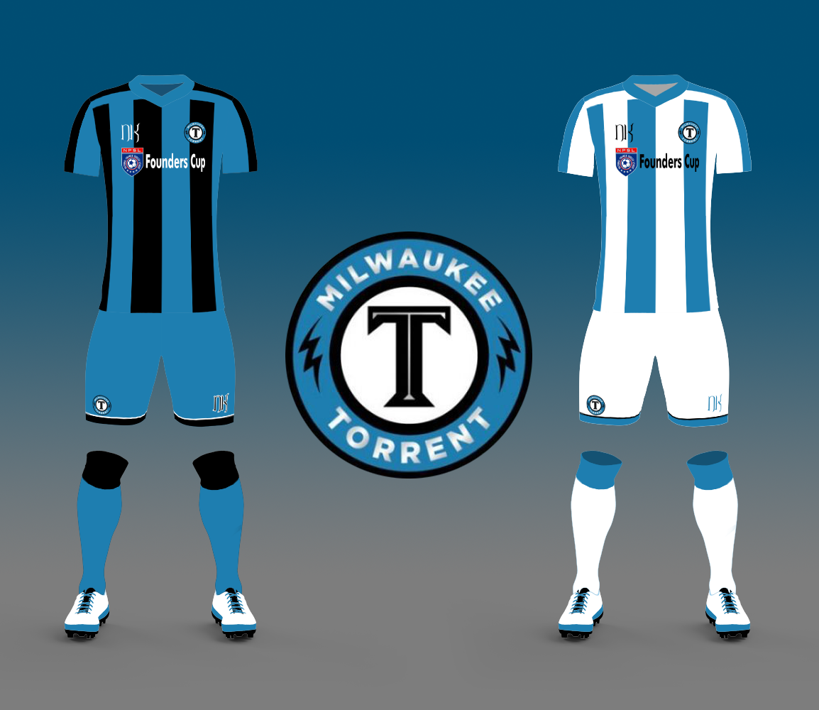
Milwaukee Torrent was another name that surprised me when I read it. Having traveled there two seasons ago, I wasn’t impressed with the turnout. The bar literally across the street hadn’t even heard of them, so… ramp up the marketing. Torrent have a very interesting silver and blue color scheme, and in 2018 not only did they use a half-and-half top, but half-and-half pants as well! Here I went with another rare look in the US: asymetrical stripes, then for home and away I stuck with the pattern but swapped the colors around. Changing out the blue for the white (instead of just swapping white for black) gives enough contrast to prevent clashing.
New York Cosmos
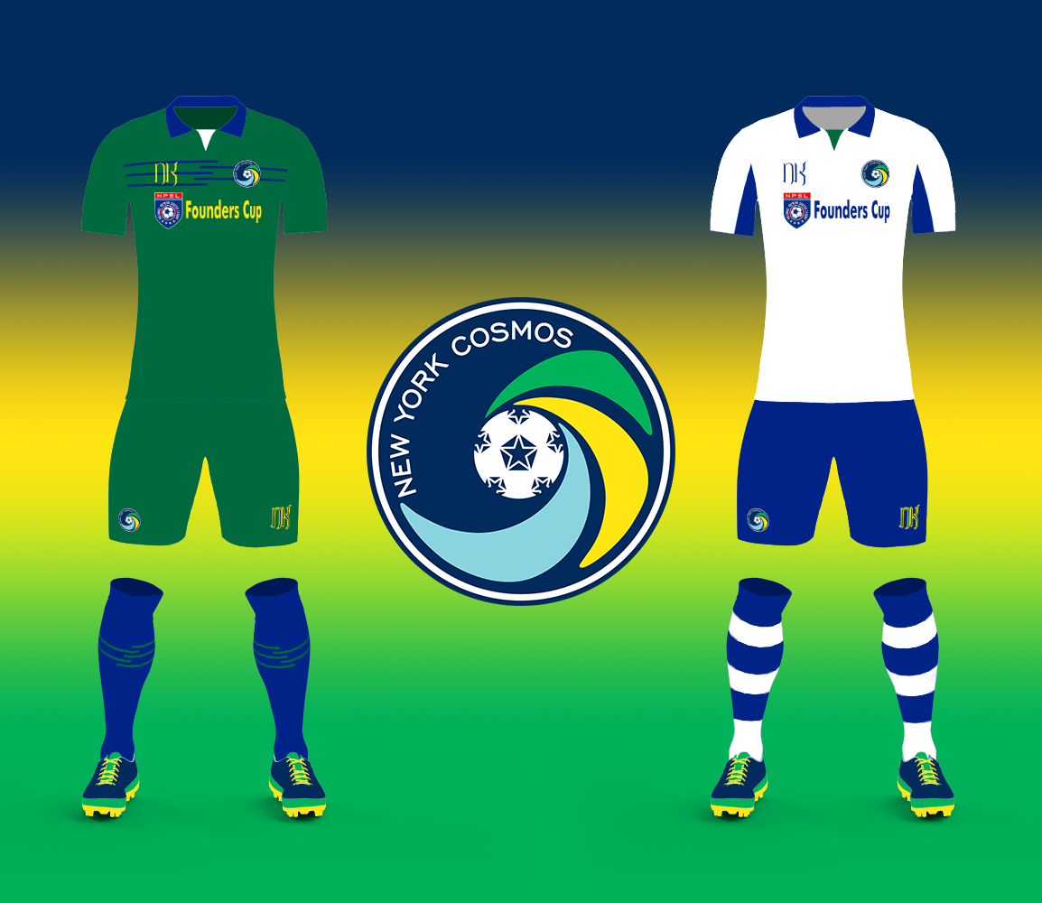
The Cosmos (long may they be fucked), are certainly the most storied of the clubs in the Founders Cup. I believe they’ve actually already unveiled their kits, but I hadn’t actually been paying much attention. As far as I am aware, both Inaria and myself came to the same conclusion – there’s too much blue in the NPSL Founders Cup. Instead of the normal blue, I went with green for the home kits, based on a design I did quite a while ago for the “Green Mountain Boys” of Vermont plus a small navy detail so it wasn’t devoid of navy. The aways are tied to the home with the navy collar, but otherwise are a simple top/shorts+socks contrast game.
NPSL Founders Cup – WEST
Albion Soccer Club San Diego
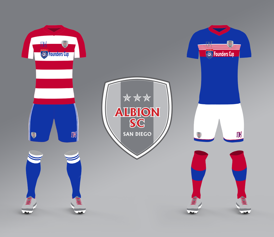
I’ve actually interacted with Albion before on twitter, when I remarked that their grey-colored crest was very interesting, and tried to design some kits around that color scheme. Their twitter account reached out to tell me that they actually had a traditional look that they used and I checked it out. Despite the chance for an interesting silver kit, I stuck with what I’ve seen of theirs so far. The home kits are red and white hoops paired with blue, which for the away kits I went with a Rangers-esque look, broken up with some red and white on the chest.
California Football Club
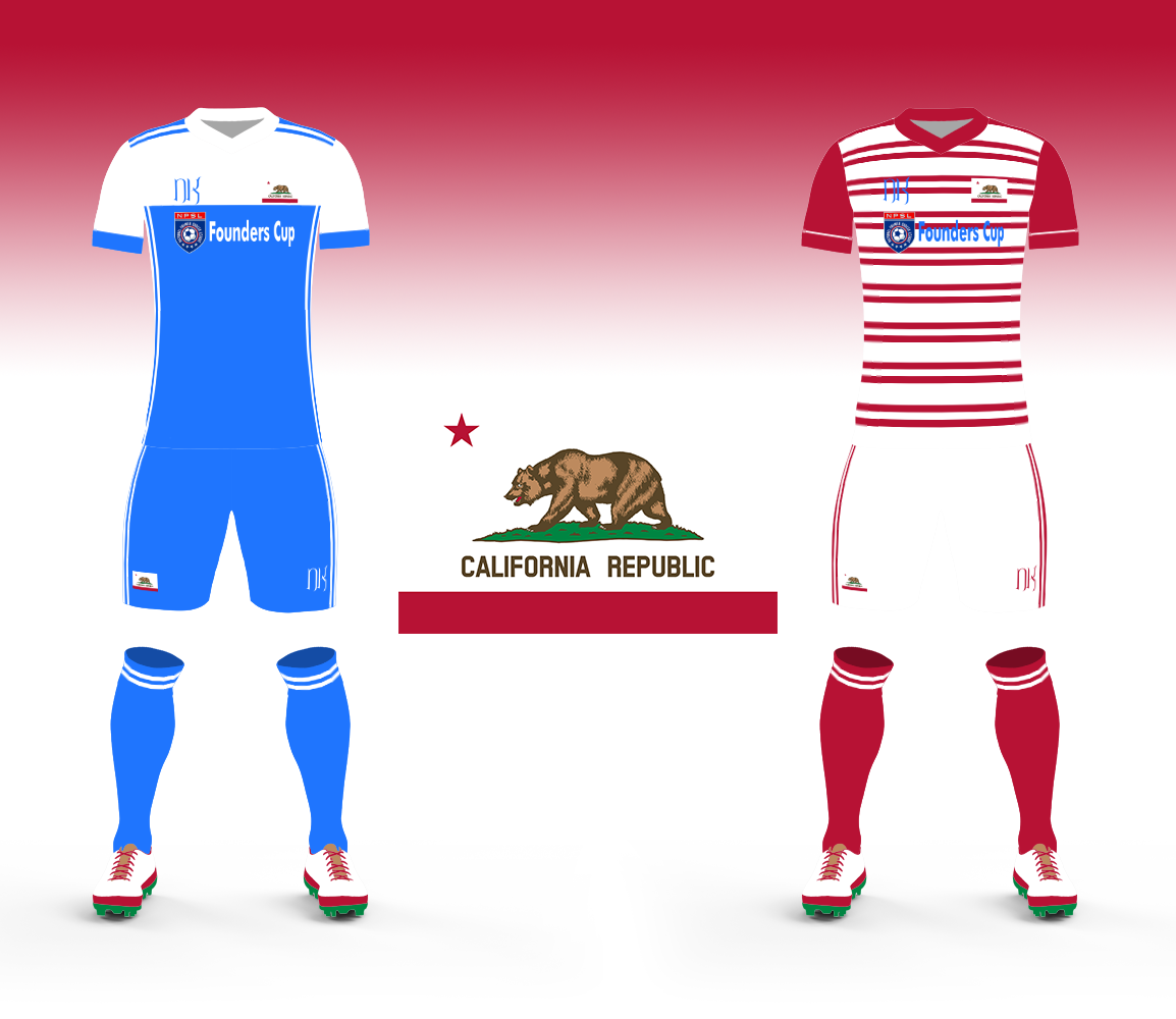
This was pretty hard, to be honest. Cal FC doesn’t have a crest, apparently. Or they really are going to go with the California flag with a soccer ball photoshopped onto it. I didn’t use that “crest” here. It was… well… it was a flag with a soccer ball shopped onto it. And the only thing I saw for them was a blue kit in their wikipedia page. So… I went with blue-white scheme, because there isn’t enough blue in the NPSL Founders Cup. For the aways I went with broken red hoops on white, with red socks as a nod back to the California flag.
California United Strikers Football Club
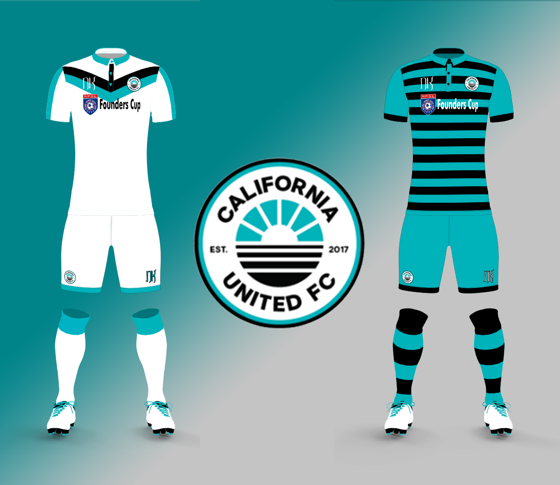
I have to admit that, like Miami United, California United’s neon-based color scheme rubs me in all the right ways. Not sure what everyone else thinks, but I love it. For the home kits I went white. White is a color that I often avoid when designing home kits, but I often use in away kits. I wanted to change that with a mostly white kit that relies on the cyan and black as flavor enhancers. The away kits, though, are certainly one that you’d expect from me. I didn’t want to copy the Miami United “color on black”, and instead went “black on color”.
Football Club Arizona
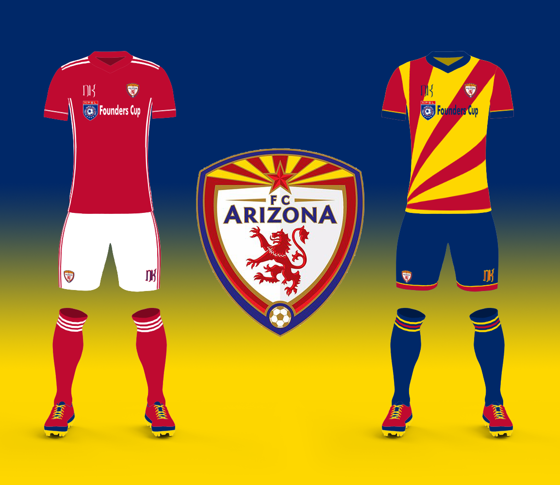
I’m really happy to hear that we have an Arizona team in the lineup as that might give a good reason to take Brigid out to her parent’s place and then for Ron and I to watch some soccer again. For their kits, I wanted to do two totally different co-equal “home” kits. First was FC Arizona’s more traditional-looking red and white kits, which is a favorite combo of mine. I wouldn’t want to take that away. Then, for the other kit, I wanted to go to the complete other end of the spectrum and do a busier kit in the modern sensibility. Gold-Red-Navy is a great combination, and given that Arizona’s flag is just that, why not translate it into a kit?
Oakland Roots Soccer Club
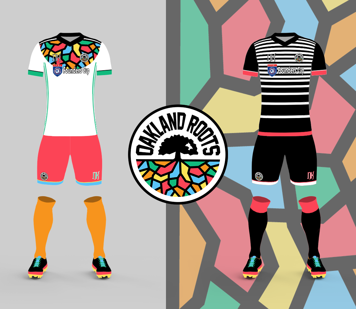
When the Oakland Roots first unveiled their crest on twitter it was met with equal parts of “What? No…” and “What? Yaaas.” I love it, personally. It isn’t a crest I would design or even want to design, but it’s like the DCFC crest of the Madison pink flamingo crest – it isn’t about working for everyone, it’s about working for the community around it. And that’s fantastic. I wanted to lean into that wild look for the home kit. I split the tree top and bottom and spread it out so the roots and their colors could rule over the chest and shoulders. Then the rest of the kit was nothing but color. For the away kits I wanted to focus on the roots themselves, in black, then combined that with touches of red.
So that wraps up all eleven teams in the NPSL Pro Founders Cup. There is a lot of great stuff to work with here, which is great. Rumor has it that the Nola Jesters will be joining too, adding a third neon-schemed team to the mix, so I am excited for that. Plus Cleveland SC and FC Buffalo rumored as well could mean the return of the Rust Belt Derby.
I’m excited for what the future offers here, there is a lot of “pros” to our punk-rock pro-league, but some cons as well. We face an uphill road, but I think Detroit City remains as level-headed as ever and we are in good company. This will be one of the most critical “fronts” in the Soccer Warz™, so regardless of where you are or who you root for, you’ll want to at least keep up-to-date on the Founders Cup in specific and the NPSL in general.
I hope you all enjoyed my designs and have a great rest of 2018. It’s been a tough year, but there’s a lot to look forward to in 2019.
Cheers, everyone!
Update 29th of December: Now with 100% less phallic imagery.