Faust: Who holds the devil, let him hold him well, He hardly will be caught a second time.
During the first DCFC season, my friend Zak and I had fashioned some cheap and easy flags. For mine he spray painted a quick trio of fleurs de lys on it in no more than two minutes and called it a day. Meanwhile he found a rouge-colored fabric with golden fleurs de lys sewn into it.
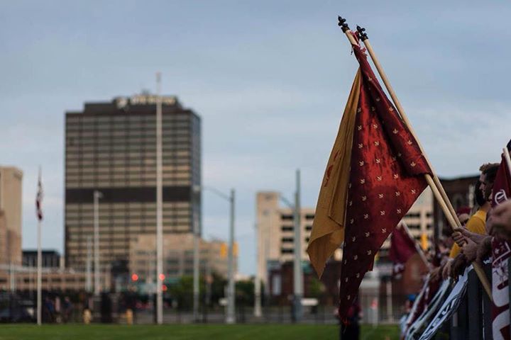
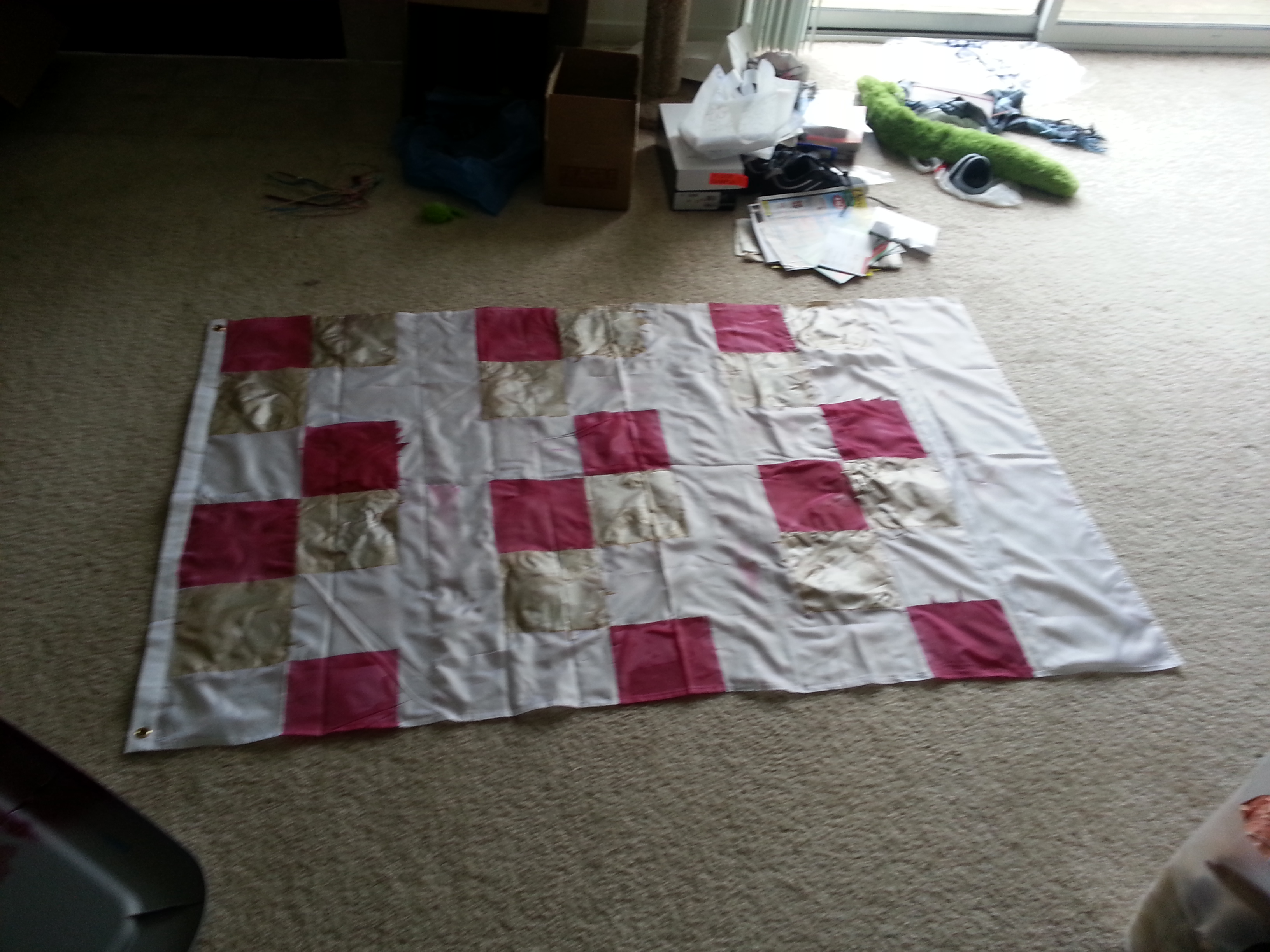
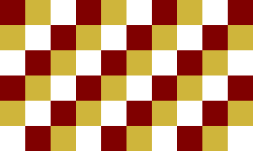
The next year I decided to get a bit more advanced. Zak had dropped out, so I was on my own. I bought a blank white flag, marked it off, and covered it in rouge, gold, and white checkers. It was janky, the colors looked like shit, and the lines between them were blurred and runny.
Over-all it blew. But it made it to quite a few matches. And as I told one supporter who called it shit but was empty handed, “It’s better than yours.”

The next two seasons I was flagless. Generally it was pretty liberating, not having to worry about where the flag was, keeping track of it, or worrying about someone running off with it (like anyone would steal that piece of shit). But I missed having one. For some reason I had it in my head that I needed a flag.
This season all that changes.
I’m back in the business of making a flag. This post is/was not written after the fact. I am saving it as a draft and publishing it upon the completion of the flag, which I have dubbed “Faust”. As I work I will add more to the post so you’ll get a stream of thought. Generally I’ll break writing periods with quotes from or about Faust.
Faust, for the uninformed was a German folklore character who sold his soul to the devil for all sorts of powers.
I am part of that power which eternally wills evil and eternally works good.
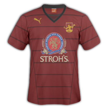
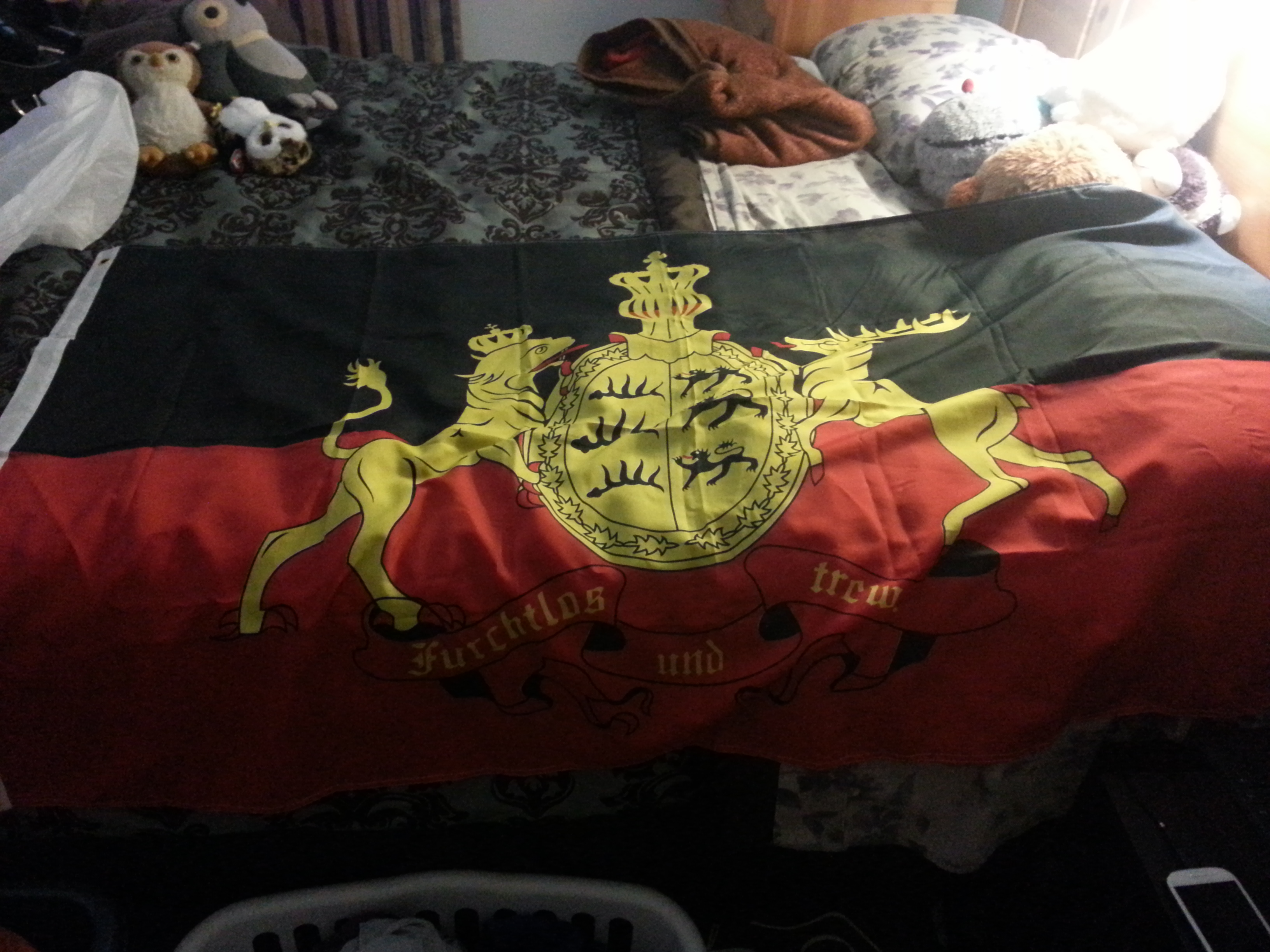
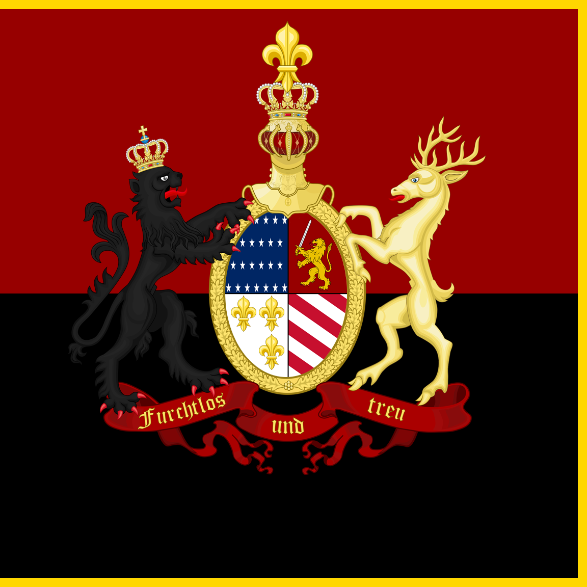
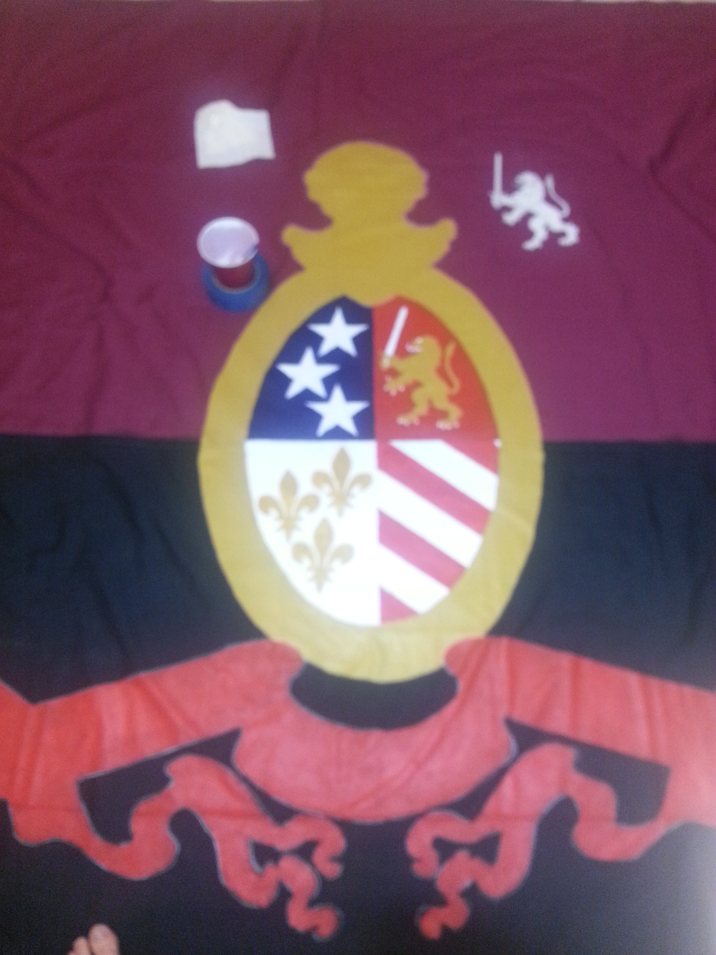
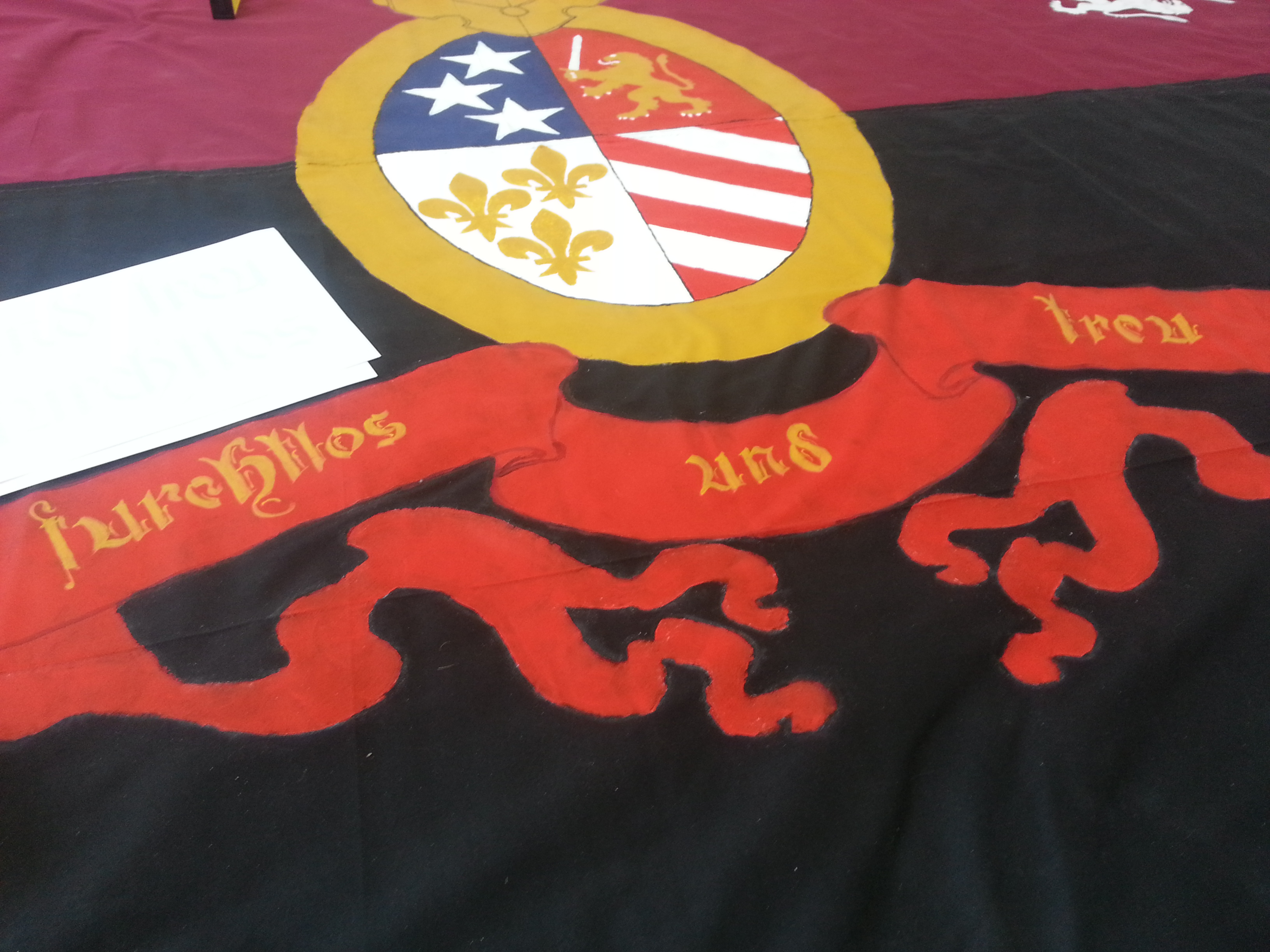
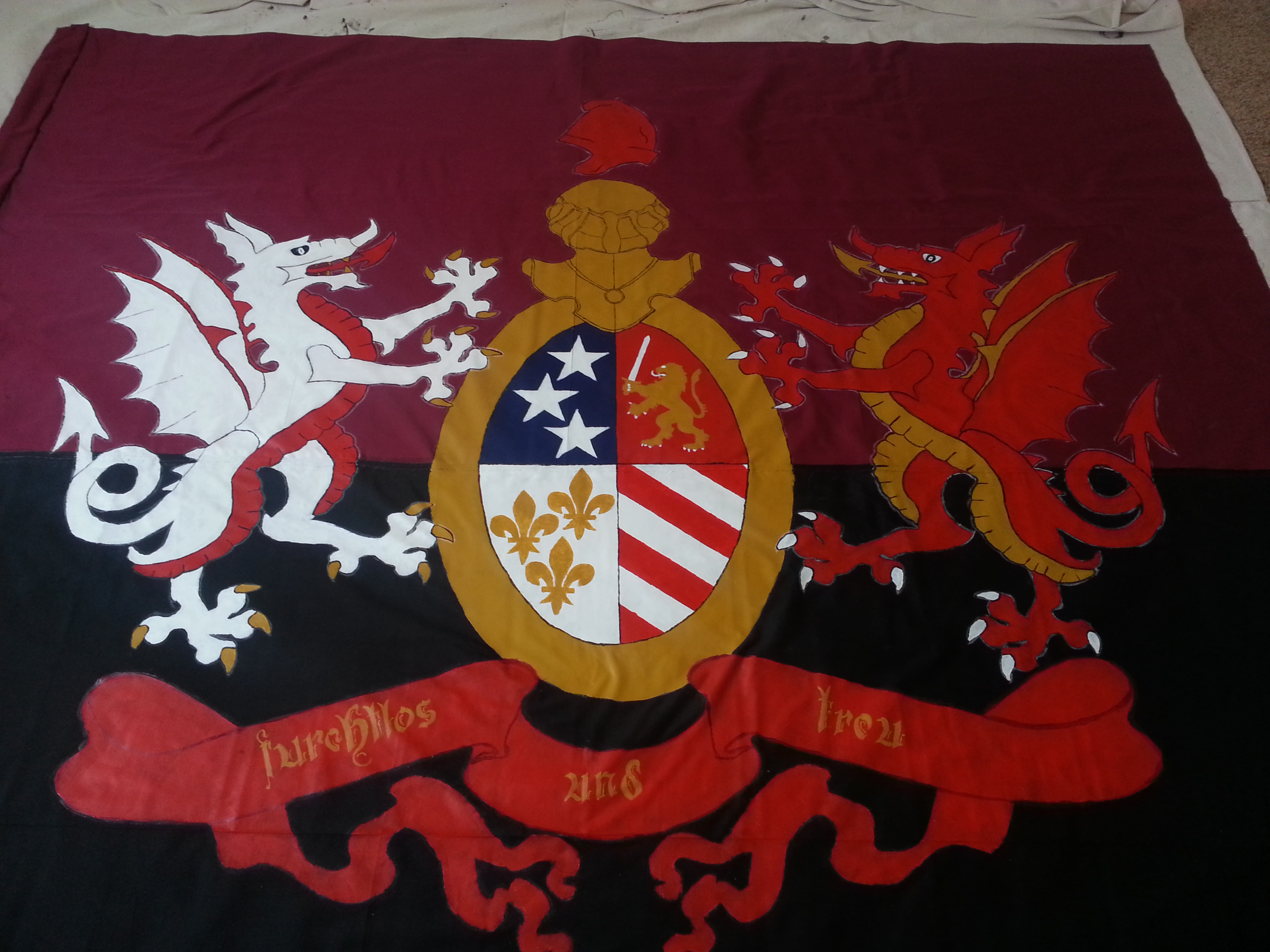
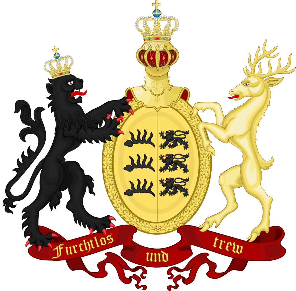
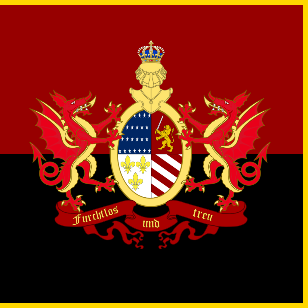
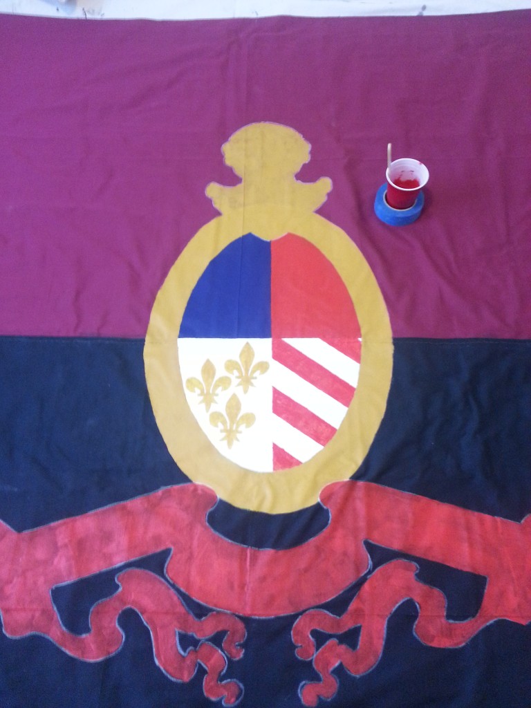
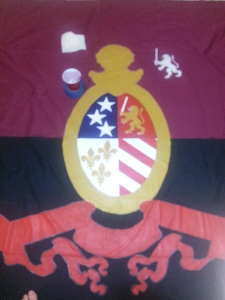
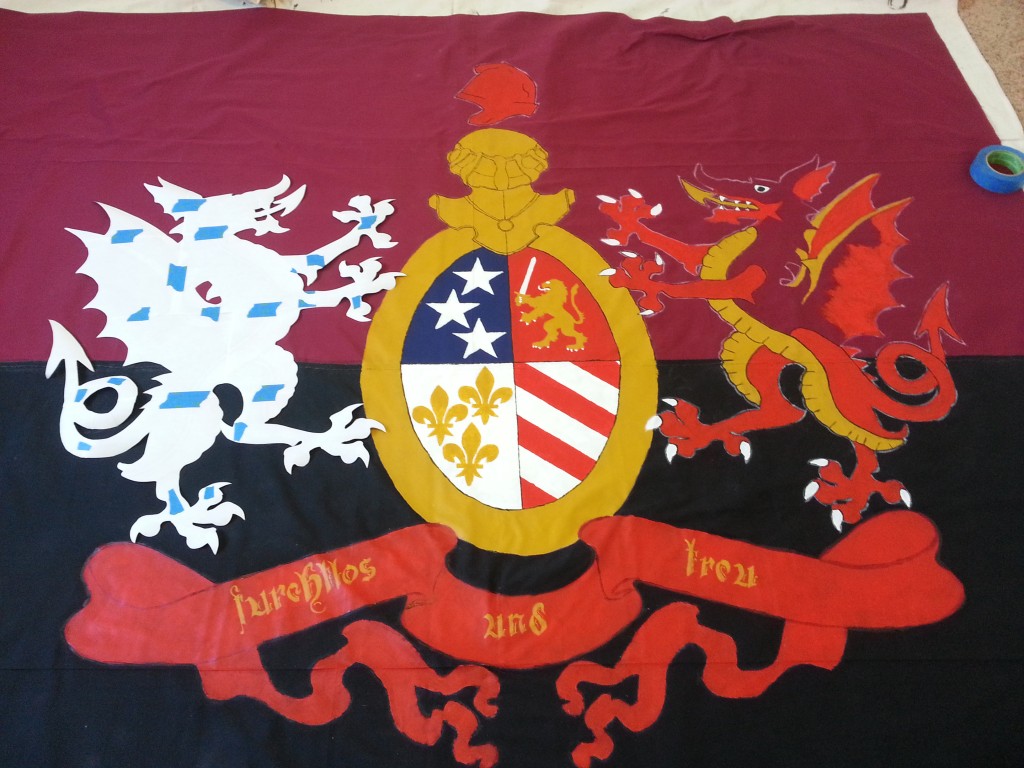
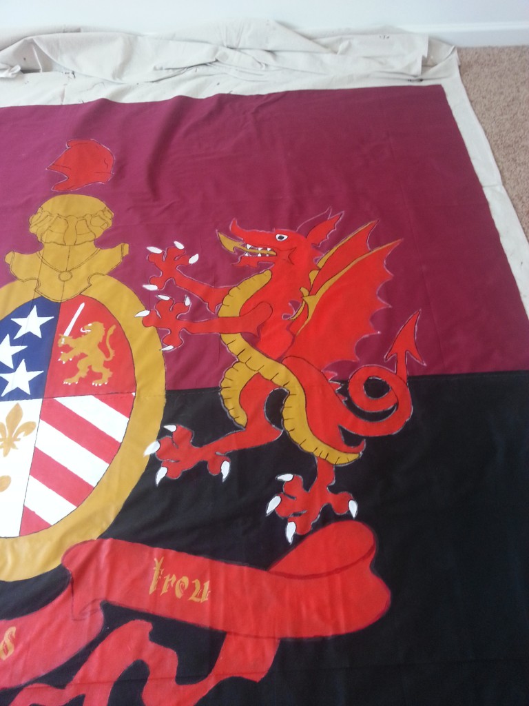
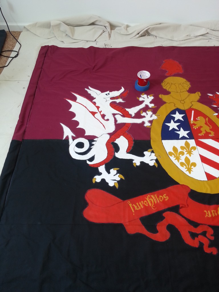
Unlike previous flags, no small deal of work went into designing Faust. The basis was the flag of the Kingdom of Württemberg. The banner at the bottom reads Furchtlos und Trew [sic]. I would keep that and fix it to the correct Furchtlos und Treu meaning “Fearless and True/Loyal”, a great line for any hardcore supporter.

I wanted a way to mesh this flag with the flag of Detroit.
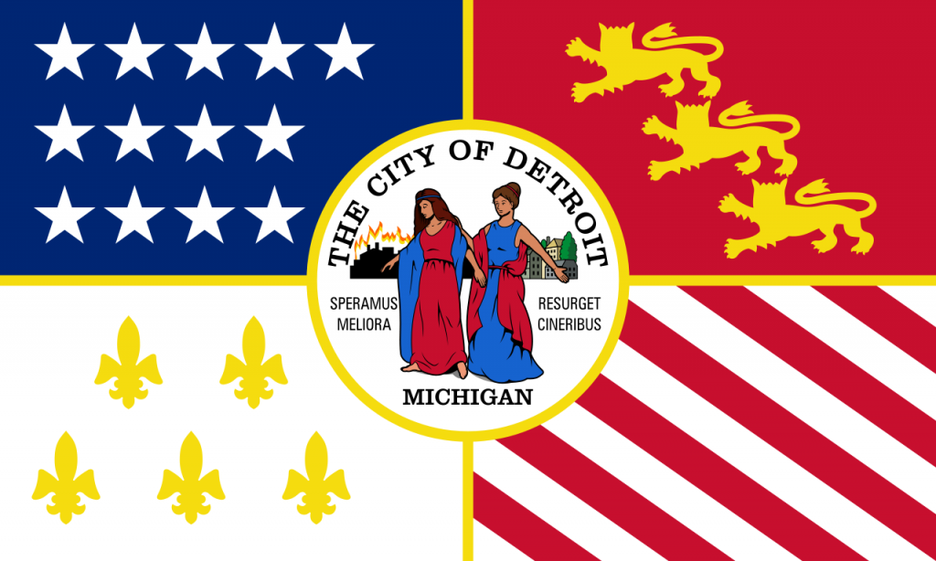
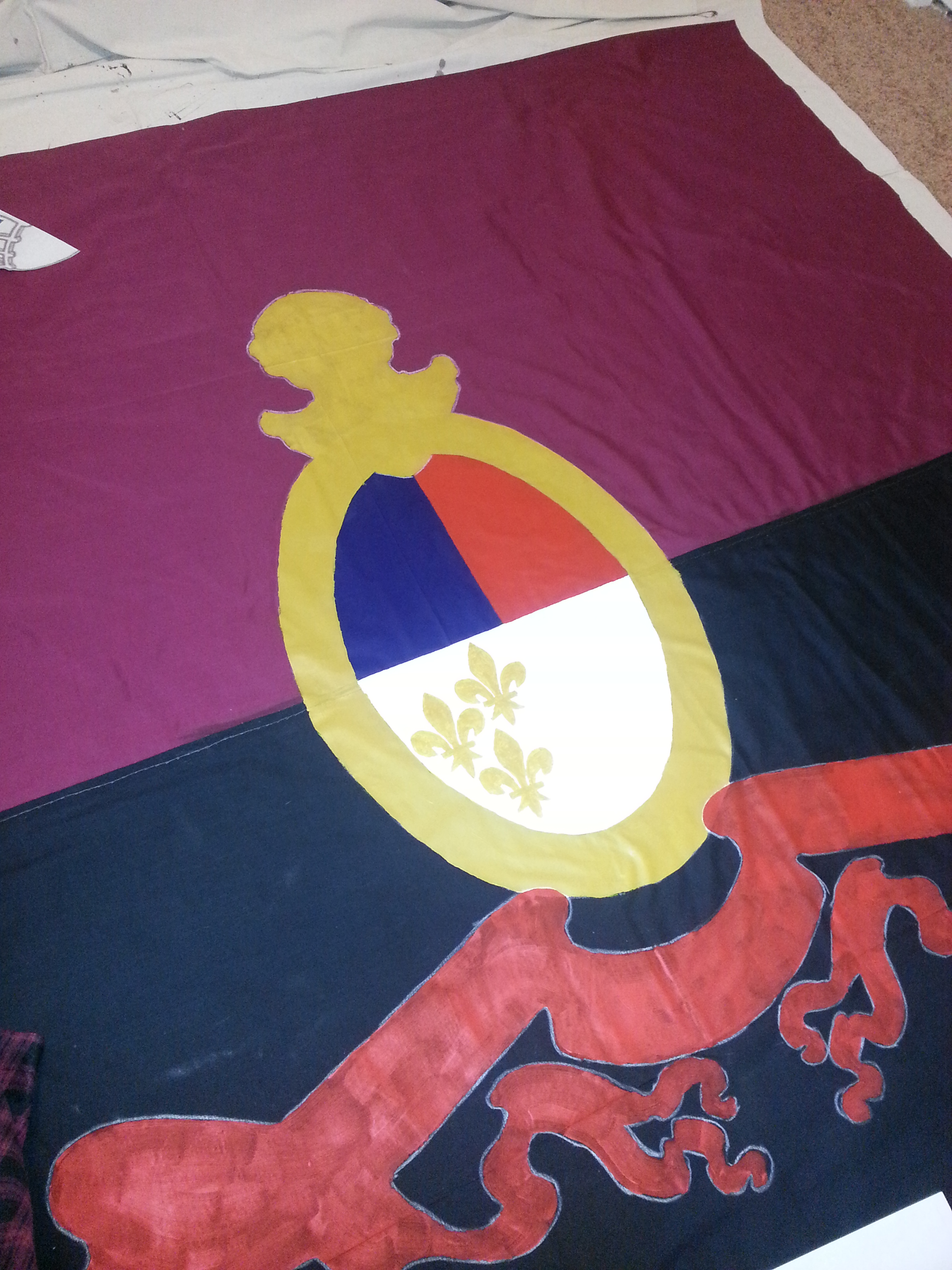
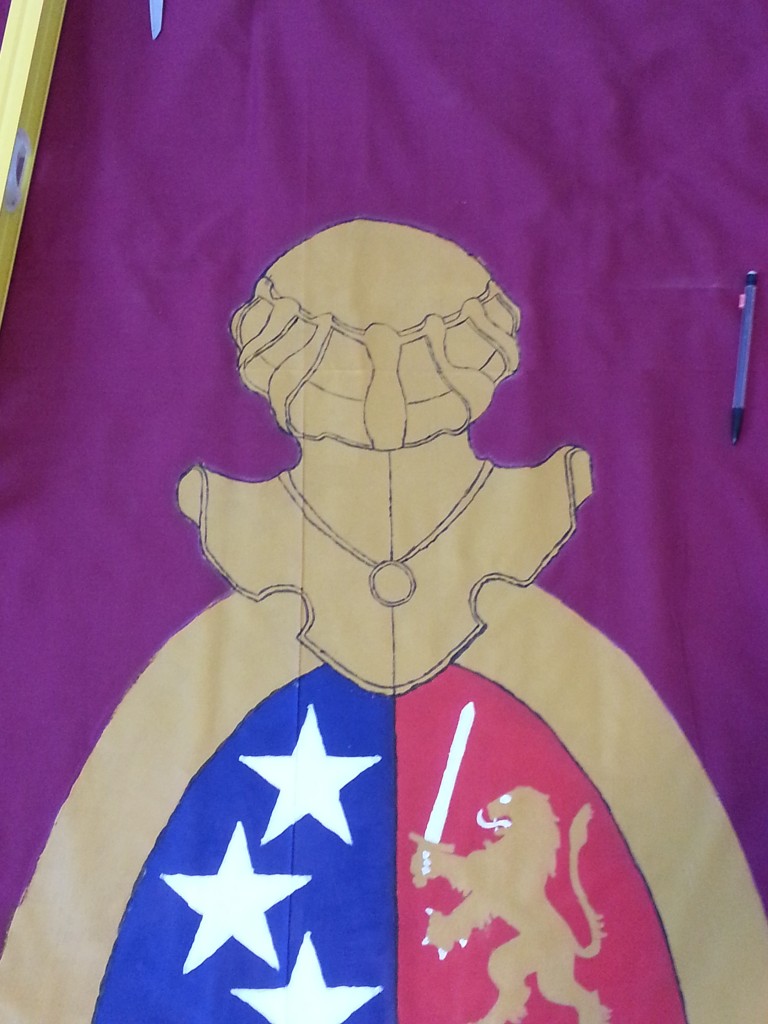
My thought was to work on the crest in the middle. Instead of Württemberg and Swabia, my thought would be to create a simplified version of the above: a field of stars, a gold lion on red, fleurs de lys on white, and alternating red and white stripes.
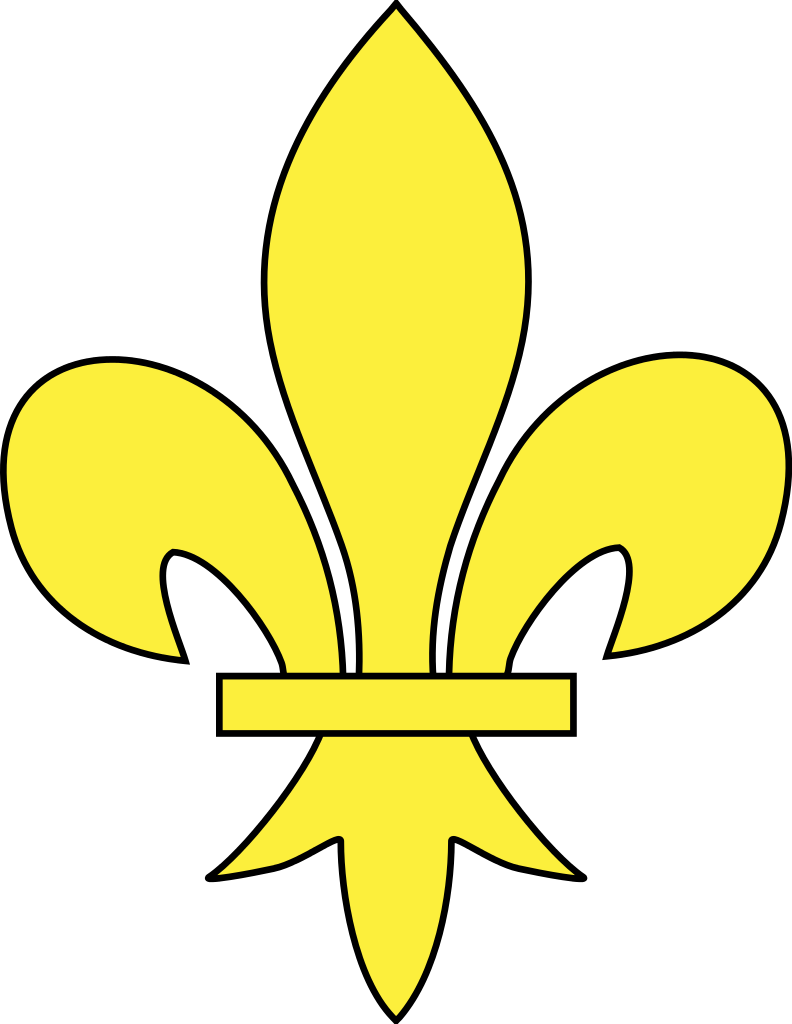
I worked on simplifying the Detroit flag. I removed the needless crest. Replaced the fleurs with something a bit more complicated, then replaced that with something less complicated but still more traditional than the ones on the Detroit flag.
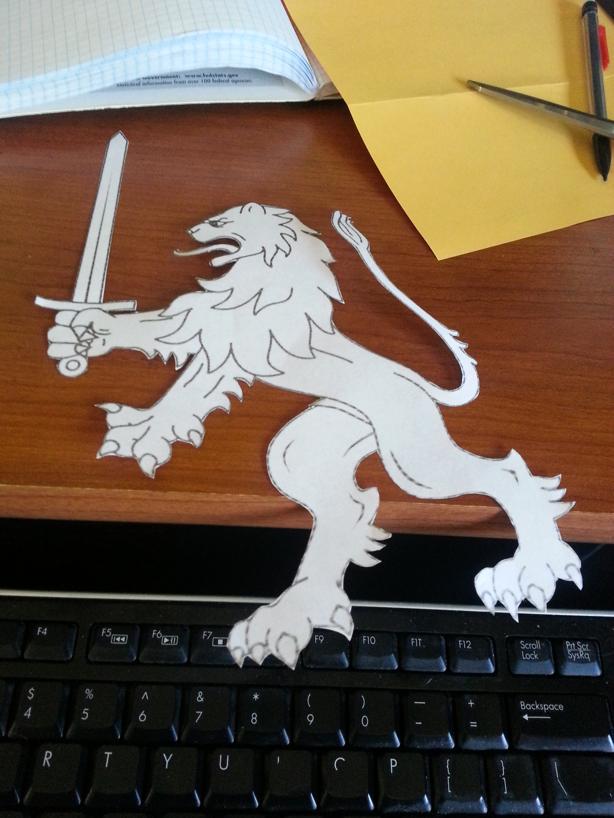
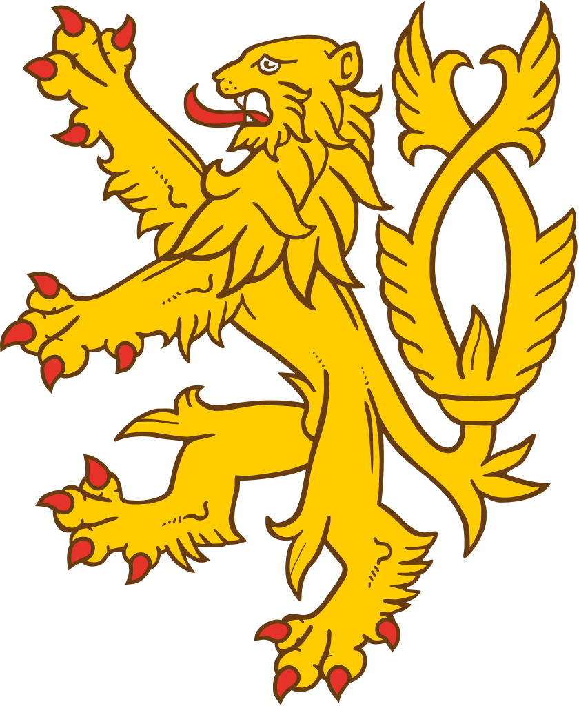
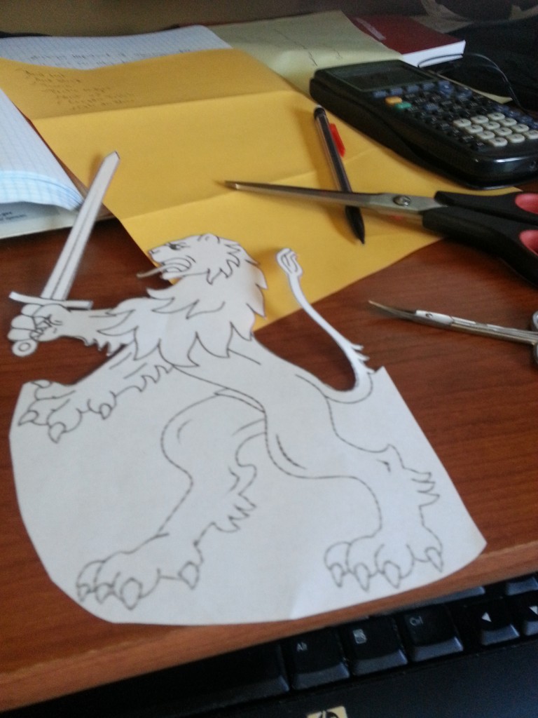
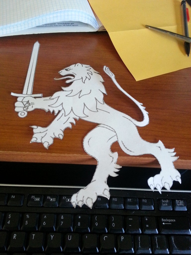
Concerning the lions of England, I knew at first I’d rather a single, better detailed lion than three smaller ones. Plus I wanted it in a more active pose.
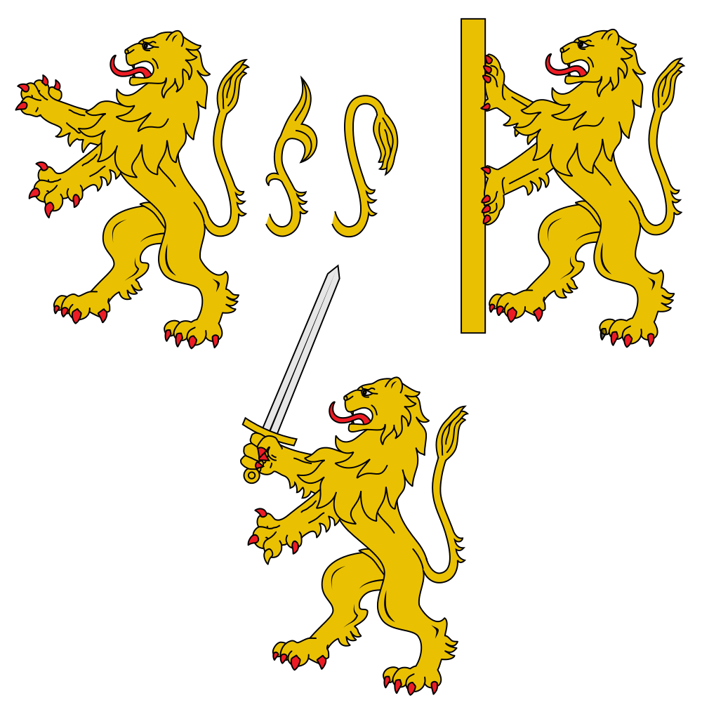
So I looked at some more complicated, active lions. And I mean, really, that one has a sword! So the sword won.
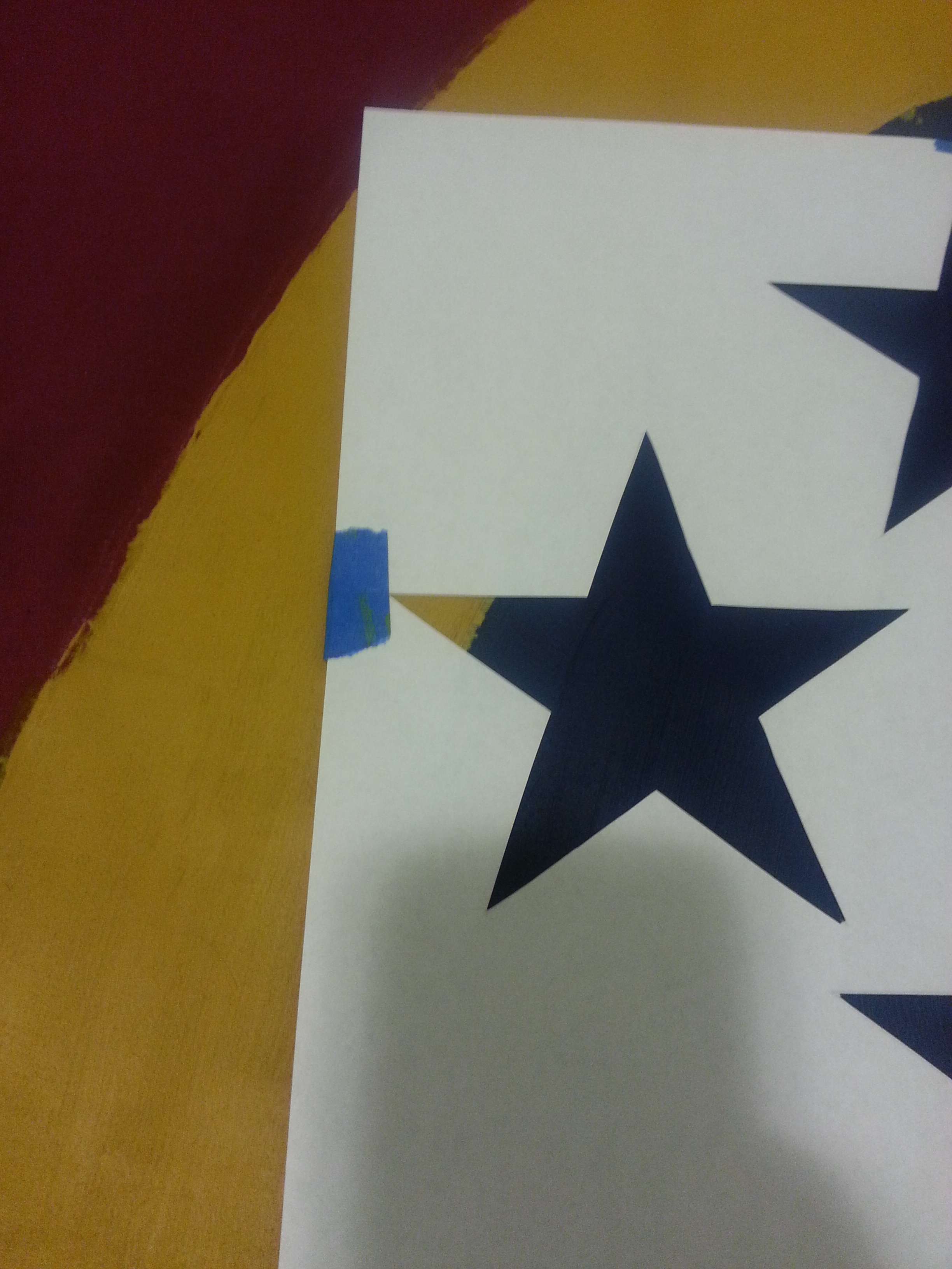
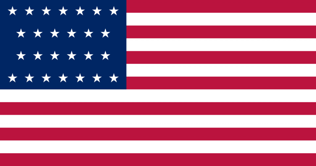
The blue field of stars should’ve been simple. The Detroit flag has 13 for 13 states, but their pattern is kind of lame. I chose to replace them with something based off the flag of the United States when Michigan was added to the Union.
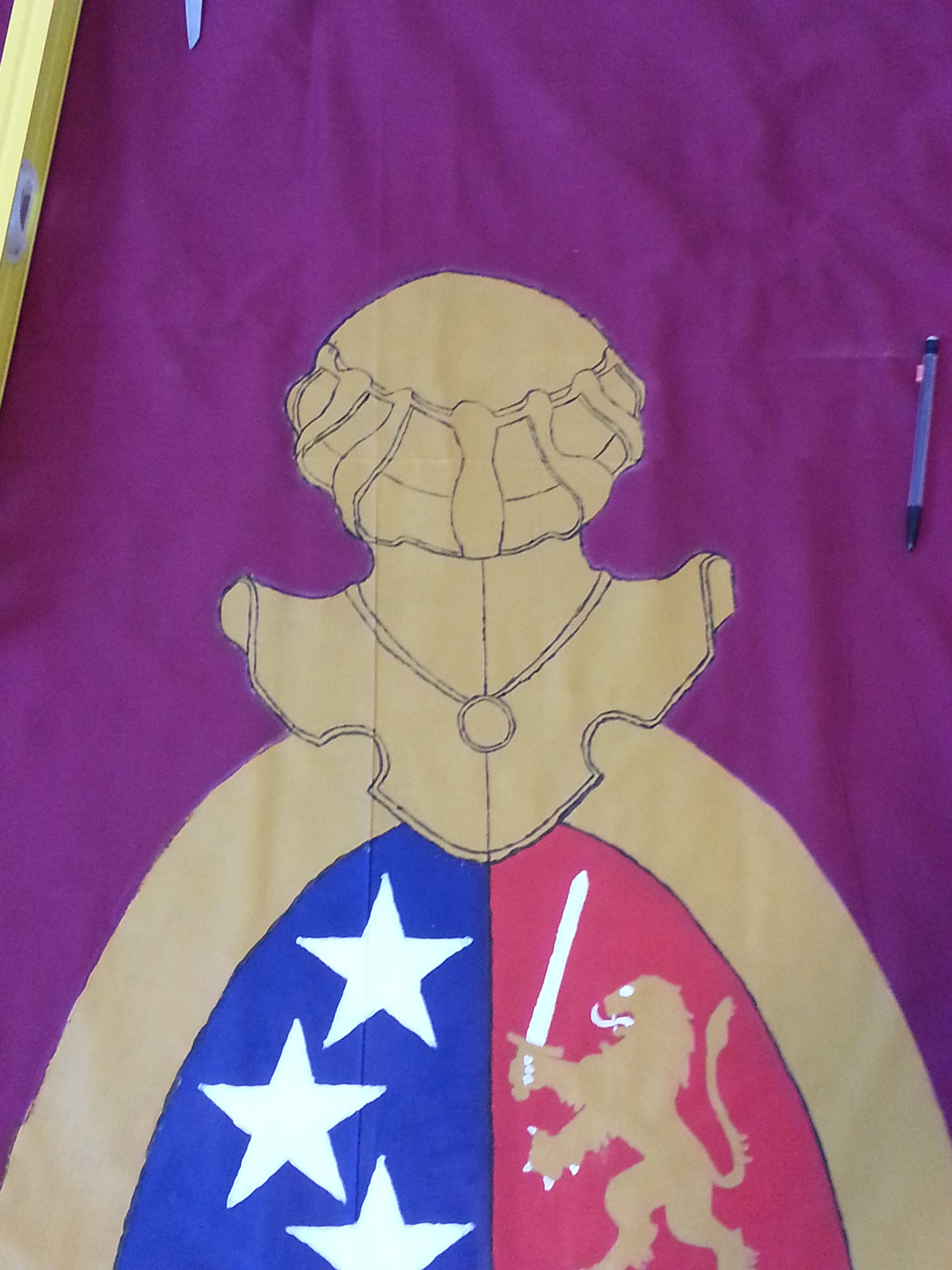
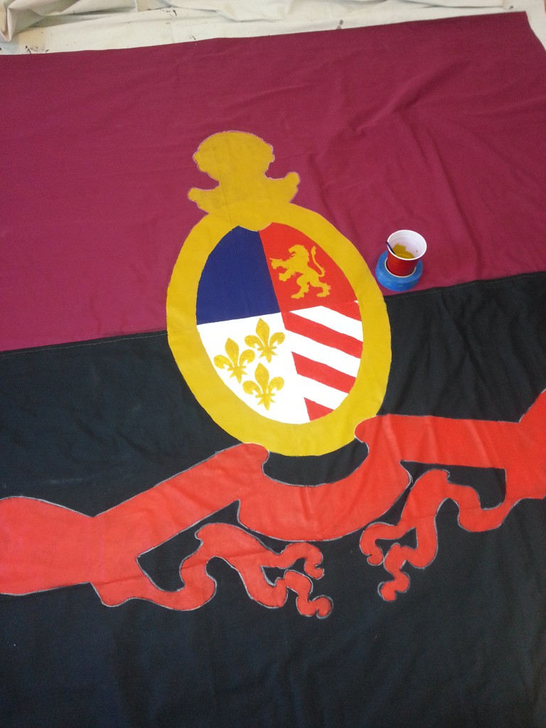
Lastly I flipped red to the top so the red banner would be on the black half of the flag. So here is the first main version of the Faust:

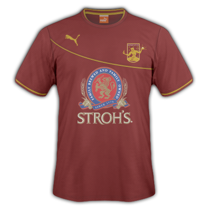
Some other changes would be needed. Originally I liked the black lion and the gold stag – it made a good reference to Michigan, but it was a bit complicated and the black wouldn’t show up well on the black and red banner.
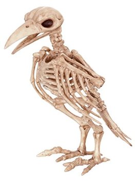
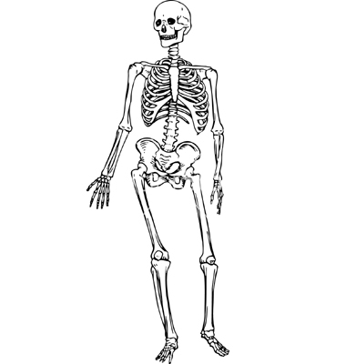
First I considered a skeletal crow and a a skeleton as supporters.
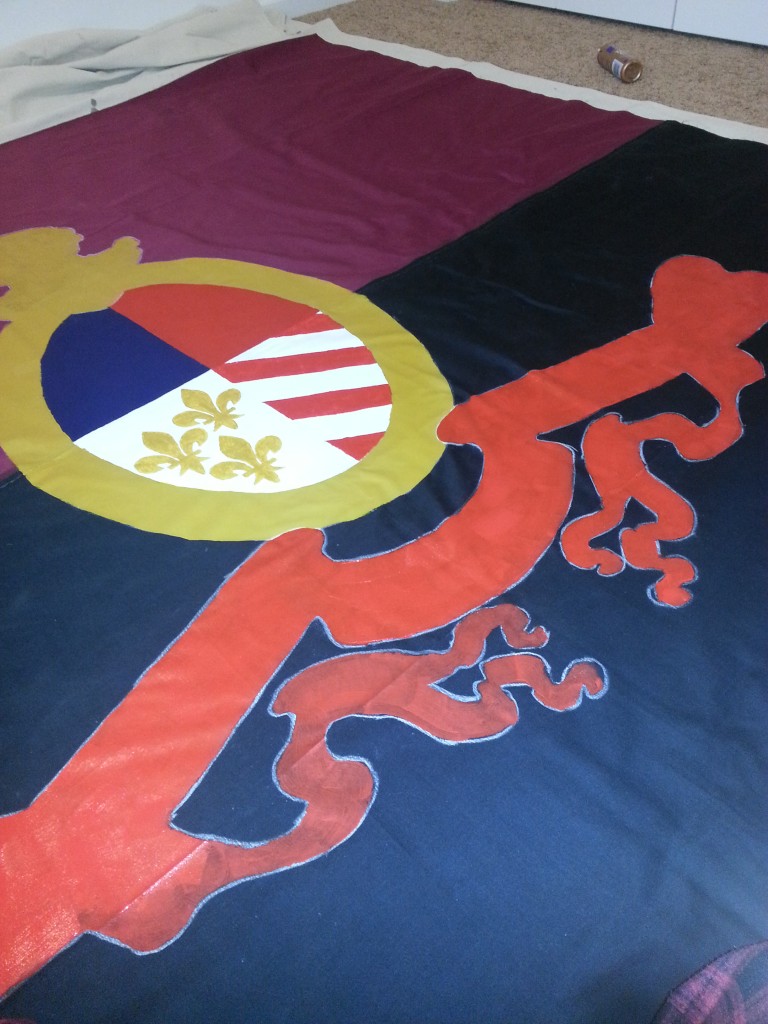
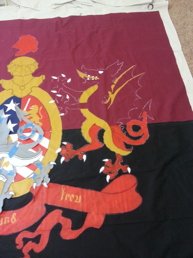
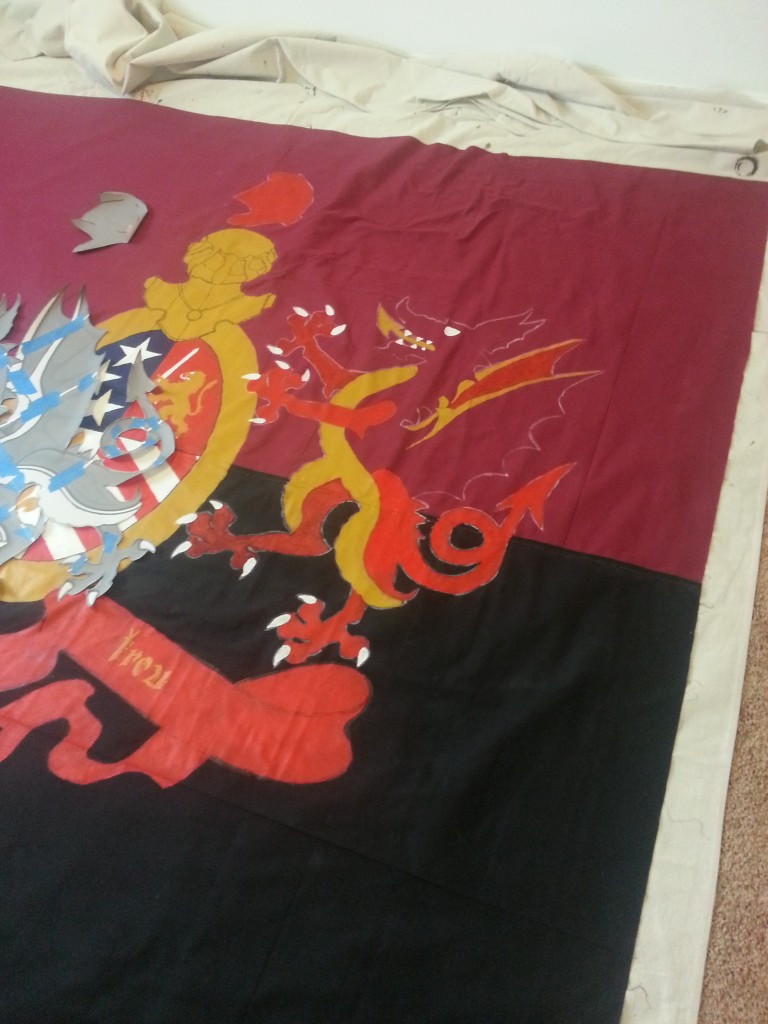
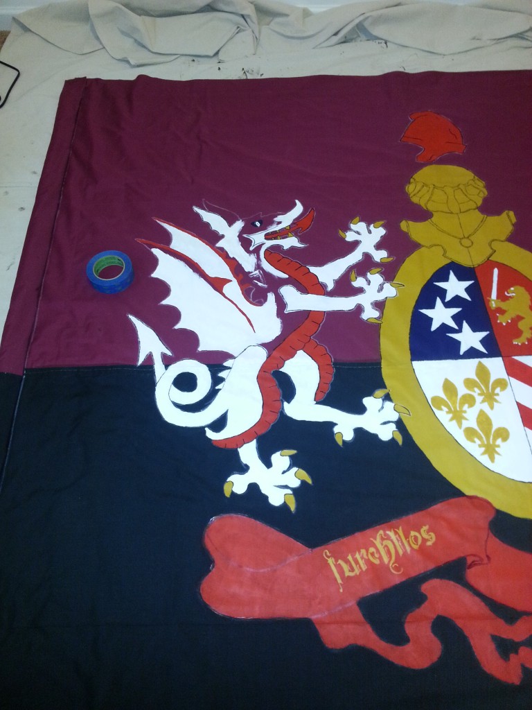
But with zero artistic ability I switched to the Tudor dragon which is rouge and gold paired with a golden lion.
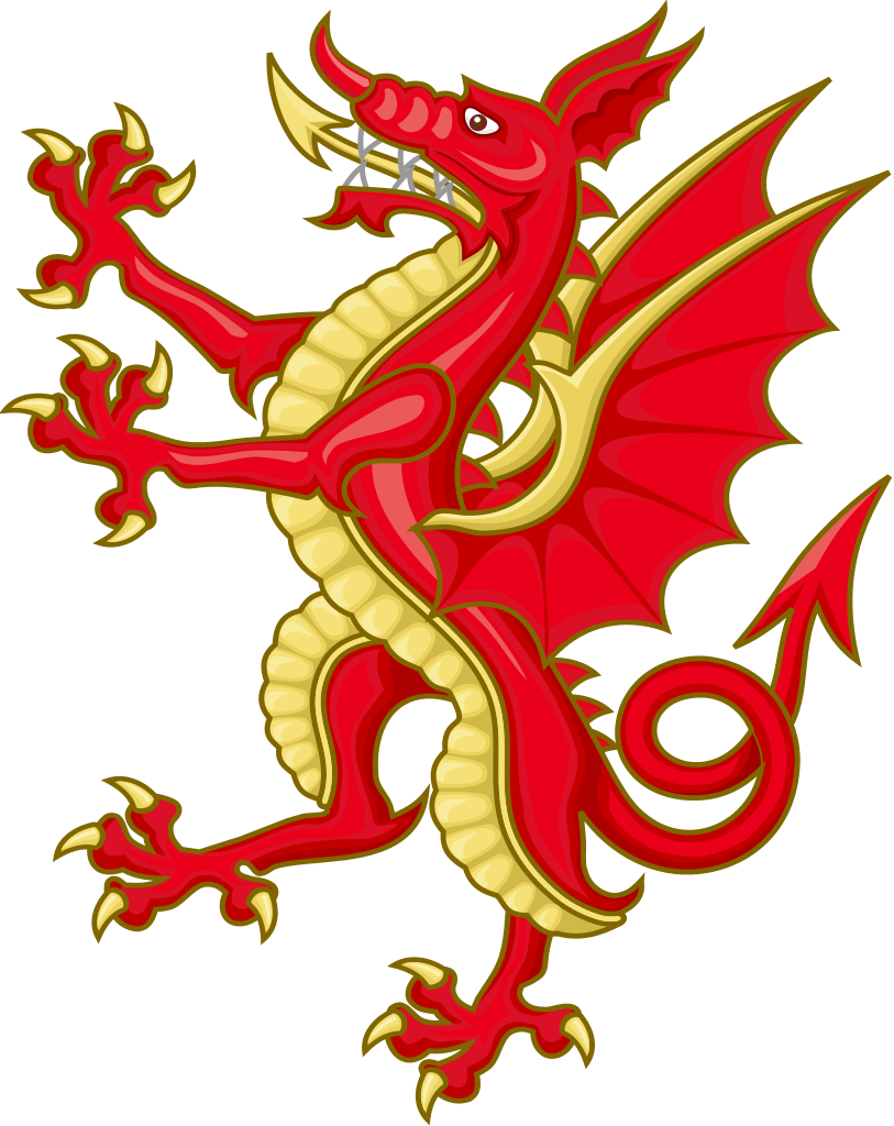
The dragon, however, is a really cool image. So the decision was made to double down on the dragons.
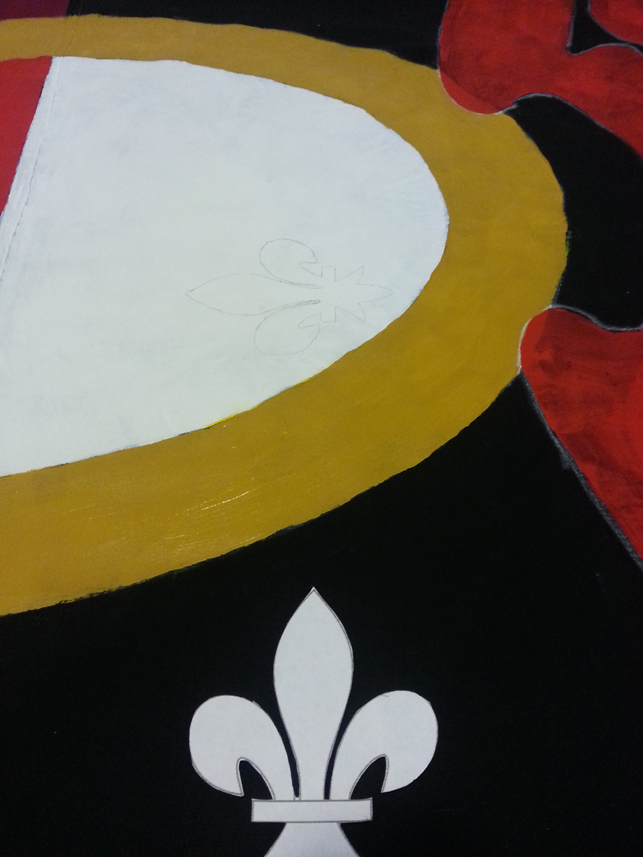
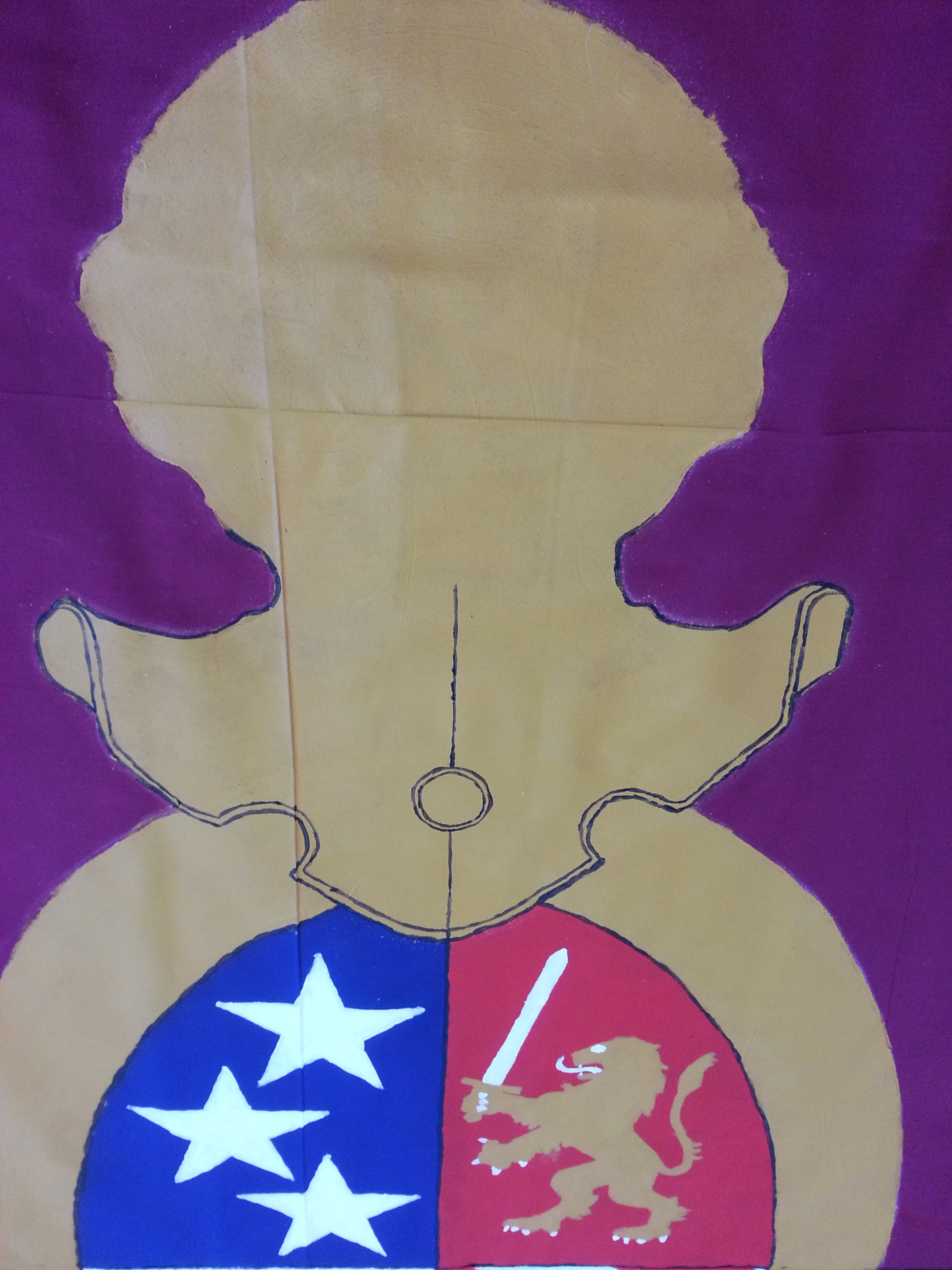
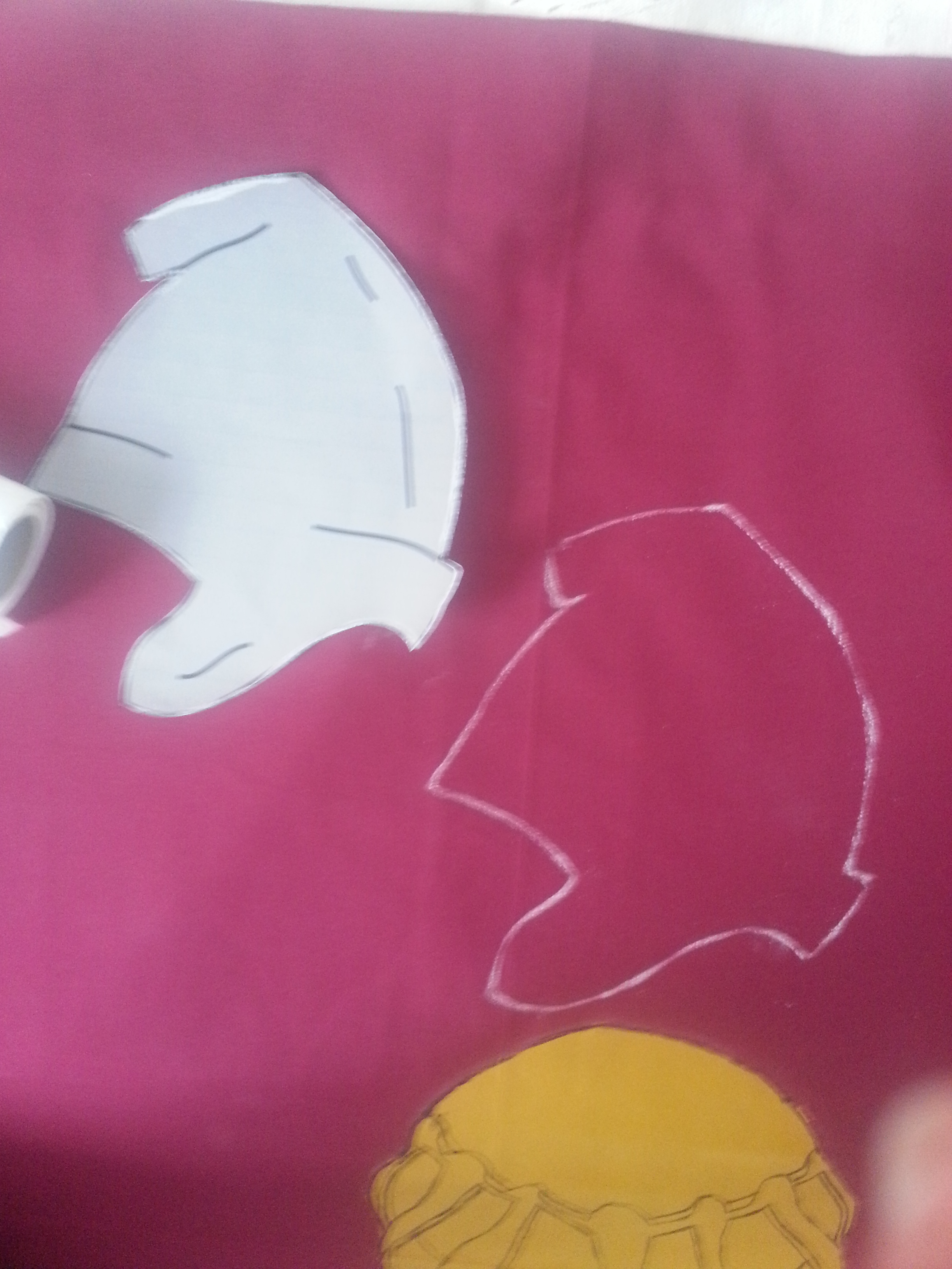
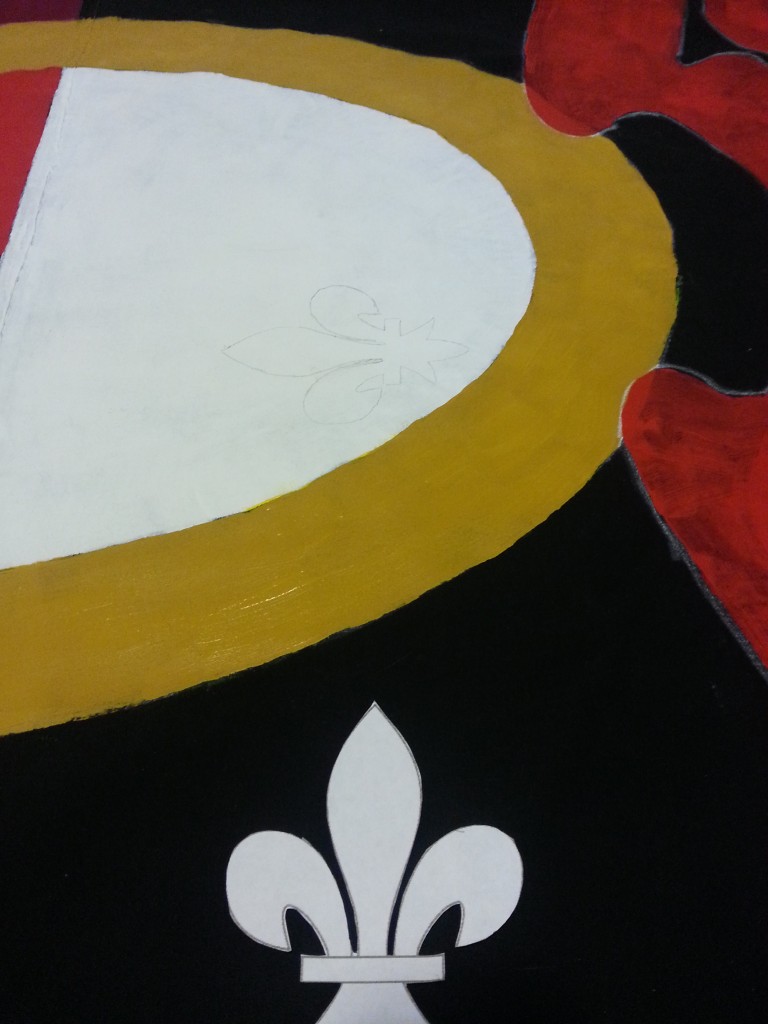
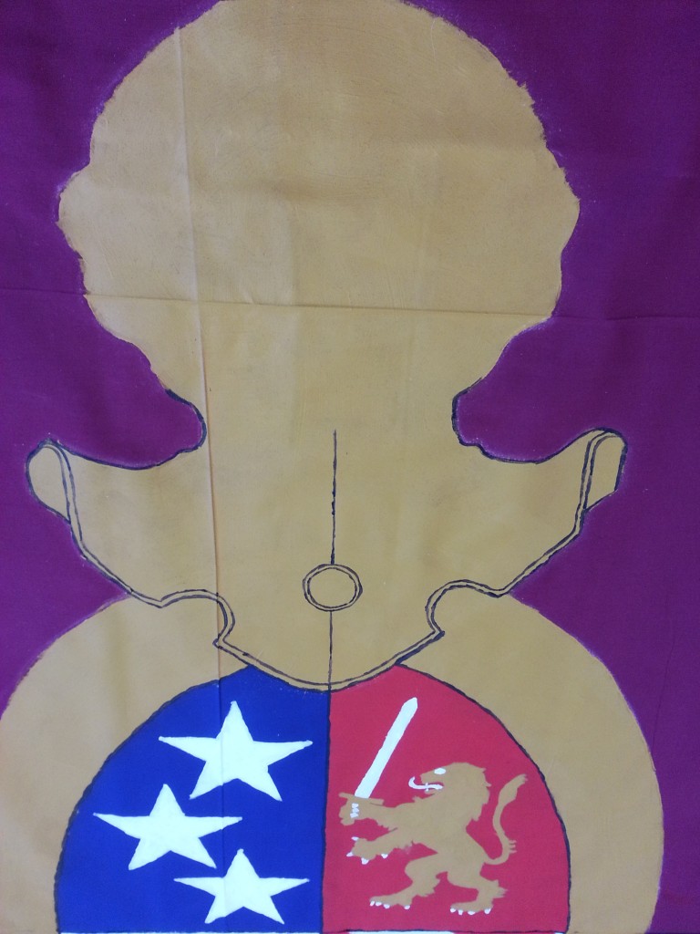
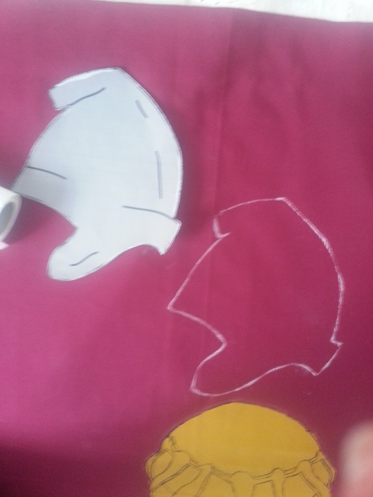
I worked on simplifying the golden shield around the crest, knowing that if time and paint permitted I could always add the the leaves and texture back in. Another minor detail I wanted to fix was the super tall helmet on top made especially tall with an extra fleur de lys on top.
The idea came to combine the fleur with the crown and find a simpler helmet to go on top.
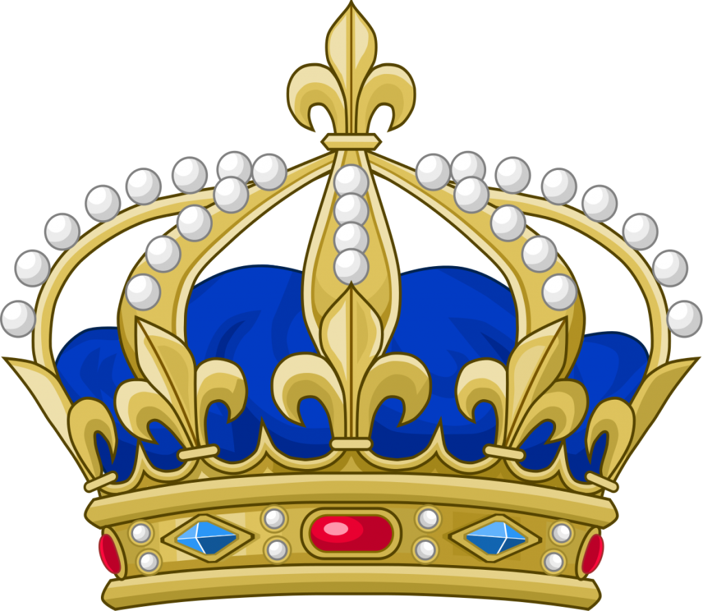
So the crown of France will have to do.
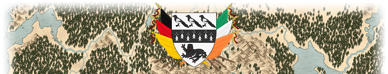
The final design for Faust:
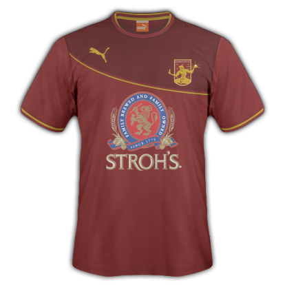
(Dragons further flattened for painting)
God help us — for art is long, and life so short.
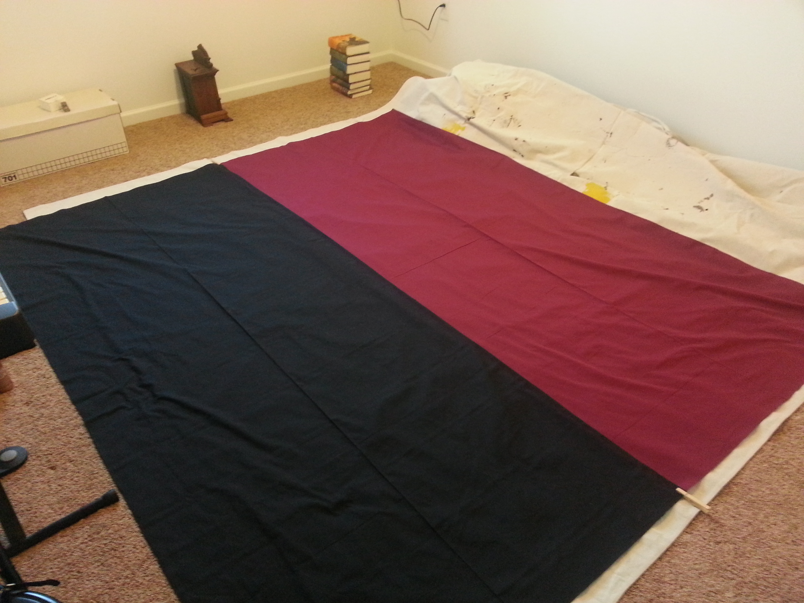
Eventually I had to get working. It wasn’t long before the itch got the best of me and Brigid and I ran out to two Jo Ann Fabrics to get enough polycotton and gold trim to put this together. Brigid came for the Japanese food.
I divided the build into four phases:
Phase 1 – Combining the halves
Phase 2 – Painting
Phase 3 – Trimming
Phase 4 – Basing
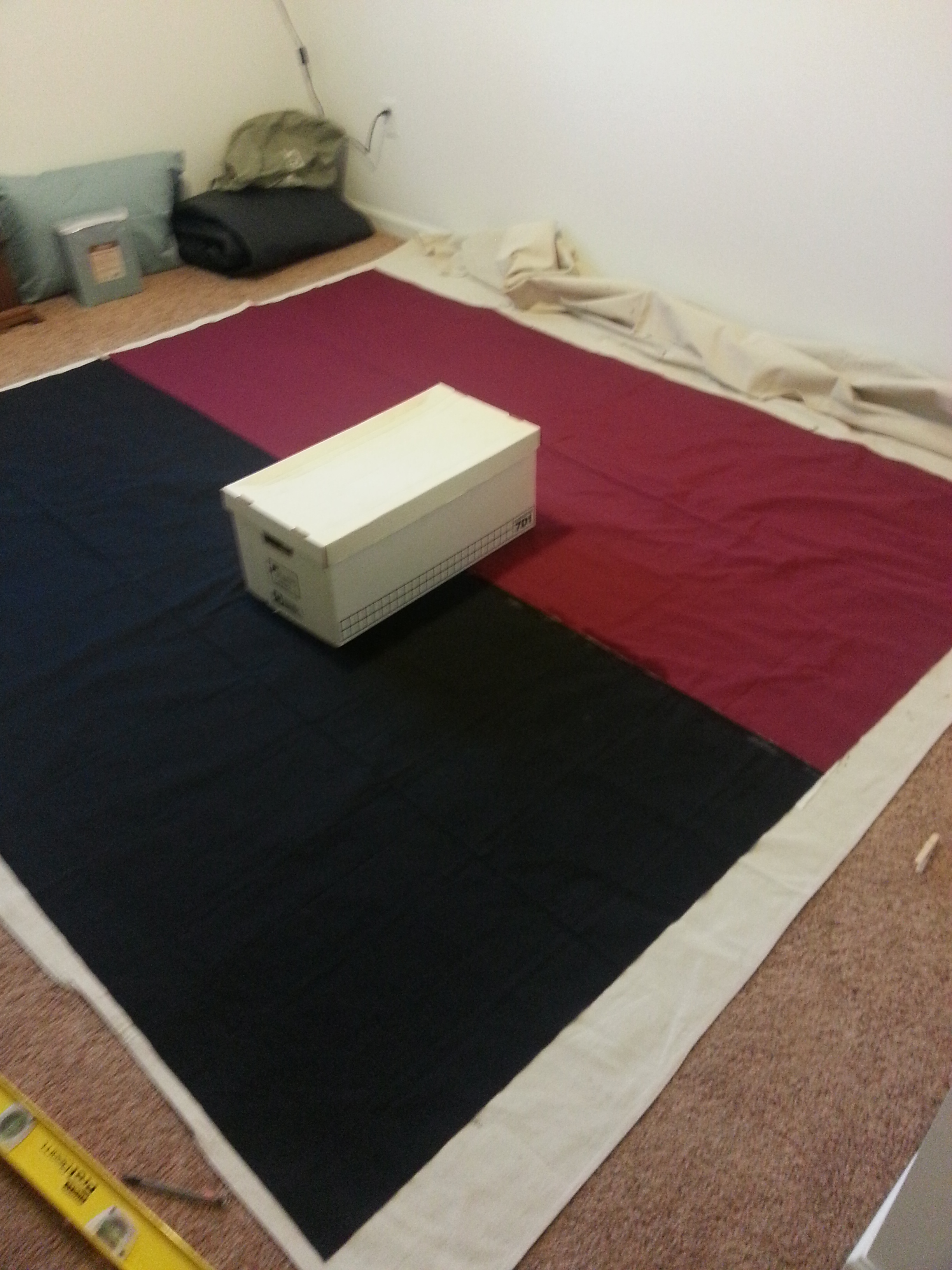
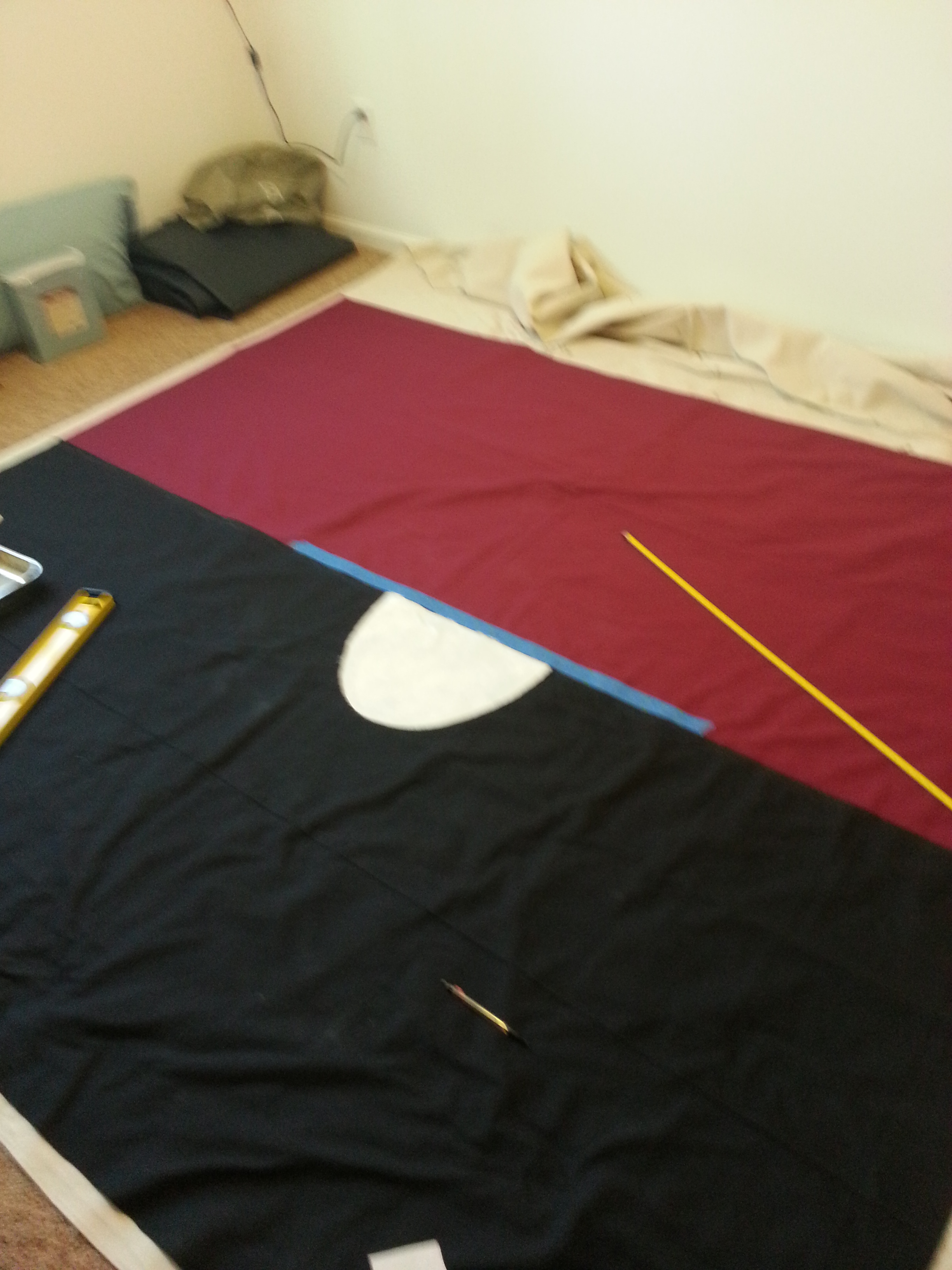
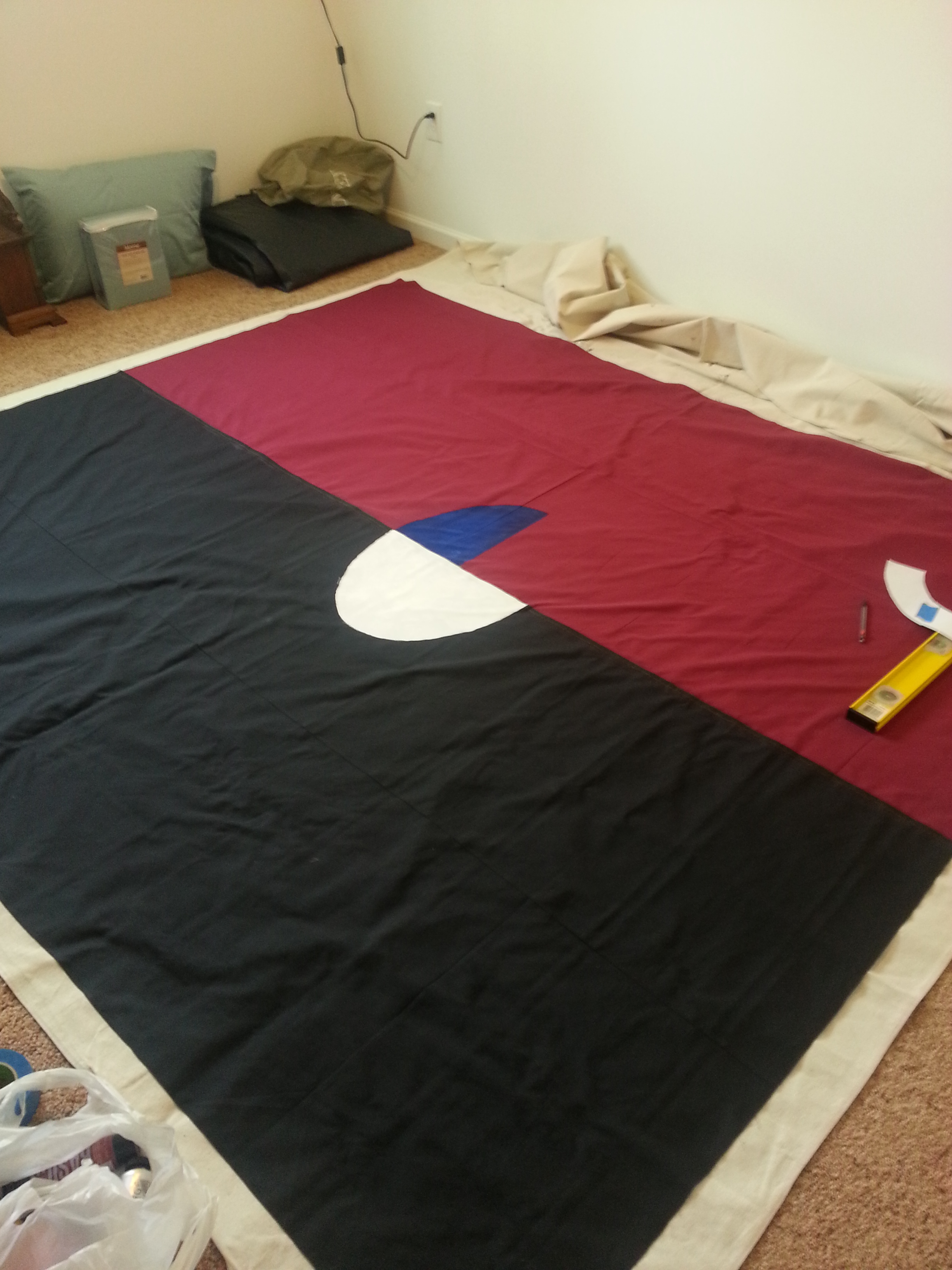
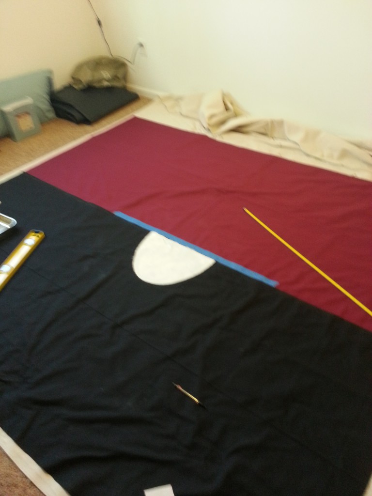
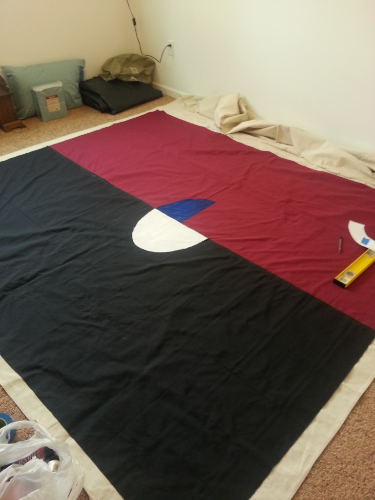
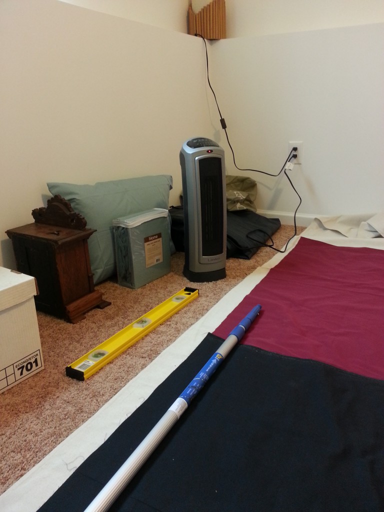
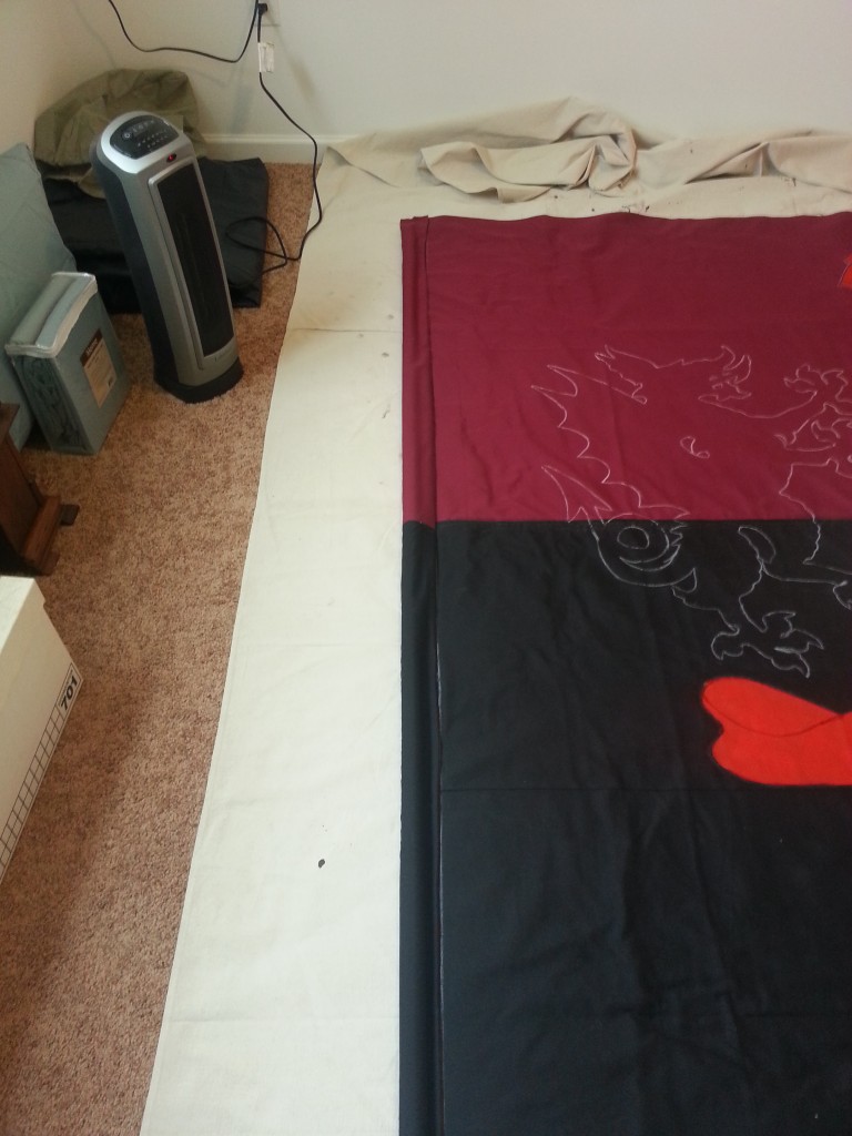
Phase 2 is far and away the longest, or at least most tedious step, itself having a main coloring phase and a second detailing phase. So here we go. First I sealed off a spare bedroom in our house and put down a thick painter’s canvas. Next I laid out the red half, then marked an inch deep onto it to overlap the black half. The I laid out the black half and pinned them at the end.
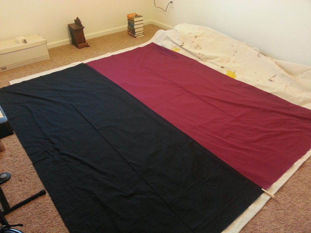
Over two days I glued the two halves together.

It wasn’t perfect but I managed to not completely cock it up. After gluing I wanted to stitch it just to be careful that there wouldn’t be a completely failure if it got caught in the rain.
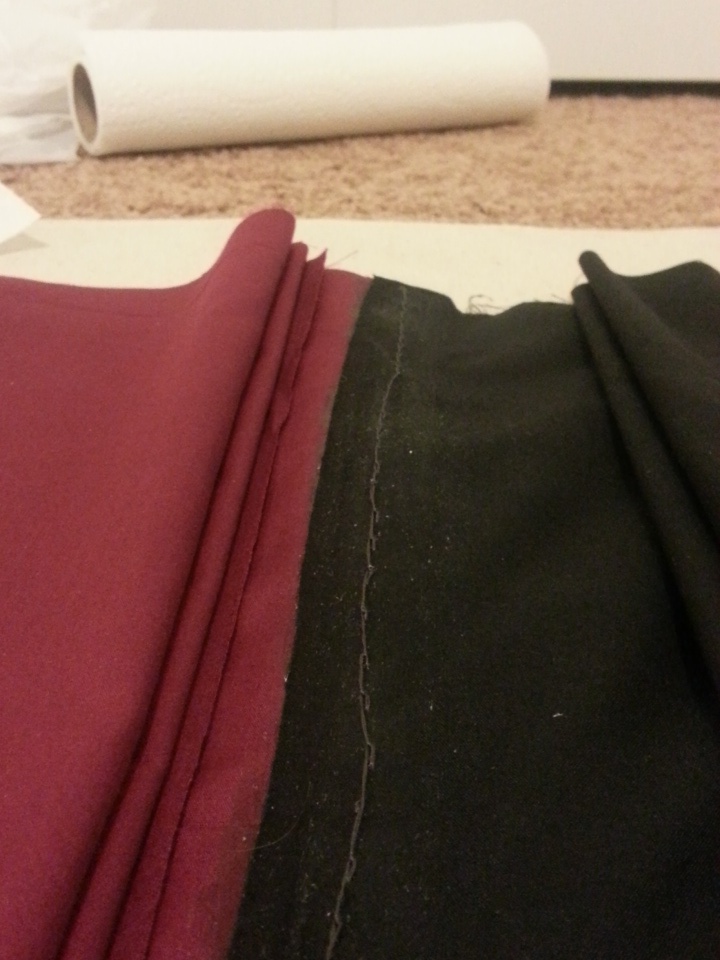
It wasn’t a terribly good stitching job, and it caused quite a bit of bleeding from the fact that I didn’t do a terribly good stitching job. Otherwise it was a a basic backstitch job.
Stitching took three nights (doing a little bit at a time so not to completely start to loathe the project), after which I let it sit for a few nights until I had time to get paints.
After I did get paints I got back to work pretty quick:

Surprisingly, all of this happened without a major fuck-up, which is some sort of record for me. Hence I wasn’t surprised when:

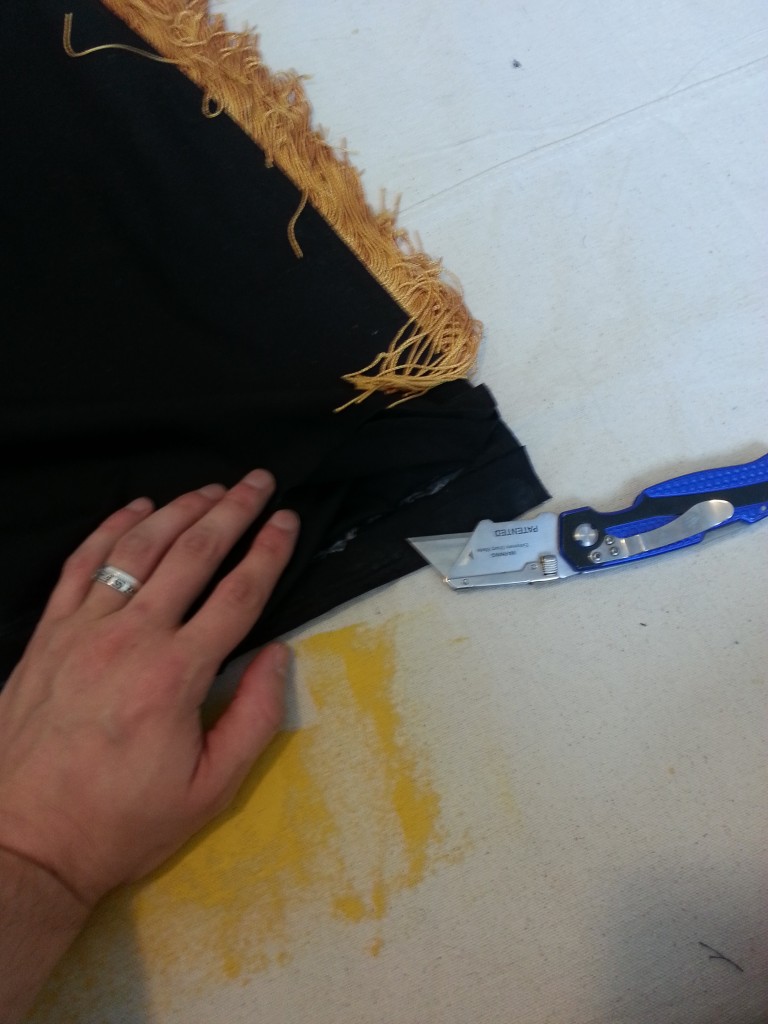
A gentle reminder to would-be painters, all yellow paint is neon green until proven otherwise. Luckily I was able to soak most of it up with a paper towel and then paint directly over it with zero wait. Not sure how the back looks as of writing but the back is the least of my worries.
I lost a shade of gold, but in the end… I lost the need to constantly swap colors, so I’ll call it a win.
Just take a look at our patrons, and you’ll know
Some don’t appreciate us, others never will.
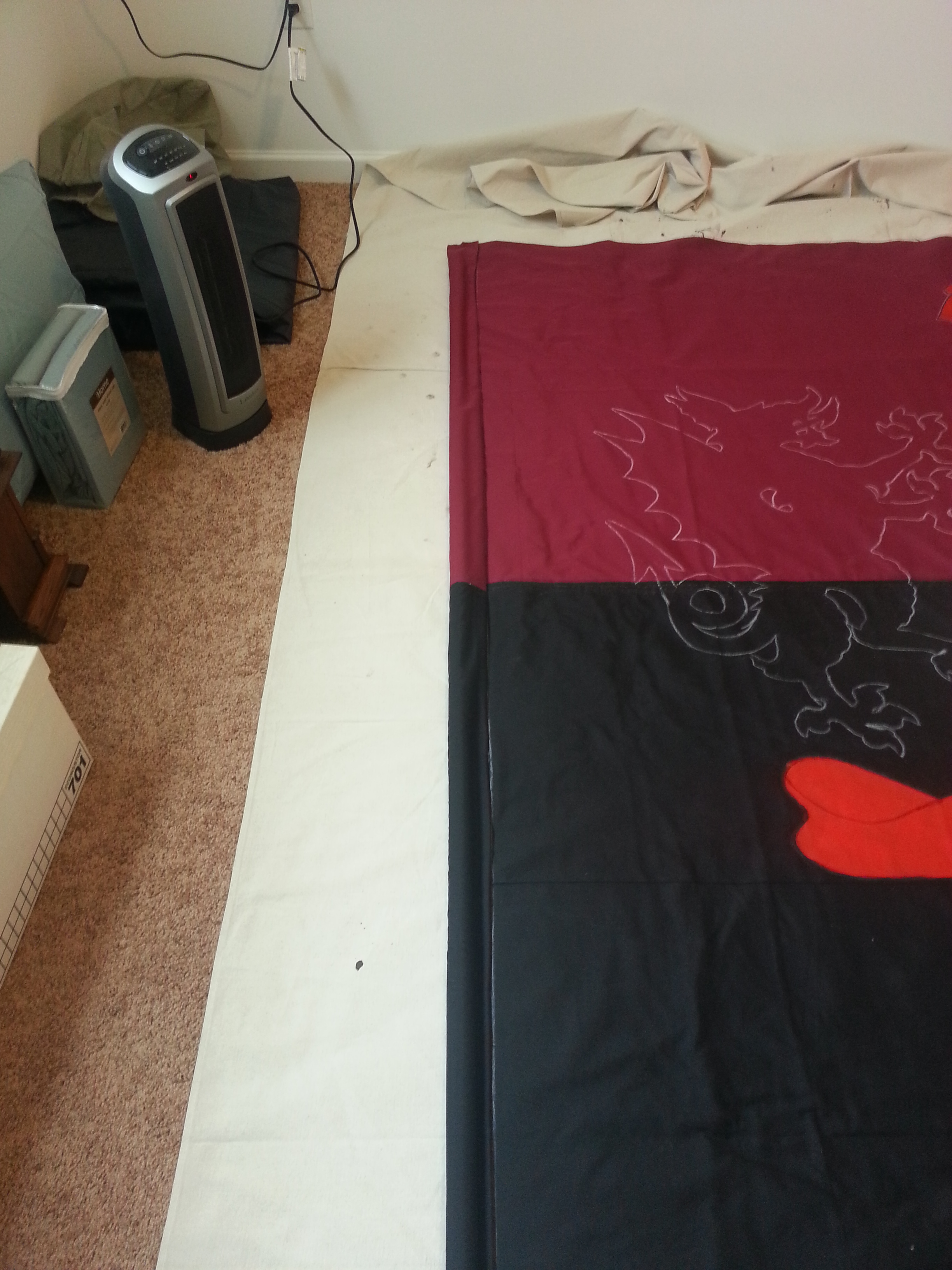
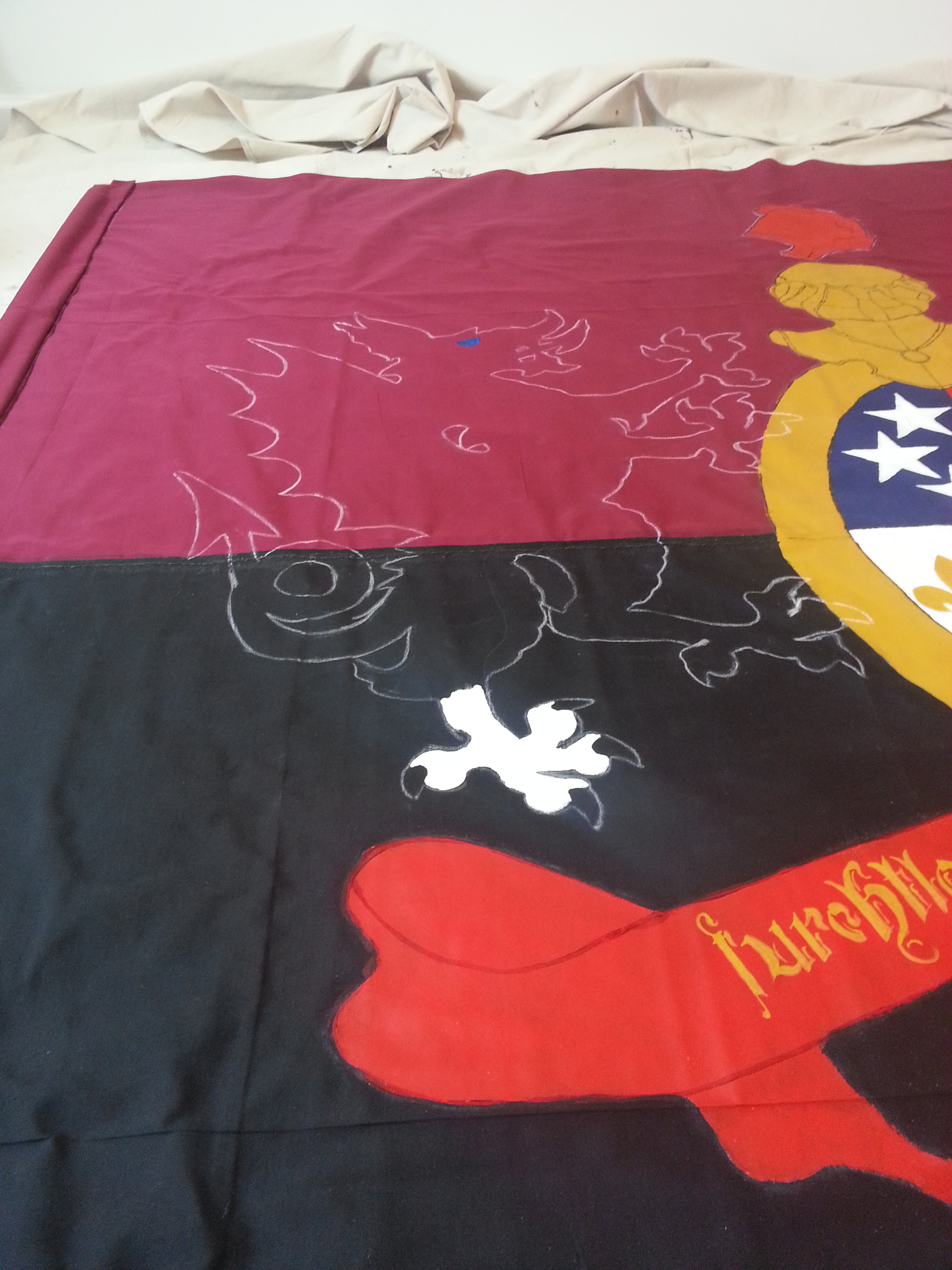
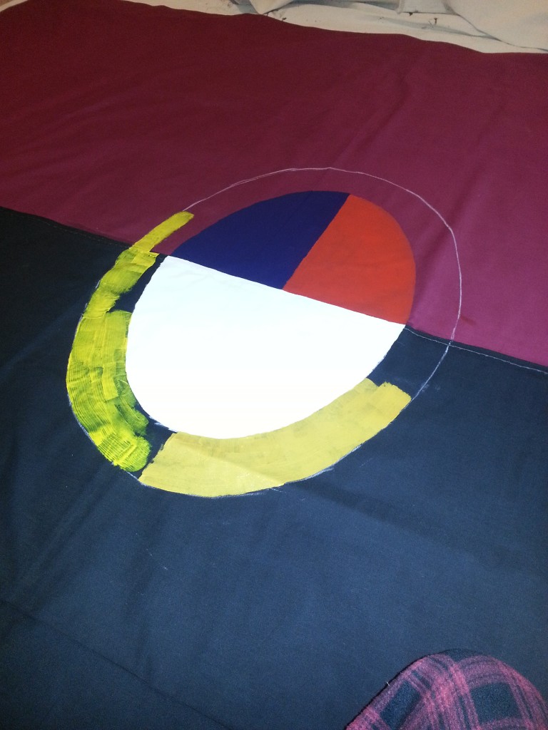
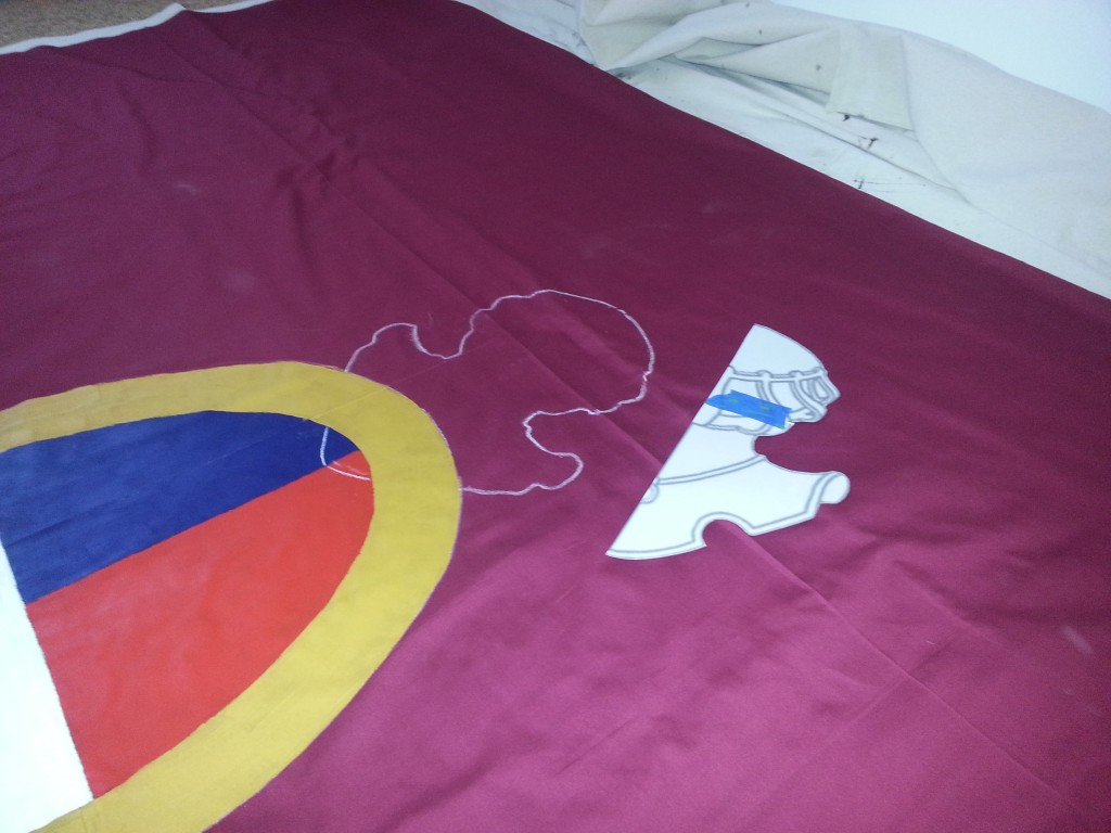
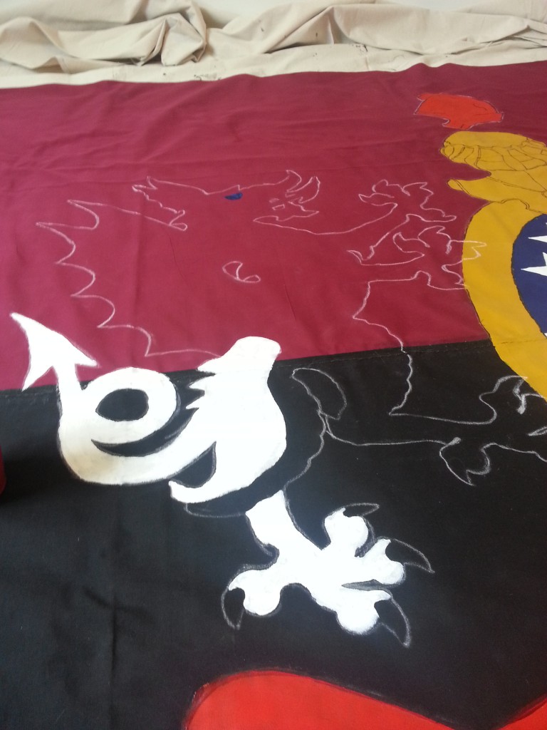
The next big step was getting some chalk and chalking out the helm, the ribbon, and eventually the dragons. I initially wanted to save the details for later, but I broke down in time and just started scatterbraining across the 8×8 canvas.
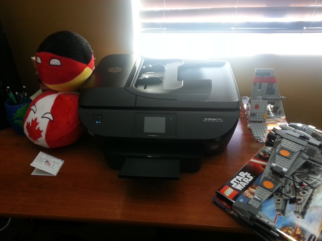
Eventually some equipment would need to be replaced. Brushes break, cups dirty, but my poor old printer was just getting too old. Plus it was like $50 for new ink cartridges so for $100 on Amazon Prime I got a new ink with a free printer thrown in. Oldest joke in the book, but work with me here.
This one has wifi. No more wife emailing print-outs to me.
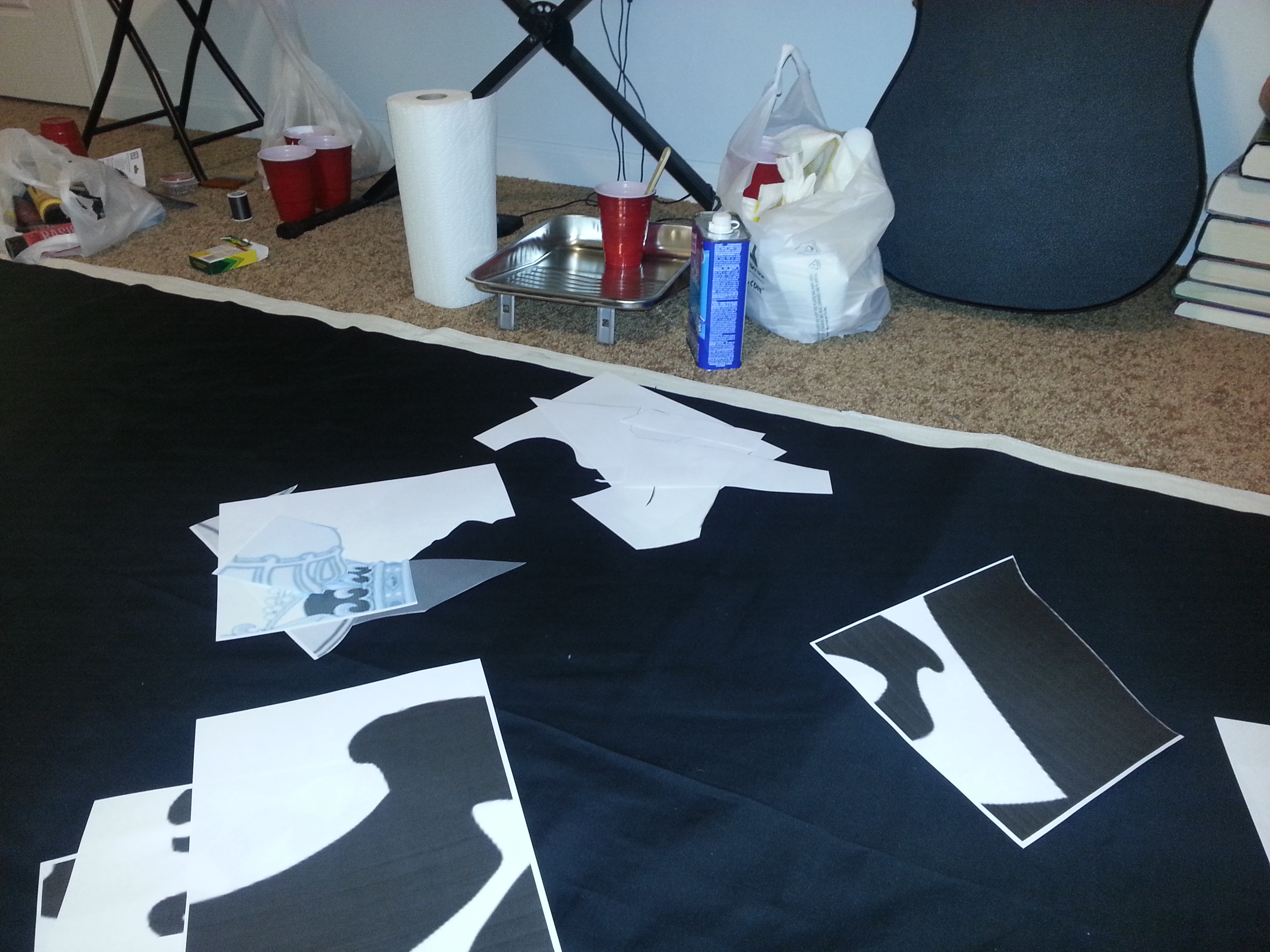
Usually one paints a tifo by first projecting the image onto a wall, hanging the fabric, tracing the image, and then painting it on. Colors are limited and even the small details are huge. Here, no luck. Projectors are expensive and the small details require getting up close and personal, often free-handing the actual lines. For the most part I use tracing, which in turn means lots of printing, cutting, and taping.

Then once the stencil is made, it is traced out. One of the reasons I made everything as symmetrical is that I can use the stencils “twice” – once on each side.
Plain, white blackboard chalk is surprisingly hard to find. I’ve checked at multiple places multiple times over the year and have never actually found white chalk, always just an empty hook next to the colored blackboard chalk no one wants because it stains everything.

First coat of the red banner, right before getting scatterbrained.
Second coat of gold on the ring, first on the helmet. Genius Kendall. Also, by this point the brush death toll started. A 1″ brush Brigid grabbed so I wouldn’t have to dedicate a single night to a single color died about halfway ’round the ring.
So while the gold dried I decided to work on small details instead of cleaning my remaining 1″ brush twice.

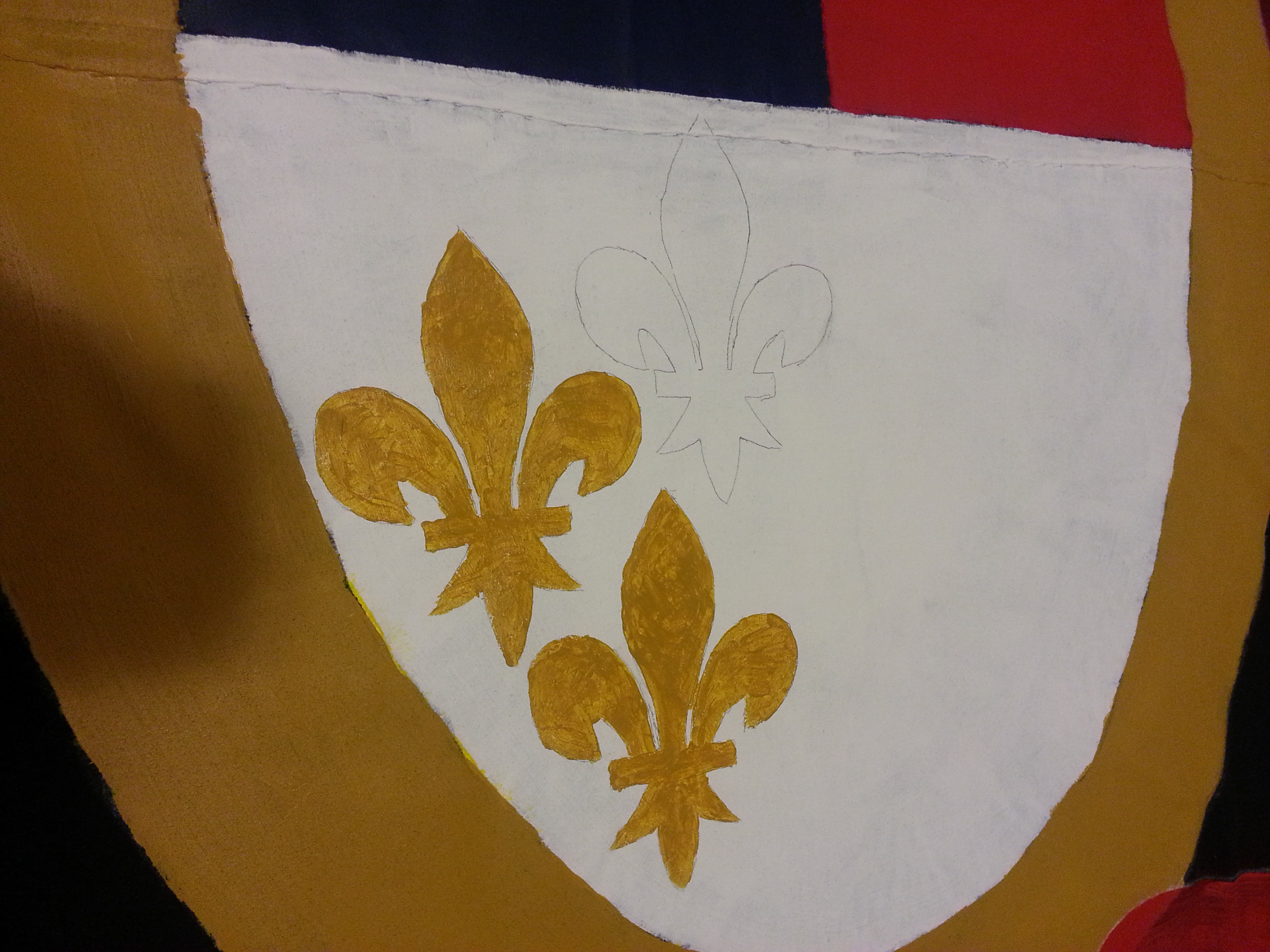
At this point I also realized that my old printer had slightly enlarged certain print outs. So my fleurs de lys were too big to fit two abreast.
So they got staggered in a weird pattern. Had I know earlier I would have aligned two to the right and one center and to the left. But fuck it. Perfection was never the goal. So I finished the third fleur and then went to wash my brushes…. and promptly killed my good 1″ brush by rinsing it under too-hot water, causing all the bristles to loosen and fall out.
For fuck’s sake, Kendall.

All theory is gray, my friend. But forever green is the tree of life.
Bought new brushes today. Grabbed two and didn’t grab cheapos. The first order of business was going to be the crest I was hoping to finish it first so I wouldn’t be sitting on the supporters to get at it later. This would include the helmet too and then eventually the motto. The first day back to work was a red day.
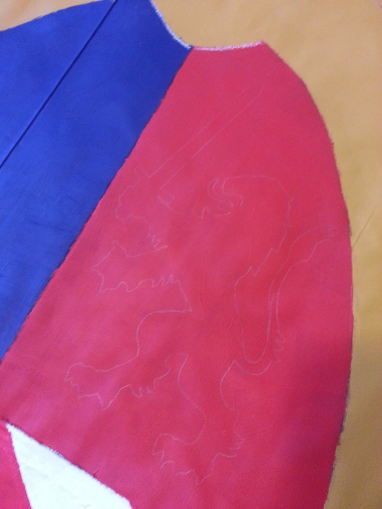
Traced out the lines.
Looks good.
And promptly went about adding a second coat to the banner.
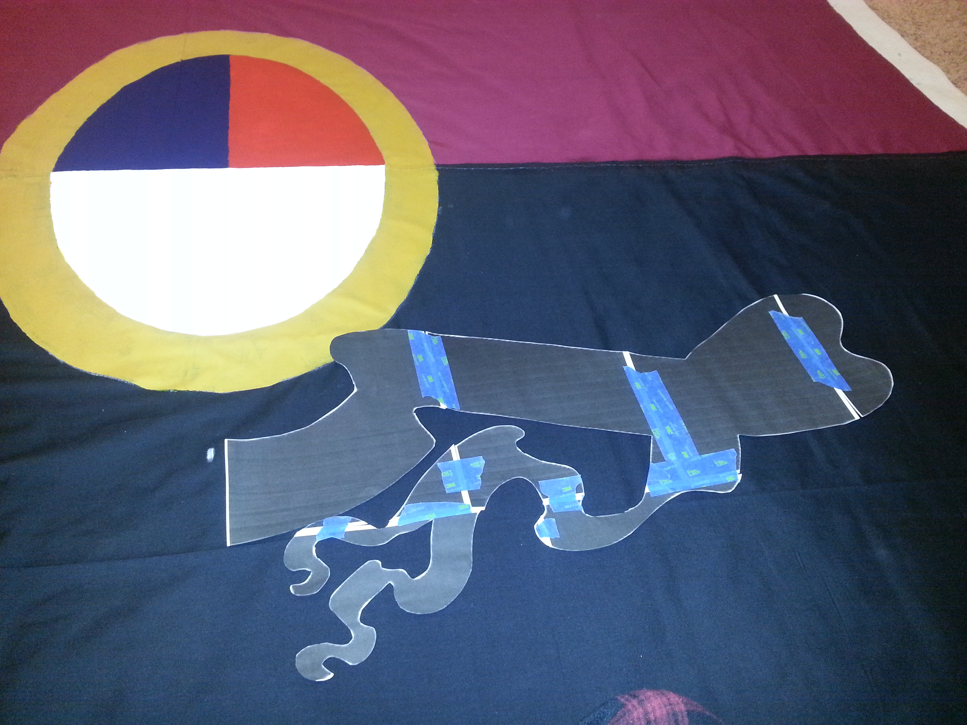
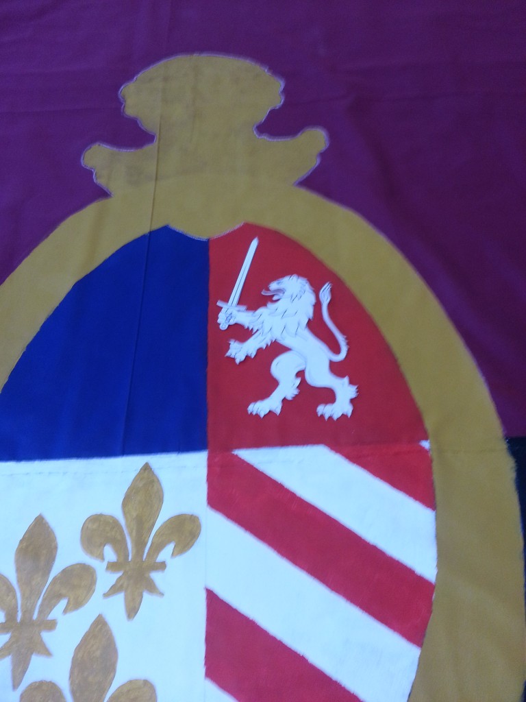
With the red done, it was time to move onto the first of the arty parts of the project – the Lion in the red field. The Detroit flag uses a stylized version of the English coat of arms – three Lions. I wanted to simplify this, but also add a Detroit flair. The choice of a Lion holding a sword was a simple one.
Worked upstairs on this one.
Freeeeeee!
It fits! Mostly because I specifically shrank it.
A quick trace later.
And the gold paint added.
And before anyone asks what’s happening to all the brush cleaner, don’t worry, I’m no litterbug.
That’s right. Kitty litter. It’ll go into the trash, not the best but beats down the drain because I’d never do that…. ever… really.
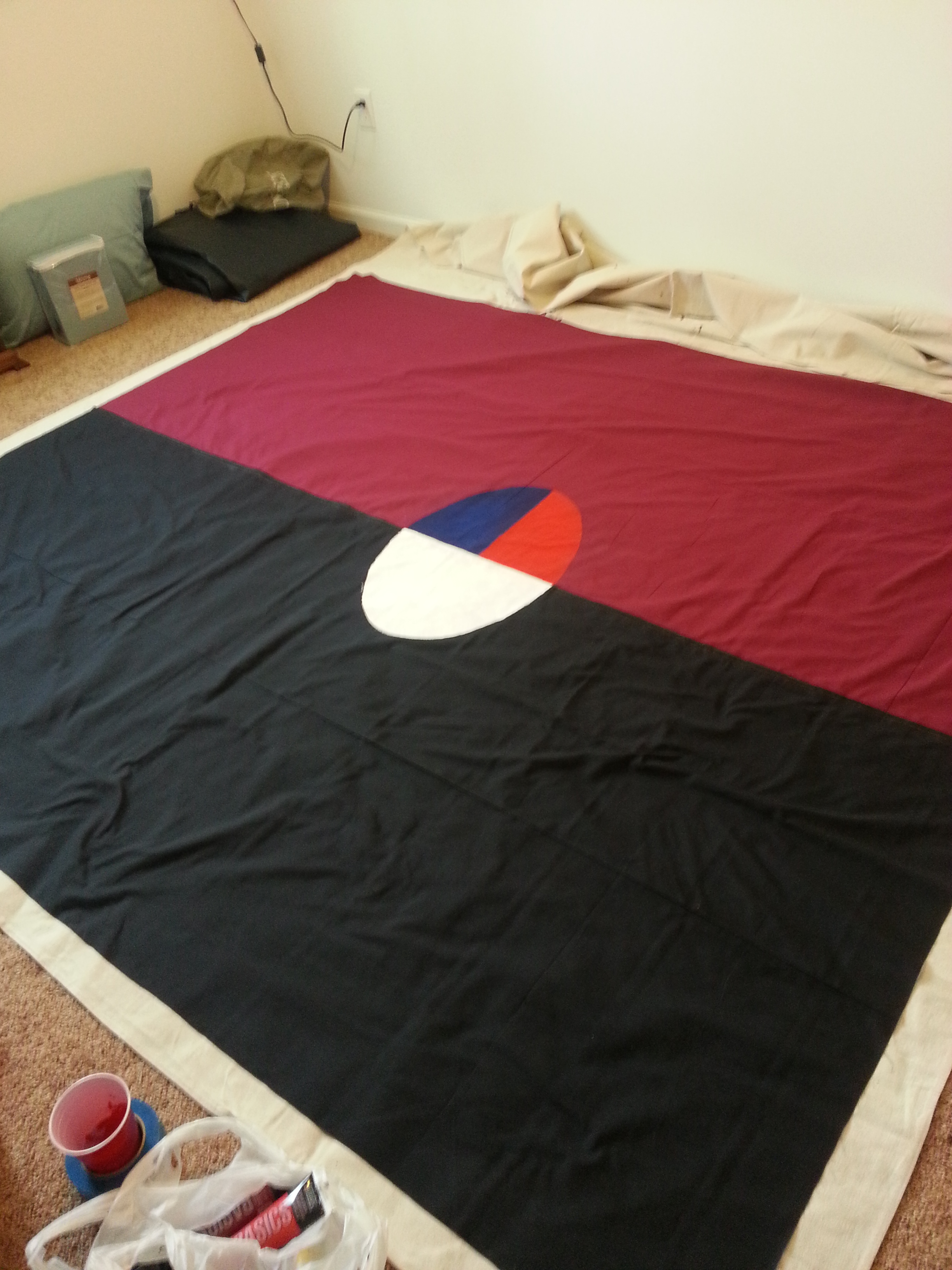
I waited to finish the Lion’s sword, teeth, and claws until I was getting the white paint out, basically when I did the stars.
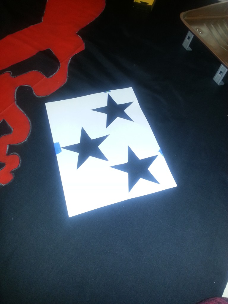
Going with an inverse stencil to keep the spacing.

FUCK.
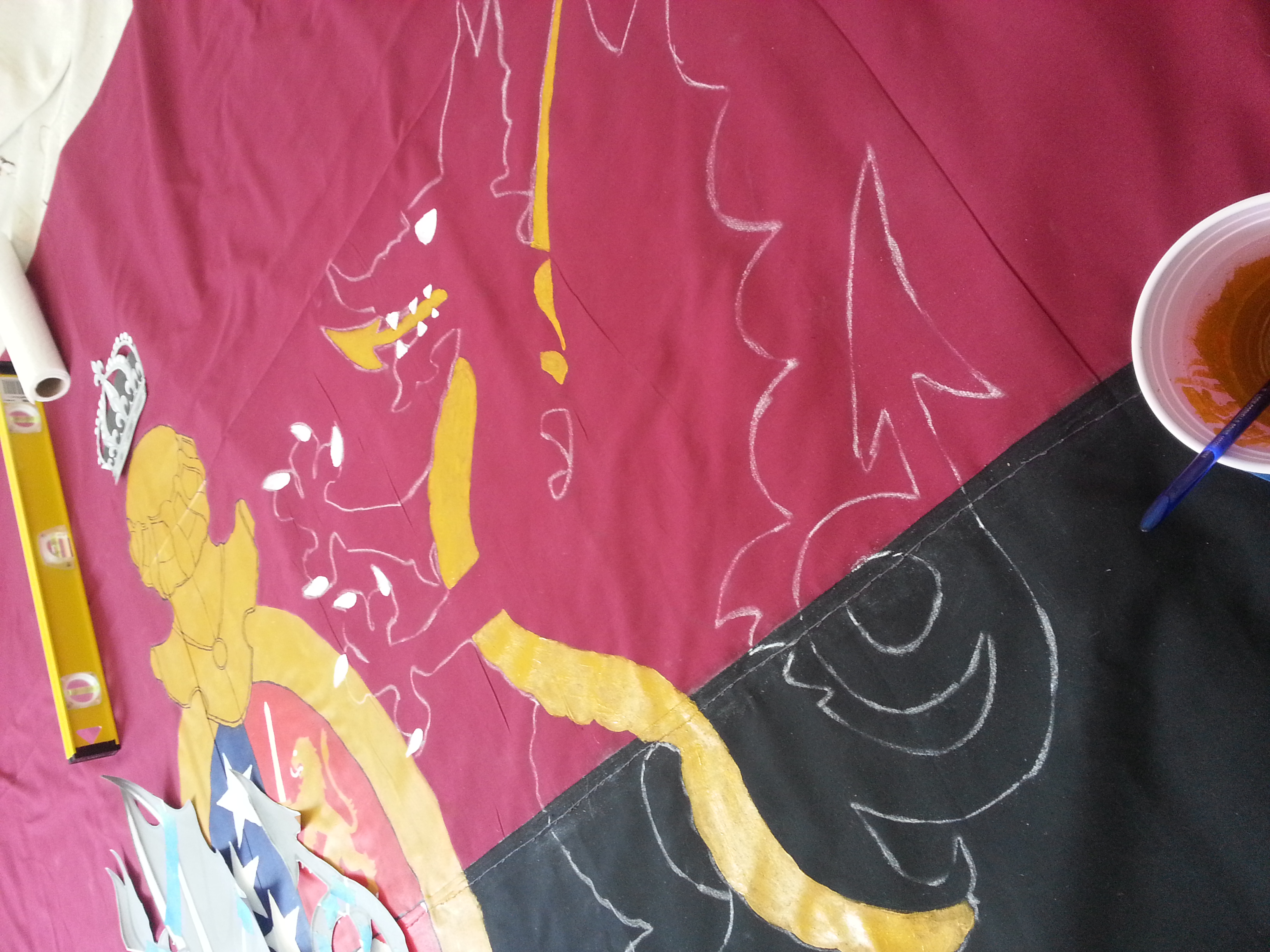
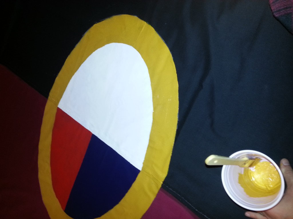
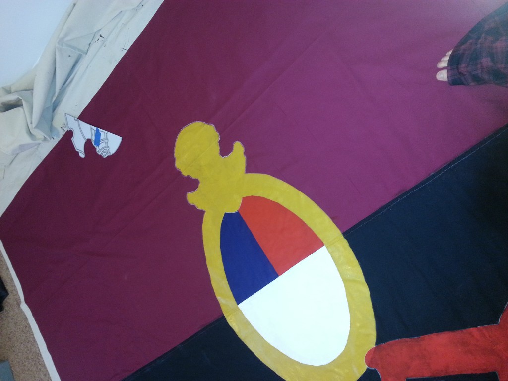
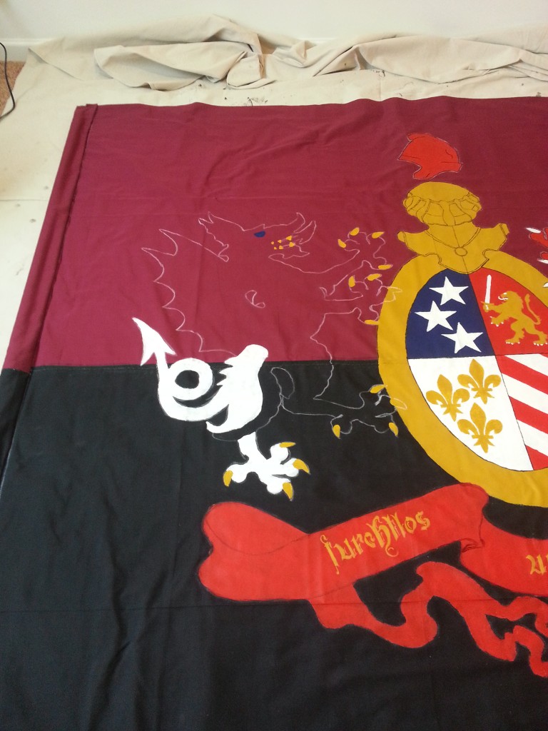
Squished that second star in. Still. Fuck. Anyway, shitty picture – but that is the nearly finished crest. Just needed some black outlining and that needed a a bit of bravery because we were getting into freehand territory.

Practiced outlining with the dark red for the banner. It doesn’t look good up close but fuck it. Paint was not sticking well.
This bit I could free hand, or use basic existing stencils like a ruler or a spool. However eventually I’d have to at least trace the main guidelines.
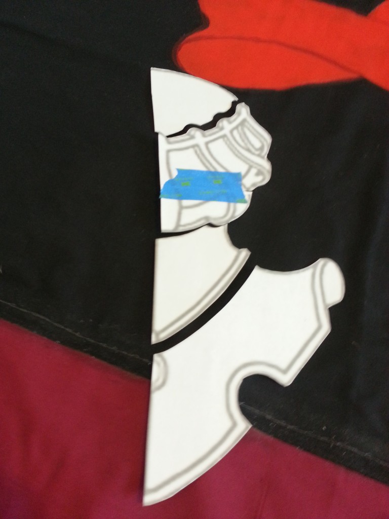
So I cut apart the existing stencil.
Boom! Looks good considering I’m shit at art.
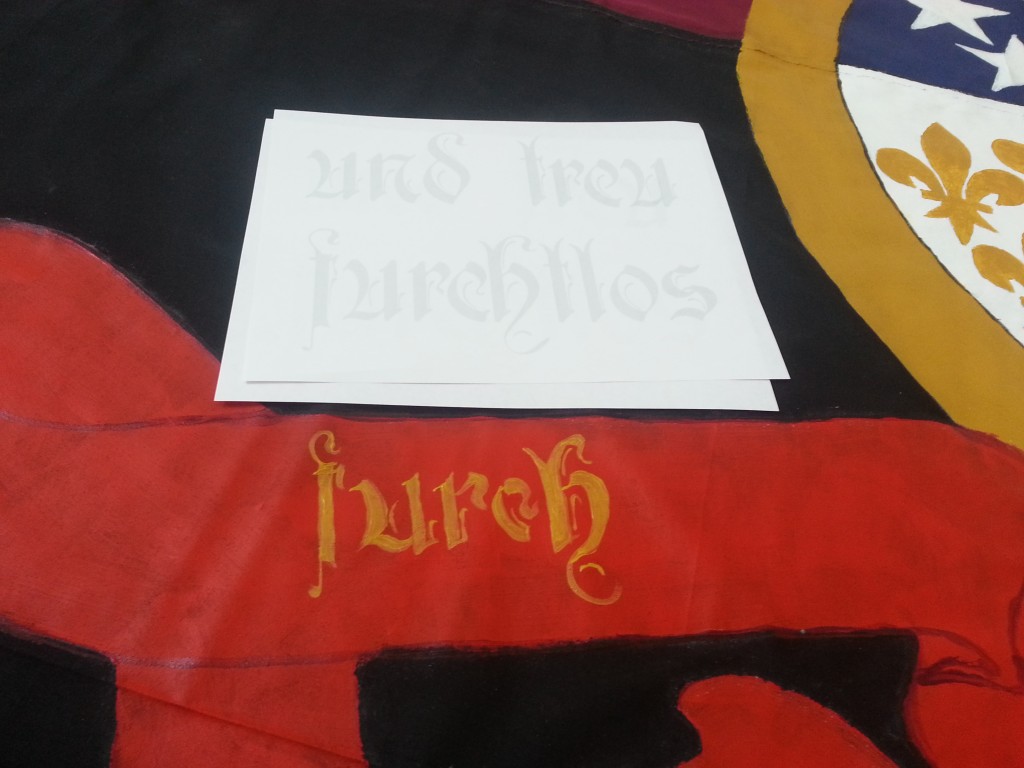
More free handing. Super, super proud of the calligraphy I was able to do. Probably wouldn’t be able to do it again. But I got it when it counted.
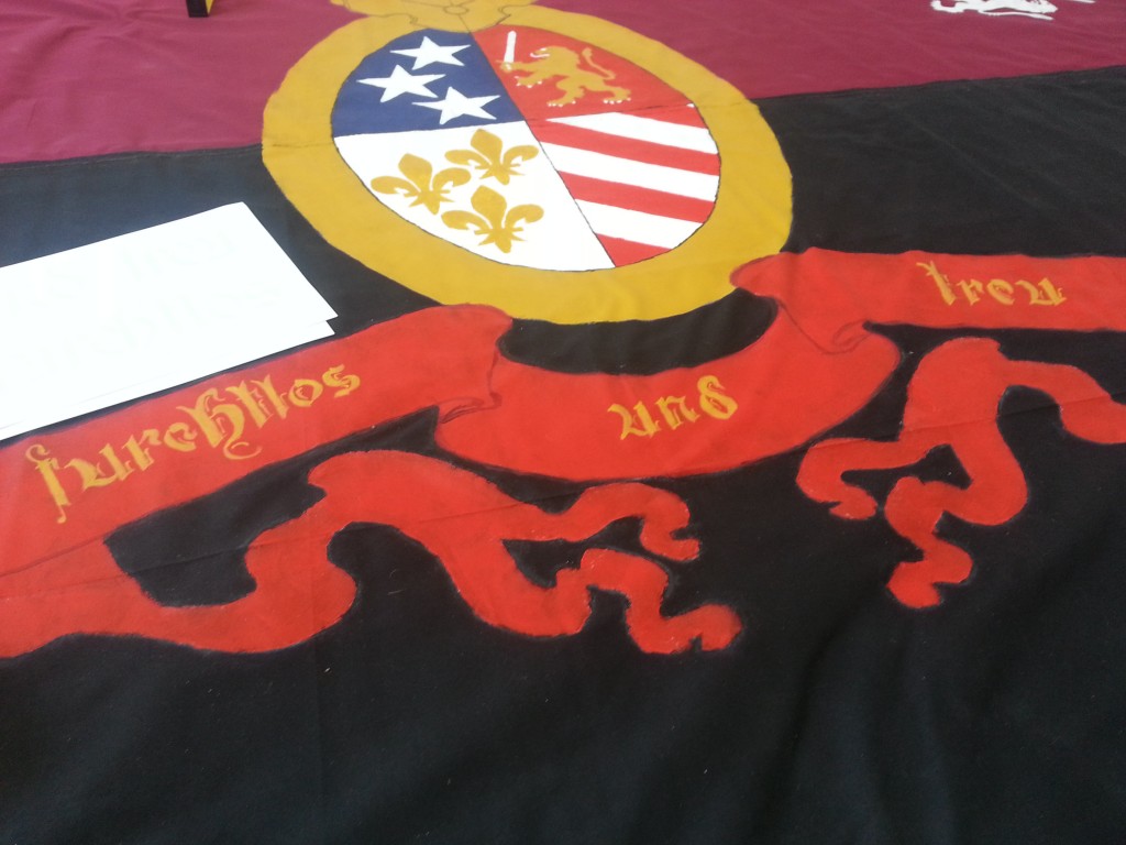
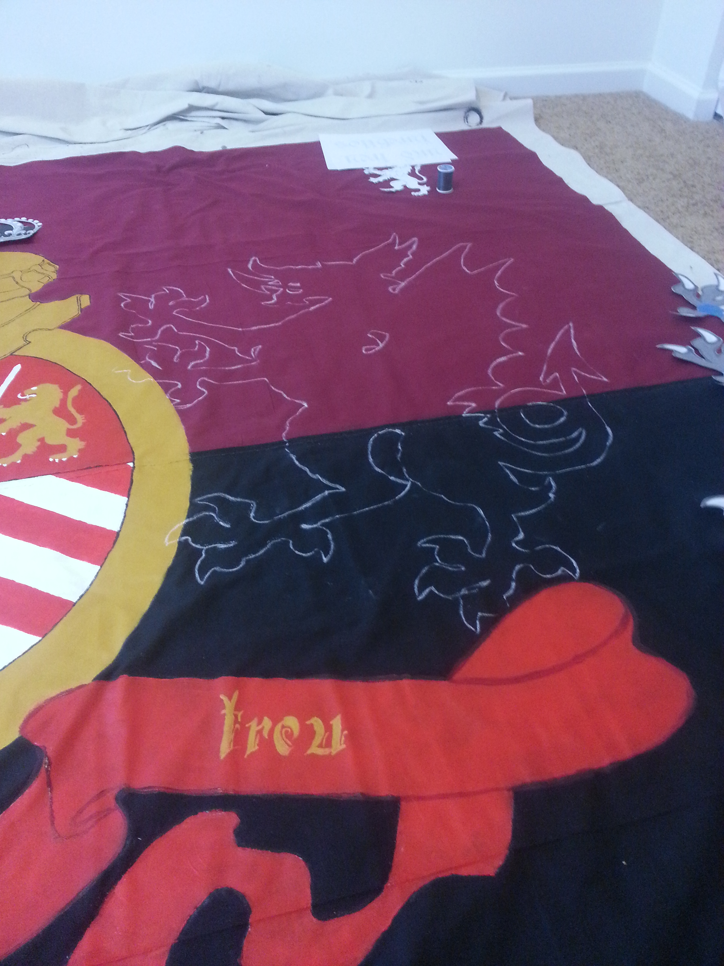
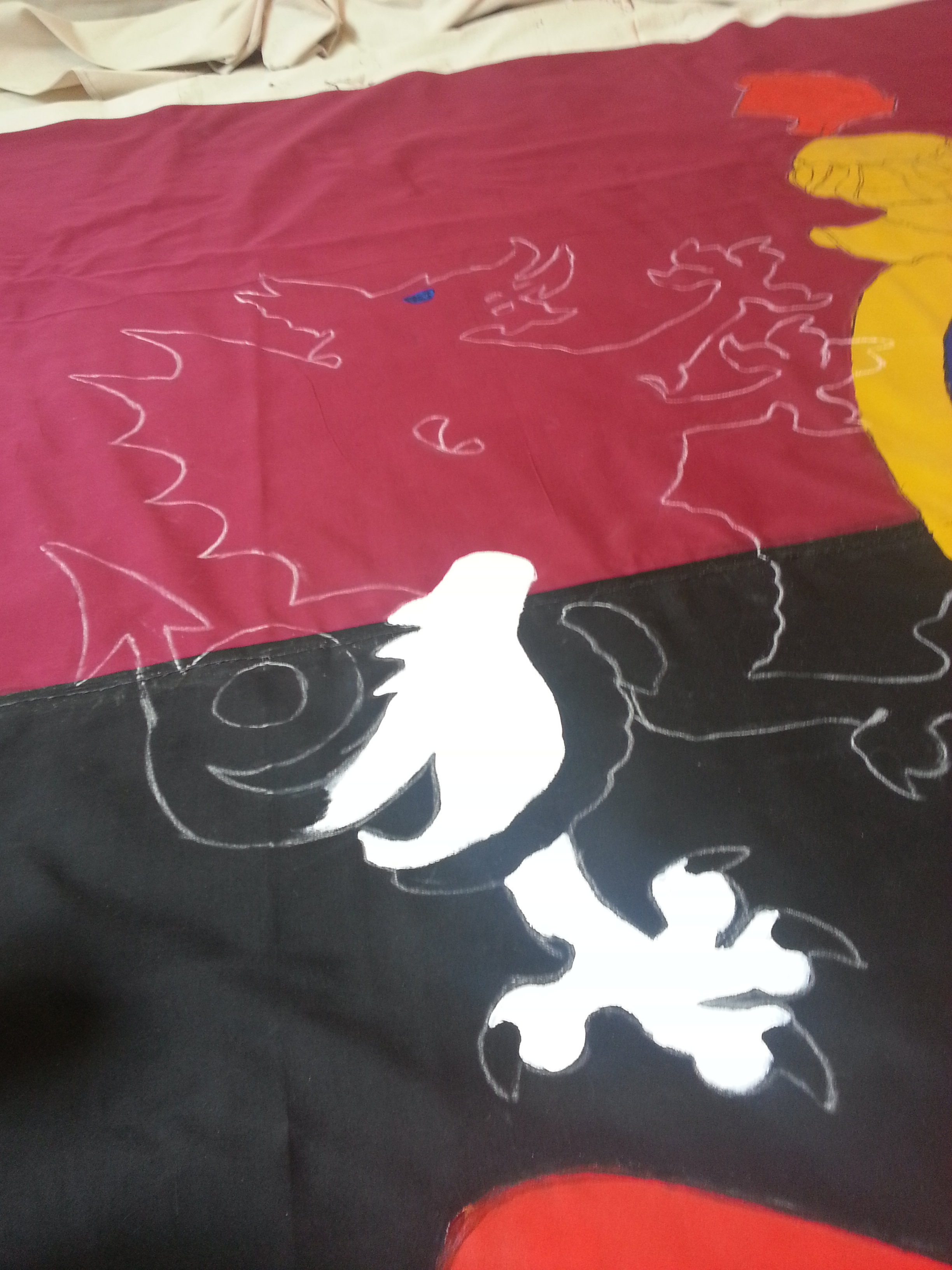
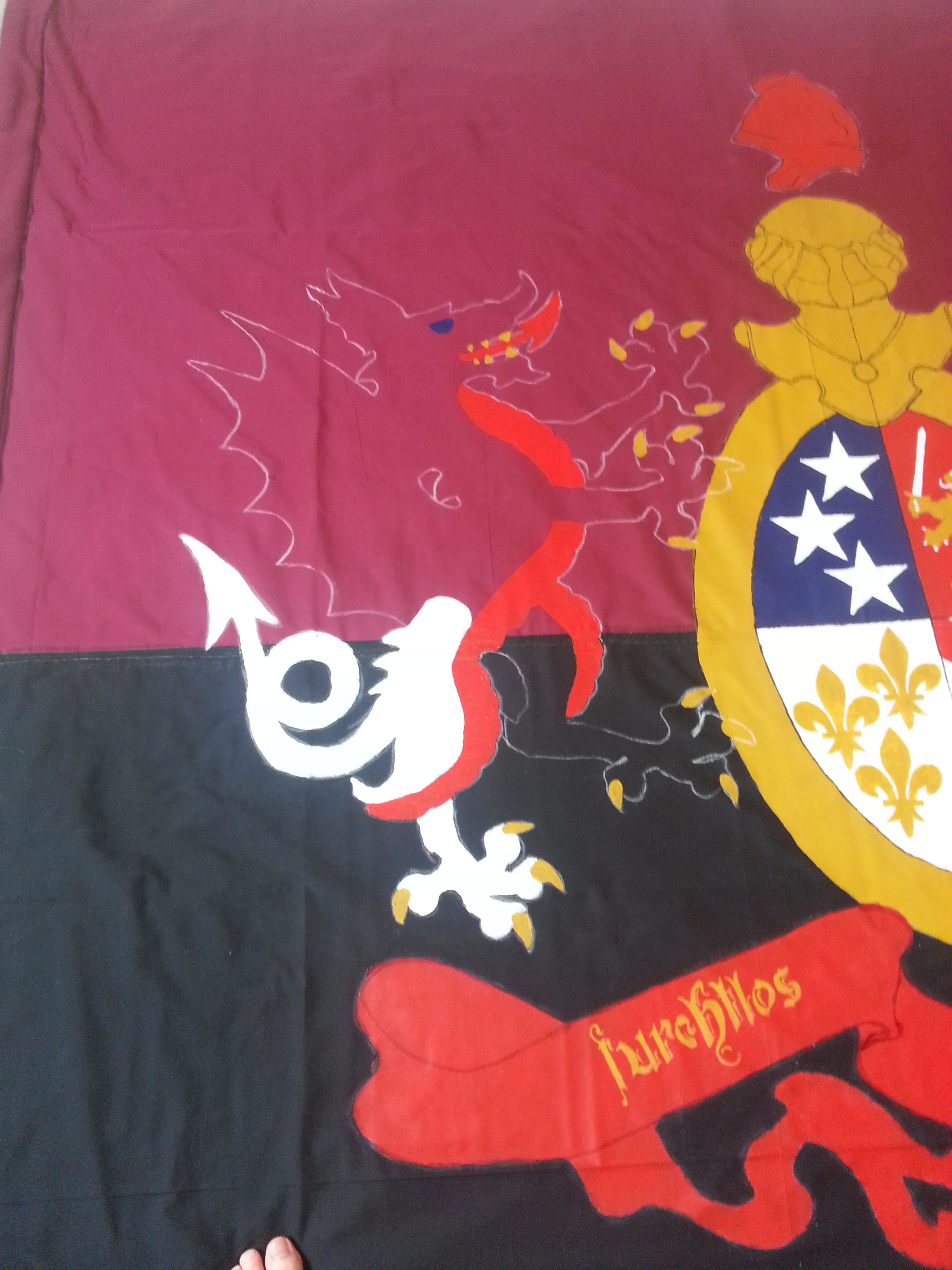
The traced crest and the motto. Furchtlos und Treu for sure. But with that there were two things to go… two things I had been postponing – the highly intricate crown… and the two massive dragons.
That which issues from the heart alone,
Will bend the hearts of others to your own.
So, that crown… kinda royalist… don’t you think? Maybe you don’t. Maybe you don’t care about things like that. But I do. It was grating on me for a while. Not only was it intricate and hard to paint, but it also symbolized something I don’t support – monarchism. If only there was some sort of hat that represented freedom and democracy… Wait! There is!
It’s called a Phrygian cap and is a symbol of revolution. It appears in a lot of French Revolutionary scenes as well as the coat of arms of Argentina. It’s also on the seal of the US Senate.
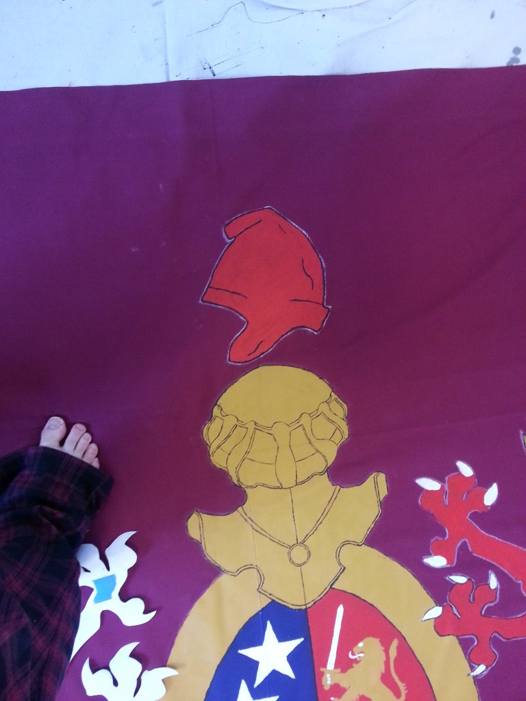
That was easy. 😉
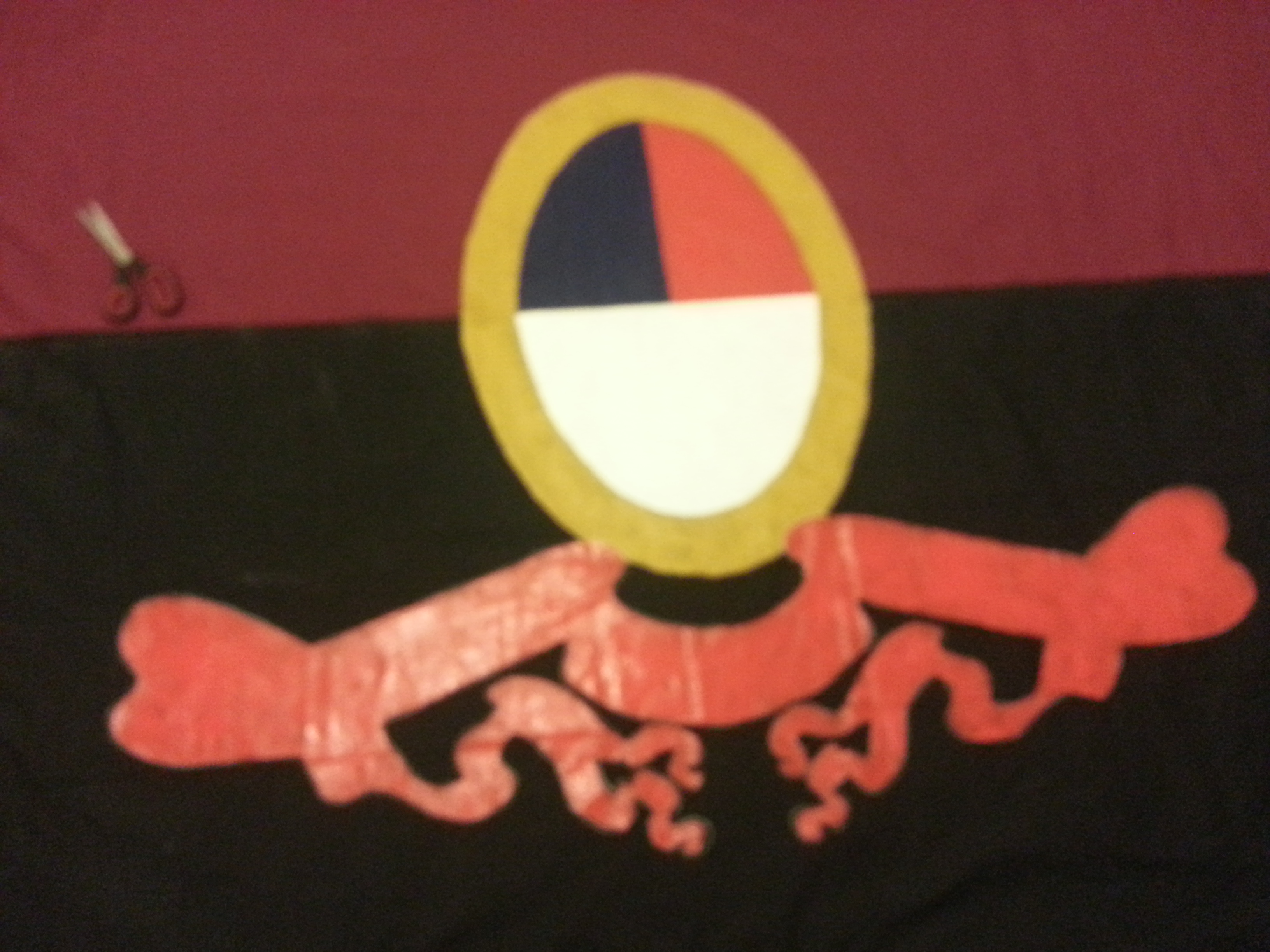
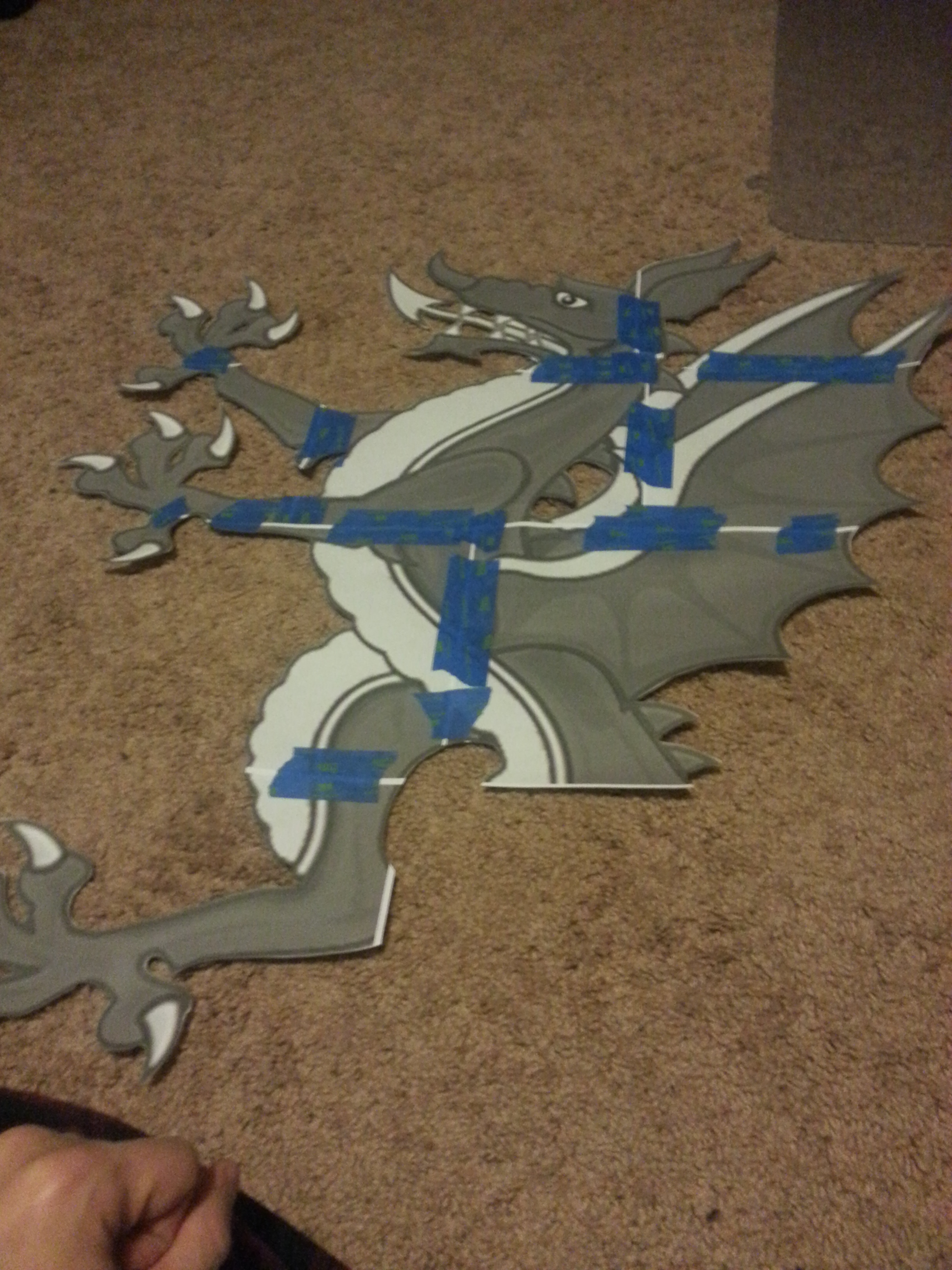
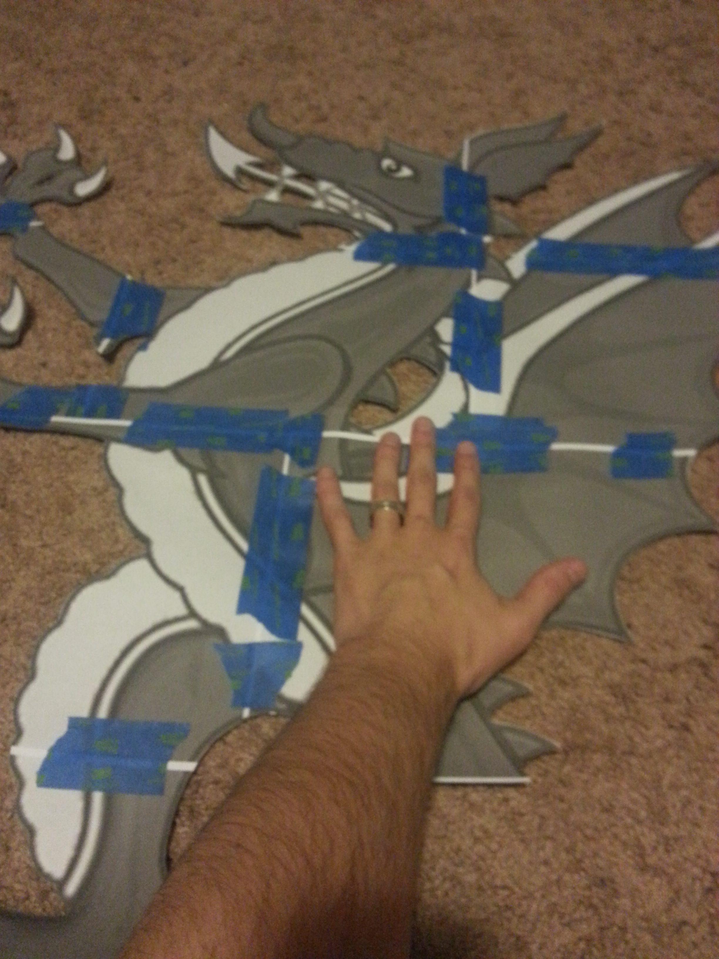
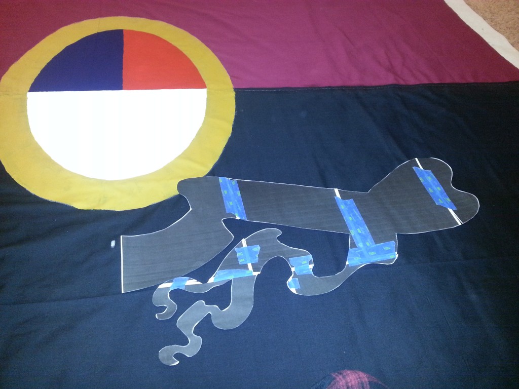
Now those fucking dragons.


It’s pretty big.
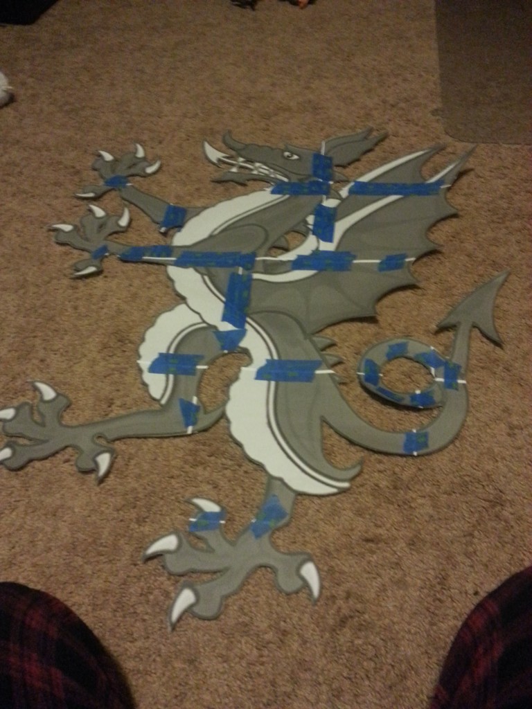
Finished. It was something like 13 or 14 sheets of paper all told. I don’t have the final count any more. It was a lot though, but it is for a good cause.
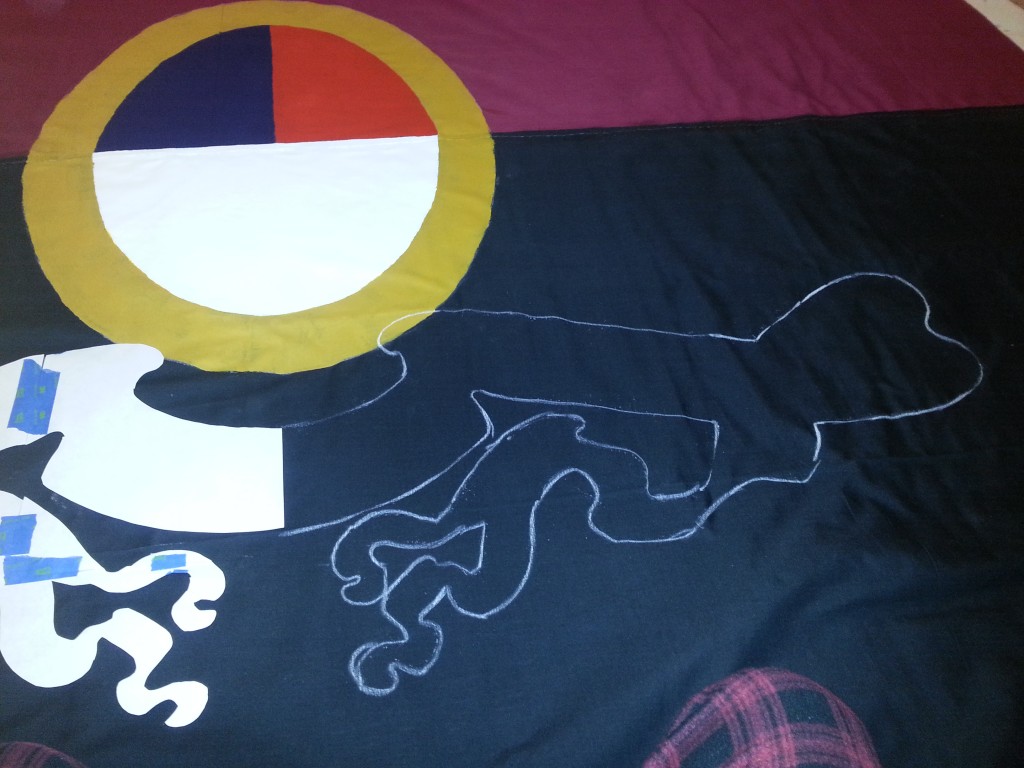
Positioning. Ignore the missing phrygian cap.

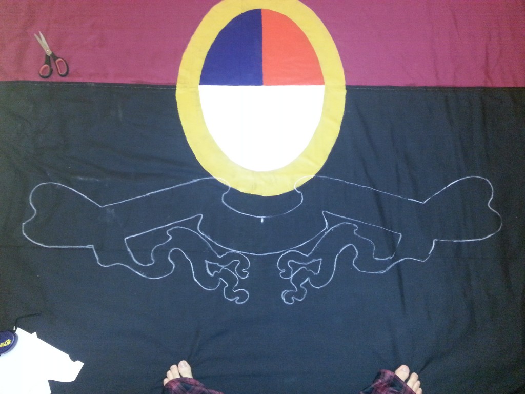
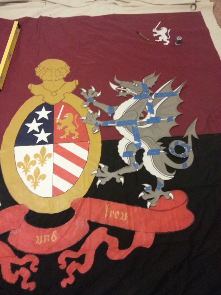
Traced.
White details.

Gold details.
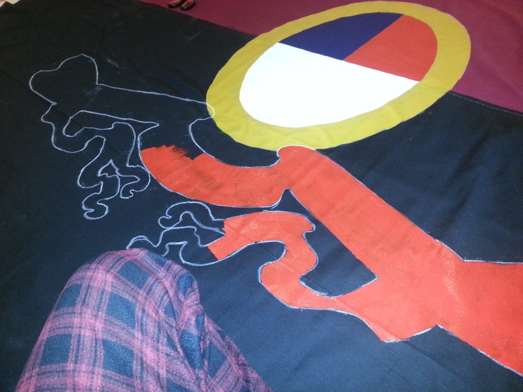
Starting the red.
More red.
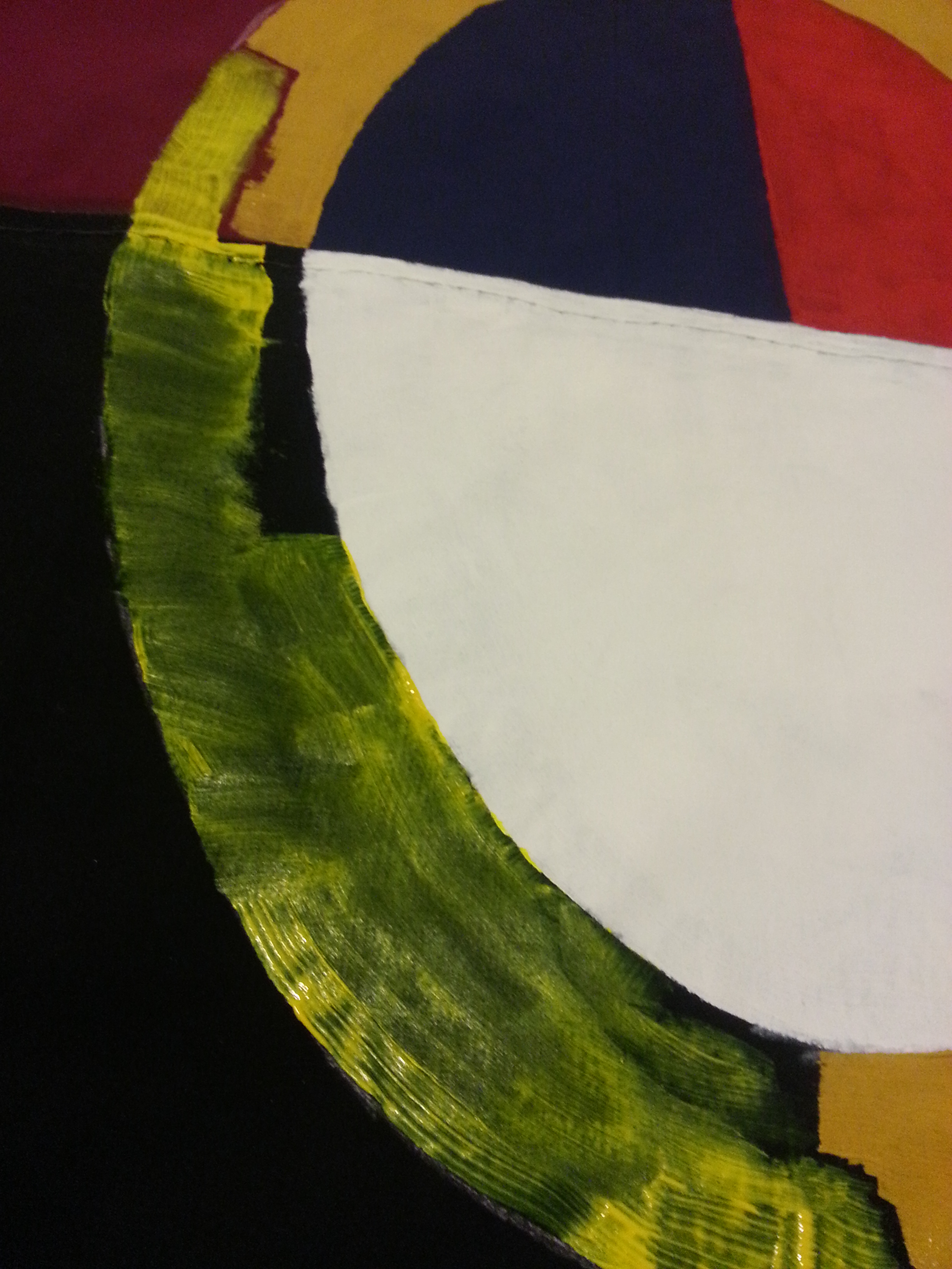
Added black details and more red. Still a lot to go… plus… another fucking dragon? Shiiiiiiiiiiiiiiiit.
Whatever is the lot of humankind
I want to taste within my deepest self.
Working down in the basement was hell on my fingers, decided the best thing to do was get a space heater and let that baby wash over me. I also started bringing down a tablet to listen to podcasts and things to keep my brain occupied. After this I noticed shifts went from an hour or two to six hours pretty quick.
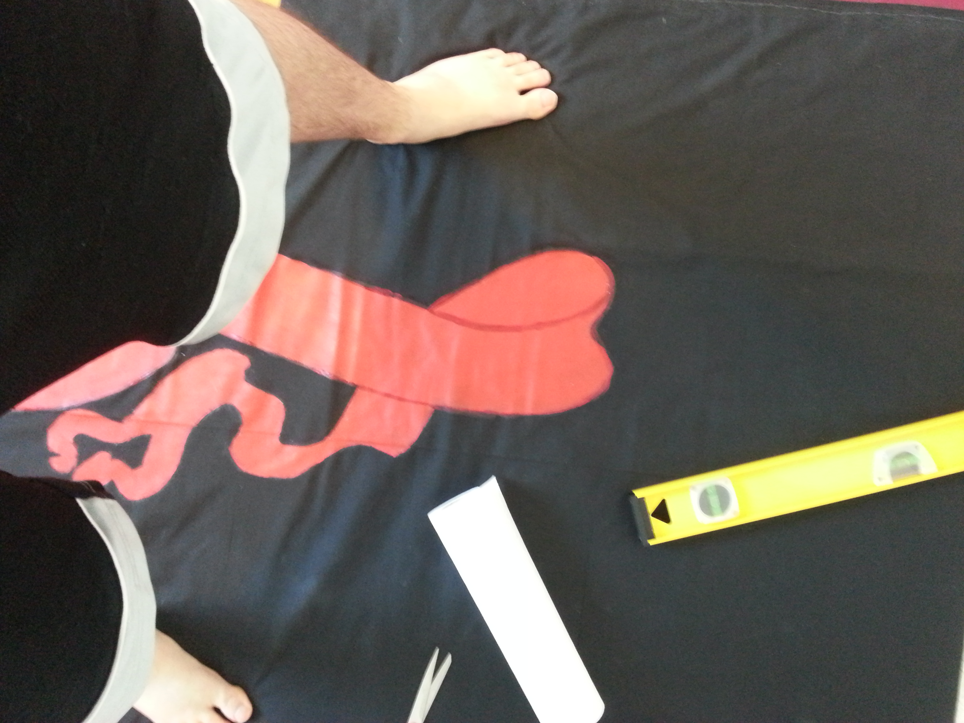
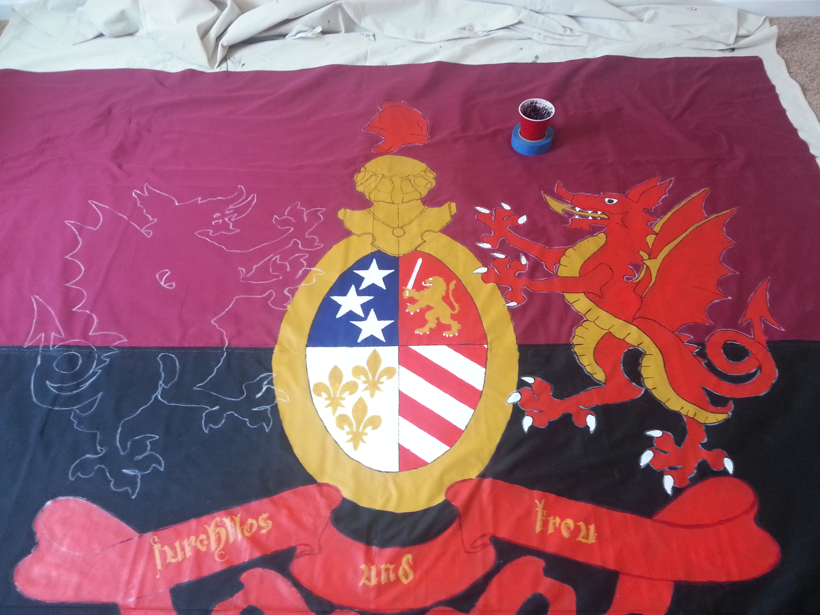
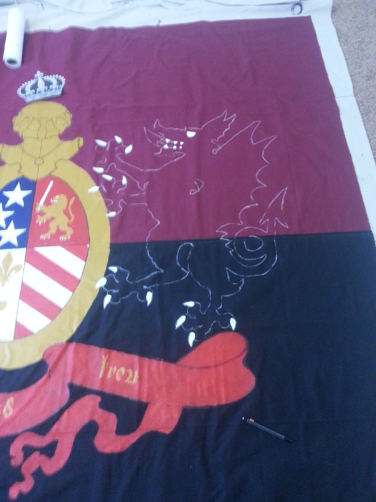
An nearly complete dragon.

One down, one to go.
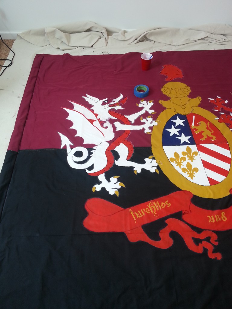
Got the sleeve glued, but not stitched. In this time frame I was thinking about the colors of the dragons. I was thinking that a lot of the flag was very samey looking. After talking to Brigid, I decided to switch the second dragon up. White -> Gold, Gold -> Red, Red-> White.
This would give me some more variety and could also reflect the Polish roots of Hamtramck and have the dragons wearing the traditional kit colors of DCFC – Rouge (home) and White (away).


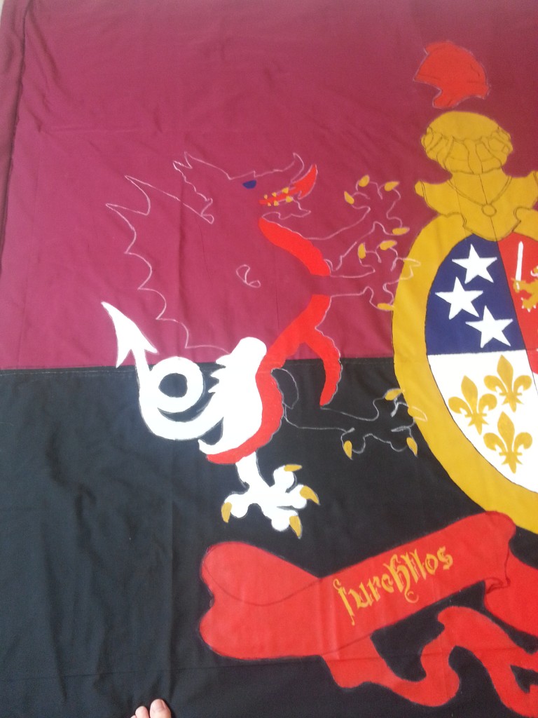
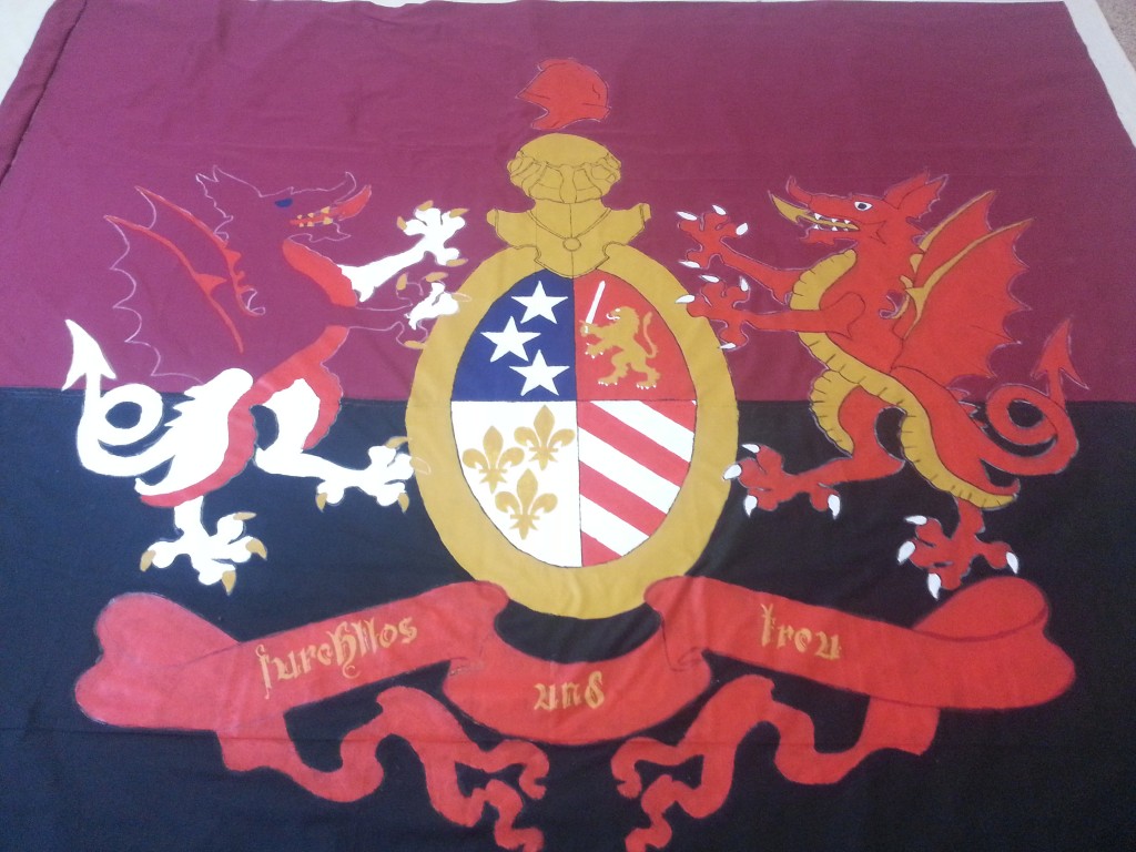
I got the sleeve and a massive chunk of the white dragon (everything seen above) done in a single shift. I also named the dragons – Danny on the left, Dave on the right.
I am not omniscient, but I know a lot.
I’m headed into the final stretch at this point. Finish the white dragon and then getting trim and re-enforcement on before the 16th of April was the goal. I put zero work in over the week, but was dedicated on getting it finished on the weekend.
On Saturday we did our normal routine of Bob Evans followed by grocery shopping. Then. Work.
It had to be done in time.
In case anyone (no one) was wondering, I used the tape roll to keep my paint cup from getting knocked over. Saved me quite a few times.

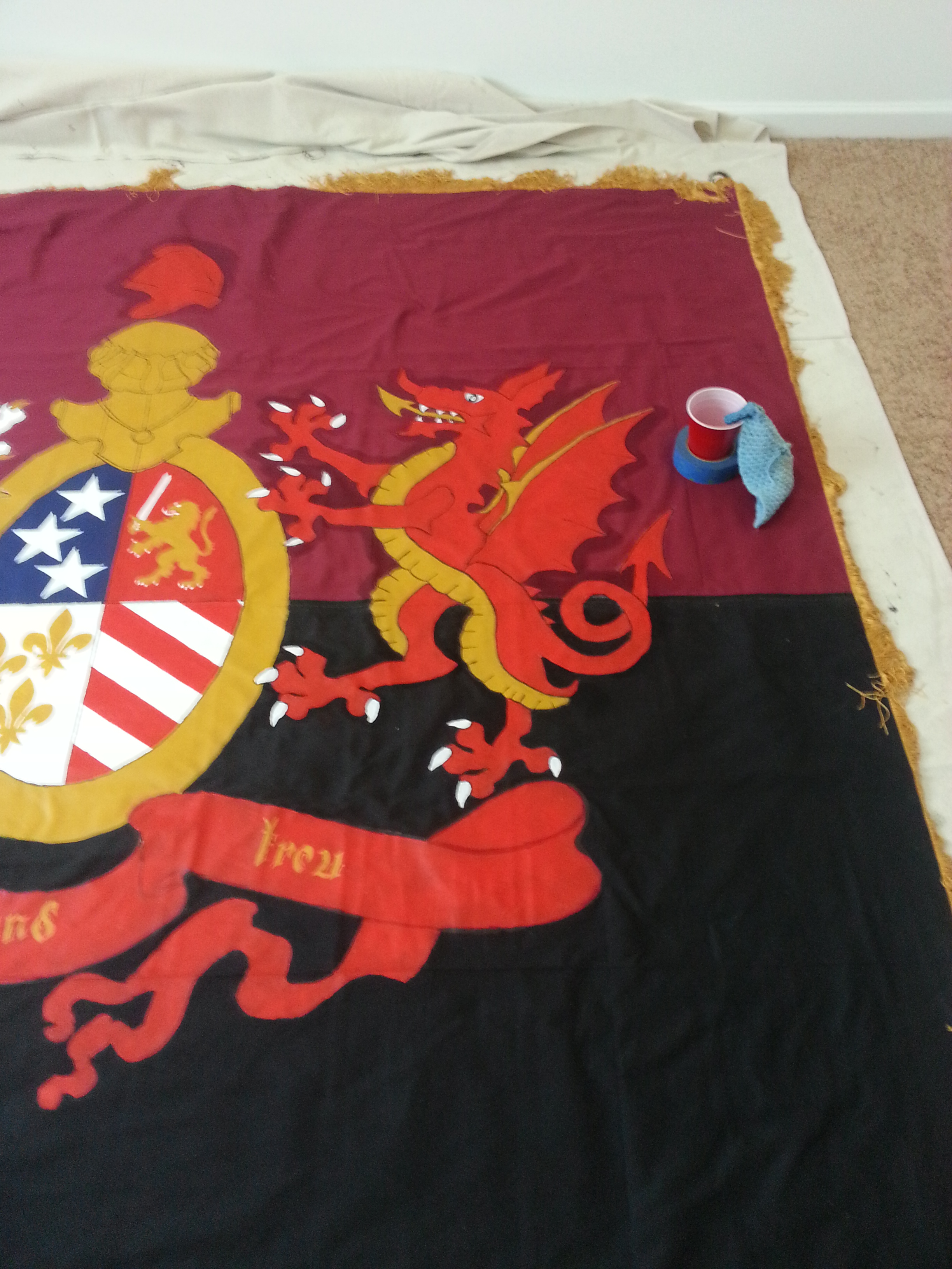
Painting complete.
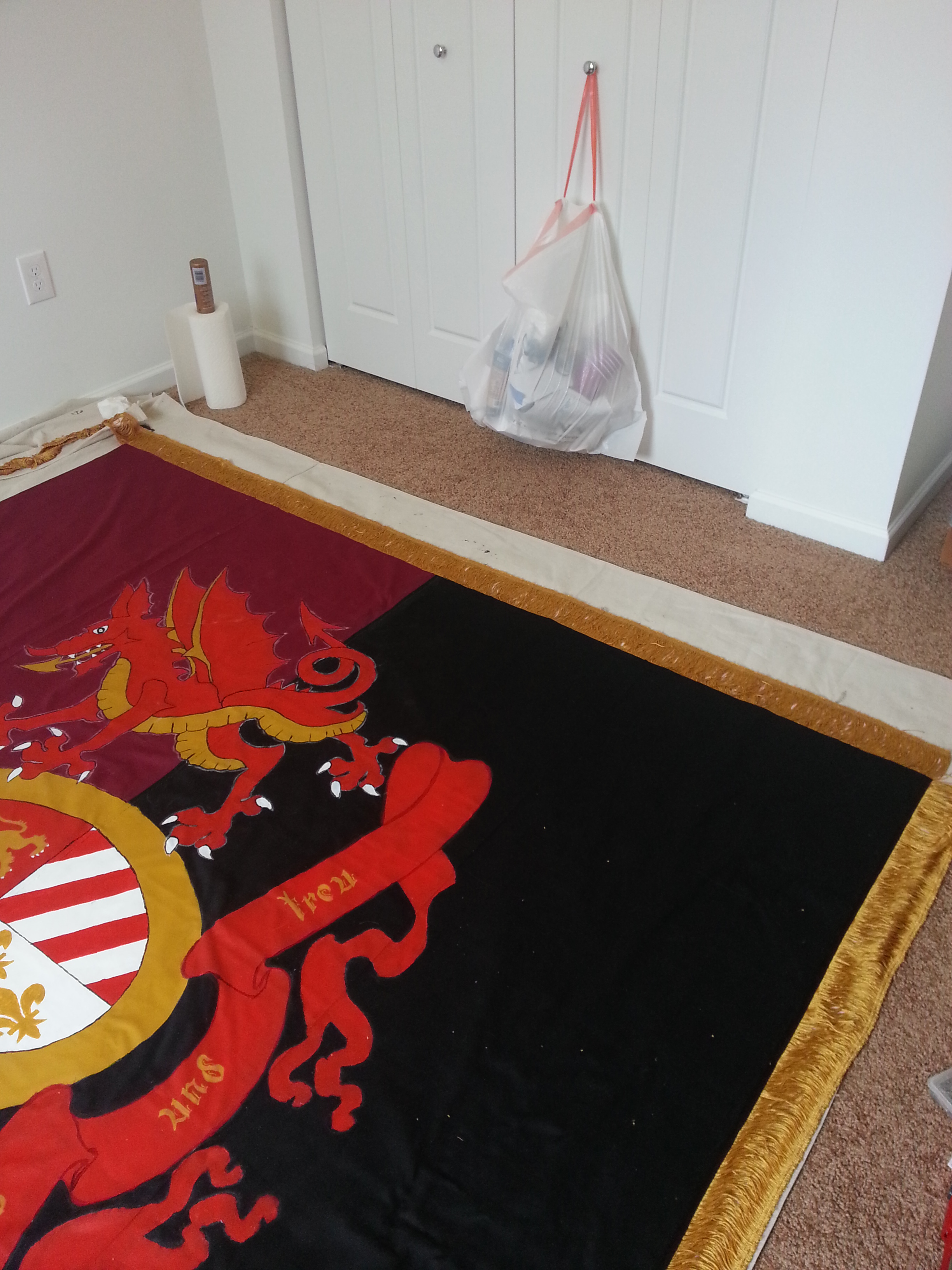
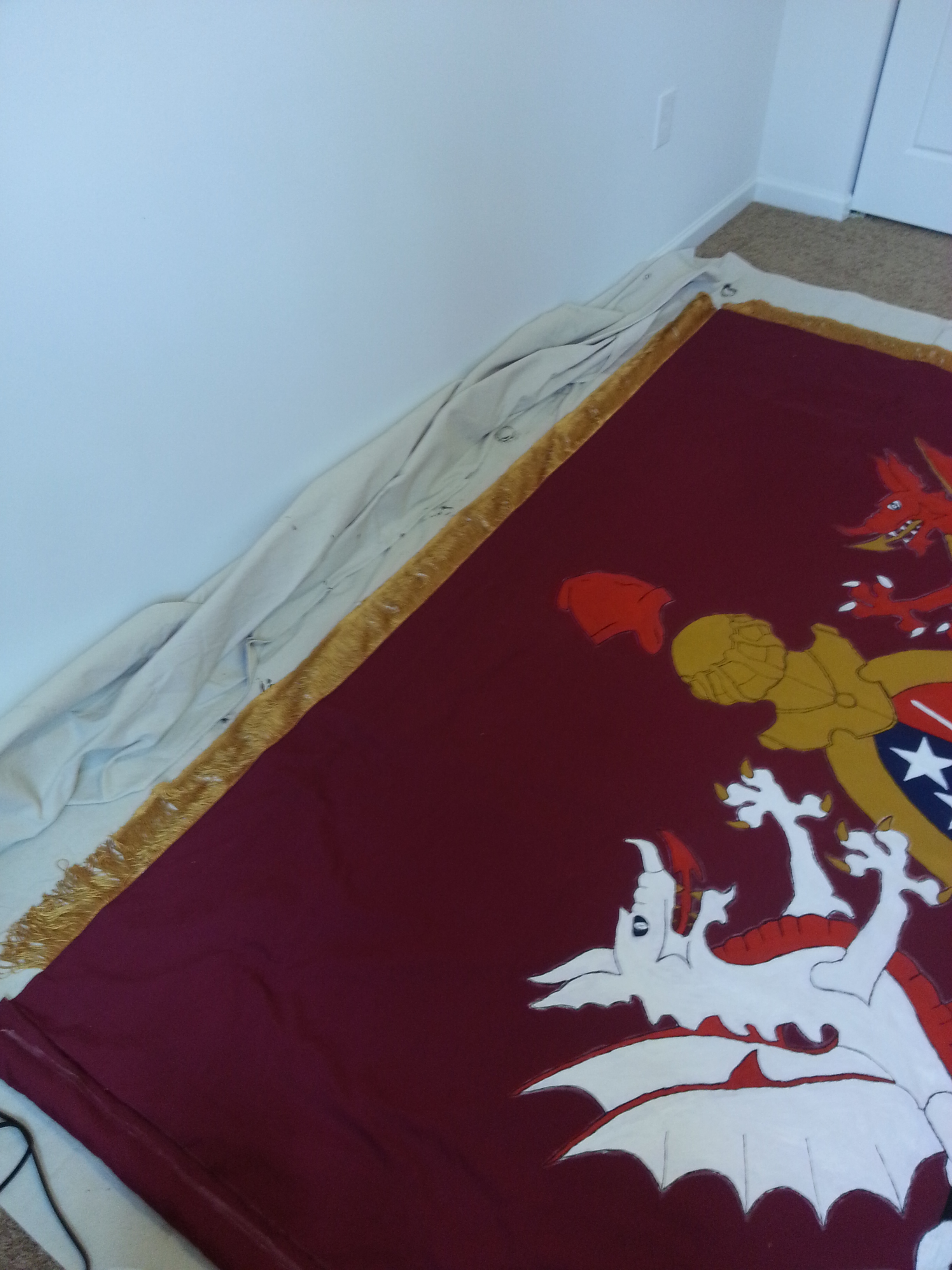
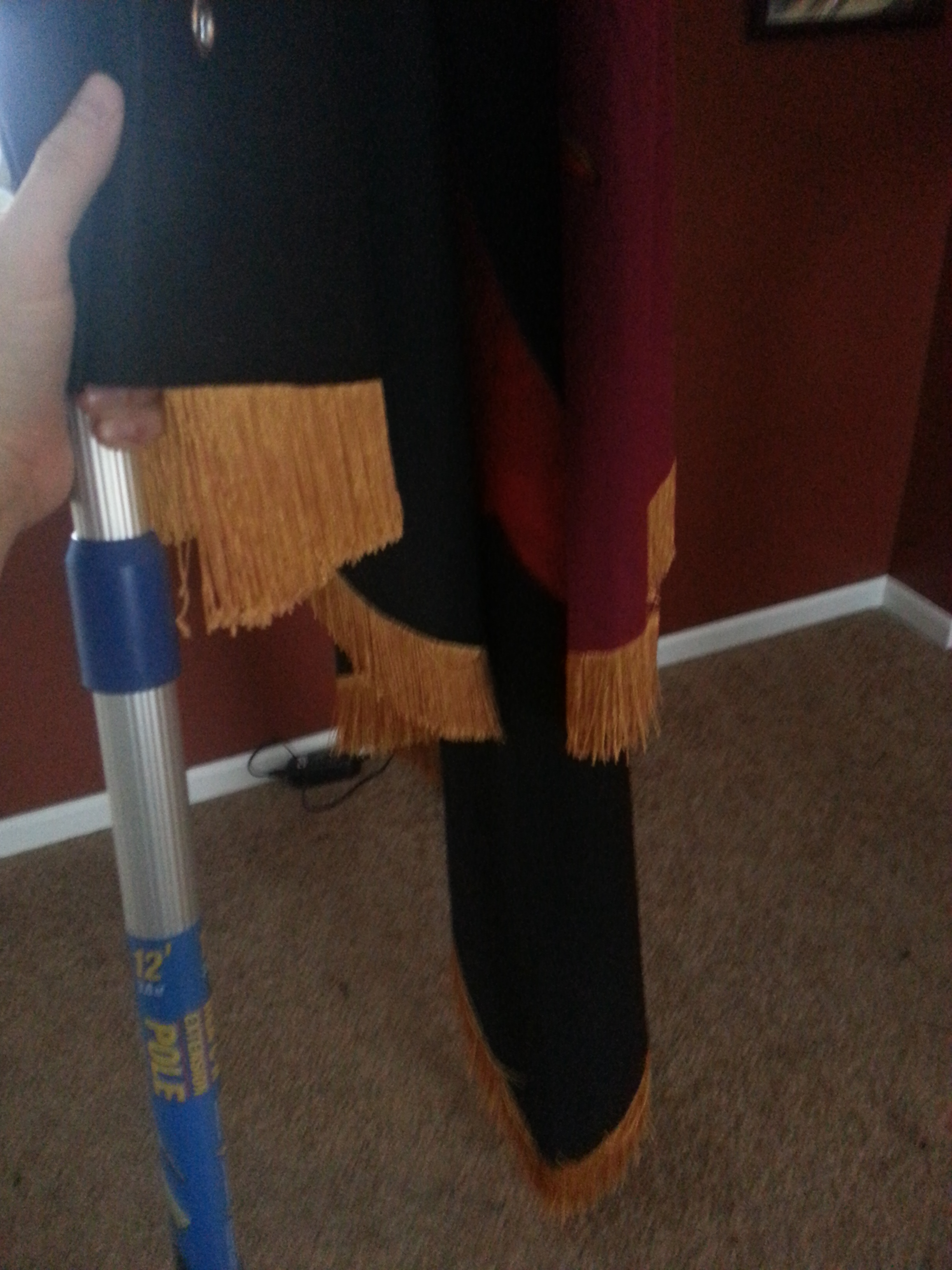
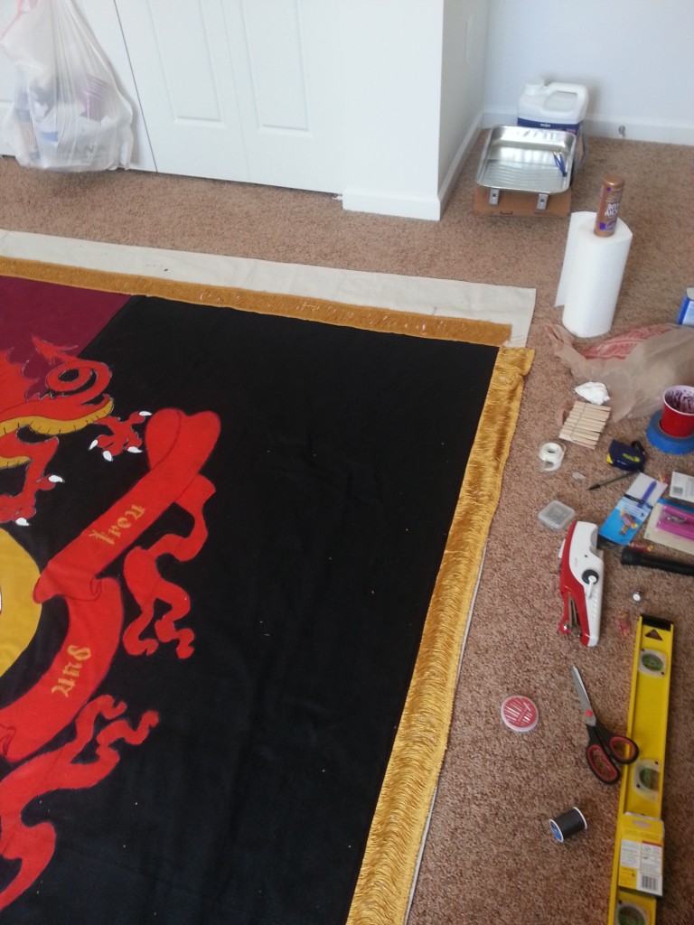
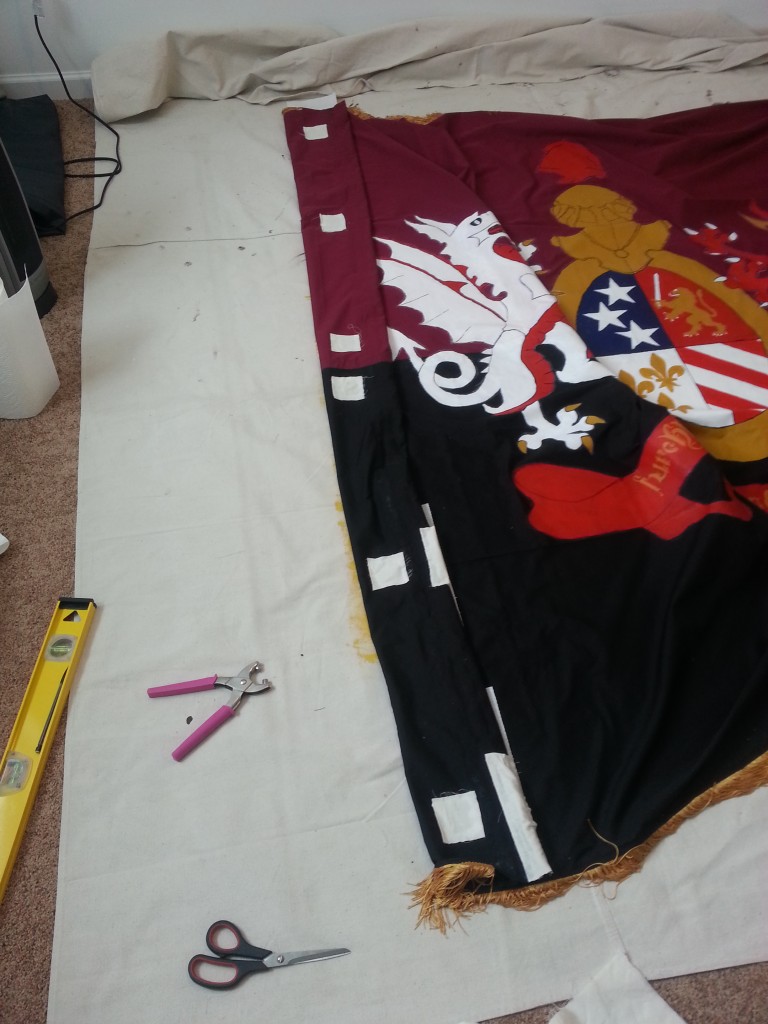
Now I had to move onto the trimming and the re-enforcements.
It’ll never look this good again.


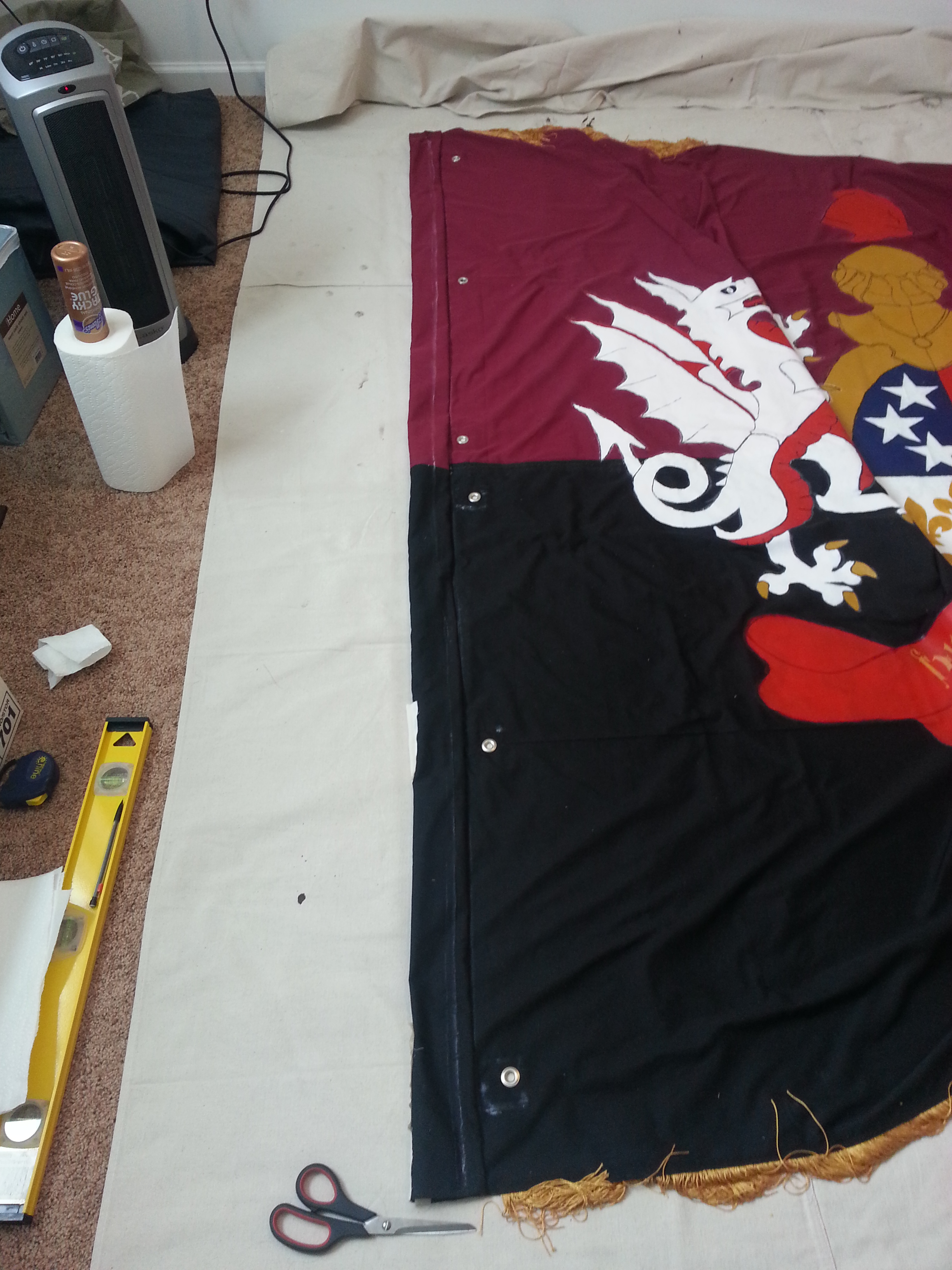
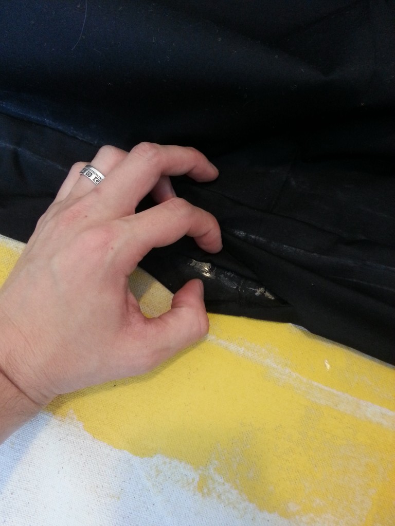
Around this time I was horrified to discover that the sleeve around the pole had two pinch points and thus it was impossible to remove the pole from the sleeve. Which means I needed to cut it out.
Luckily I had some fabric lying around from uni when we tried to make bags for cornhole. I was planning on using this for the grommets, but I had plenty so it would also be used to expand the sleeve.
First pinch at the bottom.
Second pinch about a quarter the way up.
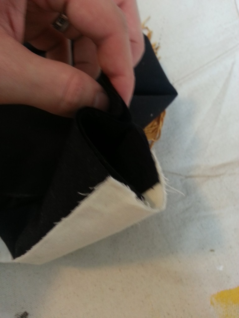
Little extra room.
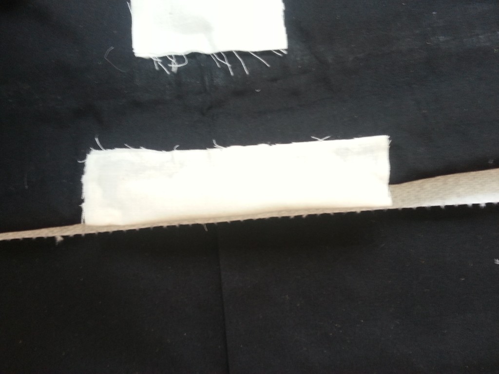
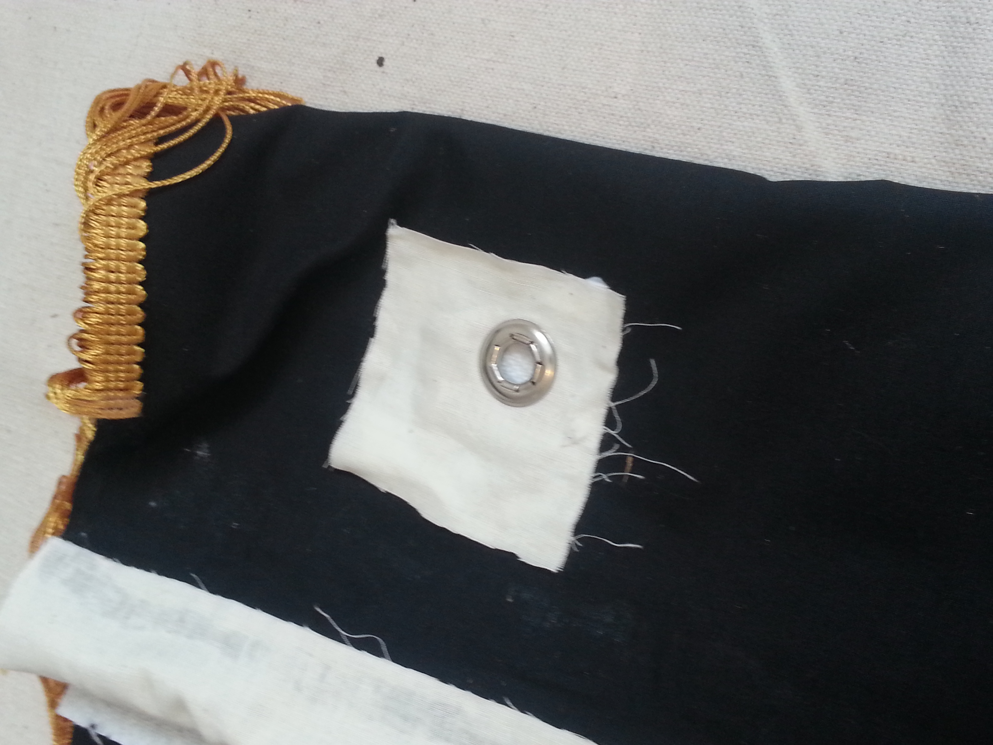
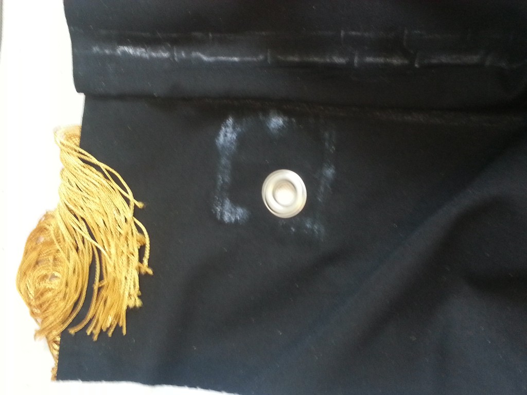
I laid out patches for the grommets. This would add a few extra layers of canvas so they wouldn’t pull out easily. The plan was that the grommets would be used as a secondary re-enforcement to the sleeve on particularly windy days.
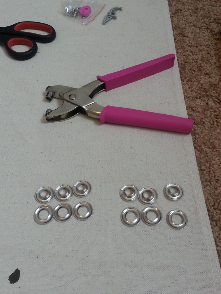
Pretty in pink.
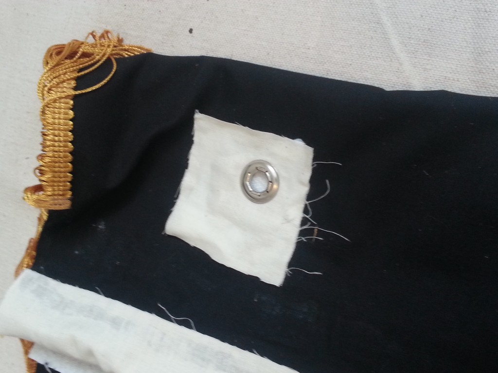
If my aim was off it was because getting over the sleeve was a pain in the ass.
I have to admit cleaning the grommet pliers was pretty awesome.

All nice and set.
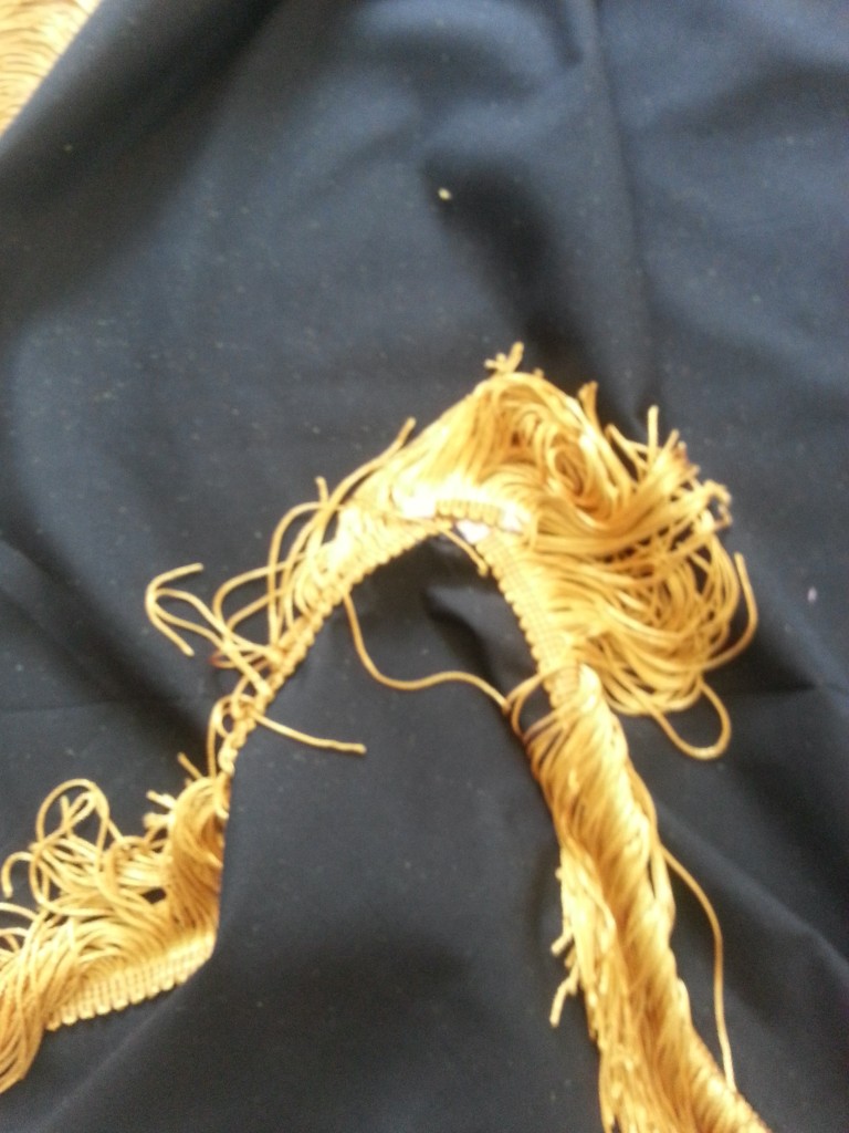

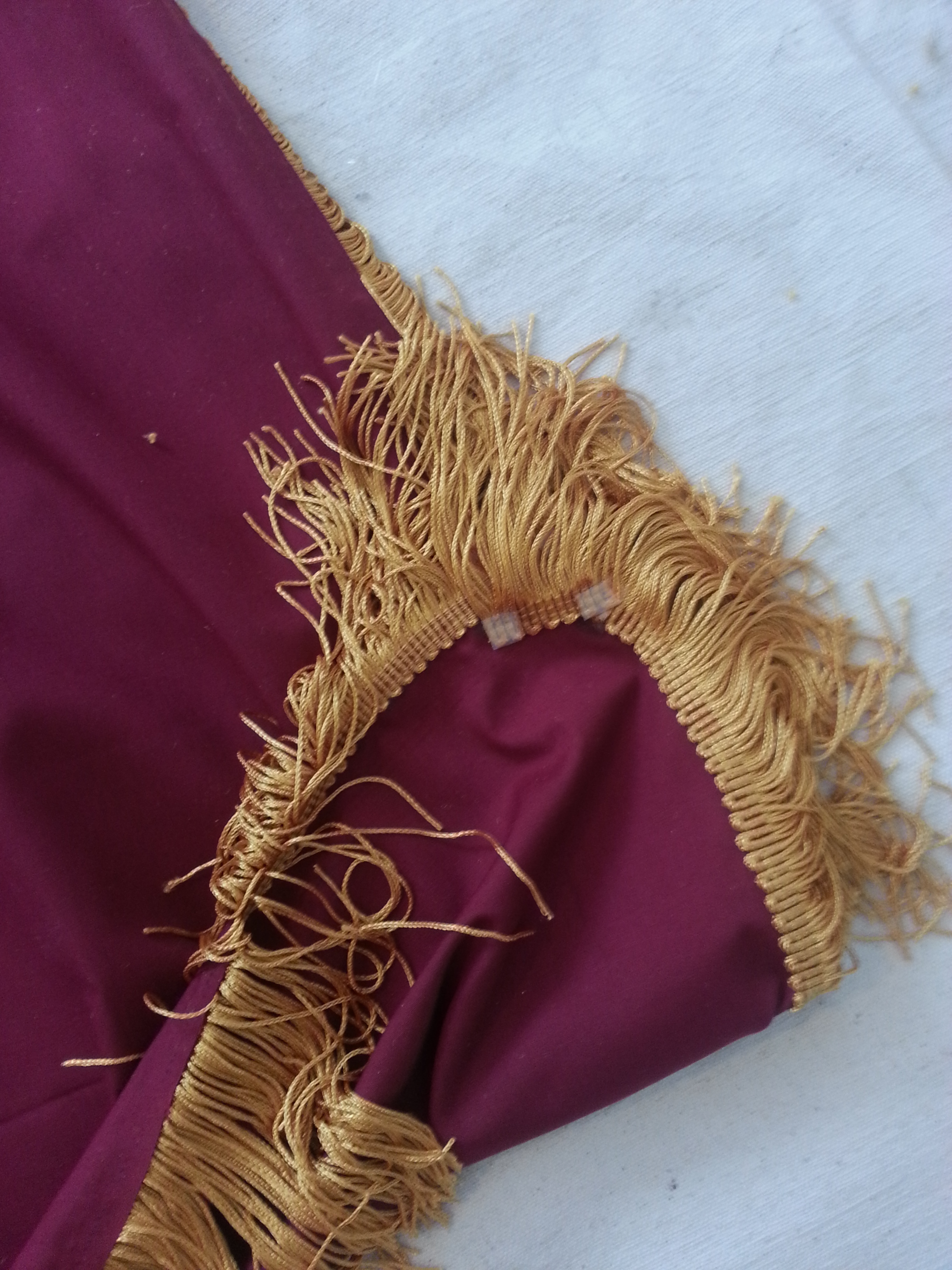
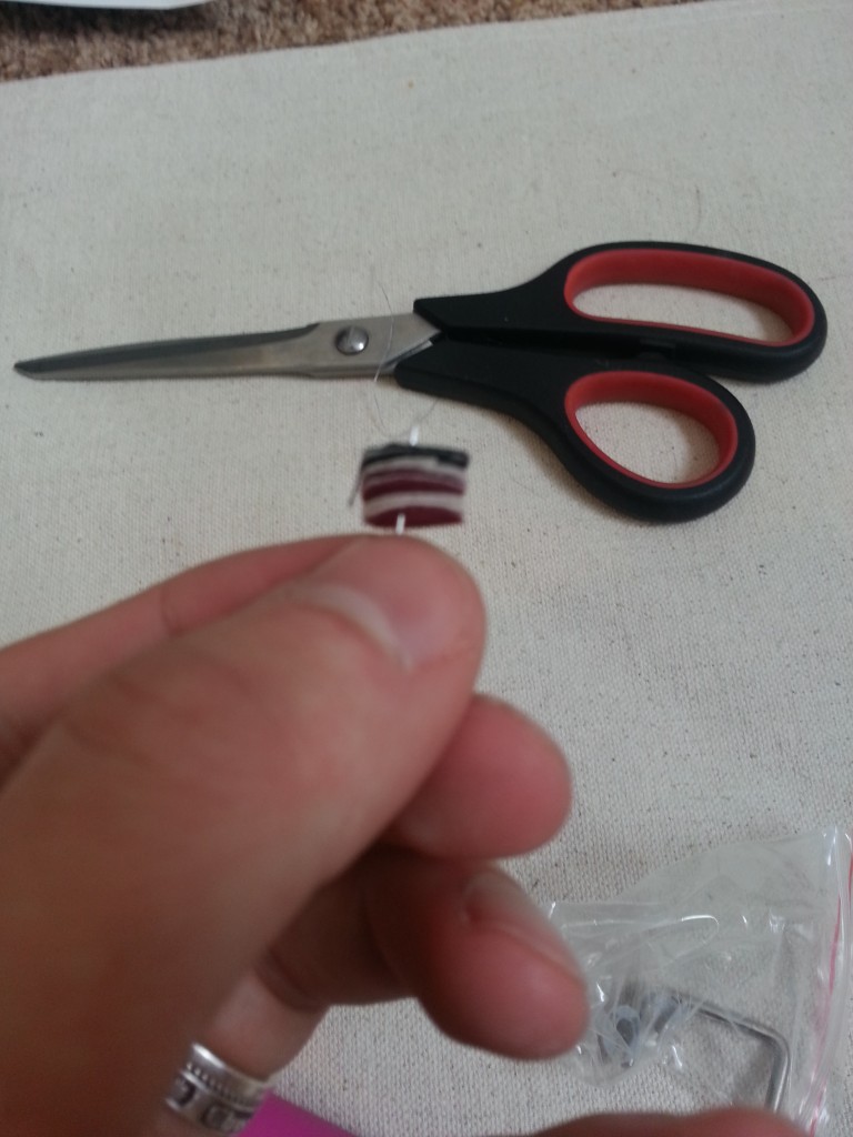
At this point I undid the ties holding the fringe together and wasn’t happy with the corners. (Un)Luckily I had mismeasured along the top and had to run to JoAnns for more fringe, so I had a foot to play with. I cut some tiny sections out and glued them diagonally across the corners. This really filled it out well.
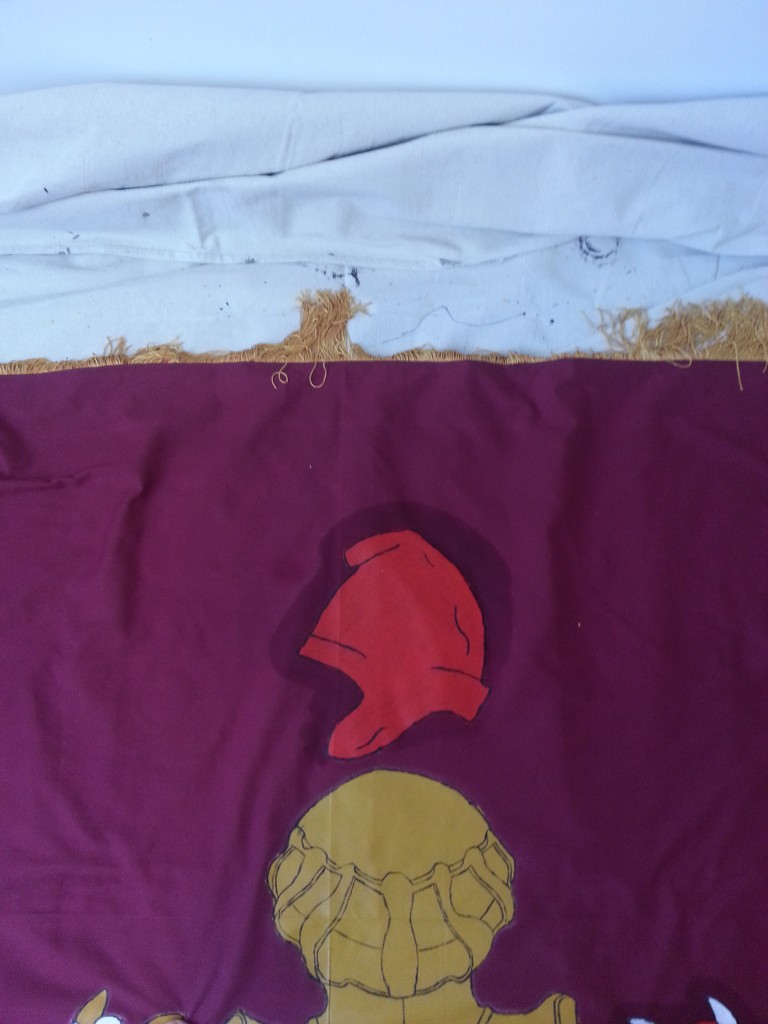
The last steps were cleaning. I had to get all the chalk off and all the gold lint from the fringe as well, also cat hair, human hair, and just general junk.


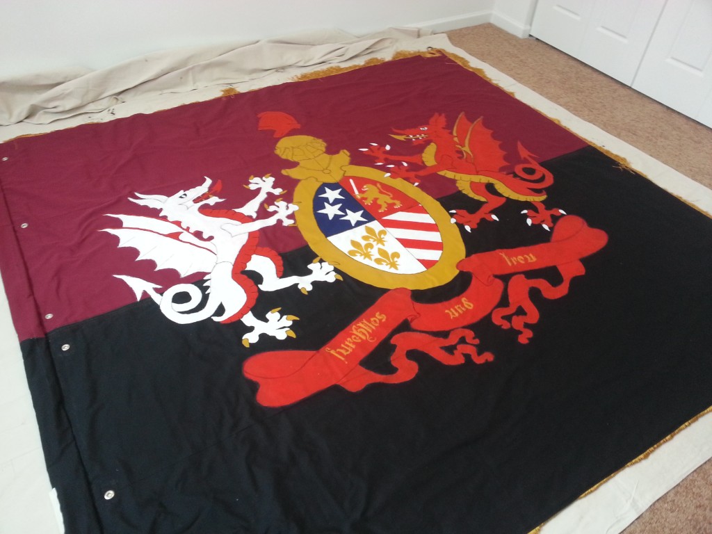
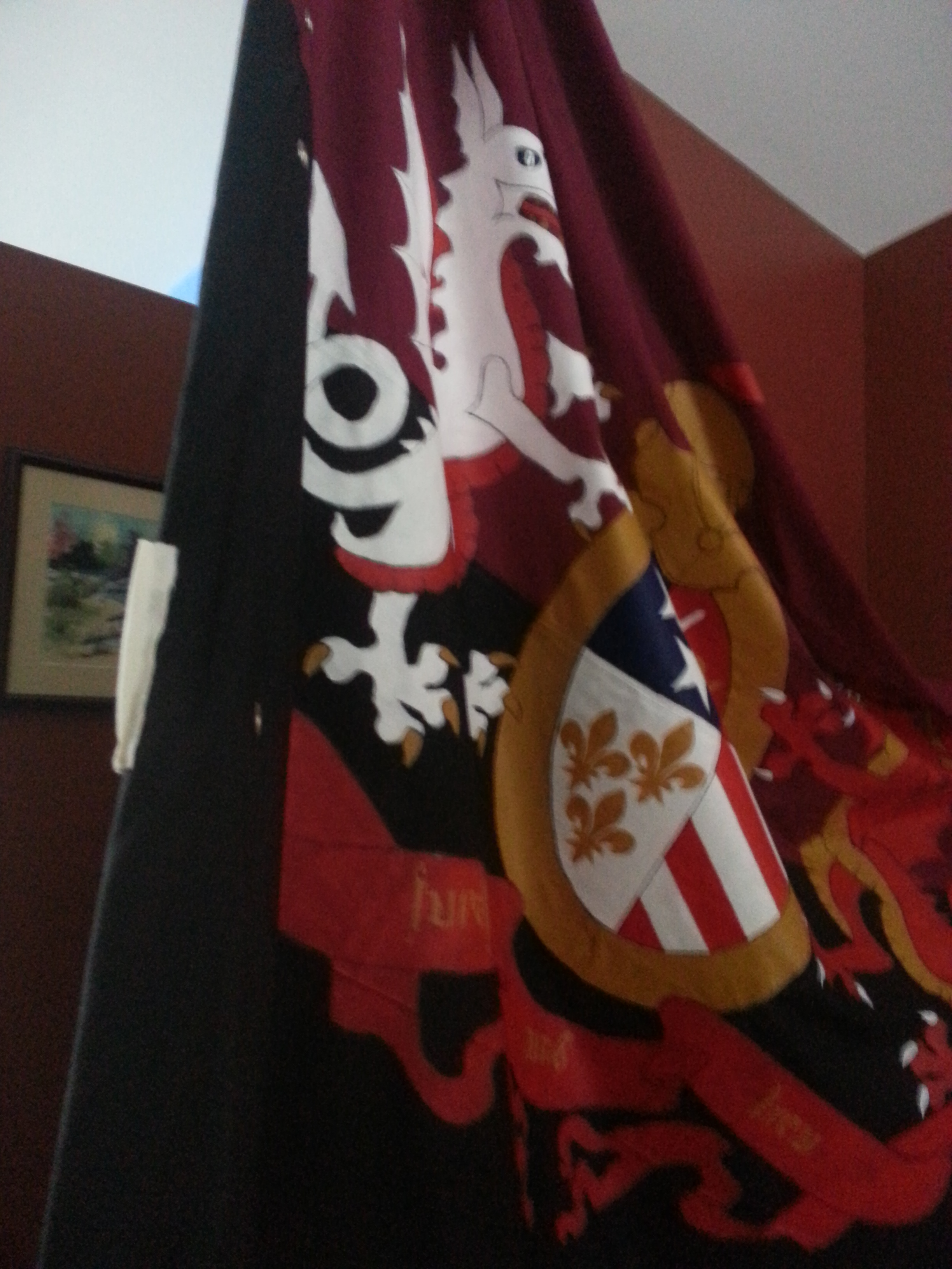
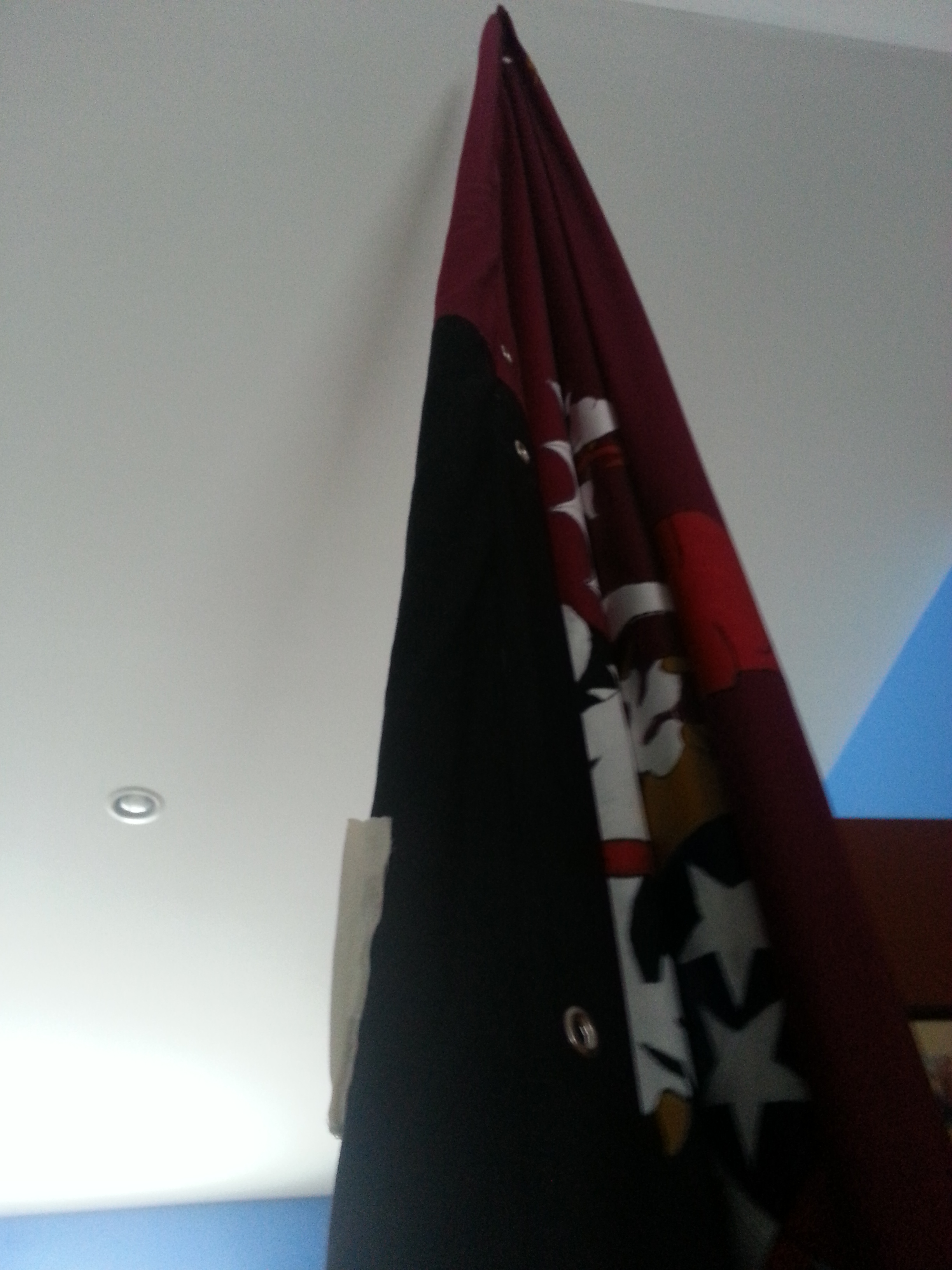
And so ends my project!
Brigid suggested we give Faust some air upstairs in our great room.
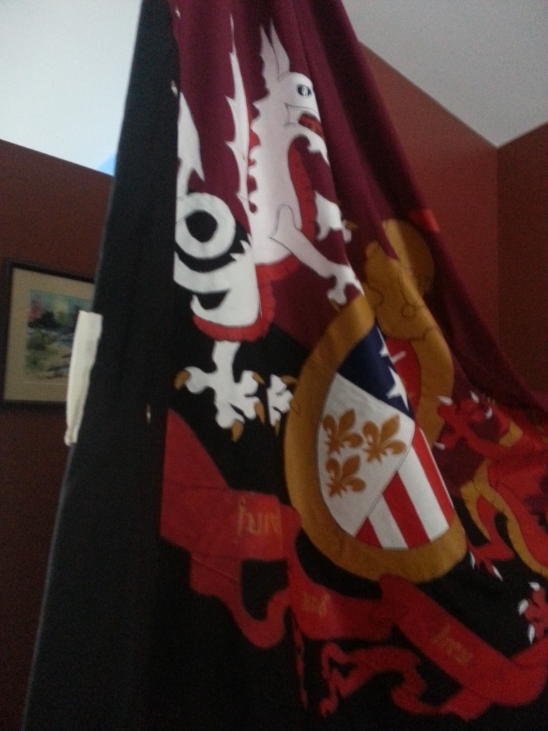


Faust stands proud.
Thanks to everyone who helped me along the way when I had questions or just needed a little encouragement. This project had a lot of twists and turns and a few complications, but in the end everything for my club.
Up The Fucking City!
Draft to Reality:
Only took two months.