Month of Exhaustion, Quarter of Death

Tomorrow is the end of what has probably been the most stressful and seemingly unproductive months in my life since graduating from Purdue at the ass-end of 2011. I looked at my calendar a few days ago and nearly had an anxiety attack just thinking of all the stuff I had done. Not “to do”, already done and it still hung over me like black storm clouds.

Social life has been busy. Work has been overloading. And it all seemed to culminate in the realization it had been in a month that had blow by so quickly that I’m still dealing with the headaches.

In the last week my social media presence has dropped nearly to zero. There was literally nothing I felt like doing but just screaming about whatever thing, trivial or not, was on my case at the time, which was usually “all things”.

As we fade into October, a month I swore started today, things are at least looking up for the time being.

The Harper’s AFC season starts on Tuesday and while it’s one of those things that puts a lot of boxes on my calendar they are usually moments of release. As bad as I am at soccer, it’s fun and just the pure act of running around with a bit of purpose invigorates me somewhat. Doing so in my lovely kits more so.

I’ve also got a lovely wedding to attend to, which means some parties and social gatherings, again, another way for me to decompress.

But the biggest drag in my life recently has been the difficulty in writing I’ve been dealing with lately. The stress has been eating away my time and my time needed to be spent writing and not stressing. By September 30th, I wanted to have written 40,000 words in the final book in my quartet. I am currently sitting at 33,500, which is far too short.

It’s not nothing, but I have schedules because I treat myself as a professional here and not keeping to schedules is depressing.

The stress has also torn down my drive for writing moving into the near future. Generally, every year I do what’s called “the quarter of death”, it’s like NaNoWriMo, but it’s daily goal is slightly lower (1,330 vs 1,667 words) and its duration much longer (92 vs 30  days). In the end the intended word goal is much, much higher (roughly 122,000 vs 50,000).

Last year I was able to do this, though a great lead was eaten away by a huge drop in work as I dealt with writer’s block and depression. But the goal was accomplished and the book was finished.

This year I’m taking the precaution of lowering the daily word goal to 760.

Precaution?

Because if I don’t meet word goals, I’ll start to second-guess myself. Is it purely motivational mumbo-jumbo? Yes. Does it help my anxiety? Yes. Am I really aiming for 1,330 anyway? Also yes. My hope is to keep to the main goal but seeing little boxes on an excel sheet change to green will help.

And it’s about self care as I get ready to jump over the ledge into this year’s quarter of death.

At the 760 rate and including a few extra days in January, I’ll write a minimum of 72,960 words. It’s far, far short of what I need to finish book four, and that has me worried, because I don’t want to spend too much time in 2019 writing it. I want to get to editing the series and getting it published, finally.

I’m really hoping that the next three months pick up, and I can get back to full writing strength, but there would be something storybook by finishing my series sitting in Newcastle or Kendal at the end of February.

I said I’d get an update here up before the end of the month and the start of the QoD, I managed that. And that’s what I need right now.

Small victories.

You Must First Create the Universe

It’s almost a throw-away line, though now widely quoted and oft recalled. In the original Cosmos, hosted by Carl Sagan, a scene begins with a waiter walking through an empty restaurant with an apple pie, placing it in from of Mr. Sagan who, in his usual calm, paced tone sets the scene.

If you wish to make an apple pie from scratch, you must first invent the universe.

And so it is with many things.

What constitutes “from scratch” differs from person to person, though some thing are taken from granted. Baking a pie from scratch does not – for the most part – first start with inventing the universe, but rather with rolling some dough. It does not, however, start with buying a pre-made pie crust, though in the grander scheme of things is there really that much of a difference?

The 2018 hobby de jure that I’ve adopted is cocktail culture, preparing and inventing cocktails for my own enjoyment out of a basement-based fridge. If you frequent my twitter you’ve probably seen threads on making the Trinidad Sour, the Bijou, and the Last Word (among others).

The perhaps my favorite cocktail, and the favorite of my lovely Brigid, is a simple martini. I usually like mine dry with a dash of absinthe and garnished with a lemon peel.

I love the combination of gin and absinthe enough to have commissioned a bit of artwork of it for my calf.

So, anyway, I’m rambling.

This is going to be be a cocktail thread. I am going to make a cocktail for you and I’m going to teach you, step by step how to make it. It’s got a lot of ingredients, it’s got a lot of steps, and you will need some specialized equipment.

Because I am going to make a martini, as legally as I possibly can… from scratch.

And to make a martini from scratch, you must first invent vermouth.

VERMOUTH

I chose to start with vermouth because for many folks vermouth is a secondary ingredient that can, callously, be tossed away without a second thought. There is a long-standing series of jokes that a martini is a glass of gin served with a bow to France,  or on a postcard from Italy, but I don’t necessarily subscribe to that line of thinking.

A martini, in short, is a cocktail made primarily from two ingredients: gin and vermouth. The balance between those two partners it what gives it the majority of its characteristic. From “perfect” (2:1 gin to vermouth ratio) to dry (3,4,5:1) to very dry (10+:1) Other things can be added to it, but it’s got to be both.

Aside, though you use “dry” vermouth, a “dry” martini means more gin, not more vermouth (which makes it “wetter”, or sweeter). This goes back to when “dry” gin (as compared to what is now known as “Old Tom” gin) was new and it needed to be ordered specifically.

Again, I digress.

Vermouth is a herbal wine that includes wormwood, in fact the name “vermouth” comes from the French spelling of the German word for wormwood. Most recipes I’ve seen call for the addition of sherry as well as some other herbal components to be steeped into the wine after it’s made.

So my thought is… I can make wine. I’ve made plenty of wine. And wine is legal to make in my basement. So I’m going to make a crazy Michigan Vermouth from apples, cherries, cherry pits, sugar, and honey.

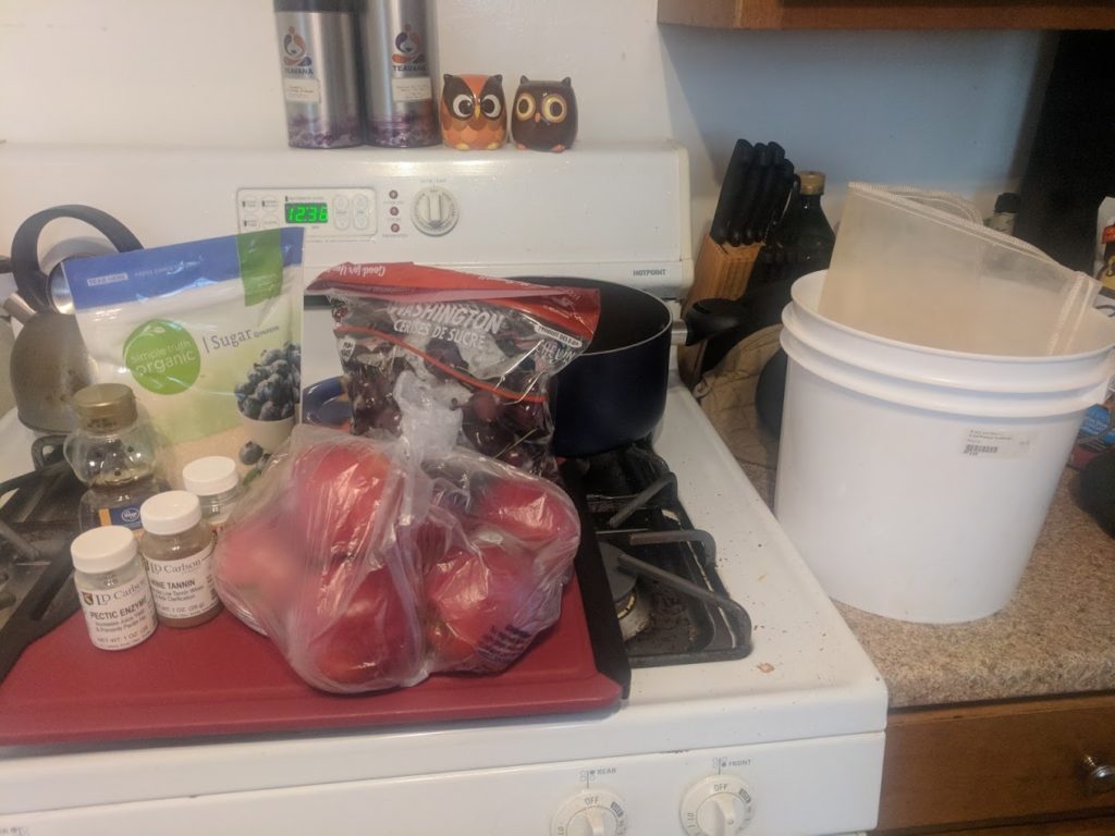
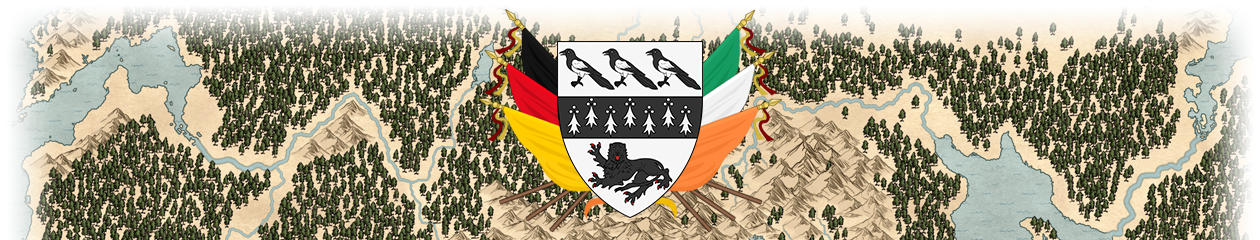
First order of business was dice up apples and pit the cherries.

Apples getting diced.

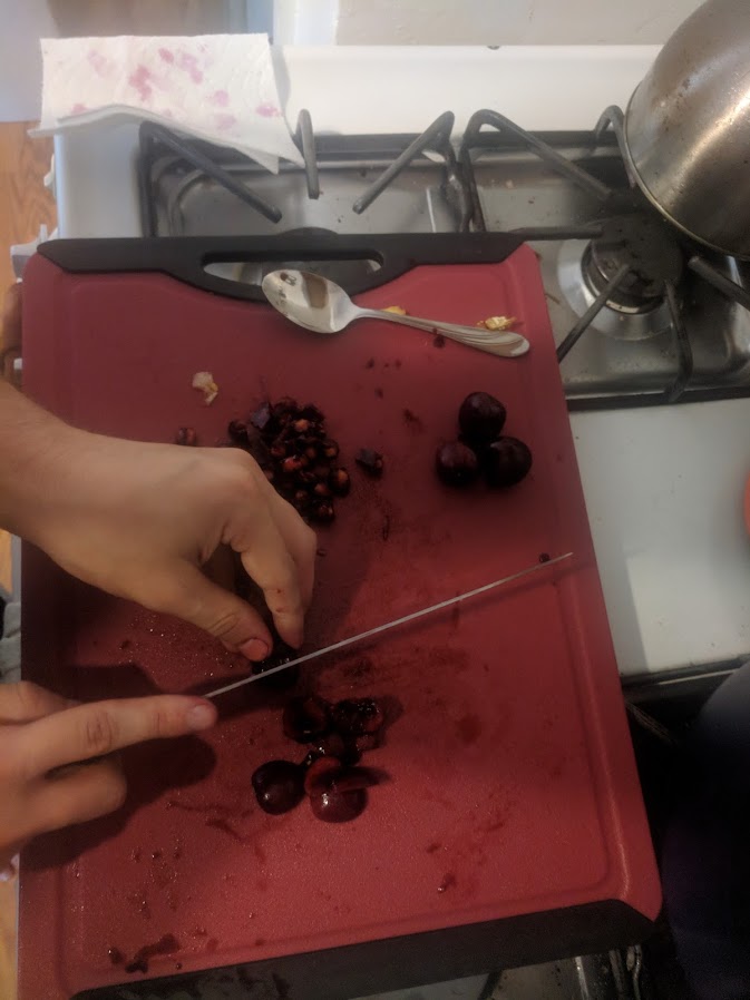
I wanted to keep the cherry pits because they impart their own flavors, but I wanted them separate so I could deal with them separately.

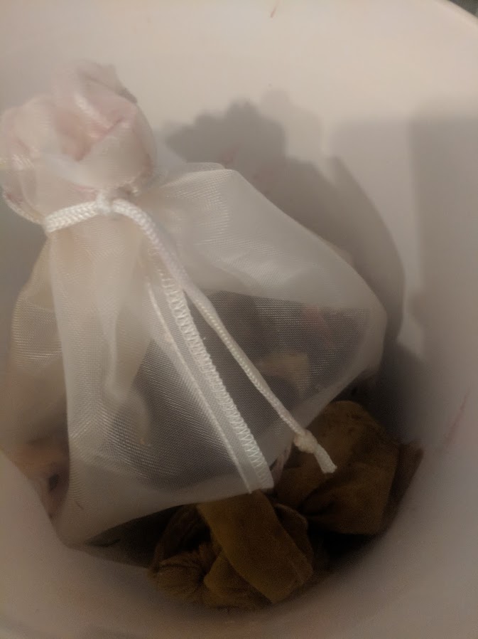
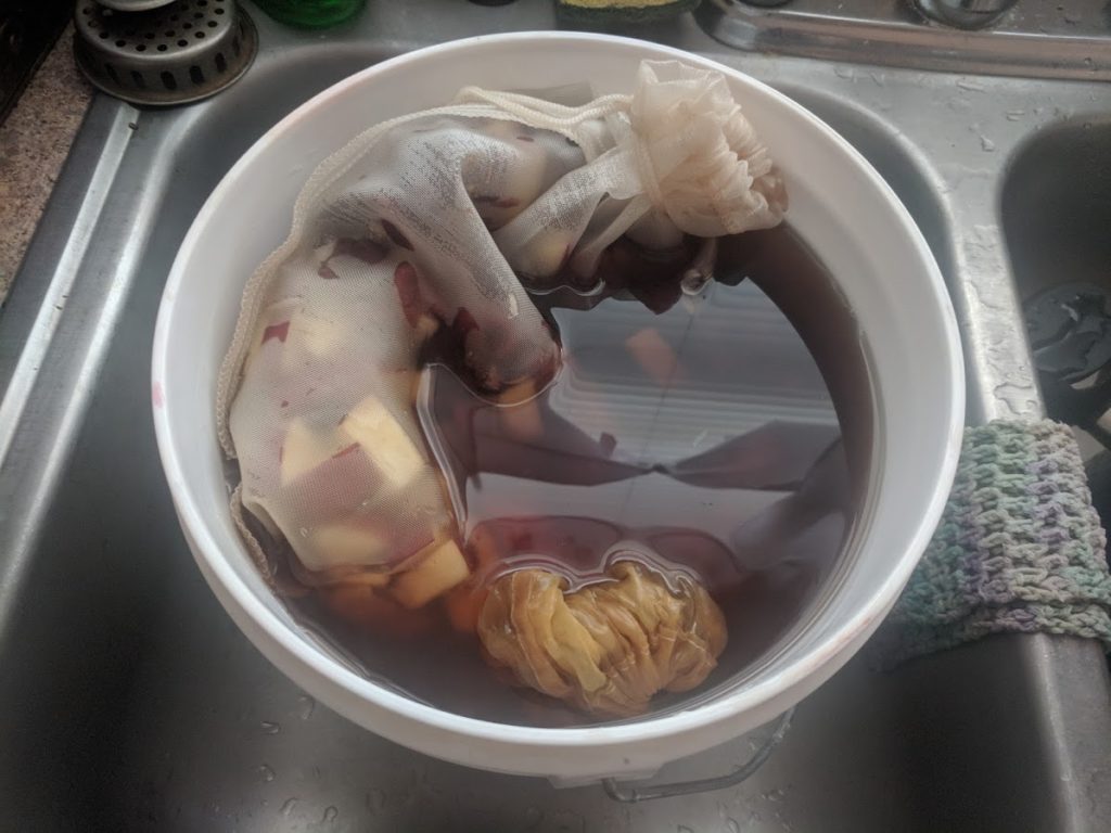
So then I threw those into some steeping bags and threw the bags into a 2-gallon plastic bucket.

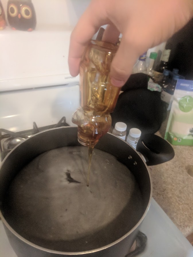
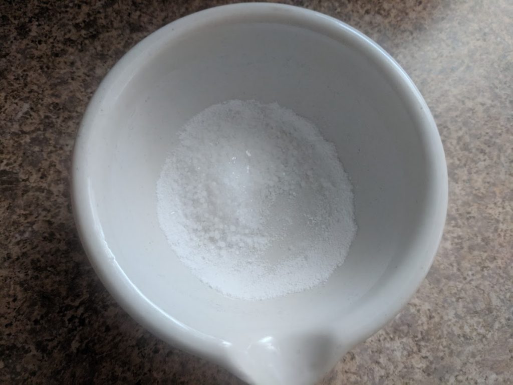
Next it was time to pix the additives for wine, namely tannin and pectic enzyme into 2.5 quarts of nearly boiling water. I also used this to dissolve the sugar and the honey.

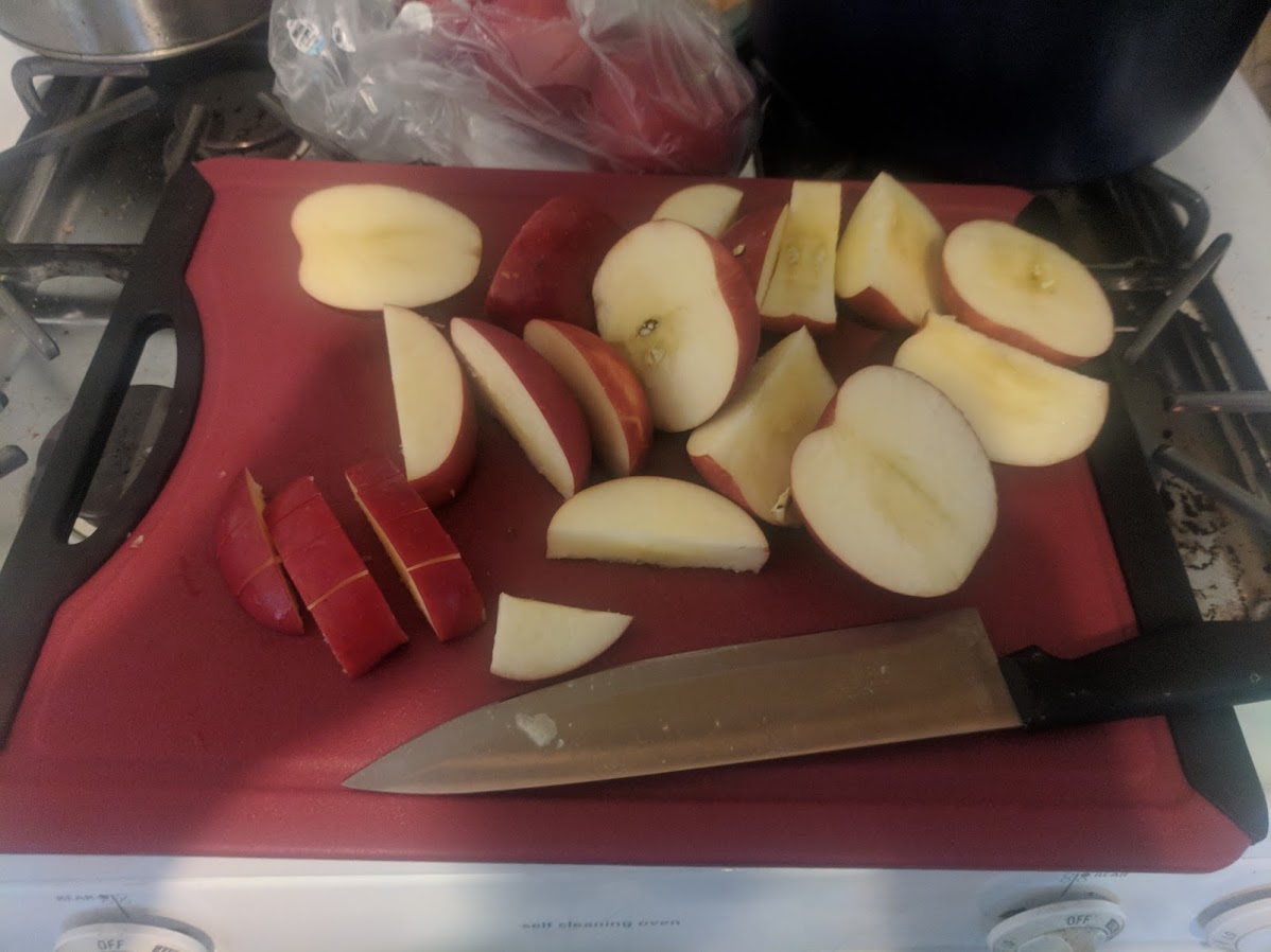
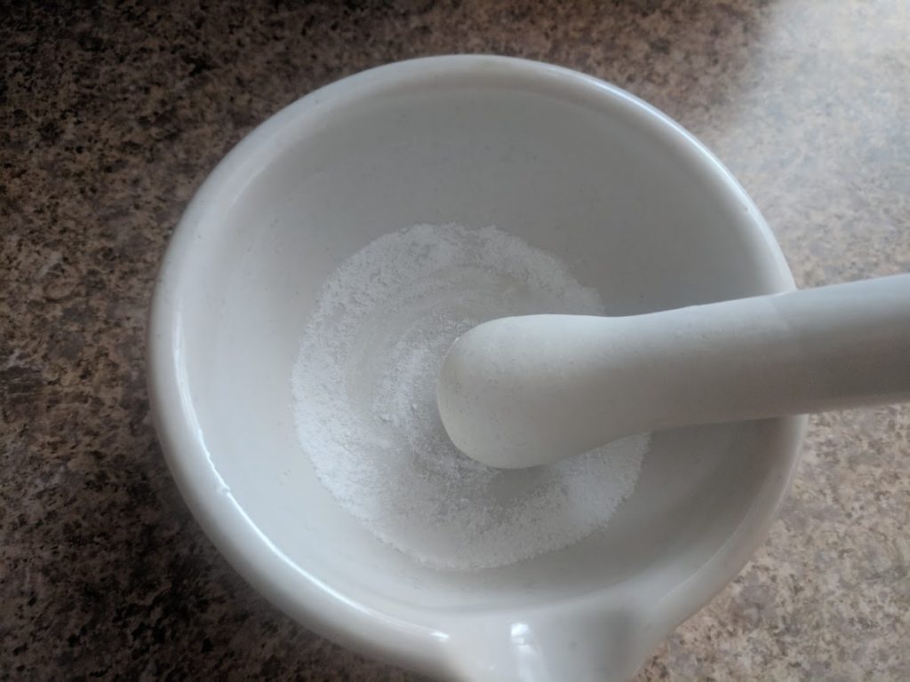
In a mortar and pestle I crushed two campden  tablets (to kill any natural yeasts and bugs that might be on the fruit) and the yeast nutrient.

The near-boiling mixture is dumped over the fruit, and the nutrient/campden mixture is poured and stirred in as well.

The campden tablets take a day to do their work, so the bucket is left covered in my wine cellar overnight for the yeast the next day.

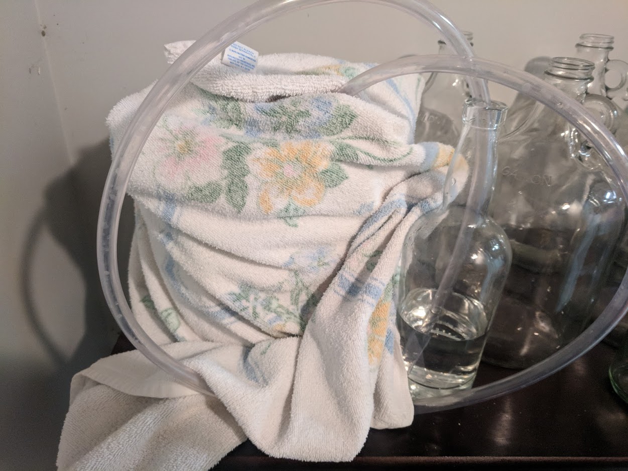
The next day, soon as I got home from work, I pitched the yeast and got a blow-off installed.

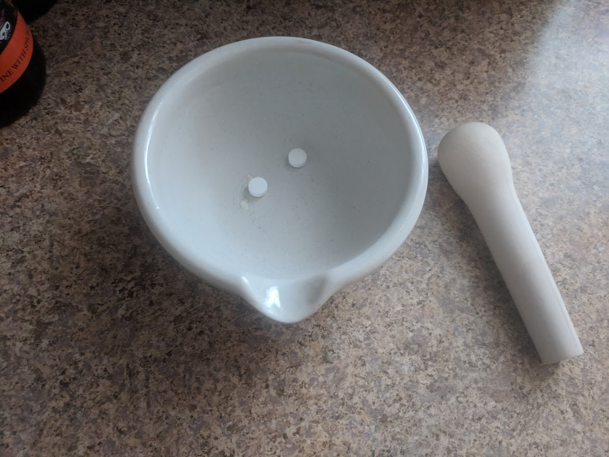
First I proofed the yeast for a bit, basically mixed it into some warm water to wake them up. I’m using my favorite: champagne yeast, because it ferments dry and I can always add sweetness back. But in this case I really am interested in complete dryness here.

Pitched it into the bucket and gave it a good stir. The red from the cherries is already really starting to come out.

And it goes back into the spider-filled hole that is my cellar.

NINE DAYS PASS

Okay, so the glory of wine/vermouth making is that there’s a lot of sitting around a doing nothing. Generally I usually stick to the rule of thumb that you should leave the wine in the first fermenter for about a week. This meant probably racking it over on a Monday, but Monday I didn’t feel well and literally went to bed around 4pm and slept until dinner at 6pm, then slept on-and-off for another four hours before dragging myself to bed where I slept soundly until work at 5am.

Tuesday was the last game of the 2018 Detroit City campaign so that wasn’t going to work. But Wednesday? Wednesday is the day I work from home so after running an errand or two I returned to rack the wine over.

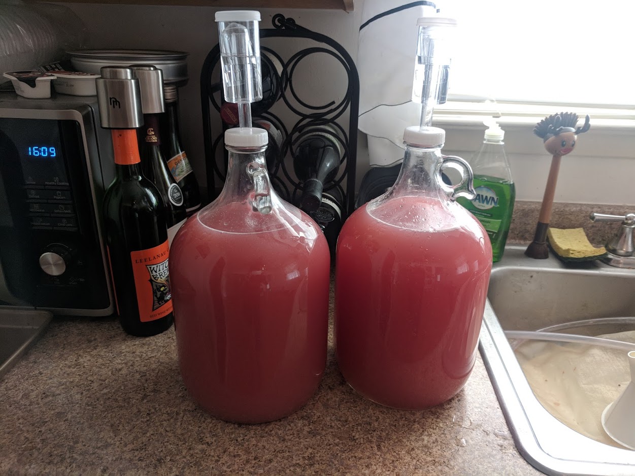
So I moved my equipment up from the spider cave up to the kitchen and then brought up the wine and the degas bottle. The fermentation had been extremely vigorous and spent yeast lined the bucket and the lid. There was a small amount of lees in the degas tube, but not much and none in the bottle, which was good. I was hoping to get two-ish gallons out of this batch, which is twice what I normally make.

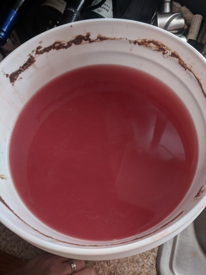
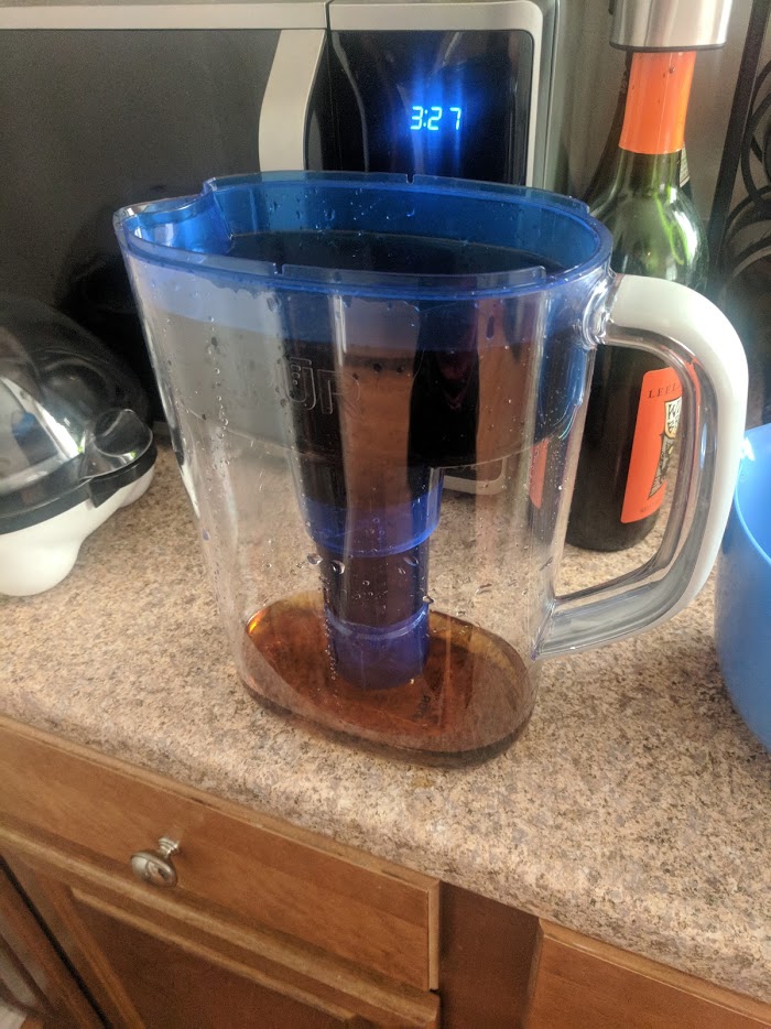
First step, check the wine and see if it went bad.

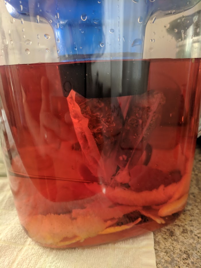
That color. Absolutely gorgeous. A bit strange for dry vermouth, but that’s the fun of making it yourself. Plus, as I was telling Brigid, this will help with the color of the compound gin, which is usually a pale yellow/brown.

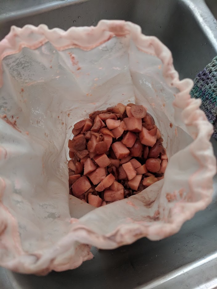
You can see here that the color had been entirely sucked out of the cherries. I also removed the pits, not pictured here as I had them in a disposable bag that went straight into the trash. This bag is reusable so it got cleaned out.

And there’s the wine! Excluding the bit lost to the siphon, I got 1.5 gallons, so I am going to cut it with water to get an even 2. Wine I make tends to be super alcoholic anyway, so that’s not a huge concern. Even cut it’s probably at least 12% by volume. I don’t really take the readings and stuff because my hydrometer was shattered in the move and I am too cheap to replace it. Plus I don’t really care that much, I’m more worried about taste and I tend to ferment dry and then cut/sweeten at the end as needed.

Is that the right way? Probably not.

Do I care? Absolutely not.

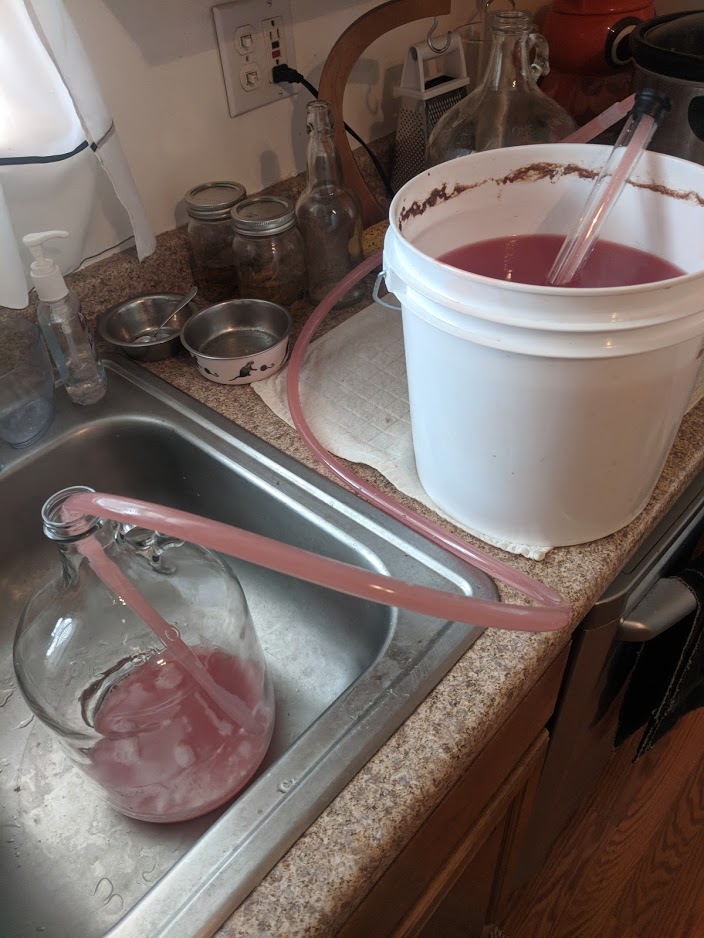
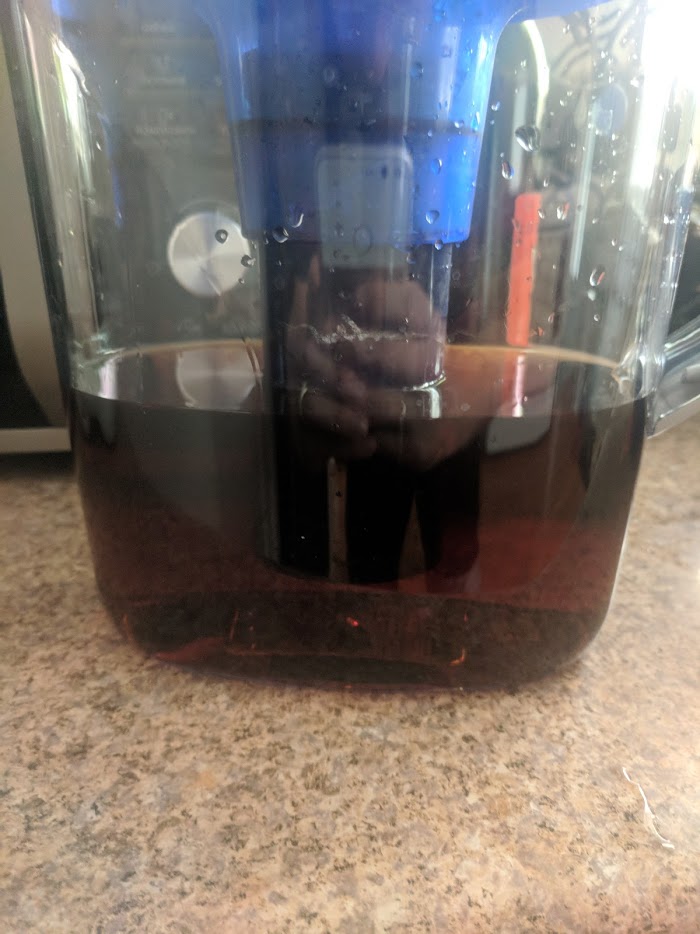
Here’s the actual racking in progress.

The fall from wine is called “lees”, a mixture of fruit and mostly dead yeast. These yeasty fellows died so that we might drink. Tonight I raise a zero-calorie sparkling water to them. Santé!

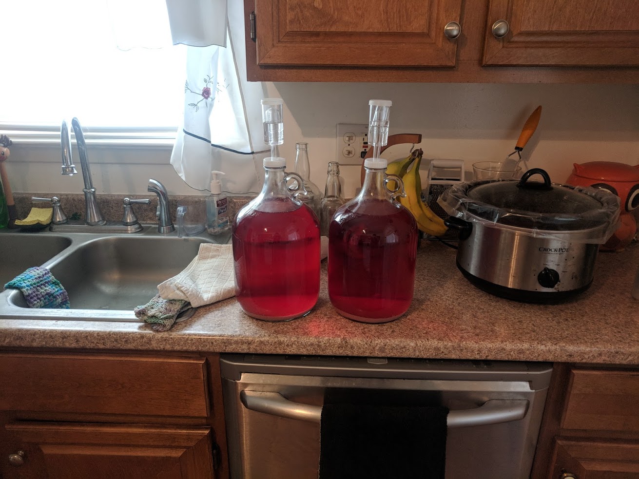
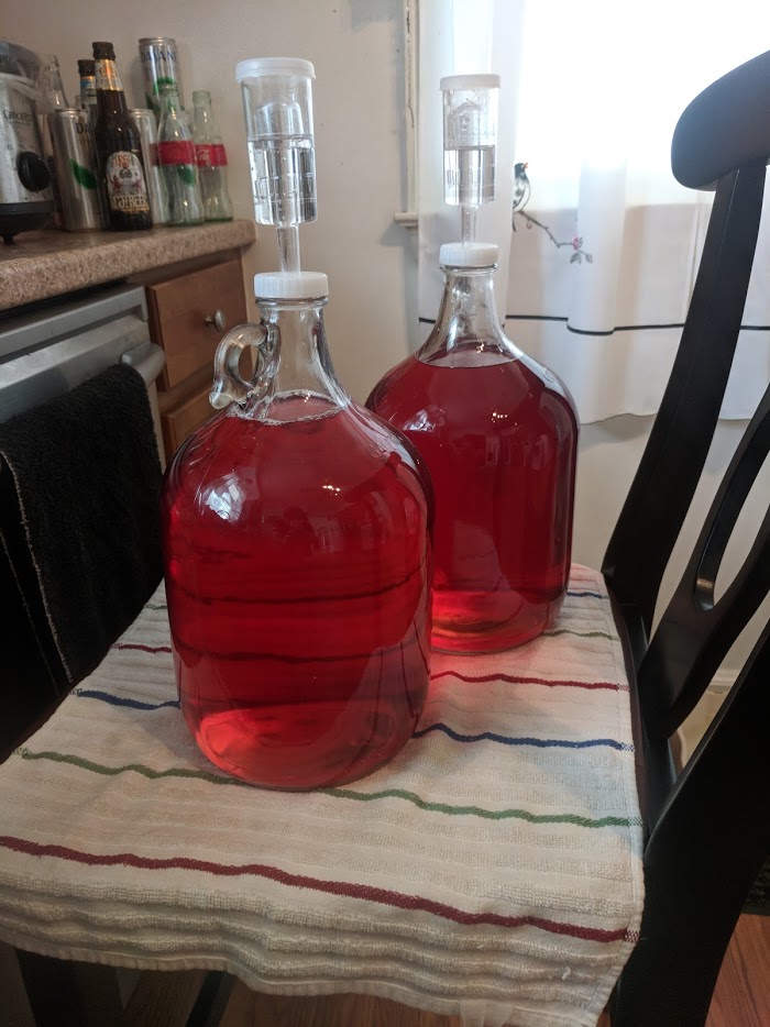
And two happy jugs with a gallon of wine each. My plan is to bottle and only turn maybe a liter and a half (two bottles) into vermouth, which will involve a secondary period of soaking with some botanicals.

Botanicals, for those not into drinks like gin, absinthe, and vermouth among others, are the selected herbs, spices, and other organic additives that are used to give those drinks their particular flavors. Some drinks are strongly defined by their botanicals: like gin with juniper (and coriander seed), absinthe with anise and wormwood, vermouth with wormwood as well. Some drinks are absolutely crazy with their botanicals, like chartreuse (which uses 110+ last I checked) and you can find some absolutely amazing additions like I have a gin, Terrior by St. George Spirits, which uses Douglas Fir among other botanicals native to California.

The last thing I did  before returning the wine to its slumber in the spider pit was take a bit of a taste test. It was good. Not the best I’ve made, but it was tart and light and crisp, which was nice. Obviously the apple and cherries were there, which was good, I was afraid I might’ve not added enough. Also very yeasty, as to be expected. With all that done, the wine will be allowed to rest for at least a week, probably a week and a half so that I could do the next racking on a weekend.

Ten…ish Days Pass

So I didn’t really keep track of time, instead I found some free time during an otherwise rather busy Sunday which also involved cooking ribs and making pasta salad and BBQ sauce to move over the two gallons of wine I had downstairs.

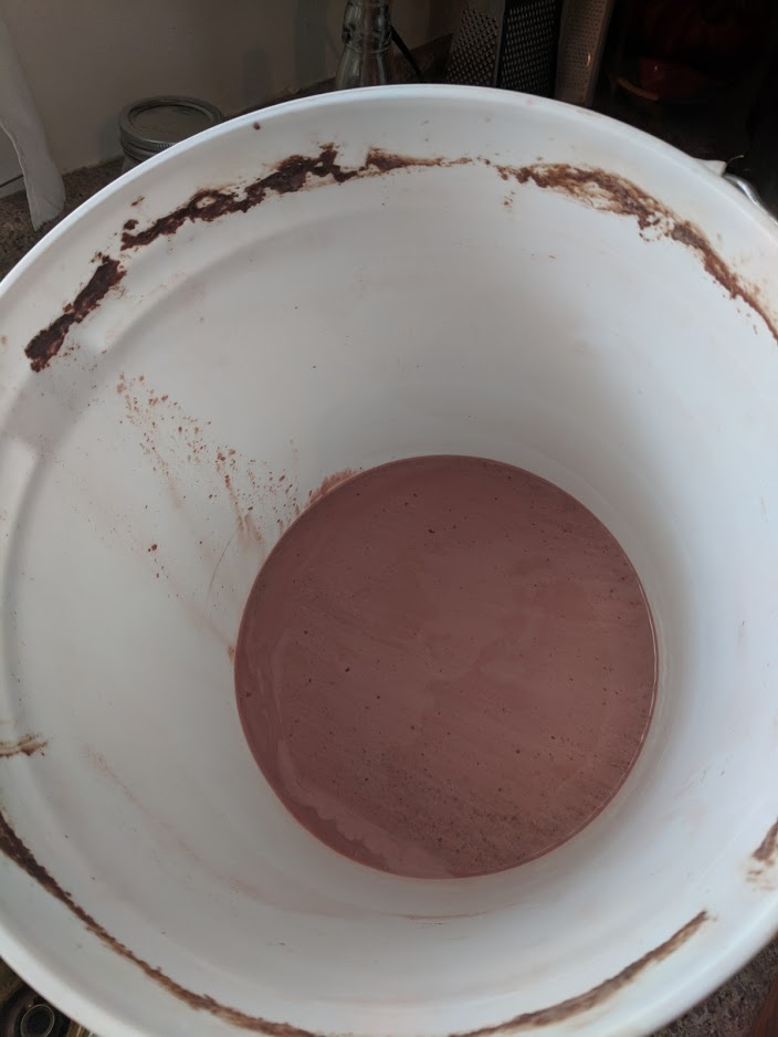
Pretty quick after moving the jugs into the basement, I had noticed a pretty strong lees fall and that the wine was practically clear already, almost ready to stabilize and bottle, even though it had only been three weeks or so. And you can’t argue with the results.

There’s about an inch or more of lees at the bottom and I’m going to be careful not to suck too much of that up when I make the transfer. Once again, let us raise a glass to the yeast that dies so we might drink. Salute!

It was a pretty quick day. I did take another taste of the wine. It is very, very light. Just a hint of apples and cherries. I suspect that the vermouth is going to be very heavy on the botanicals, but we shall see. The wormwood and gentian root have already arrived and everything else I can grab from Kroger or the cabinets. Currently I am waiting on a botanical for the gin, rose hips, which had originally arrived in pill form.

So apparently that’s a thing. Thanks online herb shop.

Two. Weeks. Later

So, since I have everything in, including another last second order from the online herb shops, I’ve decided to make my vermouth at the next racking, which I think was on day thirty-four, but really I’ve lost count and care at this point. Also this is being written on the final day and I’m starting to get sick and the next section (“GIN”) is a huge step back in time for me but is more or less a straight narrative for all of you.

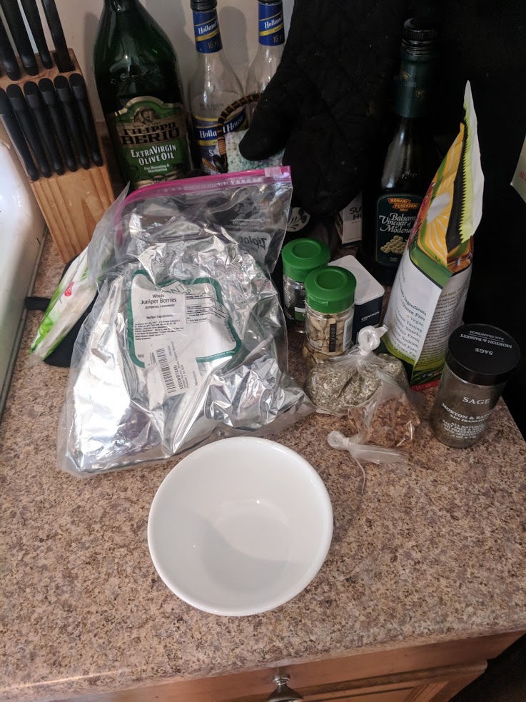
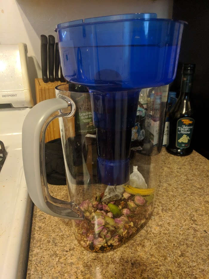
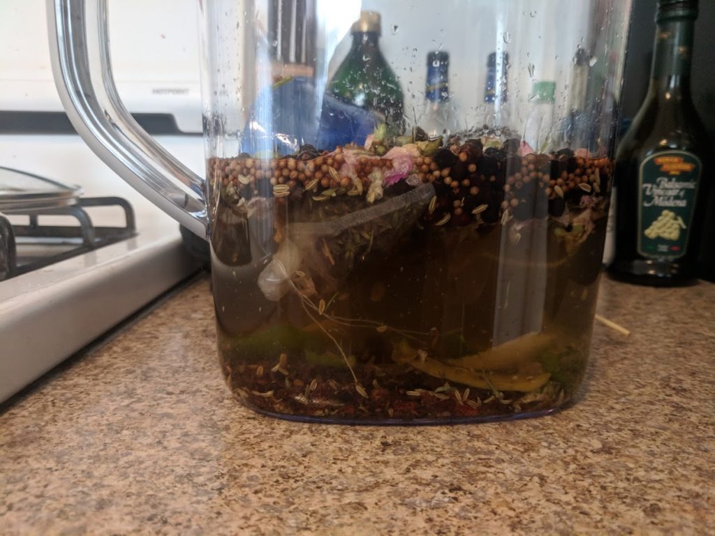
So here’s our botanicals for the vermouth: wormwood, gentian root, sage, cardamon pods, coriander seed, chamomile flowers, cinnamon sticks, half a vanilla bean, the rind of a lemon, and the rind of an orange.

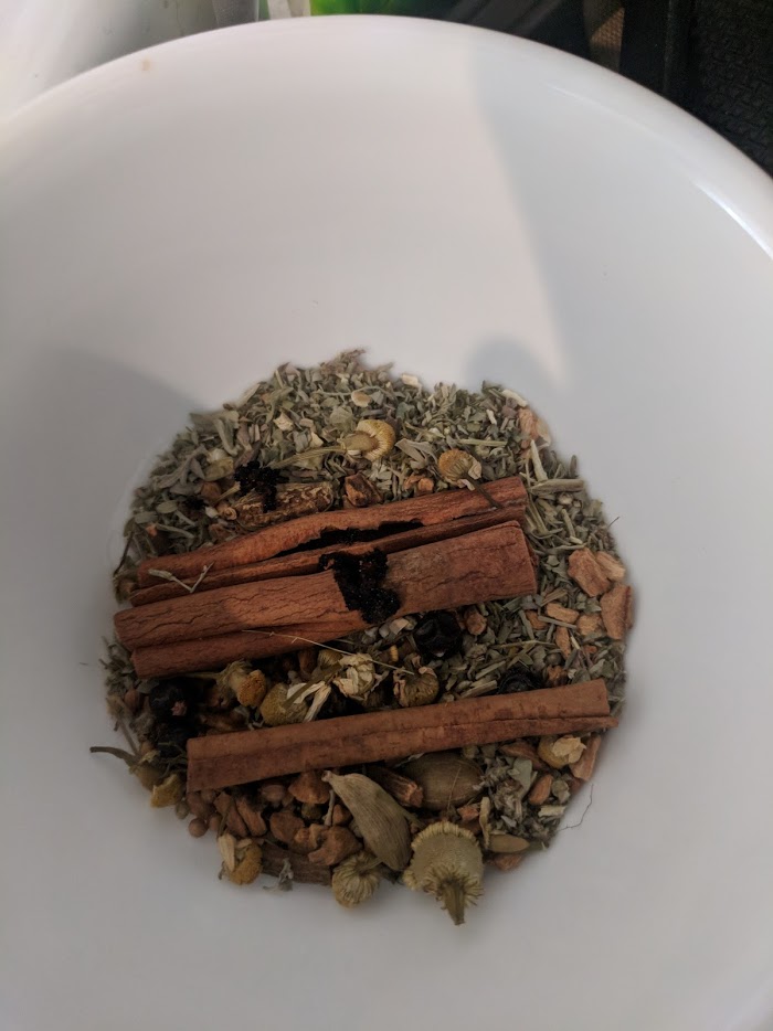
Here it all is as a tea-like mixture. I have to admit the chamomile bag is great just to open and stick your face into. I’ve really enjoyed that part of this whole experience: smelling and trying all these botanicals in the raw forms and then as a drink.

I put the loose botanicals in tea bags and then pour 1500ml of my wife, freshly racked over them. I’ve also added stabilizer to the mix to prevent the yeast from reawakening with the addition of a bit more sugar. As you can see here, the tea bags are floating, which is a bit of a problem. After some attempts to push the air bubbles out of them, I give up and tie them to a spoon and throw that in there too. Fuck it.

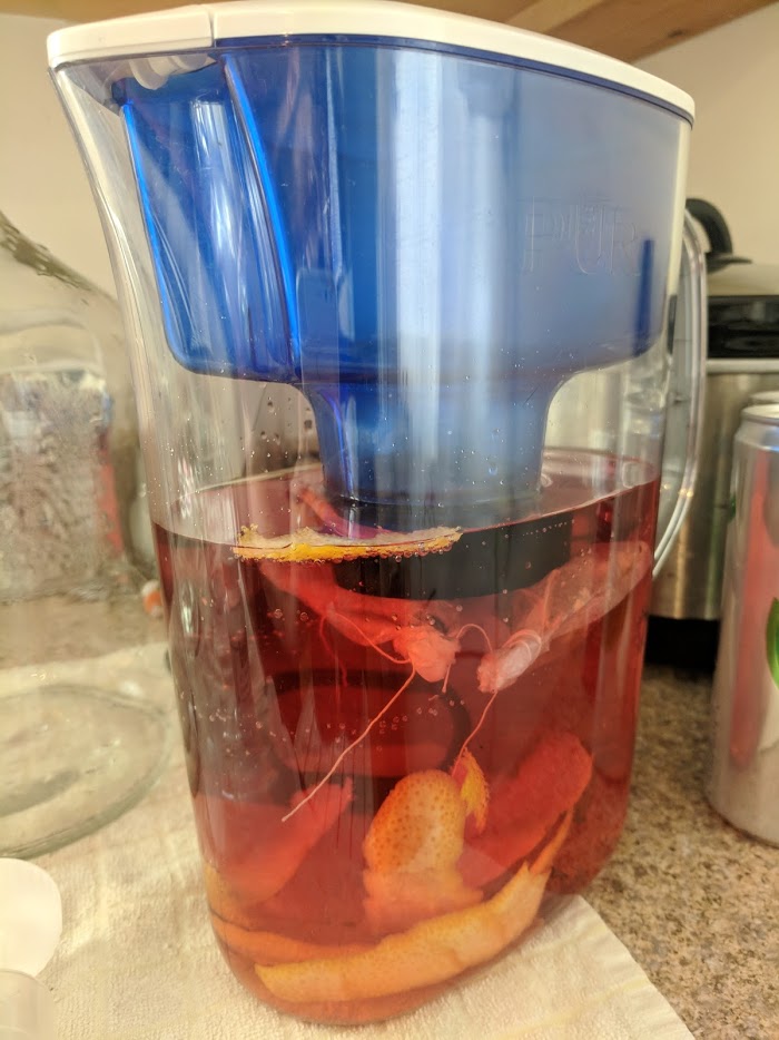
For those of you following along on twitter, this is when I made my Fuckitmosa, using the remains of the lemon and the orange. That was fucking amazing and temporarily held my cold at bay. I then took the mixture down into the spider den to await its fate.

Two. More. Days. Pass.

It is now day thirty-six or so.

I’m tired. I’m definitely getting sick. I’m over-caffeinated. And I’m tired.

Yes, I know I literally just wrote that bit above, but I’m also hungry and that’s exacerbating the whole problem. Also I just drank raw, warm vermouth so… you know… spoilers.

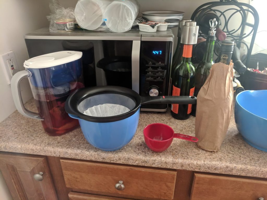
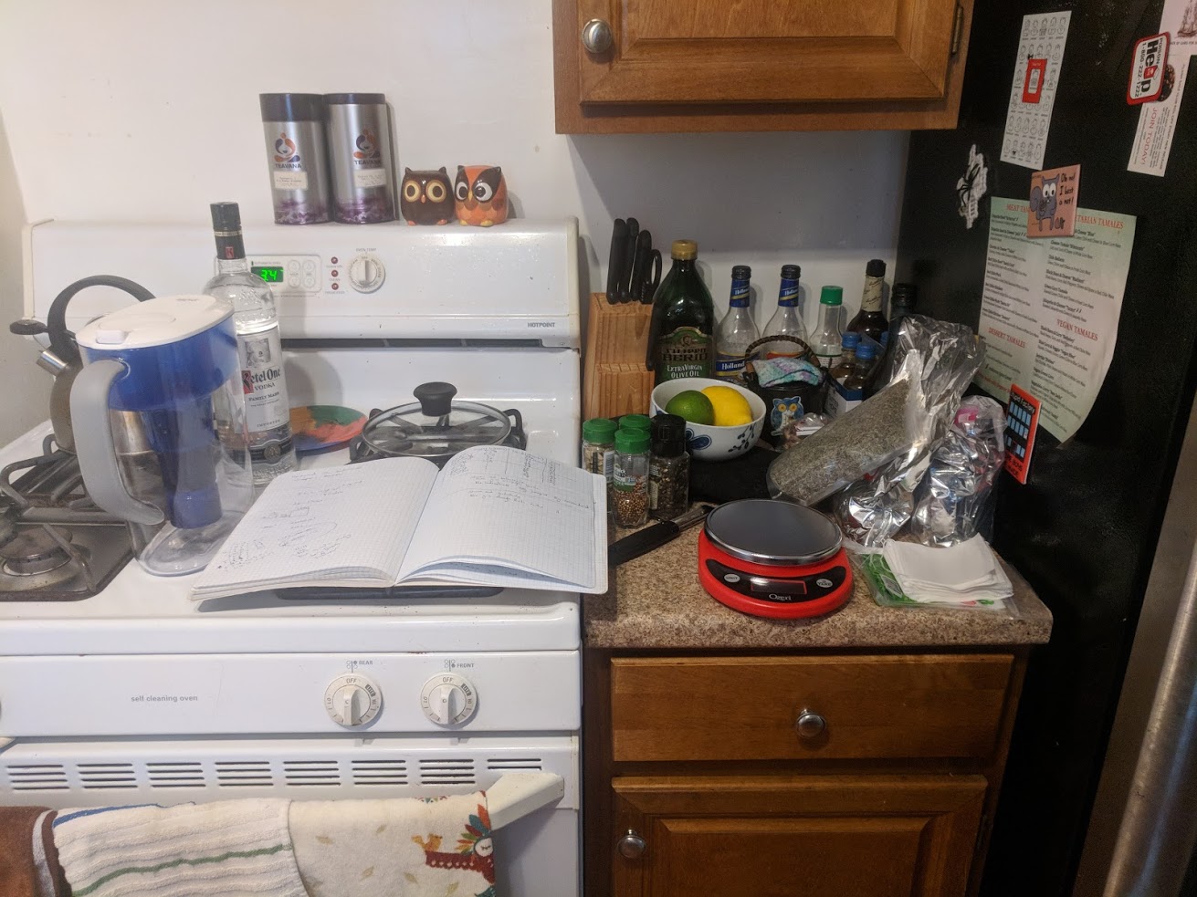
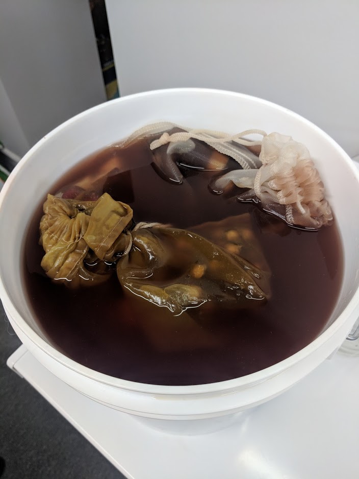
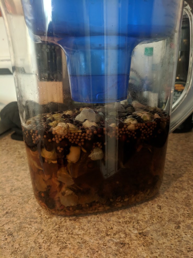
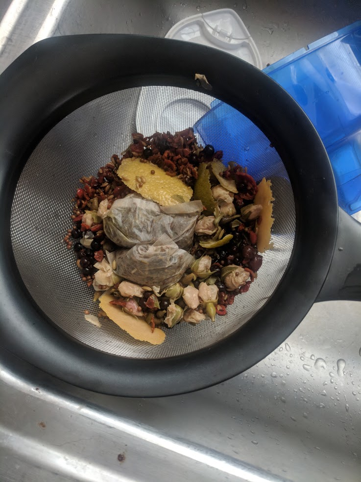
Here is everything we need to finish up, including a bottle of extra dry sherry, which is going to help fortify the vermouth. In this picture I’ve naively believed I’d be able to use a coffee filter to filter this. In time, I will be proven a fool.

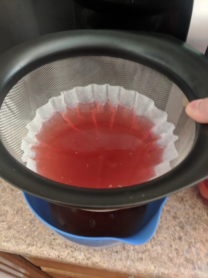
This is going abysmally slow and I have to hold it.

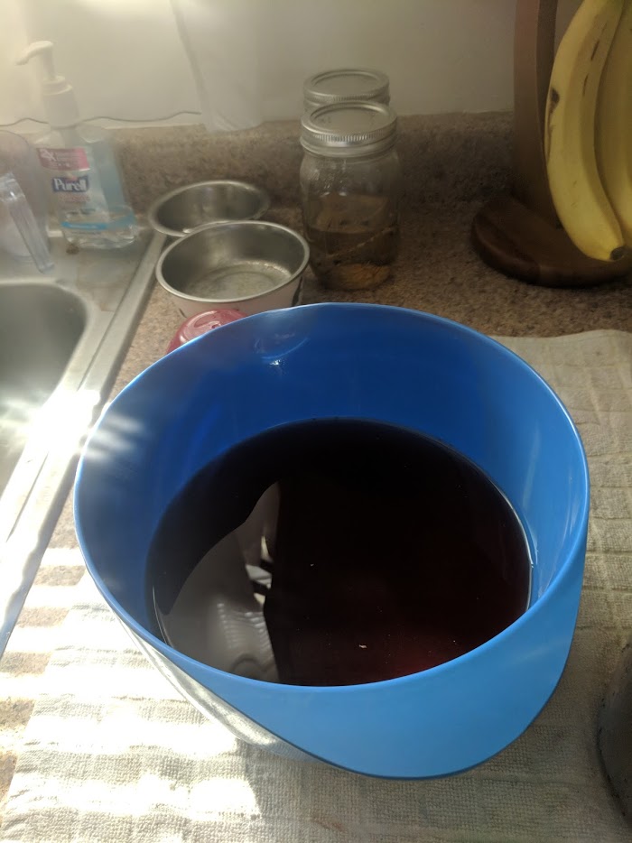
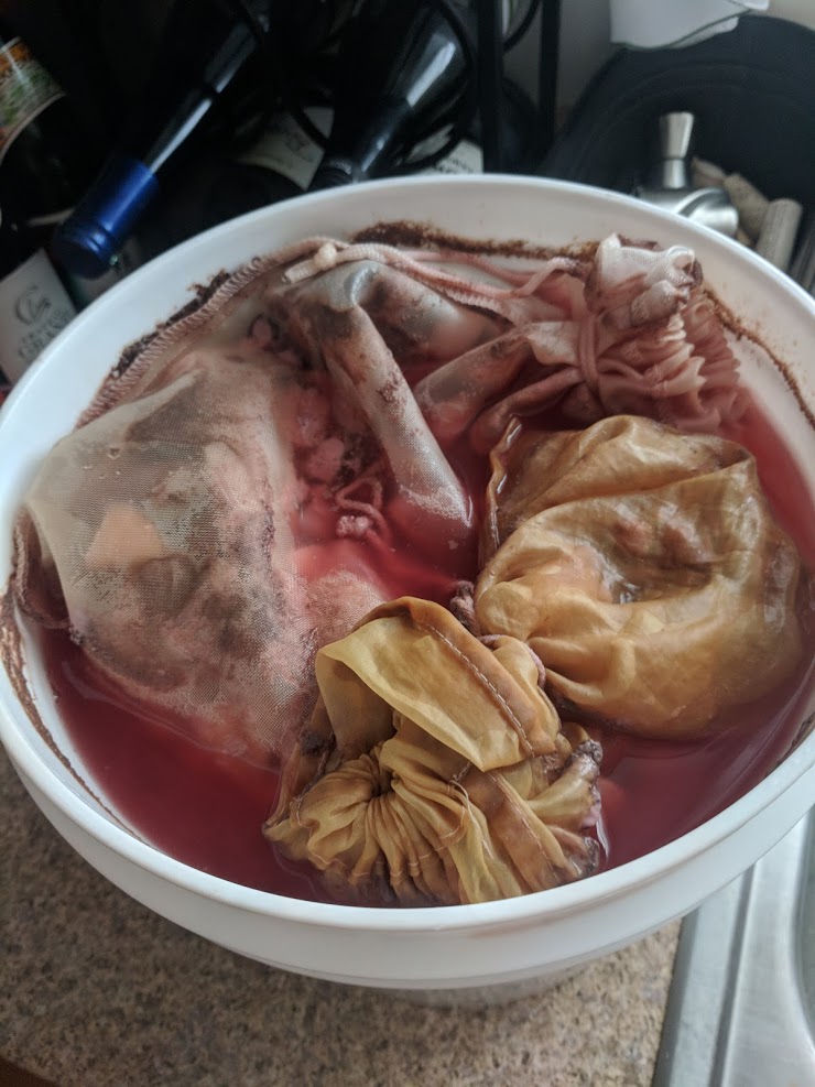
Just dumped it into the bowl.

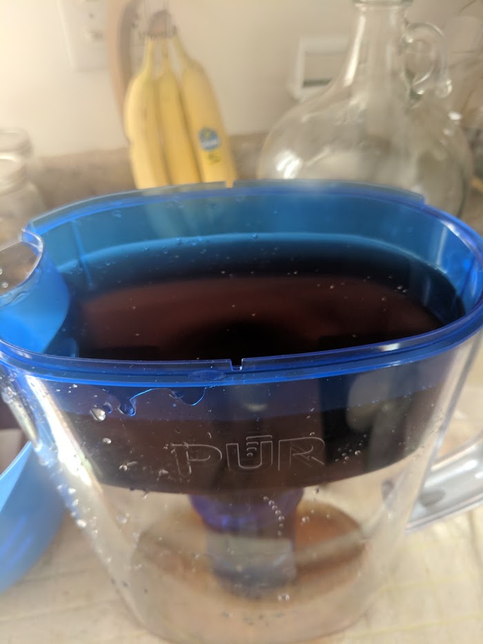
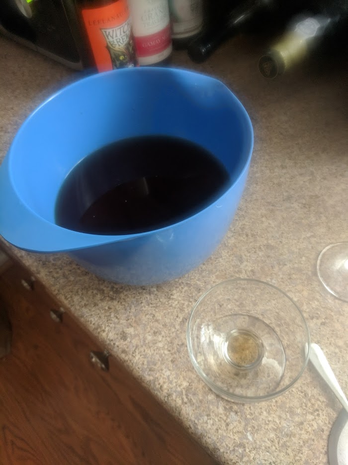
Then ran it through the brita. Not sure why I didn’t just do this to start, but again: hungry, tired, sick.

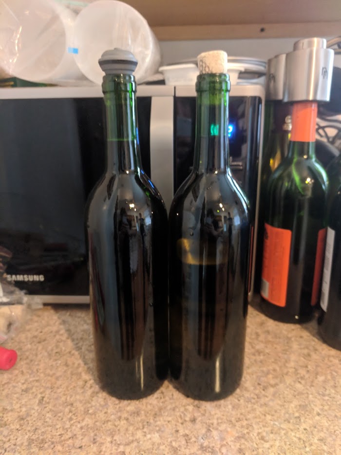
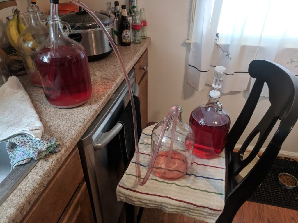
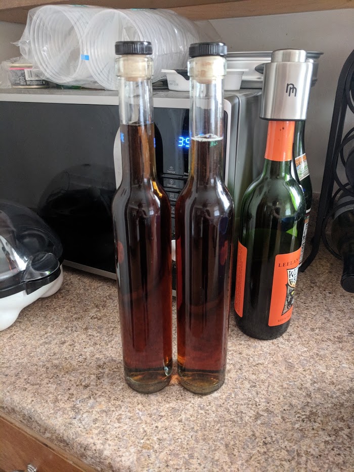
And there we go! The vermouth is done! I’ve corked one bottle and the other I’ve just stuck a stopper in because I’m going to pop it in the fridge and later tonight I’m going to finally have my fucking martini.

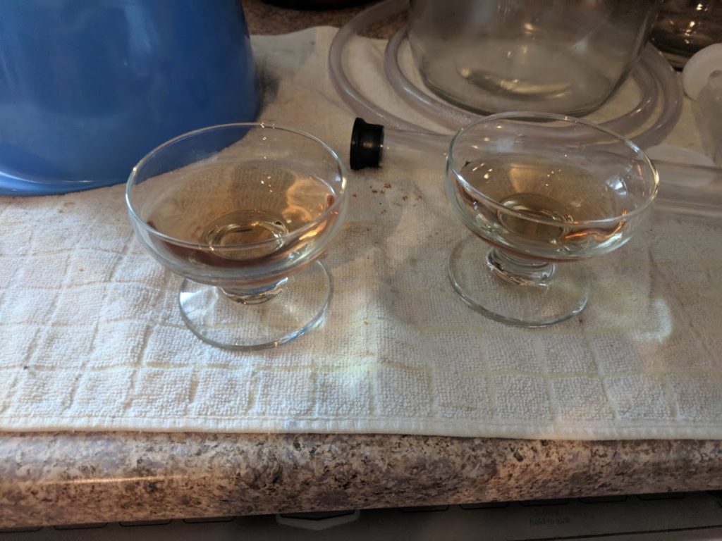
But first I’m going to try the vermouth raw. The color is very interesting, and though the whole thing started red, it’s a pale gold here. And the nose is really, really full of cinnamon and chamomile, but the taste is very, very herbal. I don’t think Brigid is going to ever drink that straight again, and honestly, I might not either.

I’ve been told sweet vermouth is good on the rocks with some soda water or even just as-is, but this? This might need a little something to cut the flavor. But it’s not bad, just strong.

GIN

Gin is a deceptively simple and beautiful drink. I was on the gin subreddit recently talking about what botanicals we liked in gin and the conclusion of my response was this:

I like being surprised with something new or unexpected, which I think is why I love botanical-based spirits like gin, vermouth, chartreuse, and absinthe so much. There’s a piece of the maker’s soul in there. They chose these botanicals over all others to give me a little taste into their minds.

The booze fridge in my basement is always full but the vast majority of it is gin. Gin gin gin-gin-gin.  Piney gin. Citrusy gin. VERY piney gin. Peppery gin. Detroit gins. London gins. Dry. Old Tom. Fruity gin. American, British, German… you name it, it’s probably there.

And everything that isn’t gin can probably be mixed with gin some way to make something better.

So I really considered what I wanted out of this gin. I had already done the compound process to mixed success. The flavors, while there, were very muted and it tasted, even when served plain, very watered down. I knew I needed to up the ante.

So up it I did.

This gin is a very floral gin. For one liter of vodka the botanicals were:

  • 45g juniper
  • 15g coriander seed
  • 3 cardamom pods
  • 6 pepper corns
  • 6g fennel
  • 10g lavender flowers
  • 15g rose buds
  • 20g rose hips
  • 3g lime peel
  • 8g lemon peel

The final ingredient, the rose hips which had originally been delivered in pill form, arrived on day 25 and I ran out and bought a liter of vodka soon after with Brigid.

Basically you weigh out and pour each botanical into a container and then add vodka. I also strain the vodka because I hate how it tastes.

And then you basically steep the botanicals in the vodka like you’re making a very slow, very boozy room-temp tea. This is called a compound gin, because the botanicals were not distilled with the alcohol. Distilling is illegal without a permit in the US because, among other things, it’s dangerous and can one can potentially  produce poisonous drinks by bottling the pure methyl alcohol that comes out at the start of the distilling process.

I have been told that the above is incorrect – that a small still would not create the pressures needed to explode and assuming one began your gin with a pre-distilled grain alcohol, there would (for obvious reasons) not be any methyl alcohol. 

Compound gins are far easier to make, and while they might have an ugly brown color, instead of crystal clear, they are absolutely delicious and you can make smaller batches to experiment with your favorite botanicals.

So after adding the first day’s botanicals, I put the gin in the basement next to it’s eventual partner in boozy crime, where it’ll sit (with an occasional shake) for two days. After those two days you have what appears to be a tea and smells like all hell.

What I do is remove the botanicals by running it through a strainer in a bowl, give it a taste, then run it through the filter, give it a taste, and repeat as necessary. Sometimes it is helpful to remove botanicals at day one and and add fresh ones, but this one I let sit for the two days. And the initial nose is full of flowers. It’s amazing.

The first taste was heavy on the vodka, and gritty. Both of these are easily removed by the brita.

So that’s not the gin you’re used to – clear as day, but it’s definitely gin. I took a sample to my lovely wife, who approved, and I bottled it up.

The initial liter of vodka gave us about 750ml of gin. There are some losses to the botanicals, though I did give them a light presing, as well as to the filter. I wasn’t suspecting it’d be that much, but it is what it is, and 750ml is plenty enough for the original task.

THE MARTINI

Twenty-nine hundred eight-five words later… thirty-six days… several herbal store orders, one botched rosehip conundrum, and a few drips to the liquor store for vodka and sherry. It’s all leading to this. Possibly either the best, worst, or most mediocre martini I’ve ever made.

So, I started off intending to make a 5:1 martini, garnished with olives, but a math error meant I made a 10:1 martini garnished with olives, so this is a bit out my normal zone.

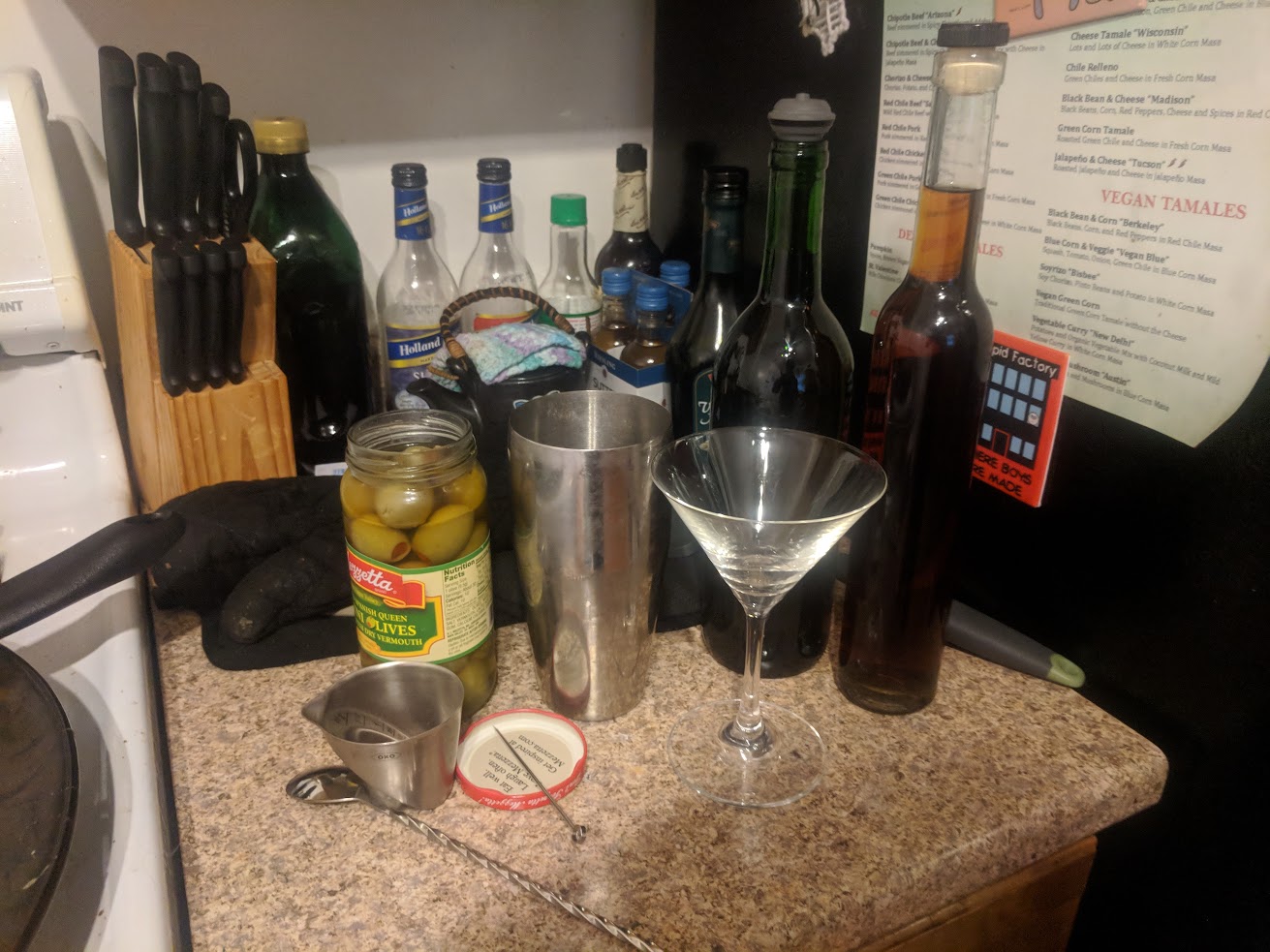
I gathered all the materials.

  • 2.5 oz homemade compound gin
  • .25 oz homemade dry vermouth
  • 2 olives

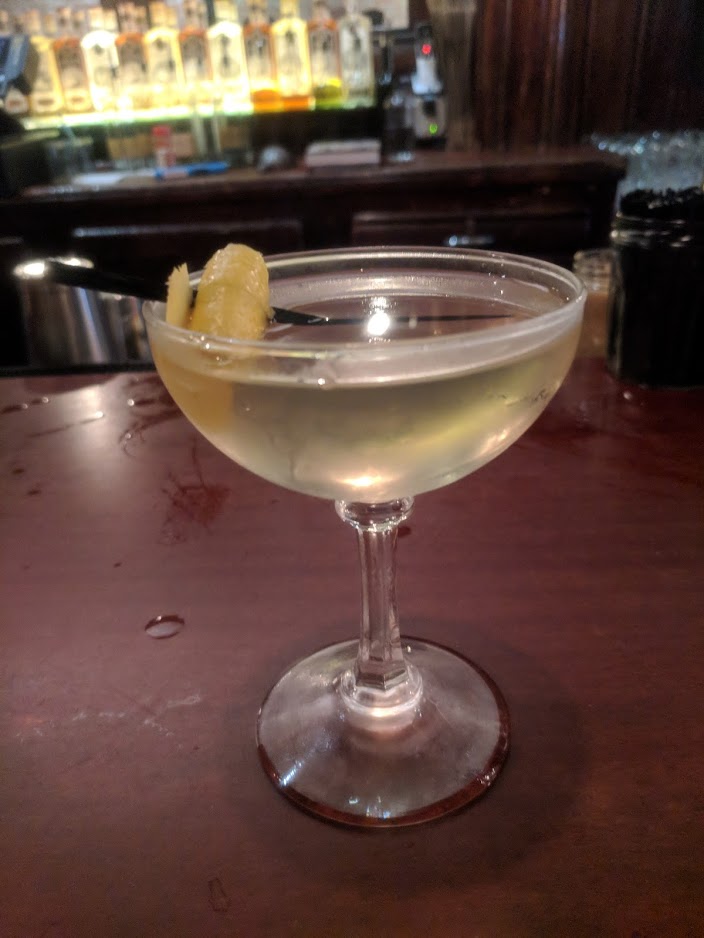
We’re going to stir with ice to combine and chill, then pour into a martini glass. When finished, it should look something like this:

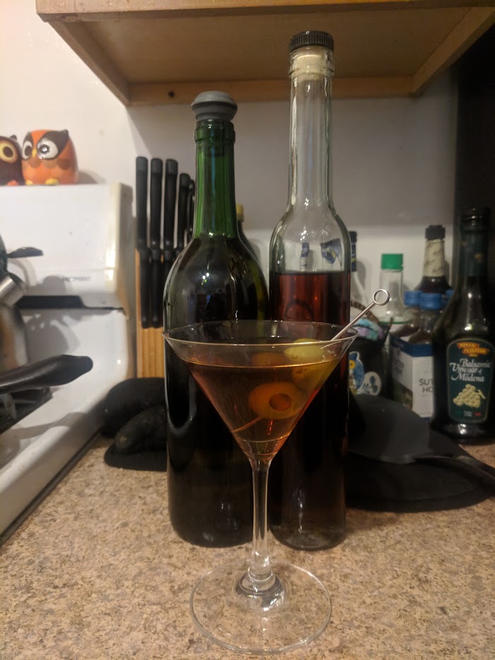
A normal dry martini is crystal clear, this is not. The vermouth is a pale gold, the gin a deep rusty red. Combined it looks more like a Manhattan or Martinez. At 10 to 1, this is a very gin-forward drink. The gin, with heavy notes of juniper with a floral bouquet on the nose fades into an herbal note.

Does this finish among the best martinis I’ve ever made or had? No. Far from it. The gin is a tad powerful and I think that even with a full half ounce of vermouth it still wouldn’t be enough to balance out. This might need a retesting at 3:1 or even 2:1 to completely balance out.

However, it is far from the worst martini I’ve ever had. As it gets farther down in the glass and the olive brine begins to soak in, it’s a bit more balanced than when I started.

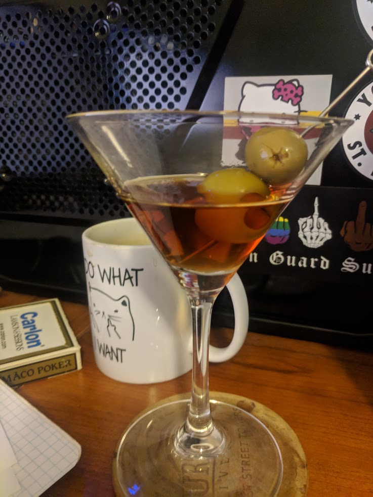
So there you go: a simple, straightforward way to make a martini, one of the oldest and most recognizable cocktails ever in only 36 days and probably close to a $100 in materials not including the equipment I had lying around for wine making.

Too often, I think, we often forget the craftsmanship that goes into the things around us; from food to furniture, from our cars to our cocktails. There is a primal sort of joy in doing something ‘from scratch’ from taking the long way home instead of the direct routes.

I like to step back and do those things when I can, and being as unhandy as I am, that can be both nerve-wracking and dangerous.  So when the opportunity presents itself, I don’t hesitate to take it. Whether it’s mixing a Trinidad Sour, choosing botanicals for a compound gin, or sitting down to write a chapter in a book. Sometimes it’s worth rolling things back as far as you can and retracing the steps of so many before you little by little.

If anything, I hope this very long update has inspired you to try something new, to explore the process of creation. And I wish you luck on that journey. Until next time.

Cheers.

The Kit Post – 2019

Cheers and salutations to the fifth annual Kit Post! Five years of talking my head off in these Sisyphean attempts to further my clout and reach as a kit designer so that one day I may be sipping martinis with Cristiano Ronaldo while one of my kits barely contains his physique.

For those new to my site, whether you hate-watch it or I freshly picked you up during the 2018 Detroit City FC season, welcome! Every year in August I make a post about Detroit City FC’s kits from that season and then make some “predictions” on what we can look forward to next season.

If you’re interested in the previous four, you can find them here:

2015 | 2016 | 2017 | 2018

Over the last several years, I’ve learned a lot about designing kits and how they are made. I’m not far from making the jump from “hobbyist” to “freelancer” and have actually had a few (three or four) false starts on that front. But each time I learn a bit more and come back a bit stronger. I’m also on the cusp of figuring out a way to just design kits and sell them, which I might experiment with. Things like my fantasy kits are probably the best place to start. So if you’re a fan of the Union Macenburgh kits, perhaps you should watch this site or my twitter for details.

My designs, I think, are significantly stronger than they were even a few short years ago. Partially because I’ve started using professional templates, but also because I’ve become better at translating the vision to the page. Still not great at logos. Not sure what I can do for that but keep working on it.


So let’s start with the 2018 Detroit City kits. I have some mixed opinions here and I actually managed to get a few things right:

  • Away kits used white socks with red flip-overs
  • We dropped Detroit Metro Chevy Dealers
  • I predicted the chevron for the home, we used them on the charity kits

Some things that I was completely wrong on:

  • I predicted we’d use the darker, purple-y maroon again for the home colors, we returned to just dark red
  • The away kits returned to white
  • I have *always* predicted a black charity kit, once again that proved not to be true (more on that in a bit)
  • We still didn’t pick up Stroh’s as the primary, but we did pick up Lyft; so welcome to the team Lyft
  • The Metro Chevy Dealers deal did not have multiple years left on it

Okay, but I got some hits! That’s better than nothing.

Last seasons kits can be ranked as thus: Away just barely hedges out Home, then a massive gulf in quality, the charity kits. If we were talking purely the tops it be a much closer race but… let’s just start there.

The charity kits, when first unveiled were already divisive. There’s the undercurrent of anti-blue in the DCFC fandom that is not surprising.  Our biggest rivals all wear blue (Lansing, A2, GR, the Cavs… apparently), so for us to don it as well is not going to be well received. There’s some evidence that the FO is just trolling, but whatever. I liked the sky blue tops, I liked that they still incorporated touches of gold and the rouge chevrons. The problem was everything else. When they were unveiled, they were unveiled with the white shorts and socks. That looked good. Later in the season, I noticed that the white socks that had been worn at the unveiling were not the white socks we were using that season, so I put a vote up. People supported using the away socks or perhaps sky blue socks. What we got was so much worse: the home socks and the home shorts… for some reason. It looked like utter garbage, a very rare miss for our kits.

The home kits, on the other hand, were great. I really liked the subtle nod to Dave Edwardson’s hometown for what turned out to be his final season (apparently, as of writing). The vertical stripes of Newcastle looked good in the two-tone rouge. I prefer the hoops, if I’m honest, but I also like breaking up plain-looking kits. I’m thinking that next year we’ll return to a more plain look. I really hope we avoid the mess of patterns offered by Adidas for the upcoming season. Some are descent… but others are just… bad. Like snow flakes? Really? For fuck’s sake Adidas.

Finally, the away kits, which were absolutely stunning. Loved them. Didn’t grab one because I’m a clutz and I don’t want to ruin a $90 kit. The touches of rouge in the collar and on the cuffs was sublime. That’s how you do an all white kit… by not taking “all white” literally. A few teams in our league, including DCFC a few seasons ago have worn what are essentially bargin-bin white kits from Dick’s that have had the logos and sponsors ironed on. That’s good for a team that pulls fewer fans out per game than it concedes goals, but for DCFC you gotta be cutting edge. This year’s away kits? Italian chef finger kiss Divine.


Before we continue, I have a few disclaimers for readers:

  • I don’t work for the DCFC front office
  • The DCFC front office fucks with me
  • Kits shown here are not official direction
  • Logos, league, and sponsors are used without permission
  • Sponsors and league are not official or necessarily endorsed by our front office
  • The reality of 2019 might be very different than what I predict here

So we’re nearly a thousand words in by this point so you’re probably going, “Nick, just show us your fucking kits,” which I think is a rational response, so we’ll get the show on the road.

Last year I wanted to focus on the possible, that is to say I studied some of Adidas’ available templates and based my designs off those. This year I’m not sticking to that so much. I want kits that are both possible, but also are a bit more involved. So with the next three designs I have one that fits the “fully sublimated” design, the “easily available template” design, and another that falls in between. I liked mixing it up and I liked getting to do some more complicated things.

I have a feeling one or more of these designs might be a tad controversial, but we’ll see.

One last point to address before I get started is that I actually reached out for feedback and ideas and really I only got three: pink/black combo, “verdigris”, and for the sashes from the 2014 season to return. I’m only going to address one of those points here: pink/black. I just designed a pink/black kit for a client and so I was not necessarily keen on doing it again. I love the pink/black combination and I’ll certainly revisit it in the future, but the timing was off for me so it’ll wait. However, I do hope everyone enjoys the one I did make when it comes out in a couple months.


The Home Kit – Soul of Detroit

My 2019 Detroit City FC home kits feature the Detroit city flag sublimated onto the front in the two-tone rouge that has become a mainstay for our home kits in the last few years. For an added touch, I alternated the colors of the sleeves as well to give the traditional feel of a quartered kit, a pretty common design in Europe but very rare on this side of the Atlantic, especially in the US.

I have a love-hate relationship with sublimation. I feel that it’s often misused to create these vastly complicated designs instead of bringing a fresh take on older designs (like using the quarters to create the Detroit flag). Gold trim on the collar, shorts, sleeves, and socks bring the overall look together – an otherwise disjointed design framed and united. Not unlike the city itself.

With the constant war in US soccer on an increasing number of “fronts”, including Detroit and now Chattanooga, I wanted to make it perfectly clear what team is Detroit’s team.


The Away Kit – Heart of Detroit

The idea of bringing back the sash from the infamous “kitless” season of 2014 (which also gave us the hoops for the first time) has crossed my mind, but having it specifically called out when I requested input made it too much to avoid.

The sash itself is two-tone rouge, like the home kit, to give it a bit of dimension, and then “trimmed” in gold. The gold trim on the sleeves and shorts remains from the home kits, but the collar switches to rouge, not unlike the 2018 kits, and I kept the red flipover with white stripes for the socks.

A repeat of the 2014 and 2017 seasons would be fantastic, picking up this under-rated beauty would be a great place to start. That and picking up a certain WMB.


The Charity Kit – Spirit of Detroit

So the suggestion of “verdigris” was a fascinating one, certainly got my gears turning for possibilities. For the unaware, verdigris is the color of weathered copper… featured prominently on old statues like the Statue of Liberty and our own Spirit of Detroit, which has been featured on every single Detroit City FC kit from the very beginning.

I knew right away I wanted to go into one of those “traditional” kit designs that are not common in the United States. Originally I started with the quarters, but I quickly shelved this. It just didn’t click in my head, so I switched the the halved design thinking that I could add some smaller details in it to give it some life. Sublimation ideas crossed my mind, including the statue proper, but like I said the statue is on every kit and I didn’t want it to look like it was a larger crest sublimated over the entirety of the kit. I also considered some golden pin stripes, but again getting too complicated.

What I chose is what’s here: the gold collar and trim on the shorts, sleeves, and socks as well as the verdigris and white alternate logo. Sleeves alternate color like the home kit (or really the home kit picked it up from here as this was the first kit I worked on) with the YMCA as the charity sponsor. Between the two halves I applied a bit of a staggering design to give it a bit of needed life without over-complicating the entire design.

This is absolutely, hands down, my favorite of the three. The choice of verdigris as a color was amazing, it works brilliantly with the gold and white and is definitely being added to my dossier of color combinations for later. If I had to pick one kit, just one kit for DCFC to actually make real, no competition: it’s this one.


So that’s that! Kit Post 2019 has come and gone and we’re still under 2000 words!

I hope everyone enjoyed the little discussion today and I really hope everyone loves the designs. As always, keep your eyes on my twitter where I often post snippets of, or even full designs for kits and in the coming weeks definitely stay tuned for some big unveilings that I have planned.

And what do you guys want to see? What did you like, what didn’t you like from the 2018 Detroit City kits? Let me know!

Cheers, everyone!

The Making of a Fantasy Team

Taldērszon, gamédunz!

I don’t often start my posts with conlang stuff, but I think today’s long-overdue post deserves it. Over this long break I decided to work on a project that I’ve been kicking around in my head for a while, specifically because it would combine my fantasy world, my conlang, some calligraphy, and of course soccer kits.

Well, technically hurling kits, but I digress.

For those who are new to the site, I dabble in fantasy writing; I’m currently about 3,000 words into book four with the intent to finish writing the drafts of the books before cleaning them up and publishing them one after the other sometime in the unknown future. One of things I like to do in my downtime is work on world building for the setting of my fantasy realm. This often involves long periods of working on nothing in particular but time wasters and stuff like that. But one thing I hit on a while ago was to do a fantasy World Cup, including all the participating nations and everything.

I got a lot of work done on that, but as I kept writing I didn’t like the idea that I was making much of the World Cup work invalid. So it became hard to focus on an eventually I gave up on it. Plus I found designing crests very difficult. I actually talked about this on a previous post and this is a similar post to that, the road one takes when working on a literal fantasy sports team. Regardless of the outcome, it was a lot of fun to work on and it definitely improved my design-sense when it came to soccer kits.

So, moving forward, I wanted a smaller-scale thing to work on. Something that was based in a part of the world that was decently fleshed out and unlikely to change too much – Hadyrland, the main setting for the books.

Makes sense, right?

Plus I’ve already worked on some conlanging and stuff, so I can make it truly fantastical. This is also something I’ve worked on in the past, though it was in the days before I got my PSD templates. The work even got me a nod from Azzurri, the Italian-based maker of kits. So that was awesome.

I’ve learned a lot since then, about how kits work and why there are design limits put on them. It gave me a lot to think about moving forward.

A recent-ish project you might’ve seen getting posted onto twitter were just huge dumps of Wikipedia-styled kits. I’m actually not done with them yet, but here’s the gist: five leagues of 20, 20, 22, 24, and 24 teams divided into four tiers, with the two 24-team leagues representing an East/West regional divide for low-tier teams.

Part of this was an off-shoot of another project I was working on to update my map of Hadyrland to be much more accurate and give me a better understanding of the human geography of the region. Accents, religion, income, population density. Part of that was adding the smaller towns and cities that surrounded large ones and that got me thinking about low-tier soccer.

So with the goal of making 110 teams, I set out.

I picked cities, names, years founded, tri-codes, colors, how many top-tier championships they had won, and even the “identity” of the club. Identities included political affiliations (including non-political and even anti-political), racial and religious affiliations, and in a few cases military-backed clubs. This really gave a sense for the world, the cities these people lived in, and what made them get up and go to a game in the morning.

The club that I wanted to work on was Union Macenburgh, which I mentioned in that previously linked post.

It was a club designed to have my heart from the get-go. A top-tier team that hadn’t given up its identity for fame, one that fed a huge Old Firm-styled rivalry with the big club across the river. It is the home club of one of my main POV characters and for a chapter in book two, we actually get to go to a game (though a game long before the rules were ever really codified outside of the local “understood” rules).

So I started at the base-level. What is “Union Macenburgh” in Hadysh?

Well, that was pretty easy – Macenburgh is “Moxn” in Hadysh. Union is “Opubfę”. Combining them it’s Opubfę Moxnd (with the “d” at the end sort of being like an ‘s in English).

Cool. That’s done.

Next was the crest. 

I wanted to work with a monogram-style, much in the vein of the baseball work from last time. The crest is the club’s name abbreviated (OMd). I debated having the d as a superscript because it’s not really an initial (we’ll see this later), but I liked how it came out when it was at an even footing.

Hadysh is a unicase script, meaning there’s no upper or lower case letters. It’s heavily based on the Armenian and Georgian alphabets, which I think are truly beautiful. The influences from Armenian are much more apparent, with lots of u-looking glyphs.

This particular font is “Western Blackletter”, or a script that arose in the western part of Hadyrland (where Macenburgh is). It differs slightly from Eastern Runic forms and it’s decedent systems. I can make a whole post on that, and I probably will, but later.

Next I did the sponsor:

Here it is another abbreviation, this time for “Opubfę Acléęttaƥin ț Unħódna Moxnd” which means “Macenburgh Dockyard and Packing Union”. The though process here was even though this was a big team, it still pulled from local companies and groups for sponsorship, usually with a focus on manufacturing and labor, which is a vital part of both the club’s history and the city’s financial security. Macenburgh is a twin city with Blackwater Port, which the later being the more economically well-off and globally powerful. So if Blackwater Port is New York City, Macenburgh is New Jersey.

This also gets into a weird little tidbit about Hadysh: most conjunctions (like “and”) are single sounds. If the word following starts with a consonant, you add a vowel to the end, but you don’t write it, it’s implied. But that means the ampersand for Hadysh is just another letter on the keyboard, not hidden away above the 7, which is good because Hadysh has two numerical systems…

Anyway…

From that previous post on Hadysh hurling, Macenburgh’s main colors are maroon and gold and they generally wear hoops, which is usually, but not always, a marker for working-class teams.

The last bit was a bit of a slogan, one that if you’re a St. Pauli fan you might’ve seen.

Now for this I used the digital font I’ve been working on for a couple months now, so unfortunately there’s no scan document to show.

Get the easy bit out of the way, the lower bit is a name, “Ulēmad”. The top bit is what we’re interested in, “K̦o kémõ za ay͂a̋fa̋nyodda̋õs” – No Hurling for Fascists.

Ay͂a̋fa̋nyodda̋õs was an interesting word to come up with. Most, if not all, of the vocabulary I have thus far is not modern in sense of what words are available. I might have “cart” but I don’t have “bus”, I might have “pen” but I don’t have “computer”.

But the idea of “fascism” is a modern term so it required a lot of work, more than usual. First I needed to expand my fixes to include “ism” and “ist”. For the former, I used a modified instrumental case, dropping the object fix at the end and only keeping “a(~)-“. The ~ marks that the fix causes nasalization to the next consonant if that consonant can be nasalized. For “ist” I used “-daʊ̯”, which is the Hadysh fix for “-er” in English (e.g. Runner or builder).

The English for Fascism comes from the Latin fasces, the axe surrounded in a bundle of sticks. It was a symbol of the Roman legions and was co-opted by the Italian Fascists.

I didn’t necessarily want to get this deep (shocker, I know) into a project that was already ballooning out of control in size and scope.

To make a long story short the word breaks down into:

a(~) + ja̋f + a̋nyo + d + da̋ + õ + s

“ism” + “federation” + “nation” + genitive marker + -er + object marker + plural.

Yes, that means in Hadysh both “ism” and “ist” are going to appear in the same word. It’s just another quirk of an already quirky language.

After all that, or really, during, I worked back and forth, I got to work on some killer kits.


The home kits were pretty easy, rouge and hoops are like my calling cards, getting to use the gold was a huge plus, I was happy to not always be doing “shadow” hoops. 

Awwwww yeah.

I am super pleased with how these turned out. The dual-tone of maroon and darker maroon. The sponsor in the middle was a bit of a sticking point, switching between white and the darker shade of maroon from the outside of the kit, in the end the darker shade just wasn’t legible even at this scale, so I had to switch to white, adding another color to the mix. Oh well, I think it is still clean enough to work well.

The shorts have the crest on the right pant (our left) and the player’s number (in this case “9”) on the other. I debated going with hooped socks, but I left it with just the flip over, a favorite of mine. Sleeve cuffs are hard to see, but they are the lighter shade of maroon with two gold bars through them. Breaks up an otherwise plain sleeve.


For the aways, I wanted to go for a simpler, old-fashioned look. On my league sheet, I had white kits with maroon cuffs, collar, and short bottoms. I basically planned to take that whole-sale but with a minor tweak or two.

Instead of white, I went with silver. And instead of plain, I brought back the hoops as shadows to tie it more closely with the kits above and the club’s history.

The outer edging was dropped, though, so the hoops run from side to side, top to bottom, with nothing in their way. Compare this to the home kit with the darker maroon framing the hoops on three sides. I dropped the two stripes on the cuff in favor of a solid color, and all the trim pieces are the same color as the logo, crest, and sponsor, giving the whole thing a very cohesive look. Clean, simple, classy.


Recently I’ve been doing more than just field players, I’ve wandered into the realm of keepers as well. And in the case of this project, much more into the rest of the kits as I did rear views as well, which had their own issues. Anyway, for the keeper kits, I try to go for the radical departure. For example, in my portfolio there’s a mockup for a non-existent “Grosse Pointe United” that uses blue/gold/white/black for the field players and carries that white/black over to the keeper kit only to replace the blue/gold with orange.

Here I went with green/white/black to compliment the maroon/gold/silver from above. It’s also important to note that these are the national colors of Hadyrland. On the left leg (right for us) the player number has been replaced with the branding logo. Otherwise it is a particularly “normal” kit for me. One difference is the gradient-shadow hoops in the green bits. They’re meant to be hardly noticeable, just a fine detail.


So it’s time to bring them all together and do a sort of mock-announcement. I know the next on right of a kit is sort of a thing I do, but in this case I didn’t have the time to do much else. I was thinking about trying to class it up, but how? Unfortunately my talents are still limited. Maybe in the future I can get some kits made and then shoot some “real” footage.

Ah well.

The labels under the kits read “home”, “away”, and “keeper’s”. The text in the upper right reads “Your 1423 OMD”. I liked the idea of having the crest as part of the statement, rather than above or below it.

So that wraps up this monster of a post. I hope everyone  at least found it a tad less controversial than the last one. With the DCFC season picking up and my writing still flailing around, no idea when I can get updates on my actual books and stuff, or even make sure this gets updated more often than once a quarter.

Cheers, everyone.

Forest City – Or: Breaking Comfort Zones

So this post has been a long-time coming, originally meant to be posted way back in November, I was dealing with some other issues that I glossed over briefly in a twitter thread in the context of talking about my daily word counts. Right when I was hoping to get this out, during a four-day weekend around Thanksgiving.

That didn’t happen.

Actually, thanks to some work-related stressed that spilled over into my real life, not much of anything got done. Including my normal writing or perhaps a bit of blogging.

Anyway, this has been postponed long enough.

This is a project that has been floating in the back of my mind for quite a while now, namely it is a rebranding of a team that has caught some (justified, if you ask me) ire lately due to their name and their iconic mascot: the Cleveland Indians.

For the uninformed, I am a Cleveland native and not much of a baseball enthusiast, but that itself needs some discussion. I don’t care for the actual sport of baseball – which I find a boring, tiresome drag – but I do love the traditions of baseball – which I find fascinating and lovely in a quaint kind of way, but it’s a good quaint, like finding a small midwestern town and stopping in a dinner for a shake, having a great time, and then asking yourself why you don’t do it more often.

Cleveland’s mascot, the maligned Chief Wahoo, goes back a long way. He’s, in short, a caricature of a 30s racist rendering of a native american man. And as of writing there are a lot of signs, including selective marketing images and the ever-present rumble of political correctness gone mad that Chief Wahoo is about to be binned permanently.

And good riddance, though it does mostly defeat the purpose of this post.

There’s a lot of ways to deal with this issue and Cleveland is taking pretty much the compromise route in that it’ll leave most people unhappy, but I can’t speak for the native americans in the least, but the name “Indians” is still there and there’s still baggage with that and I know for a fact that people were running out and buying up as many Chief Wahoo hats as they could so they’d have a stock to either sell when they get rare or to wear at games as long as possible.

That strikes me as a little crazy, to be so dedicated to something that is causing a peoples whose history since 1492 has been “how low can low go” feel even lower. Perhaps sports and empathy aren’t supposed to mix in the minds of many, but I’m not of the many. Sports are about empathy and community. So let’s cut to the case.

I’ve been waiting for nearly three years to have the ability to rebrand the Cleveland Indians. Three years. It came in steps. First it was finding the TIF-based images that allow me to work in a pseudo three-dimensional space. Those are the kits you see quite a bit both on this site and on many other sites. Second was finding a baseball version of that template. There’s been one floating around for a few years, and they’re gorgeous, but they’re also $80, which is a bit more than I expect to ever make from this project. But, in the last few months, one did come out, and it’s a pretty good one, cutting much of the kit into much smaller chunks than the soccer ones.

So let’s begin:


As these things usually start, some disclaimers: this is a personal project. I have not discussed any of this with anyone remotely representing the Cleveland Indians nor any group advocating the removal of Chief Wahoo. 

These are not official, sanctioned, &c &c. 


In 1868 an amateur baseball team formed in Cleveland that, following the Cincinnati Red Stockings, joined the professional ranks in 1871. This team, which would only play two seasons at the professional level, were the Cleveland Forest Citys (note: not “cities”).

They finished their existence 16-35, as this was back when teams played once per week.

This is where I am going to start – with a plucky little team in 1871. Now, Cleveland had other teams between then and now, but I wanted to focus on the Forest Citys for a few reasons:

  • The 150th anniversary of professional baseball in Cleveland is 2021, a scant three years away
  • “Forest City” provides a much more blank canvas for me
  • I wanted to focus on the tradition of baseball rather than aim for a “Disney-fied” team name like “The Spiders,” though a strong case can be made for “The Spiders” and I’d love to see someone tackle that
  • I believe that by mixing a strong heap of history into this mix, it will be better received by fans and…
  • An all new look and theme will help discourage people wearing Chief Wahoo gear to future games. Sure the die-hards will never stop, but I think that more casual fans will just buy a new cap and eventually a new shirt and it’ll be pushed out of the system quicker this way. Keeping the “Indians” name does nothing to discourage this behavior.

My starting point was the logo. If I couldn’t get that done, I’d be in trouble. I’m no good with vector programs, I’ve just never had time to sit and watch enough tutorials to get good at them, which I have a project to hopefully change that… more on that later.

So for this we went the old fashioned route. I blew up that picture above, picked the most straight-on dude, cropped everything out, and printed out a giant FC monogram. Which I traced. Three times.

Here’s the start of the initial tracing.

This is the finalized trace of the monogram. But just in case, I wanted the letters separate, so I then used my trusty clipboard to make two more tracings.

And then finally:

I scanned these in at 600dpi black/white so I could then bring them into photoshop for post-processing.

Not the best, but I’m very happy with how it came out.

The next thing I started to work on was the color scheme. I’ll admit to being ignorant to what colors the original Forest Citys wore. I probably could’ve done a deeper dive into some historical records, but in the end I knew I wanted forest green for some pretty obvious reasons. Alongside green, I wanted to stick to the traditional colors of black and white.

So I loaded up the wikipedia page for shades of green, and began to pick and choose some of my favorites, building a palette of colors to ponder over and consider. The final cut of those looked like this:

Each one had pluses and minuses, some were too blue, others too grey, some too green even.  The one that I chose is the second from the top. I think it balanced out the dark, the greens, the blues, and the greys. For those interested, it is called “Brunswick Green” and was historically used in many settings including auto racing and passenger cars on trains. It’s also sometimes called “English Green.”

So with the logo and the color scheme picked out, it was time to design some baseball ki… um… uniforms.

Going into this project, I knew precious little about how baseball uniforms “worked” (for lack of a better word). Generally, in football, you have a “first” kit, which is strongly rooted in tradition; a “second” kit, which can be rooted in tradition but more often is a canvas for creativity; and a “clash” or “alt” kit, which is almost always a departure from the norm and is intended for use either as a charity thing or in case both the first and second kits are ruled to clash with the home side. This actually came up recently: in the Hibernian vs Celtic game on the 10th, all three of Celtic’s kits were ruled to be “clashing” and they were forced to dig out last year’s charity kits in order for the game to start.

Baseball teams usually have three or four uniform choices as well. A white set for home games. A grey set for away games. And then a number of “alternative” sets that are colored and may be used whenever. There are some other rules that seem to come up. First home sets usually have the team name/logo on them. Away sets have the city name on them. And alternatives have a bit more leeway.

There’s some history behind this. Back in the day, grey sets hid dirt, so require less laundering – an advantage when you’re on the road and don’t have access to your cleaning facilities. Whites required more cleaning, but the home side did have access to cleaning facilities, so that’s not a problem.

The team vs city name basically came from fans know the home side by their name, but might not know the away side. Back before cell phones and access to a constant stream of electronically broadcast information, this was a legitimate concern.

These traditions provided an interesting design space for me to work with. And there were other concerns, thoughts, and ideas as well. For example: Pin stripes? Or no? Monogram? Or team name? “Old English”? Or Block?

If one thing is obvious so far, it’s that I chose to go with a monogram over a mascot or one of the more “modern” names that are based off some kind of [NOUN]. I wanted to go back to a very traditional looking form.

The Home Uniform

For the home uniform I went with pinstripes, which I think is probably the most controversial thing you’ll find in this post (other than the concept of entirely removing the branding of a much-beloved MLB franchise). Brunswick Green dominates the secondary features: pinstripes, undershirt, cap, belt, buttons, and stockings. Instead of a team name, I went with the monogram over the left chest. It gives a clean look that really lets the pin striping do the heavy visual lifting. White accents the caps both in the monogram and the stitching.

The Away Uniform

Brunswick Green continues to be heavily represented in the secondary features here, but the plain grey with block lettering takes over in the traditional away uniform. A few features remain from the home uniform: the piping on the sleeve roll-over for example, and the two pinstripes on the front-most belt loop. The cap is still green with the white accents, now with the block C in white front and center.

Alternative One (Color Uniform)

For the first alternative or color uniform, I went with a Brunswick Green jersey and plain, white pants. The stockings are no longer a solid green: they have black flip-overs. The piping on the jersey’s sleeves has been removed for a crisp, mono-color look. The undershirt and belt have been made black and white is more heavily featured on the cap, which instead of all green with which stitching, now has a white bill and green stitching. The monogram returns, this time in white with a black stroke.

Alternative Two (Color Uniform)

In many ways this is the inverse of the previous uniform, though the white pants remain. Undershirt and belt are Brunswick Green. This uniform has black stockings with green flip-overs, the piping on the sleeves returns in green. The buttons remain green as well. The jersey itself, though, is black with green block lettering, stroked in white. The cap is black, with a white bill and green stitching. The block C is featured here in the same green/white combo as the jersey itself. Of all the uniforms here, I have to say that this one is the most striking to me. The combination of the dark green, black, and white really comes together here. Especially the white stroke around “Cleveland” and the block C.

Over-all, I am extremely happy with how these four uniforms turned out, though perhaps I am a bit biased about that. While I have no doubt that the Indians are probably not going to do a complete rebranding this late into the argument, especially with stiff resistance from a vocal part of the fan base, it would be fantastic if they did or maybe even considered a heritage match in 2021 celebrating 150 years of professional baseball in Cleveland.

If you are one of those vocal fans, I really do hope you give this some though, or at the least, you like the designs from an abstract, objective view (rather than thinking of me trying to replace your team).

As always, I hope everyone enjoyed this rather long read and liked the designs I came up with. This has been a bit of a passion project meant to force me out of my comfort zone by designing for a sport I am not quite so familiar with, that has a few more, stricter rules, about what can and cannot go into a design.

Thank you so much. Cheers, everyone.

Photo sources (other than me for the monogram process shots):

Forest Citys: Case Western Reserve

Stock art: pixabay.com

Mythology

Eight thousand (ish) years ago, my ancestors sat on the banks of the Black Sea in a region that is now Ukraine and looked out over the waves, probably telling stories. By all accounts they had a language, but what it was is unknown, and they had religion, which we do know a bit about. The stories they told around the fire or in holy places were probably not all that different from the ones we tell now. They’d speak of divine intervention, the power and might of warriors, the calm and love of healers.

Today, we speak of the same things with the same reverence. We build the same mythologies, these stories that might have no importance to someone outside of the tribe, or might be thought of in the opposite like, a tale of woe a tale of glory; a tale of victory a tale of defeat. But the sharing of these stories, the telling of having been there, of having felt the emotion first hand, will only last so long. These beloved memories will slip fully into myth.

But they also slip into myth today, in real-time, whenever they are recounted to someone who had not been there. Or every time we add a little detail, subtract a little detail, or embellish something a wee bit. When we let emotion get the best of us and blind us from an objective retelling, because an honest retelling not need be constrained by reality.

I’ve been thinking about these modern myths recently because a coworker asked about my desktop backgrounds, modern cave paintings depicting warriors in celebration or battle. Warriors wearing rouge and gold and those who see them off to battle sounding horns and manipulating the battlefield with smoke and fire. He asked what they meant and so I told him in a rather round-about way. I didn’t tell him the objective truths behind the images; I told him the myths, as real to me now as they were when I witnessed them with my own eyes, my own ears.

I told him of the great warrior WMB, swift as the wind, as nimble as a bird, who with strength and resolve dashed our foes, the vile Lansing, breaking them forever, never to rise from field again.

I spoke of the Dragon, who with rippling abs too numerous to count, dug in and rescued our forces from defeat in such a glorious way that the songs of our people summoned forces far greater to extinguish our fires.

I regaled him with the story of the beast Louro and his one-man-stand against a great stag, and beating his chest when he left that monster bloodied and dead in its own meadow. And of when he raised that golden belt above his head, surrounded by a grateful tribe who had traveled seeking revenge.

And the mousy knight, with his right foot of destiny, when things looked tight and bleak, and that our wall of brick would be called upon to save the day, did lay low that monster from the suburbs in the ninety-third minute.

But not just warriors, I also told tales of great journeys to far off lands. Of invading Cleveland (a story that I told second-hand), of bus trips to sleepy towns in Wisconsin, or converging on a field of corn in the midst of a thunderstorm.

Of friends from far overseas who came in celebration, of culture shared, history shared, of pride shared.

I told him of foes.

Of dances that could’ve lasted forever.

I spoke of friendships that were forged with one who should’ve been our enemy, but when we saw him on the field, leg shattered, we rallied around him, brought him care and comfort. Sent him home more one of us then one of them.

There were great community gatherings, of celebration, of care, of community coming together to fix a chariot, or to heal one of our cherished sisters.

And too, I told him of that darkest moment, when things looked grim, and the vile enemy did have the advantage three to nil, with one of our warriors out of the fight. And how our songs never ceased. How our voices lifted and united. And slow and steady our warriors fought back, and before the day was over, found ourselves evenly matched. And the great warrior Seb did celebrate as a windmill, standing strong over a field of rouge and gold tulips.

He listened with eyes wide, he understood what it meant, that these were no ordinary tales of gallantry, these were myths, enshrined forever by the tribe. They would only grow brighter with time, a little fuzzier sure, but no less true, no less glorious.

In the nascent days of a kingdom, these myths bind us together, and they tell of who we are, what we stand for.

The Kit Post – 2018

Welcome to the fourth annual Kit Nerd Day!

That’s right, I’ve done three of these already, and so far I’ve successfully predicted literally zero of the kits. Of course, that isn’t necessarily the point. The point is for me to have fun and for you guys to get a gander of all the crazy ideas constantly going through my head.

For those new to the site: every year around the end of August I do a post with some ideas and thoughts about next season’s kits. So just to repeat, these are ideas for the 2018 season.

And, like always, let’s start with some disclaimers. First, I am not a professional. I don’t work for Detroit City FC or any of the major kit design companies. I’ve used all images without permission. Nothing I post represents an official direction of the front office or any one tangentially involved. Remember – the FO actively works to fuck with me and they’ve even told me.

Any potential sponsors/leagues, these are not endorsed by the FO, the NGS, or anyone else. I make them for fun.


So the first thing is thoughts on last year’s kits.

Fuck. Yeah.

I mean, that was a crazy season. Beat two professional European teams. A new record-sized crowd was there. We won the Midwest. We attracted attention from all over the world through our friends at Copa90US. Keyworth’s stands are nearly completely opened. The “Wolfpack” started as a meme and ended up as a rallying cry. I got to meet Peter Wilt, who’s setting up NISA, in the stands at the Key. So that was pretty awesome from just a soccer-nerd standpoint.

Oh.

And Lansing blew a 3-0 lead.

As for the kits: the hoops returned! We did actually get throwback kits (to the ’67 Cougars). We even made the long-desired, long-awaited switch to Adidas! That’s fucking awesome. These kits were way better quality than the Nike’s. Way better. They did come at a higher price tag for us, but damned were they fucking gorgeous.

Across the board they were fantastic. From the hooped rouge on rouge on rouge kits to the golden away days kits (which saw quite a bit of use at home) to the fantasticly simple charity kits to those drop-dead gorgeous Cougar throw-backs. There are three 2017 kits in the Kendall-Collins household. I feel that is too few, but it is what it is.

Adidas pretty much owns US soccer, namely through their agreement with MLS, which IIRC was just renewed. Nothing of their really struck me this year. Portland’s home kits are more reminiscent of their third kits from previous years, which is nice.

Atlanta’s kits are pretty good. I’m a fan of the black/red combo and the grey and red makes for an interesting away. Columbus got their yellows back. That’s good. New England has an interesting 50/50 kit, rare on this side of the pond.

I noticed a few “default” designs either leaked into MLS or out. Atlanta’s home kit. NE’s home. Columbus’s away. Houston’s away. Plus any solid color kits. Not a good or bad, just something I found interesting.


Okay, some thoughts about DCFC kits in general before I move forward with unveiling my designs.

According to Crain’s the deal with Adidas is a multi-year agreement. That means I can pretty easily open up the Adidas miTeam app and fiddle around. But instead of using their kit builder, I’ve chosen to instead create some designs based on what’s available in the kit creator. So these designs should be entirely possible for Detroit City to don for 2018.

Moreover I’ve learned about when they actually put in the orders, so… I know that I’m ahead of the curve here. Fingers crossed. Is this the year we get the Nick Kendall kits?!

We’ll see.

One last note:

Sponsor – Stroh’s

After the loss of Flagstar as a sponsor, I’ve had to switch it up. I’ve more or less fallen into the rut of using Stroh’s because damn it looks great on our kits. Now, I don’t actually think this will be a thing because I think the deal with Metro Chevy Dealers also has multiple years left on it, but I’ll be damned if I stick a bowtie on my designs.


The Home Kit – Wolf’s Bite

Starting from the top, my prediction for the 2018 home kit. Based off Adidas’ chevron design – the chest is broken up by a bloodied dagger like a wolf’s blooded maw. Put five or six of them together and you’ve got yourself a fearsome beast.

I’ve stuck with the darker shade of rouge for the main body, adding just the barest hint of a lighter shade for the accents on the side and on the edges. And at the very bottom, just above the hem, is the flag of Detroit.


The Away Kit – Upwards

Next up is the away kits, I want to continue the gold and white kits. I was extremely happy to see them make a return after too many seasons away. We’re the blood and treasure, rouge and gold allez allez, so let’s keep it going. Whether we end up in NISA, NASL, or remain in the NPSL it’s all coming up City.

This design is based on the same design that they use for the New England Revolution’s home kit and has since become a default design, only here the stripes go the whole way through. The rouge accents are far more visible on the gold and white, but remain consistent with the home kit.


The Charity Kit – Soccer’s Heel

Not everyone gets to be a good guy, someone has to play heel so some self-righteous prick can play face and tell himself that no matter his own faults, at least he doesn’t light off smoke, swear, and have too much fun in the stands.

Harking back to arguably one of the greatest teams of all time and certainly back to the single most beautiful Adidas kit ever the charity kits are a combination of black and rouge that begs, begs to be unleashed on the pitch.

Let the soccer moms tremble, everyone’s favorite team to hate is here.


There it is everyone, Kit Nerd Day 2018! What did you like? What do you hate? What do you want to see the Boys in Rouge don this year? Let me know either in the comments or on twitter.

I’ll keep posting extras on twitter as I usually do.

And as always; Lansing blew a 3-0 lead.

Cheers everyone!

Kleinstaaterei – NISA Joins the Mess

As is often the case German has the perfect word for any situation. Kleinstaaterei literally “small state -ery” is a great description of three things: Germany before Bismarck, the Balkans after 1992, and American soccer in 2017.

Today, as unveiled by Midfield ϕress, the giant goatsee-esque gaping hole in the American soccer “pyramid” might finally come to a close. For those not keeping up (and why would you?) the pyramid is currently very not pyramid-like as we currently have the MLS on top, both the NASL and the USL in tier two, noöne in tier three (because that fucking makes sense), and then PDL and NPSL in tier four.

(Detroit City is in that tier four clusterfuck.)

What is bringing this to a close? In an interview between Chris Kivlehan and Peter Wilt apparently it is NISA: the National Independent Soccer Association the USL to the NASL’s MLS.

Now, a large portion of the hype driving this, that pro/rel has finally reached America is cut down quick; Wilt is pretty straight-forward and honest that there is no agreement between NASL and NISA. He says (emphasis mine):

I presented the concept of the third division league to both the NASL and NPSL.  Both thought it was a great idea, and was needed.  The idea was a link league that would eventually lead to promotion and relegation.  Everyone agreed it was a great idea, but  the devil was in the details.

Over the next several months the focus became who would organize it and lead it, NASL or NPSL.  At the end of the day both said they needed to focus on their own leagues

This bit of honesty, when showmanship could’ve reigned, is one of the reasons I tend to let Mr. Wilt speak. It’d be easy to promise the sun and stars and deliver New Jersey, but expectations must be reasonable.

So what are those promises? Well, Peter continues by outlining four “pillars” of the league:

I. An affordable pro division national soccer league with regional based competition

II. An independent league with team owners controlling their markets and intellectual property

III. Our intention to incorporate promotion and relegation once the league is fully populated with 24 teams

IV. Have a strong league office with quality staff supplemented by expert consultants

I’m going to break this down from my perspective. One and two say “we’re going to mix the NASL with the NPSL” – regional with low travel costs and independent teams, no franchises here.

The first problem I see, though, is immediately followed by number three: twenty-four teams? But that’s a fourth what the NPSL boasts and about the same as the MLS. It’s also twice the current NASL roster of teams.

How is one supposed to be regional when there are so few teams? Or is the plan to have two divisions? “No” says Wilt. One. One division of eight to ten teams in 2018.

Ooookay.

However, Wilt continues, this will break into two conferences as the goal of twenty-four teams is reached.

I’m ignoring that other part for now.

Lastly, that fourth pillar is just saying to investors “we learned from the NASL blowup at the end of last season and we’re going to move forward smarter”.

Whether or not that is true has yet to be seen, but acknowledging that you have a problem is always the first step to fixing it.

Next few sections are business talk I’m not smart enough to understand.

Flip flip flip.

Wilt brings up an interesting point, which I will use to jump off to that discussion a bit earlier than planned (emphasis mine):

There is the potential that NISA could fully populate at 24 teams before NASL can populate to its goal of 20 teams.  So NISA can work as an incubator of sorts for the NASL, at first, before promotion and relegation.  A team could play for 2 or 3 years in NISA, then join NASL via expansion.  This would allow those teams to get their feet under them from a business standpoint.  They can build their fan base and revenue model while operating at a lower budget.

Well isn’t that a whole lot of common sense, but it still (wisely) skirts around the whole pro/rel issue – which I guess is the point.

I’d like to think that every team in NISA will have the ambition to either buy their way up or earn their way up through a promotion and relegation meritocracy.  Our ambition is to grow the sport.  We want to promote teams to the higher division, and eventually do that in a merit-based way in an open system, which is obviously another contrast to USL.

So the plan seems to be a sort of hybrid system, which makes sense in a round-about way. NISA will probably still be operating without paid players, hoping to maintain the ability to tap into the NCAA’s player base.

Or maybe they’re not.

A longer season might make this harder. Ten teams means eighteen home/away games. Currently DCFC plays fourteen with a pretty packed schedule that relies on favorable geography.

Will the longer season mean fewer NCAA players? Probably. In the past DCFC had issues keeping players from certain schools on board all season because they’d get called back early.

And college players travel notoriously poorly – primarily because they don’t travel so they can work a part-time job. Low-tier soccer in the US doesn’t pay. And without TV deals it probably never will improve too much. That’s what makes MLS squads so much stronger than even NASL or USL squads – there’s a huge cliff between them, a cliff bridged with money from sponsors who want national exposure on TV, not just some YouTuber’s stream.

In the end I think that will be the largest hurdle between NPSL and NISA, but not as big as a hurdle between NISA and NASL. You can’t really be semi-pro, because the NCAA basically dictates that you either pay everyone (and get no NCAA players) or pay no one (and get no professionals).

Now there is some grey room – but it is limited to those willing to essentially work two jobs to play soccer.

I’m going to move this entirely into the realm of my personal thoughts, because the interview, while well-written, starts to get into business stuff pretty quick and I want to just think aloud rather than regurgitate.

I am not convinced by this. I’m just not. If Detroit moves into this league, and given hints from Sarge on twitter, it seems likely, I am worried. I am worried about my club being dragged down by the weight of another ASL. Remember ASL? No? Well they were a thing and they were essentially dead on arrival.

On the flip side I trust Peter Wilt more than most people.

On the flip flip side, USL is also getting ready to launch its own tier three division. There are pros and cons – USL has the “B” squads and affiliate squads that can help bolster their second division in the rough early waters; however that can also stagnate interest in the league from outsiders. It also means that the USL will be running two leagues while the NASL and NISA operate independently, meaning each can focus on their own interests while only paying respect to the other.

Whether they are “relegated” is not my concern. Boot them before they drag the league under.

That sort of decentralization might be healthy and give NISA a good advantage.

I also think that NISA and Peter will attract some interesting teams that will help the league in those early water days with good, strong attendances.

Another issue, though, is that I can’t think of that many teams to make this worth-while. NISA needs to be willing to cut the chaff and not give fledgling teams enough time to sink the entire league. If a team is floundering they need to be kicked out, period. Whether they are “relegated” is not my concern. Boot them before they drag the league under.

This also means that this war between the independent leagues and the franchise leagues has no end. And the hill that seems to be the one NISA/NASL/Peter are willing to die on is this idea of pro/rel. I think, in the end, pro/rel is a marketing ploy – a tag line for the articles to employ to get more clicks. Whether in five years or ten, whether between two leagues or three, I don’t give a fuck about pro/rel as a hill to die on.

Would it be fantastic to have? Yes.

Is it worth losing DCFC for? No.

When is the league healthy enough for pro/rel? When all the sides are pro.

When will that happen? If the NPSL is involved? Never. Without the NPSL? By 2030.

In the end I don’t think pro/rel is here, I think there are ten teams taking a massive risk and I really, really hope it works out for their sake.

And where does this leave DCFC?

I still don’t think MLS will really come.

As always, we are linked to every expansion announcement since 2013 so let’s think this out.

Currently there is a push for “MLS to Detroit” from a couple billionaires. I doubt strongly they are going to actually move DCFC either because they want total branding control or because the owners will stick to their guns before selling out. Or really – both those things.

So that means a tier three DCFC potentially up against a tier one MLS team. Can Detroit support both?

I say “maybe leaning on yes?”

I still don’t think MLS will really come. I think that when Gilbert/Gores don’t get their stadium land, it’ll mostly fall through. And Gores’ recent(-ish) comment on not even wanting another team probably doesn’t sit well with Garber, who will want strong, united owners.

Moreover Garber probably wants to avoid adding a second Miami FC to the mix – with MLS Miami still looking for land on which to build a stadium, the last thing they need is two teams sitting around waiting for property. Or to finally get Miami into the queue only to refill the waiting spot.

I think Garber will aim for “easy” expansion (his comments about St. Louis reflect this) and no messy, political ones.

I think, in the end, Detroit City is moving to tier three and the city is going to remain a one-team-town.

So? Who are the other nine? Here are the ten teams I think will inaugurate Peter Wilt’s NISA (based on twitter rumor, speculation, and bullshit alone):

  1. Detroit City FC
  2. AFC Cleveland
  3. Chattanooga FC
  4. FC Buffalo
  5. A Chicago-based team
  6. An NYC-based team
  7. A Florida-based team
  8. A Mid-Atlantic-based team
  9. A Deep South-based team
  10. A Missouri-based team

Sorry that lacks any form of specificity. Cheers, everyone.

Northern Guard Kilts Part Deux

So we’ve had a less-than-stellar start to the 2017 season, but the victory against Glentoran on Saturday is definitely a well-needed boost to morale.

If you didn’t notice, I took that chance to parade around in my NGS kilt and tens of you might’ve thought, “Damn, where do I get one of those?”

Well you get them from  me. Using this order form. Before 31. August.

So if you’ve read the previous post on this you’ll know how I calculated the prices and how they are subject to conversion rates and tariffs. I can’t see the future, so once I get the 25% of the expected price, you’ll pay the rest once we get the actual price.

In 2016 the actual price and the expected price matched, so that was awesome.

The run-down is (all prices exclude any extras):

  • Base kilts range from $245 to $332
  • The Works kilts range from $285 to $373
  • The Ultimate kilts range from $345 to $433
  • Women’s base kilt range from $245 to $289
  • Women’s Ultimate kilt range from $345 to $389
  • Baby kilts $74
  • Toddler kilts $79
  • Youth kilts $128
  • Raw material is $45/yard

Tartan:

I will try to remember to bring my tape measure to help people with sizing out in the parking lot at Fowling. Otherwise there are measuring guides inside the order form.

I hope to get a few more of these floating around!

Cheers guys!

Detroit City 2017 Kit Guess

I’ve been getting a lot of work done on my fake world cup stuff, but recently Detroit City FC announced their 2017 charity match and charity: the Kalamazoo match 23. June will benefit Alternatives for Girls, a Detroit-based charity that helps homeless and at-risk girls and women in the city.

What a great group to be helping, and honestly what amazing possibilities for some awesome charity kits, right?

Right.

Listen, I designed more kits and I’m about to shove them down your eyeholes.

Anyway, I decided to guess what the 2017 Detroit City kits are going to look like. I have a bit of an advantage because I’ve possibly been tipped off to what they aren’t but there are still a lot of unknowns. First is the possibility of a fourth set of kits hinted at debuting at the Glentoran match as throw-backs to the Detroit Cougars.

But, as a few of us agreed, there is the likely chance that there will still be only three sets – home, throw-back, and charity. I think this is what we will end up seeing. It keeps with tradition and doesn’t saturate the market with unwanted kits.

So let’s start with that throw-back. This isn’t terribly hard, we already have a raging clue: Glentoran already unveiled their Cougar throw-back kits and they are white plus orange. From there it is easy to deduce that ours will be black and orange. Here it is folks, our first non-white secondary kits. That’s pretty exciting. But what will they look like? Maybe something like this:

Simple black kits with orange trim/cuffing. Arm space is almost always reserved for the league and sponsors so I’ve put the Cougar’s logo on the pant leg.

It would be strange seeing orange on our kits, of all things, but I assume that as throw-backs they’ll be in for a season and out. Hopefully, though, the black stays and next season we can have some black on black on black kits.

So we got a black and orange kit… what next? How about a pink and black charity kit!

Our charity, Alternatives for Girls takes over on the chest of a stunning hot pink and black combination. I love, love, the idea of pink/black kits for Detroit City. If we do end up getting them, they will surely be hard to beat in the future.

Definitely check out the Alternatives for Girls site and give them a follow/like on your favorite social media site. Very excited to bring them into the DCFC family.

“That’s all fine and dandy,” you might be thinking. “But there’s only one kit I care about” and you’d not be wrong.

I don’t think you’re right, but you’re not wrong what with opinions and subjectivity and all, but you do you. I love secondary and alternate kits a lot as an expression of creativity. Home kits should be consistent, the others should shake it up from time to time a place to test what works and what doesn’t. To throw metaphoric shit against the wall and see what sticks.

Anyway, the home kits:

Rouge. Lots and lots of rouge. And a little bit of white. It’s very similar to a design I posted a while ago, but I’ve added the collar so the home kit isn’t just a ctrl+c, ctrl+v of last year’s, which admittedly was very simple.

Anyway, that wraps up this “surprise” update. Hope you guys enjoyed and feel free to let me know what you think… or, alternatively if you are a kit manufacturer hire me.

Cheers, everyone.